Anthropocene is the unit of time, that describe the most recent period in Earth’s history when human activity started to have a significant impact on the planet’s climate and ecosystem.
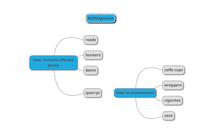
In this project I am going to explore how humans effect the environment, this can be shown in many different ways for example litter is a direct way humans toxify the natural environment with harmful chemicals from man made packaging’s and products.

Mindmap
Eadweard York artist reference
Edward York is a photographer that takes images of litter where it lies in streets and roads. he is most know for his image that show a “society on the verge of destruction”.
His street litter project inspired me to go out and take images of litter where I find it this relates to Anthropocene because humans drops foreign objects in and the environment showing disrespect tot the earth, litter harms the planet by adding toxins from plastic and chemicals used in the manufacture of packaging’s and products that leak in the environment meaning a less healthy environment for plants to grow. I will respond by going out around the my local areas to find litter and photograph it where it lies.
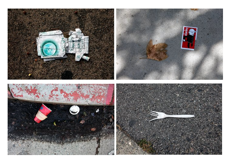
Image Analysis
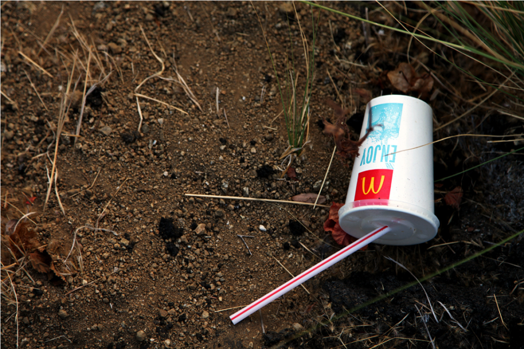
I like this image because it shows how out of place litter is because it isn’t made for these environments. the contrast between the clean bright coloured, loud packaging against the dull rugged environment. there isn’t a lot of grass in this image which represent the impact that humans plastic pollution is effecting the environment.
Keld Helmer-Petersen
Keld Helmer-Petersen was a Danish photographer who achieved widespread international recognition in the 1940s and 1950s for his abstract images. He is recognised as the pioneer of colour.
most of his image are on black and white high contrast film negatives. these images relate to Anthropocene between the hard black shapes of man made structures juxtaposing to the pure white sky that fills the rest of the image. I will respond by experiment using this effect on my images.
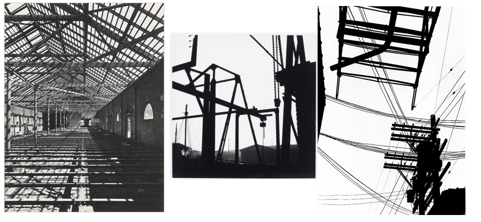
Image Analysis
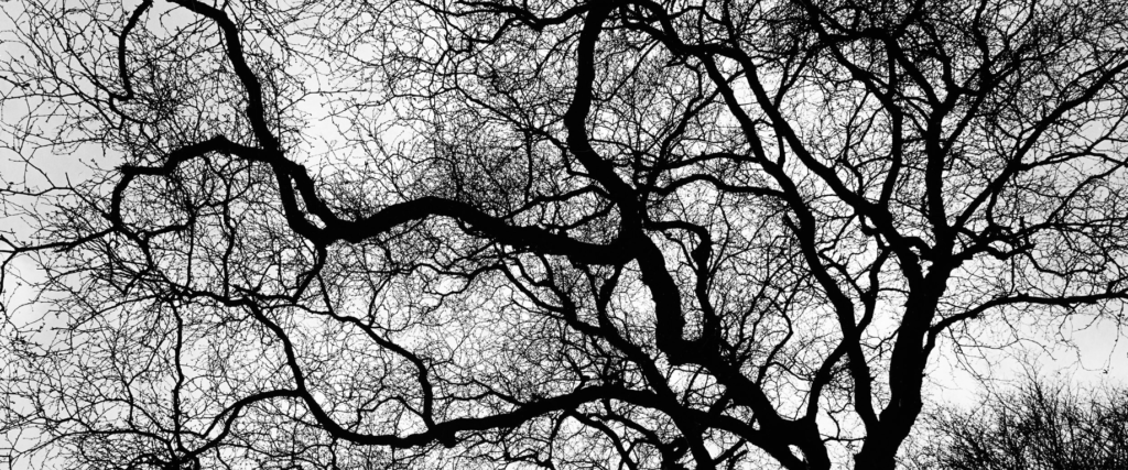
I like the intricate in this image how the infinitely splitting branches break up the white background creating more of a flat image. this image was taken of a tree out of season becasue it has no leaves. the darker parts of the image are where the trunk is thicker, and where the the tree once grew from.
George Marazakis
George Marazakis is a Greek photographer, born in 1976 in Creta Island Greece where he lives. He studied Mechanical Engineering and works for the Greek Ministry of Justice. He uses Anthropocene as both concept and title for a series that looks at a new epoch engendered by the greed of mankind. planet, plastic pollution, and power stations.
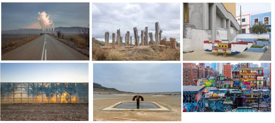
Image Analysis
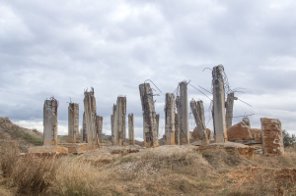
This image uses dull colours and a bright image to convey a lifeless, meaning the there is no cure for Anthropocene and the earth will be left lifeless if humans continue having such a large impact on the environment. the image shows a concrete ruin. concrete is very hard to recycle and is one of the most used materials on the planet. this image was taken to show that what we abandon does not disappear. it was taken to make more people aware of this ever growing problem.
Photoshoot
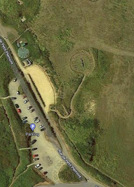
1 I will go to Plemont to photograph the area trying to convey a similar meaning through my images as George Marazakis.
2 I will go to a green house and take images of the inside and outside I am hoping to convey the how green house gases are effecting our planet.
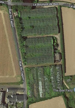
3 I will go to a quarry because it is a very large area that shows how humans have taken a large area

4 I will walk around and take photos of litter that is see along my way.
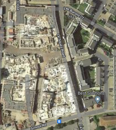
5 I will go to a an estate to capture images of man made structures.
Contact sheets


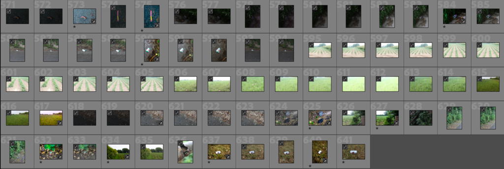
In preparation I took 641 images in 5 locations i first started by going through my images and rating them to best suit my artist reference.
Image selection
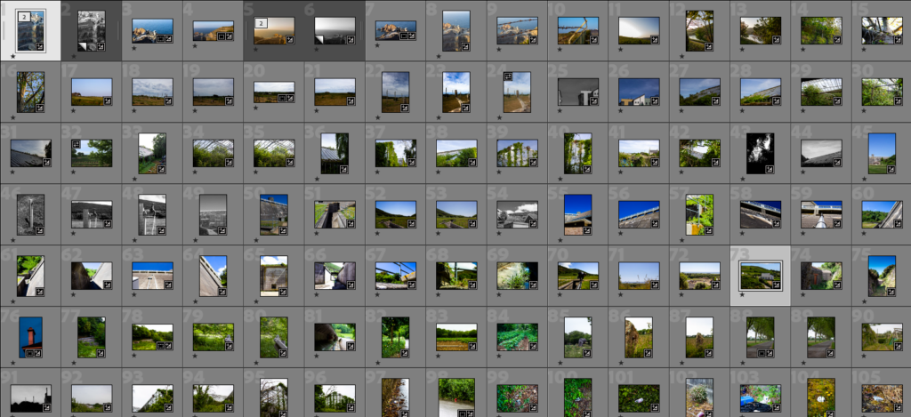

Image sub selection, then refined my selection even more to get 47 images

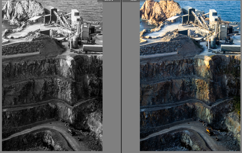
I then started to edit my images and make duplicates to experiment different ideas on this example is an image of the quarry in St Ouen that I took from the car park above the quarry. the downward angle the image was taken provides more perspective than a affect on would have been. I edited this image until I was happy with the result then I made a duplicate to see how the images would look in black and white, George Marazakis uses colour in his images so I decided to go with the non black and white version.

I further more refined my selection down to 19 images that will then be refined further into my final images.
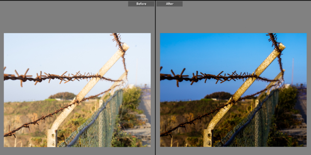
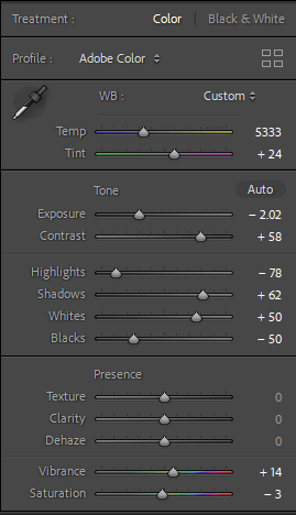
I really like how this image turned out after I edited it to reduce how over exposed the image is then I increased the contrast and shadows to give better definition and depth to the image. I like the way the natural blue sky contrast with the harsh spikes of the barbed wire fence. I decreased the black to give a clearer image.


I edited this image to bring out the greens of the overgrown bushes in the green house. to do this I increased the contrast and saturation. to bring out the brighter tones in the image.
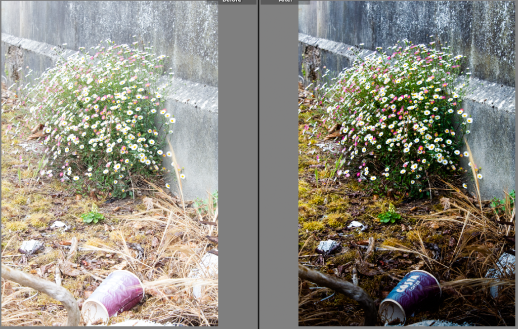

This was an over exposed image of a coffee cup left to contaminate the natural environment. I used the graduate filter on Lightroom to reduce the exposure at the bottom of the image i increased the shadows and decreased the highlights to give the image more depth. the dark foreground blends into the lighter background with lighter brighter coloured flowers growing out a crack in the concrete.

I edited this image to better relate to Keld Helmer-Petersen i used the graduate filter tool again to create a better contrast between the black shapes against the white sky’s.
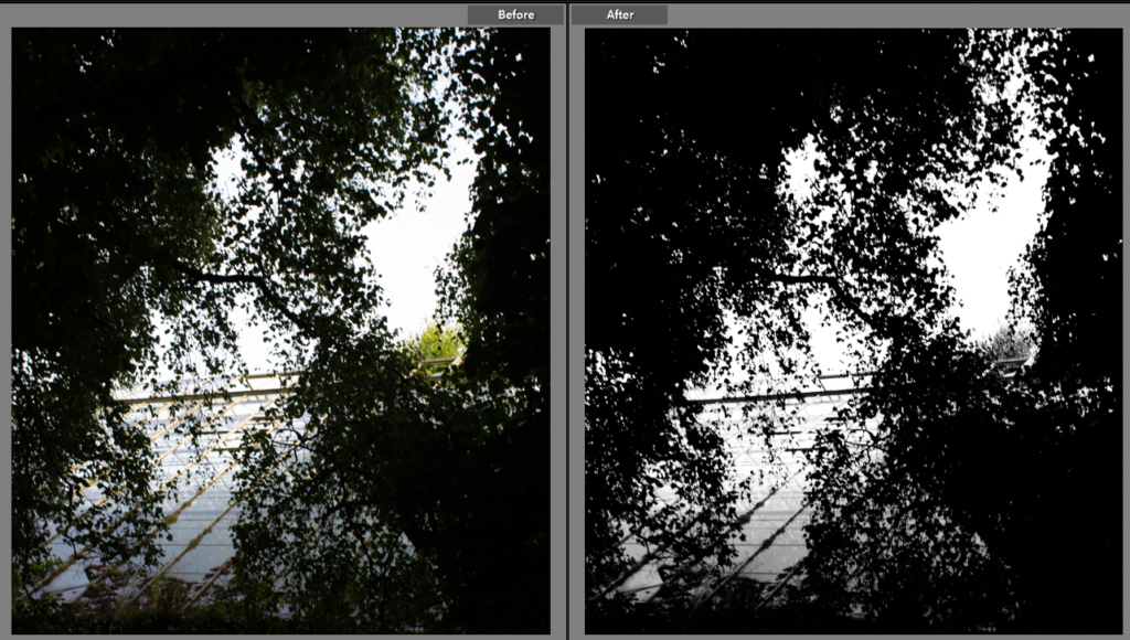
I experimented to better relate to Keld Helmer-Petersen, I decided his abstract style would look good on this image because of its interesting shapes created by the gaps in the leaves and the light reflecting of the glass roof that blends with the white sky. I increased the contrast and changed the image to black and white to create this effect. this effect brings out the leading lines in the image that bring your focus into the image.
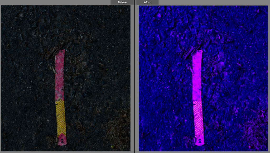

I increased the tint to experiment with colour in the whole image, to appear out of its context. this brings out a more vibrant tone to the object in the image. I dislike the less natural look to this image it looks like it has been over edited.
Comparing my artist reference

George Marazakis image inspired me to got to this location in Plemont that reminded me of his image. my image has a slightly more colourful tone because it the location is surrounded by forest and streams that give more colour to its natural environment. the sticks in the ground have a similar shape to the twisted concrete pillars in his image. His image where taken from a lower angle which gives extra contrast to the pillars because they are on the lighter sky background. I decided to take a higher perspective of the sticks so that I could fit all of them in the shot.

His image of a green house inspired me to go out and photograph a green house, the green house that I went too was actually abandoned and overgrown. however they way the plants where pressed up to green house which is exhibited by the plants growing up the green house. my image was taken after his image so it shows how time can effect the structure of a man made building and how the environments take backs its land. the over grown bushes are a metaphor for time. time between humans effecting the land scape by putting up structures and how the environment slowly takes back its land.

Keld Helmer-Petersen image shows the line the shadow makes is similar to the lines the railing makes in my image. I like these zig zag lines to lead your focus through the image his lines are made by a straight line shadow falling on different surfaces but . however his image is of a black shadow on dull concrete steps. My image is shows the lively green over throwing the dull concrete, the railing adds more structure to the image.

Eadweard York‘s image of a contrasting coffee cup in a dark place relates to my image of a coffee cup in a more natural pace. our images are different because the subject of his image ‘the coffee cup’ is bright where as mine is been faded by the glare of the sun. my image uses the flours to juxtapose the abused natural environment with flowering growth.
final images
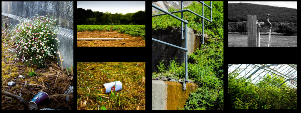
I arranged my final images into this format to best portray the images in terms of size in relation to the others. I chose to make certain images larger because those image look better when superimposed next to the rest of the collection.

I then created a virtual gallery and put my images in. I did this to see what it would be like to see my image in a real gallery’s.
Evaluation and critique of my work

I like this image a lot but in the I could improve on this image next time by adjusting the aperture to get more of he content in focus. which would give better definition to the image. this image relates to the theme as it represents how humans act while on this planet this image features a barbed wire fence meaning that not all humans are on the same side which shows why we have such a big impact on the environment because humans create to many other problems on this planet that they can not deal with the wellness of this planet.

I like the angle and perspective of this image. I edited this until I was happy with the colour tones of the image, I did this to create contrast between the vibrant greens and the lifeless grey steel beams providing cover and shelter to the weeds. If I took this image now I would have taken I from more inline with the roof to get a longer effect to the image which would lead the focus in. this is image relates to the human race by showing that the plants are out growing their environment which is having a large impact on the environment (in this case breaking glass)
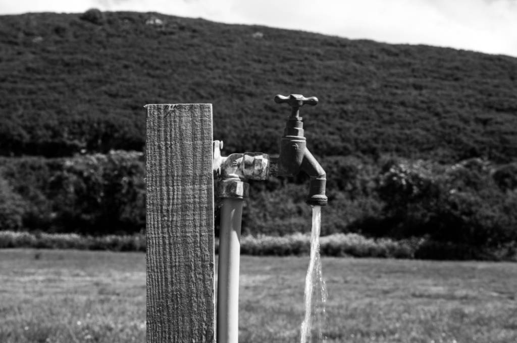
I like how I framed the tap with in this image. I was thinking of amore deadpan style when I was framing this image so I experimented with it in black and white which I ended up choosing over the colour copy. If I did took this mage again I would have taken more images form different distances and angles which would have given me more to explore with. this image relates to Anthropocene because it shows how humans have dug up a natural land scape and disturbed wild life so that they could have amore convenient water source.

I like this image, the shapes the railings make in this image creates a interesting effect that draws the focus into the image. when framing the image I tried to create a half an half image to give juxtaposition from the overflowing ground and the hard concrete shapes. If I took this image again I would have have taken an extra step back and positioned more of the railing in the frame to incorporate more of those leading lines. this image represents that we can have as much as on impact as we like but nature will always be in charged, as it shows in this mage the ferns over taken these hard man made structures.

I like the way the rain creates an extra shine on the metals in this image. I increased the highlights to bring out that shine just a little bit more. if I took this image again I would take it at a later time to create a darker effect use man made lights to bring out that shine even more to create even more contrast between the natural green environment. this relates to Anthropocene because it shows how that man made structures stick out in nature because they do not belong.

I like this image but I wish it had a wider view to show more of the scale of the effect we have on the land. I like the way I have edited this to bring out the saturation in the plants and have the trees fade to darkness which is a metaphor how humans disrupting natural land to create their own food, which juxtaposes the natural trees fade to black because they are being chopped down all over the globe to be turned into farmland which has a very large effect on the green house gasses i the environment.
overall in this project I feel I have done well to improve I could learn more in depth about how the camera settings can effect an image better or worse to level up the quality of my work.
