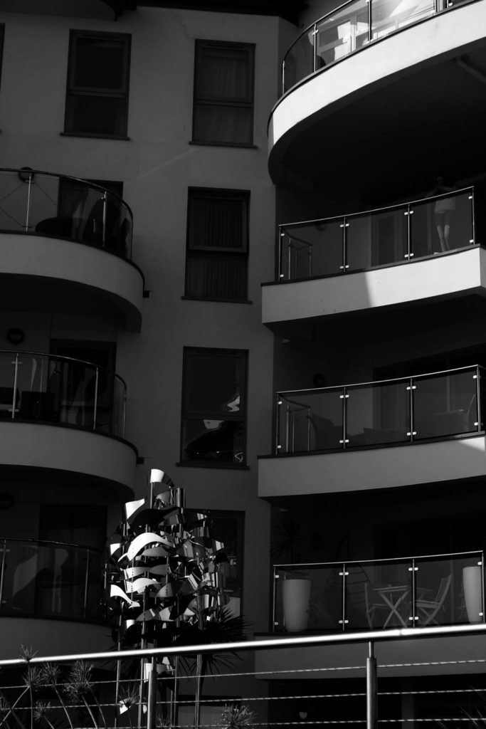
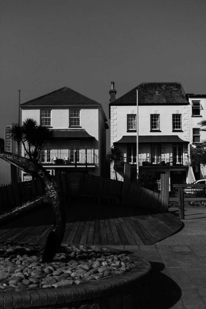
| Photoshoot 1 | For my first photo shoot, I went down to the harbours and the block of flats near there. I went around 5:30 so that there was still good lighting. |
| Photoshoot 2 | For my second photoshoot, it was the photography walk around Havre de pas and La Collette also near the harbour, this was from 2:20 – 3:20 with good lighting. |
Contact Sheets

The day I went to the harbour it was sunny, with a bright blue sky which made a nice background to the photos. There are a few repeated photos as the sun was slowly starting to set so I kept having to change different settings on the camera to get the right lighting.
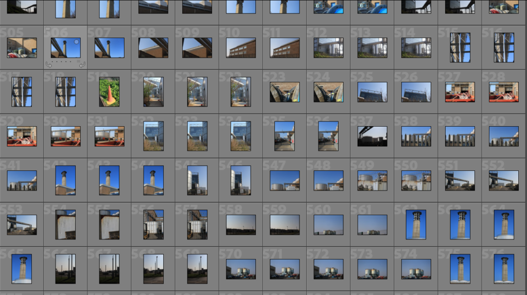
For this photoshoot, it was also a sunny day, with little clouding so there are no shadows in the photos and they also have a bright blue background from the sun. I tried to get a lot of different photos as I did not need to adjust the settings a lot as the lighting stayed the same a lot of the time.
Editing
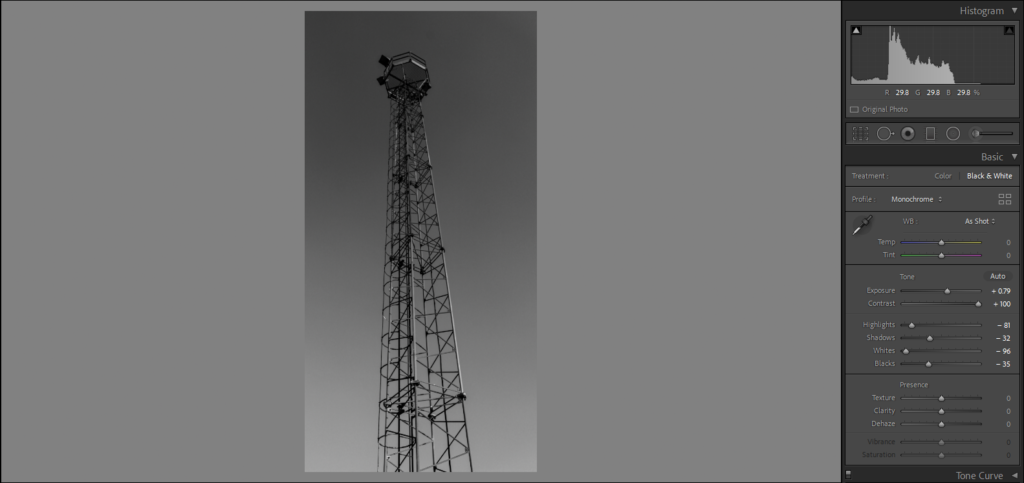
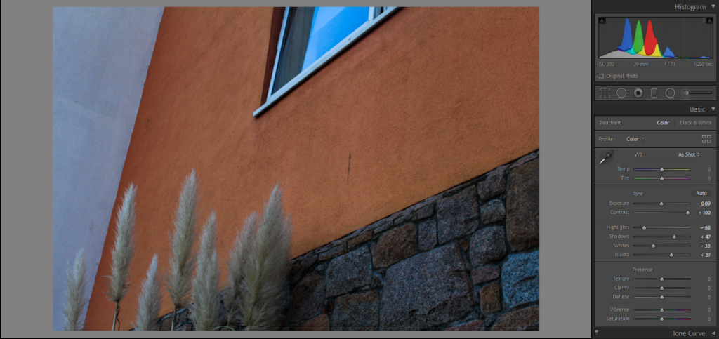
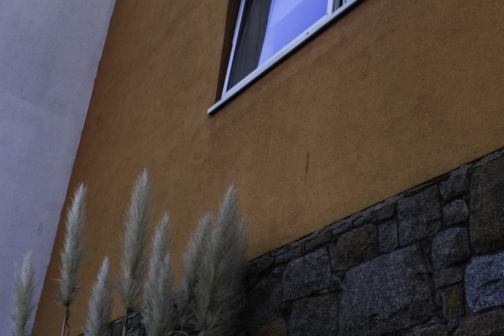
For my black and white edit, I have increased the contrast and only slightly increased the exposure to give the structure a darker look and have the background give an ombre type effect going from a dark grey into a lighter one. As I wanted it to be a darker image I have also decreased highlights, shadows, whites and blacks to get this edit. For the photo of the flats, I have increased the contrast up to 100 to get a brighter orange and extenuate the brick beneath it. I have increased the shadows and blacks also to try and help this as I really like the brighter orange against the white wall next to it.
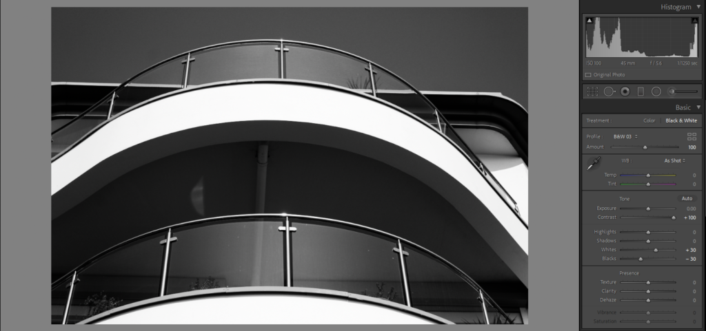
Similar to the black and white edit I did above I have increased the contrast but in this one, I did touch the exposure as I felt that if I decreased it the photo would be too dark and if I increased it the photo would be overexposed. I also didn’t adjust the highlights of shadows and I felt that only the white and black needed to be adjusted the get the effect that in I wanted. For the photo on the left, I wanted to keep it in colour to show the bright blue of the sky. For this edit, I increased the exposure to 58 to give the photo a more vibrant look and make the blue pop. I also decreased the highlights because I wanted the harsh line between the shadowed side and the lit side to be obvious and easily noticeable.
Final Images
I chose the top left photo as one of my final images as I think that the colours all go together as the cream building sits nicely with the brighter blue of the sky. I also like the contrast between the two sides of the building and the harsh line going down the middle. I also like how there are small elements of blue in the different windows which I think helps the photo look more put together. I also think that it looks better having a little bit of the top cut off as there is not as much sky distracting from the building. I chose this to be one of my final images for the middle photo because I really like the contrast between the darker parts of the image and the brighter whites on the balconies.

