
Possible Photoshoot Locations:
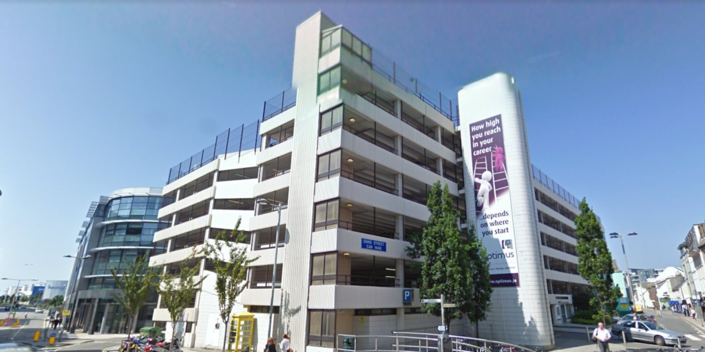
For this photoshoot, I went around St. Helier and took pictures of the buildings in it from different viewpoints, such as from the top of car parks looking downwards/at the horizon or at the foot of buildings looking upwards.
Contact Sheets
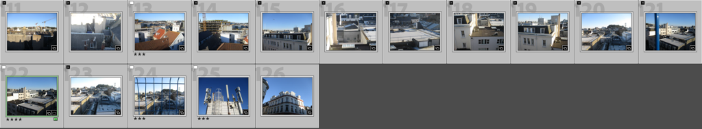
Contact Sheet of my Best Images
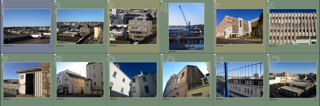
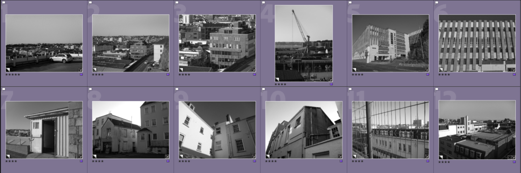
Final Edited Images
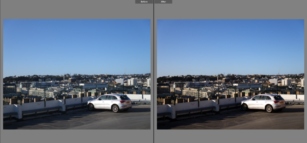
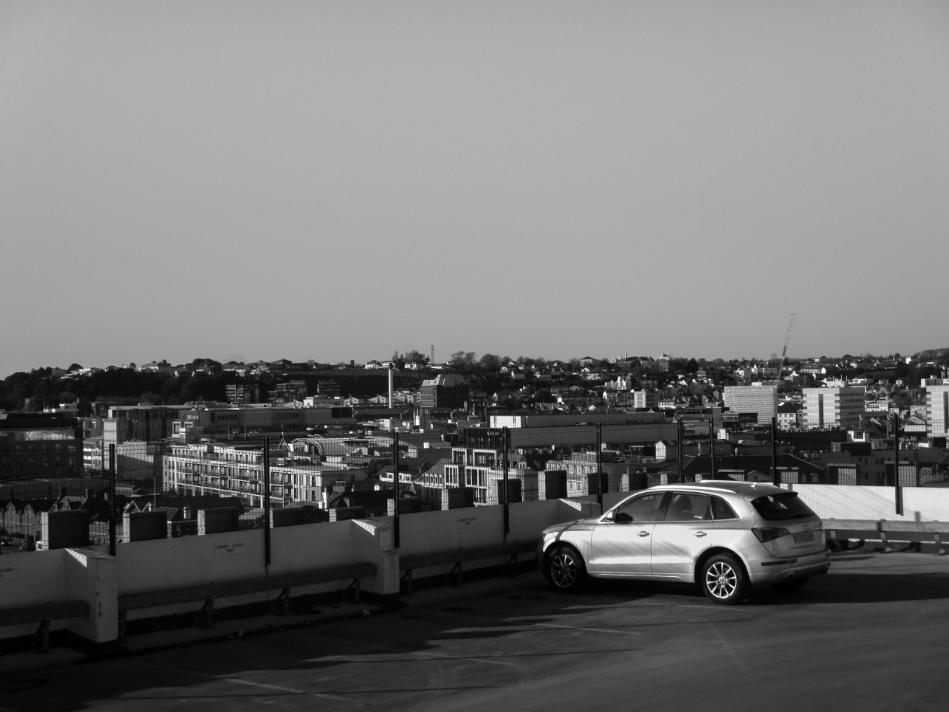
I chose this as a Final Image because I like the way it uses distance and scale to show how large the urban landscape is in comparison to a car. I also think it is interesting how the foreground, due to the fact that the building is high up, is much larger than the buildings on the background (in terms of scale in the image), which creates a very clear divide between the foreground and the background. There is also a clear divide between the top and bottom halves of the image due to the top half being a clear blue and the bottom half having many lines and a mix of greys, greens and browns. The car acts as the focal point in the image, due to how it’s silver paint reflects light into the camera, making it the brightest part of the image. This image follows the rule of thirds as the car is positioned at the bottom right corner.
I chose this as a Final Image because I like the relationship between the car in the bottom right and the buildings that surround it. It creates a sense of life that would not be seen if the car was not there. The difference in scale between the car and the buildings also shows how vast the man-made landscapes are. Due to the fact that there are many buildings that can be seen, there are many lines in the image, giving it an unnatural look, however the road the car is on has noticeably less lines on it, creating a contrast that allows the car to be seen more clearly.
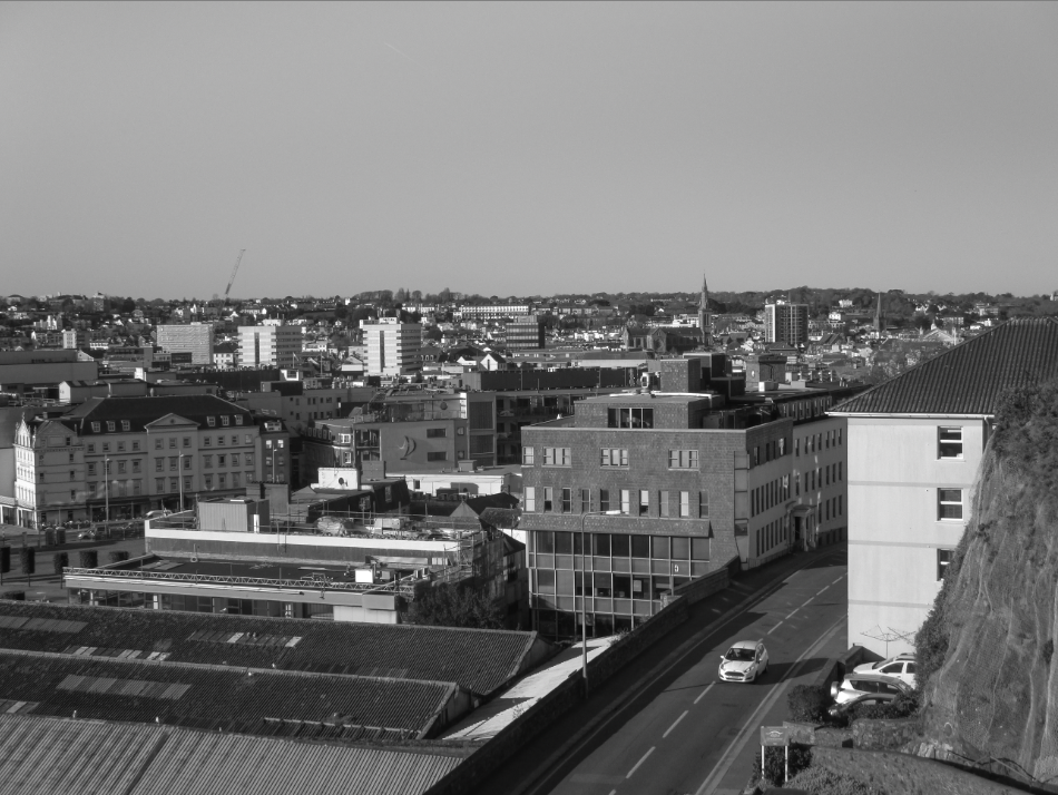
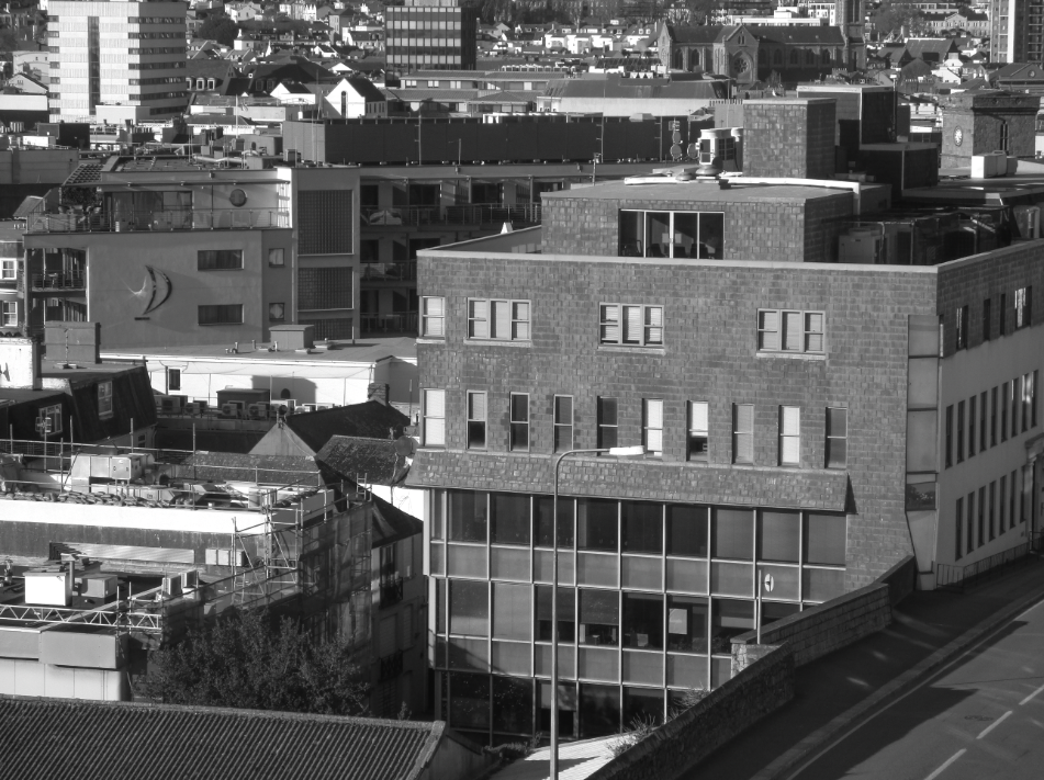
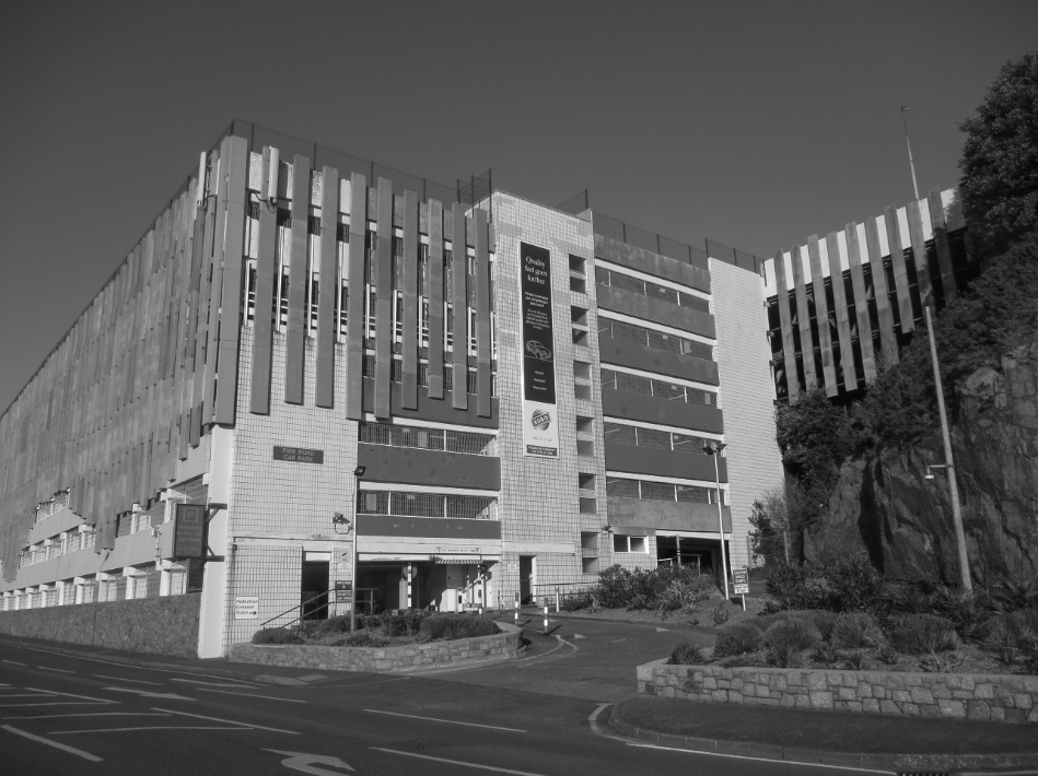
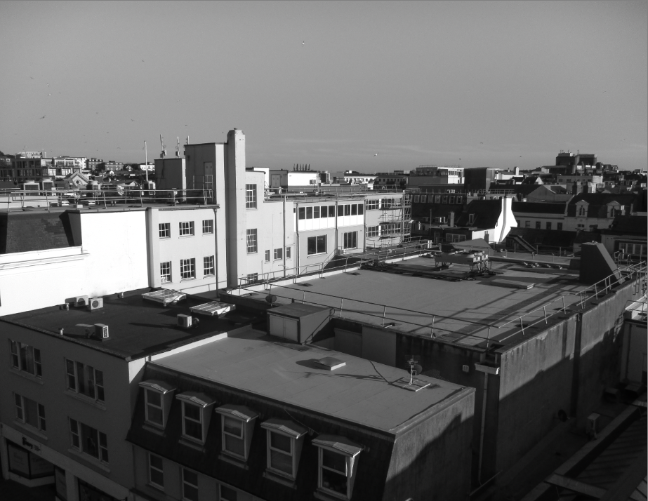
I chose this as a Final Image because I think the clear lines on the larger building on the right gives the image an urban look, however there are considerably less lines on the building than on the background of the image, making it stand out more. When editing, I made the tone of the image slightly more warm to make the greys more vibrant. I also like the way the low sun allows large shadows to form behind the buildings, while the faces of the buildings facing towards the sun are given a highlight.
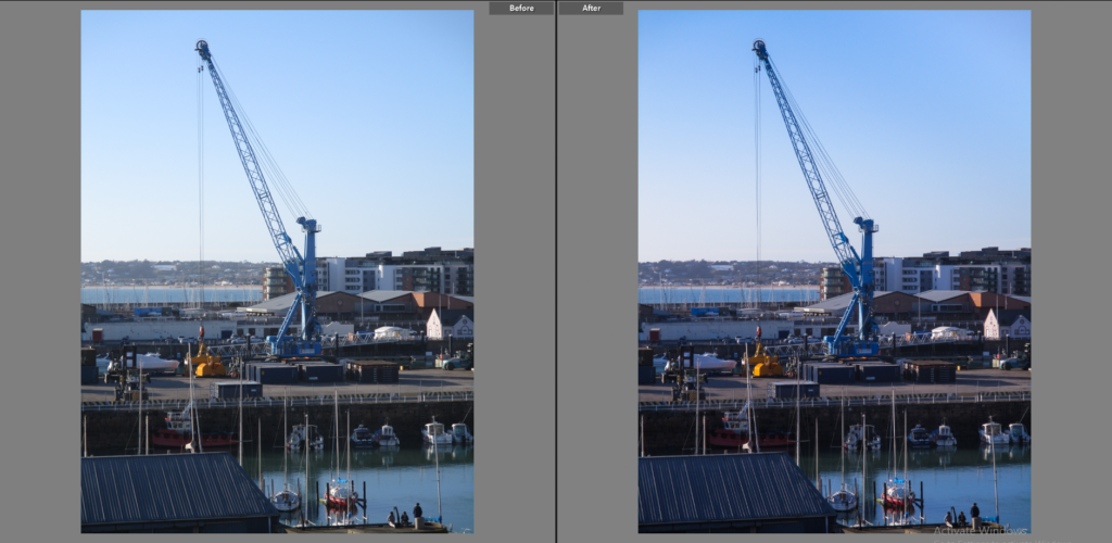
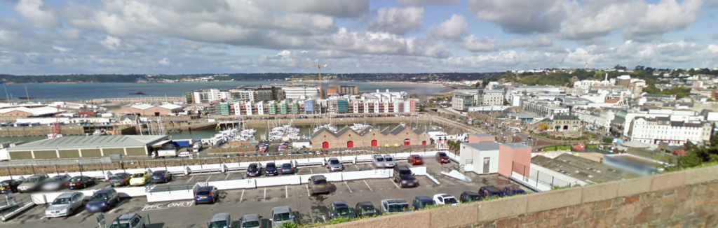
I chose this as a final image because I like how the foreground, midground and background are displayed, each separated by water. The foreground contains a building’s roof and 3 people by the edge of the water, this compared to the crane in the midground creates a huge difference in scale, while the background shows a distant bay/headland which aligns almost perfectly with the buildings on the right creating a horizon line of sorts. I think the fact that the image is made up primarily of blues gives the image a unique look for an image displaying an urban landscape.
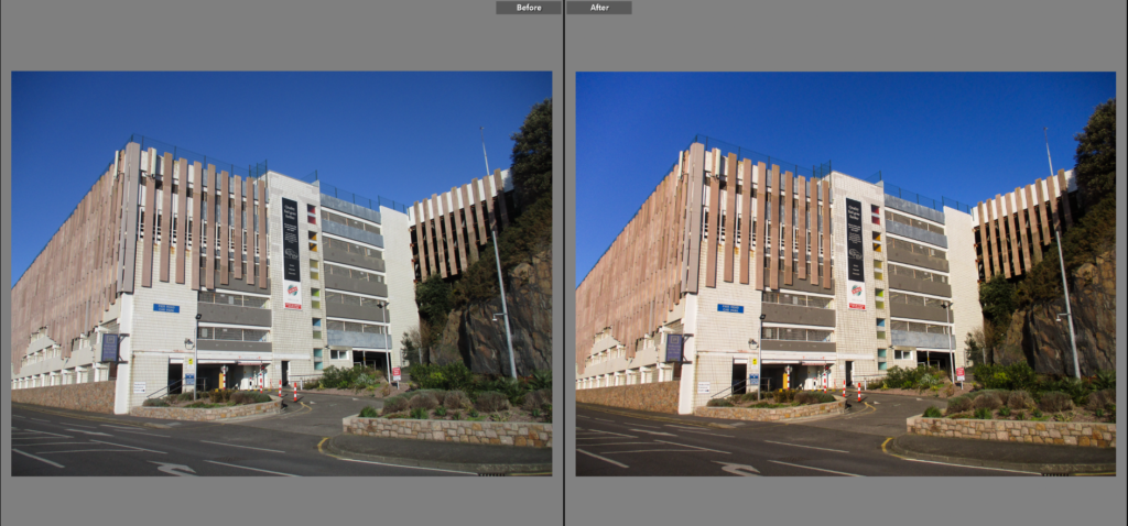
I chose this as a Final Image because I like the simplicity of the subject of the image, being simply the entrance to a car park, I think that simplicity makes the image link to the New Topographics. When editing I made the the image slightly warmer to help give the image more colour, especially in the greens and browns. I think the blue sky in this image creates a large contrast between the upper and lower half of the images.
I chose this as a final image because I thought the regular lines and shapes gave the image an unnatural look which I think represents a ‘man-made landscape’ nicely. The way that the building is cut of by the frame of the image, as well as how an upwards angle was used when taking the shot, gives the image a closed-in feel. I think that the blue sky may ruin the image’s industrial aesthetic, however the black and white version may resolve this.
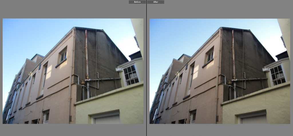
I chose this as a final image because I thought the gritty, dirty marks on the walls gave the image a very industrial/urban look, when editing I increased the contrast slightly to enhance those darker parts. The straight lines and regular shapes, as well as the limited colour palette containing mainly creams and browns, also give the image an urban look. The image was taken facing the sun, with the buildings partially obscuring it, this puts the part of the buildings shown in the image in the shadows, meaning there are no parts that are obscured from the viewer.
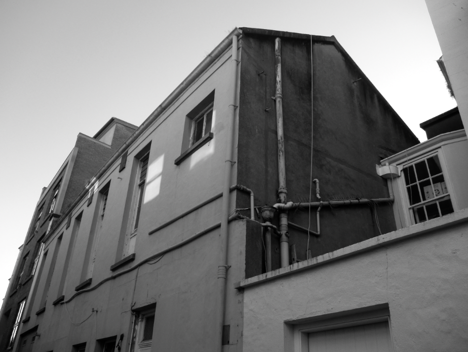
I chose this as a final image because I think the way part of the building has a shadow cast over it and another has sunlight shining on it creates a nice contrast between those two points. I think that the piping around the building makes it more interesting to look at as it gives it extra lines to break up the plain flat surfaces of the building. Because of the sky, as well as the way the light is reflected in this particular area, there is a lot of blue within the image, which, to me, gives the image a unique and colourful look for an image of an urban area.
I chose this as a Final Image because I think the brown and cream colours of the buildings, the dirt/soot on the roof of the buildings, as well as the shape of the buildings, being made up of regular lines, gives the image a very urban look to me. I also think that the piping on the side of the brown building adds to this effect. I think the focal point of this image is the left face of the brown building, as it is fairly bright, as well as the fact that there are leading lines created from the pipes and window frames that point towards it.
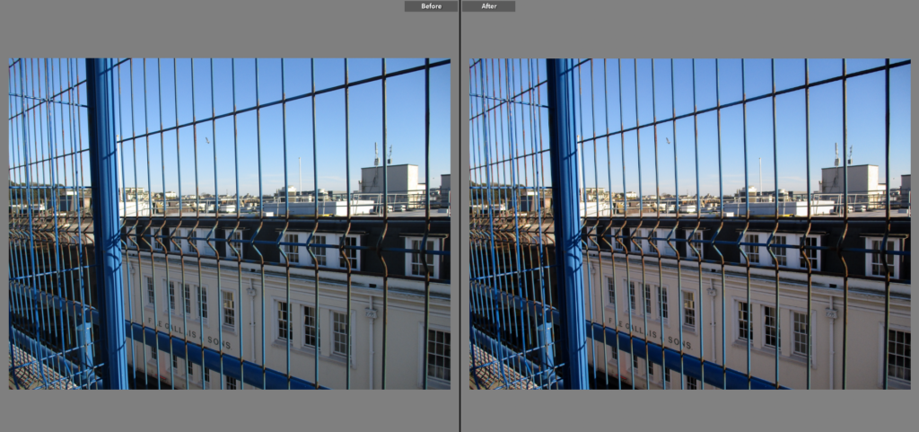
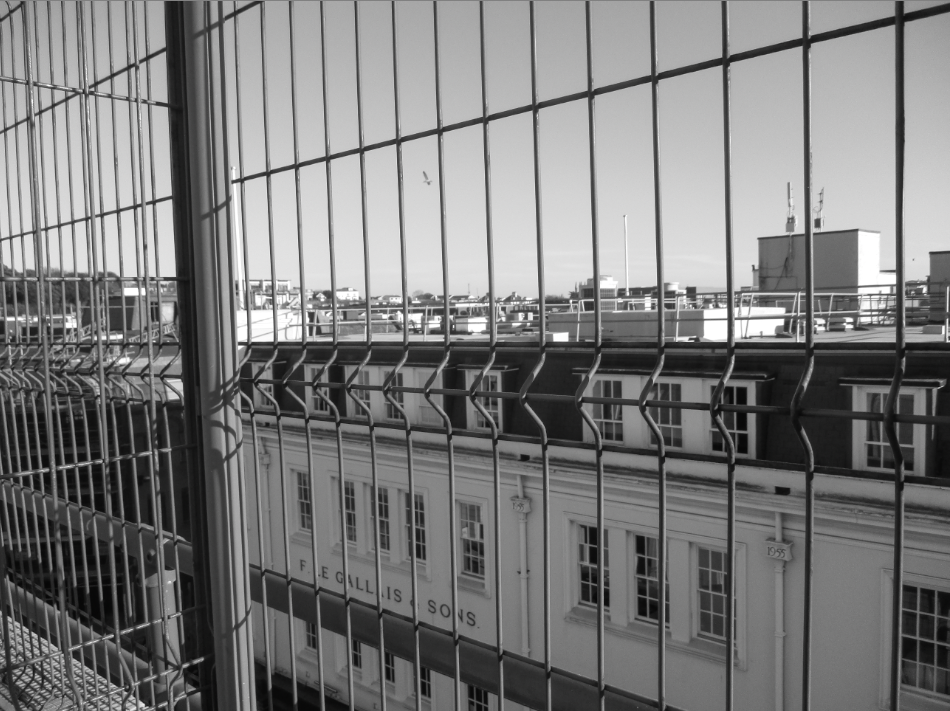
I chose this as a Final Image because I thought looking at a large cityscape horizon through a wired mesh gives the image an urban aesthetic. I like the way the top, dark division of the building is enveloped by a protrusion in the wires – it helps separate it from the rest of the image. When editing I made the tone of the image slightly warmer to give the buildings behind the mesh more colour. This warmer colour, paired with the blue of the sky and the mesh, creates a nice overall colour palette, giving the image an unorthodox look in relation to other urban images.
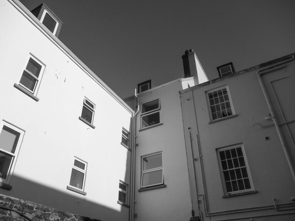
I made this a final image because I like the way deep shadow is used to create a harsh contrast between the faces of each building. I made the image slightly warmer when editing to give the image more of a ‘golden hour’ look, which I think helps separate this image in style in comparison to other urban images. The focal point, the bright row of faces from the left, stands out from the rest of the image since it is very bright due to how it is facing the sun.
Comparison to Henry Wessel
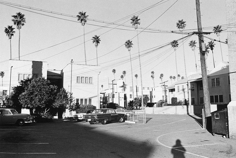
I chose this picture to compare to Henry Wessel because I thought the viewpoints were fairly similar and both of these images use light and shadow to create a contrast between the different faces of the buildings. Since Wessel mainly took pictures in California, the skies in our pictures are different, with his appearing far lighter due to the harsh sunlight California experiences. I tried to use light and shadow to expose the faces of the building like Wessel does, and I like how that exposure creates a nice, pure white on the face of the building. Wessel’s picture focuses on a far wider range of buildings (which puts more of an emphasis on the landscape), while mine focuses on one/two buildings (which focuses on the little details such as pipes and patterns in urban environments), however in other images I have made in this photoshoot have a wider scope. Wessel makes use of plants such as trees in his images, while (some of) mine do not, I like the effect of contrasting nature with urban landscapes.