
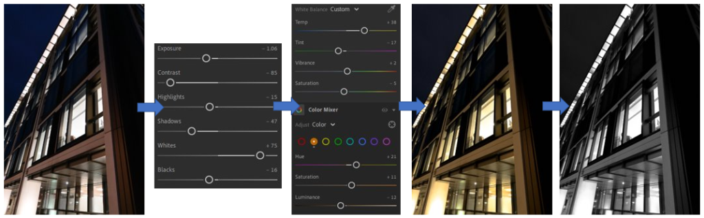
For these edits, which I like the outcomes of, I wanted to experiment in the style of Charles Sheeler and Rut Blees-Luxemburg, I began by darkening the photo slightly with the contrast, exposure, shadows and blacks which gave it a darker appearance. Then to make the lights appear brighter, similar to Luxembourg’s work I brought the whites up which amplified the lights which were on inside the office building. Then to give the photo the “streetlight” effect which appears in Luxembourg’s work I made the temperature and hue of the photo warmer but to stop it turning completely yellow I adjusted the tint, vibrancy and saturation which would cancel that out of happening. I then changed it into black and white as well which is similar to Thomas Struths work, and I really liked how it turned out because it creates a lot of different shapes which are highlighted by the lighting.
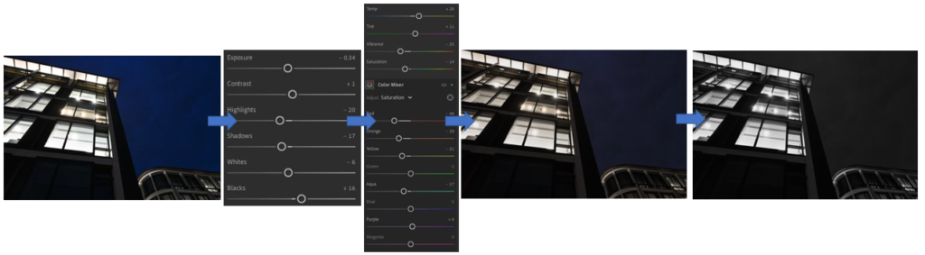
For these edits, I started off by working in the style of Thomas Struth where a few of his photos are quite dim and bland in the colour palette which is used when he photographs and as the picture was already quite dark I began by mainly adjusting the highlights to tone down the brightness and the shadows as well to make it appear darker and gloomier, like Struths work. To create the dim, bland and washed out effect Thomas Struth reciprocates in his work I brought the temp and the tint up to make the photo slightly warmer then brought the vibrancy and saturation down which drained quite a bit of colour from the photo. I then experimented with the colours in the photo where I was able to adjust how they appeared on the photo, which was able to be changed drastically, as the colour was being drained to appear bland. Then to experiment further with his style as he uses black and white filter in a lot of his work I selected the filter but I didn’t like how it turned out a it came out too dark, especially in the bottom left corner where the building is completely lost.
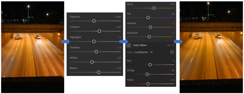
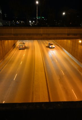
For this edit, which I think is successful and I really like, I primarily focussed on editing in the style of Rut Blees-Luxembourg because the photo already had a warm, orange/yellow “streetlight” tone/feel to it due tot he lighting of the underpass. I chose the photo because I liked how the 2 cars were in the same space opposite each other, showing them both going different ways. I didn’t want to change a lot of this photograph while editing as I liked the effect it already created so I adjusted ad controlled the lighting a small bit and made most of the lines more defined. To brighten the effect further through the style of Luxembourg so to define the darker tones I applied a small tint/temp towards it which helped to control it then used the orange and yellow colour to0 give it a little more vibrancy and bri9ng it to life. Then to centre the photo up as it wasn’t straight I cropped it which made it centred and appeared cleaner with the straight lines.
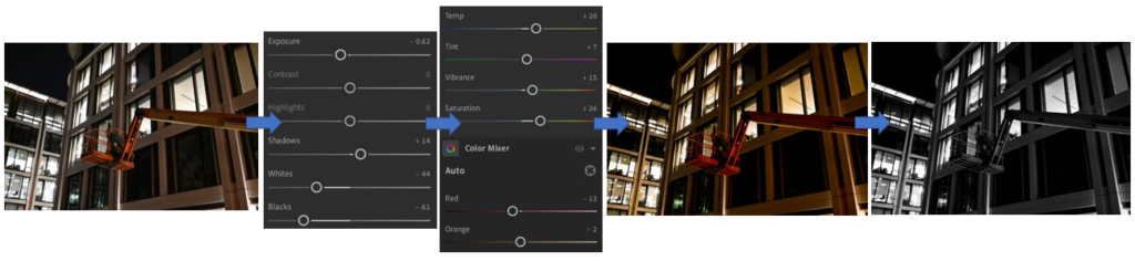
For these 2 edits, which I did in Adobe Lightroom in the style of Rut Blees-Luxembourg, I began by bringing the lighting down from inside the office building which made the photo appear slightly overexposed and this effect can be clearly seen through the windows in the background where everything else gets lost (such as objects in the windows) because of this. On the other hand, I think that the warm, yellow tones of the building work well with the orange which creates a good contrast of colours making it stand out well due to the abstract shape as well which goes against the traditional, uniformed order of the photo of straight lines and square boxes which are repeated throughout.
Most and least successful edits –
Most –
Successful:
– Yellow, orange, brown tones work well together.
– Cars going opposite ways, same place in the road.
– Similar to Rut Blees-Luxembourg’s work due to the warm, soft lighting which I’ve created.
– Creates a distinct contrast against the darker surroundings above.
– Different shapes of straight lines, square boxes on side, lines in the road all work well together and doesn’t make it look messy.
Not successful:
– Not centred or straight.
– Too much dark space above, cropping needed.
– Slight overexposure on the space in front of the car on the right, creating a glare.
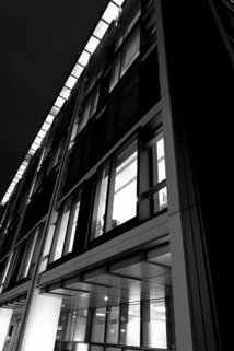
Successful:
– Balanced amount of light and dark space.
– Straight lines, uniformed shapes.
– Taken from an angle which adds dimension.
– Mixture of black/white tones which work well together, don’t overpower one another.
– Similar to photographers work due to the angle which I’ve taken it at and the building which I’ve photographed.
Not successful:
– Needs to be cropped slightly at the bottom to make the windows appear more level to help balance the photo and shapes in it.
– Crop the right side as there is too much negative dark space on the side.
– Adjust the darkness slightly in the middle to make the windows appear clearer and not as if they are blacked out.
Least –
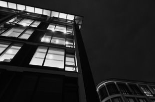
Successful:
– The buildings follow one continuous line, no gap in-between which adds fluidity to the photo.
– Defined shapes created through the windows, bright and able to see clearly.
– Taken at a slight angle which changes the perspective and makes it appear bigger.
Not successful:
– Too much dark space on the top right corner of the picture, drowns the smaller building out.
– Needs to be cropped at the bottom or brightened to make it not appear as one huge block of dark colour.
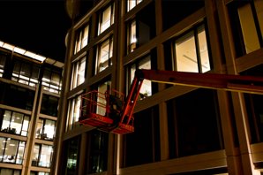
Successful:
– Strong, vibrant orange colour contrasts well against the background.
– Adds a different shape into it.
– Buildings are continuous in the background, no gaps in-between adding fluidity to the photo.
Not successful:
– Yellow tones have made the darker areas a dark brown, instead of black.
– Lighting in the buildings in the back have turned quite overexposed to the windows get lost in each other.