Final Images and Analysis

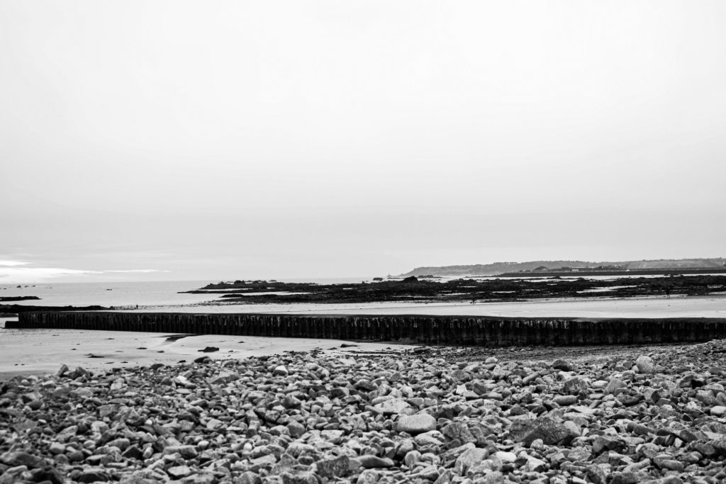
I have selected this as one of my final images as I think that there is many strong features of this image, starting with the perspective of the image, as I had to position the camera low down to the ground, and to make the structure of the image in the centre so that the final piece was symmetrical. Furthermore, the rule of thirds isn’t very present in this piece, but I like that the structure makes up the majority of the width of the image and then it disappears and gets smaller, this then nearly meets the horizon line and creates parallels within the image. I have made this image monochromatic and tried to make the contrast more clear so that the concept of Ansel Adams’ zone system is more present and the fact that this image has a large depth of field means that the wide range of tones is demonstrated all throughout.

This image was originally one that I thought was unusable as I thought it looker very average in colour, which is why I have edited it in monochromatic. Additionally, I think that the fact that the sky lacks tones and is all white is an advantage as it just means that contradiction between the structures, rocks and sky is made more obvious, making the image stronger. I like that this final piece has lots of components so that the cluttered foreground contrasts with the background. Furthermore, I think that the lack of quality if the image gives it more depth as the it makes the shadows look slightly blurred despite me adjusting the dehaze in Lightroom. This piece does contain some weaknesses including the fact that it could be seen as boring as not true to the project as there is manmade structures in this piece.

This is another one of my good images from my photoshoot down at the beach, I have selected this as one of my final images as I think that the composition of the image wasn’t planned but turned out to be successful as I like how most of the image is the land and this contradicts with some of my other final images as they most contain sky. I think that the depth of field with this image is important to note as it means that a lot of the landscape is present and it really shows how important this is when taking landscape photos. Its important to note that this image has been edited so that the rocks are very dark and this contradicts with the light blue, yellow and blue sky. Furthermore, I think that the water which lays on the sand that appears blue on the sand and the blue sky help link the image together.

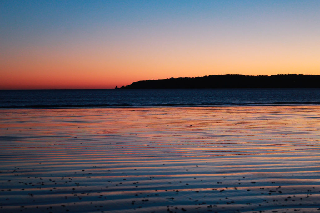
This photograph was taken during my photoshoot along St Aubins beach, the best part of this image is the colours, and I have enhanced these in Lightroom. I really like that the sunsets contains contrasting colours as the orange and the blue work well when reflecting back onto the sand. Furthermore, the composition of the image and the fact that half of the image is a fake reflection and half is natural features means that the photography itself would be seen as a contradiction. I think that the abundance of parallel lines within the image ties the whole image together they help the image become cohesive as its the only part of the image that matches together.

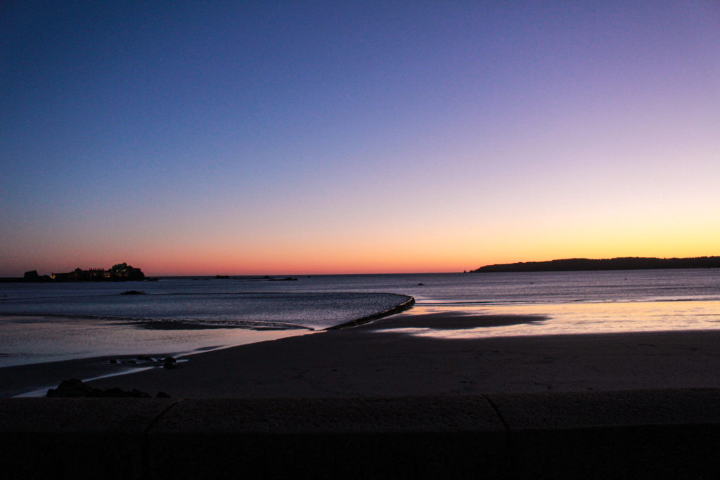
I have selected this final piece because I think that the perspective of the image is really important as it means that more of the natural landscape is in view and creates a straight horizon line and this image is symmetrical as the top half of the image is sky and the second half is land, structures and sea. Furthermore, I like that this image was taken at sunset as it means that the colours can be easily saturated and the blacks in this piece contradict with the yellows and the fact that everything is in focus means this is more clear. One weakness of this image could be that its very generic and many people have seen this type of landscape photography before but I think that the strengths of the image save it.
