
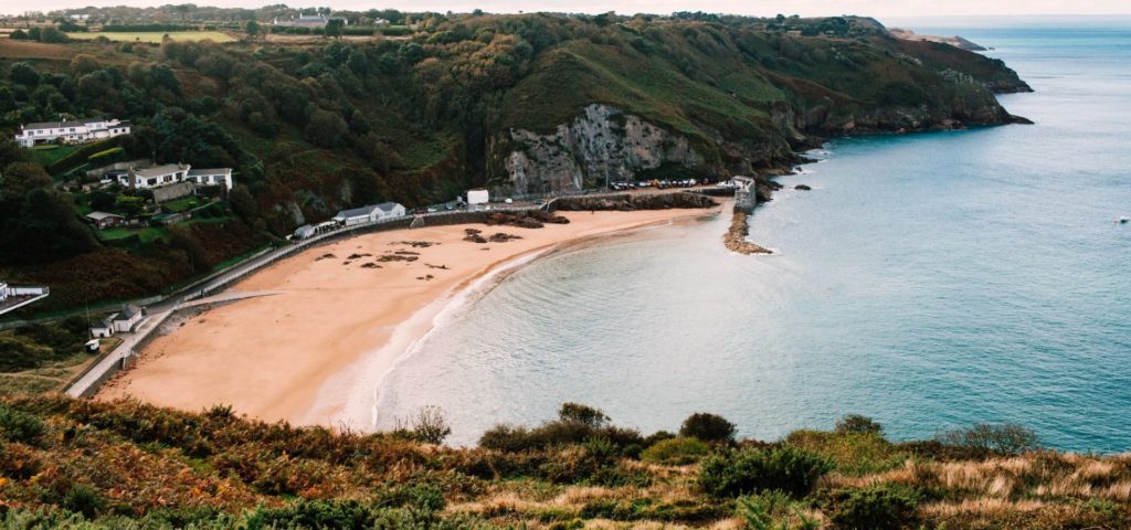
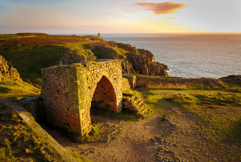
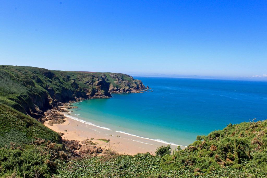
Possible Photoshoot Locations:

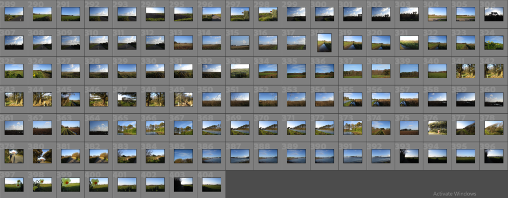
Contact Sheets
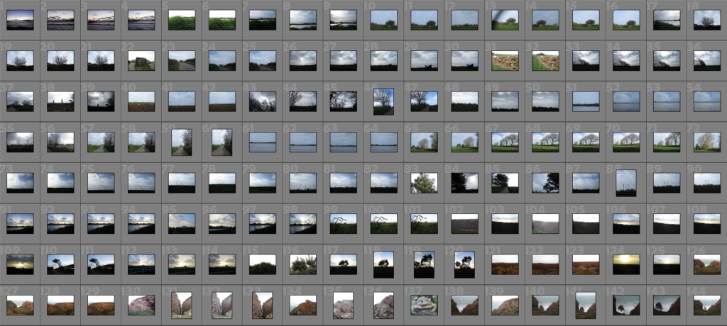
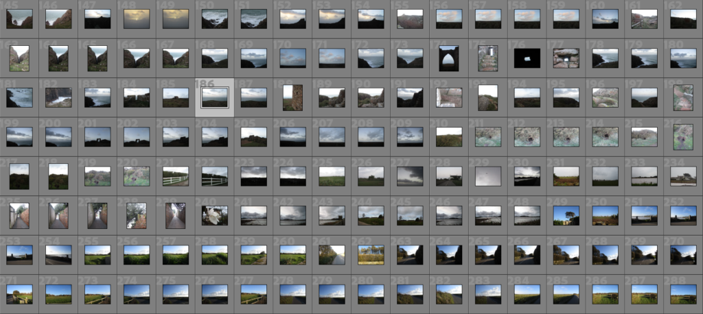
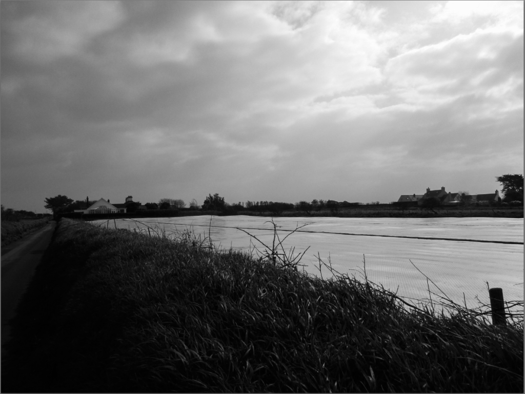
Contact Sheet of my Best Images (Unedited)
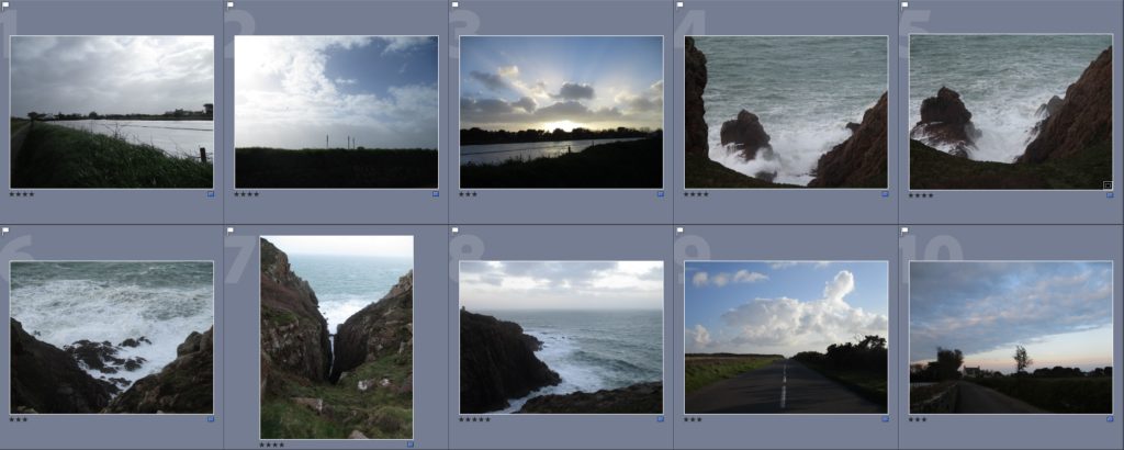
Final Edited Images
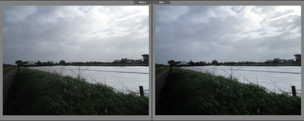
I chose this as a final image because I think the overcast, grey sky, paired with the grass on the bank, which seem windswept thus implying movement, gives the image a more chaotic look. I think it is interesting how the road on the bottom left of the image has a darker tone, while the sky in the top right has a much lighter tone, it creates a parallel/contrast between the two points. I also think that the plastic covering on the field having a similar colour to the sky creates an interesting link between the sky and the land.

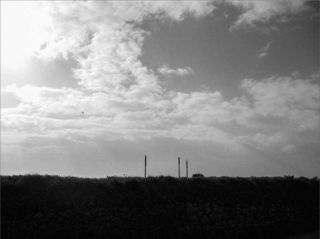
I chose this as a final image because I liked its composition, with a bank/wall covering about 1/4 of the image in a darker shade of greens/browns, the three poles emerging from that in the centre and the rest of the image being a sky made up of patterns of cloud formations. I edited the image to look warmer and made the bank slightly brighter, while maintaining the stark contrast it gives to the rest of the image. Because of this warmness, I think it gives it a slightly larger colour palette that has a pleasant mix of blues greens and browns. The image was taken from a lower down viewpoint, which allows more of the bank and sky to be seen.
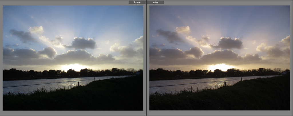
I selected this to be a final image because I found the way the sun, the horizon of trees and the clouds above/surrounding the sun correlate with each other to be a more grandiose scene. I think the slight glare of the sun also makes it appear larger in the image, as well as the bright rays of sunlight that are emitted off of it give it a more sublime or exaggerated look. When editing, I made the images tone slightly more warm, giving it a more exaggerated, sunset-like tone. I kept the contrast between the dark foreground and the sun, as to make the sun itself and the sky the main focus of the image, however I did make the grass slightly brighter to allow more detail to be seen.

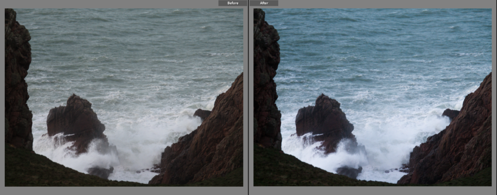
I made this a final image because I thought the spray of water in front of the rock, as well as the general roughness of the tide, gave the image a sense of the sublime. I like the way the white part of the water contrasts with the darker tones of the rocks, which I increased slightly during editing, as it helps separate the two further. While editing, I also made the image slightly colder, not only helping to make the rocks look darker, but also giving the sea more colour. I think the way the rocks on the left and right of the image frame it quite nicely, however I think I could have positioned the camera slightly lower down to capture a bit more of the rocks below.
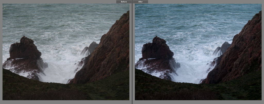
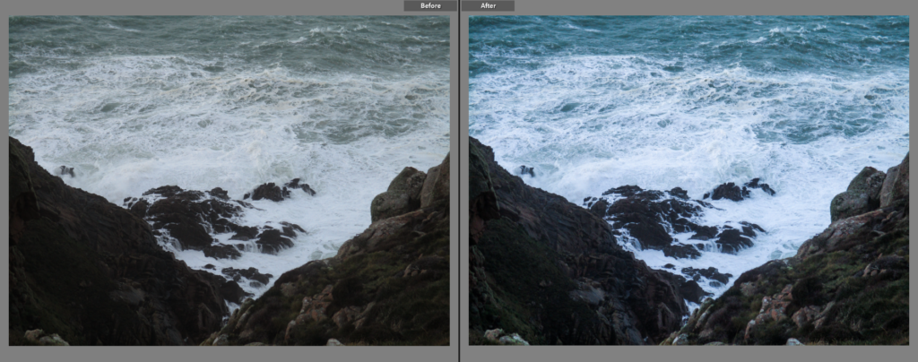
I chose this image for similar reasons for the image above, however I think this image is slightly stronger, due to the framing of the image being slightly better in my eyes. I wanted to keep the contrast the image above had, so I made this image colder to make the white in the water brighter and the browns of the rocks darker. I also gave the rocks themselves a greater contrast, this makes the grooves and nooks in the rocks more defined, giving it a more angular and jagged look. This image also uses a rough sea with breaking waves to create a sense of the sublime within it.
I chose this as a final image because I think the roughness of the sea, paired with the natural jaggedness of the rocks, gives the image a very romantic look. When editing, I made the tone slightly colder, to give the water a slightly more lively aesthetic, and the rocks slightly more exposed, while maintaining their contrast with the white of the sea. The focal point, the rocks in the centre of the image, contrast greatly with the water surrounding them, making them more noticeable, in addition, the rocks on both sides of the image create leading lines towards the rocks in the centre.

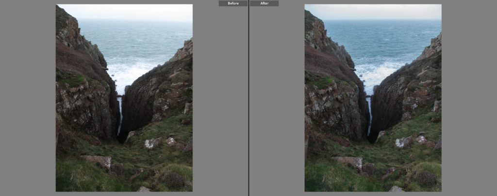
I chose this as a final image because I like its composition, with the rocks facing diagonally down into a narrow gulley in which a line of water can be seen, separating the two headlands. I chose to take this picture in a portrait orientation so that this relationship between the rocks and the sea remains the primary focus of the image. The colours in the foreground are somewhat dulled, which creates a contrast between the brighter/more vibrant colours of the ocean, which I made slightly more vibrant when editing by changing the tone of the image to be slightly colder.
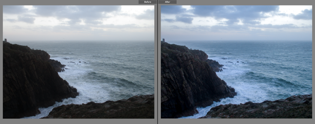
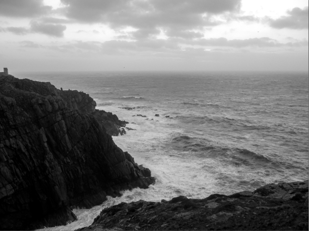
I think this image is one of the best from the photoshoot, thus I chose it as a final image. I think the crashing waves, the irregular shape of the headlands and the clarity of the clouds gives the image a romantic aesthetic. When editing, I made the image slightly colder, giving the clouds and sea slightly more colour, I also made the headlands slightly brighter, making the lines and patterns on them more noticeable. I like the way the headland in the foreground (on the right) and the headland in the background (on the left) are separated by a line created by the sea as it gives the image more clarity in its composition.
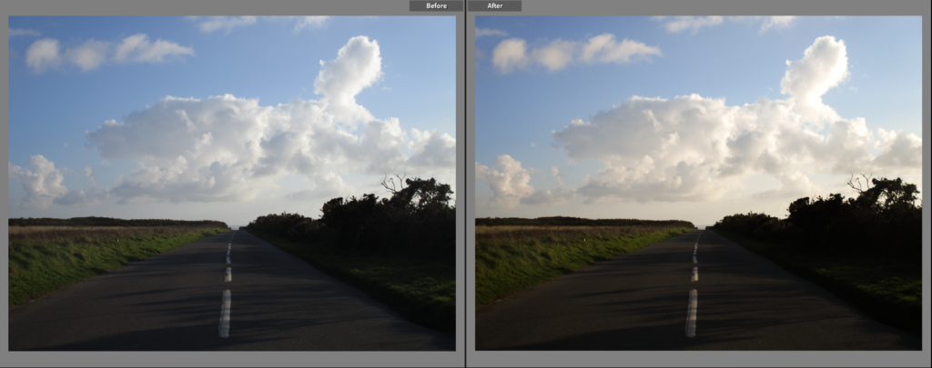
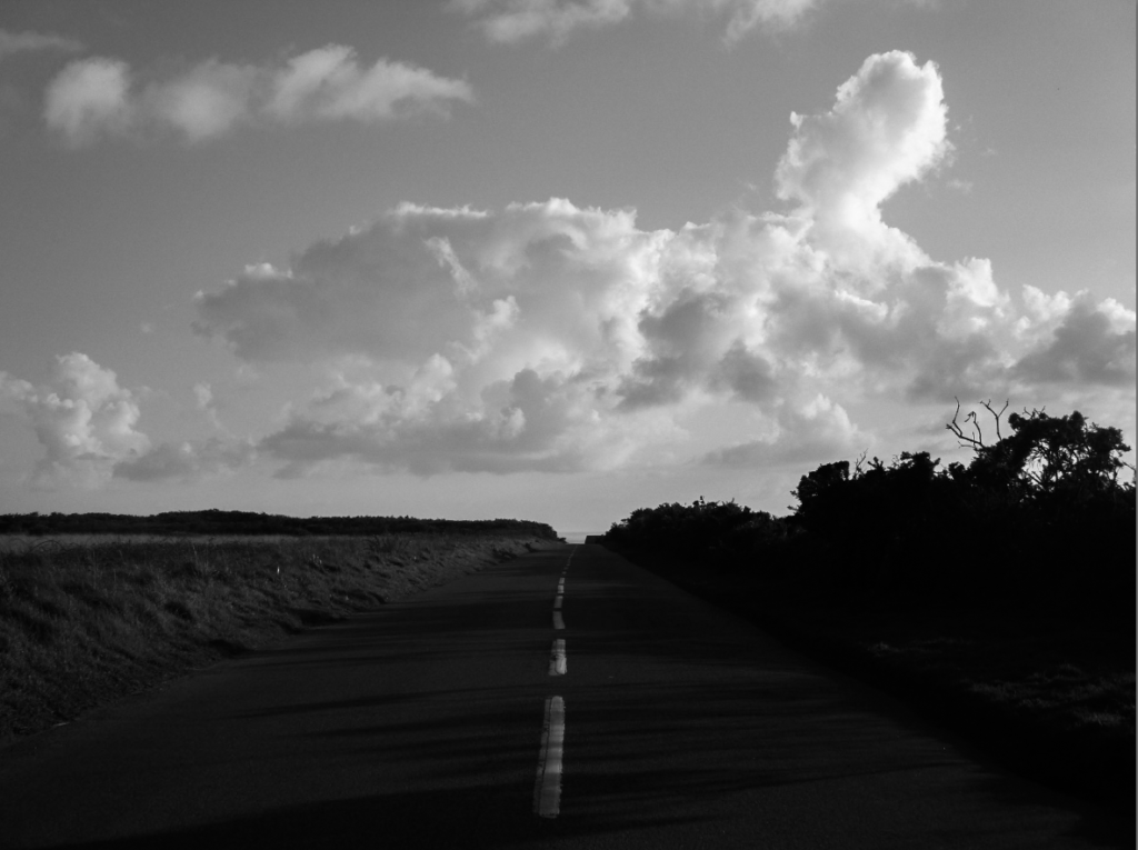
I chose this as a final image because I like how there is a clear division (made by the horizon line) between a landscape made predominantly by straight or jagged lines and a skyscape which uses far softer and irregular lines and shapes. This difference in look, as well as the clear difference in brightness between the halves (with the bottom half being darker due to the shadows that cover it), creates a contrast between those parts of the image. I think the warm tone of the image, the blue sky with clear cloud formations and the long road gives the image an almost endless, dream-like aesthetic.
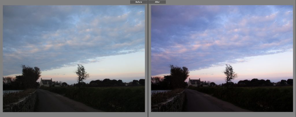
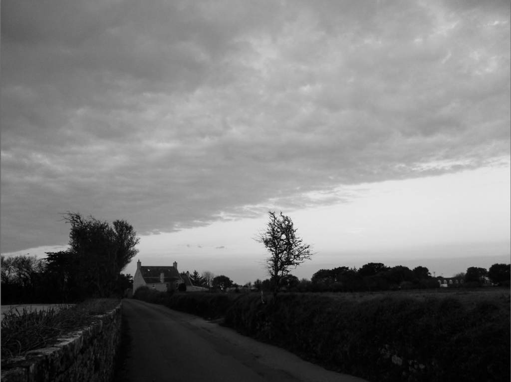
I made this a final image because I liked the relationship between the clouds and the road/banks, as they both point diagonally down towards the house near the bottom left of the image. When editing, I made the image wildly different from the others by giving it a warmer, pinkish tone, which can be seen very clearly in the clouds. I think the tone of the image paired with the soft shape of the clouds gives the image a slightly romantic aesthetic. There is a contrast in brightness between the trees and the sky, which separates the land and sky more clearly.
Comparison to Ansel Adams

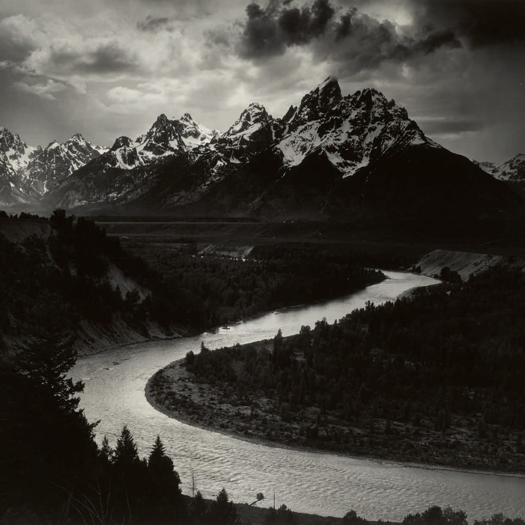
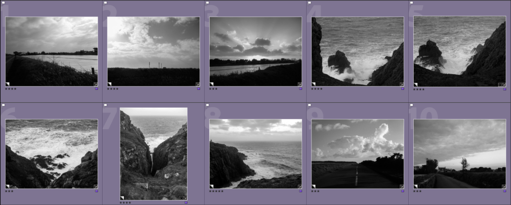
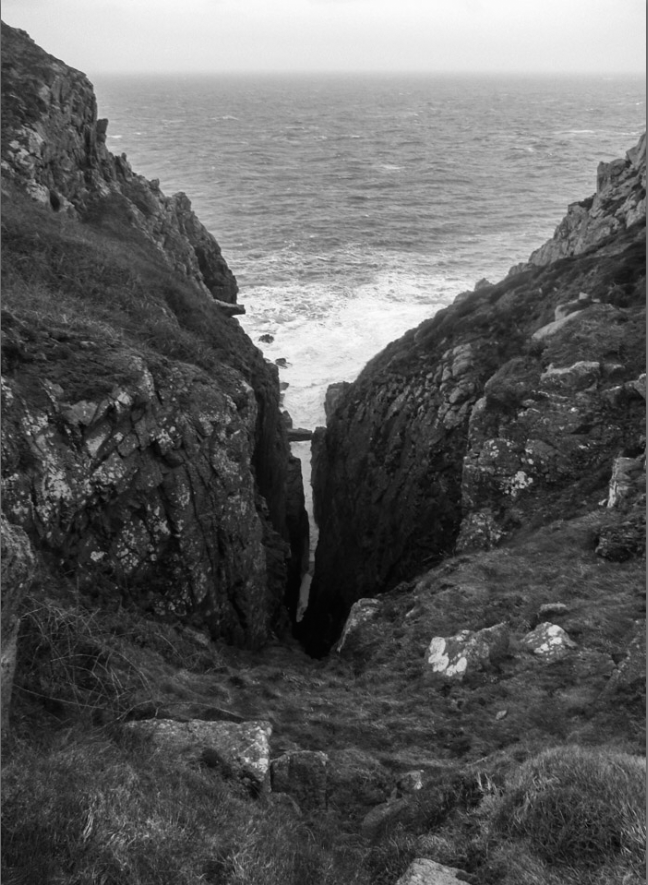
I thought this image had the closest resemblance to Ansel Adams’ work because it has elements of romanticism within it, with the breaking waves crashing on the vast headlands, as well as the fact that the little surge created between the two headlands loosely mimics the river in Adams’ own image. I also think that the mountains in Adams’ image, specifically their angular shape, are similar to the shape of the headlands in my image, giving them a link in that sense. The sky in Adams’ image is slightly more dramatic than in mine, due to how there is a greater contrast between the lighter and darker parts of the clouds, while my image has less of a contrast. I also think it is interesting how the water and land have a similar relationship in both of the images, with the water being far brighter than the land, creating a contrast that clearly outlines the flow of the water.