Angela Kelly


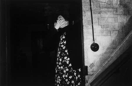
I’m comparing one of my images to one of my original inspirations, Angela Kelly, as I think we’ve got some similarities in our work, despite them looking so different. We’ve both used photos of ourselves and hidden our faces however have gone about it in different ways, I used photoshop to blur out my face post-photoshoot whilst Kelly has used her hand to hide hers during the photoshoot. We’ve also used full body photos of ourselves with the background still in view, taking attention away from us and almost allowing us to become apart of the background of our own photos.
Despite all this, we also have a few differences in our work such as the editing style. Kelly has made sure to increase the contrast in her image which allows the shadows to take control of the image and almost consume her into the background whilst I’ve decided to keep my image in colour, allowing all the details from the photo to stand out against one another and create different points of focus due to how busy the photo looks. Alongside that, Kelly has a more naturalistic style, keeping her images simple and lifelike as if someone had taken a photo of her leaving the room whilst I’ve edited a page out of a book to my work, taking away the naturalness of my original image.
Robin Cracknell


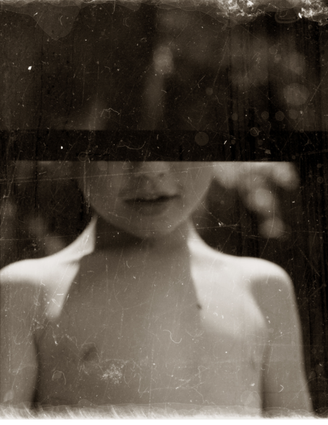
I’m comparing my some of my work to Robin Cracknell’s as both our images look dramatic and vintage, mine through the use of an overlay and his through he use of a vintage camera. This adds to our work, making it look older and almost like a memory which links back to both of our themes. Both of our images are centred, helping to draw attention towards the figure, aka the focal point of the image, despite both of us using different profiles in our portraits – his using a front profile whilst mine is more of a side profile. Along with that, we’ve both hidden part of the face in our photos, although we’ve obscured a the face in very different ways – I used an image of a plaster whilst he used his vintage camera to his advantage and purposefully framed the photo to create a line across the face.
i
[


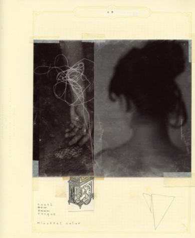
Here, I think our work also shares similarities as we’ve both chosen 2 of our photos and placed them next to each other, allowing them to work as one piece instead of individual images. Along with that, we’ve both used paper to help enhance and bring the 2 images together, however, I’ve used photoshop to blend the paper into the photo whilst Cracknell’s printed out his images and stuck them down onto a piece of paper, adding to the vintage manner of his work.
There are also some clear differences between our work such as the amount of colour in my work vs the lack of colour in Cracknell’s work. His lack of colour creates a dismal atmosphere surrounding his images, almost as though the viewer is supposed to mourn/pity the girl in the image which is emphasized by the lack of focus in the image as it’s almost as though the girl is hiding from the camera, especially as her back is turned away from the camera in one photo and her arm is the only visible proof of her in the other.
