
I knew there were certain photos I wanted to pair with each other so I decided to spend some time choosing what photos would be paired together.
Experimenting
—Experiment 1:———
Here, I was trying to pair a photo of me as a kid with a bright, colourful one in order to get a big contrast between both images and exaggerate how much has changed from then until now.
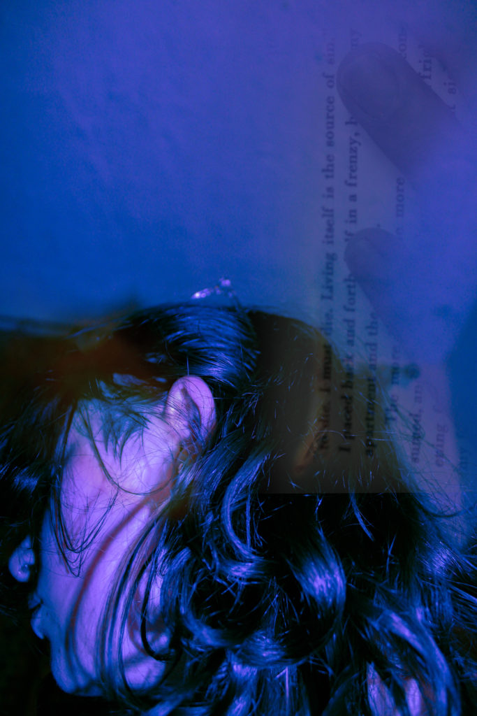
I like the way that both of these images work together as the paper helps create a connection between them, however, I’m unsure as to whether the paper makes them too similar to each other, making the pairing look busy/tacky.

I think these two images work well together as neither image is too busy, allowing both to stand out instead of competing with one another. I decided to pair a simpler version of the older image as the final version was too busy for my liking and didn’t work well whatsoever with the other edit.
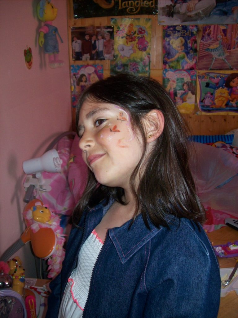
–Experiment 2:———
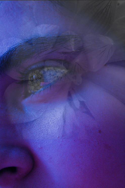
Here, I was trying to pair a photo from when I was little. I knew exactly what photos I wanted to try pairing with it as I attempted to recreate the butterflies on my face during my final photoshoot.

I really like how the images look paired with one another, especially as it looks like both images are looking at each other, creating an almost sad atmosphere surrounding the images due to how different they are from one another and how their positions/completions should be switched.

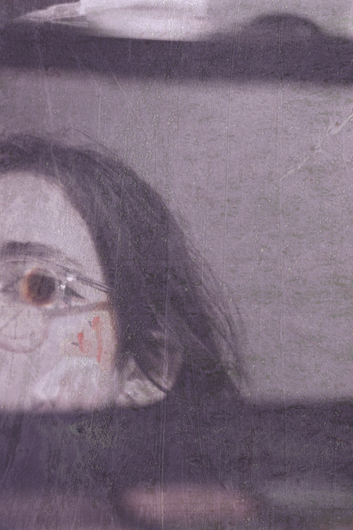
I also really like how this pairing looks. I think the lack of colour helps bring both photos together as it makes the contrast between them more dramatic whilst the small pop of colour from the plaster and stickers stops the images from being too different from one another.
As my final pairings, I decided to go with these pairings:


STOP HAVING GOOD EDITS FFS
*knife emoji* *knife emoji* *knife emoji*