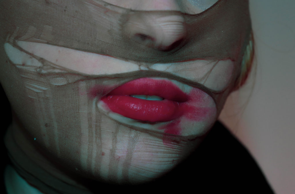
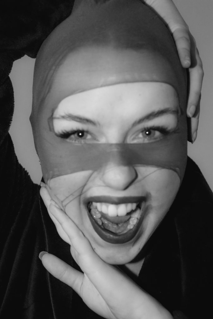
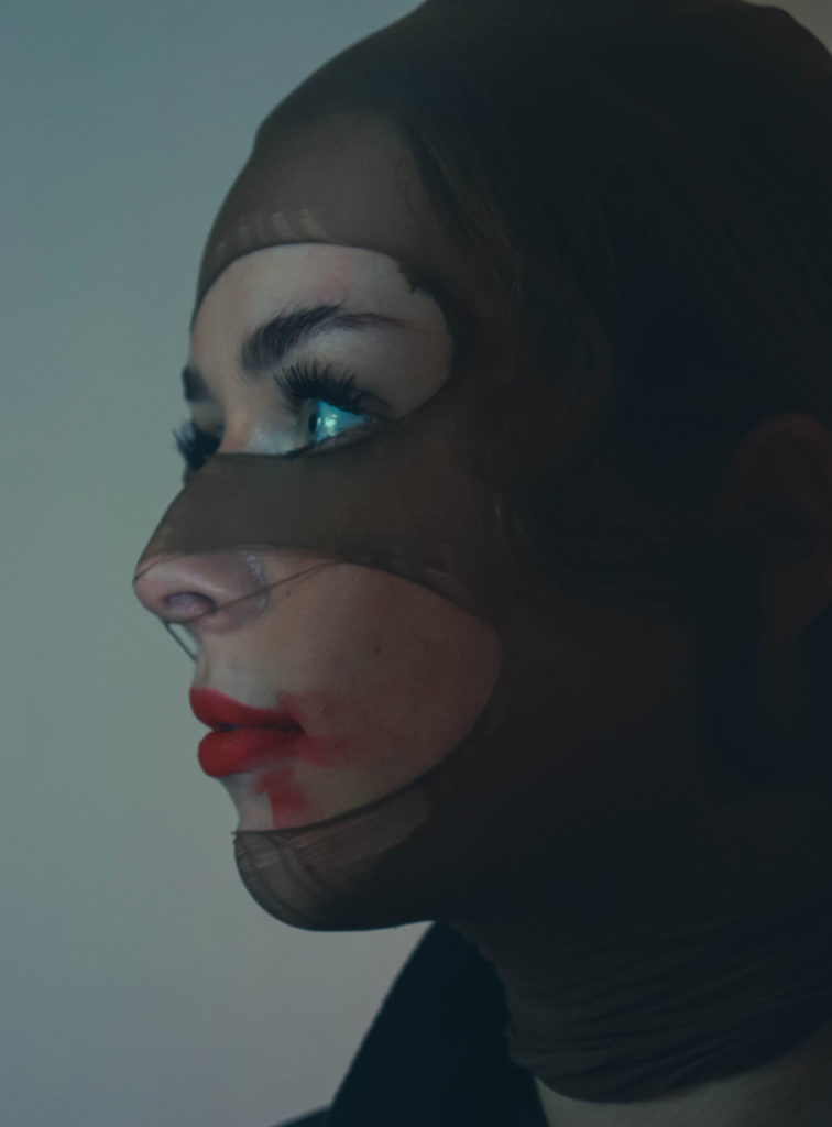
initial edits on Lightroom
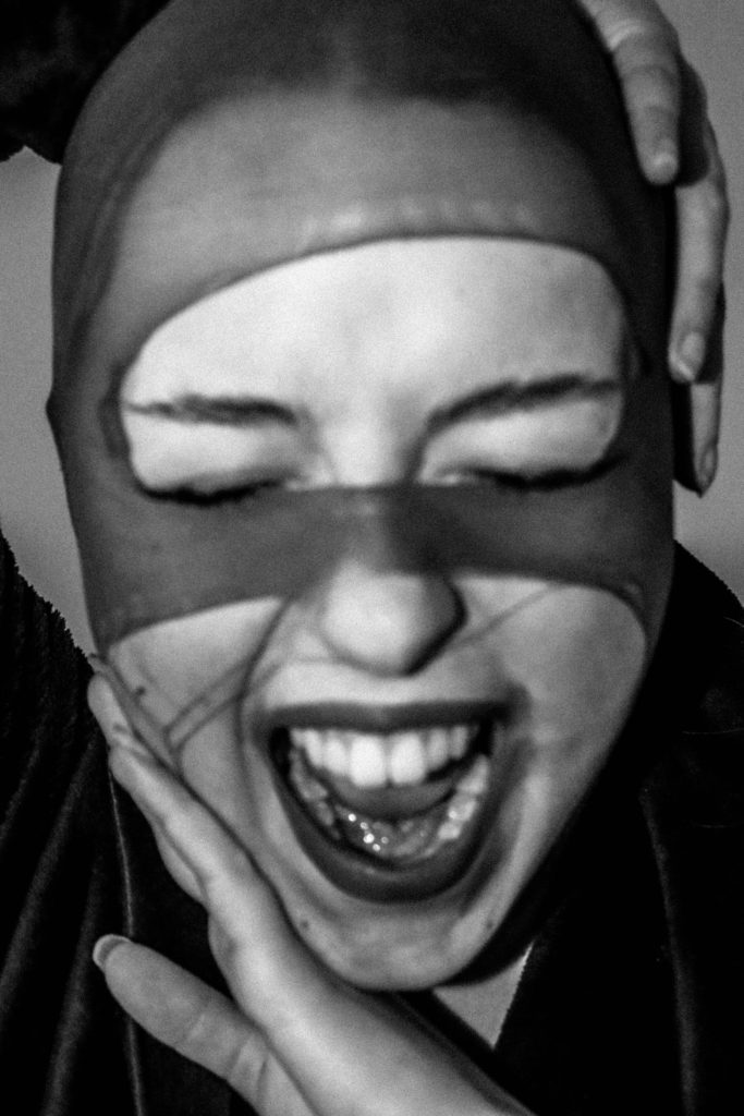
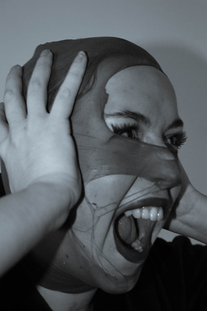
for my final images I wanted the simplicity of black and white as it doesn’t pull focus away from the actual images it also allows for more depth and the shadows create a good balance against the contrast of the head piece. I also wanted to keep them as close to my chosen artists theme of identity loss.
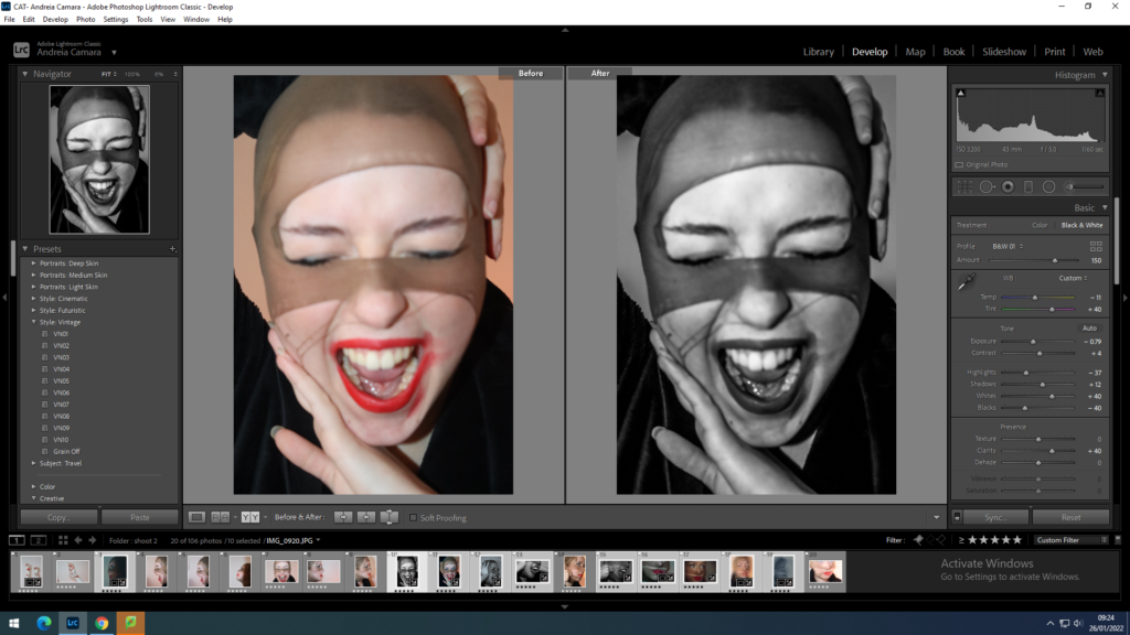
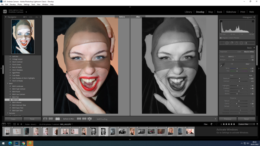
For all my images I adjusted the WB and the contrast in order to bring more depth into my images once they were turned into black and white I also cropped them to allow for a cleaner finish.
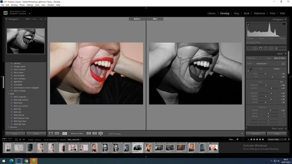
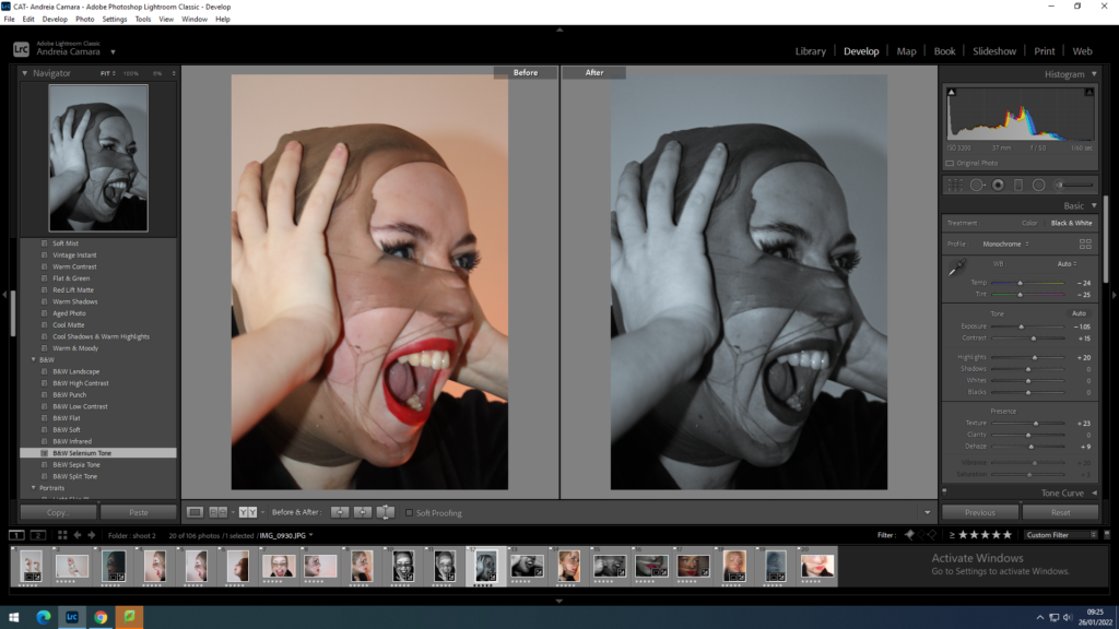
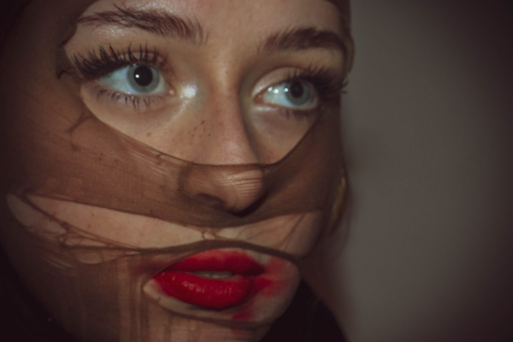
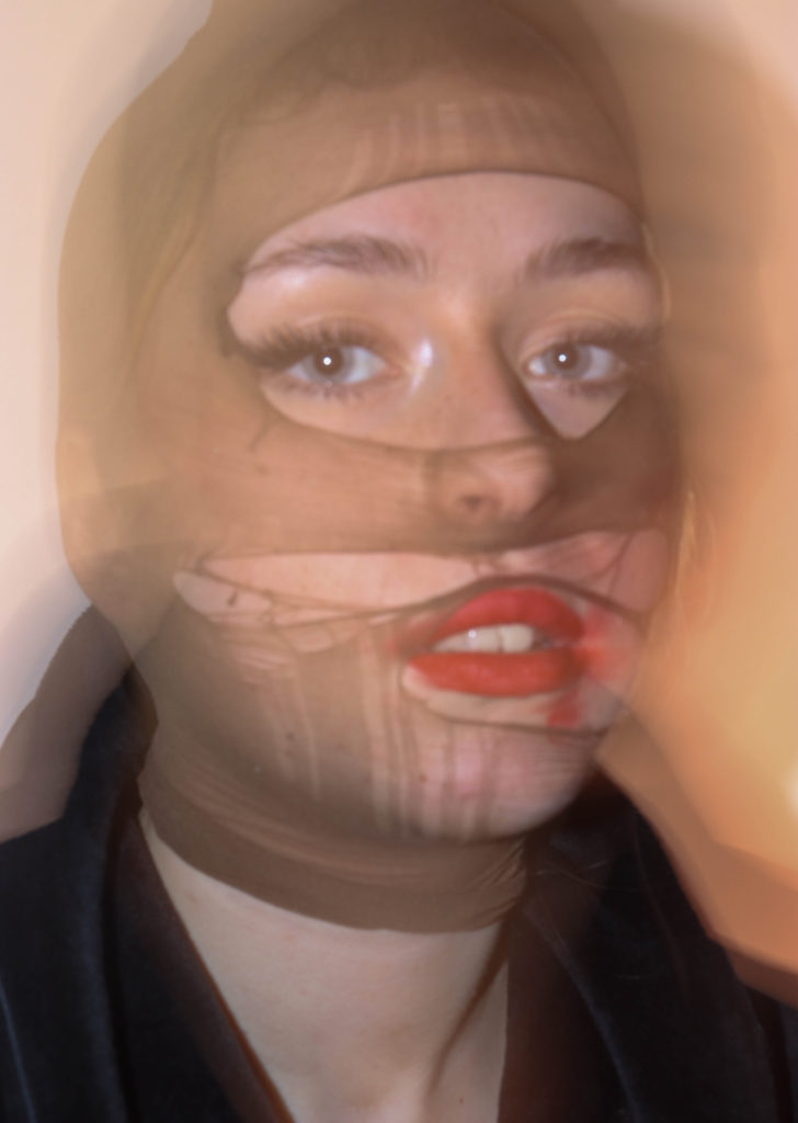
The coloured images lack a certain brightness which helps to pull focus to the more defiant facial features such as the lips and eyes as a persons eyes can tell you a lot about them and how they perceive themselves or portray themselves to others around them. The contrasting cool and warm tones go hand in hand with the softer and harsher shadows in the first images which make them a more correlated final outcome.
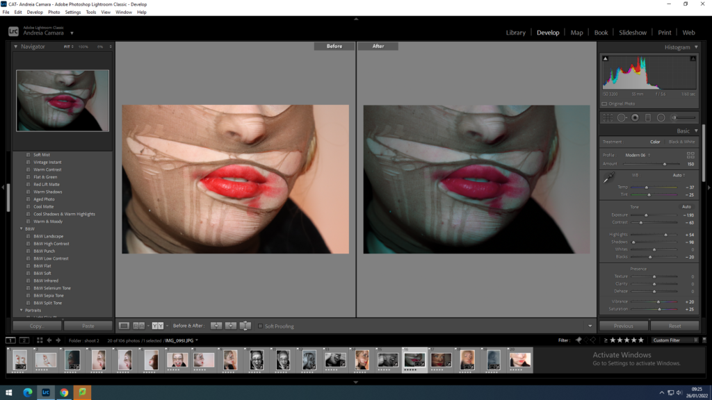
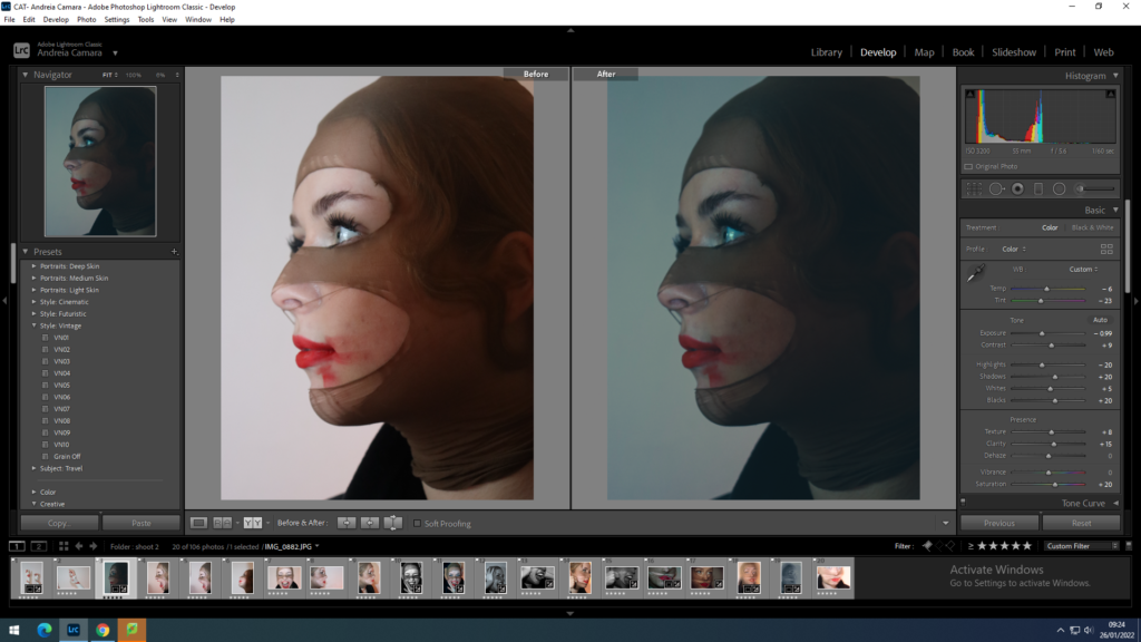
for the coloured images I wanted to focus on not losing the brightness of the red tones in the lipstick as it was one of the main focal points of this shoot. I strategically chose to make two images cooler tones in order to show an almost dark and mysterious side to her identity and two warmer tones to show a sense of calmness and youthfulness through a more playful tone.
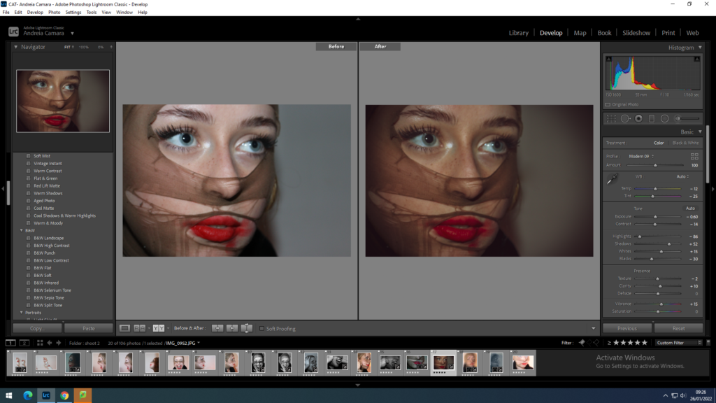
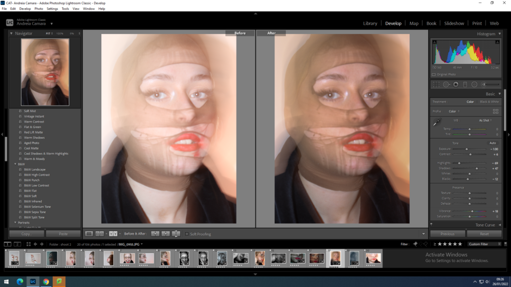
final images after Lightroom
reworking ideas
idea 1: print off these two images and stitch the mouth closed to add contrast to the red of the lipstick I’ll either use black or tan thick thread in order to use colours that are already in the images.
I printed the images on A4 paper and used adhesive to glue them to some card so they wouldn’t rip when sown threw I then made a selection of a thicker almost yarn like thread to pull more focus in the images.
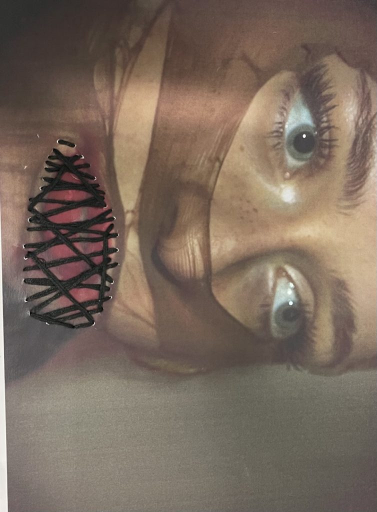
used black thread to eventuate her eyes and to help portray the theme of lost identity 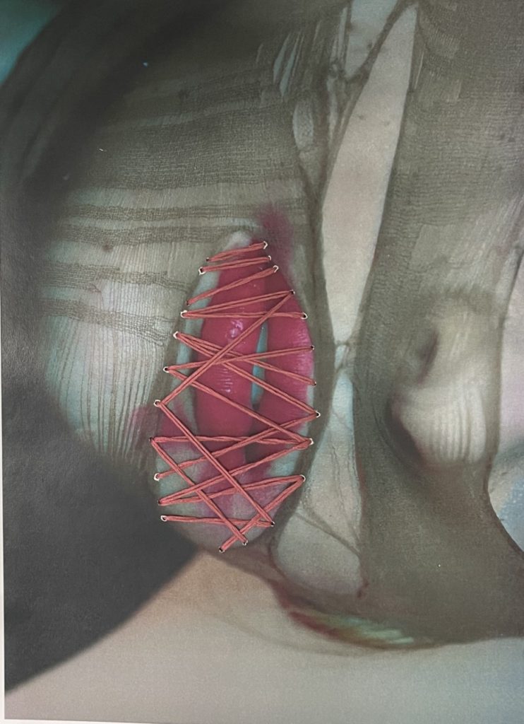
the stitching in red helps to show how identity isn’t always shown through superficial factors
Idea 2: Double exposure on photoshop to create a set of dream like images and add a factor of surrealism to my identity project. These are the images I will use to achieve this.
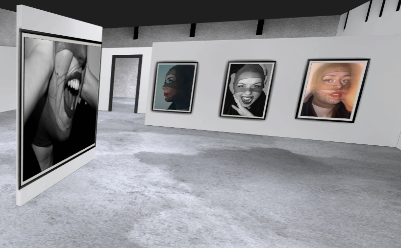
Final Double Exposures
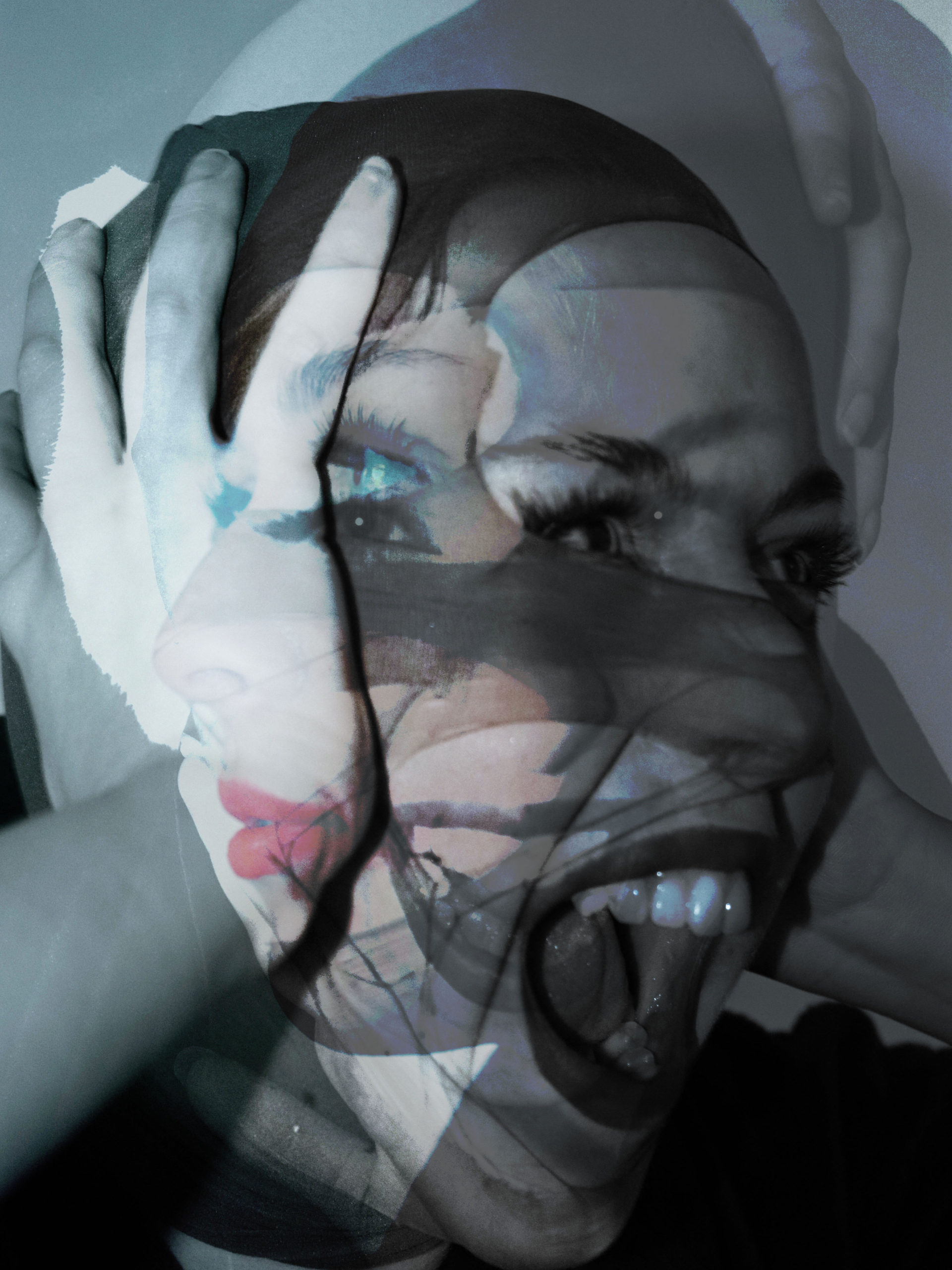
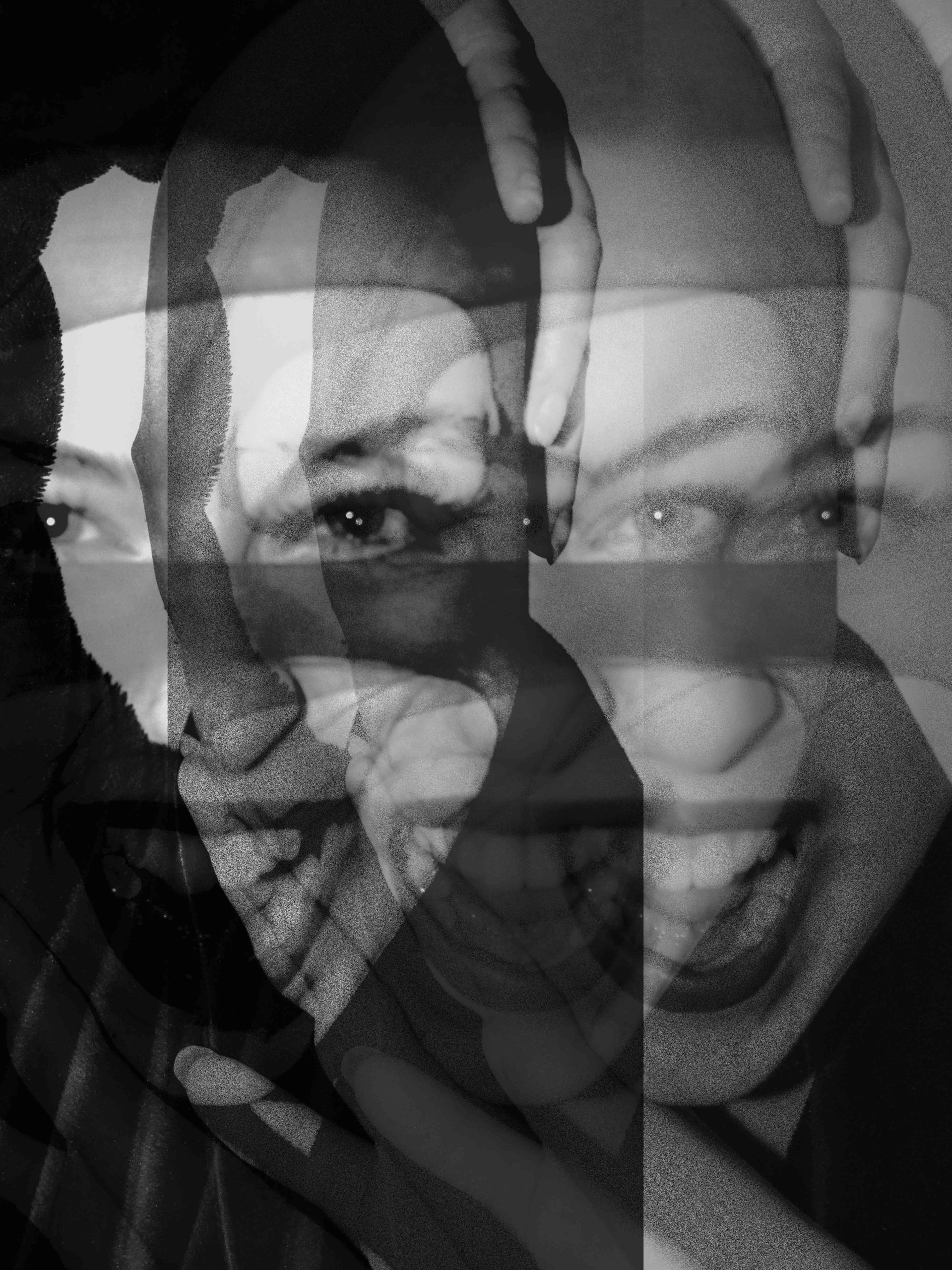
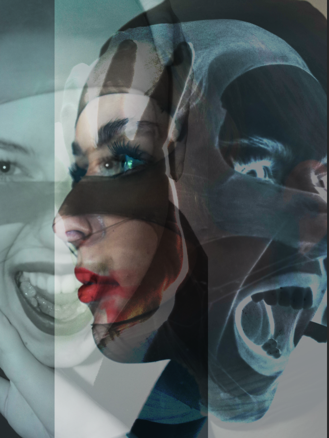
i used 2 black and white images and one in a cool tone to create a good contrast and made sure to use different angles and poses in order to create a sense of chaos to the images.
comparison
Both mine and Andreas use a head piece to create a sense of mystery as to who the person under it is although my subject is more visible than his it still holds the same feeling of loss of identity through the facial expressions.
My image is taken at a different angle with a smoother lighting which creates less focal points and mine opposes his full loss of identity through having some of the more prominent facial features exposed.


