
IMAGE EDITING/EXPERIMENTATION
SET #1
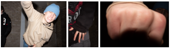
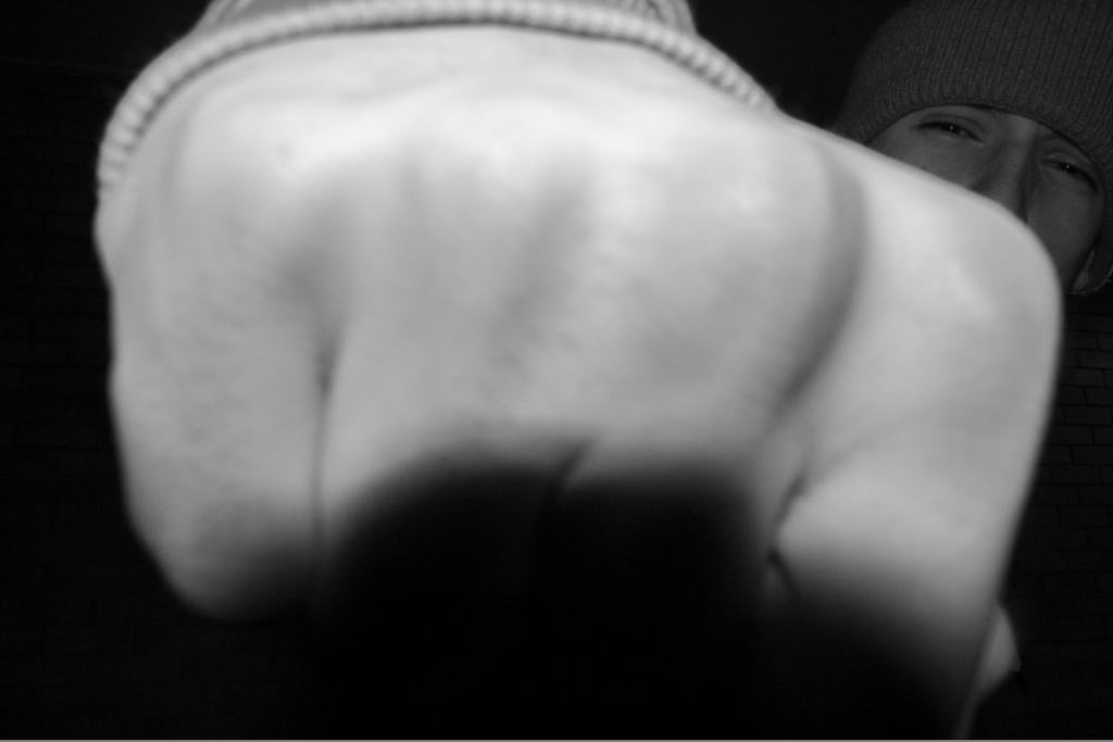
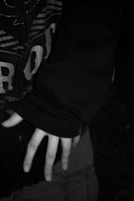
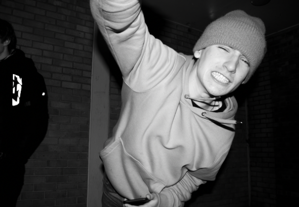
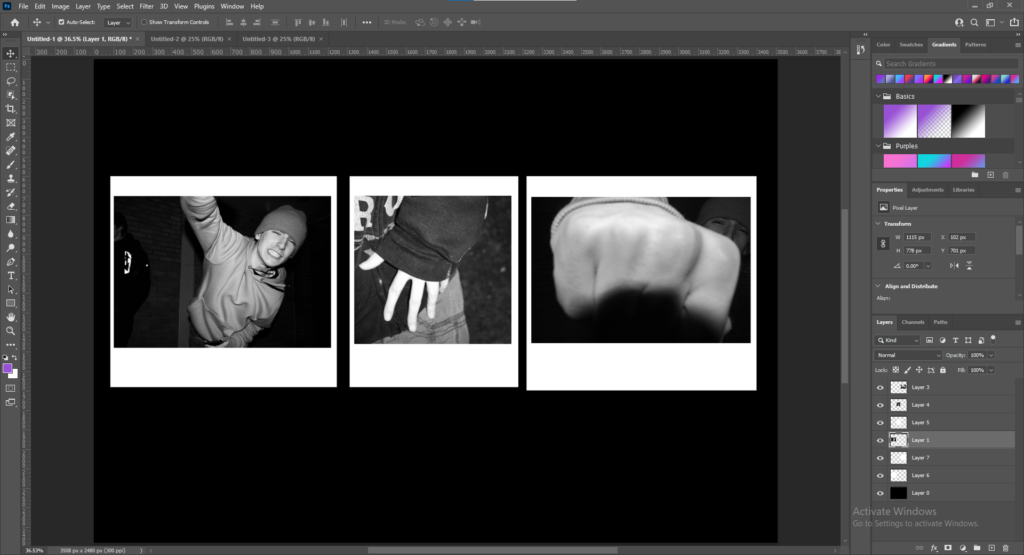
The first set I chose to edit was on violence and restraint, I really liked the first image as it reminded me of the underground punk movement in the 70s- which was fuelled by violence and soon became mainstream thanks to the likes of The Sex Pistols and The Clash, introducing a new generation of teenagers to the turmoil of “punk life”
These images also reminded me of Ryan McGinley and Corinne Day’s work, showing an autobiographical display of adolescence culture.
First I started by turning each image black and white to mimic Francesca Woodman’s distinct black and white style as she rarely shot in colour.
Then I played with the exposure and contrast to create images that look like they were taken with a film camera so they did not look unnatural when I changed them in photoshop to look like a grid of polaroid images.
I wanted the two “violent” images highly contrasted so they looked shocking to the eye and stand out while the middle image (showing restraint) nearly sinks into the background as it has lots of dark negative space – demonstrating how quiet behaviours often go unnoticed.
I also turned up the texture so facial expressions and details on hands were more noticeable.
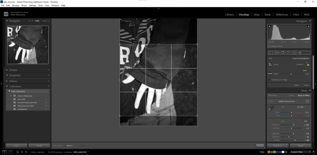
While I was editing these images on photoshop (see bottom of blog post for arrangements of sets on Adobe Photoshop Classic) I realised I didn’t like the way they lined up as two of the images were landscape while the other was portrait, so on photoshop I resized the middle image to make it more square-shaped so it would fit in with the other images better- then I exported this image back onto Photoshop.
SET #2
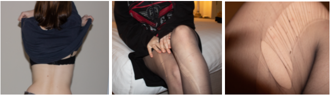
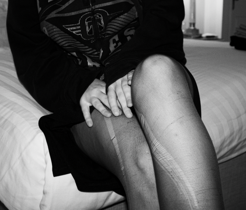
The second set I chose to edit was on bad habits, I really liked the third image as it looks similar to Corinne Day’s photography style with my take on it where I took the photographs from a higher angle to make the perspective look more unusual.
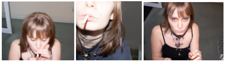
I decided I wanted every set to be black and white so I changed all the images into monotone and resized them to focus on the main subject of the image.
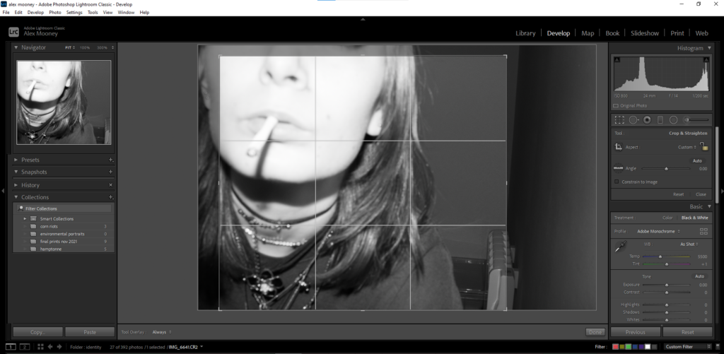
My images taken from this shoot are quite blurry and out of focus but I decided to keep them like that because I believe they look more raw and improvisational, as they show a short timeline which looks natural and intimate.
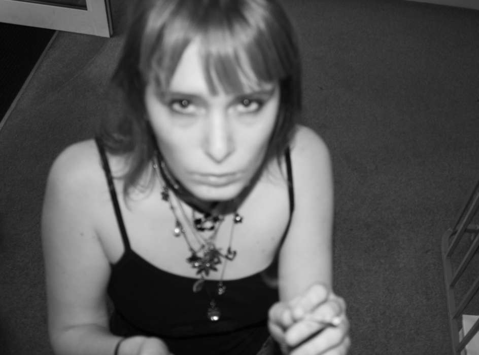
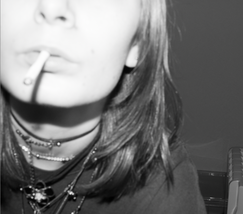
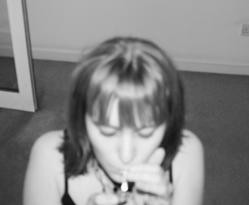
I edited all the images in the same style, playing with the texture to make the images look more grainy and heightening the contrast between black and white so the images are more drawing to the eye.
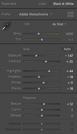
I turned up the contrast and whites while turning down the exposure and blacks to create more of a simple tonal spectrum that concentrates on the textures of the images and the main subject.
SET #3
Finally I edited my third and final set of images, these images reminded me of Francesca Woodman’s work, they carry a similar theme where identity is see through someone’s body, while their face remains anonymous.
First I changed all the images into black and white and resized them to centre on the main subject.
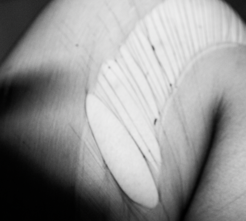
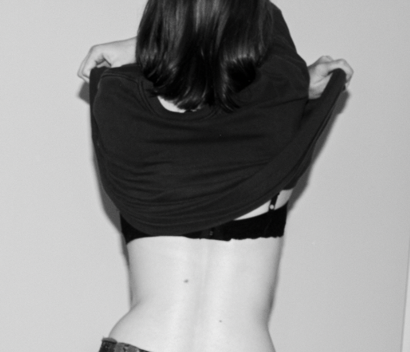
I wanted these images to have more of a minimal, light tonal composition to portray the idea of the pureness of the human body which is highly contrasted with the darker tones of the clothing the subject is wearing.
I turned up the contrast and whites while turning down the exposure and blacks to create more of a simple tonal spectrum that concentrates on the textures of the images and the main subject.
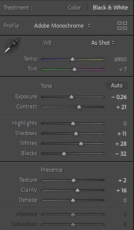
ADOBE PHOTOSHOP ARRANGEMENTS FOR ALL SETS
First I opened a new page and changed the first layer to landscape with a black background (as all the photographs are in black and white I believe this will make them stand out)
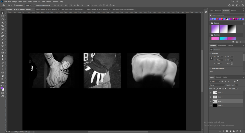
Then I imported my images into Photoshop and resized then arranged them in a way that I believe told a story about the images. After this stage I decided to experiment try and make them polaroid-style on Photoshop.
I created a new white background and resized it beneath the images so they would look like polaroid pictures. Overall I’m unsure if I like this style and if I will continue with it on all sets.
I repeated these steps with all my sets, then I flattened all the layers on each separate set to create my final sets of images.