
In this post I will be editing the three best shots which I chose from my 2nd photoshoot in Adobe Lightroom, so that they can be used when creating my final pieces, I used a variety of different editing skills when manipulating these photos to show a diverse range.
1st photo experiments –
– I really like how it gives a pink, sunset tone towards the picture giving it a soft atmosphere.
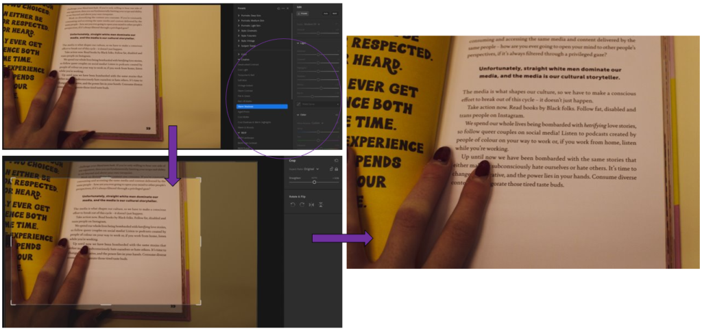
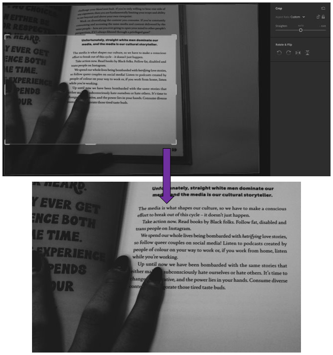
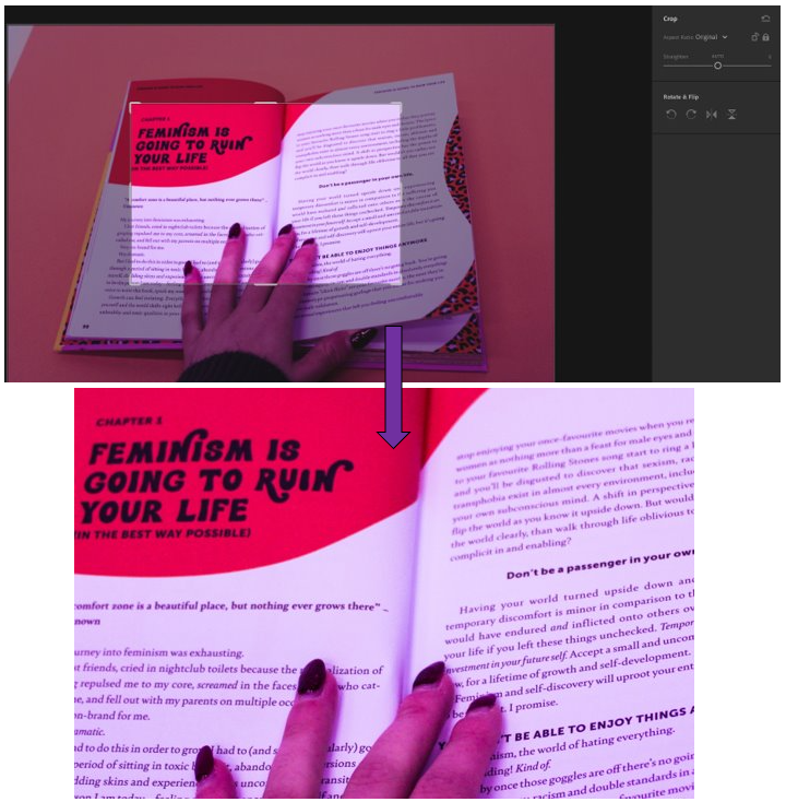
– Then I cropped it, similar to below, so that the message in bold is highlighted yet there is still my fingers in it to give it that personal touch of identity.
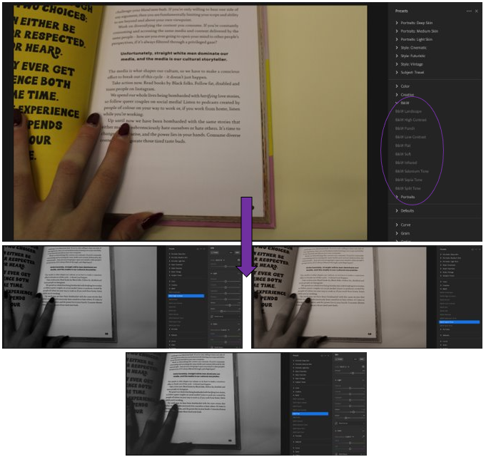
– Used the pre-sets of B&W on Adobe Lightroom to see which edit I liked the most.
– 1st= B&W high contrast, 2nd= B&W Sepia tone, 3rd= B&W Flat.
– In my opinion, I like the 3rd edit using the pre-set B&W Flat as it shows a heavy, dramatic contrast to the photo which I like.
-The 1st way is focussing on a more direct part of it where it mainly highlights one part off it whereas the second focuses more on the image as a whole, just without the background.
– I prefer the 1st way as it highlights the words in bold well, making them clearly seen which catches your attention so that you read it and consider the message which is being put across.
2nd photo experiments –
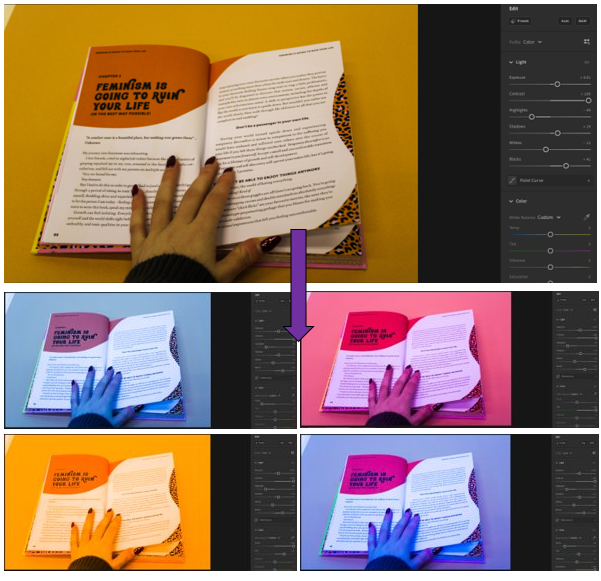
– I really like how they turned out because they resemble Hargreaves work where he uses brighter colours but instead of as a background its over the whole photo.
– My favourite is the purple or yellow one as the colour is mainly all over the photograph.
– I took inspiration from Andy Warhol’s work, which is similar using bright colours to transform repeats of the same photograph.
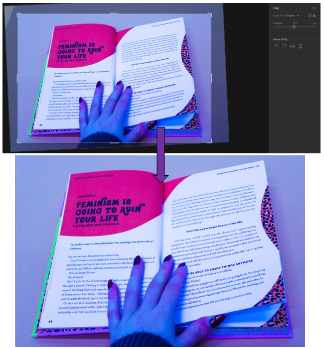
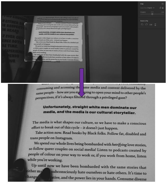
– Straightened it up and brought it in so that the corner where there was a bit of white coming through was gone.
– The filter helps to make the bolder words stand out more and makes you want to read more about it.
– Still a level of individuality and personality in it as my fingers are are the bottom, showing identity.
3rd photo experiments –
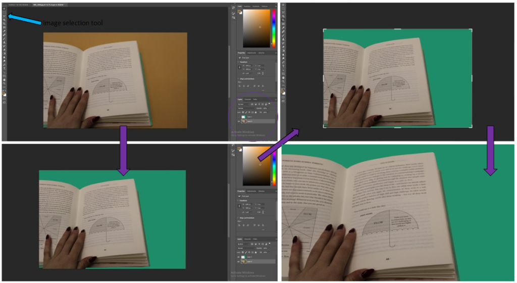
– I started off by bringing the photo into photoshop, then using the image selection tool so that I could highlight the part of the image that I wanted to change.
– Then I filled it with a colour that I though went quite nicely with the object, which was turquoise.
– Then I cropped it to get rid of the parts of the image where the old background colour was still coming through, to make it look tidier.
– I think that this came out quite well, but it is not my favourite technique which I have done, so I will not be using it again in my work.
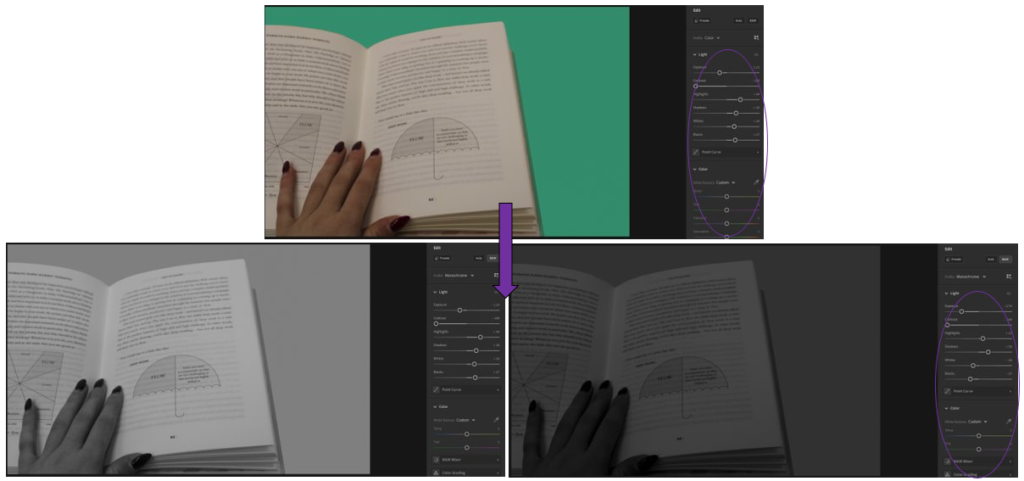
– Then I changed it into black and white as I wanted to see what that looked like, I really like it.
– Then I adjusted the settings again to make it darker and more contrasted.
– I like how this turned out because
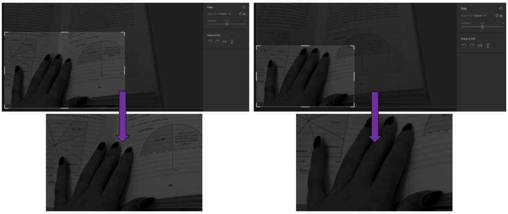
– For the 1st way, I wanted to focus on the little umbrella, as well as the hands as hands are able to show a lot about someone and how hard they work.
– I like how it turned out because it creates a story of who the person may be.
– For the second image, I wanted to focus entirely on the hand, which I really like. This is because you are able to see fully, the identity of the person who is reading the book and what they may be like, with the context of the book to help.