Identity
Identity from Latin means “the same”, and so in a sense it is the sameness of individuals that makes them belong, as well as the distinctiveness of character that makes a remarkable being, the sense of oneness we feel within ourselves. Identity can take years to mould and it determines our entire life; our job, our friends, the place we live in; in order to stay happy we need to live accordingly to our true identity. The desire to belong and be accepted in a society has always been here. We surround ourselves with so many influences it is hard to isolate what feels right and what is right. Being wanted and appreciated feels right but is it truly right when it requires us to conduct ourselves in a superficial manner. Factors that strongly influence identity include culture, language, religion, social status or race as often those shape the way we perceive the world; our views, opinions and practices. Identity also includes what we stand for, values such as kindness, honesty or trustworthiness. All those help us recognise what matters to you most and effect our everyday choices. Our upbringing can have a huge impact on our sense of self. The way our parents or the society lets us explore, learn and express ourselves and our desires. If we were shamed or discriminated for expressing our true selves our sense of identity can be distorted to the liking of others. A fair amount of individuals does not have a solidified sense of identity or suffer from identity loss due to some events in their life such as finding out truths about your family history.
Mood board
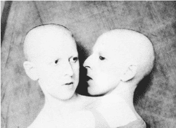
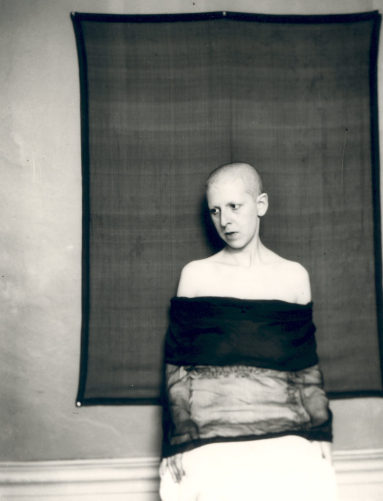
Claude Cahun
Born Lucy Schwob, later changed to a gender neutral Clause Cahun, in 1894 to a Jewish family in France the photographer explored gender identity and the subconscious mind, presenting neither masculine nor feminine. Their work dates back as early as the 1912. Cahun moved to Paris where they started experimenting in the Surrealist art scene and went on to collaborate with artists such as Man Ray, as well a co funding the Contre Attaque with Andre Breton and George Bataille, the Anti-Nazi Resistance group. In 1930 Cahun moved to Jersey where they lived disguised as non-Jew. Soon Claude was caught spreading anti-Nazi propaganda and sentenced to death. They avoided the death sentence and was freed when Jersey was liberated in 1945. Unfortunately Cahun never recovered from the mistreatment in prison and passed away in 1954.
I find Cahun inspiring because they knew what they stood for, what they believed and represented, without hesitating to show it. They influenced photographers such as Cindy Sherman, Gillian Wearing and Nan Goldin.
Bobby Becker
Bobby Becker is a Nashville based photographer who presents the thin boundaries between reality and illusion and does so in a simple yet powerful manner. By contrasting the black with the white he conveys the distance, the struggle for connection, the comprehension of all and nothing, light and darkness, the loss of identity and rediscovery.
I find those photographs inspiring because they convey the feeling of emptiness formed from the lack of identity, as if a piece of you is missing, or looking in the mirror and not recognising yourself for the person you are. They also represent the way identity is influenced. A significant influence on our identity being the media. I think the media forces individuals to uniformity in order to be accepted, by in a way, fabricating our identity, based on the standard image. The photograph presenting two people underneath a house to me represents the impact your family and upbringing can have on your identity and the idea of nature vs nurture as generally a big part of us is shaped by believes passed on to us for generations; the basic values and principles. What part is really your true nature and what is your parents views materialising through your actions? To me, the photograph of people trapped in a house portrays the struggle some individuals face in order to be able to express themselves in the way they desire. This can relate to certain cultural or religious believes our family holds. A great deal of individuals faces rejection and discrimination every day, as certain patterns of expression are viewed as socially or morally unacceptable. For example, the LGBTQ+ community as opposed to members of the older generation.
Ideas
shadows/ silhouette of identities, loss of identity, mask out of alter egos/ different people like pixel art, double exposure.
Photoshoot plan
Equipment needed: Drum set, guitar, microphone plus a stand, camera stand, warm, round light, white infinity curve.
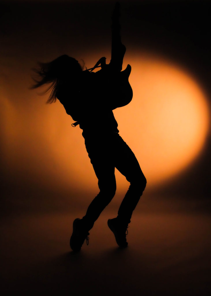
Photo series 1 = Subject 1 playing the guitar
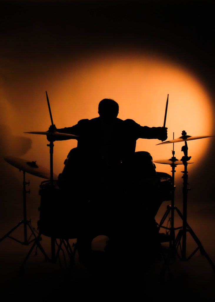
Photo series 2 = Subject 2 playing the drums
Photo series 3 = Subject 3 singing
Only light source being a warm light on the right, behind the subject creating the silhouette, warm and bright mood. Photos taken in the studio as space and equipment needed.
Contact sheet


Those are all the photographs I took in two separate shoots. The first shoot was more for gathering ideas and setting up the lights and the camera settings.
Image selection
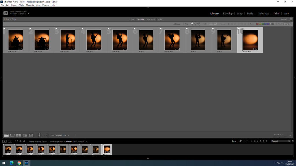
Those are the photographs I flagged as usable

Those are the photographs marked with 5 stars. I chose those because they were the sharpest silhouettes and had the right amount of asymmetry to help illustrate the movement.
Image editing
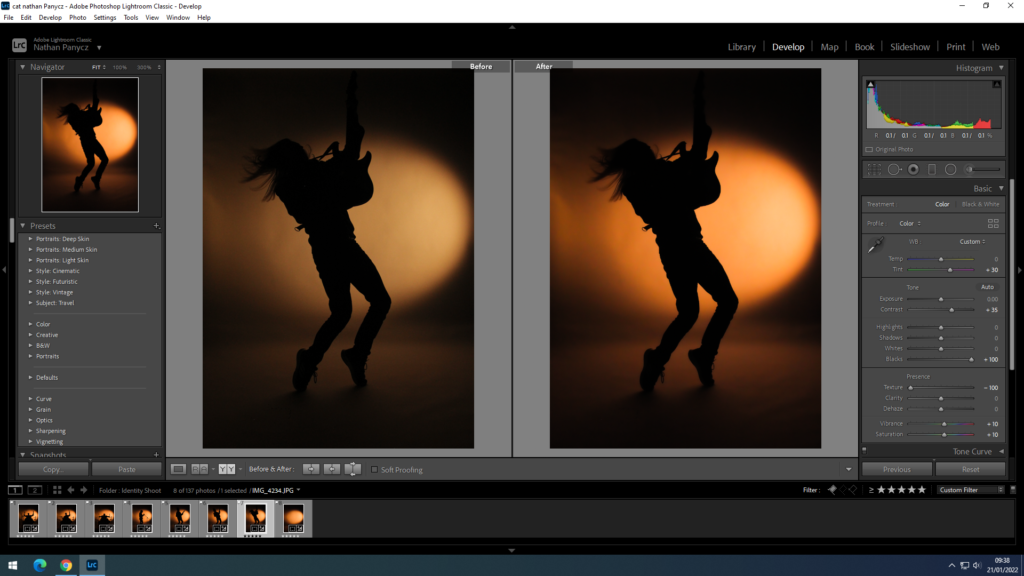
Firstly I cropped the image as at the top you could see the white infinity curve end. I increased the contrast because the photographs didn’t look deep and defined enough but rather bleak and washed out, I also increased the blacks to make the silhouette stand out more against the orange light. Since I shoot the pictures in the dark it was hard to get the right settings on the camera and all of the photographs came out a bit grainy so to smooth that out I turned down the texture. This also gave it a satisfying blur effect around the edges and the background, leaving the middle sharp, especially the model. The colours weren’t very defines as well and I wanted to get that yellow-orange sunset colour so I changed the tint to +30 and increased the saturation and vibrance to +10. I needed all the photographs to look the same for a triptych so I used the synch settings option to edit the pictures all at once with the same setting as the original one.
Experimentation
I converted my final photographs into black and white because I wanted to find out how powerful they would be if they followed Claude Cahun’s or Bobby Becker’s black and white theme. I personally found that too dull and apathetic, not really conveying the excitement of self discovery or the journey that comes with it.
Final outcomes
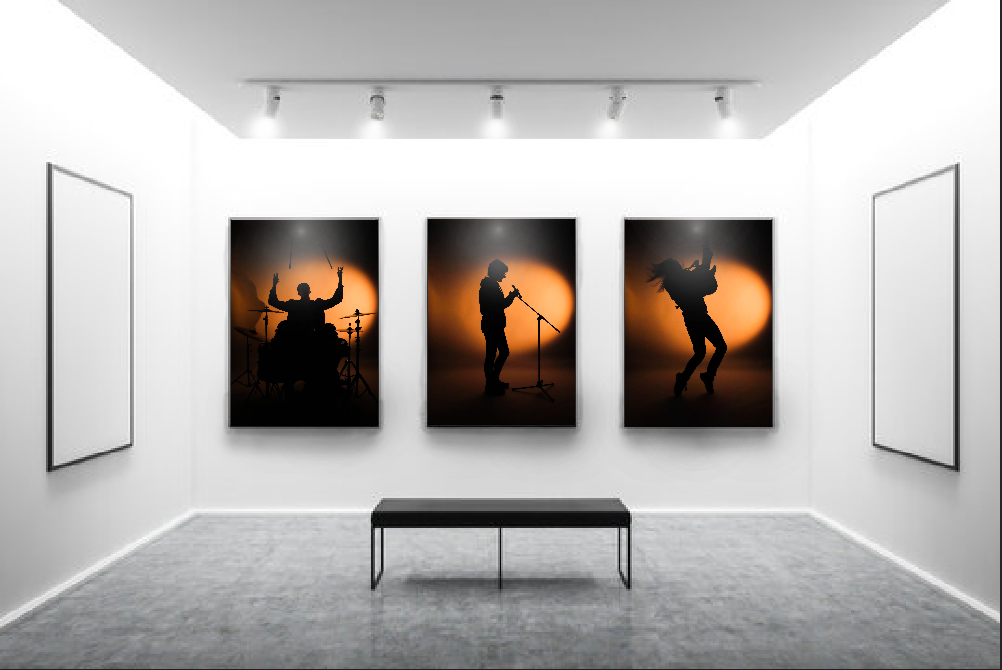
The overall idea behind those photographs was to show the loss of identity and finding a huge part of my identity in music. You can’t see the subjects but you can clearly see what they do and what they represent. This is because even when I feel like I can’t or find it difficult to express myself in front of others I always find ways to express myself in my music, whether it’s playing an instrument or lyric writing. The first and second triptych shows the progression of movement which makes it really dynamic almost like a video. In this I wanted to convey the journey to self discovery. The momentum in the third triptych on the other hand has a pause in the middle as the model singing is standing still without any movement, this gives it a subtle contrast and represents the doubts or struggles individuals face in their journey. The third tryptic also represents the idea of unity within identity and how it gives individuals a sense of belonging.
I decided on using warm, bright light to create that sunset vibe and because it is the most attention grabbing of the colours. Yellow also energises, helping convey the liveliness and movement and the orange hue adds enthusiasm and excitement. The position of the light source is behind the subject creating a silhouette and to the right, pointing at the background. This creates the smudge effect on the left side as the light fades helping express the concept of motion. The light reflecting onto the floor behind the subject adds visual depth and makes the photograph look 3D as well as the yellow/ orange hue contrasting the deep black as lighter colours tend to be perceived as close and dark colours as being further away. The space also makes the photograph feel light, not cluttered. Since the contrast between the light and dark is so high you can clearly see the outline of the silhouette, all the shapes such as the hair or shoelaces. This also creates space as sharp, well focused objects appear closer than blurry objects such as the background.
Comparisons
My photographs differ from Cahun’s or Becker’s in that I decided to use colour to help me convey the idea of a journey and included actual movement as opposed to my chosen photographers who take still, black and white photographs. On the other hand, I quite liked the idea of strongly contrasting two colours together like in Becker’s photographs to show the distance between losing your identity and rediscovering it. He shows that sometimes less can communicate more.
Evaluation
In my opinion, I did a good job with setting up the scene (lighting, background, props) as well as wording my ideas to the models to achieve the desired shots. I could have done a better job with the camera settings as the photographs weren’t as good of a quality as I wanted. The images came out a bit grainy because the ISO was too high as I needed to use fast shutter speed to capture the movement. I should have used a higher aperture to make up for the light lost with the high shutter speed instead of increasing the ISO so much. If there wasn’t a time limit I would have reshot the photos.




You have until February Half Term to complete and improve any missing / weak blog posts. In this time you can also add to your photo-shoots, ideas and edits…maybe even coming up with more final images.
Use your tracking sheet to pinpoint areas for improvement.
We will be framing and displaying your final prints too before Half Term and re-marking your coursework for you.
Keep working hard!