History
First introduced by John Herschel, creating cyanotypes is a photographic printing process that produces a cyan-blue print. Engineers used the process well into the 20th century as a simple and low-cost process to produce copies of drawings, referred to as blueprints. The process uses two chemicals: ferric ammonium citrate and potassium ferricyanide. Originally Herschel, an astronomer, created cyanotypes as a way of ‘copying his notes’.

Whilst we were at Hampton we had the opportunity to experiment with cyanotypes as it was a perfectly sunny day to collect natural objects such as feathers, leaves and sticks and for the paper to dry quickly. This was a fun new experiment to carry out as i had not learnt about cyanotypes before and it was interesting top see how the reaction on the paper only took one minute to occur. The reaction works when iron compounds react with UV light and washed in water to oxidise to create Prussian blue images.
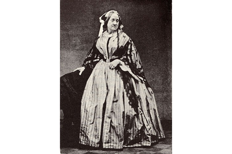
Anna Atkins
English botanical artist, collector and photographer Anna Atkins was the first person to illustrate a book with photographic images. Her nineteenth-century cyanotypes used light exposure and a simple chemical process to create impressively detailed blueprints of botanical specimens. Anna’s innovative use of new photographic technologies merged art and science, and exemplified the exceptional potential of photography in books.

I like how Atkins’ work includes lots of contrast between the blue and the white, this shows that she is very experiences using this material. In addition, her compositions throughout her pieces of work make the very aesthetic. This image below on the right is my favourite as the different areas of the plant are each very legible and look very natural.

Experimentation
Below I have included an image of the cyanotype I created at Hampton. My composition wasn’t very thought out but I do like how the final piece turned out as the legibility of the induvial strokes of the feather contrast with the washed out background. Furthermore, some parts of this piece didn’t turn out as great as others, as the flower petal near the top left corner doesn’t have a clear outline and its unclear that its part of nature. However, i do like the randomness of this piece is what makes it unique in my opinion, the main part of the piece which is the large leaf makes up the majority of the white.
