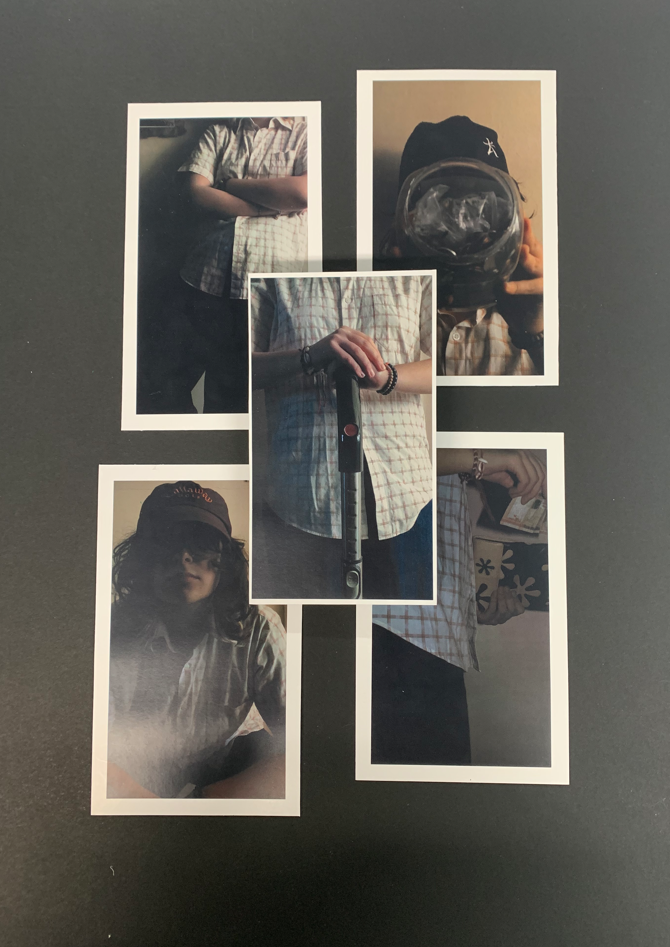
Prints:
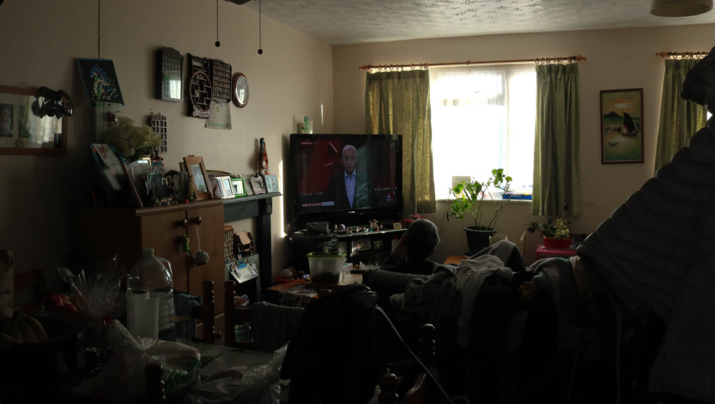
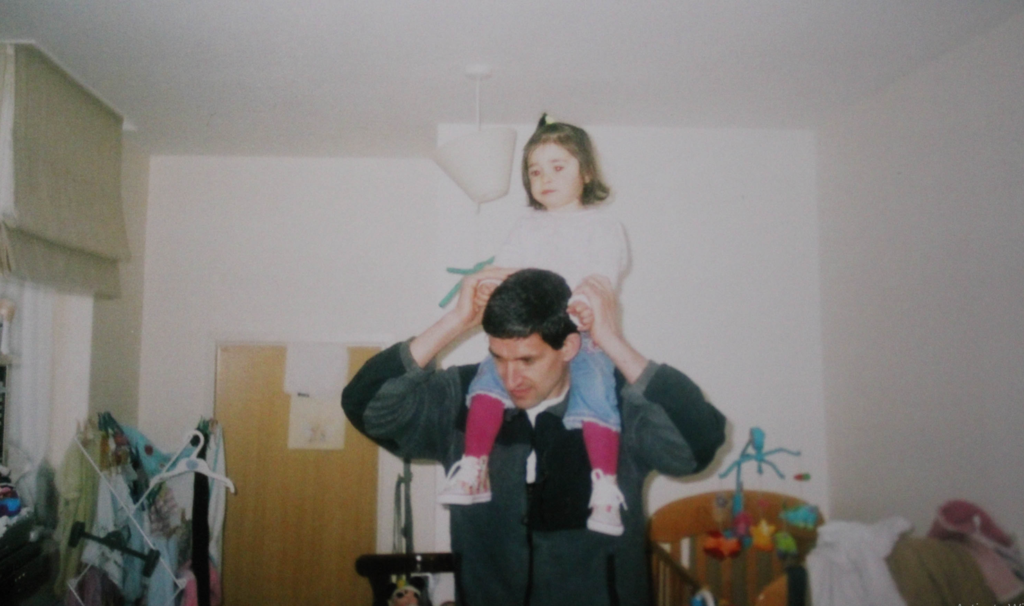
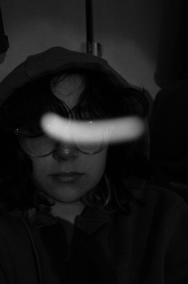
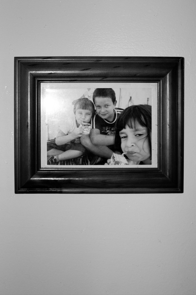
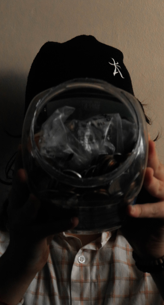
For this project, I decided against having a lot of final prints as I knew my photobook would include most of my images and I didn’t want my final pieces to be exact copies of spreads in my photobook. Due to this, I carefully went through my images and paired a few images together that I felt would work well mounted, leaving me with 3 sets of images.
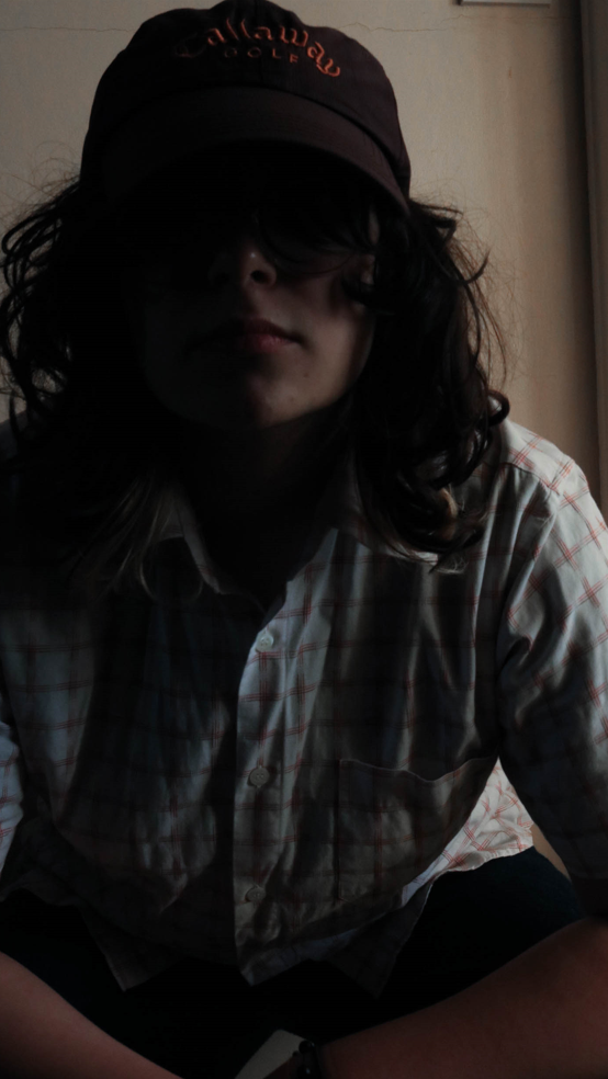
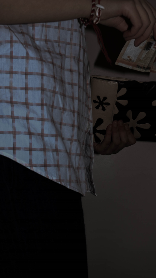
Mounting + Experimentation
I decided to mount my first 2 image sets in a simple manner in order to draw more attention towards the juxtaposition rather than create a busy/distracting frame that would take away from the images. This led to me sticking my images onto foam board then mounting them onto a sheet of black mount board as I felt it’d help to make my photos stand out.
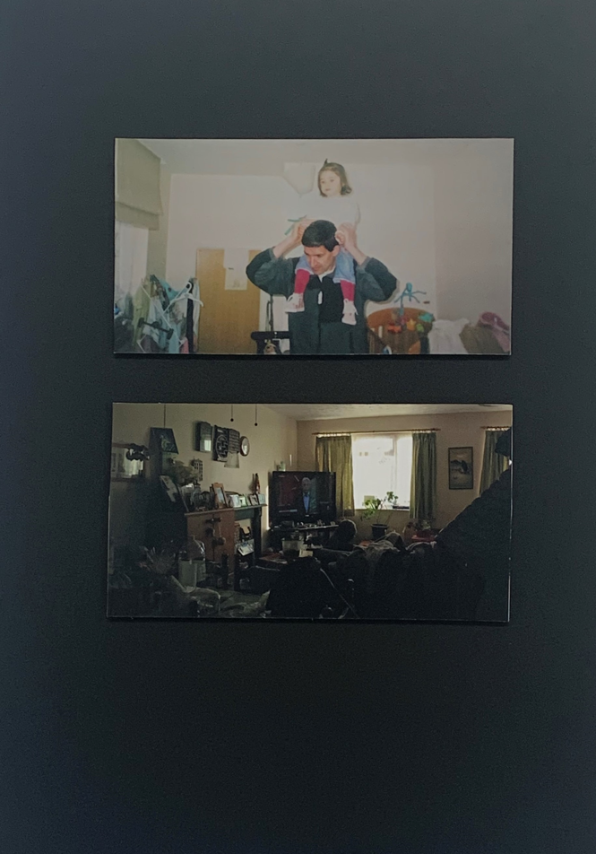
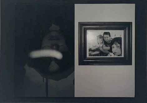
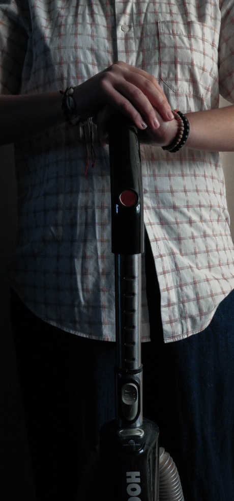
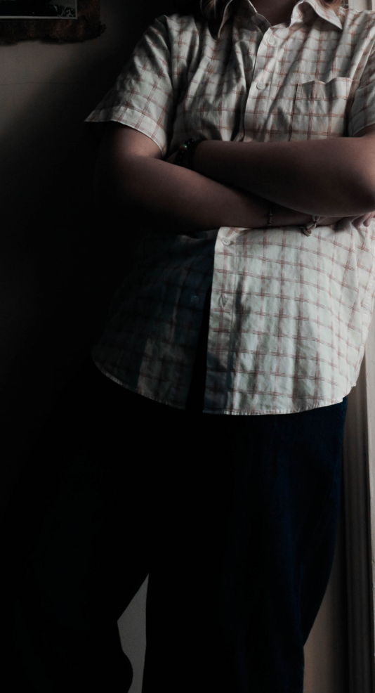
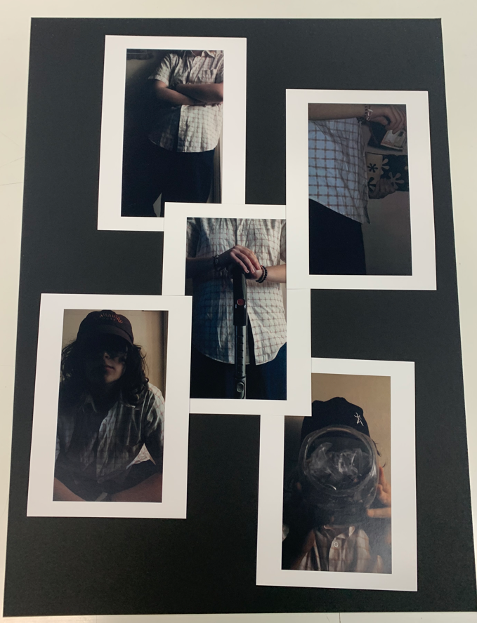
For my 3rd set, I decided that I wanted to create a more interesting layout as I hadn’t used these images yet in my photobook and I wanted to make them look more interesting whilst still keeping the overall layout quite simple. This led to some experimentation where I laid my prints out on a table and tested different layouts before deciding on the one I liked best.
Some of my experiments:
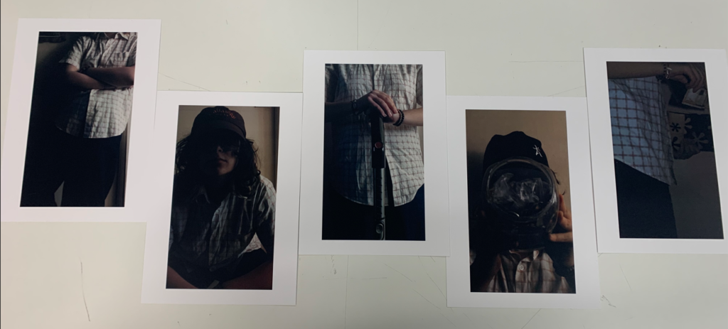
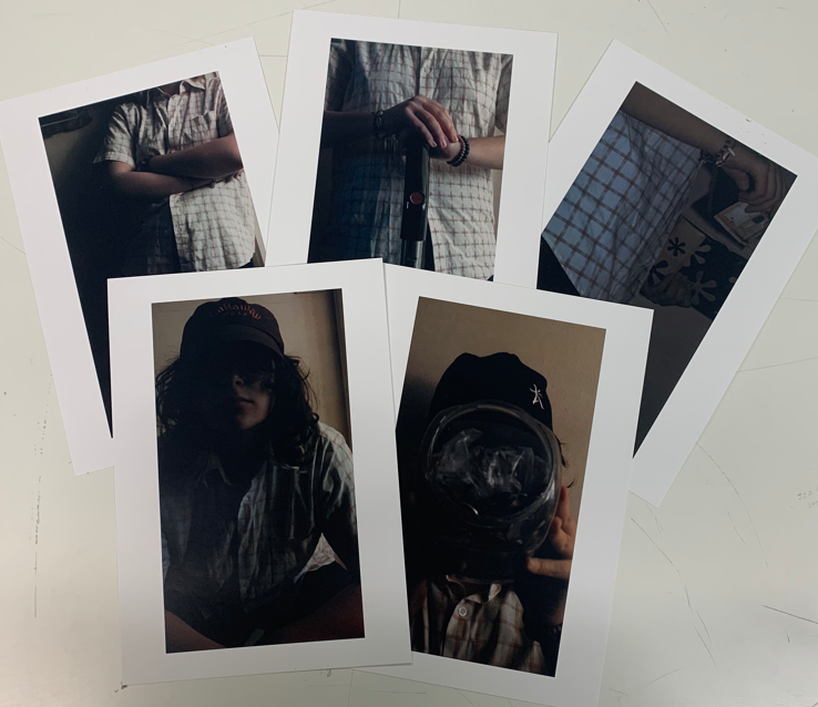
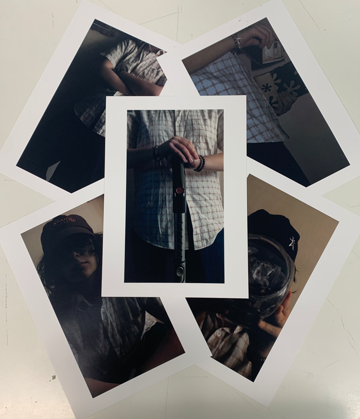
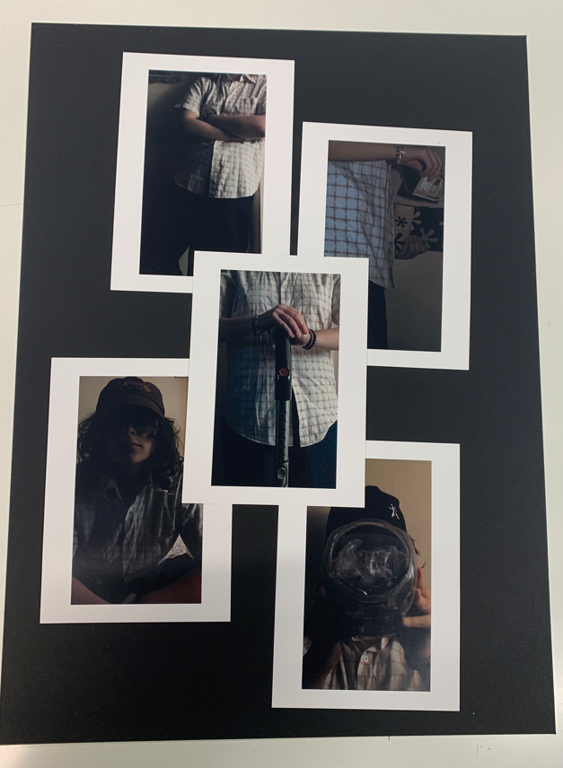
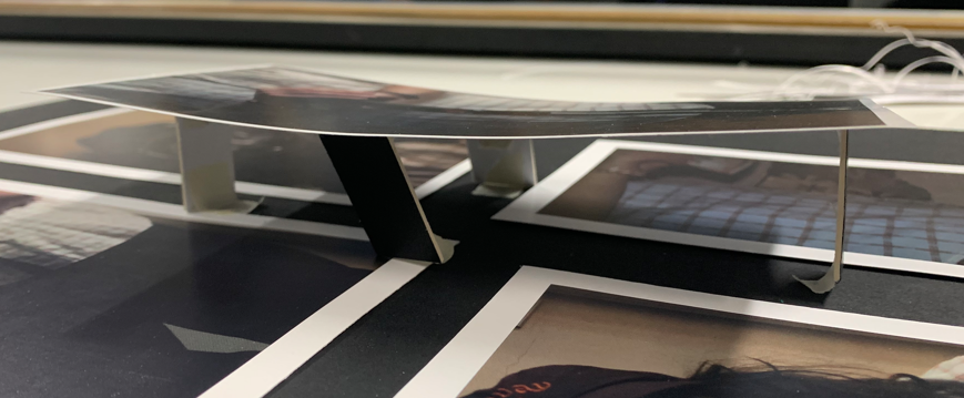
As I explored my ideas, I thought about the possibility of having one of my images floating above the rest which led to some further experimentation on how I would be able to do so and what the most effective method would be. At first, I tried having my image held up by small pieces of mount boards, however, I disliked how unstable and visible this method was. Then, I tried using 2 small pieces of mount board and locking them together by cutting a small slit into each piece. This allowed the image to be held up from a smaller, less visible point which I preferred as it made the piece look cleaner and more stable.
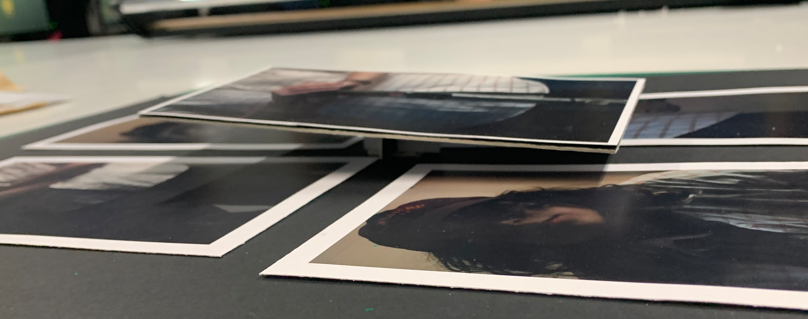
I decided upon my final layout as I preferred having my images slightly skewed rather than perfectly symmetrical as I found it more visually interesting/impactful to look at, especially as the images work together to create a small scene.
