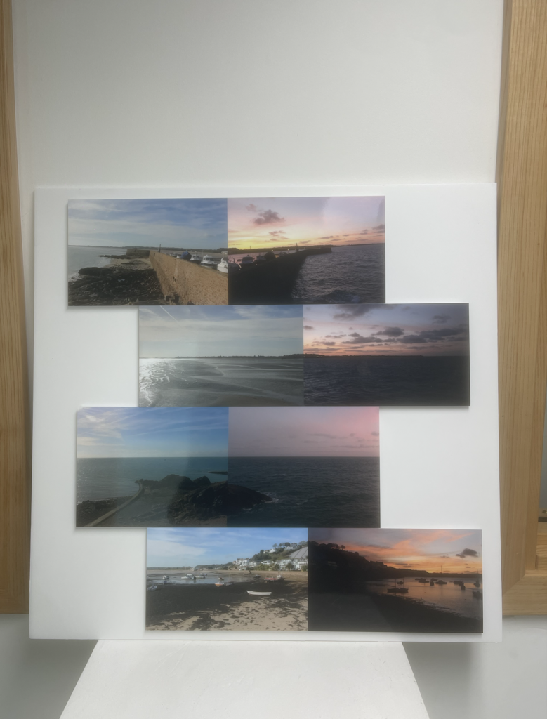
I went with this layout as I wanted to present these photos alongside each other, but rather than just lining them up I wanted to add some contrast/variation so that they are presented more as individual pieces.

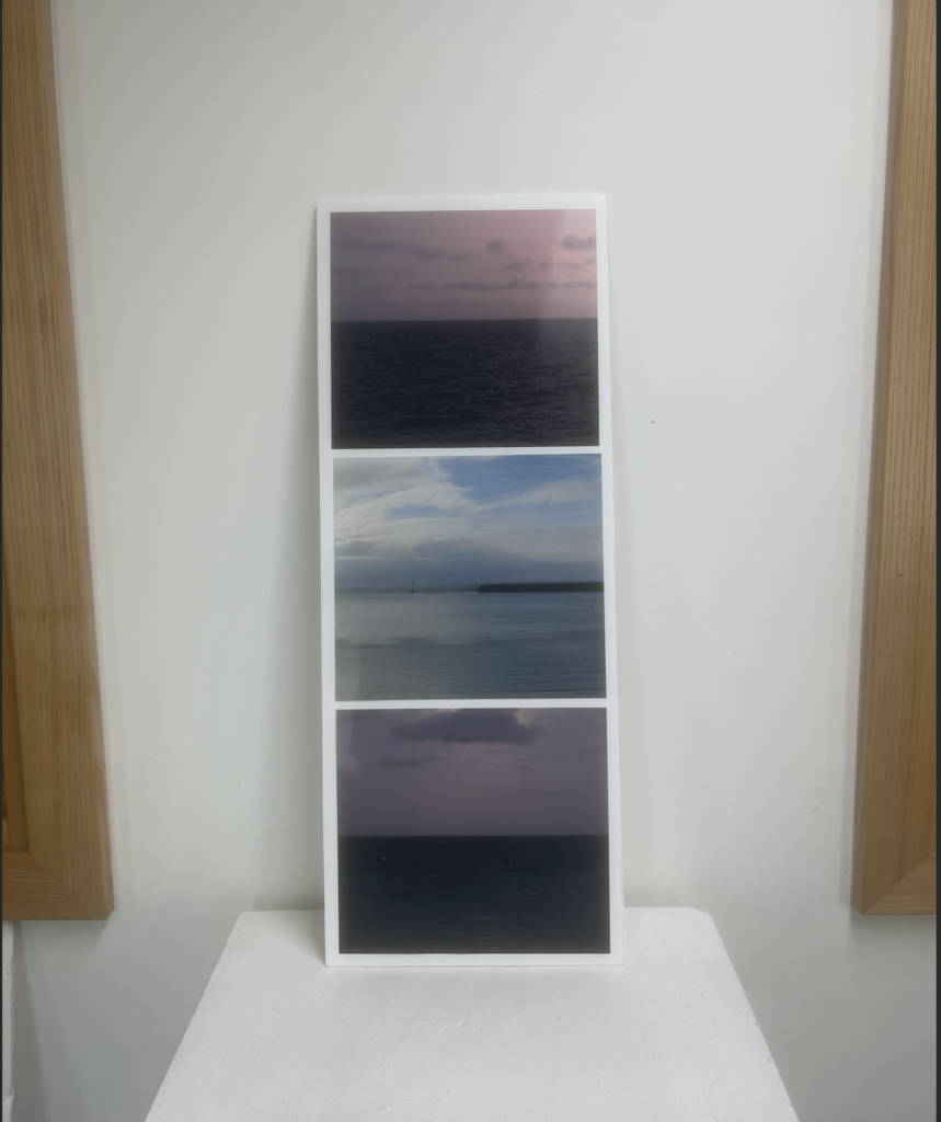
The same goes for this piece, I wanted to create something slightly different to my inspiring artist Hiroshimo, and so I mounted them in a verticle orientation instead of horizontle.
