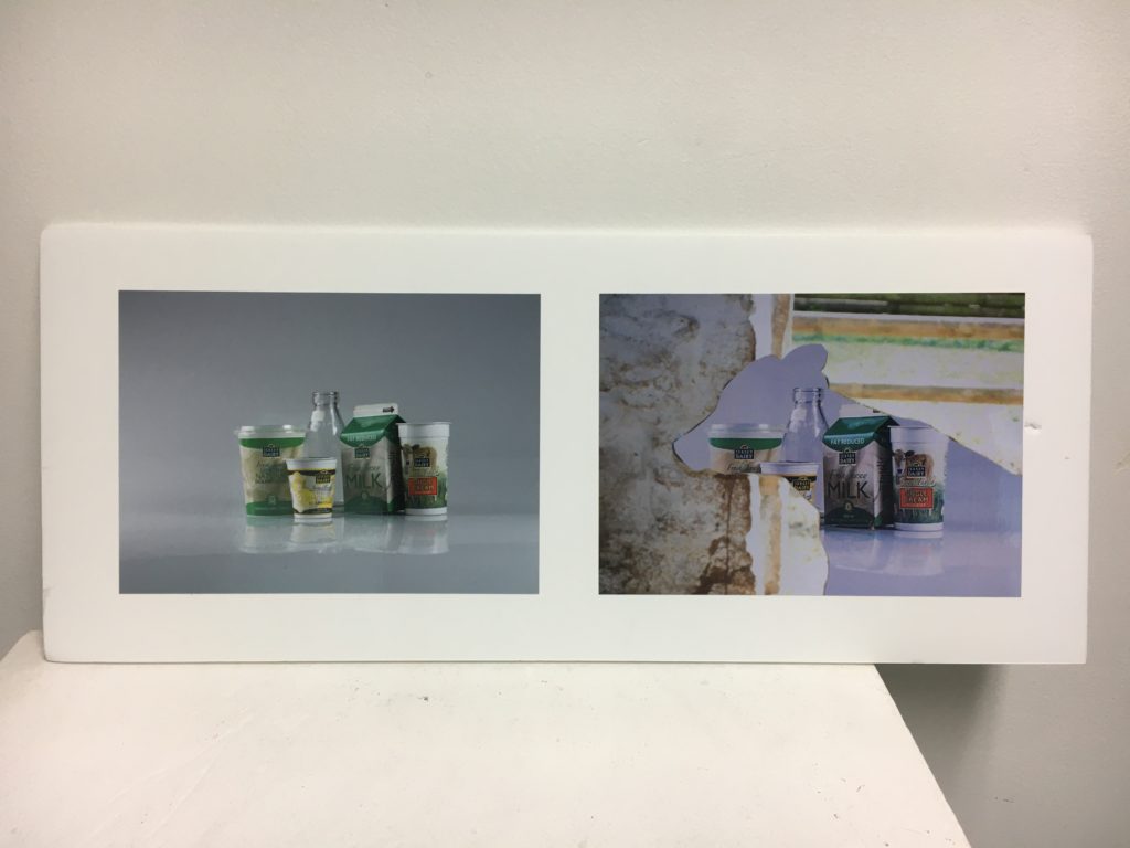
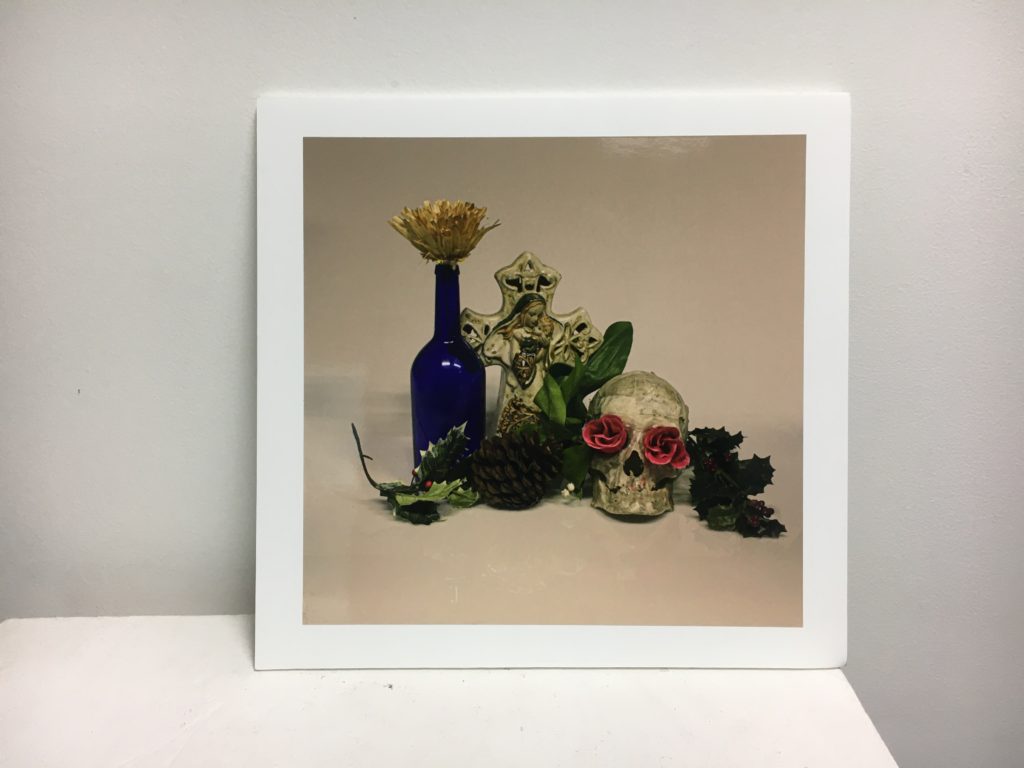
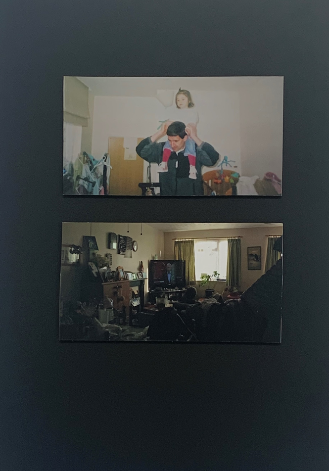
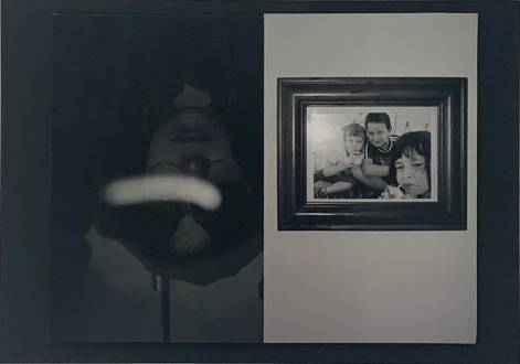
Final Outcomes Gallery

Still Life

Two single-mount A3 images, one was from a professional company, the other printed in school, hence the slight size difference

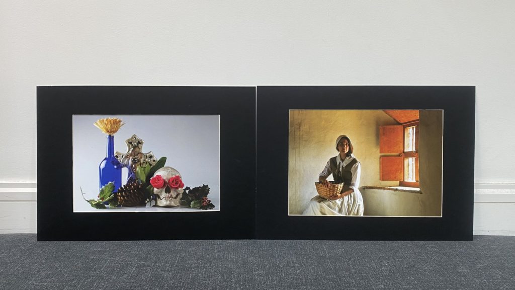
For the start of the course, I was shown the two methods of mounting my printed photos, Window mounts and foam board mounts. I took an immediate preference to window mounts as they are not only more aesthetically pleasing, but make the images stand out more. I chose my favourite image from each photoshoot, one from a trip to Hamptonne Country Farm and the other from a shoot taken in the school’s photo studio.
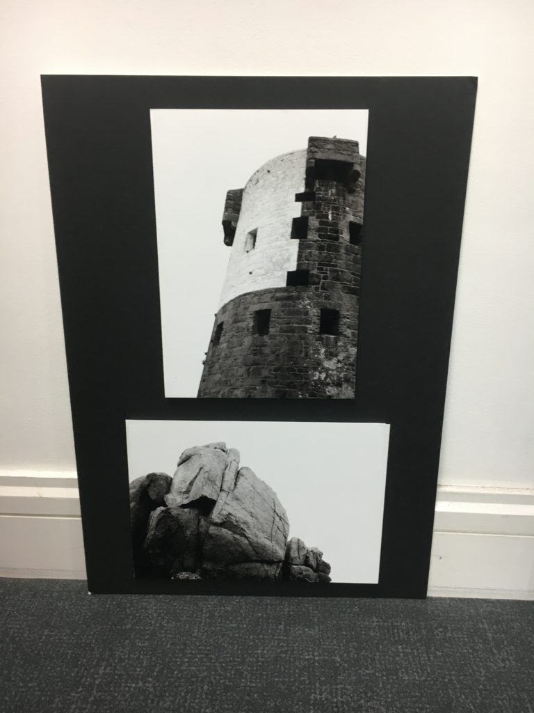
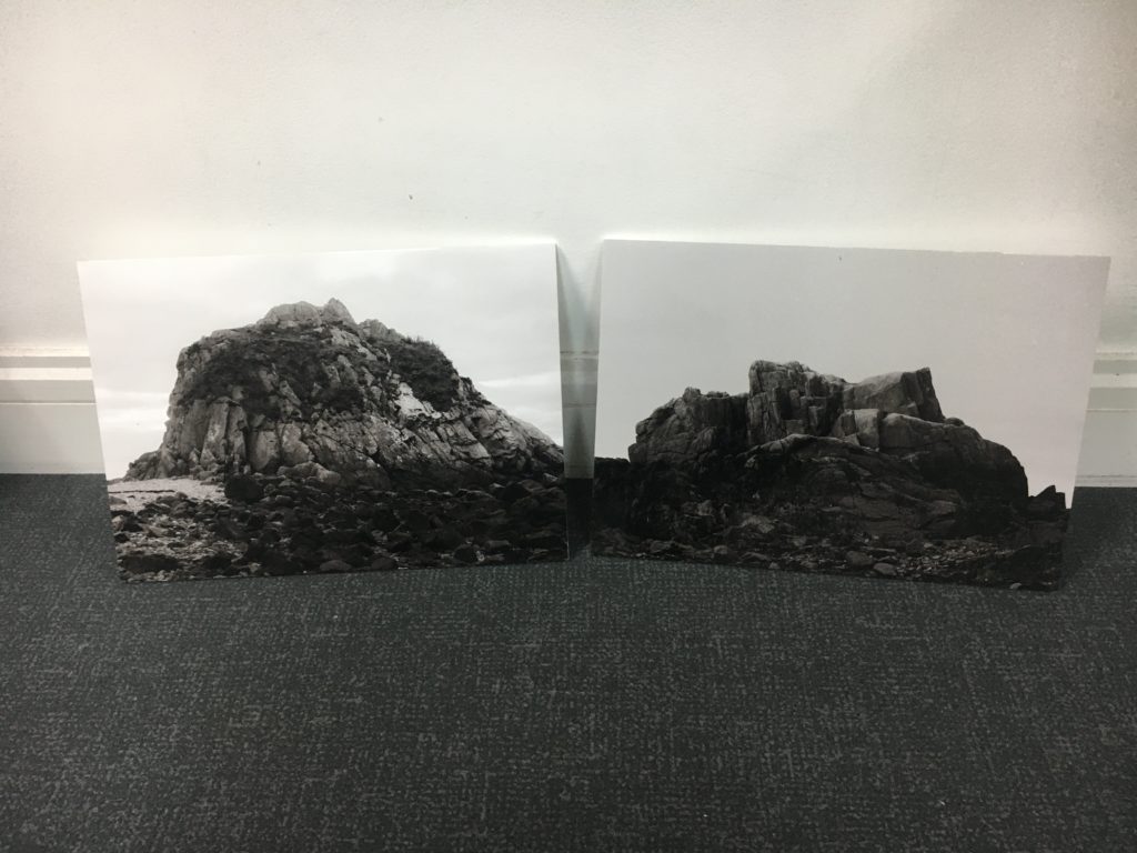
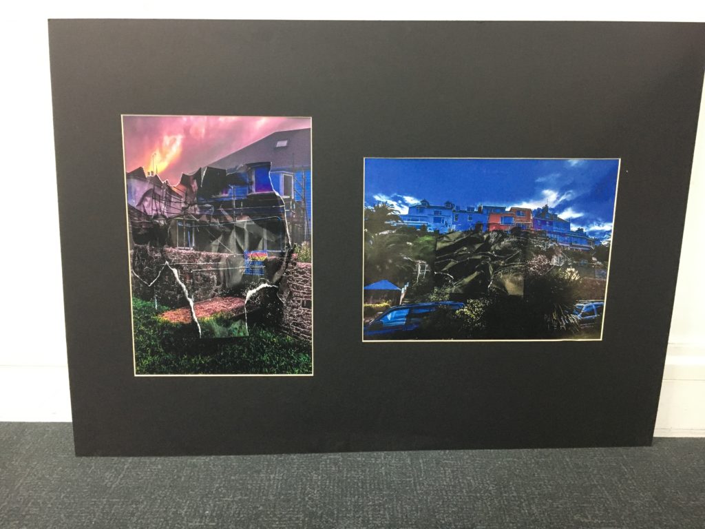
Anthropocene

Two large A1 displays, with nine A5 images displayed in window mounts
Medium-sized A2 display, with two downsized A3 foam-board mounted images

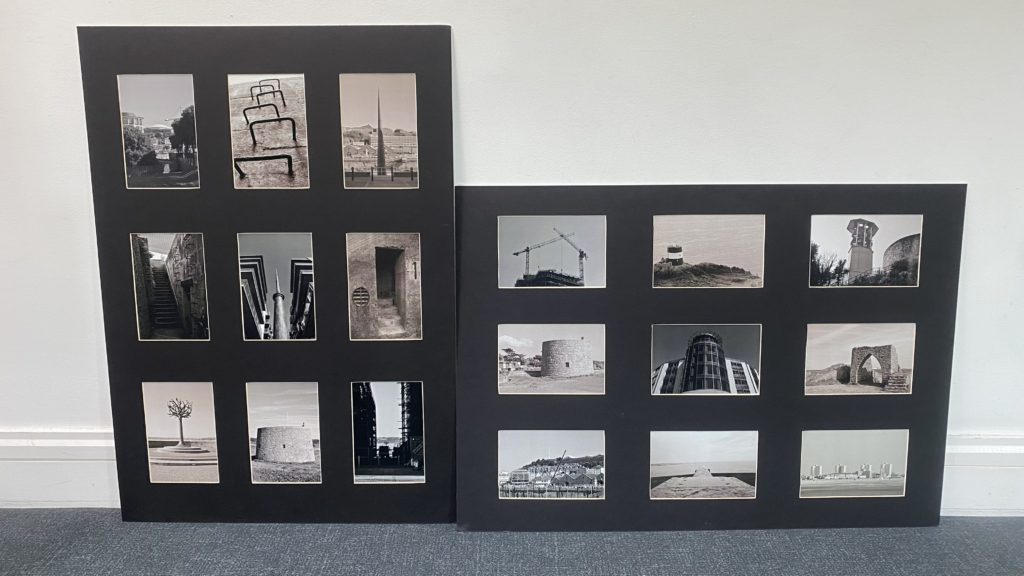
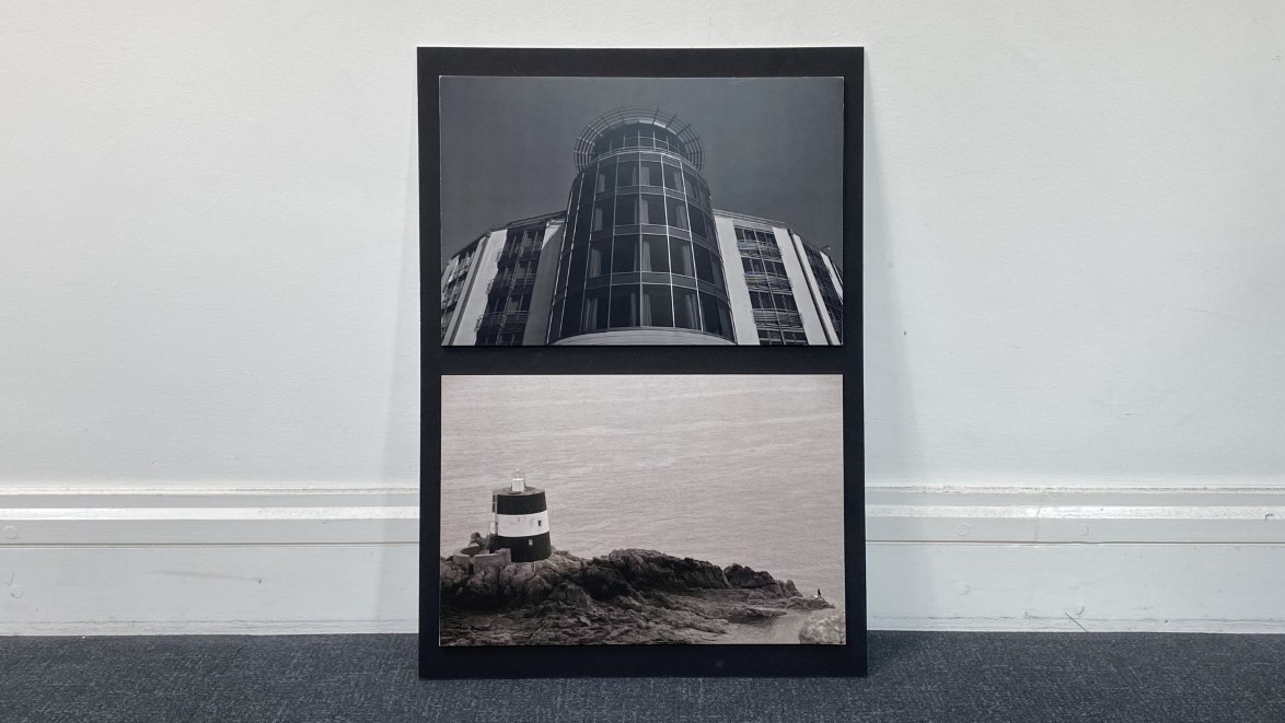
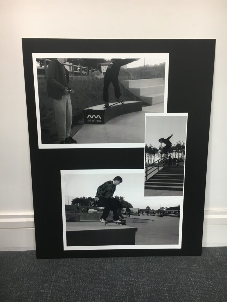
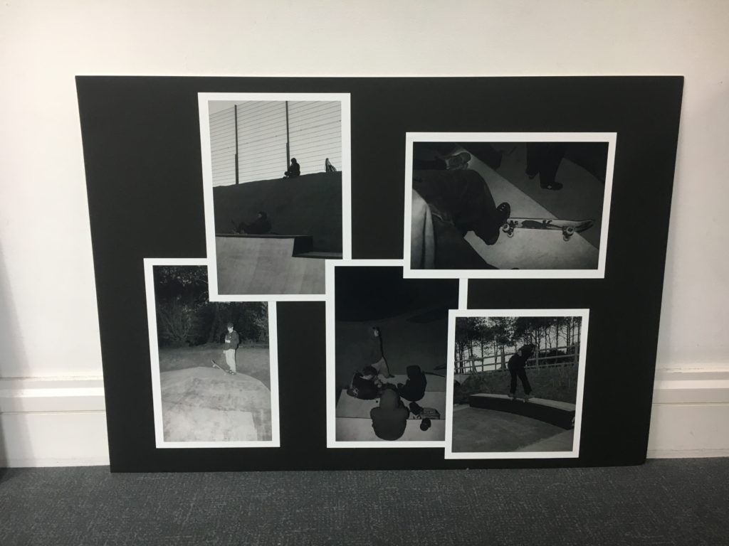
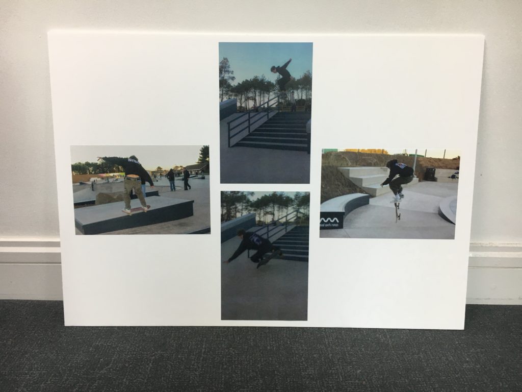
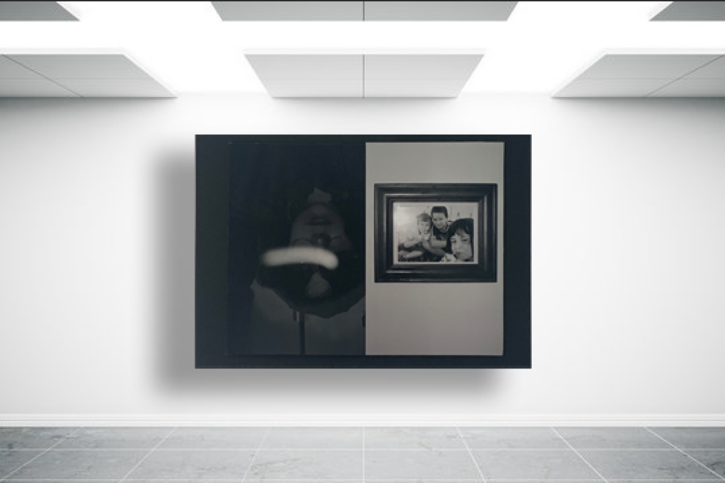
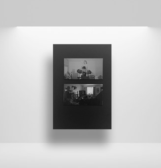
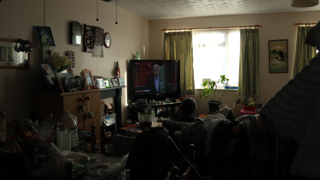
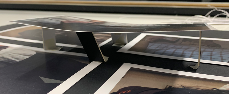
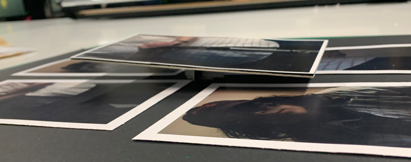
The topic of anthropocene was one I thoroughly enjoyed, if not the most throughout the entire course. The aim of my investigation was to show the comparison between new and old architecture on the island of Jersey. The island has an extreme variety of structures, from La Hougue Bie, a small temple said to be one of the six oldest buildings in the world, to the ultra-modern structures found in the town’s financial district. To do this, I photographed the two ends of the scale on separate occasions and kept the images together when planning my displays. Both large window mount layouts feature the new landscape in the corner and middle images, with the old landscape forming a diamond pattern in-between. This results in an interesting, but tidy presentation of my images and won’t be seen unless mentioned. The other display is my first attempt at a 3D mount, and I feel that it looks great.

My Rock

Two large A1 mount-board displays, but images are displayed in one slightly more complex pattern, and one very complex pattern

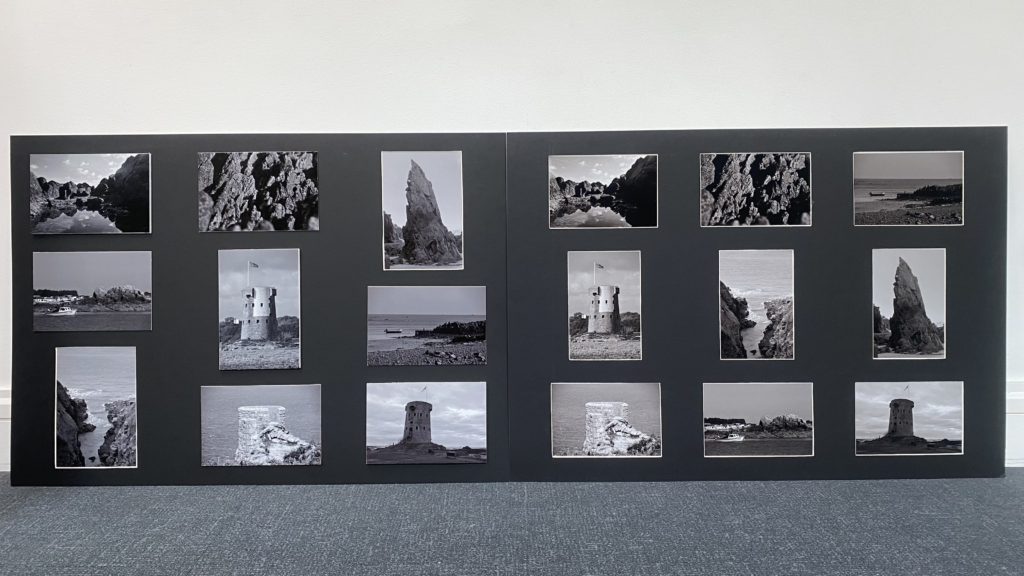
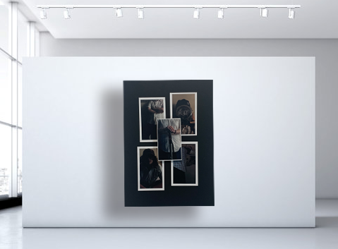
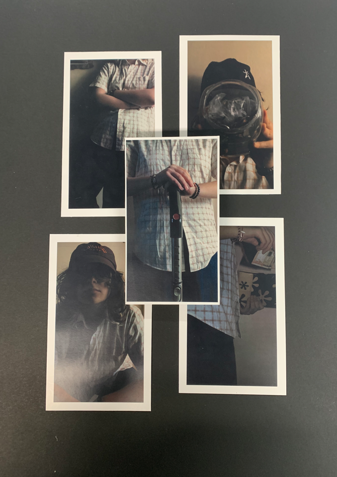
The My Rock project was my least favourite out of the course, however I used this opportunity to develop my skills with the mounting process. I chose nine images, three of which were portrait with the rest being landscape. My first mount was again, nine window mounts with the portrait images arranged along the middle row. This mount was different, but I wanted to create something special. I printed the same nine images out again and planned a complex mount featuring the portrait images diagonally along one axis, with a combination of window mount, mount-board and foam-board along the opposite axis. This process was extremely time consuming as it required extreme amounts of precise measurements so that the display would look symmetrical when complete.

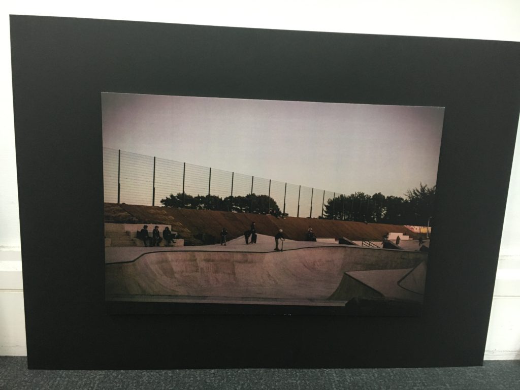
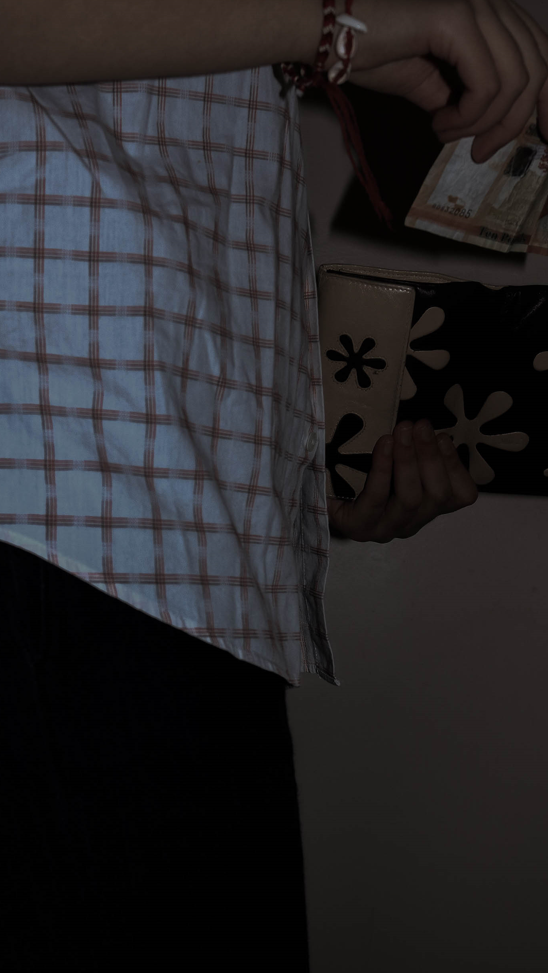
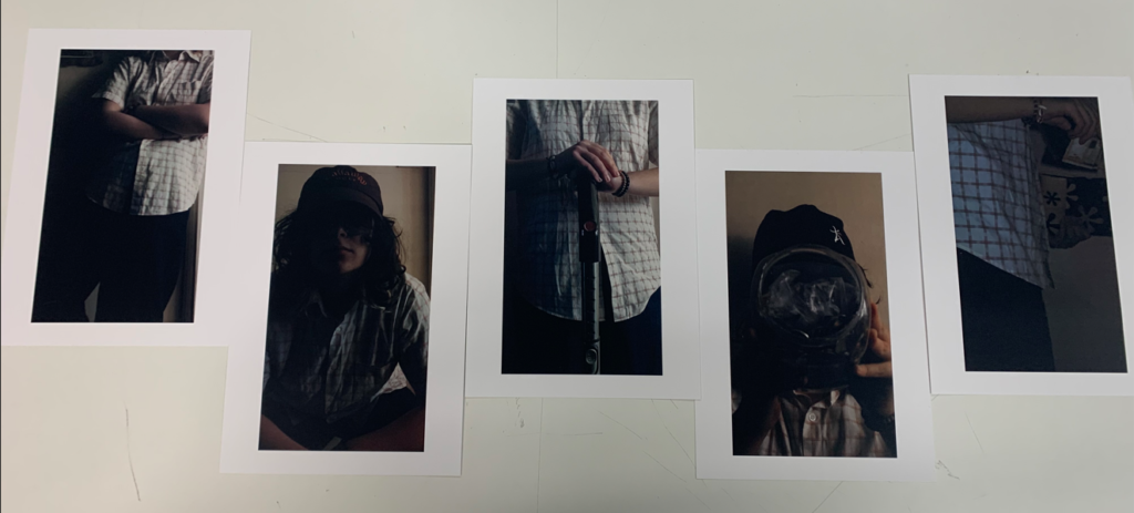
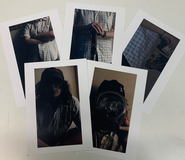
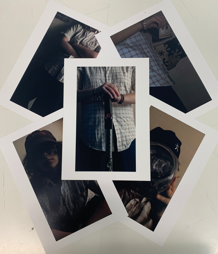
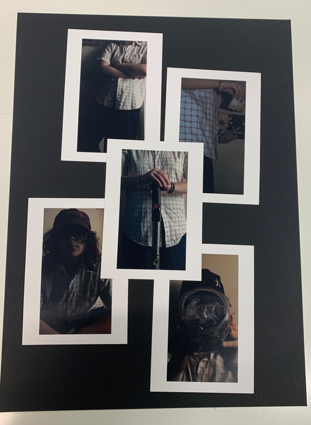
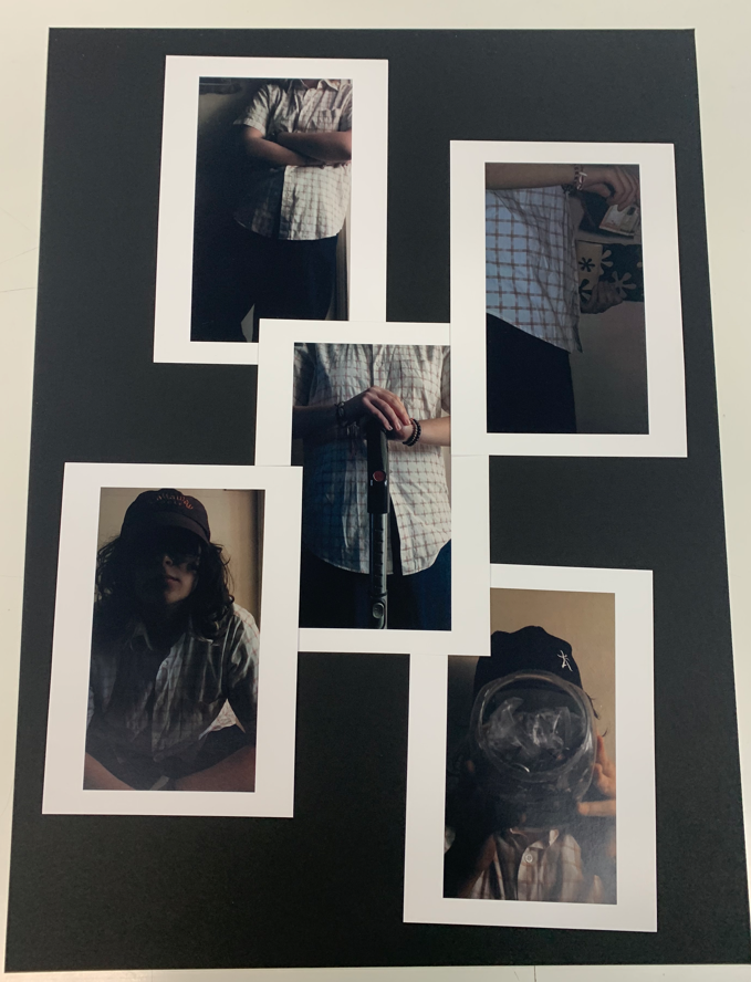
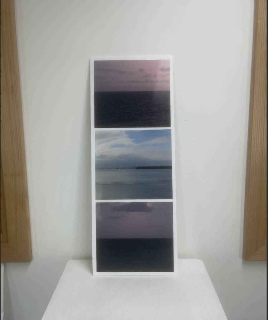
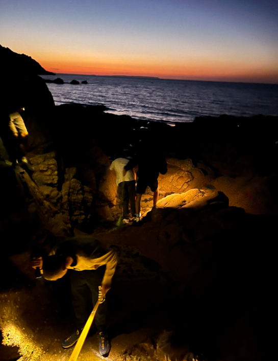
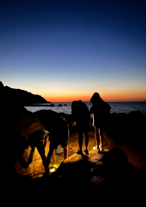
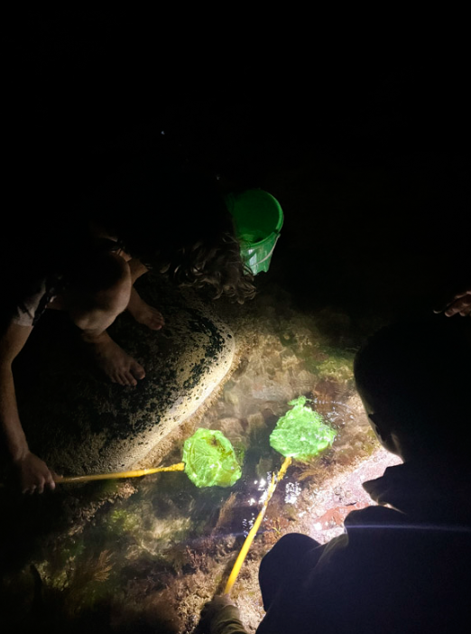
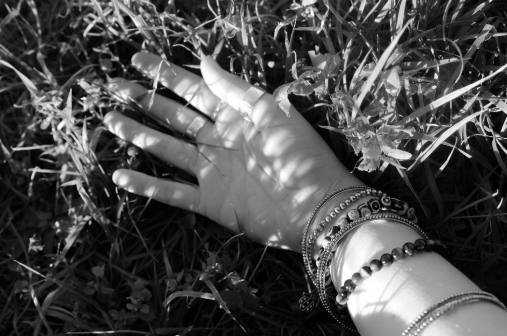
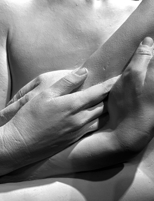
Personal Investigation

Large A1 window mount with nine images, alongside photobook

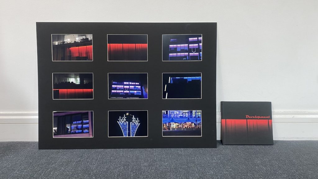
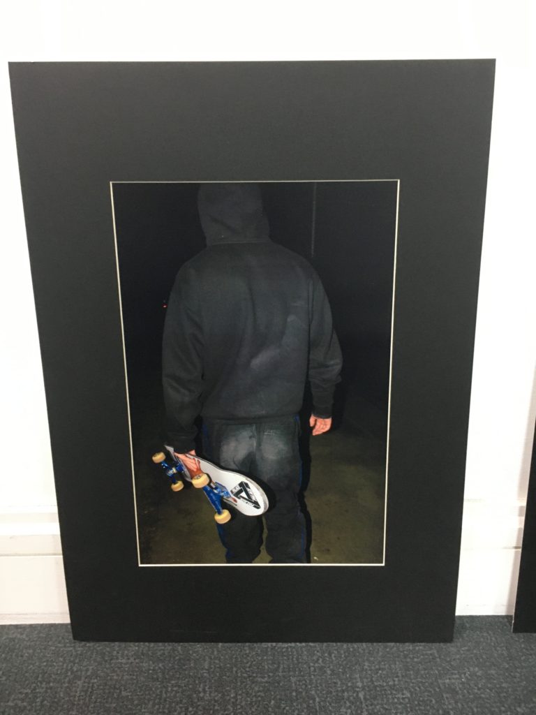
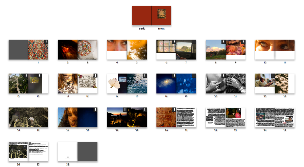
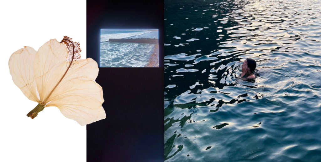
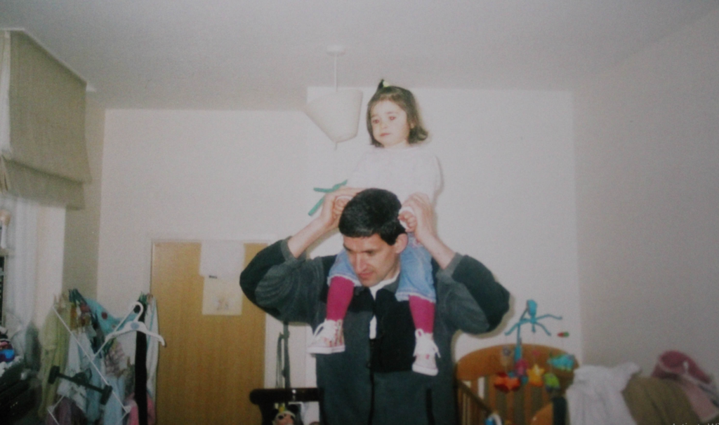
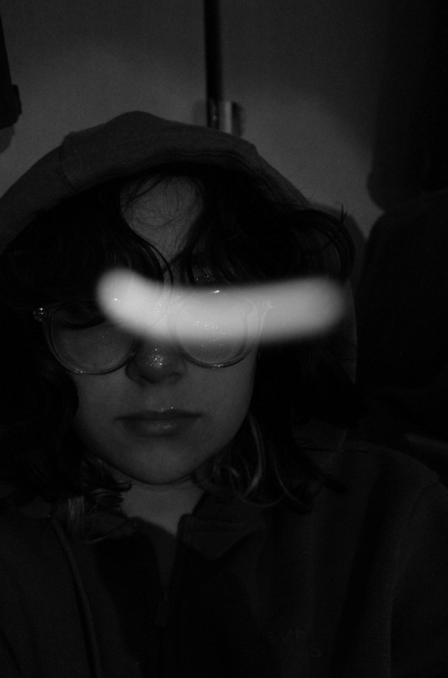
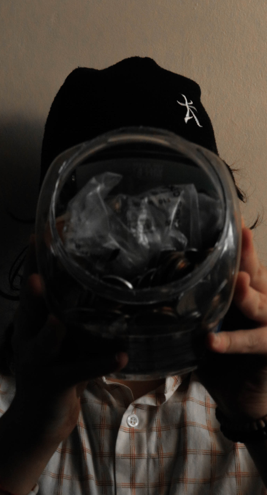
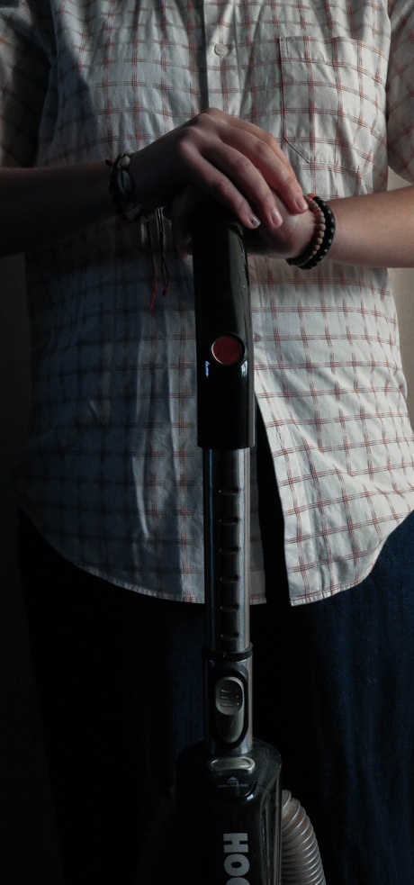
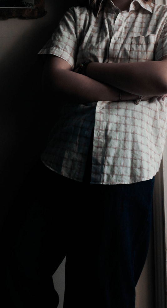
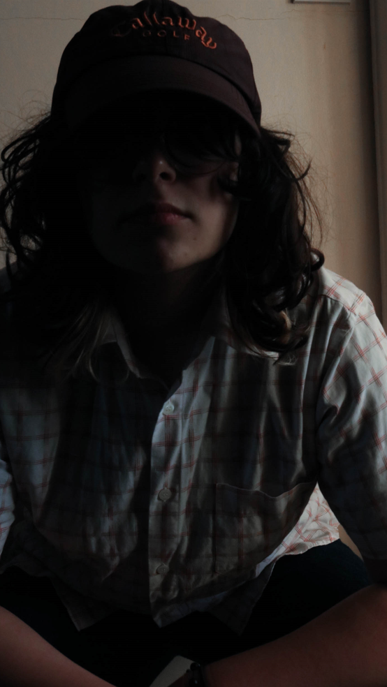
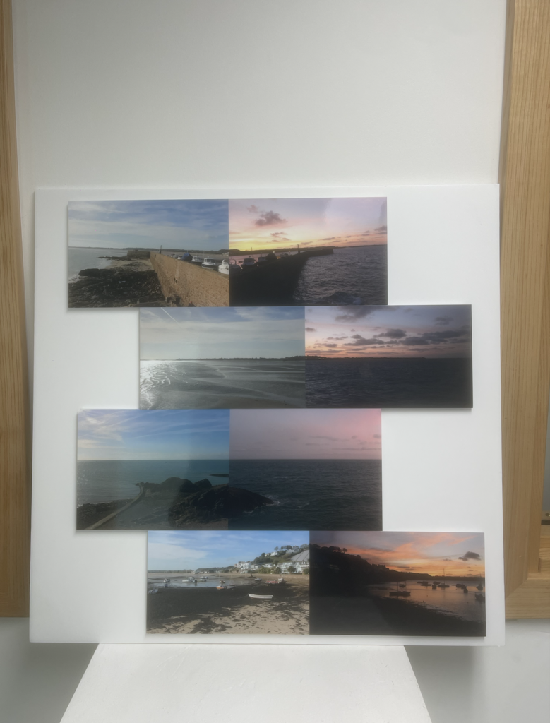
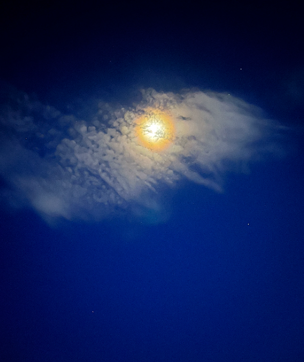
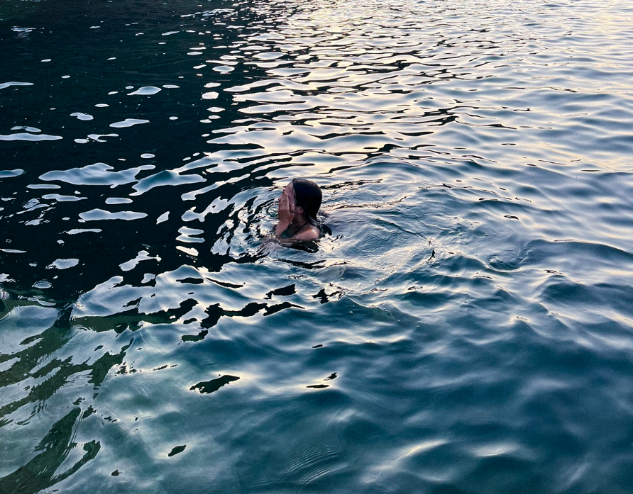
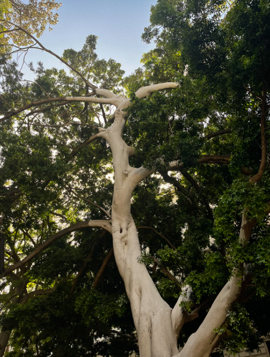
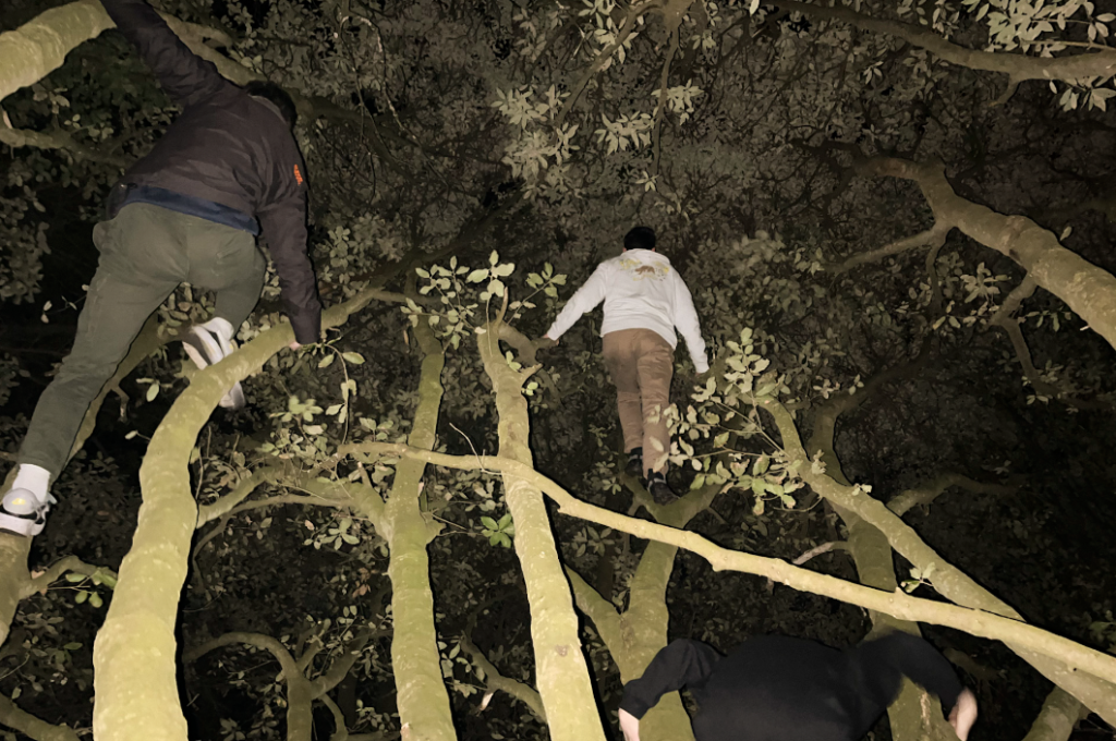
My final project was a personal study. This meant that I could pick whatever topic I wanted. I favoured the anthropocene project and so wanted to do something similar with a different theme. I wanted to experiment with light as I hadn’t thought of that before and thought it cold provide an interesting result. I went with the same mounting technique that I was used to and also produced a photobook to properly display my images in a more physical form

Final outcomes

These are my final outcomes for my islands photobook project i was very happy with how this project turnt out and feel have some strong final outcomes

These are my final outcomes from my rock project i was very happy with how these turn’t out and feel they have a good contrast of colour

these are my final outcomes from Anthropocene i was overall pretty happy with this project and am glad i had monochrome and colour final outcomes

these are my still life final outcomes i am happy with how they turnt out as one of my first projects and like the edit of the dairy projects behind the car

deconstructing photobook

The photobook is am deconstructing is Girl Pictures. The book by Justine Kurland, explores the free world of rebelling teenage girls in both portrait and landscape forms. Kurkland began the project in 1997

Throughout the book we are exposed to changing seasons, perhaps highlighting the changing world of the teenage girls in a chaotic yet peaceful way. The primary subject of Kurland’s pictures are the adolescent girls who inhabit these places, both familiar and uncanny, captured by the artist’s camera. The fact that Kurland’s pictures are carefully staged seems to contradict their intimate, candid quality. Speaking about her work, Kurland has said that she constructs pictures in order to let them unravel, working along a “spectrum between the perfect and the real.”

Girls Pictures by Justine Kurkland, carries a façade from the front cover, Girls Pictures is presented as baby pink hardcover and has an almost ‘inviting’ feeling through the use of flowers and soft colour creating a safe feeling for the book, however what he book holds is rebellious and surprising, similar to how teenage girls look and are expected to be friendly, but in reality, hold a lot more than that good and bad.

Girls pictures is a portrait shaped book with landscape images inside, the images tend to spread over one or two pages per book. The titles of the images are all quite literal e.g. ‘Spinning and smoking (1997)’quite literally shows two girls, one spinning and one smoking this theme of ‘literal’ can also be seen in the title of book ‘girls pictures’ as it is a book of pictures of girls. However, I think these obvious titles are in means to allow the audiences to think more about the image, to see and feel more than what is being stated directly.

Girls Pictures is an obvious story of adventure, Kurkland stated that she took inspiration from adventure stories such as Huckleberry Finn, Tom Sawyer, Where the Wild Things Are, The Outsiders… However, these stories are all male based. The costumes within the images impact ad change the images completly, placing girls in worn out overalls, ripped jeans The book holds a common theme of rebellion, self-sufficiency, confidence, often having an obvious leader within the groups of girls, perhaps expressing a discourse from the American dream within the use of youth and rebellion.

Islandness images/photobook evaluation

PHOTOBOOK

Here is a link to my photobook

Click on the image above to view individual pages of the photobook

I believe my final photobook has turned out very successful and clearly relates to my artist references as well as the theme of islandness with a constant theme of nature where it is shown through flowers on the page, the content of the images including night skies, the ocean, trees, and even shadows which I believe this creates a flow through the book- there is another theme through the book which is the colour scheme: images are in a warm to cold colour gradient minus the warm pages before images where green is prevalent on the next page this is so there is some disruption, like the black and white image which breaks up the flow.

A page from my photobook

Above is my favourite page from my photobook, I feel as if shows the theme of the photobook best where it links childhood/teenagehood with a female gaze, showing the beauty of everyday life. Interpretation of these images imply island life- the sea is obviously extremely prevalent in these images as well as nature- seen in the flower, which could possibly show a more intimate side as the flower has been pressed which can imply it is dear to someone. Actual image content displays a lone female swimmer covering her face which is from an outsider perspective as there is a distance between the subject of the image and the viewer, both images in the book cover one page with a difference in tones of blues in the sea, one image of a rough sea while the other calm (and swimmable) these images together can be used as metaphors where island life is typically either smooth and calm or difficult.

Personal Study: Virtual Gallery + Evaluation

Virtual Gallery:

Evaluation:

Overall, I think my personal study was very successful. I enjoyed the process of making my photobook and found that it helped me develop my skills as a photographer throughout the different phases as I learnt how much time was needed in order to produce a coherent final result during the process of taking photos and organising them, especially as I used words to accentuate each spread. I found the process of creating a narrative by mixing various images quite pleasant as I was able to change what each image meant by changing where it was placed and its colour scheme – this was something that intrigued me quite a bit.

I did struggle throughout the process due to my Lightroom glitching, however, I think this helped me to refine some of the details within my book as I was given the chance to restart and reimagine each spread, allowing me to improve the spreads I wasn’t sure on and create a more visually appealing book. Alongside that, I struggled when beginning my photobook as I wasn’t sure how I wanted to lay it out due to how many options there were to compose my layout which felt quite overwhelming at first. Despite these struggles, I was still able to create a physical photobook that I’m proud to have made.

Personal Study: Final Prints + Experiments

Prints:

For this project, I decided against having a lot of final prints as I knew my photobook would include most of my images and I didn’t want my final pieces to be exact copies of spreads in my photobook. Due to this, I carefully went through my images and paired a few images together that I felt would work well mounted, leaving me with 3 sets of images.


Set 1

Set 2

Set 3

Mounting + Experimentation

I decided to mount my first 2 image sets in a simple manner in order to draw more attention towards the juxtaposition rather than create a busy/distracting frame that would take away from the images. This led to me sticking my images onto foam board then mounting them onto a sheet of black mount board as I felt it’d help to make my photos stand out.

Final Layout
Final Layout

For my 3rd set, I decided that I wanted to create a more interesting layout as I hadn’t used these images yet in my photobook and I wanted to make them look more interesting whilst still keeping the overall layout quite simple. This led to some experimentation where I laid my prints out on a table and tested different layouts before deciding on the one I liked best.

Some of my experiments:

As I explored my ideas, I thought about the possibility of having one of my images floating above the rest which led to some further experimentation on how I would be able to do so and what the most effective method would be. At first, I tried having my image held up by small pieces of mount boards, however, I disliked how unstable and visible this method was. Then, I tried using 2 small pieces of mount board and locking them together by cutting a small slit into each piece. This allowed the image to be held up from a smaller, less visible point which I preferred as it made the piece look cleaner and more stable.

Side view of the small strips of mount board
Side view of the interlocked technique

I decided upon my final layout as I preferred having my images slightly skewed rather than perfectly symmetrical as I found it more visually interesting/impactful to look at, especially as the images work together to create a small scene.

Final Layout

Final Islandness Mounts


I went with this layout as I wanted to present these photos alongside each other, but rather than just lining them up I wanted to add some contrast/variation so that they are presented more as individual pieces.

The same goes for this piece, I wanted to create something slightly different to my inspiring artist Hiroshimo, and so I mounted them in a verticle orientation instead of horizontle.


photo book

1. Research a photo-book and describe the story it is communicating  with reference to subject-matter, genre and approach to image-making.

2. Who is the photographer? Why did he/she make it? (intentions/ reasons) Who is it for? (audience) How was it received? (any press, reviews, awards, legacy etc.)

3. Deconstruct the narrative, concept and design of the book and apply theory above when considering:

  • Book in hand: how does it feel? Smell, sniff the paper.
  • Paper and ink: use of different paper/ textures/ colour or B&W or both.
  • Format, size and orientation: portraiture/ landscape/ square/ A5, A4, A3 / number of pages.
  • Binding, soft/hard cover. image wrap/dust jacket. saddle stitch/swiss binding/ Japanese stab-binding/ leperello
  • Cover: linen/ card. graphic/ printed image. embossed/ debossed. letterpress/ silkscreen/hot-stamping.
  • Title: literal or poetic / relevant or intriguing.
  • Narrative: what is the story/ subject-matter. How is it told?
  • Structure and architecture: how design/ repeating motifs/ or specific features develops a concept or construct a narrative.
  • Design and layout: image size on pages/ single page, double-spread/ images/ grid, fold- outs/ inserts.
  • Editing and sequencing: selection of images/ juxtaposition of photographs/ editing process.
  • Images and text: are they linked? Introduction/ essay/ statement by artists or others.  Use of captions (if any.)

Photobook final prints + virtual gallery

FINAL PRINTS

For my final prints I did not chose the images which displayed the most technical ability but more the pictures which are more in tune with my artist inspirations Sam Harris and Olivia Bee. I believe my images represent the notion of growing up as portrayed by Sam Harris and emphasise everyday life- as Olivia Bee’s images do.

VIRTUAL GALLERY

When creating my virtual gallery I realised when generating my images I did not have professional environments such as galleries in mind (i.e. artificial lighting, white walls etc) so when creating my virtual gallery in photoshop I chose a background which was less commercial as my images are more intimate and meant for a photobook.

evaluation + critique

Whilst creating my project, I chose to do the theme of youth culture that I captured in my work through documentation-style photography that highlighted the authenticity behind my images, as the photo-taking process for this project simply based on capturing candid moments with my friends to create an atmosphere revolving around the freedom and liberation of youth culture on an Island. I feel I worked to the best of my extent whilst working on this project – I did multiple photoshoots in several locations during different times of the day to show the activities myself and my friends got up to whist being stuck on a small Island with limited places to go. Out of all of my photoshoots, my favourite ones were the images I produced during my night photoshoots in forests, as I had to experiment a lot due to limited lighting, which in the end created many interesting images for example the one below – this is amongst my favourites due to the way the branches contrast with the dark background and the figure captured in motion.

Overall, I really enjoyed making this project as I felt Islandness was a personal theme therefore I could work with it in any way i wanted, and was satisfied with the outcome as i felt it incorporated my artist references and the insider/outsider perspective I had planned to include in my work, but still had my own take on it. However if I could redo the project, I would focus more on applying my artists references into my photobook, as I was really inspired by the layout of Raised by Wolves, yet my photobook displayed a completely different aesthetic, which I liked but was not satisfied with the outcome of the layout.