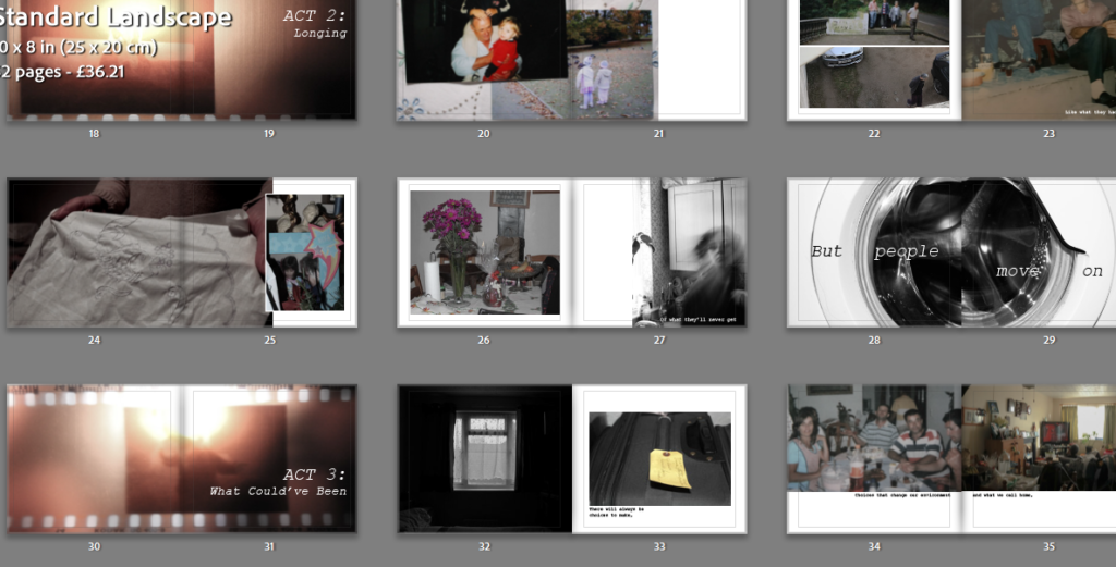
I began the process of creating my photobook by importing all my images into a folder in Lightroom so I’d have all of my images in one place, making the selection process much more convenient as I could easily switch back and forth between my images and between my photoshoots.
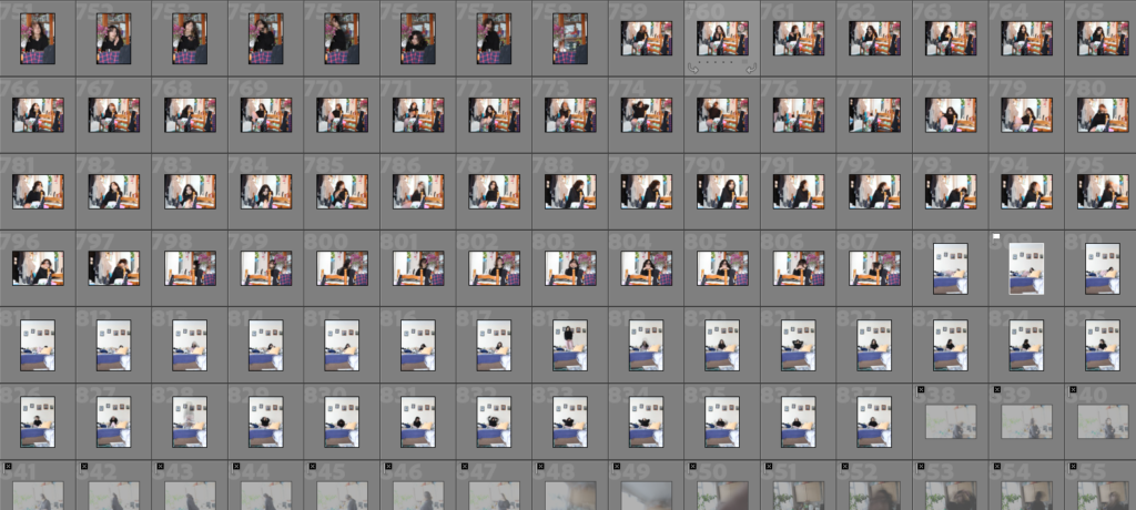
In order to differentiate between my good quality images and my less successful images, I used the ‘X’ key to reject images that I didn’t think were of a good enough quality for my photobook and the ‘P’ key to select images that were in focus and I would be useful for my project.

From there, I began some of the editing process, doing some small changes [such as turning them black and white, increasing the contrast etc] to improve images that I was considering for my final photobook. I made sure to add a blue colour label to these images so I’d be able to keep track of how many images I was considering, making it so locating the edits would be a quick process.
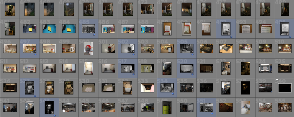
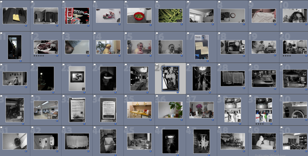
Next, I filtered out all my images so that only the blue ones would be seen and began organising my images into a rough layout, pairing images that I thought would work well together.
Then, I began the process of making my actual photobook, beginning to create the first few spreads whilst adding text in order to add depth to the images and book itself.
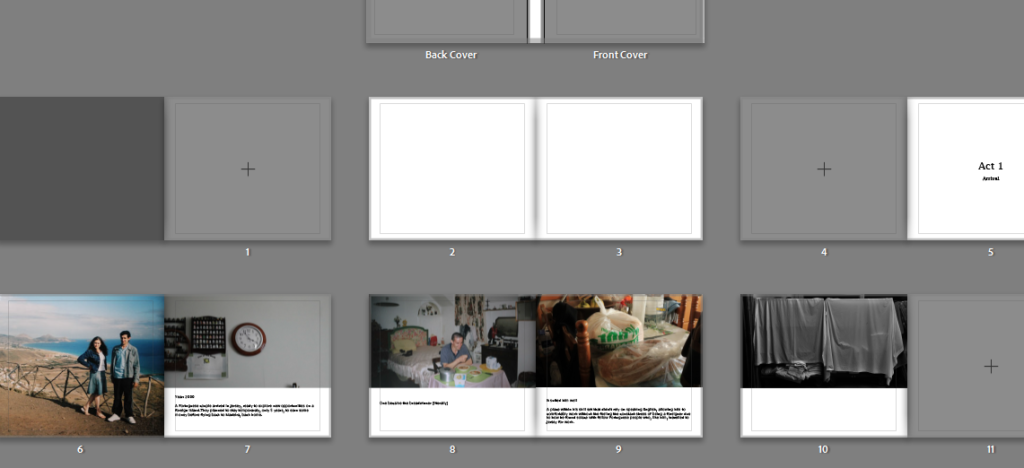
I put in a working cover whilst I began to figure out what I wanted the title to be and where I wanted it to be placed. I decided upon the phrase ‘this is a life’ as I felt like it fits quite well as it states what the book is about whilst setting the tone too.
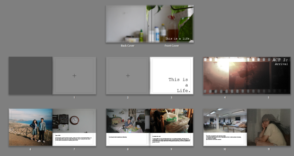
I experimented with the layout of my spreads, pairing various images together so I could choose the ones I liked best and reuse the photos that didn’t fit in elsewhere.
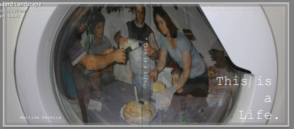
I then went into photoshop and created my front cover by taking an images of my family and editing it into a photo of a washing machine, lowering the opacity to create a more distant look. I chose a washing machine as Portuguese people are often stereotyped as cleaners and I thought it would be a subtle way of showing some of the stereotypes we face. Alongside that, I also though it looked like a window which would invite people to look into the book along with helping people understand how they’re looking into our lives as an outsider.
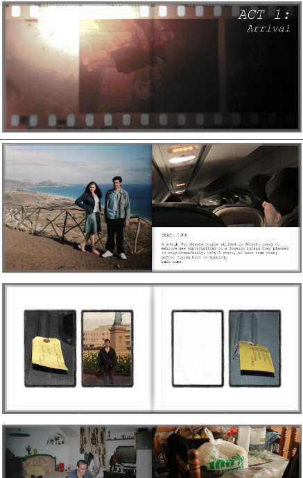
Then I continued adding and arranging images carefully, taking care with each spread to make them flow into each other rather than having each spread be really busy which would of made it difficult to look at each image and the story/reasoning behind them. I also tried to use text that would guide the viewer through the photobook, helping to piece together the narrative being portrayed in each act.
