
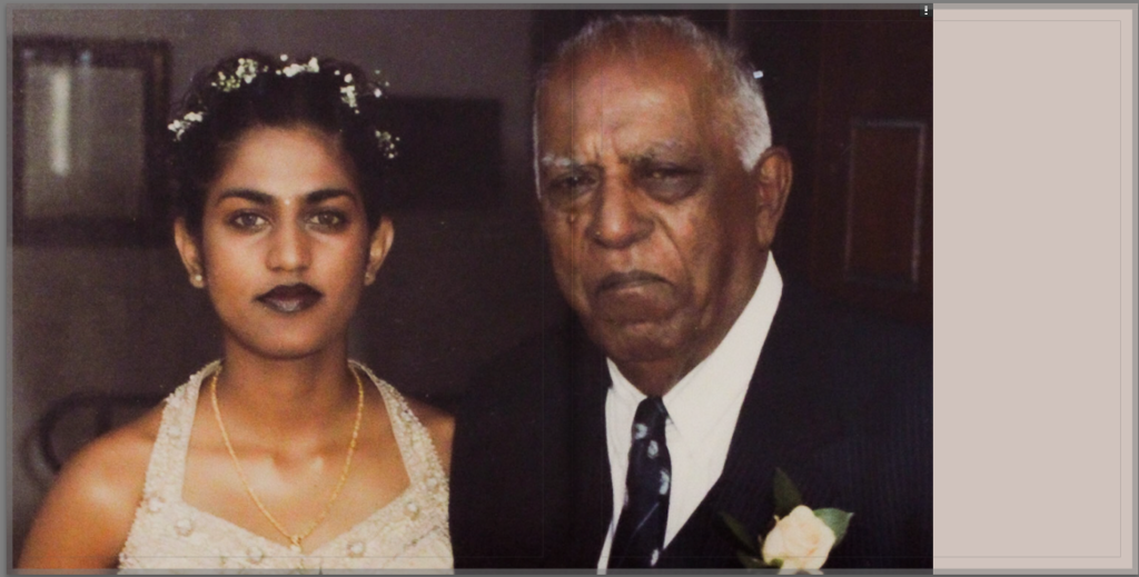
Over the exam I decided to make a photobook using the images I took over this project. It took quite a bit bit of experimentation to find a layout that I liked but I am happy with the final design.
I decided on using a large square format to be able to show a mix of portrait and landscape images with borders alongside full bleed images on some pages, creating some variation and contrast. I also wanted to keep the flow of the pages based off of subject matter, composition and colour, to make the book more engaging and interesting to read.
I considered adding text like in Frazier’s photobook, The Notion of Family, however decided against it, feeling like many of the images work well without explanations. I also attempted to add in my essay, however I was having difficulties with the editing software and could not get a result that I liked in time for publishing.

My final layout– it can also be viewed here– Tīvu

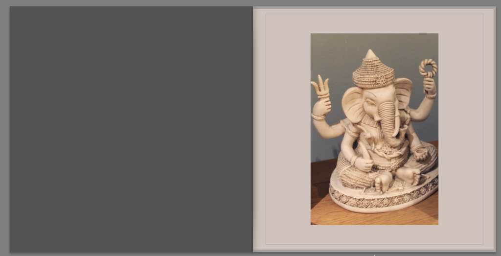


I decided to make the background paper an off white colour to fit into the colour scheme of the older images as well as making the book look older in general. I like the contrast it creates against the blue throughout the book as well.
For the title I decided on the name “TĪVU” which is the Tamil word for island, tying the photobook back to the overarching theme of islandness. Both of my great grandparents spoke Tamil but never passed it on to the rest of the family so I wanted to find a way to incorporate a part of the language into my photobook.
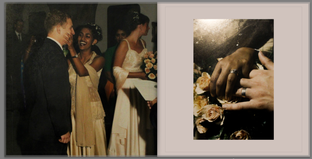
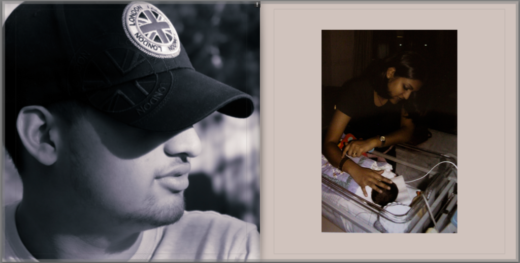
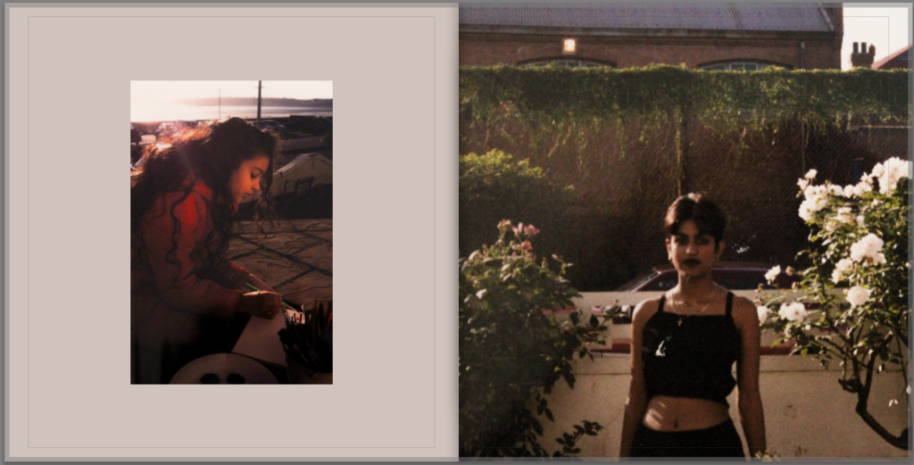
Overall I am very happy with the final result of my photobook, especially the contrast created by juxtaposing the older images with some of my newer ones. If I were to do this project again, I would definitely try to take more images, especially here in Jersey, perhaps photographing my family as we are now, alongside myself as there is only one image of myself in the entire book. Doing this might have tied my work more to that of LaToya Ruby Frazier, while I feel like I placed more of a focus on taking inspiration from Vasantha Yogananthan throughout this project, as I really liked how my edits inspired by Yogananthan look, and feel like they make the images much more striking and memorable.