Front/Back Cover
For the front cover (and back) I will be using this image from the Bhamra-inspired photoshoot as a wrap around:
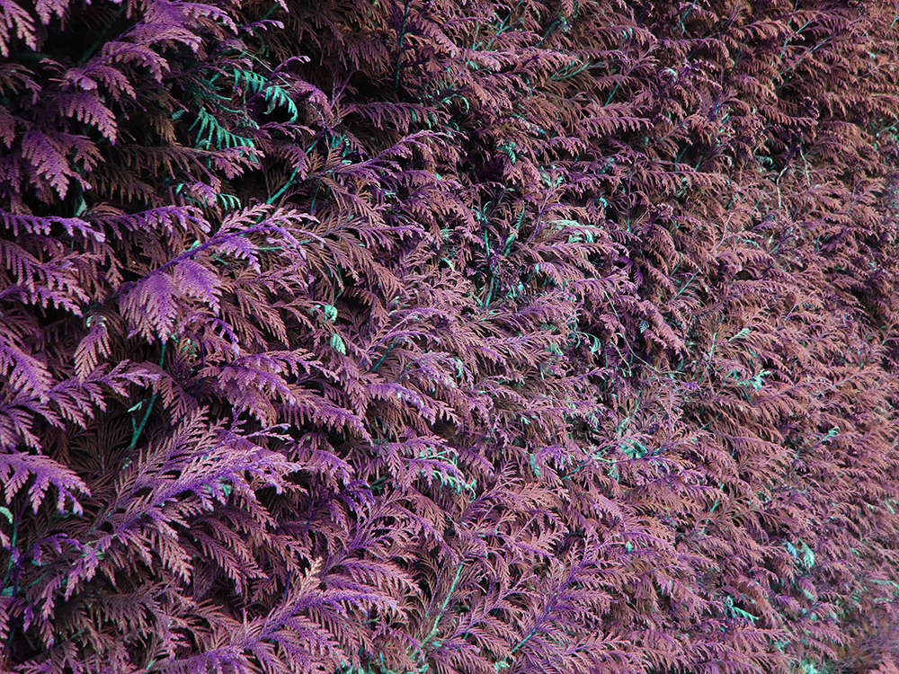
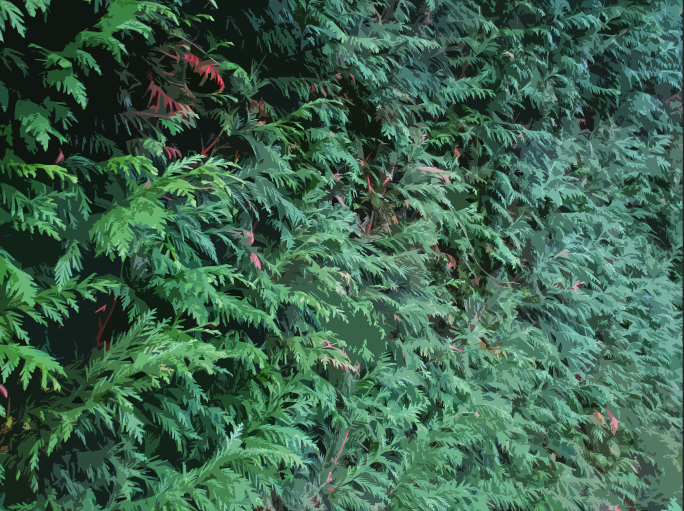
As the image is fairly detailed with lots of lines and details, I want to edit it to make it easier on the eyes. To start I used the ‘Cutout’ filter on Photoshop to make it softer. I like the way this filter makes the image makes the leaves more angular and sketch-like, to me it blends the idea of the organic leaves becoming like synthetic, angular leaves seen in decorations.
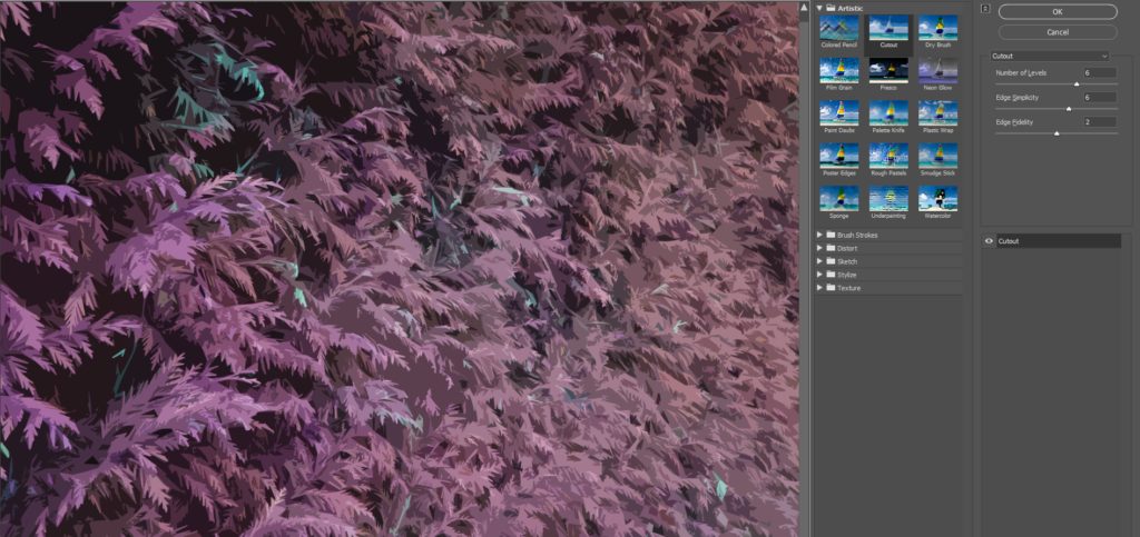
Here are two variations of this, each with a different level of detail (I chose to use the more detailed version):
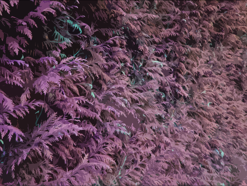
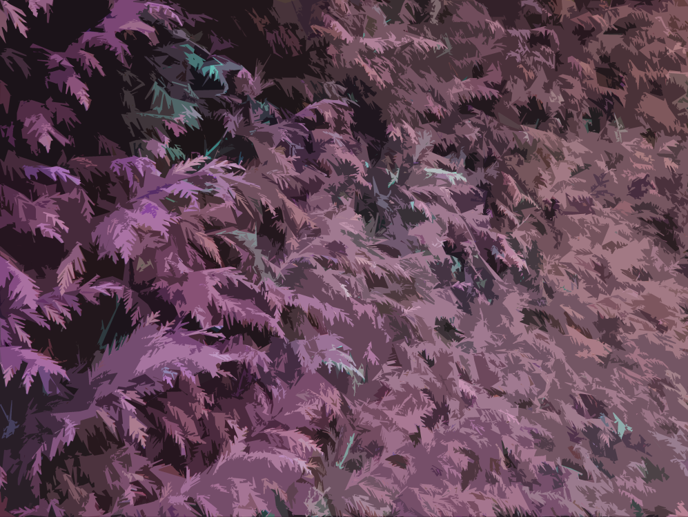
Next I increased the saturation and contrast of the image slightly to make the colours and shadows pop more, making it appear more lively:

Here are some experimental edits of this image using different colours:

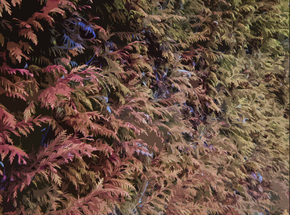
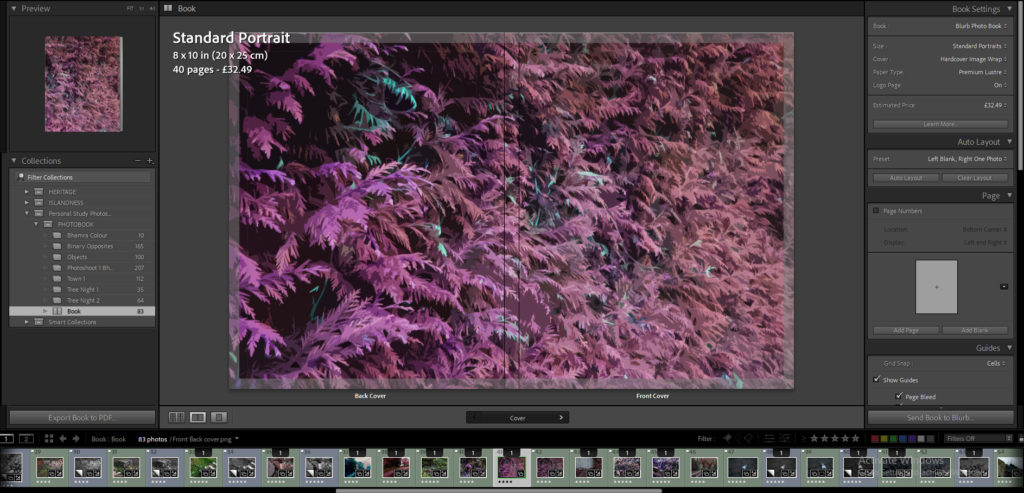
I will be using the original version (with pink leaves and green flowers) for my photobook.
This is what the cover looks like within Lightroom:
Title and Text
Next I decided to focus on the title for the cover – where it would be on the page, the colour, the text, etc. I decided that white would be the most appropriate as it looks professional and is easier to see with the image behind it than black.

After searching through the fonts on Lightroom, I found this font called ‘OCR A Extended’ which I think fits with the front cover aesthetically, as well as the theme of my project, as the font reminds me of a classic CLI (computer) font.

I experimented with the ‘tracking’ slider on the font settings, which increases the spacing between each letter.
Here is where I experiment with the placement of the title on the cover:

I think the version with the text being right aligned at the top of the page fits quite well (I will use this as the final layout for my book).


I don’t think that putting the text at the bottom of the image will be as effective, as that is the point in the image where it is the lightest.

Next I worked on the spine of the photobook:

I used the same font as the font used on the front cover, this time I used full-caps as I think it makes the font easier to see and makes it different. The title of the book is aligned to the left (top) while my name is aligned to the right (bottom).
Final Cover:

Front Page

For my front page I put the title of the book in the centre of the page, using the exact same font and sizing as the front cover.

Here I have added a black and white version of the image on the front cover at 7% opacity so it is not fully visible, which I think gives the front page a nice effect.
