EDITING ON LIGHTROOM
Whilst working on my project, I took roughly around 500-600 images, composed of about 4 photoshoots, along with a selection of random photos taken in other settings. Locations in my photoshoots included car drives with friends, fields & woods, and friends houses. After going through all my images, these were the ones that stood out most to me – however after editing I will narrow the images down.
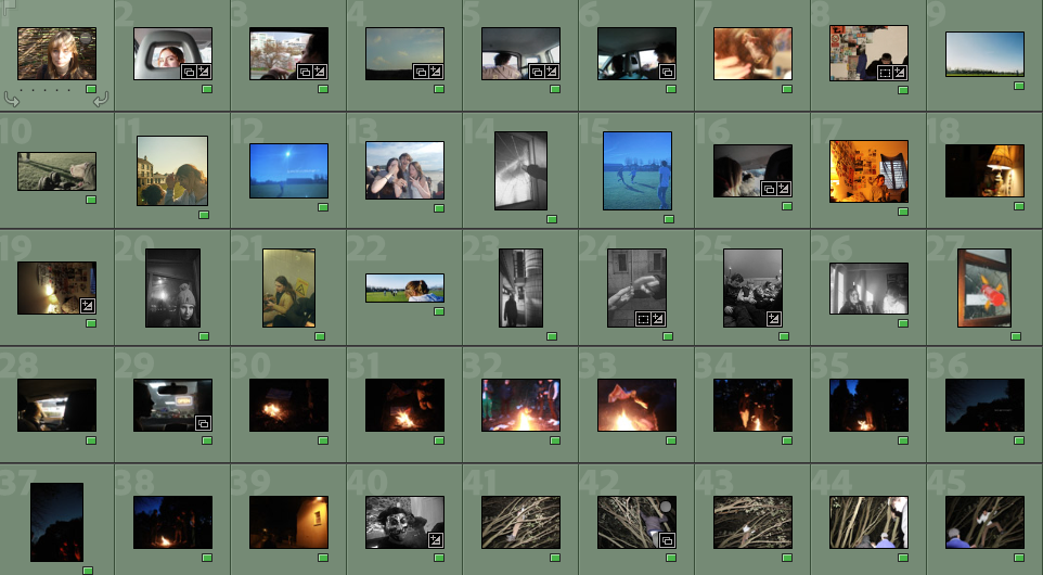
I wanted to make sure all of my coloured images had similar tones to avoid them looking out of place, however some were too bright or dark, therefore I edited them on lightroom by turning up / down the saturation, exposure, and vibrance. My black and white images however were left for the majority unedited.
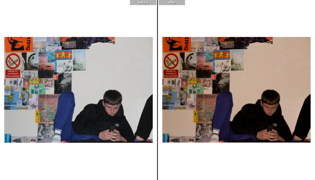
An example of adjusting the image to avoid an unwanted viewpoint. For this photo, I wanted the focus to be on my friend, however the posters were too bright and clashed with the white background, so I adjusted the hue to give a more yellow tone, and turned down the exposure to make his coat darker, therefore the viewers eye will immediately be drawn to him and any background ‘noise’ will be minimized.
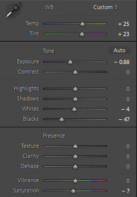
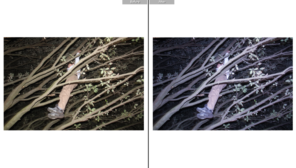
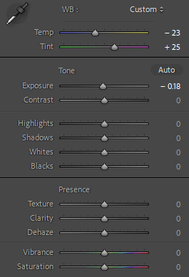
Another example of adjusting colour in lightroom. Opposite to the image above, I felt this photo instead had too many yellow tones and wanted to adjust it to fit the colours of other images in my book – I turned down the saturation and temperature and turned the tint to give the image a slightly purple hue.
EDITING ON PHOTOSHOP
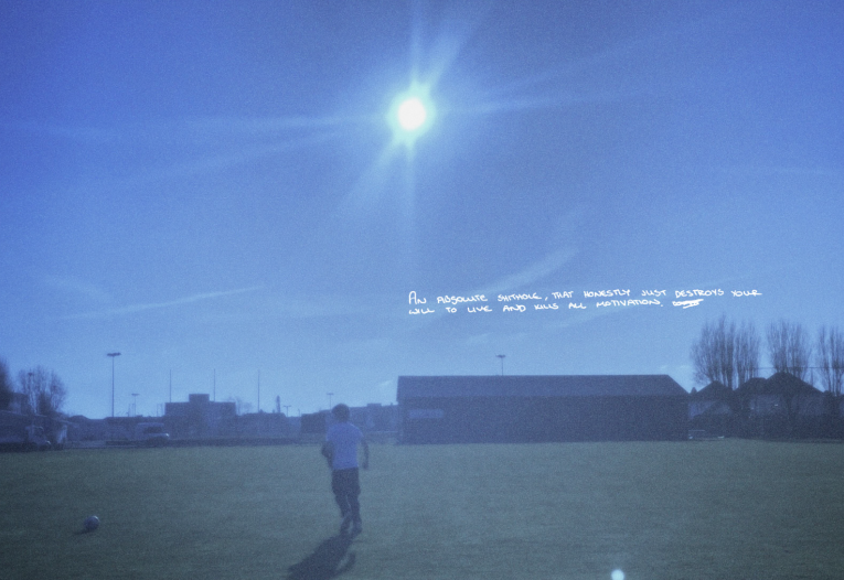
In my project I chose to incorporate text by tracing handwriting from a piece of paper – I had given it to my friends and asked them to write what they thought about Jersey. Instead of using a font I chose to replicate the handwriting as i felt it gave a more authentic feel to my photobook and took inspiration from Goldberg’s use of text in Raised by Wolves.
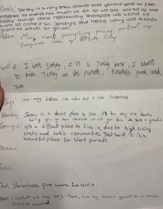
In order to do this, I screenshotted a particular bit of paper that I wanted on my image, then on Photoshop used the pen tool to draw over the layer. Deleting the photo after I was done left me with an overlay that resembled handwriting.

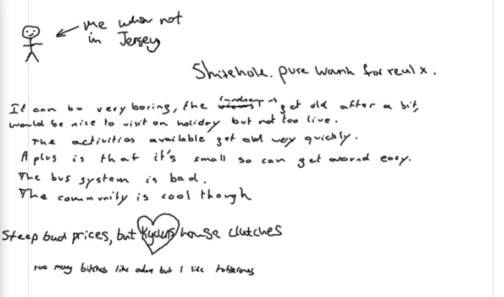
Final outcome of editing on Photoshop. I like the way this page turned out as although it doesn’t feature a photo, it has a unique aspect i feel isn’t included in many other photobooks and it helps convey my theme of youth culture through different opinions. The handwriting also provides an authentic feel and looks as if it was written straight onto the page.
EXPERIMENTATION
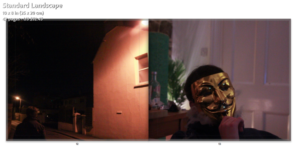
For these pages, I originally wanted to include two photos with similar yellow/orange undertones, but upon placement I felt that the two images clashed.
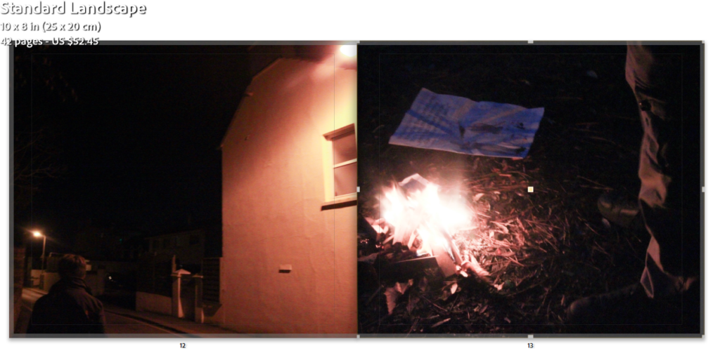
Replacing the image I felt this one looked better but the images needed rearranging.
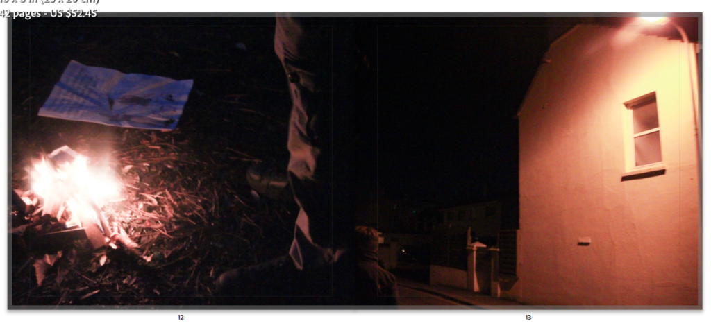
I am satisfied with the final outcome of this page as I feel the first image transitions smoothly into the other and the colours compliment each other well.
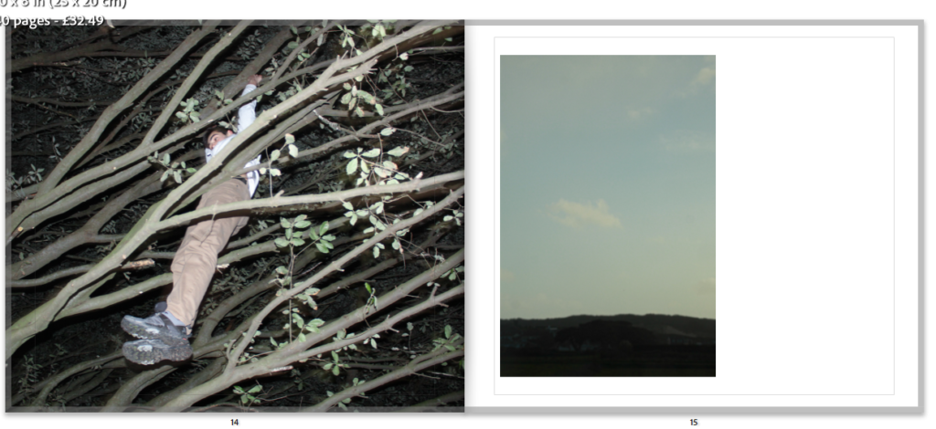
I felt this page looked good and the colours corresponded to each other well, but something felt missing on the second page.
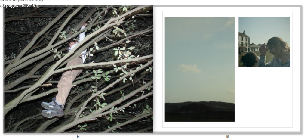
Adding a second image made the pages look more interesting. Considering placement i made it a lot smaller than the photo of the sky as that was the one i preferred therefore wanted it to draw more attention.
