The gallery which I have chosen to use and why –
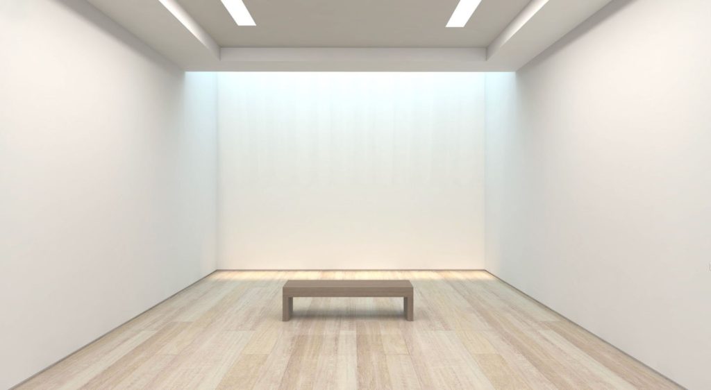
This is the gallery which I have chosen to use as my template to create my virtual gallery in photoshop. This is because I like how there are neutral, cream tones on the wall and floor, as the floor is wooden which makes it feel more homely and welcoming, and this is the effect which I wanted to create. I also like how simple yet still realistic the gallery looks because of the bright, white lighting that will make my picture seem as if they are being illuminated, through the drop shadow effect as well, and the bench which is in the middle of the photograph, which makes it seem like a real gallery once all of my photos have been added. The process which I did to bring this image into photoshop is by saving it from google, where it is automatically saved as a JPEG and then opening up Adobe Photoshop and opening the file within there, this allowed me to see the quality of the image and if it was big enough to use to produce my work with.
Image selection –
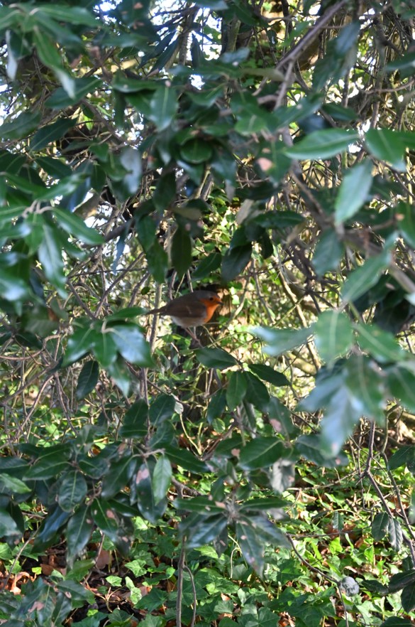
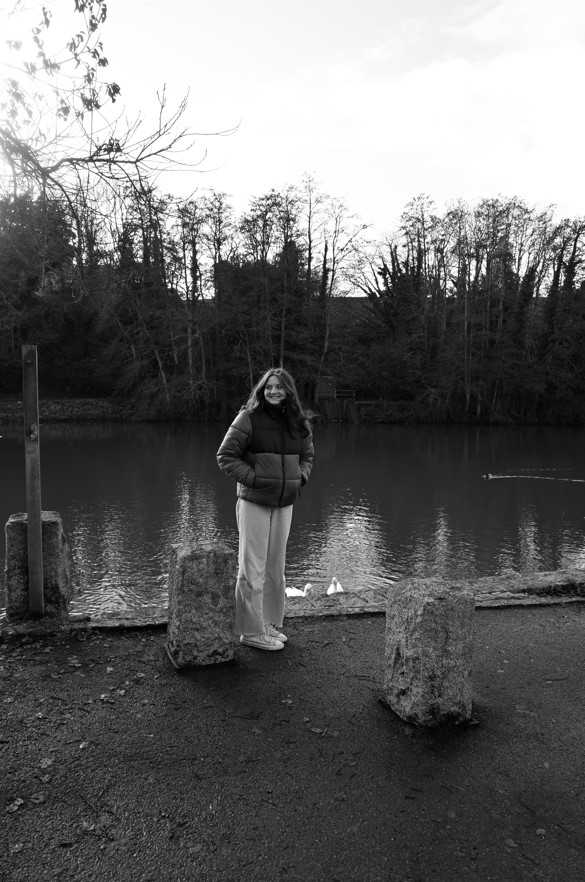
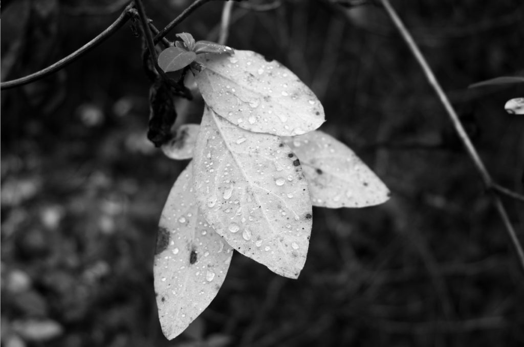
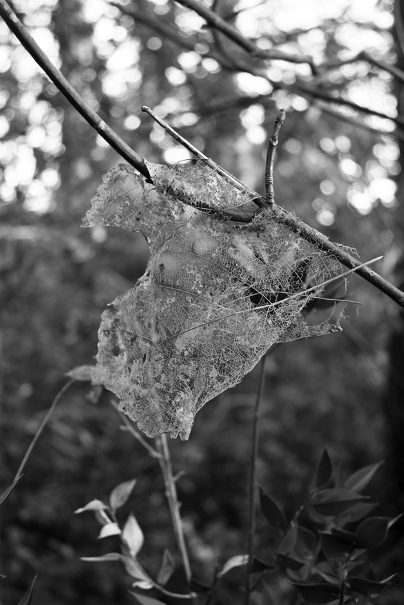
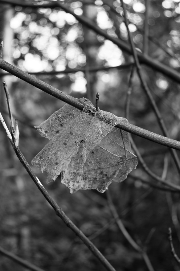
These are the images which I have selected to use, this is because the top and bottom sets of images that I have selected work well together as I have used them as pairs beforehand within my photobook. This is because they may be of same relation with what is in the photo, such as the bottom 2 photos of the leaves that are slowly decaying away naturally, or they may work well together due to their composition, this is seen in the top 2 images where the gaze of the person falls on to the small bird as if she is looking at it which I really like and wanted to carry throughout. The stand alone image is an image which I have chosen to use in my virtual gallery because I like how detailed the photo is, this is because you are able to see how the rain droplets fall on the leaf and I also like how the image is in black white, which will create a contrast within the virtual gallery as the warm, neutral tones will contrast against the cold, darker of the image.
Placement –
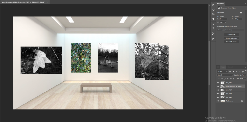
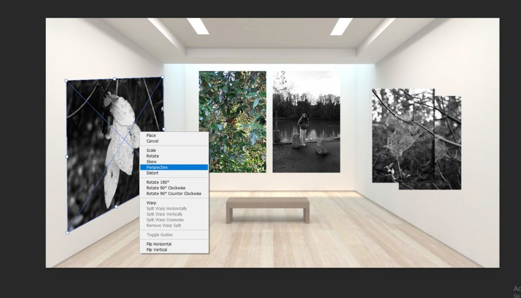
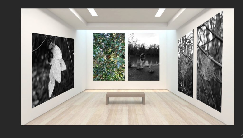
To begin the process of deciding the placement of my images, I strated ny opening the gallery file and beginning to input the photos which I had previously selected in to the file and placing them in areas whee I thought that they would wprk well. I chose to hvae the main set of images with the bird and the perosn in the middle of the gallery as iot had colour in it which would draw your attention towards the photo. Then I decided to put the other set of images on the right side and place them in the order of which they appear i my photobook, this is because I think that it creates a nice flow within my work. Then for the last image I decided to put it on the left side and make it lar
Adding a drop shadow –
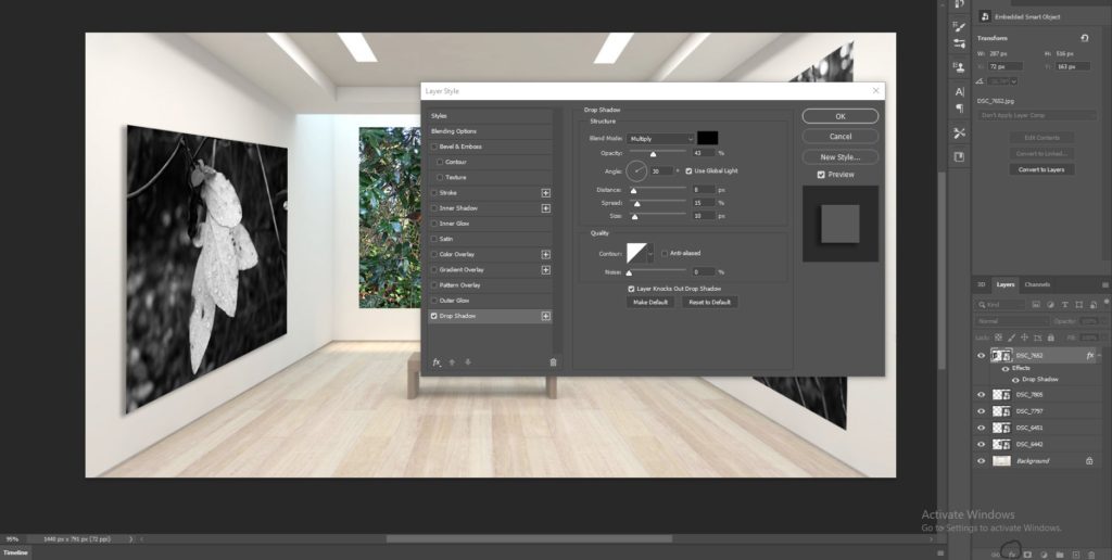
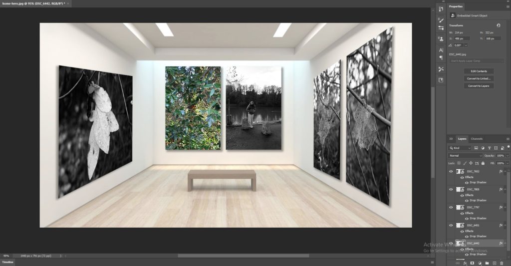
To add a layer of realism towards my photos to create my virtual gallery, I decided to add a drop shadow on to each of my images. I did this through selecting the layer that the image is on and the choosing the ‘fx’ tool which provided me with a menu of options which I could use to create a drop shadow. I then altered the opacity, how far out I wanted the shadow to spread, etc and this made these images look as if the light was falling on to them and making a shadow underneath them. I really liked this effect because I think that it makes the images seem as if they really are mounted on to the walls which makes them more realistic.
Final outcome/evaluation –
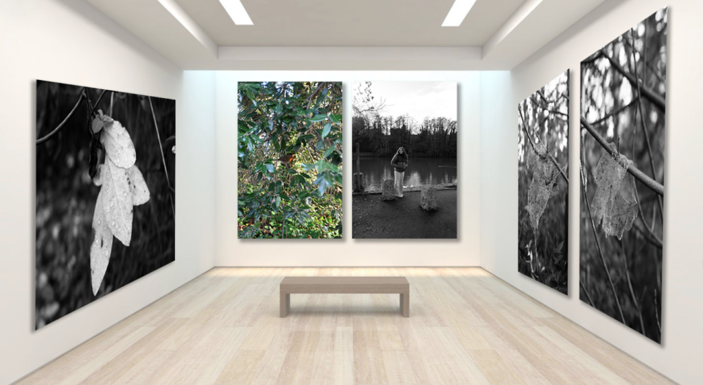
This is my final outcome of my virtual gallery which I have created on photoshop, I really liked how this turned out because I think that it represents the tranquil and simplistic side of nature and how the different formations, such as raindrops on leaves or the way a decaying leaf wraps itself around a branch, are unique and always so varied in how they are formed. The process to create the virtual gallery was tedious to begin with but became easier once I got the hang of it, and then it became quite easy and quick to do as I repeated the process of placing the images, adjusting their perspectives, and adding a drop shadow. I think that the blank gallery file with a small bench in the middle made it look quite realistic and this is why I chose to use it. This is because I think that it was good in the way that it compliments the photos which I have used. This is because the walls are plain and white and this makes the darker colours of the 4 black and white photos stand out well along with the photo of the bird which breaks up the darkness of the images and creates a break between them, which I really like.
