Editing –
Black and white –
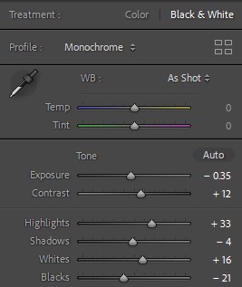
To begin the process of creating my photobook, I wanted to experiment with turning all of the photos which I had selected into black and white. This is because there was a lot of different colours and tones in each photos where they were quite strong in colour, or neutral based tones. By turning them into black and white it made them appear to be all similar, which I liked as it gave it a ‘uniformed’ effect and the different tones/colours which were present previously were now controlled.
Examples –
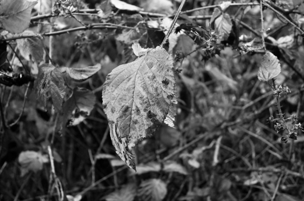
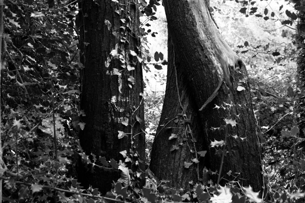
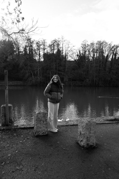
Here are some examples of images which I changed into black and white, for the first two images I found that I had preferred them when they were in colour as they had distinct colours in them which I thought brought the photos to life. This made me go through my photos once again and analyse which ones I thought were best to keep in colour and this added a variety into my work that I really like.
Final images –
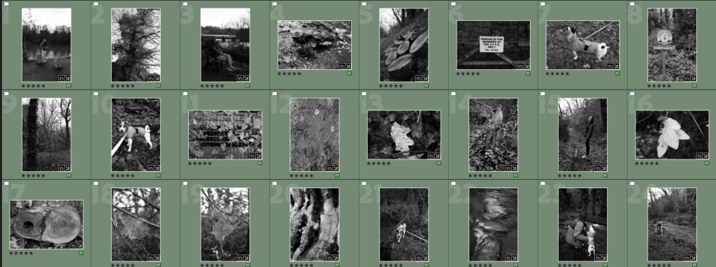
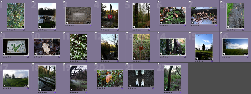
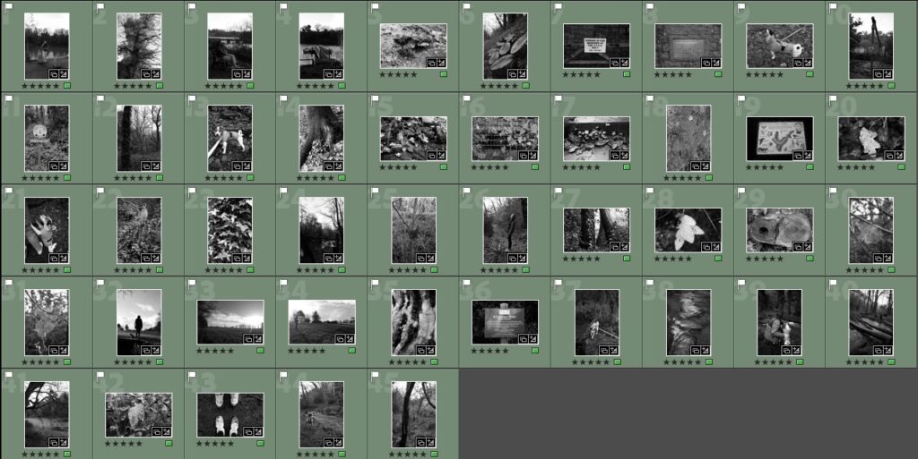
Here is the final set of images which I have decided to use to create my photobook in Lightroom. There is a variety of black and white photos as well as coloured photos. The reason why I have chosen to do this is because the images where there are a lot of different colours/tones in them made the presentation of the images together look messy and unorganised, such as of trees or people. This is compared to the photos which I have decided to keep in colour, such as landscapes or close ups, these photos are ones that I have decided look better in colour to add a range of images into my work and break up the uniformed look of my photobook. I really liked the idea of having the use of black and white photos as well as colour because I think that it adds a layer of creativity into my work where the surroundings look plain but the images which are in colour reveal what it actually looks like and the bright, unique and colourful tones which can be found in all of the places which I have explored and how nature can form beautiful formations and colours that many of us do not appreciate.
Designing the layout –
Sequencing –
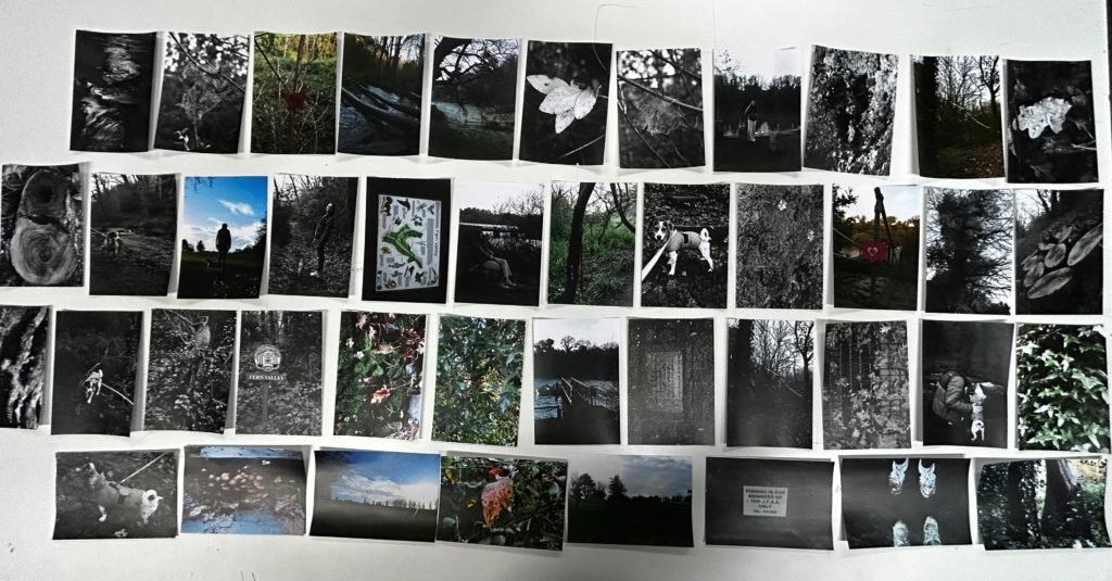
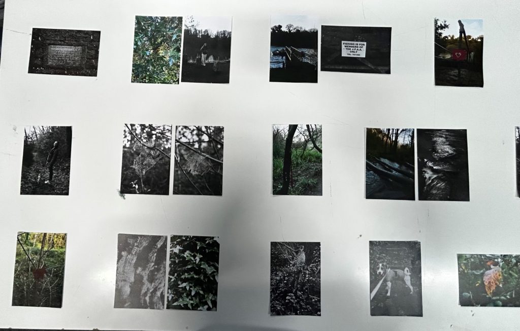
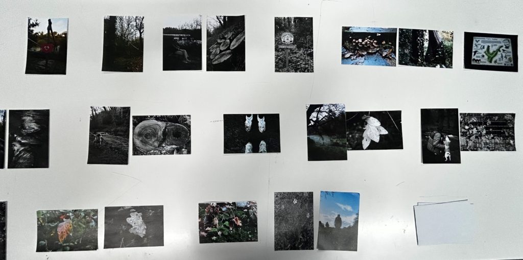
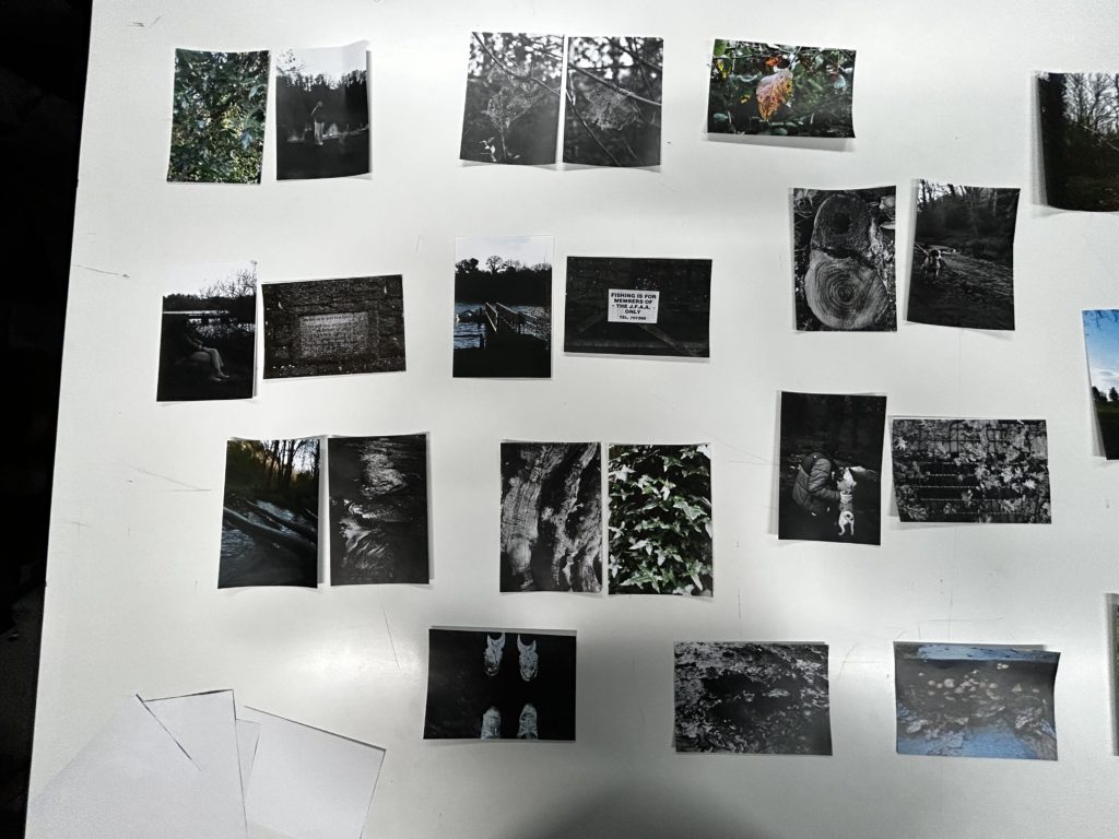
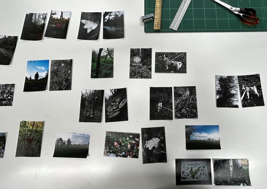
To begin the process of creating my photobook, I printed out my images into 9x13cm photos and laid them all out on the table. This made it easier for me to effectively organise how I wanted my images to look in my photobook as I could group or pair them up easily with each other and decide which ones I wanted to keep as standalones. How I decided which ones I wanted to pair together was through pictures that I thought looked as if they were a pair, such as; a fishing boat and a sign about fishing or a photo of a person who’s gaze looks as if she is looking at a picture of a bird.
Layout in Lightroom –
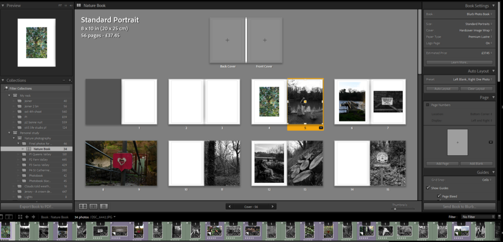
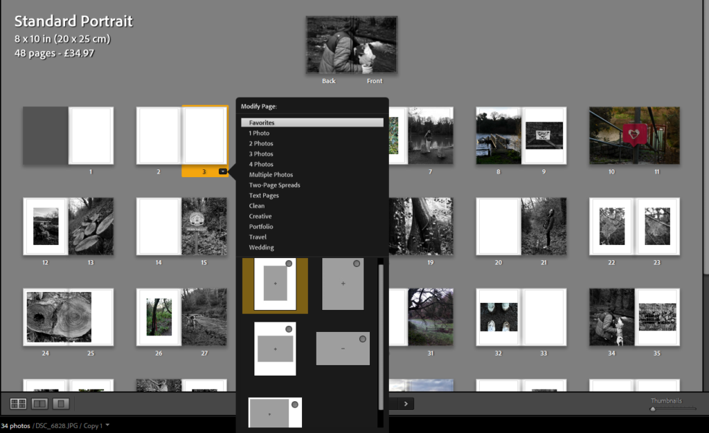
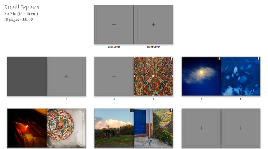
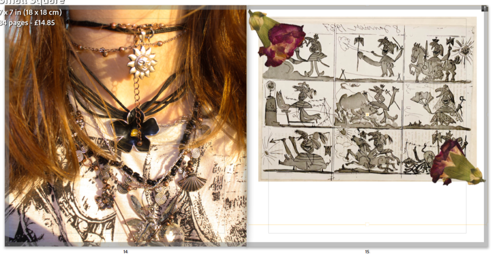
To keep a secure and tidy flow throughout my photobook, I made sure that I kept to using around 4/5 of the same page spreads that I would alternate between throughout my photobook, these were:
- An portrait image on a page with a large white border.
- A landscape full page spread.
- A landscape image on a page with a white border.
- A portrait full page spread.
- A 3/4 page spread.
Reoccurring layouts for page spreads that I have used –
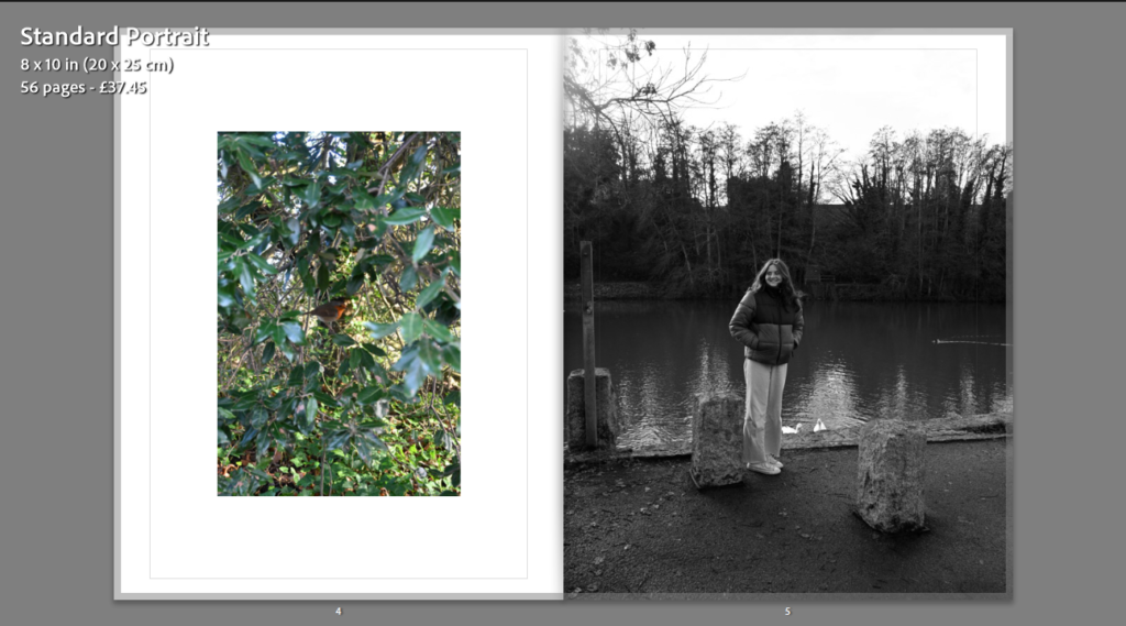
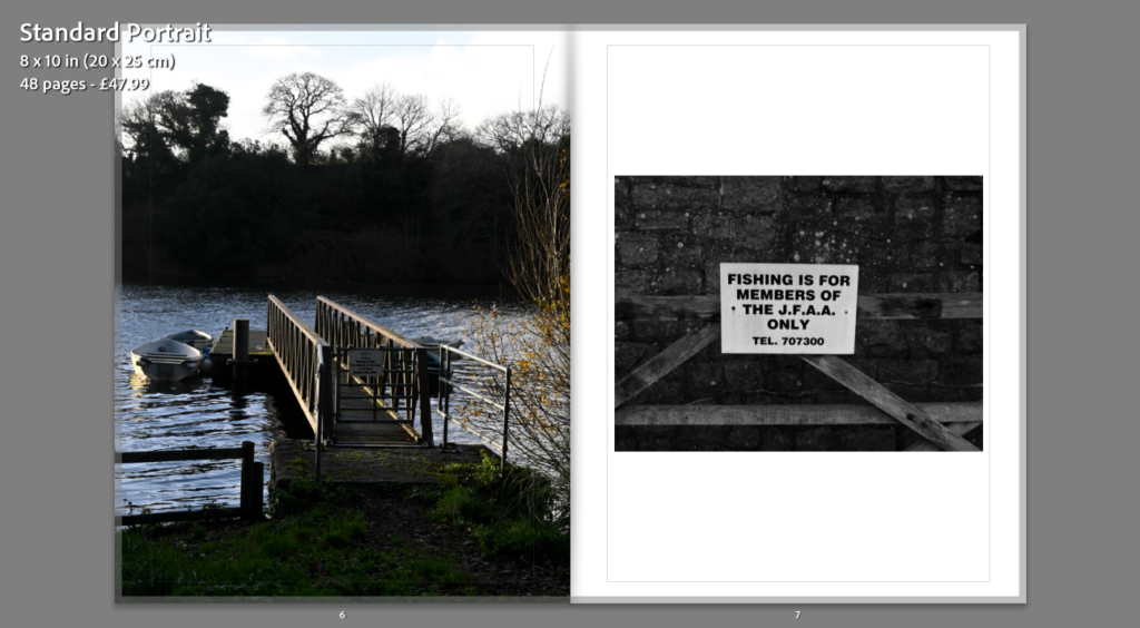
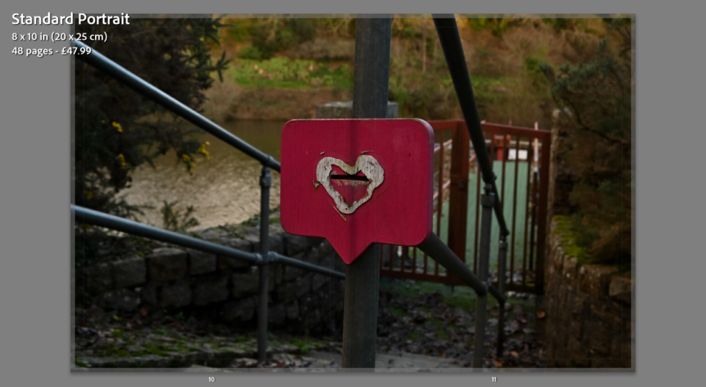
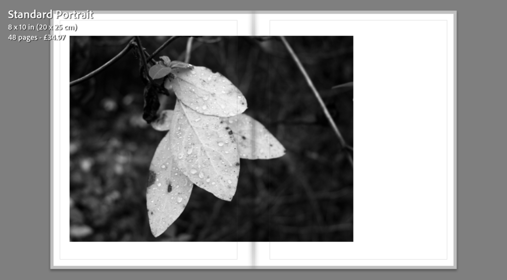
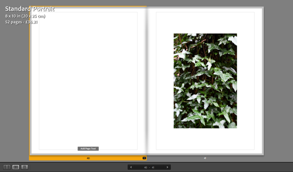
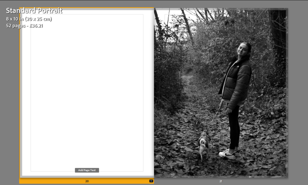
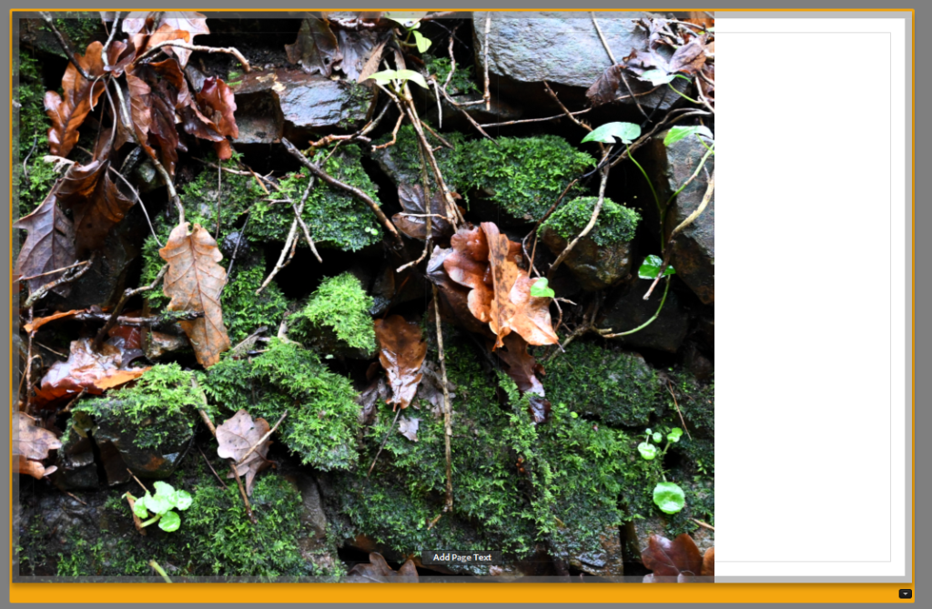
I was really happy with the layout and placements of these spreads which I used within my photobook as I repeated them all 2-4 times to create a steady flow throughout of image placement in my photobook, this is because it makes my work look more organised in the layout which is better than having a lot of different spread designs which makes it looks messy.
Title experiments –
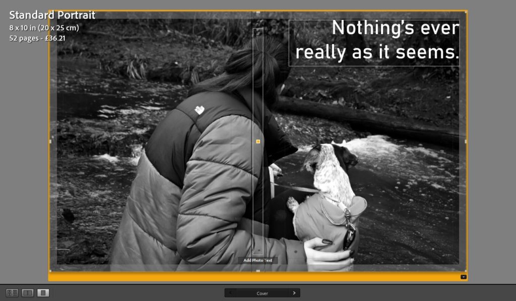
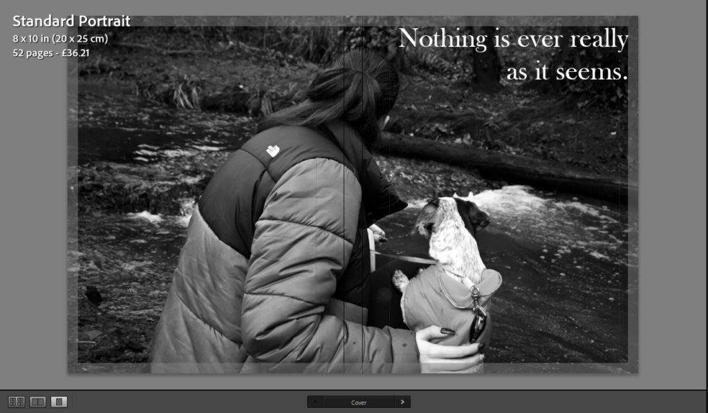
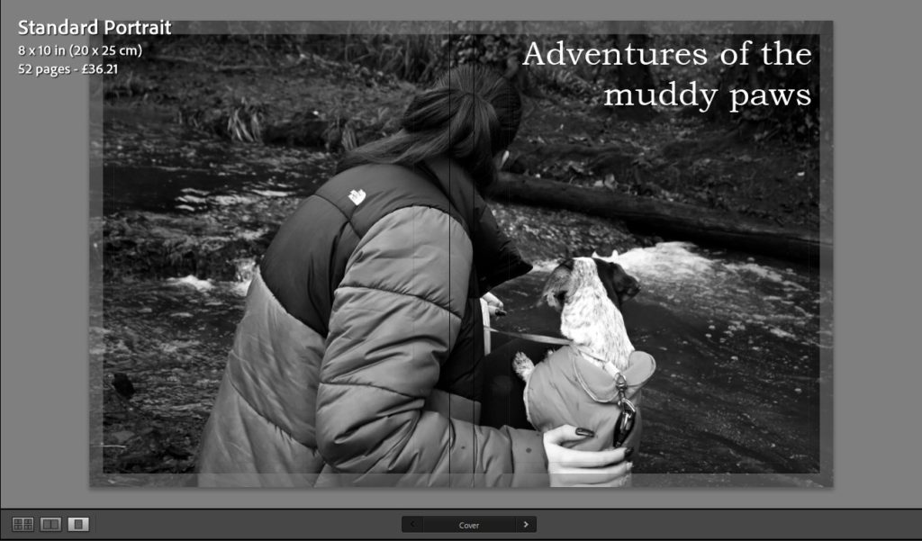
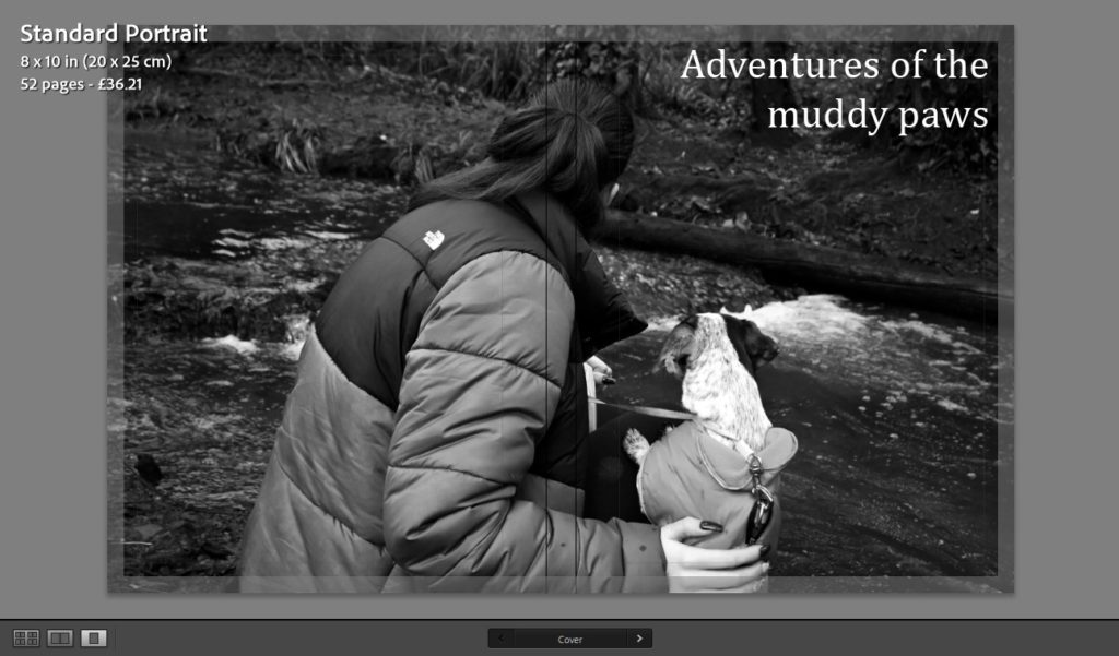
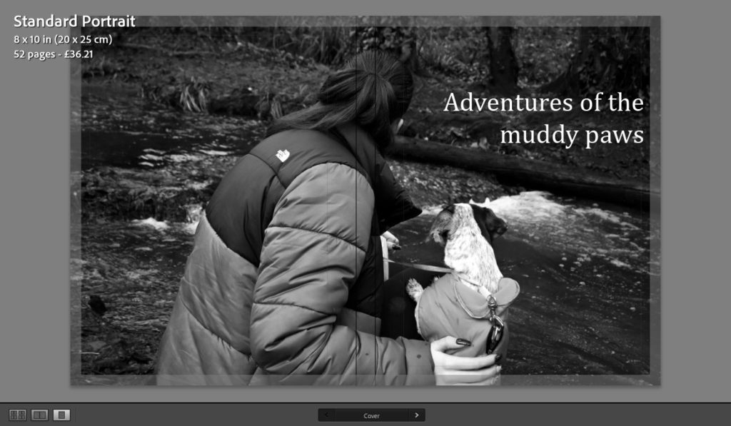
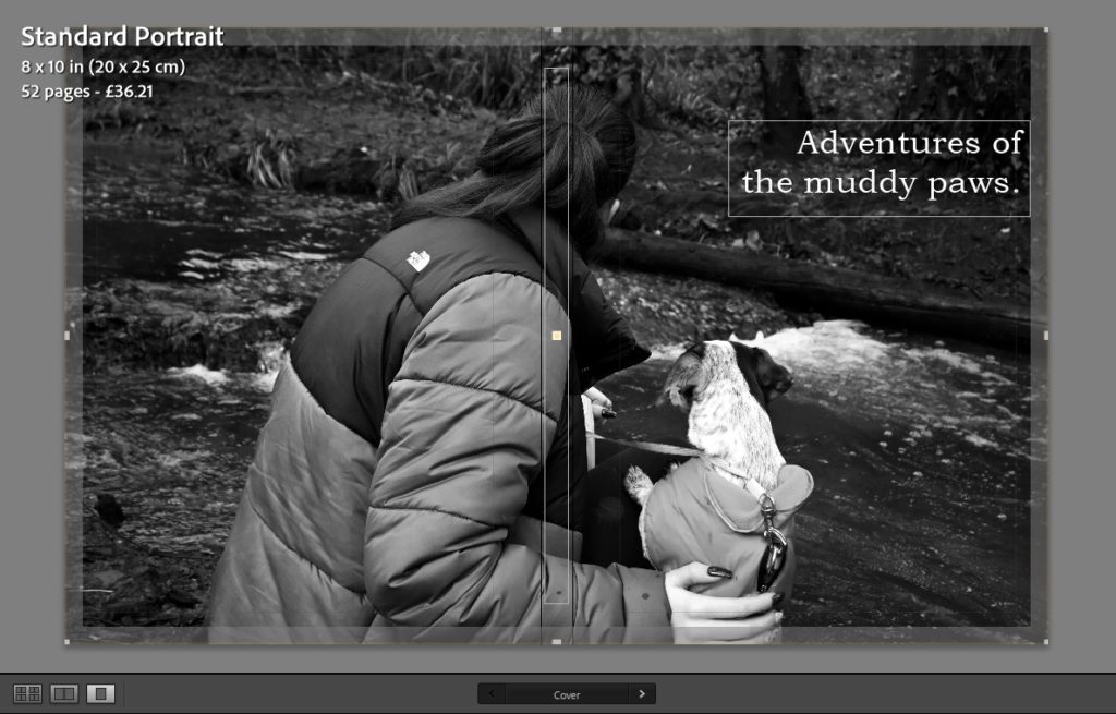
These are my title experiments which I was experimenting with for my photobook, I changed the placement and font’s which I used to help me decide. I began with; “Nothing’s ever as it seems”/”Noting is ever as it seems” which related to not knowing what nature is really like and how unexpectedly unique it can be where I placed it in the top right corner as there was not a lot in the photo going on there to distract yourself from the title. Then I used the title “Adventures of the muddy paws” which related towards my dog, who is featured throughout my photobook, and how her muddy paw mark is seen on my sisters leggings within the photo as my dog is discovering new places where she has never been before in Jersey. The placement of this title I kept in the same place as the previous one to begin with, but I didn’t really like this so I decided to move it down a little bit and alter how it is perceived by changing the font’s size below and moving the placement of the letters so that the top line said ‘Adventures of the’ and the bottom line says ‘muddy paws’ to separate it which helps you to recognise the subject of the photobook.
Finally, I decided that I was not sure on any of the front cover titles which I had thought of, due to not being sure on a front cover picture as well as I kept changing it, so I decided to name it “Everyday is an adventure.”. I really like this title because I think that it represents that my photobook is about showing how beautiful and unique the natural landscape/weather can be and how the weather can completely alter how a landscape is seen whether it be sunny, rainy, windy, etc.
Front cover experiments –
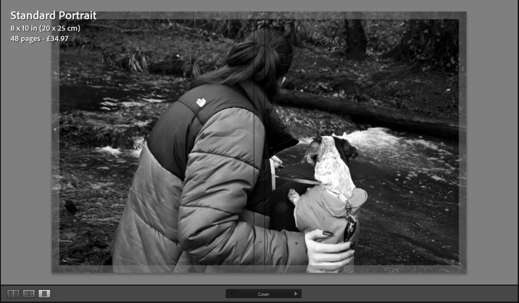
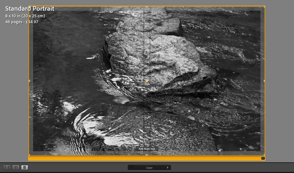
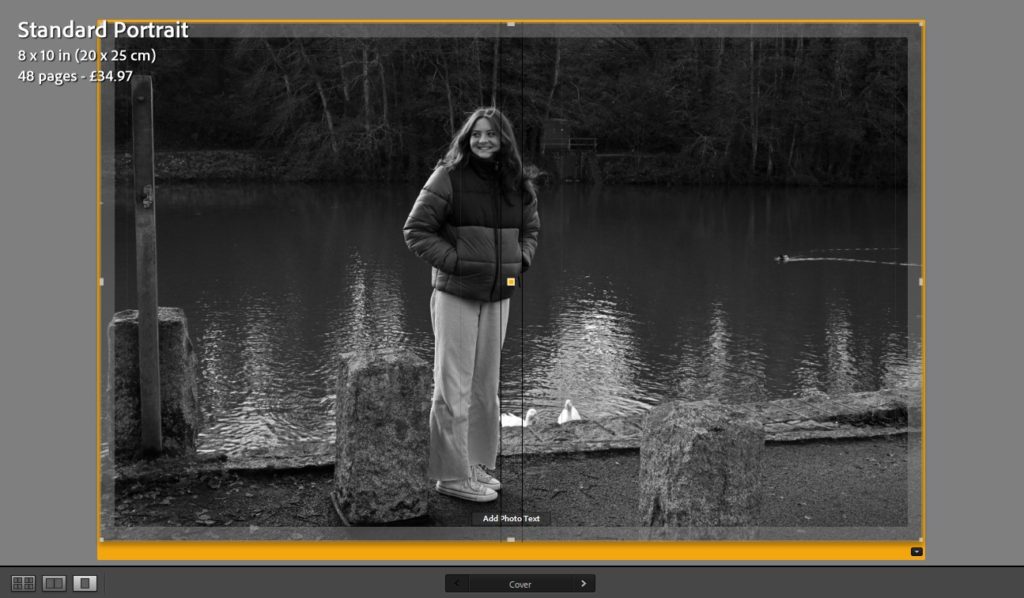
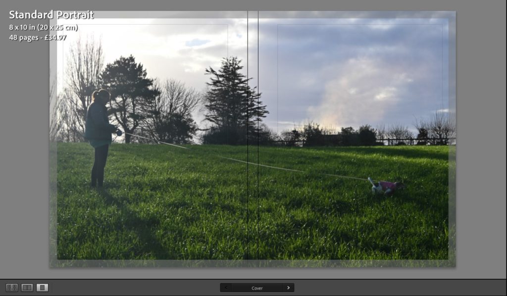
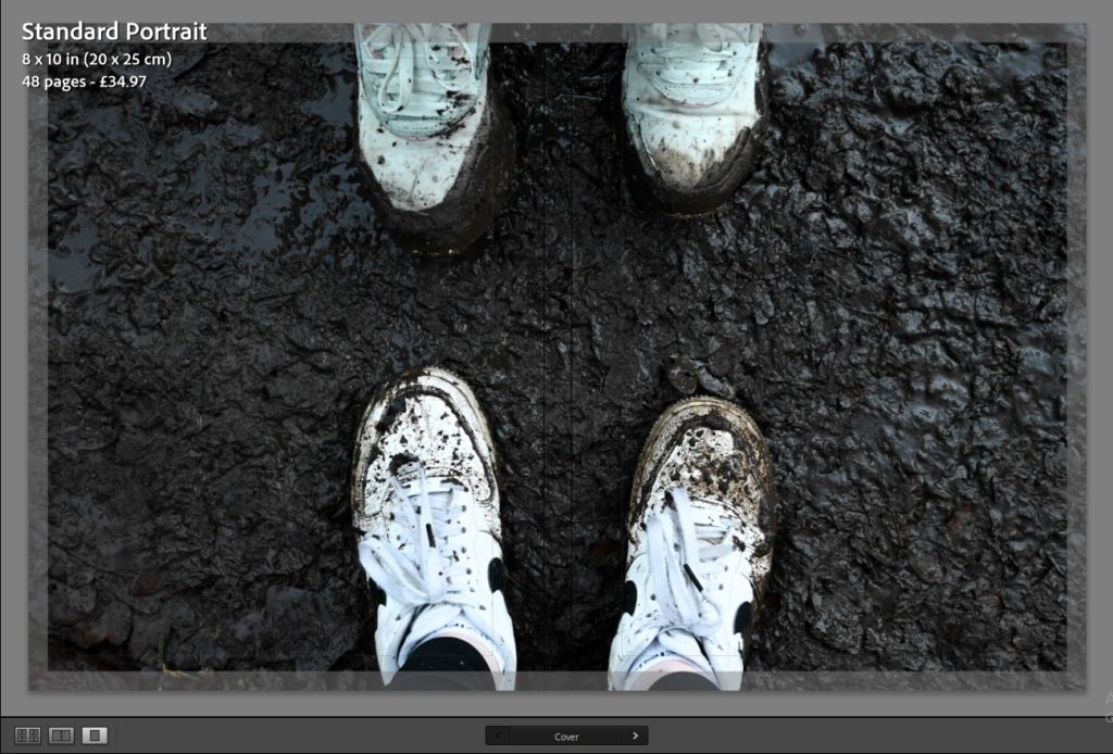
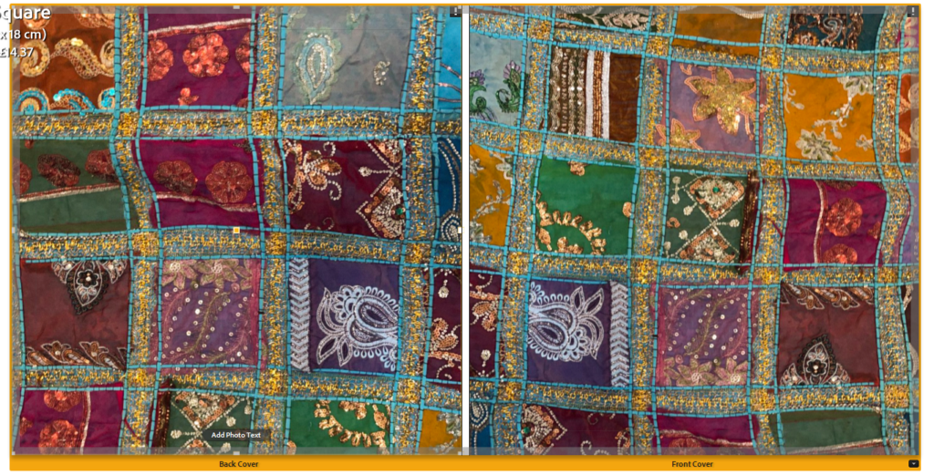
After deciding on the title “Everyday is an adventure.”, I decided that I did not want to use a picture which I had taken for my front cover, seen by the 5 different options that I had chosen to use as options above. Therefore, I decided that I wanted my photobook cover to be primarily plain in a green colour with an extra detail in the middle of the page that represents nature, the primary theme of my photobook, this is where I began a process in photoshop with deciding what to use..
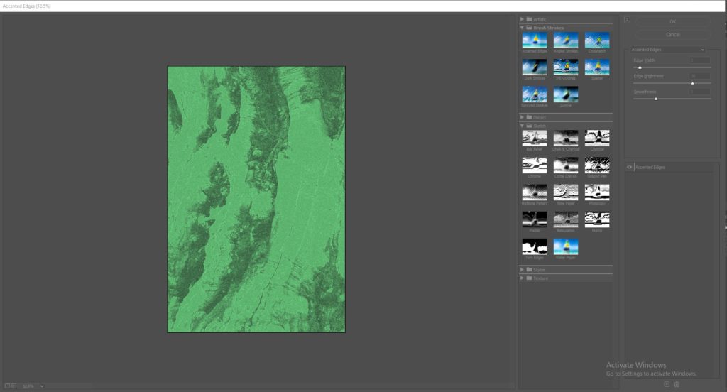
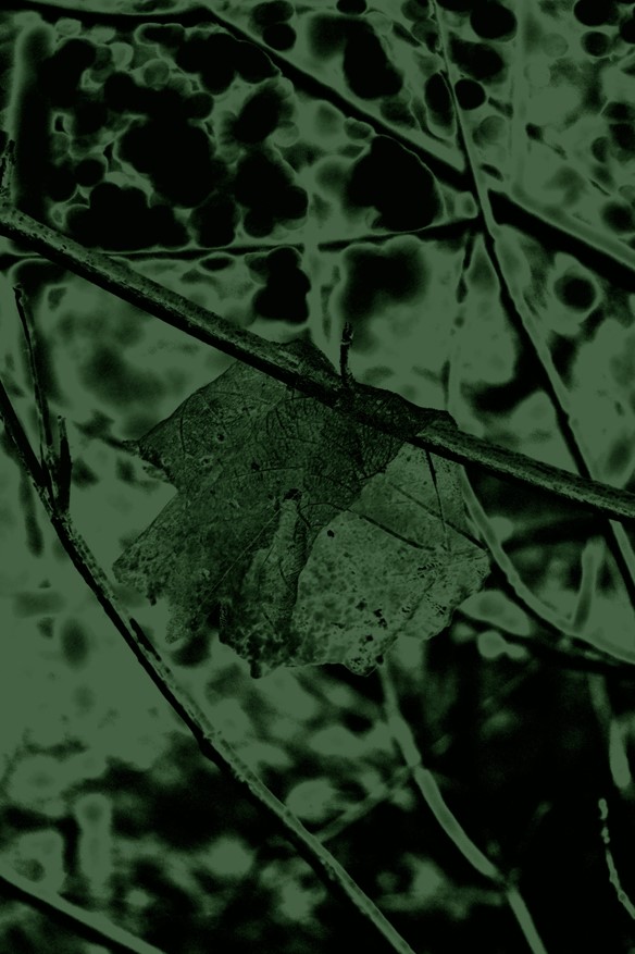
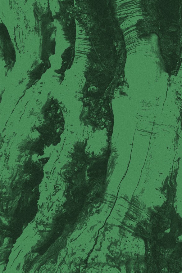
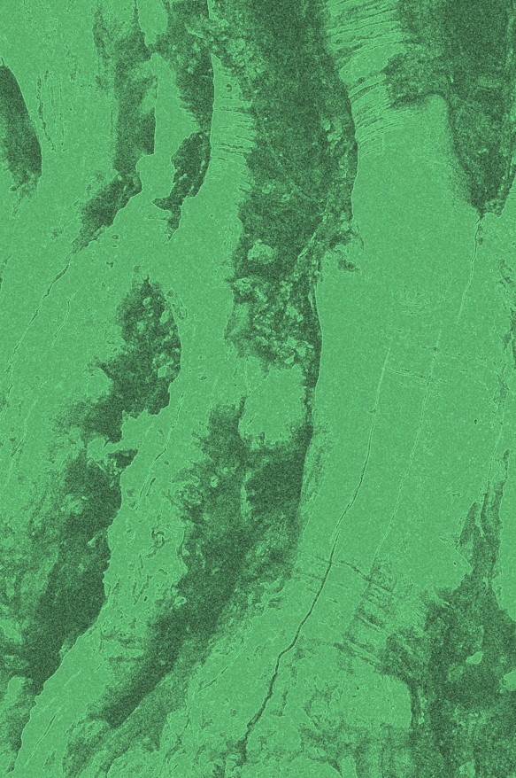
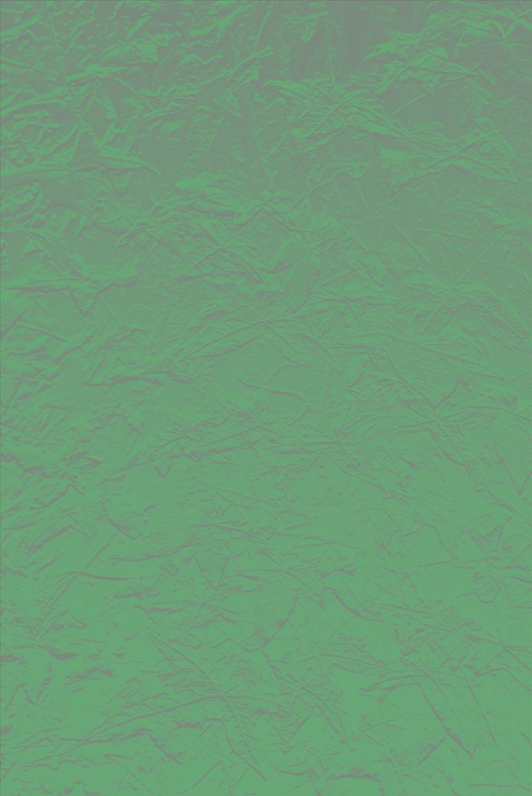
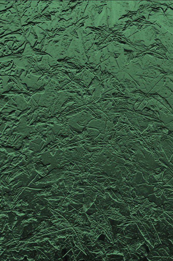
For this process of creating a front cover, I began by bringing my images which I wanted to experiment with into photoshop. To decide on what photos I wanted to use, I began by choosing images which were of different textures and could ne seen as quite abstract in how they appear. Then I brought in a duplicate layer, just in case I did not like the design I had decided, and another layer which I would colour in with a different shades of green to decide on what looked best. I ended up choosing a picture of some leaves which I had done a close up photo of and using a darker green colour. Then I selected the ‘filter gallery option’ which brought up a selection of experimentations of different textures that completely transformed the original photo. The image which I decided to use is the last image which you can see above, I chose this design and colour because I thought that they both work well with another, this is because the filter which I had selected to use looks as if it has a shine on it, and the leaves outline can still be seen very subtly which I really like because it shows nature yet in a way you might not expect.

