Virtual gallery link: https://www.artsteps.com/view/6364da4f84fb1fe866c22cc1/?currentUser

Gallery evaluation:
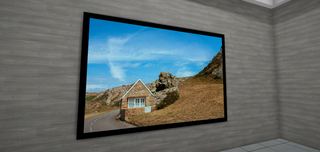
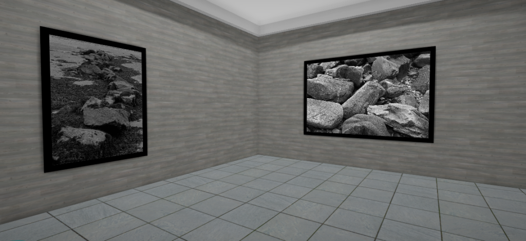
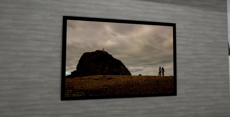
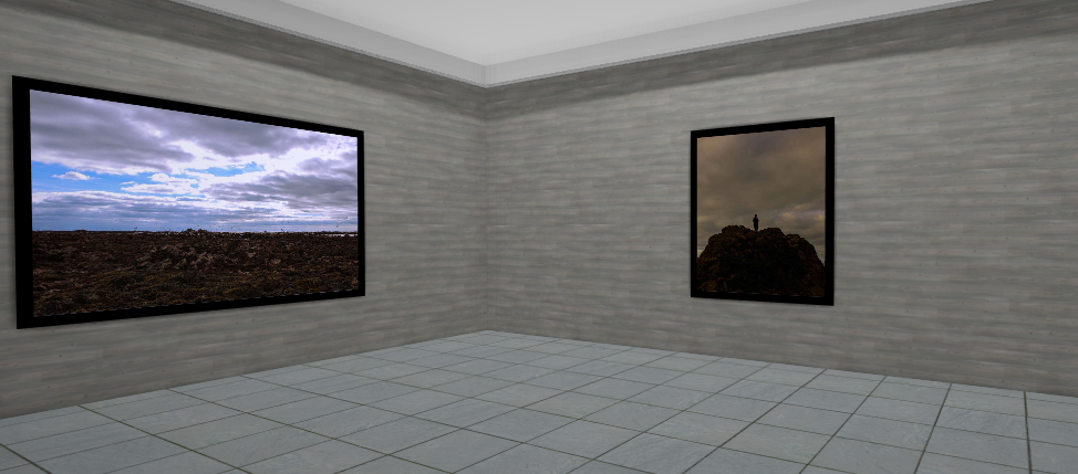
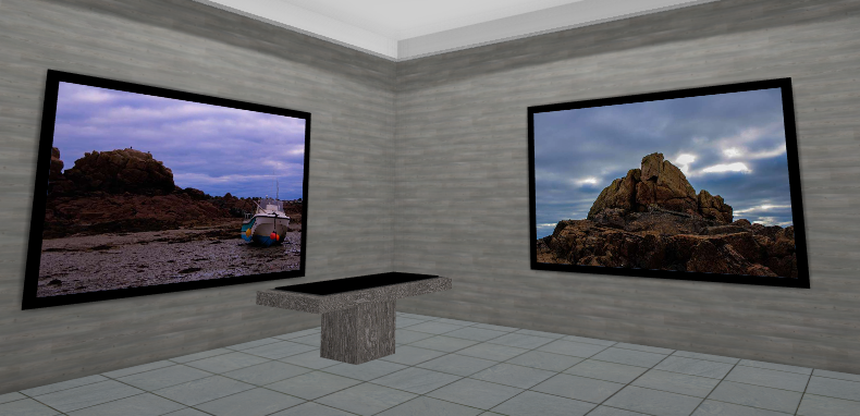
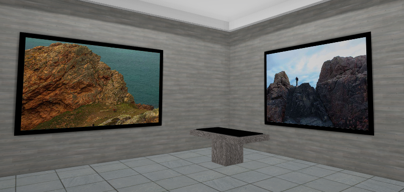
Overall, I think my gallery was produced with a good layout. I like the way the black frames mix in with the colour of the rocks and creates a contrast. I think the three photos of La Hocq tower shows a great sequence whilst contrasting against each other.
