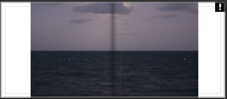
While starting to make my photobook I decided I wanted to make it slightly smaller and into more of a photo zine as I had been focusing on specific photoshoots and edits. A theme in my book is showing coastal points in jersey before and after the tide changed, as well as capturing the horizon over the coast.


I tried to keep the first 4 pages in a similar style in order for them to flow off of each other – but I included 1 variation to keep it interesting to look at
The last photo contrasts the first 3, however, upon turning the page it links into the following photo as the tide appears to “rise” under your hand.

This part of the zine is where I introduce my edits, however I decided to change the bottom 2 spreads around as it makes more sense for the images to flow into the sunset.


I decided to end with this photo as it completes the zine’s transition from daytime into night.
Final Layout

