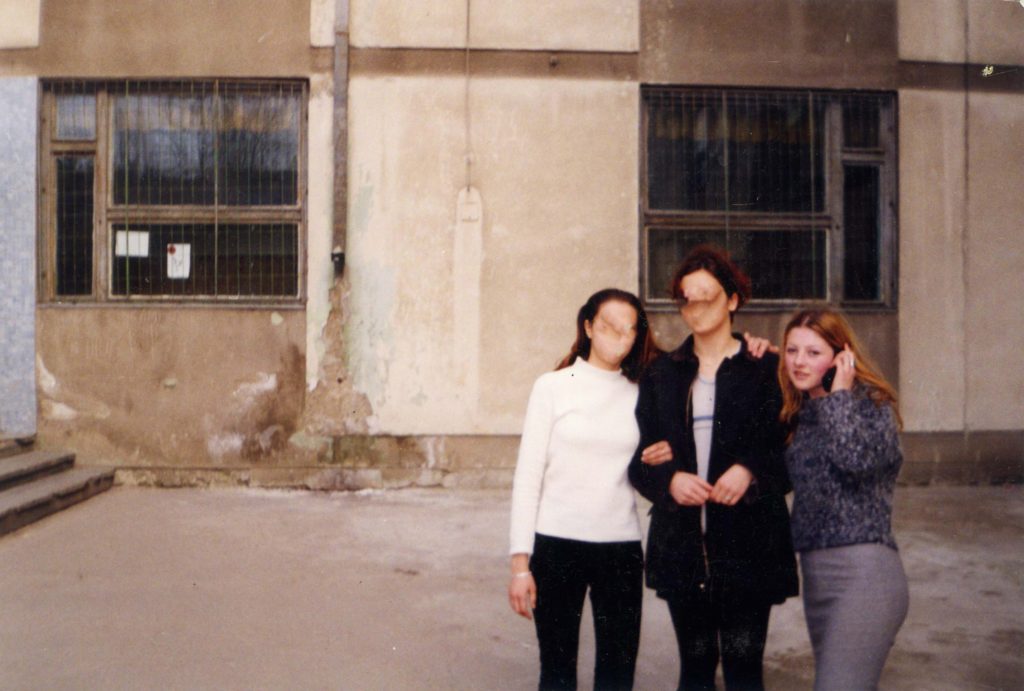
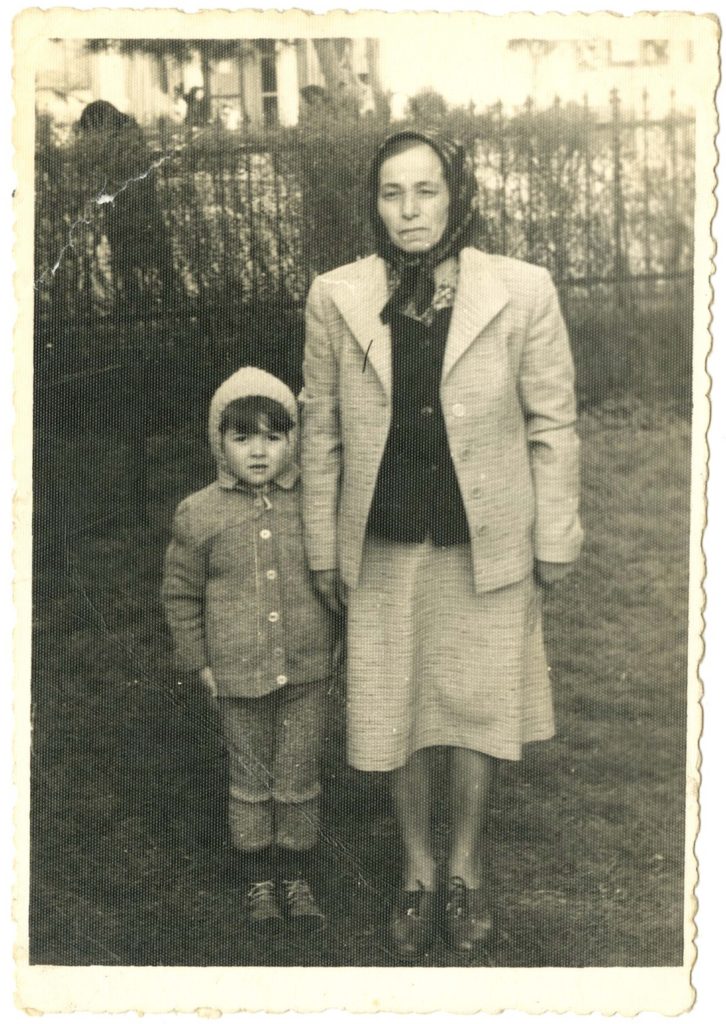
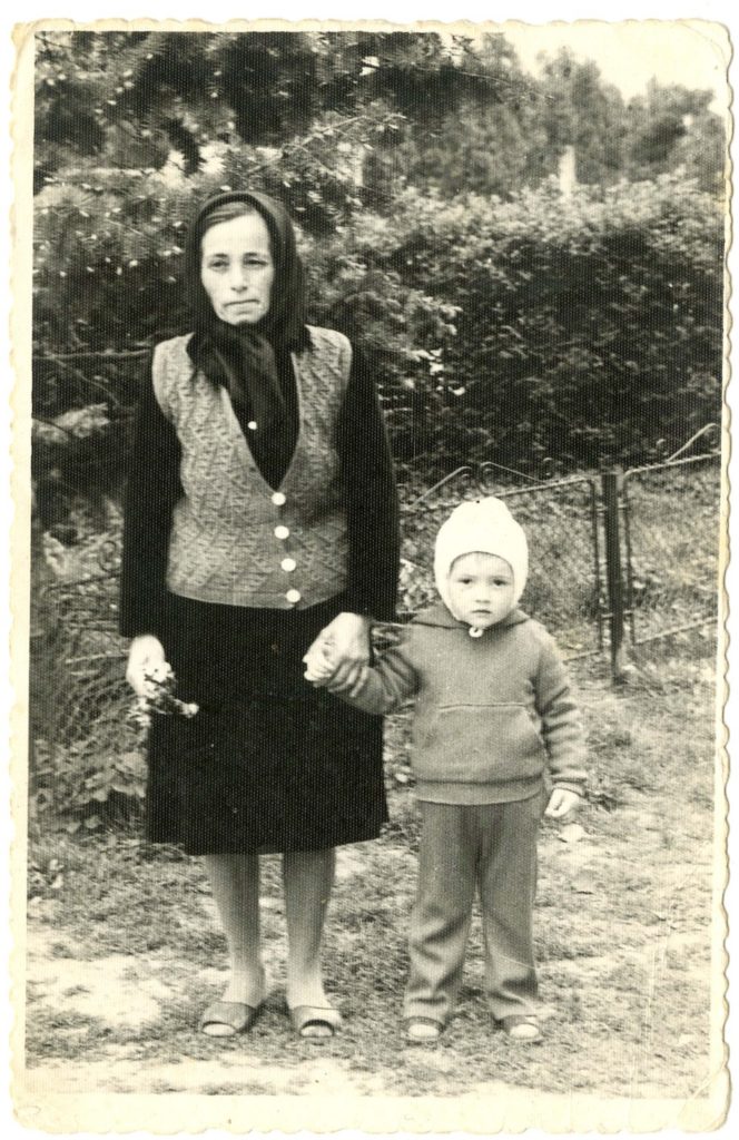
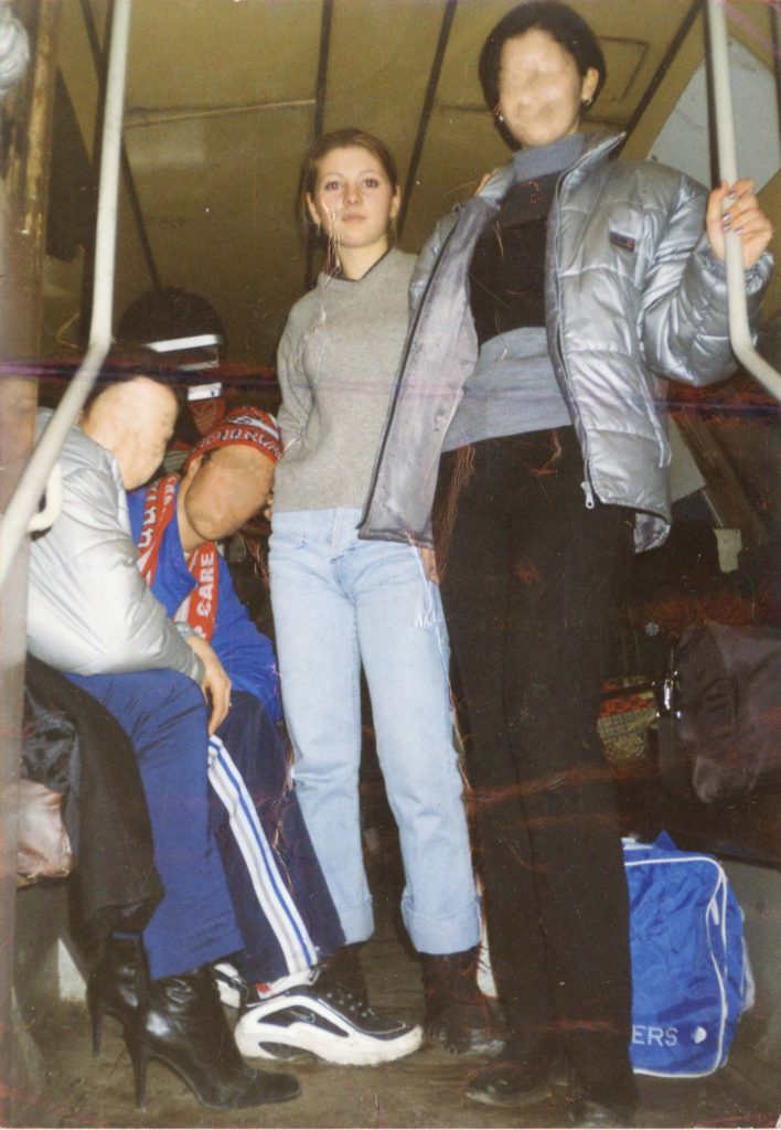
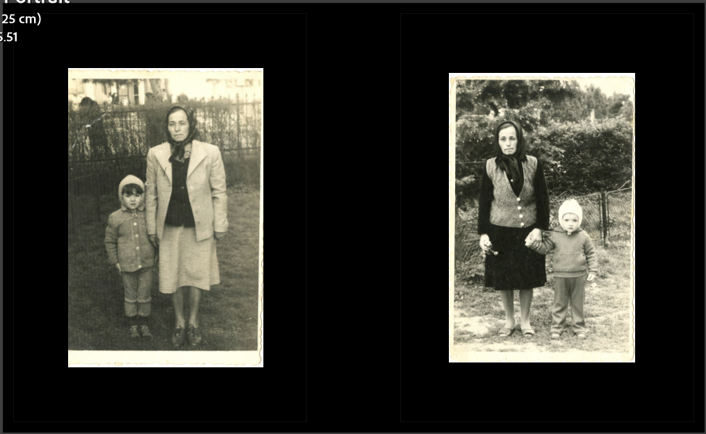
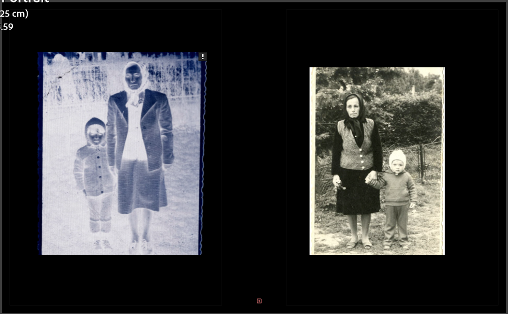
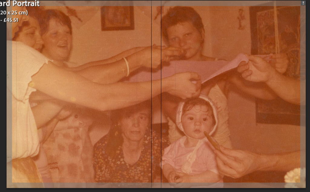
Archival Photos

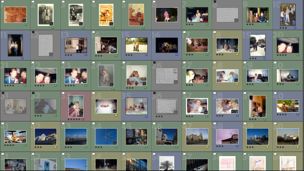
Contact Sheets

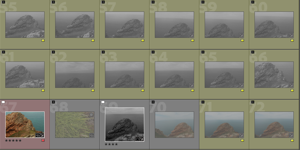
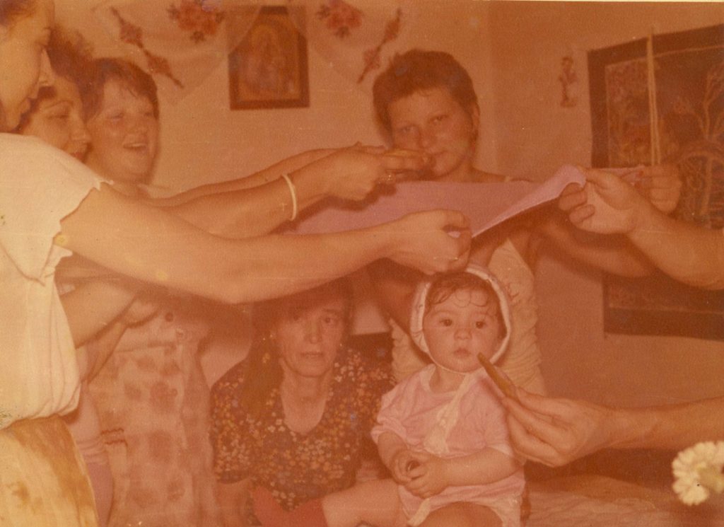
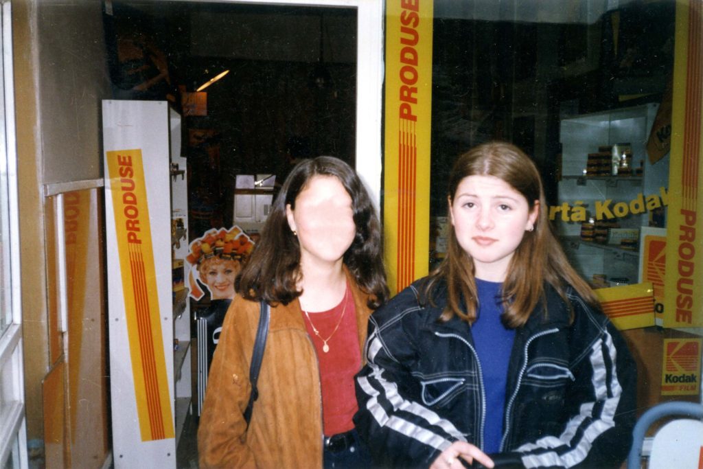
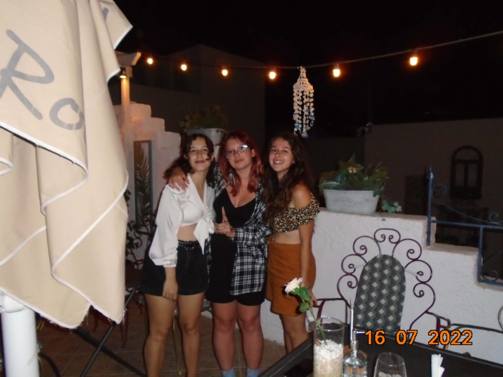
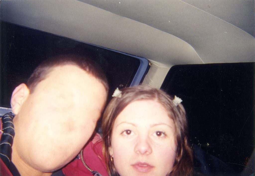
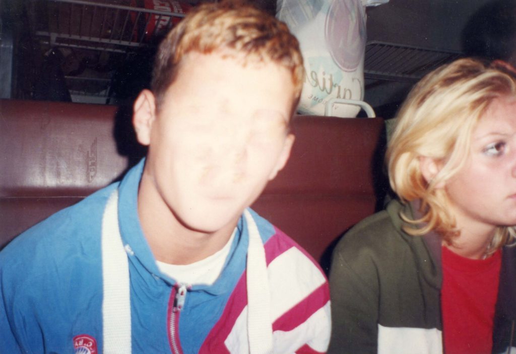
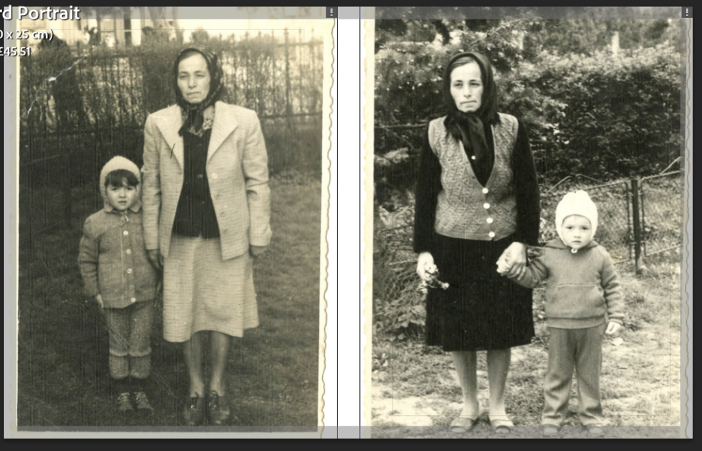
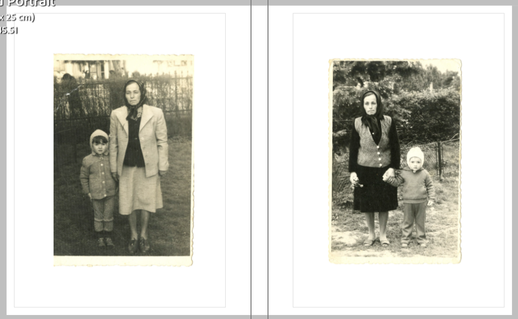
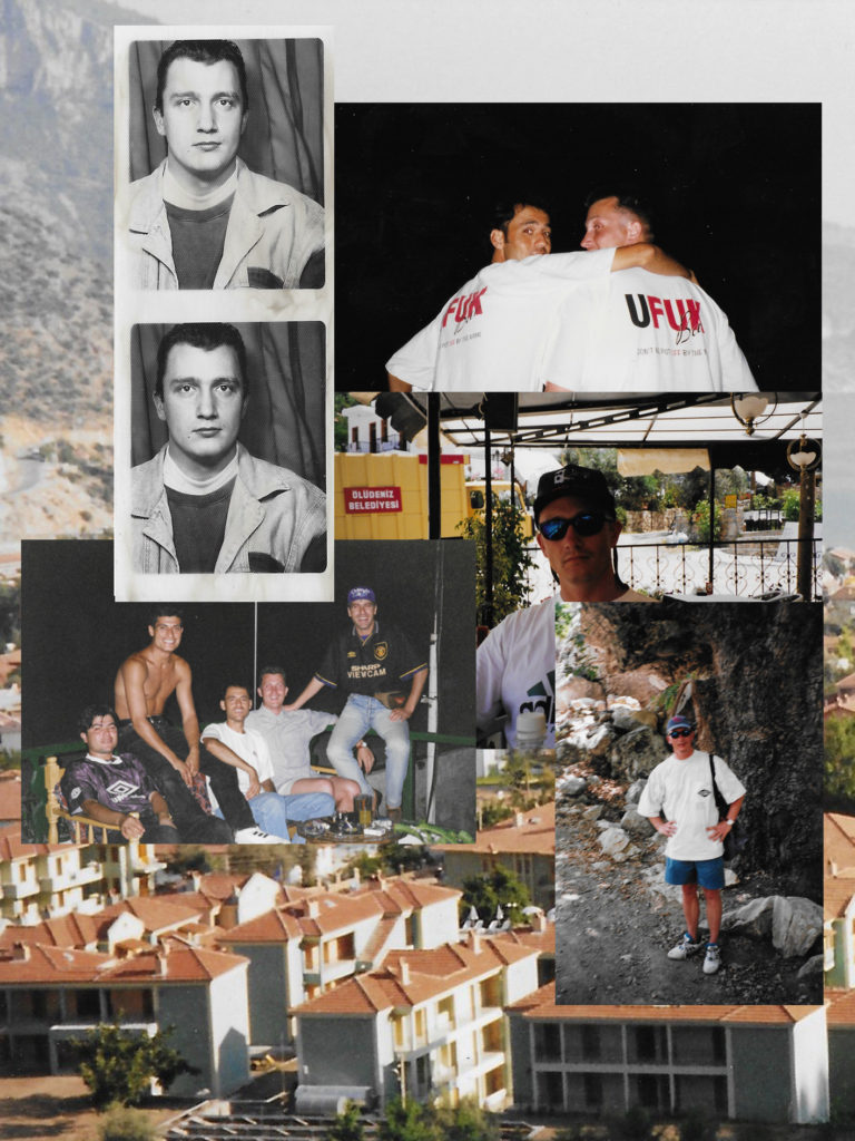
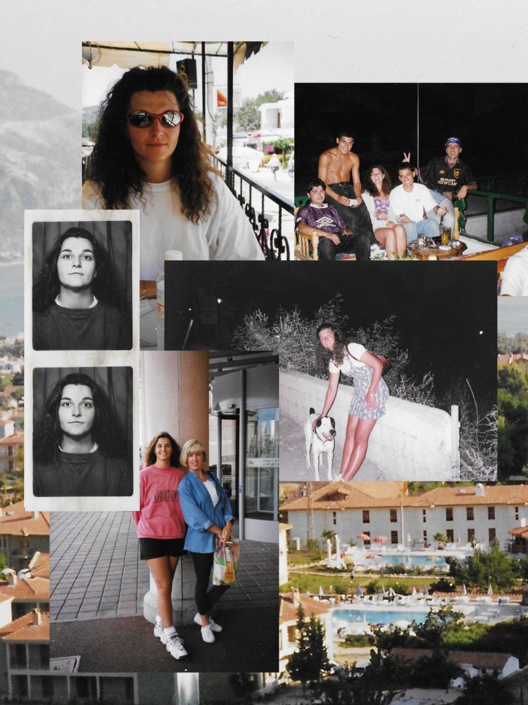
These are the contact sheets for my archival photos that I will be using throughout my photobook. I have picked images that represent both sides of my family and ones that show where they are connected through my parents. There are also photos that show family friends that my parents met when they came over to Jersey, these people have become my family and I think that this is a good way to show how the relationships have developed over time.
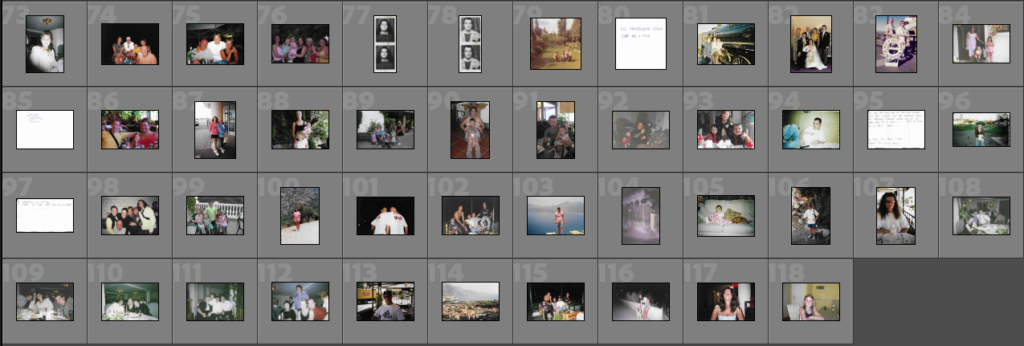
Selection

I would like to use all of my archival photos in my book but for some (yellow) I will try and include them in collages as I don’t feel that they have the best quality or I don’t want them to be displayed one a page of their own. The other images (green) are the photos that will hold meaning on their own as they show links between friends and family which is what I am trying to portray throughout this photobook. I have also excluded one photo as I have made the decision to put that as my front cover as it is one of my favourite images out o the collection.
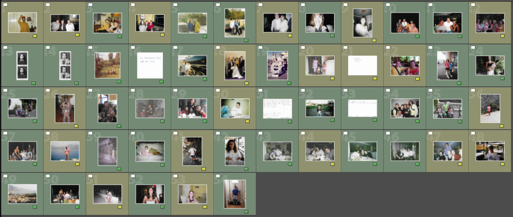
Collage Experimentation

For my cover and throughout the book I wish to use archival photos to experiment with to make different collages, below I will show some examples of me using different photos to play around with to eventually pick the one that I find the most fitting to be on my photobook.
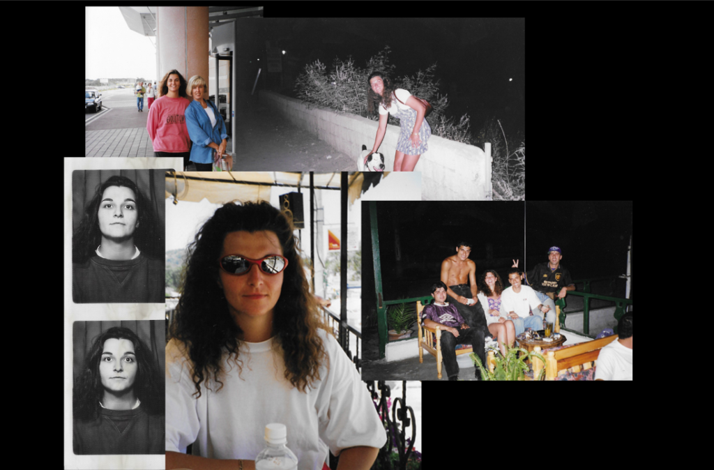
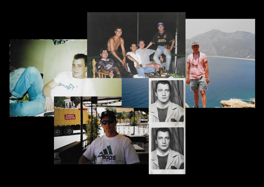
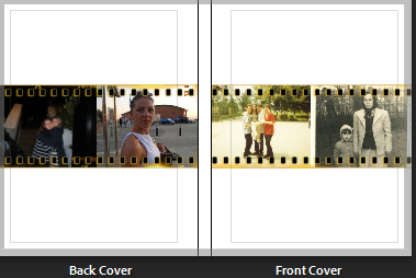
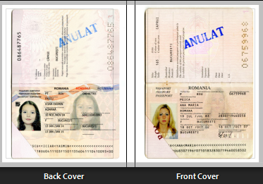
Above are my first experiments with making a collage, I did one for both my mum and dad as I wasn’t to have a collage for both the front and back cover of my photobook. I started by creating a black background for my photos to be one as I felt that it would be more fitting for the images that I wanted to use. I then took a few images that show each of my parents and moved them onto this background, I found that for my mums collage as I used a portrait photo instead of landscape it was harder to place as there wouldn’t be a boarder around all of my photographs. After finishing these experimentations I didn’t like how they turned out against the background, I feel that it is to plain and contrasts with the images that I used.

Below is my second experimentation, instead of using a plain background I decided to use one the archival images of a city in Turkey which my parents frequented for holidays. I used similar images to the ones in my first experiment but I feel that they look better with this background and it also holds more of a story as it was a place that they loved as well as complimenting the photographs used. I will be using these collages as my front and back cover as I feel that they will grab someone’s attention as well as keeping a structured narrative.
Photoshop Experimentation

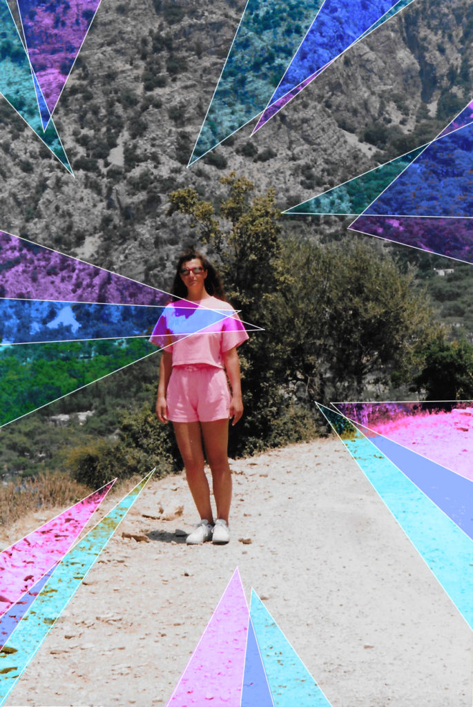
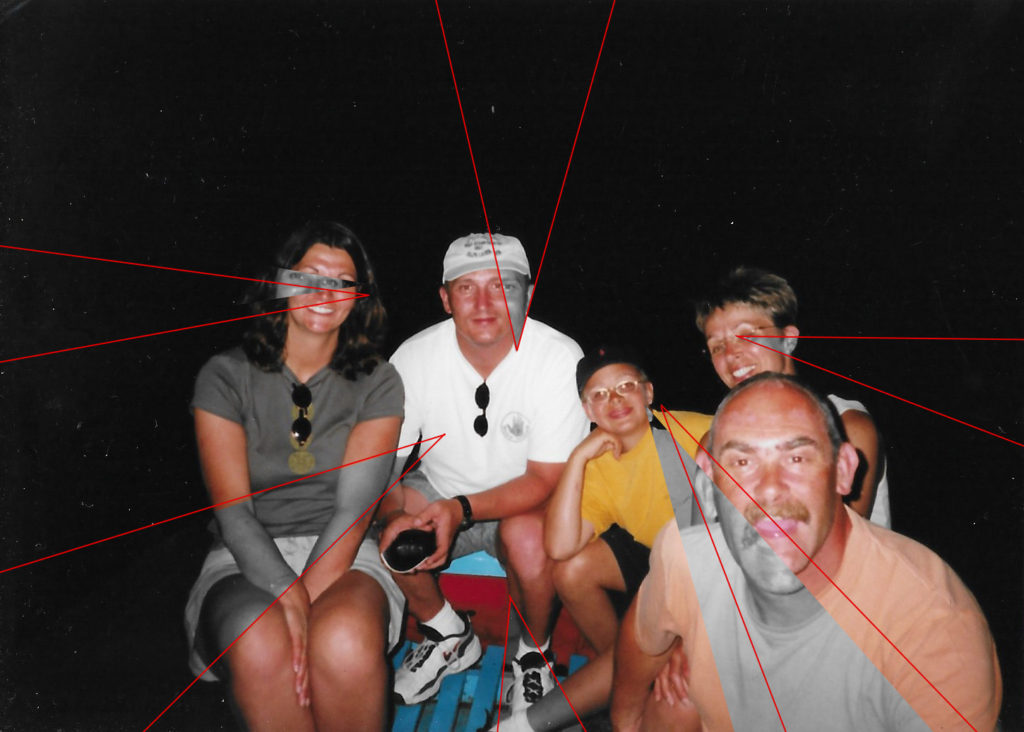
For my experimentation with photoshop I have used a few different techniques so achieve the results below. For the two portrait images I first used polygonal lasso tool to select the first layer of triangles around the photograph, I then went into adjustments and selected vibrance, this allowed be to increase both the saturation and vibrancy as this did not achieve the desired effect I also used the photo filter. This effect allowed be to chose a colour that can be adjusted whether I wanted it to be intense or mellow. I have also decided to use a gold metallic background to go with some of my images which I chose to pair with the line work.
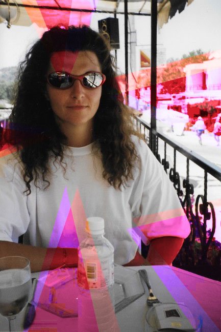
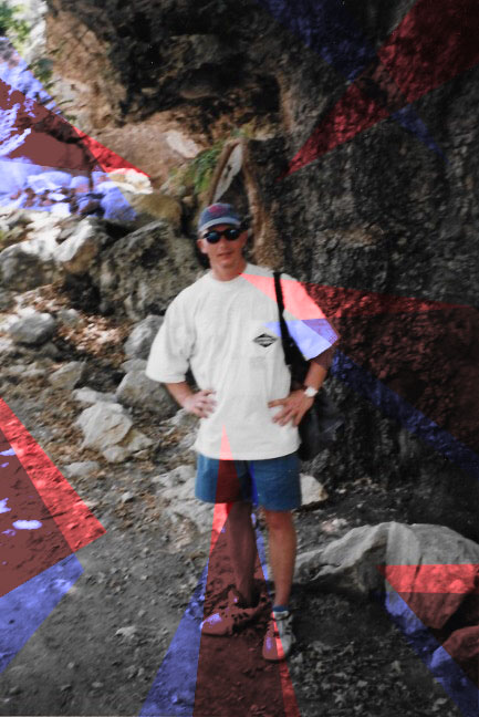
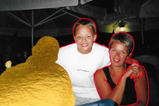
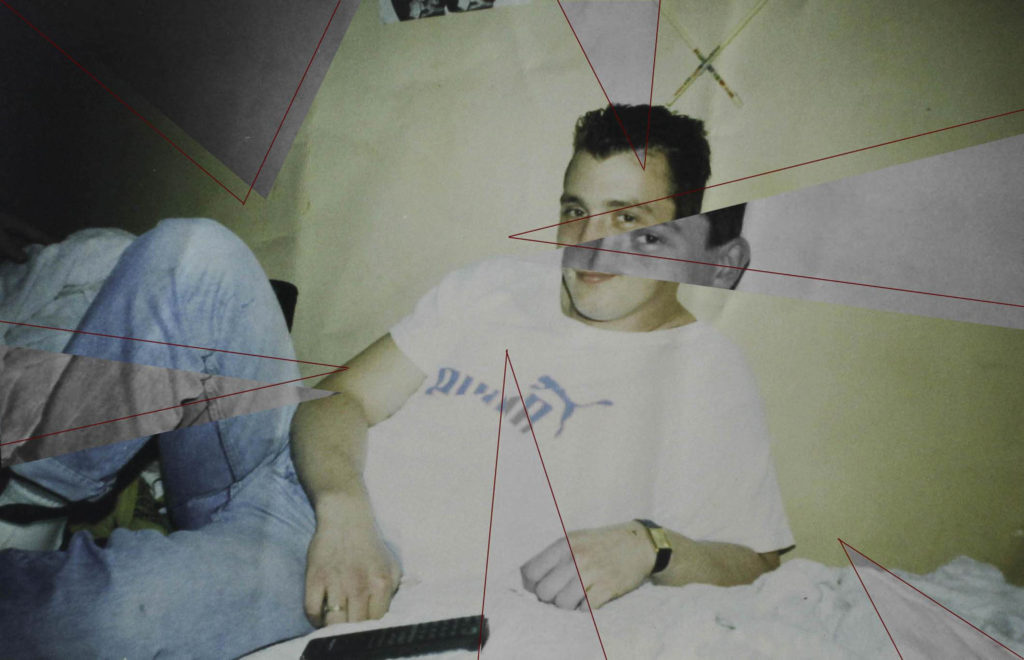
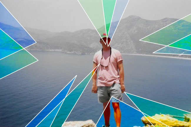
Above I have some of my landscape images that I will be using in my photobook, I have displayed two styles of editing hat I will be using throughout my book, my third image is editing the same as the portrait photographs above. For my first image I had layered the original image on top of a gold metallic background, I wanted to use gold as I felt that it complimented both the red and white line work which will be shown in my different manipulations. I will be using the gold as a layering tool or as a way to remove someone from the photo but still have their silhouette. I felt that the gold will hold a uplifting vibe to the photographs, to achieve the adaptation in the first photo I used the polygonal lasso tool to pick out the individual after I then outlined the two after people featured in the photograph with the red paint brush tool. For my second and fourth images I have used the polygonal lasso tool to make the triangles around the original image, I then turned these triangles to black and white to contrast with the different colours that are in the original photographs. I like how the saturated colours in the images make the black and white shapes standout and more clear. I next out lined each triangle with the red line tool, this helps to make the photographs flow better together as they have something connecting each other. In both my second and fourth images I make a duplicate layer so that I was able to move my cut outs but still have the same photograph underneath, I think this adds the final edit as you can see what it looks like with and without colour.

photobook production

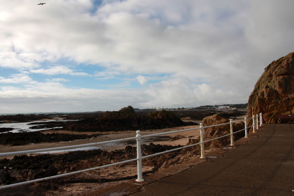
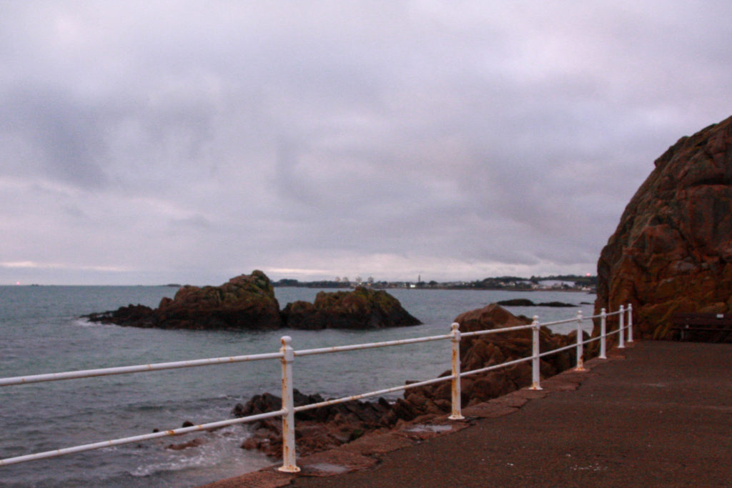
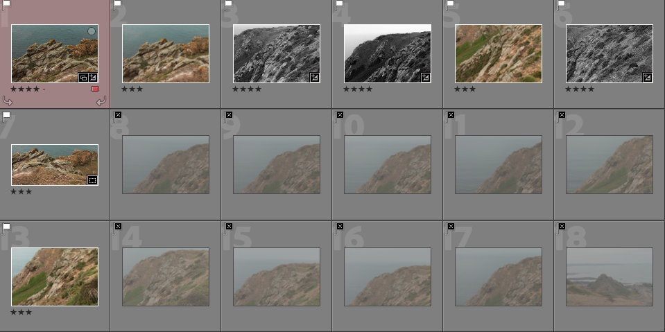
To begin my photo book, I decided to further explore the topic of Islandness. I gathered up images from past and present photo shoots all containing the subject of rocks, ocean, beach and even history. Overall, I rounded up to around 500 images that could possibly be useful for my photobook.

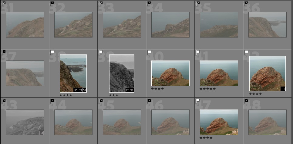
Contact sheets:

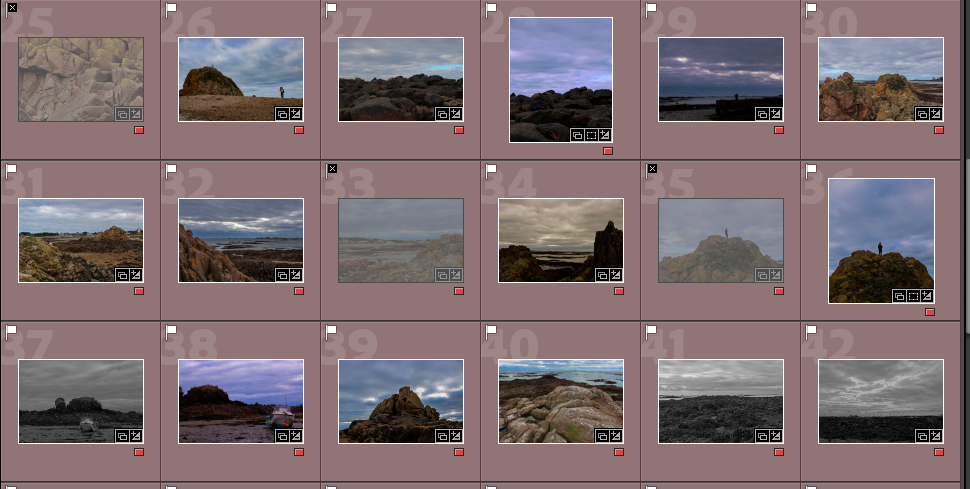
After importing my images into my lightroom collection, I organised them into colour ratings to depict which images I wanted to work with in my photobook. In the end I rounded up around 60 images that have been edited and were most likely going to end up in my book.

Small selection of my 60 favourite photos

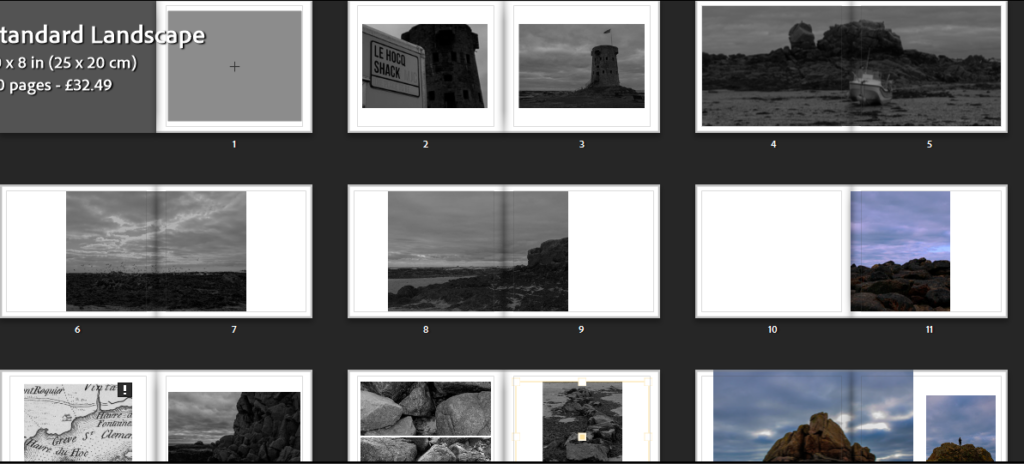
I then began by letting lightroom create a default book to give me an idea and a slight start for my photobook. At first, the default book looked very messy and disorganised until I played around and got an idea of producing the first half of my book with images from L’Etacq and the second half of my book being images taken at La Hocq.

First photobook mock

I decided I didn’t like the way this book was layered out and began my image placement again. I narrowed down my images even further and displayed them in a new layout which I much preferred.

Page experimentation:

After finding a layout I liked the most I wanted to experiment with different basic colours for the pages of the book. At first I started looking at grey and believed it wasn’t very effective.

Grey paper

Next, I tested out the black paper and couldn’t choose between using either white paper or black. I looked at how the book would look with all pages black and finally decided to use black.

Black paper

Photobook final outcome:

First half – L’Etacq

Front cover and back cover

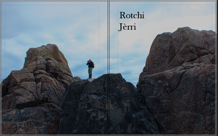
I chose the title of Rotchi Jerri because it is Jèrriais for ‘Rock Island’. My book displays rocks from our island which is a big rock. The use of rock island describes Jersey in a good way as it is surrounded by rocks and beaches. Also, Rotchi Jerri is a unique title due to the use of the Jèrriais language that I haven’t seen been used in the title of a book.

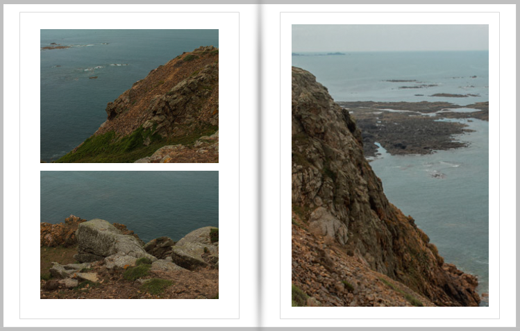
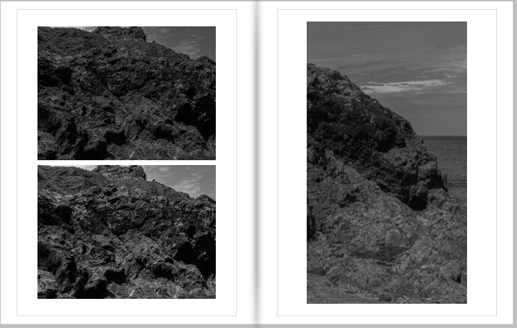
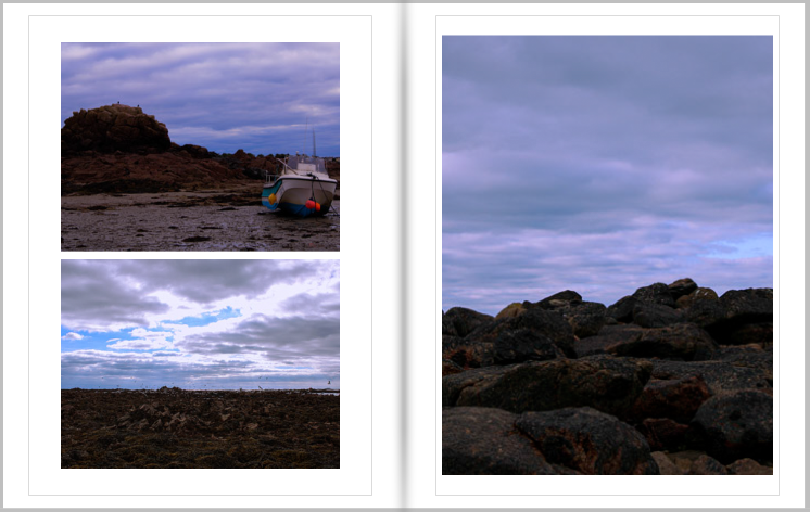
Pages 2 and 3

I chose to layout these page as such because they are all taken from the same position but in a different location. Also, I kept these three images together due to the very similar style and colour.
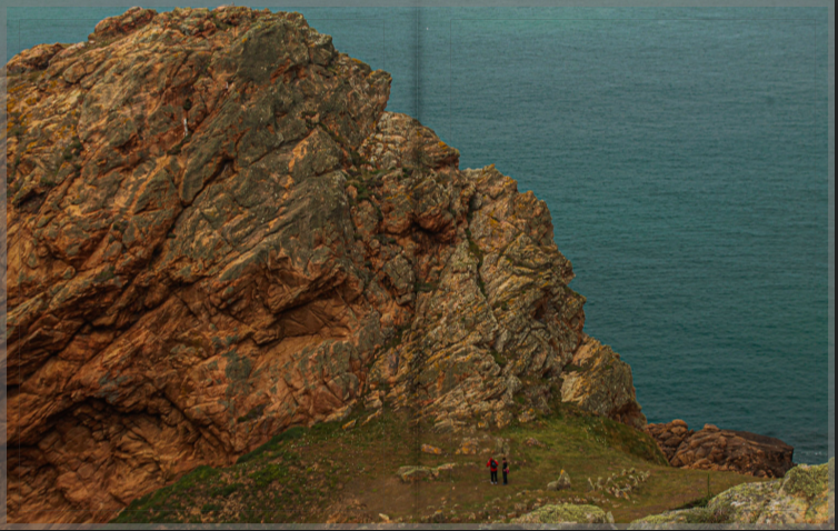
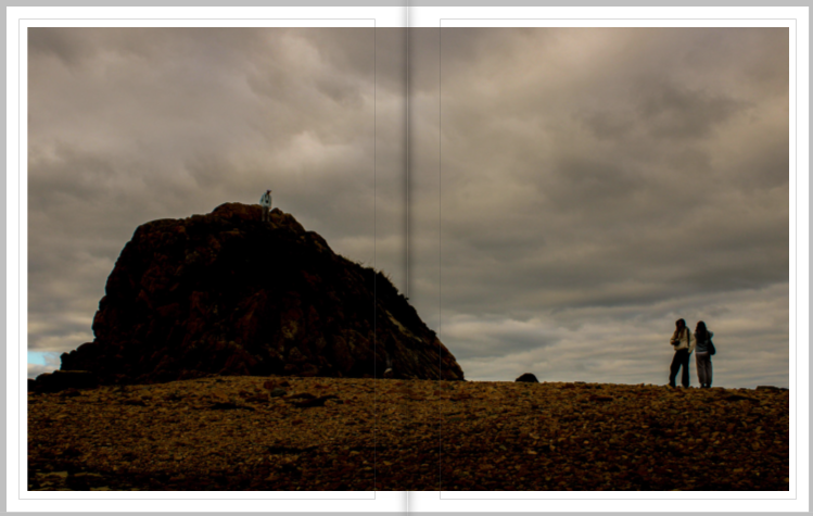
Pages 4 and 5

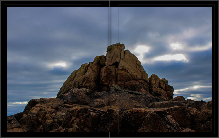
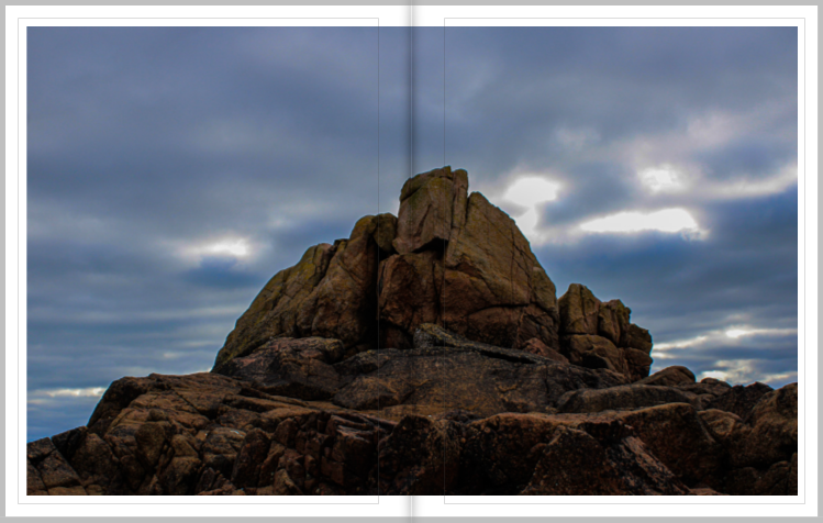
This photo is on a double page spread because it displays a massive rock compared to two people below. The use of the double page gives the viewer the full experience of seeing all the details throughout the rock.

Pages 6 and 7

I chose to use these two images on a double page because they are the same rock but taken from different positions.

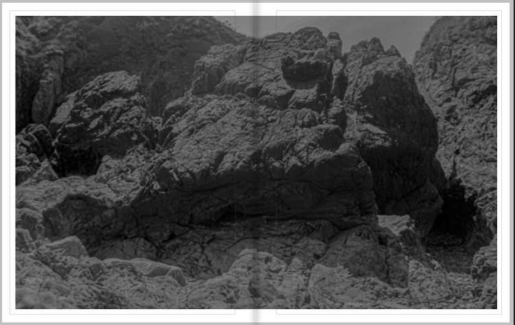
Pages 8 and 9

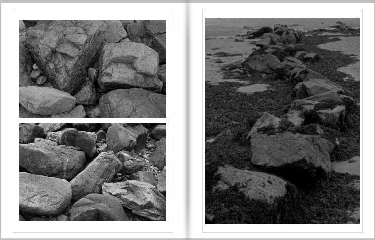
I chose this image for page 8 and 9 because of the introduction to the black and white images.

Pages 10 and 11

I carried on the theme of black and white to the next page to keep some sort of sequence.

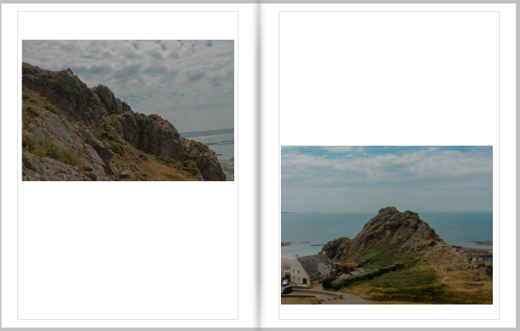
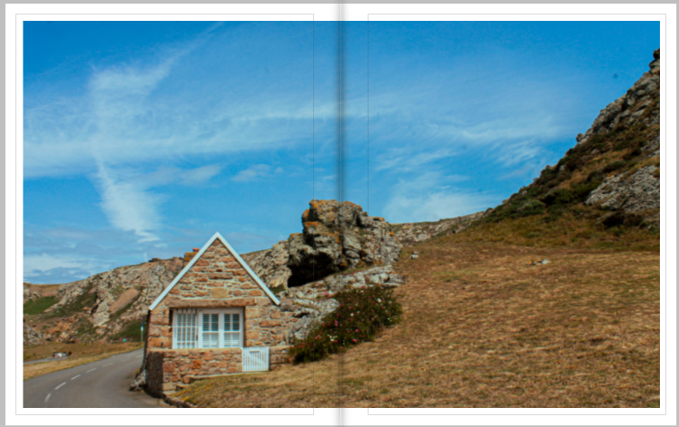
Pages 12 and 13

I chose to use this image on a double page spread because it can almost be seen as two different images, one of the house and one of the rock and scenery.

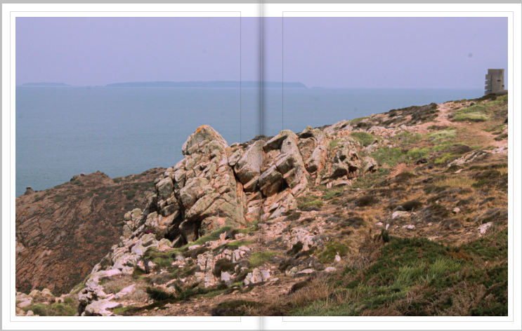
Pages 14 and 15

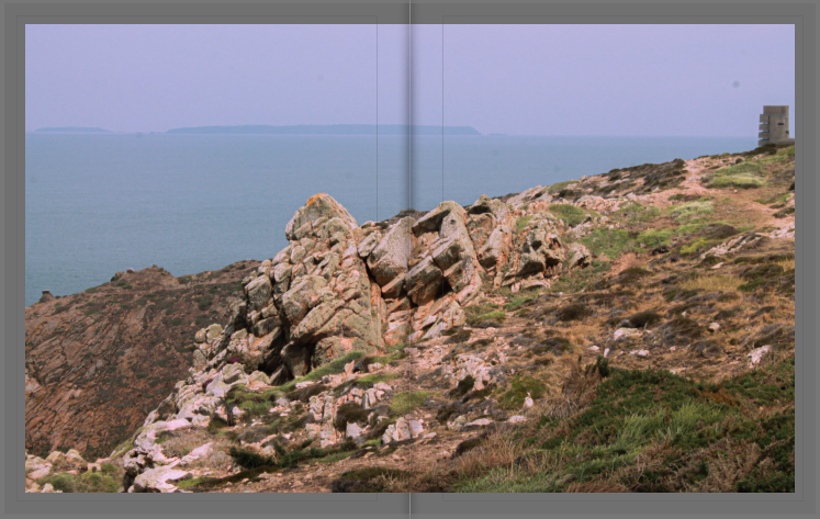
I also chose this image to be on a double page spread because of the vibrancies as it ends the topic of L’Etacq and transitions over into more black and white of La Hocq.

Second half – La Hocq

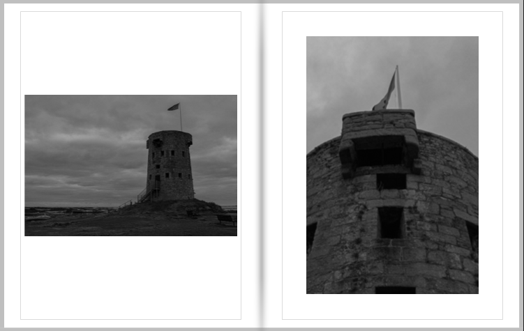
Pages 17 and 18

I chose these two images to be on the first pages of the La Hocq section because when we went on the trip the first area I photographed was the La Hocq towers, keeping a sequence throughout the book.

Pages 19 and 20

Next, I chose these three images to be together because of the black and white theme carrying on. I designed page 19 as it is because of the two similar photos of rocks juxtaposing each other.

Pages 21 and 22

I chose this image to be presented on a double page because it is one of my favourite images and I wanted to display it to full extent.
Pages 23 and 24

These two images are taken of the same rock, but from two different angles, showing the true size of the rock.

Pages 25 and 26

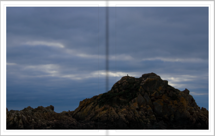
I chose to present this image on a double page spread to display how big the rock actually is compared to the bird positioned on the top.

Pages 27 and 28

These three images were placed together due to the colour of the sky all linking. Also, they are all taken from a similar position, displaying more of the sky rather than the rocks.

Pages 29 and 30

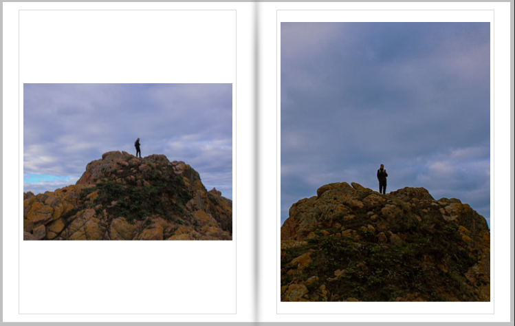
I chose this as my final 2 pages to fit the whole boulder on one page, and to show how small humans are compared to some rocks.

Evaluation:

Overall, I am very happy with how my photobook turned out. At first I was going to use the white paper, but then chose black due to the great contrast between that and the images. My photobook project could’ve progressed much further if I managed to go on more photoshoots, rather than using many past images. However, I like the topic of Islandness and I believe it is a perfect topic for when creating a photobook as it tells people a lot about the island of Jersey and what it is like living here.

photoshoots

PHOTOSHOOT #1

Focusing on portraiture

In December I started by walking through natural landscapes while it was sunny: focusing on ‘golden hour’ light, portraiture and natural landscapes. This did prove difficult in the nature of portraiture as I was photographing myself without a tripod so I actually hung my camera on a tree branch- this created some blurry, unsuccessful images so I decided to just concentrate on abstract portraiture.

MY FAVORITE IMAGES FROM THE SHOOT

PHOTOSHOOT #2

Focusing on colour- experimenting with night photography

For particularly colourful images I went through my camera roll on my phone and found images from my holiday in Spain during summer- through doing this I found some images which are of patterned rugs and tapestries etc which were in museums in Spain and Glasgow. I would like to use these as textural images which colour to pages which would otherwise be blank. I also experimented with night photography however I struggled to take pictures of anything moving as I couldn’t work out the correct shutter speed and ISO- I didn’t want to use flash and this was proving difficult.

MY FAVORITE IMAGES FROM THE SHOOT

PHOTOSHOOT #3

Focusing on product-style images

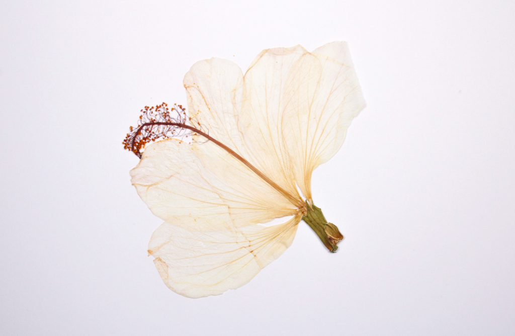
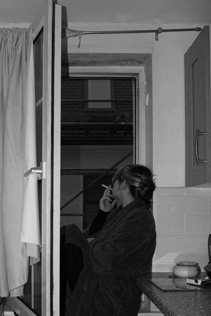
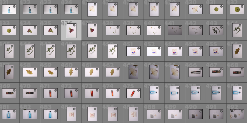
I wanted to take pictures of my own belongings such as pressed flowers, leaves, lighters and bottles to cut out on photoshop and put in the photobook layered on top of images or beside them- at home I also took pictures from my family album of my childhood and family.

MY FAVORITE IMAGES FROM THE SHOOT

PHOTOSHOOT #4

No aim

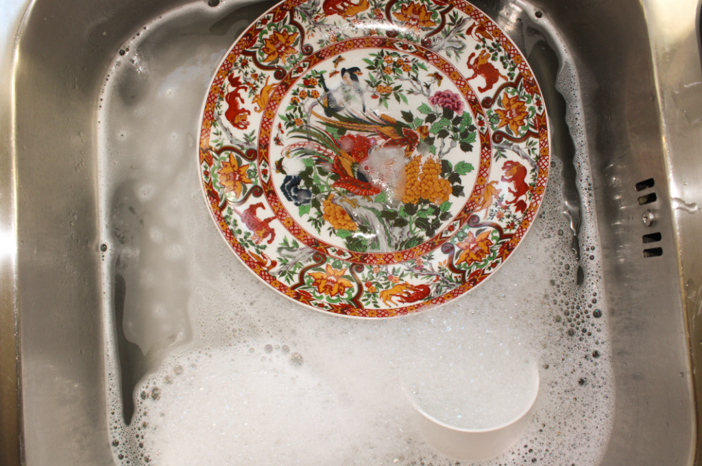
I took pictures documenting my room and my day out with friends, this is the photoshoot I took the least amount of photos on as I would forget I was meant to be taking images- I did not really have an aim with this photoshoot I just wanted to capture what I had an eye for.

MY FAVORITE IMAGES FROM THE SHOOT

Final essay

How does the work of Michael Marten and Gustave le Gray explore the sea and how it changes?

‘His beautiful and surprising photographs reveal how the twice daily rhythm of ebb and flood can dramatically transform the landscape’ – Michael Marten sea change text

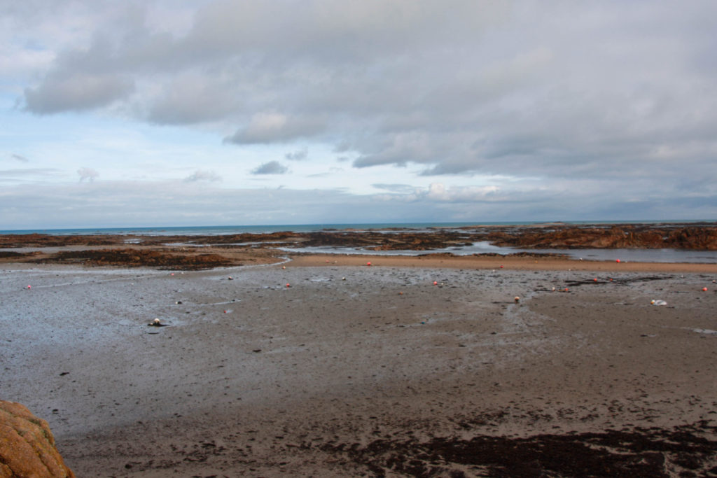
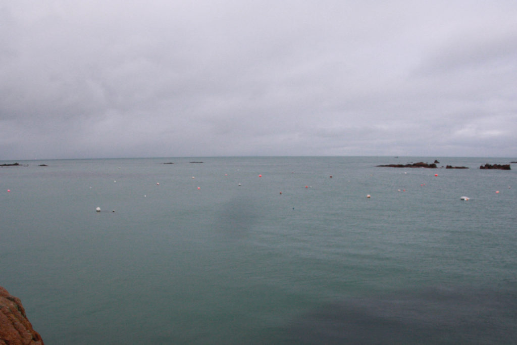
The area of my study is looking at romanticism and coastal photography. I chose to study these two photographers because they make similar work, but in different time periods. This can show a contrast between the two artists while still focusing on the same subject. I will be responding to the question by using a comparative approach, and going into detail about how they took their photos. Also another intention of my study is to compare the photographers work to my own, and use examples of my own work next to theirs. This area of photography interests me because we live on an island and are surrounded by the sea. Also, Jersey has a tidal range of almost 12m, the third largest tidal range in the world. Because of this, the size difference of the island when the tide is in and out is huge. This tidal range is what I aim to show in my own photos. This project links to some of my previous studies as well, for example when I was photographing rock types, a lot of it was on the coast. On photoshop, I plan to experiment on photoshop to make the photos look as similar as possible, the only difference being the tide and the time the photo was taken. In Lightroom, I will experiment with changing the exposure and other settings only on part of the photo, for example the sky. I will also experiment with black and white images which I will be able to compare with the work of Gustave le Gray.

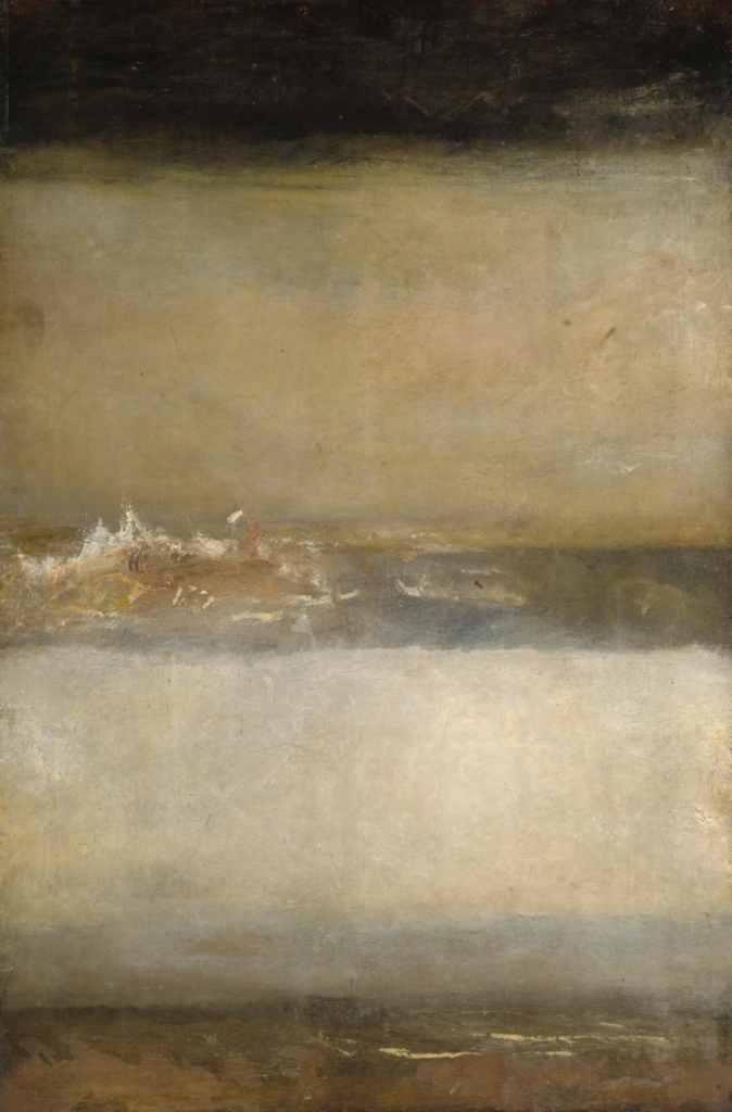
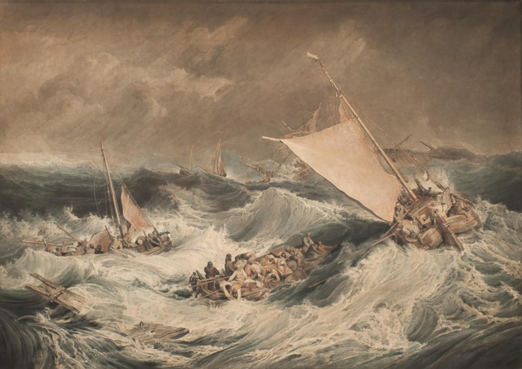
The romanticism era lasted throughout the 19th century and it favoured depicting emotions such as trepidation, horror and nature. Many artists such as Joseph Mallord William Turner found they could express these emotions by painting coastal landscapes. His 1805 painting, ‘The Shipwreck’, was one of the most famous seascape works of the romanticism era. Disasters at sea were a recurring theme of this movement, and in this painting Turner clearly shows this.

The painting depicts the scene of ships in distress, with the white colours of the waves showing the rough conditions. The sky also shows emotion, with dark shades of grey contrasting the colours of the sea. You can see people on the ships, which could maybe be lifeboats from a bigger ship, but he did not state this. This leaves a lot to the imagination and adds a sense of mystery to the painting. Turner shows the dramatic trauma of a shipwreck well, using darker colours which were popular in his early work. These dark colours contrast with the white tops of the waves and the grey sky. One more romanticist painting he made was called ‘Three Seascapes’. This painting was more abstract and used an interesting technique which was showing 3 seascapes in one painting.

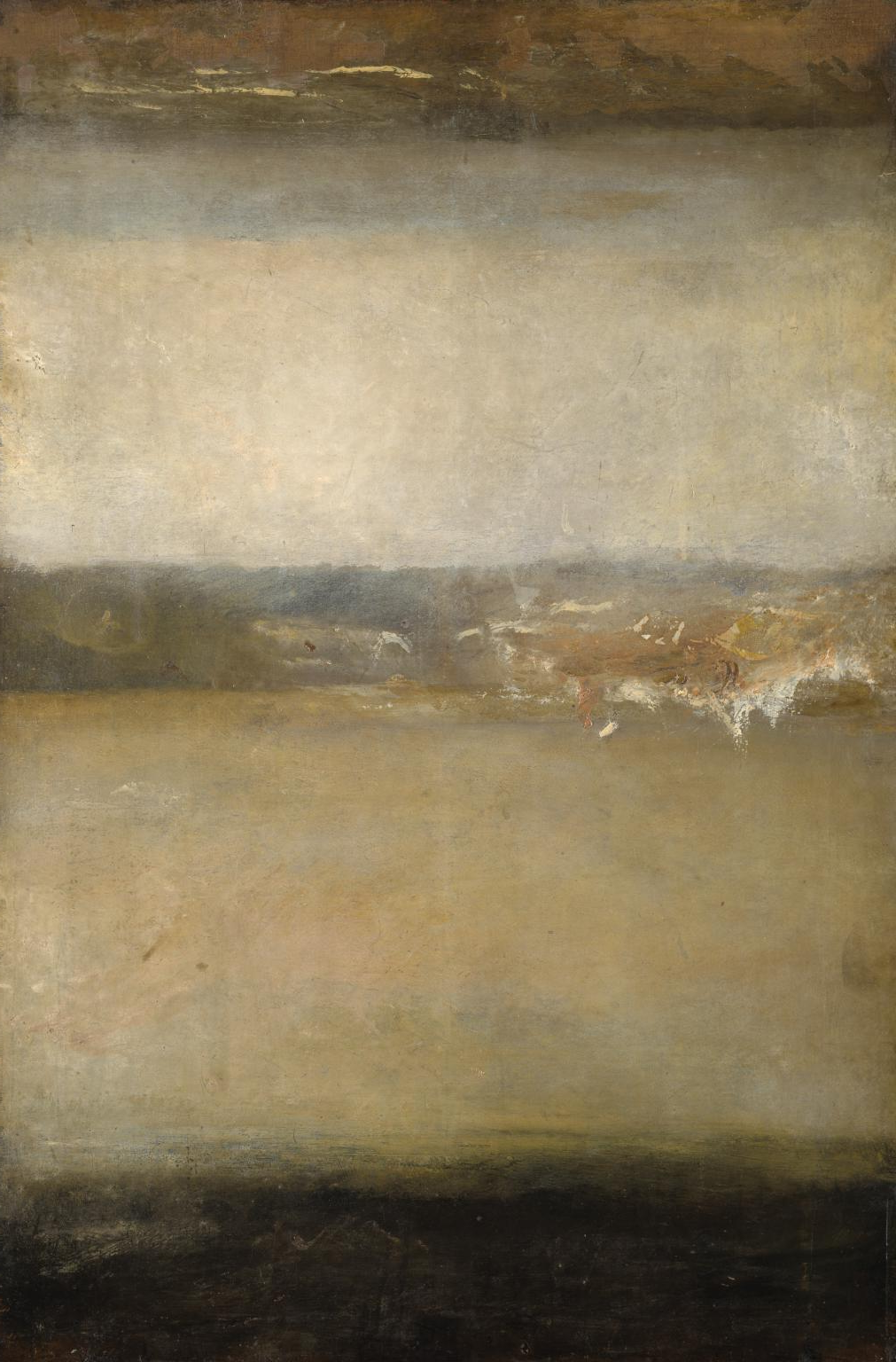
The painting was made to show 3 seascapes by flipping the top one around, so the sky serves for 2 of the sea parts if the canvas is flipped. Once again he contrasts the darker colours of the sea with the white crests of the waves. At the top, there is a much darker sea with no white crests. Turner might have made the third upside down seascape on top very different to the others because it stands out to the viewer when the canvas is flipped:

The black colours show the darkness of the sea, and creates a dramatic contrast between the sea and the sky.

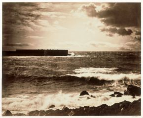
Coastal photography has been a popular genre ever since the first cameras were made. Gustave le Gray was a pioneer of this genre from the start. His photographic technique was called combination printing. Because of the limitations at the time, it was hard to capture the sea and the sky at the same time in one image. Le Gray countered this by putting together two negatives, one of the sea and one of the sky. This allowed him to create a tonal balance of the sea and the sky in the final print. He took his most dramatic seascape using this technique in 1857, called ‘the great wave’, on the Mediterranean coast near Montpellier.

This photo shows the aggression of the waves against the rocks and the pier in the distance, while also showing the horizon and how it contrasts the textures of the sea. The clouds are cut off at the horizon where they meet the sea, which indicates the join between the two negatives. Gustave aimed to combine images to show how the human eye sees nature, not through a camera. This is something I aimed for in my project. This area of photography links to the art movement called romanticism. Romanticism aims to show the accurate depiction of lifeforms, landscapes and perspective of colour and light. It also aims to steer away from artificiality. This movement links to my work as well because in my project I aimed to show natural images of the sea and the sky in the same spot 6 hours apart, with little artificiality.

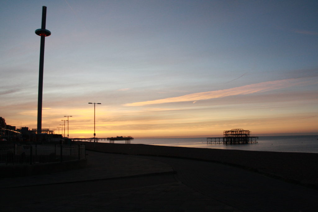
I took this photo in Brighton as the sun was rising. The photography culture in this city is mainly focused on the sea, and it has been one of the best places to take coastal photos in the UK ever since the genre became popular. My photo is similar to Gustave le Gray’s as it shows the contrast between the sea and the sky and clouds, while also showing the horizon and a pier in the distance. An indication of modernism in my photo compared to Gustave’s, is the vertical pier called the i360 on the left. This shows the 166 year contrast between the photos clearly. In this photo I also tried to show a contrast between the old and abandoned pier on the left which burnt down in 2003, the second pier in the distance which was built in 1899 and is still open, and the vertical i360 on the left which was built in 2016. I captured all 3 in one photo because I wanted to show history and modernism in one photo, whilst also getting the sea and the sky.

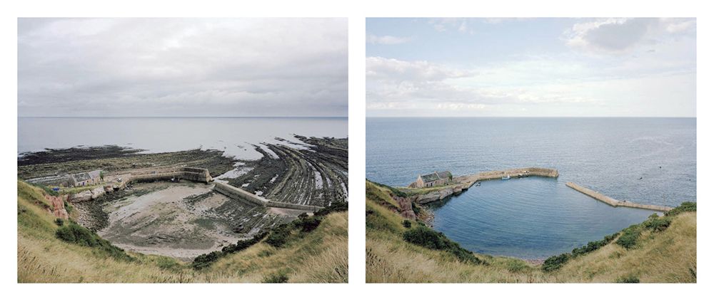
Paragraph 3: Michael Marten’s project ‘sea change’ was made to show the contrast between the tide when it was in and out in different areas around England. He would take 2 photos from the exact same spot at low tide and high tide. This inspired me to create my own version in Jersey, as the tidal range here is 12m, the third largest tidal range in the world. In England it’s only 2-5m.

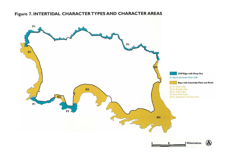
This is a map of Jersey’s tidal range, with the blue parts showing cliff edges with deep sea and the yellow showing bays with intertidal flats and reefs. For my project, I focused on the bottom right yellow area of Jersey as this area has the biggest tidal range. I took photos at La Rocque and Green Island, but most of my photos were in the La Rocque area as there is a pier and views of the next bays over on the left.

An example of Michael Marten’s sea change work:

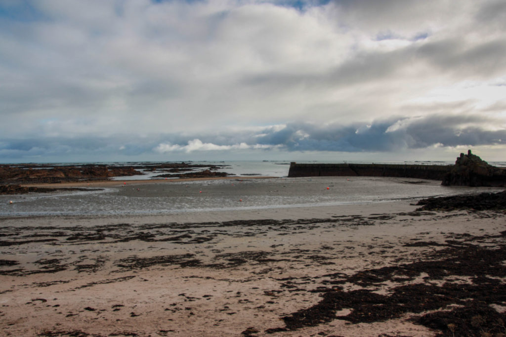
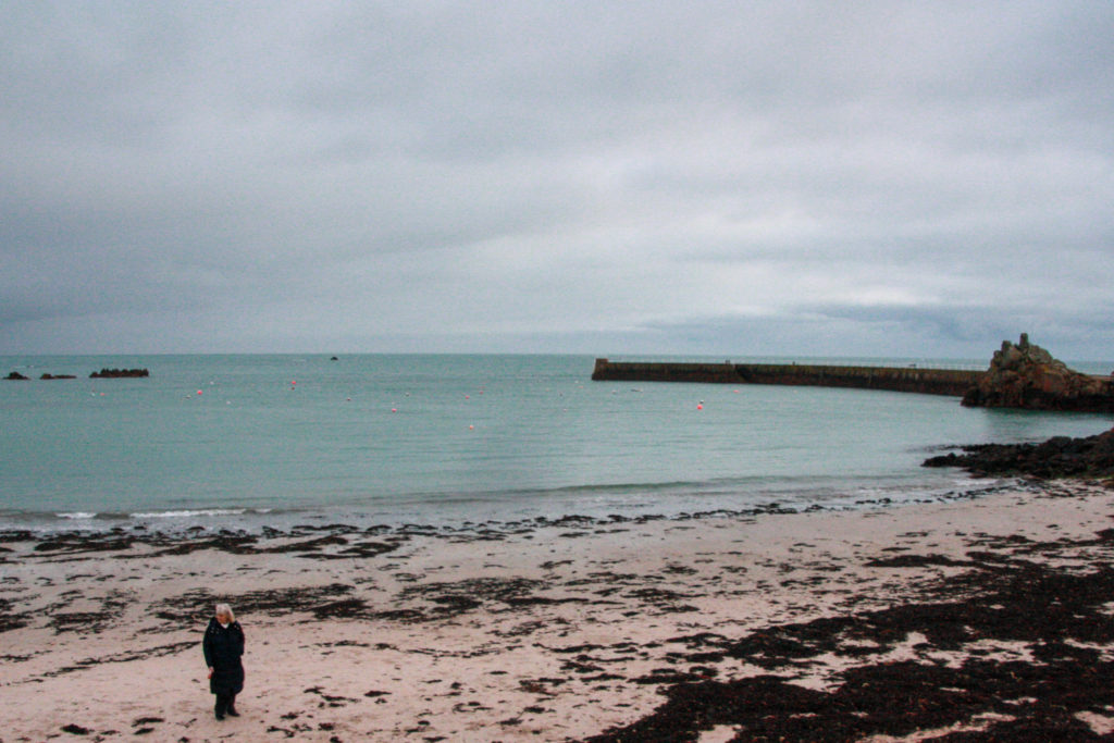
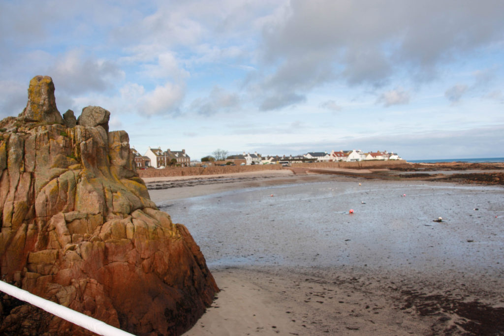
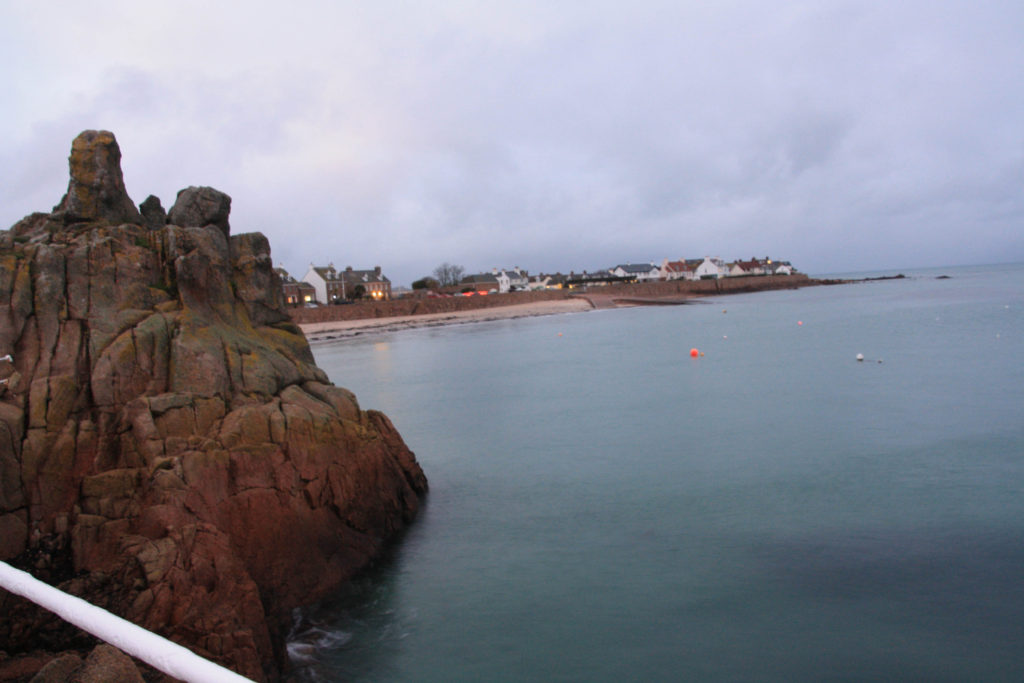
Some examples of my work at La Rocque:

I took my photos by placing down three pieces of tape at low tide where I chose to position my tripod, and returning 6 hours later at high tide to take a photo in the same spot. By putting the two photos next to each over it shows the viewer how a coastal landscape can change in a matter of hours. This is a quote taken from the text of Michael Marten’s ‘Sea Change’ photobook:

‘One aspect of what makes these photographs so compelling is the fascination of comparing each pair of pictures, spotting what has or hasn’t changed. The contrasting views play with our sense of depth and perspective, and show how subjective is our perception of landscape. The result is a substantial document capturing the variety of the British coastline, a portrait of the maritime landscape that makes visible in a dramatic new way the ebb and flow of tidal waters.’

This is exactly what I aimed for when taking my photos. The fact that Jersey’s tidal range is so big made me think how the same idea could be replicated here to show the uniqueness of the island I live on.

 In conclusion, I think Gustave le Gray, Michael Marten and Joseph Mallord William Turner all show romanticism, seascapes and how the sea changes well in their own unique ways. Gustave le Gray invented a technique which was very innovative in the history of seascapes. His work paved the path for the photographers of the next generation to carry on taking photos of the sea. Michael Marten used his unique idea of photographing tidal changes to create a photobook which inspired me to make my own.

However, all three systems are reliant on an element of construction and re-construction. Photographs can be reliable, but can also be manipulated to tell another version of “the truth”. The Romanticists were interested in capturing elements of the The Sublime and dramatizing events and conditions. But Michael Marten is different. He has incorporated aspects of British culture into his documentary of our coastline, as there is a national fascination with both the weather and the tides. As an island nation, and Jersey being a small inter-connected island we are familiar with these kinds of viewpoints and feel a sensitivity towards  seascapes and the communities that rely on the seas too.

‘From holiday beaches to industrial estuaries, the photographs record two moments in time, two states of nature.’

Personal Study: Photobook Layout

Images Used (not all):

Possible Layouts:

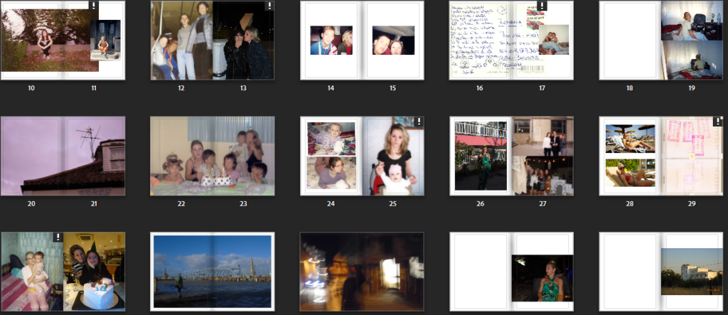
Before creating my book I placed all of the images I wanted to use in a whole different folder (collection). I then played around with the sequencing of the images to make the layout process easier.

Title layouts:

I like this on the most I think because it looks neat
But this has also been growing on me because it looks symmetrical when it’s in the middle and I think it catches the attention more
Least favourite because its the least familiar to me so it looks odd

Title ideas:

Front/Back covers:


Opening page ideas:

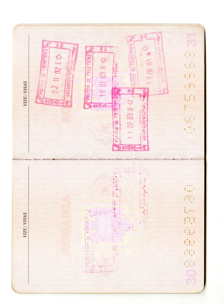
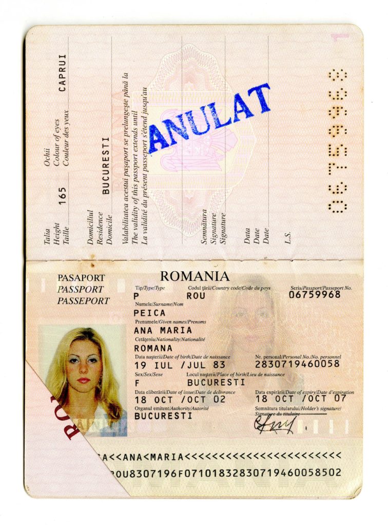
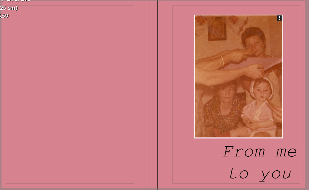
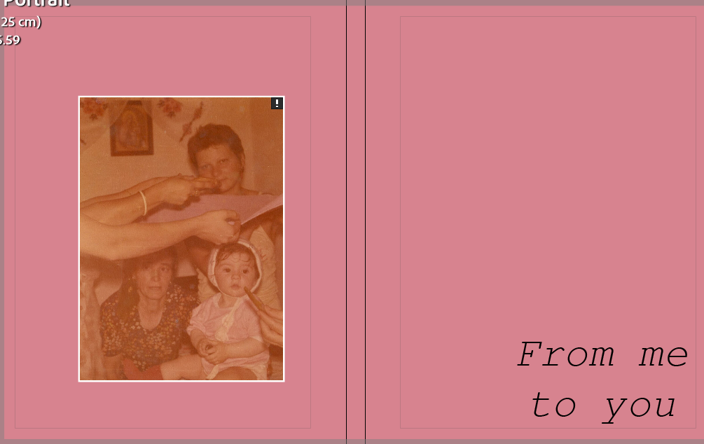
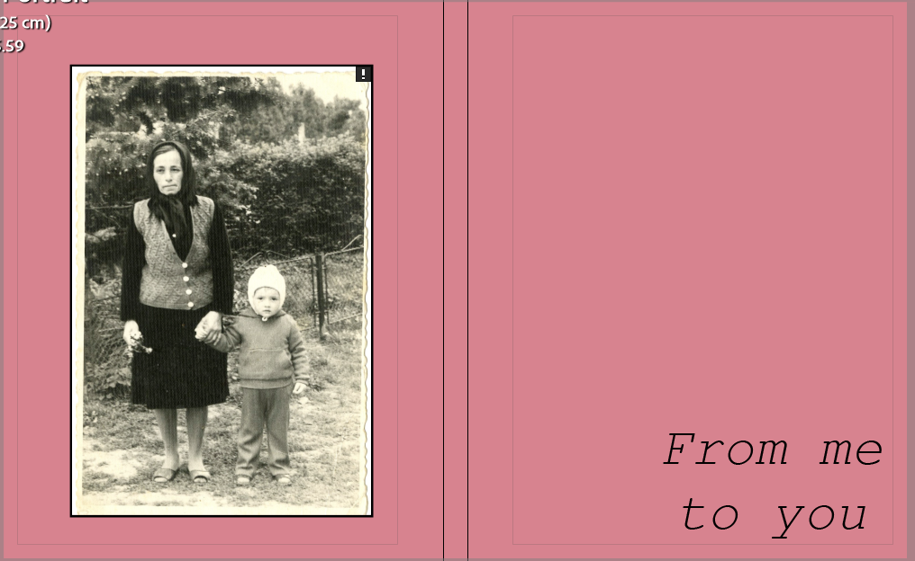
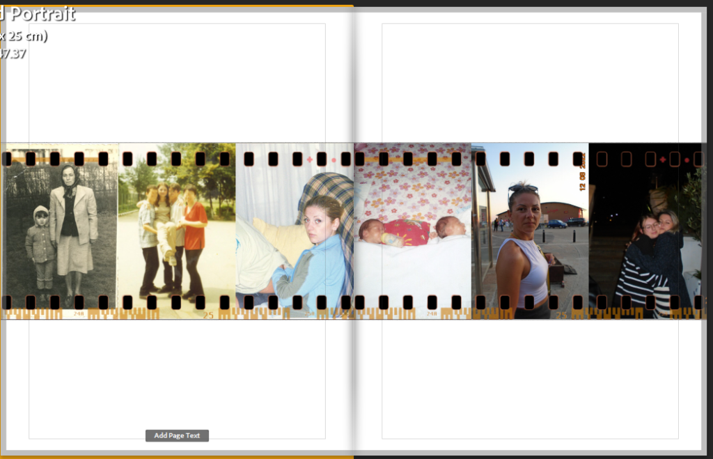
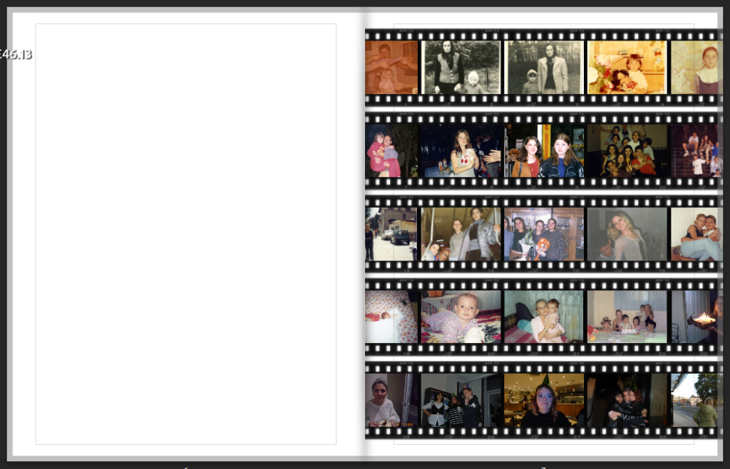
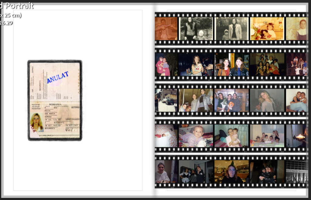
For my first page I knew I wanted to have a timeline of images introducing the rest of the photobook. I really liked the page layout with the film roll so I used that. My first design consisted of 6 images that went across a double page, leaving a lot of empty space which I didn’t like. I then tried the other layout that had 25 images and filled only one page. It intimidated me at first because of the amount of images I had to use, but I ended up really liking it. I didn’t like the empty page next o it be so I just added an images of my mum’s old passport from 2002.

Portrait or Landscape?

Landscape – This layout was the most convenient because most of my images are landscapes, meaning they fit easier on the pages. However, I didn’t like how some of the images were really zoomed in. I also don’t like the actual shape of the photobook because it’s so much harder to store when it’s in landscape because of its awkward length.
Portrait – I like this layout because it’s very convenient when storing the photobook because it’s in the shape of most textbooks, notebooks etc. I also liked how the portraits images fit and how the landscape ones looked on a double page because they weren’t too zoomed in. The only thing I didn’t like was how if I wanted to have one landscape on one page fully, I would have to either turn in and make it portrait or put two of them. This made some pages look cluttered.

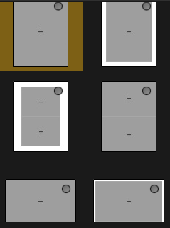
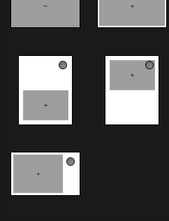
Different page layouts I’ve used:

I favourited some page layouts to keep everything consistent in my photobook.