
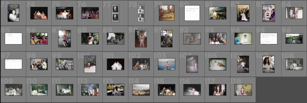
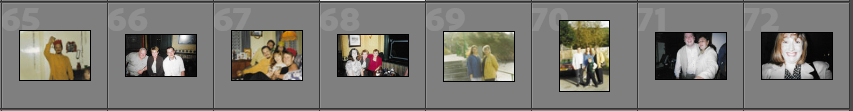
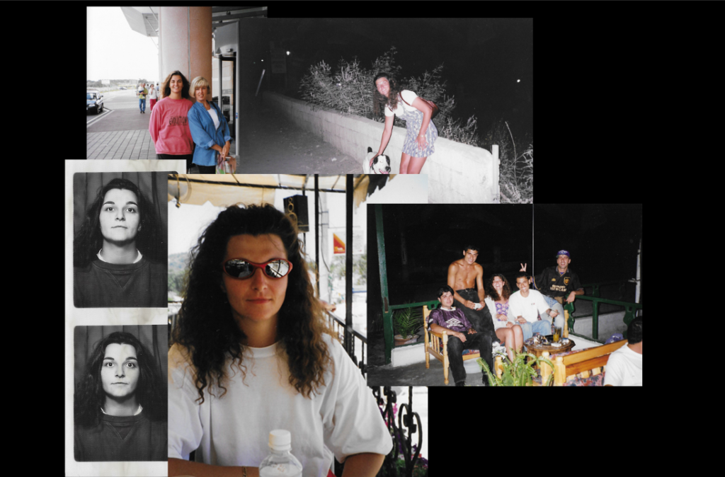
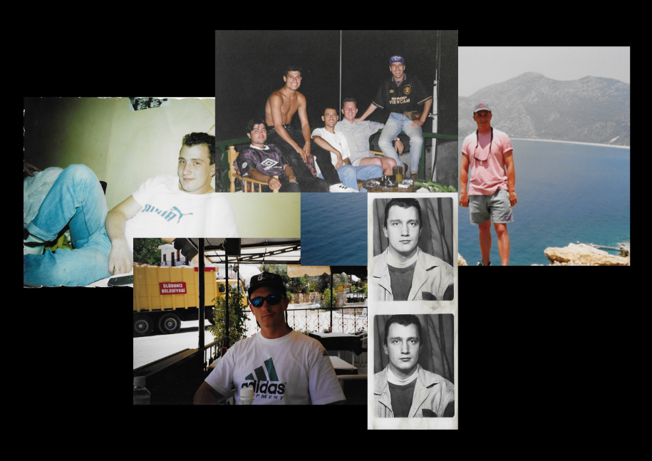
Contact Sheets
These are the contact sheets for my archival photos that I will be using throughout my photobook. I have picked images that represent both sides of my family and ones that show where they are connected through my parents. There are also photos that show family friends that my parents met when they came over to Jersey, these people have become my family and I think that this is a good way to show how the relationships have developed over time.
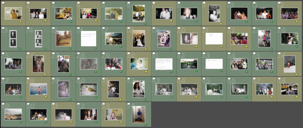
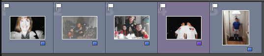
Selection
I would like to use all of my archival photos in my book but for some (yellow) I will try and include them in collages as I don’t feel that they have the best quality or I don’t want them to be displayed one a page of their own. The other images (green) are the photos that will hold meaning on their own as they show links between friends and family which is what I am trying to portray throughout this photobook. I have also excluded one photo as I have made the decision to put that as my front cover as it is one of my favourite images out o the collection.
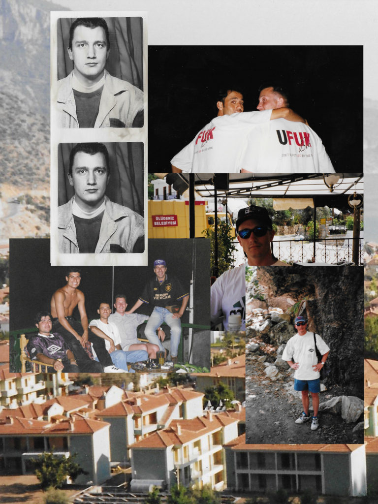
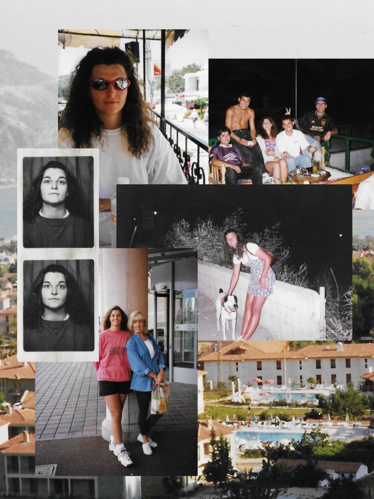
Collage Experimentation
For my cover and throughout the book I wish to use archival photos to experiment with to make different collages, below I will show some examples of me using different photos to play around with to eventually pick the one that I find the most fitting to be on my photobook.
Above are my first experiments with making a collage, I did one for both my mum and dad as I wasn’t to have a collage for both the front and back cover of my photobook. I started by creating a black background for my photos to be one as I felt that it would be more fitting for the images that I wanted to use. I then took a few images that show each of my parents and moved them onto this background, I found that for my mums collage as I used a portrait photo instead of landscape it was harder to place as there wouldn’t be a boarder around all of my photographs. After finishing these experimentations I didn’t like how they turned out against the background, I feel that it is to plain and contrasts with the images that I used.
Below is my second experimentation, instead of using a plain background I decided to use one the archival images of a city in Turkey which my parents frequented for holidays. I used similar images to the ones in my first experiment but I feel that they look better with this background and it also holds more of a story as it was a place that they loved as well as complimenting the photographs used. I will be using these collages as my front and back cover as I feel that they will grab someone’s attention as well as keeping a structured narrative.
Photoshop Experimentation
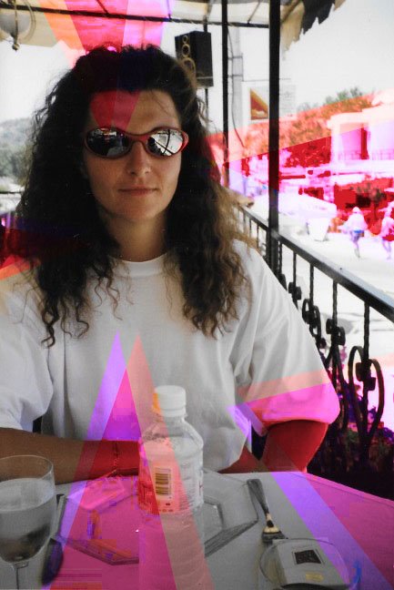
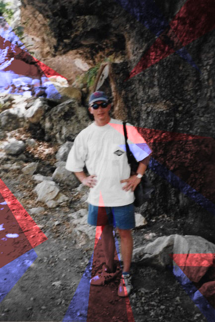
For my experimentation with photoshop I have used a few different techniques so achieve the results below. For the two portrait images I first used polygonal lasso tool to select the first layer of triangles around the photograph, I then went into adjustments and selected vibrance, this allowed be to increase both the saturation and vibrancy as this did not achieve the desired effect I also used the photo filter. This effect allowed be to chose a colour that can be adjusted whether I wanted it to be intense or mellow. I have also decided to use a gold metallic background to go with some of my images which I chose to pair with the line work.
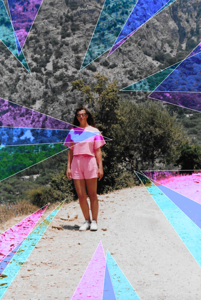
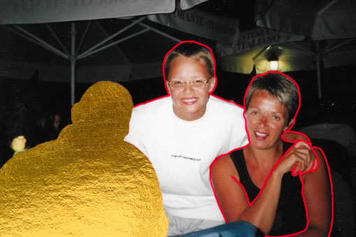
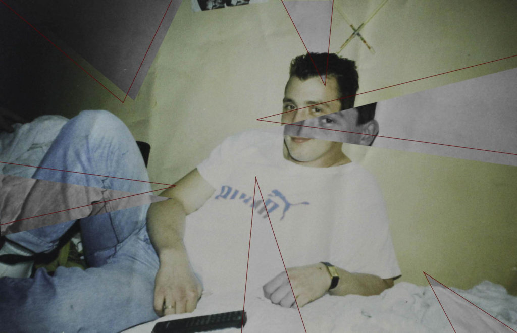
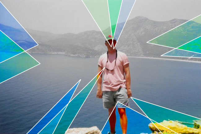
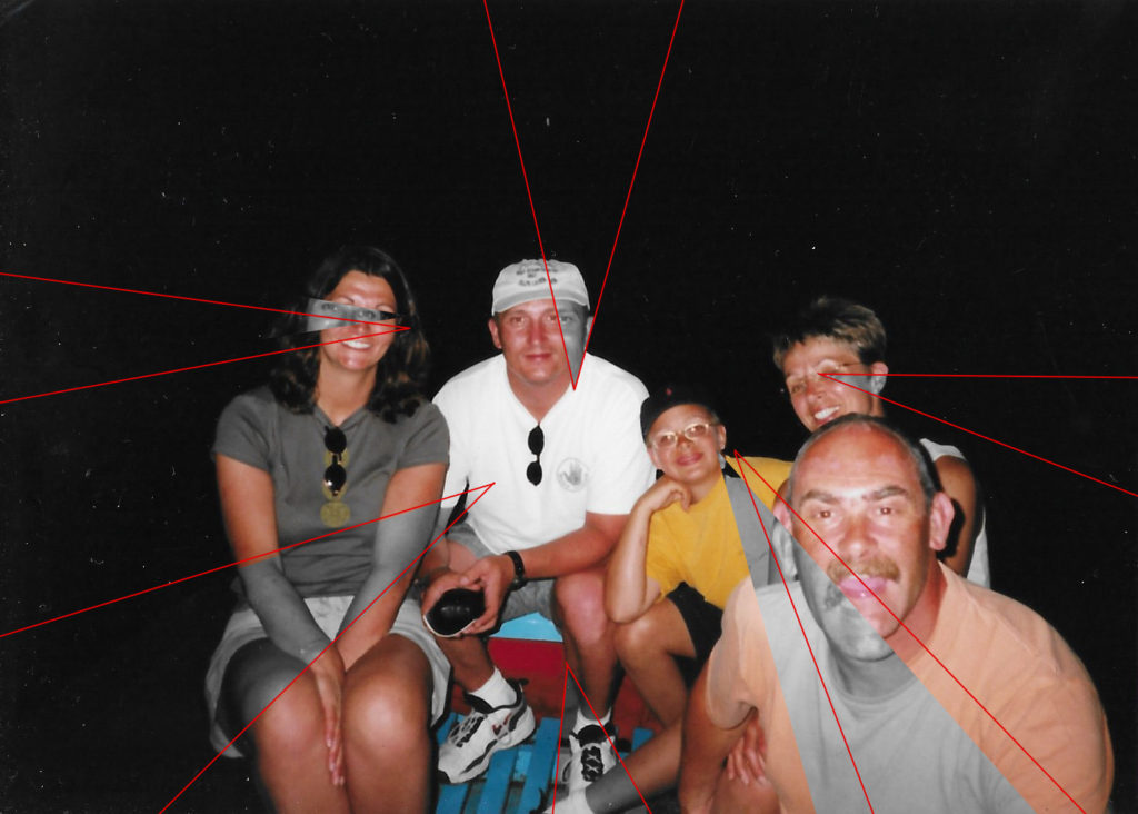
Above I have some of my landscape images that I will be using in my photobook, I have displayed two styles of editing hat I will be using throughout my book, my third image is editing the same as the portrait photographs above. For my first image I had layered the original image on top of a gold metallic background, I wanted to use gold as I felt that it complimented both the red and white line work which will be shown in my different manipulations. I will be using the gold as a layering tool or as a way to remove someone from the photo but still have their silhouette. I felt that the gold will hold a uplifting vibe to the photographs, to achieve the adaptation in the first photo I used the polygonal lasso tool to pick out the individual after I then outlined the two after people featured in the photograph with the red paint brush tool. For my second and fourth images I have used the polygonal lasso tool to make the triangles around the original image, I then turned these triangles to black and white to contrast with the different colours that are in the original photographs. I like how the saturated colours in the images make the black and white shapes standout and more clear. I next out lined each triangle with the red line tool, this helps to make the photographs flow better together as they have something connecting each other. In both my second and fourth images I make a duplicate layer so that I was able to move my cut outs but still have the same photograph underneath, I think this adds the final edit as you can see what it looks like with and without colour.