This photoshoot was capturing different spots around Gorey Harbour at low tide then again at high tide, in order to pair the two together similar to the technique used by Michael Martin.
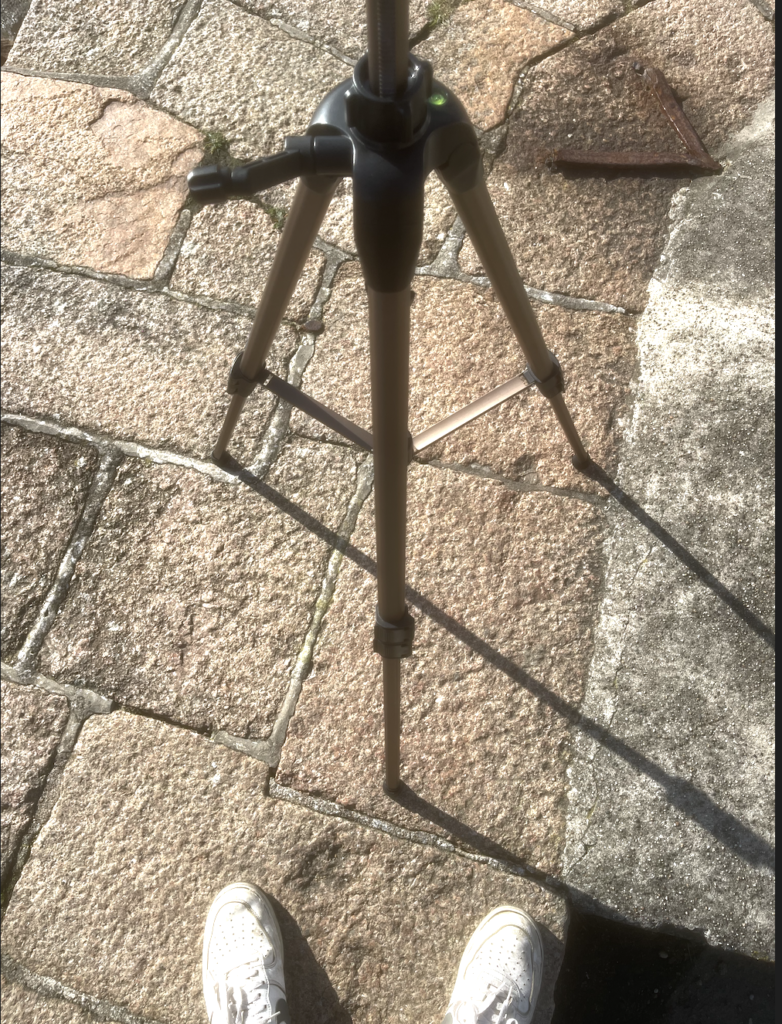
To achieve the effect that I hadn’t moved the camera between tidal changes I strategically marked and positioned my tripod, using photos to record exactly where I had it positioned. (Pictured below)
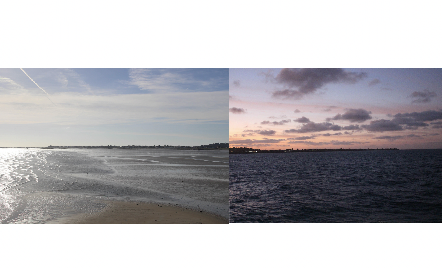
My original plan was to place the before and after images next to eachother in my photobook, however after playing with different layouts I found that this didn’t convey the dramatic type of effect that I was aiming for and so I decided that for some of my images I would flip one and place them back to back.
First variant of arrangement
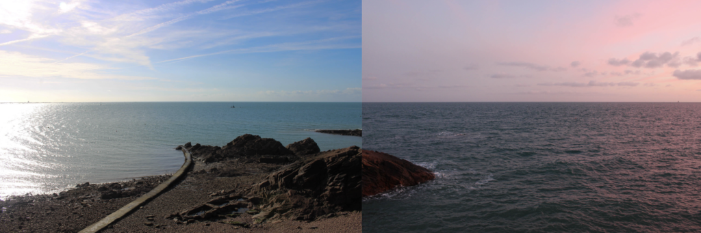
Second variant of arrangement
Even after placing the images back to back as seen above I noticed I didn’t get the angles and framing completely perfect, and so the two images didn’t line up perfectly. I fixed this by adjusting the cropping of the two images so the horizon lined up how I wanted it too.
Final adjusted variant of arrangement
I am happy with how thee edits came out and I believe they are going to be a good feature in my photobook as I think that the back to back nature of the image will flow nicely as the viewer turns the pages, and it goes through time. My plan is to have two of these edits per page, stacked on each other.
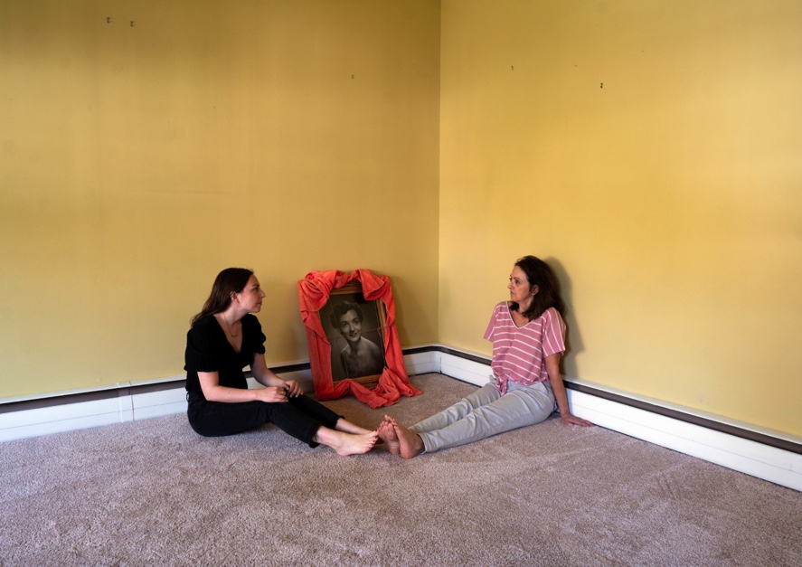
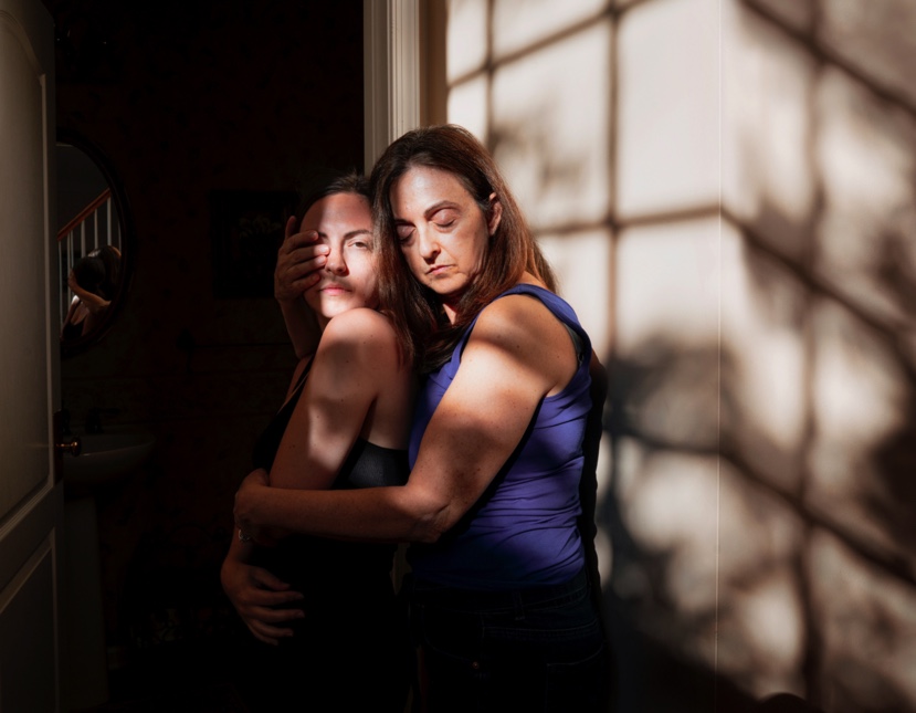
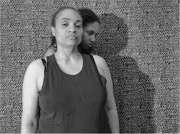
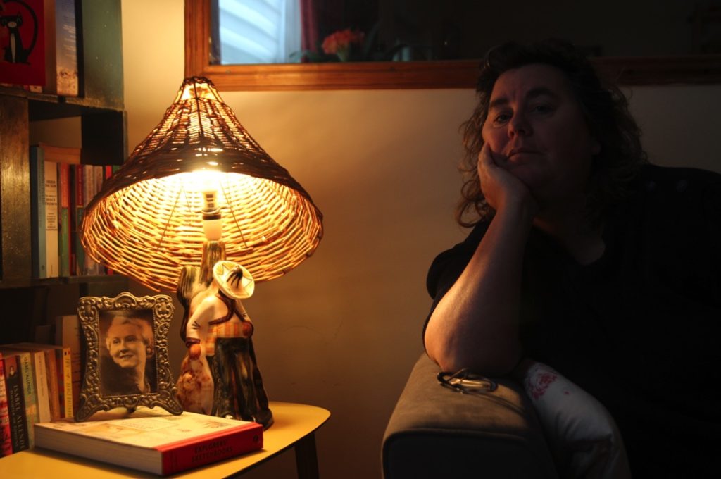
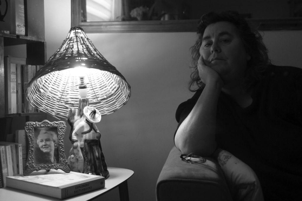
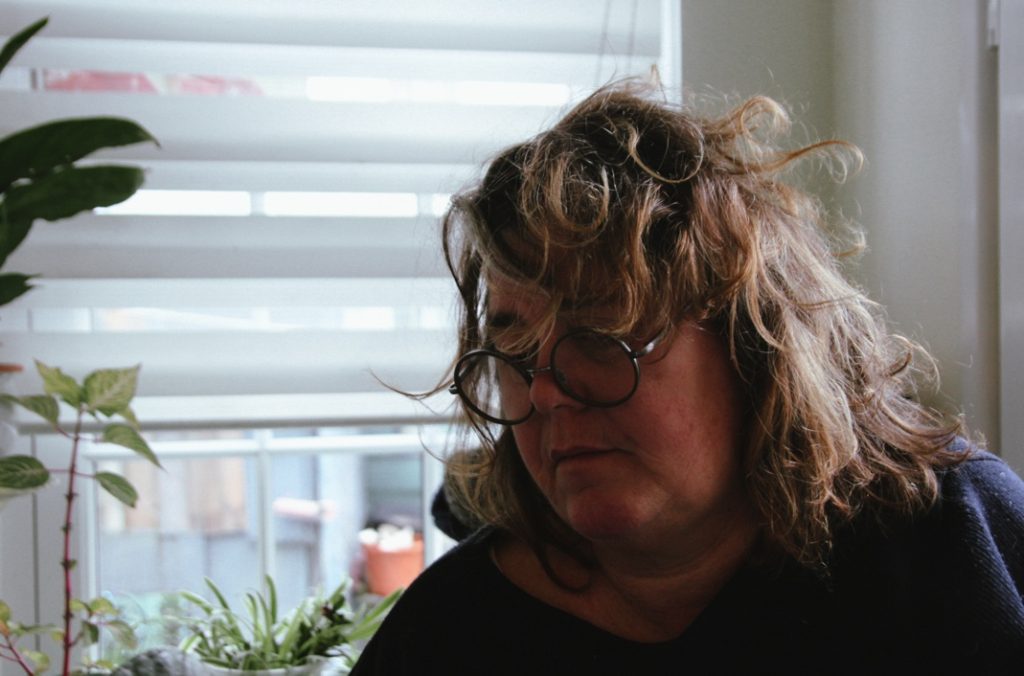
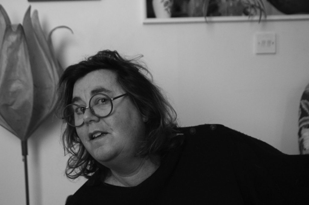
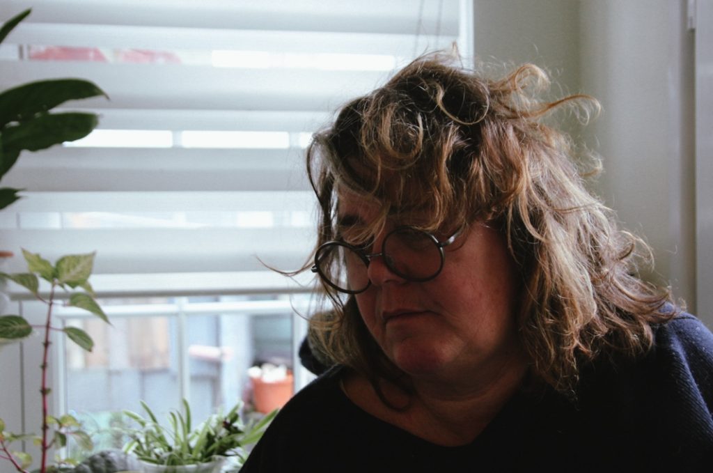
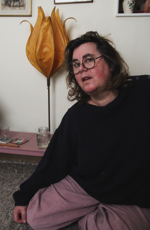
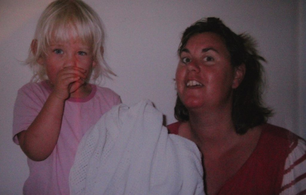
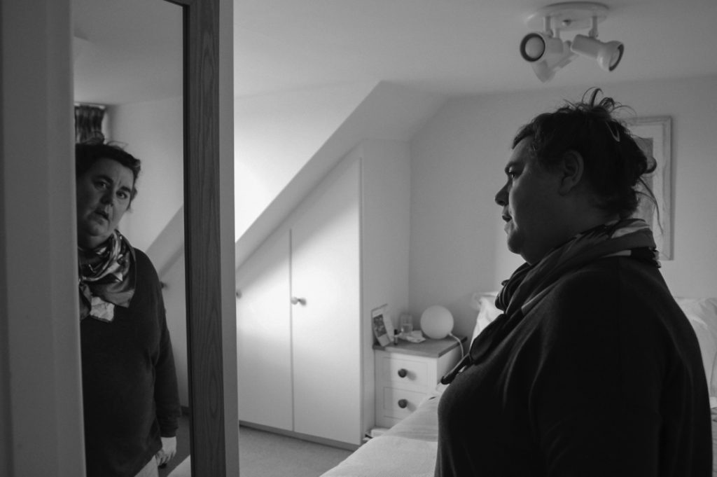
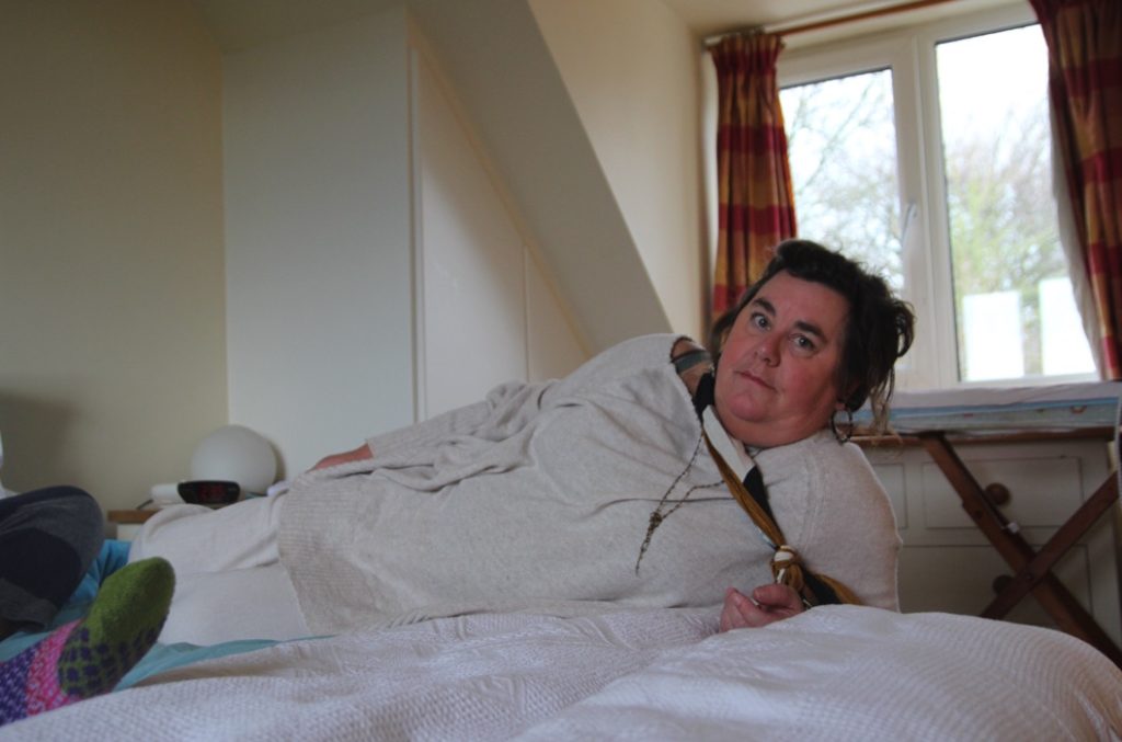
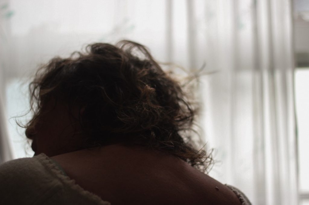
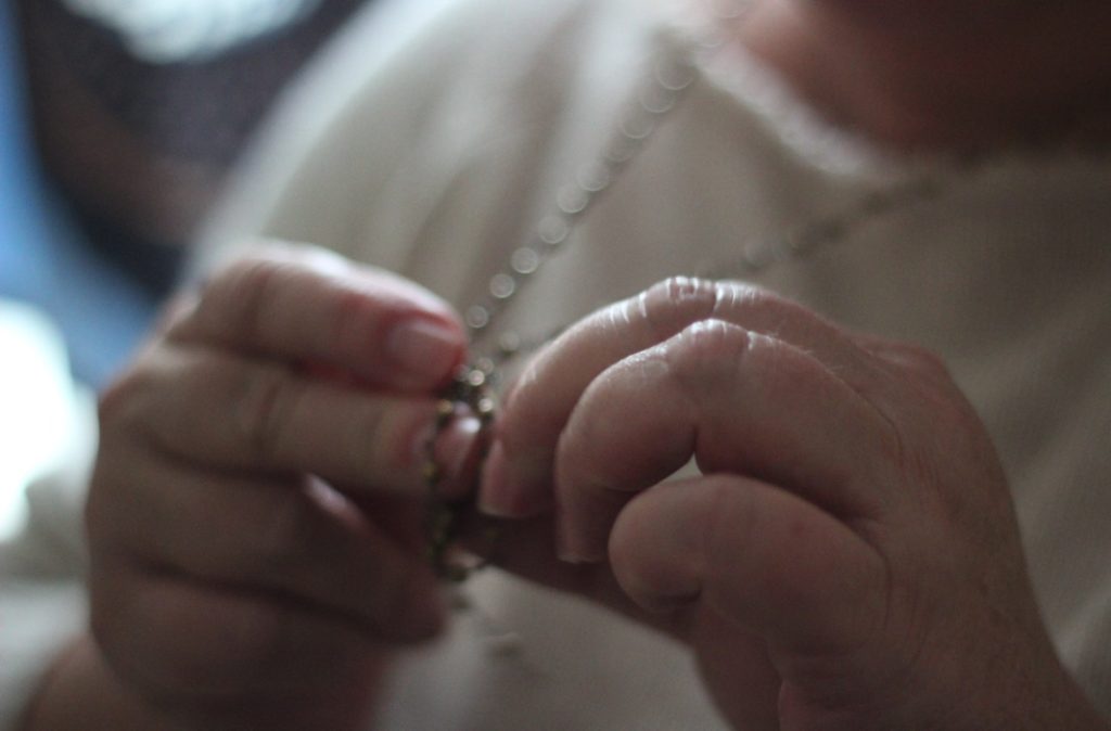
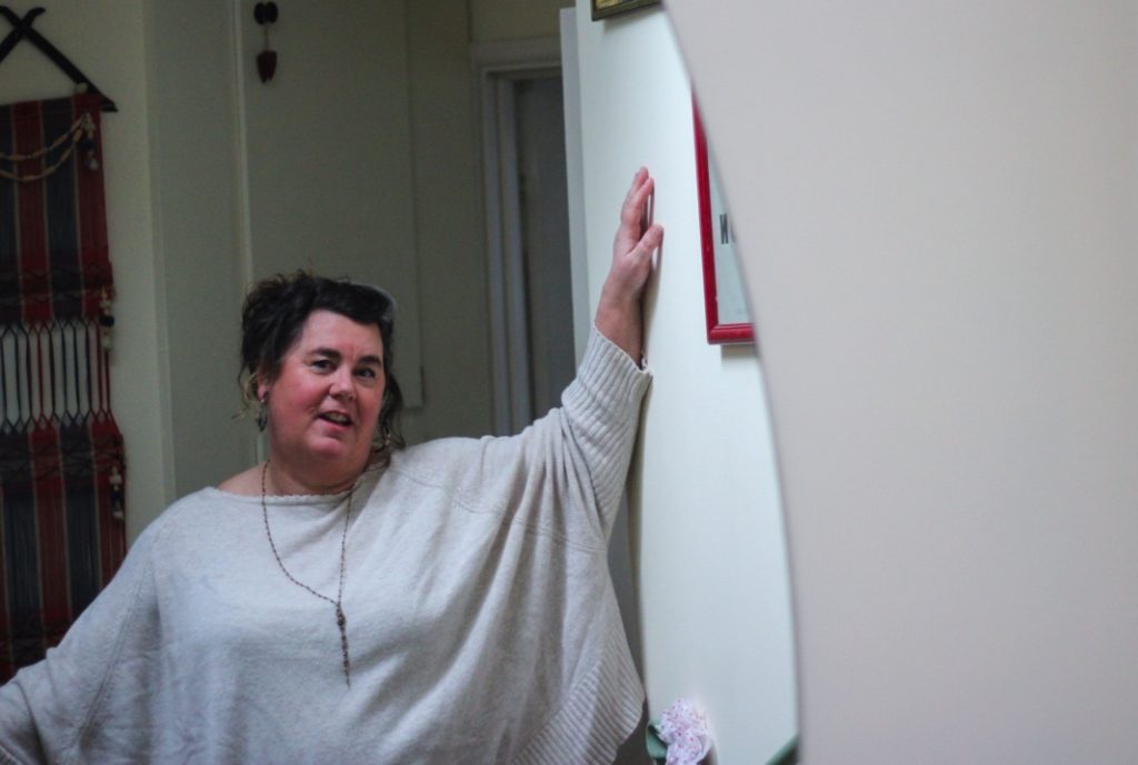
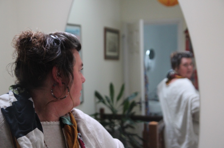
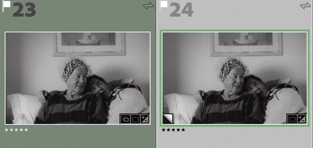
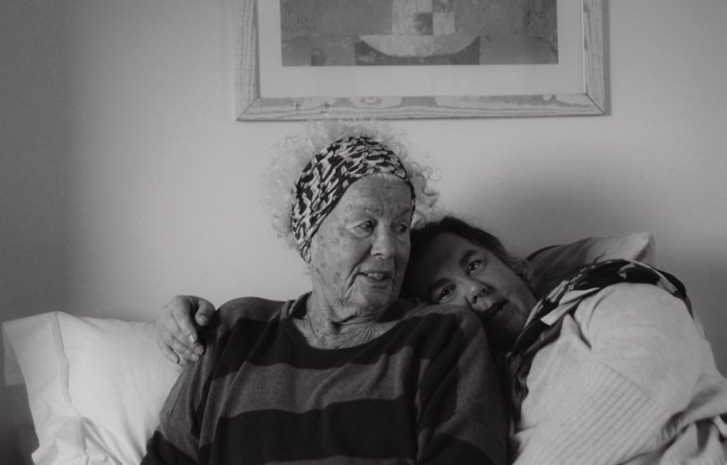
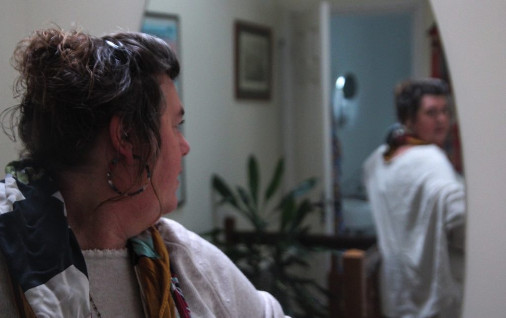
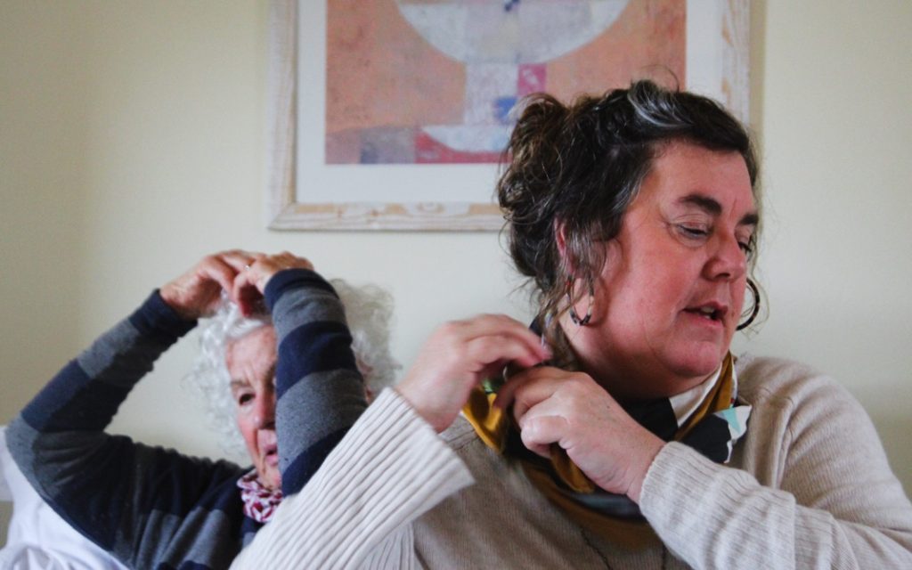
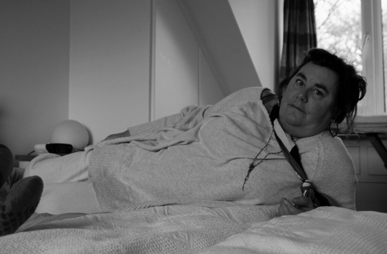
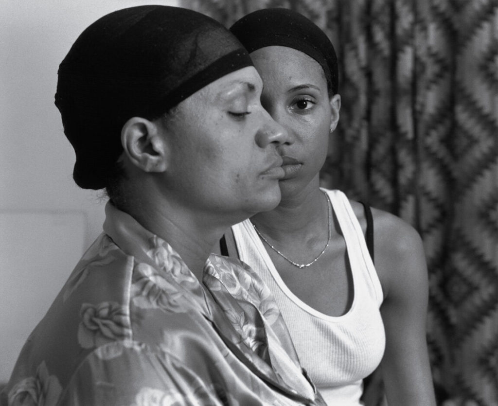
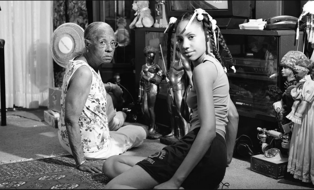
This shoot is one for this project. In this photoshoot, I will develop my portrait work through images of my mother, the both of us, and a few last self-portraits. Most of these shoots are heavily influenced, compositionally wise, by Hannah Altman’s images of herself and her mother. Latoya Ruby Frazier’s work also helped me to plan these photoshoots, especially her self-portrait work. In my photographs, I want to convey female family relationships, in relation to personal and situational identity (in the home). Using key images for reference in these shoots will help me to direct/carry out the shoot as easily as possible, influencing my compositions, posing and lighting, to create the highest quality outcomes. I’m going to produce single images of my mother, as well as photographs of the both of us, inspired by the images below. After creating images of my mother and I, I am going to create images of my mum and grandmother, and possibly all three of us – I am doing my shoots in this order to make sure my ideas develop in a way that will help the development of my final outcomes. As well as taking portraits, I plan to take a few object images that relate closely to my family identity, as well as photographing more archival images to use in my collages for my book. This is because, in my first photoshoot of archival images, I realised after that I felt that I didn’t have enough images – I often use multiple archive images in one collage and I want to make sure I have more than enough quality material to work with.
Photoshoot 5
Hannah AltmanLaToya Ruby FrazierKey images inspiring these photoshoots
Idea
Subject
Settings
Props
Lighting
Genre
Generational identity, mother and daughter relationships, personal identity
My mum, grandmother and I.
Creative Auto, portrait
Camera, Tripod
Natural – window lighting
Portrait, object.
Photoshoot plan
Photoshoot plan
Contact Sheets
First contact sheet
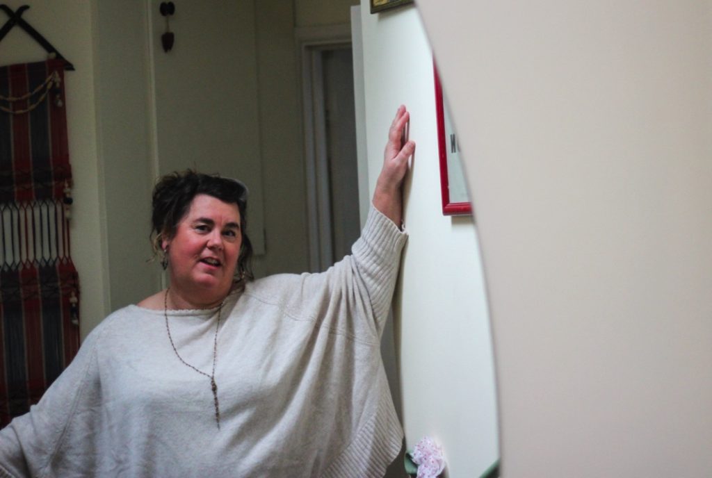
At the start of my shoot, I stuggled slightly – I began shooting in my porch, and had trouble with overexposure as the light was coming from behind me. I combatted this by moving my shooting position to the right, and directing my subject to move her head lightly towards me. The lighting then improved, and I think I acheived some of my best images from my shoot in this location.
Second contact sheet
As the photoshoot progressed, I found it easier to direct my subject, and found adapting to the difficult lighiting in my house easier – I found that as the shoot progressed the quality of the images increased.
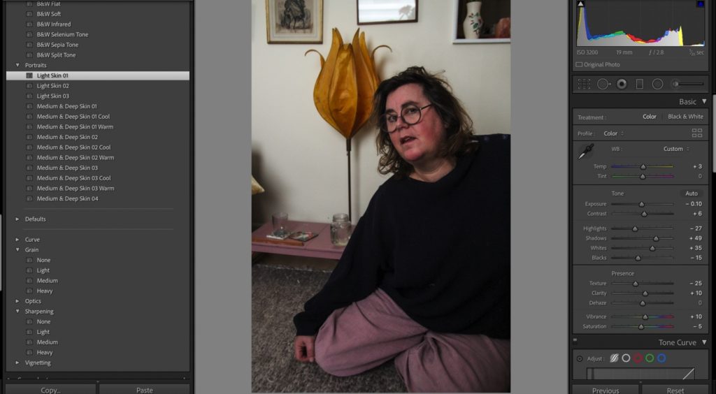
Editing
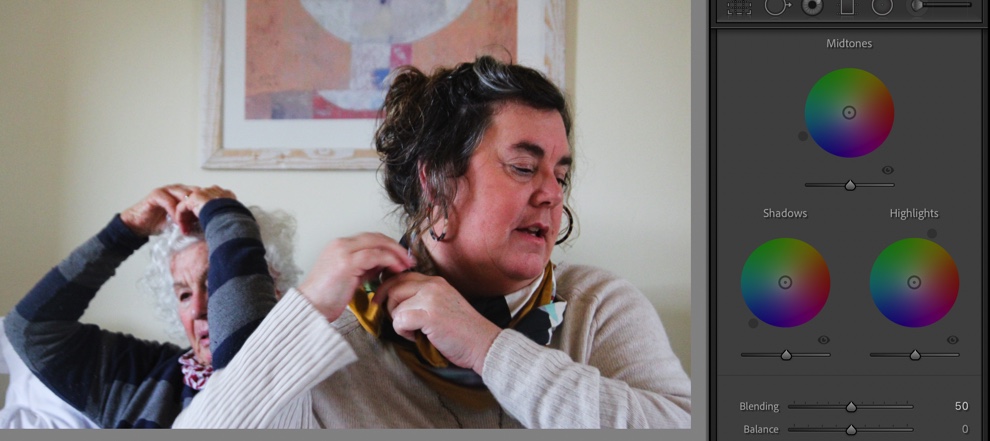
OriginalEdit – controlling overexposure and warmthB and W edit – using soft b and w filterColour editOriginalEdit – using filter and colour gradingAdjustments for the image above using colour gradingFurther adjustmentsEdit OriginalEdit 2Experimenting with filters
Final Images
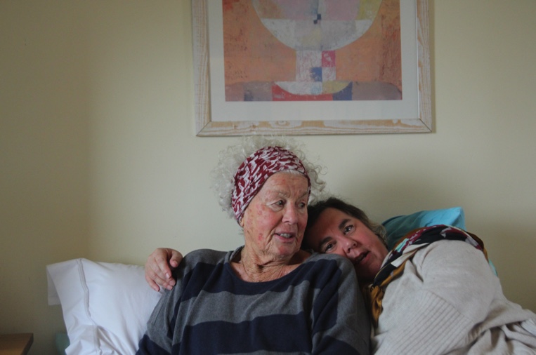
I originally edited this in B and W, but decided to turn it back to colour after comparing the two edits with virtual copies in lightroom. I chose to keep this image in colour due to the warm tones which I really like: the brown and blonde in the subject’s hair, in the cushion and in the lamp in thr backgroynd. This creates a flow of leading lines throughout the composition and adds personality to the image – something that black and white can sometimes lack.
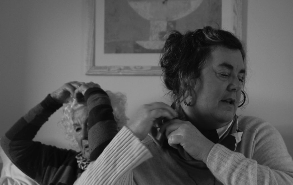
This image is one of my favourite edits of my whole project – i edited in black and white in order to emulate the work of LaToya Ruby Frazier, and also to correct over warmth and exposure in the original image (as seen above)
I edited this image with more retro tones – as above, I used colour grading to acheive this, which I developed from previous photoshoots. I edited my image in this way to create a nostalgic mood – this will fit better with my archival images and the tones of those images. This will create more coherent spreads in my book.
I had trouble editing this image – there are high amounts of contrasting tones: the wall and face of my subject are much lighter than the deep black of her jumper. When editing I had trouble keeping the edit subtle and not too contrasted, due to the differing tones in the image. I had to complete multiple edits before deciding on the final one.
Evaluation
Overall I think this shoot produced some really successful outcomes. I shot earlier in the day, learning from my last shoots which were shot too late in the day. I used different locstions to shoot in, such as my porch and also my living room floor, which created some different compositions. I think that my initial framing of photographs when I was shooting could have been improved, as I had to crop most of my images while editing them. Even though I had a few editing issues with differing light and contrast, I think my editing was successful. i’m glad I produced outcomes in colour and monochrome as this means I have a wider variety of outcomes to choose from for my photobook selections and layout.
Photoshoot 6
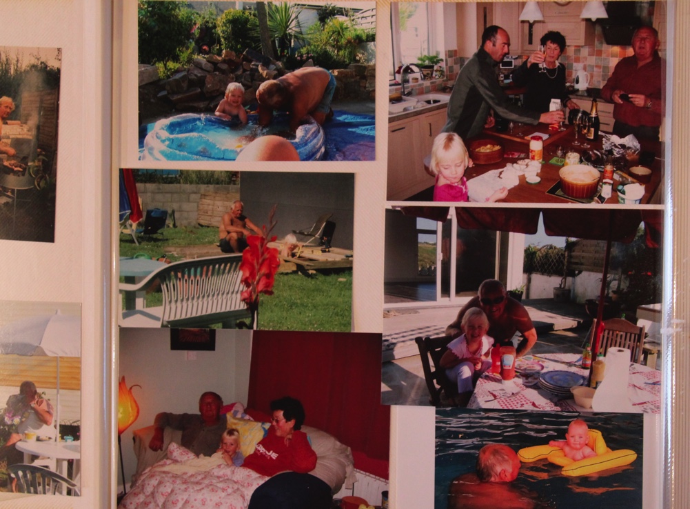
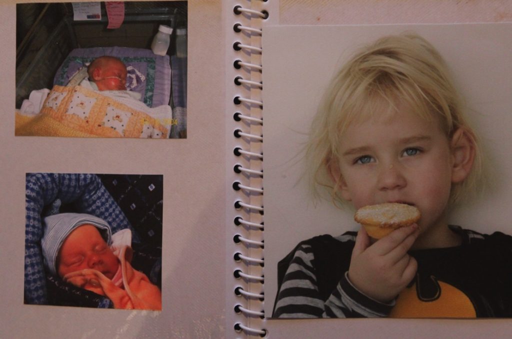
As well as producing portrait photographs from these shoots, I photographed more archival images from albums at my home – different to the ones I gathered in my last shoots at my grandmother’s house. I didn’t need to alter these images much, just rotating and sometimes turning the exposure up – I shot these in low light, so I did turn the exposure up on a few of the images in the end.
Final images from this shoot
Portrait Images from this shoot
Contact Sheets and evaluation
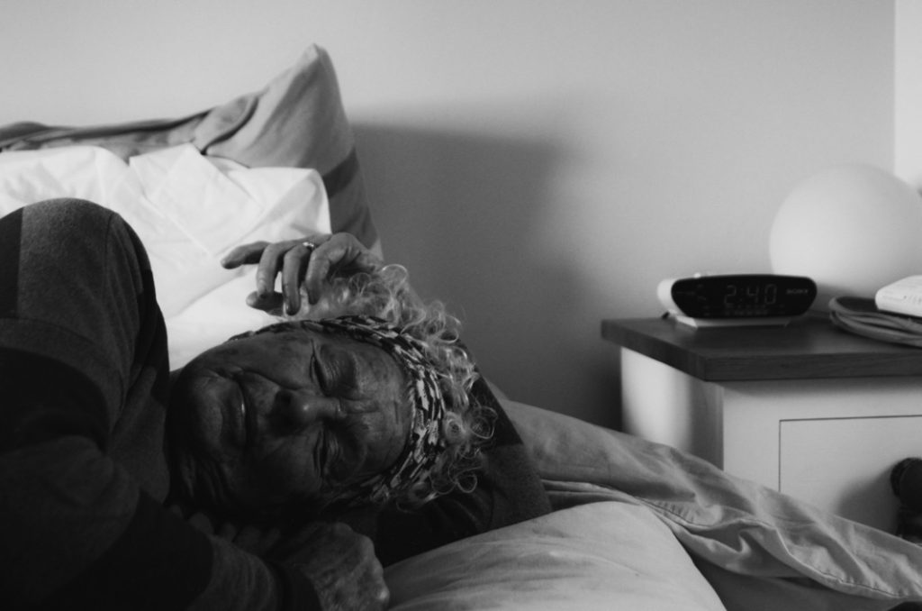
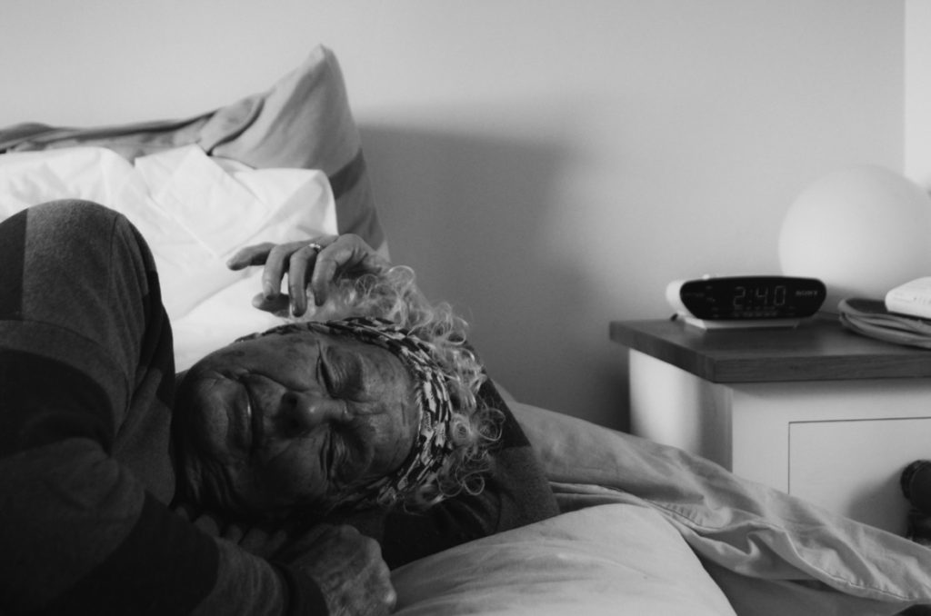
One of my contact sheets from this shoot – I didn’t struggle with much from this shoot, as I had shot in this location before and was familiar with the lighting. Images in my grandmother’s bedroom were really successful as there was 2 sources of light, creates soft and balanced light in my images. As this shoot was a development from my previous shoots, I created some really successful outcomes – drawing on inspiration from my chosen artists, mistakes from previous shoots and my own new ideas. I edited my images in the same way as pictured above in my previous shoot. I focused on B and W edits only for this shoot.
At first, in this shoot I struggled with overexposure shooting in my mum’s bedroom – I combatted this by closing the curtains and changing my position. The day I was shooting was quite overcast, so this didn’t help. I found shooting in my hallway easier, due to the better light – this was mainly due to the helpful overhead light from my skylight.
Contact sheet 2
These pictures are from my grandmother’s house – the lighting was much better here, due to two sources of light in the bedroom. The central position of my grandmother’s bed helped me to create better compositions in my images.
Contact sheet 3
These are more photographs at my grandmother’s – I think in this shoot the photos improved as the shoot continued, with better composition and lighting helping.
Editing
Cropping after edit – creating a more effective compositionOriginalFinal Edit After editing there were too many cool tones in the image – correcting this by adding warmth and grain the final image.EditOriginalOnly subtle editing in this image in order to reduce overexposure in the background.EditOriginalHigh contrast B and WImage too warm Adding cool tones to reduce rednessFirst editFinal – reducing contrast with filterUsing filters ‘soft tone B and W’ in lightroom after my own editing.Reducing temperatureToo warmOrginalReducing warmth and rednessTurning b and w but unsuccessfulBasic editing then adding filterChanging midtones of filterFinal editOriginalCreating virtual copy to experiment with colour grading – development from shoot 1 (self portraits)Final edit
Colour grading used – red/ orange shadows
Final Images
Evaluation
Overall, I found this shoot to be successful – I hadn’t taken portraits in a while before carrying out this shoot, so it took me a while at the start of the shoot to get to grips with directing my subject, using lighting correctly and adjusting settings effectively on the camera. This shoot was definitely an improvement from my first self portrait shoot – I had better planning and organisation, which really helped me to produce more quality outcomes. Plsnning locations and times specifically before shooting really helped me in this shoot. Although this photoshoot was still successful, I need to carry out at least one or two other portrait shoots in order to have a high enough amount of quality images to use for collages and final prints.
Photoshoot 4
Contact Sheets
I took these in late afternoon, so had a little trouble with redness/orange lighting from overhead lights as it got darker. To combat this, I ended up taking the last few images outside. I could have avoided these issues by using a copystand at school, but most of these images are very precious and I wouldn’t want to bring them in out of their albums – the images still turned out even with the minor issues and weren’t affected too much so this didn’t change much in terms of quality.
Editing
I don’t need to edit these images much initially – they all are more or less as I want them. However, when combining them with other images i may edit them a little to make them more similar, or to correct over/under exposure. I used a red colour label to separate my best images out of the shoot and cropped/ rotated images as needed. I wanted to keep raw edges and imperfections in the images, as I think taking them away removes their authenticity to a point.
Best Images
Below are my best archival images from this shoot.
How have Vasantha Yogananthan and LaToya Ruby Frazier explored identity and heritage in their work?
“The photographer is always trying to colonise new experiences or find new ways to look at familiar subjects—to fight against boredom. For boredom is just the reverse side of fascination: both depend on being outside rather than inside a situation, and one leads to the other.” -Susan Sontag, On Photography
In this essay I intend to investigate the differences and similarities of how photographers Vasantha Yogananthan and LaToya Ruby Frazier each explore the concepts of identity and heritage in their work. I have chosen these two because I feel that I can relate to aspects of their work, due to being a person of colour myself, and find that they have both approached the subject with their own unique style and technique. Yogananthan often making images of strangers, blurring the lines between fiction and reality, as well as implementing the technique of hand painting film images, something particularly important to photography’s history in India. His work stands between an outsider and an insider’s perspective, while being a stranger and photographing a world, he is not entirely familiar with while also reconnecting with his own culture and restabilising the portrayal of South Asia through photography. Frazier focusing on documenting her family, very much from the idea of an insider looking at world that she herself as black woman inhabit growing up in a steel mill town, taking her images using a monochrome film camera, giving them a timeless feel. In my own work I intend to explore my position in South Asian culture from my unique perspective as both an insider and an outsider due to being half white and living far from South Africa, where most my mother’s side of the family live, as well as India itself where they are originally from. For this project I am using older images of my family and images I had taken in South Africa, alongside newer images of Jersey and a few items related to my heritage. I feel like using archive images like this helps to show both my connection to that side of my family as well as how do not feel like I am truly a part of it due to not being a part of any of these images myself, and not being there to take others due to distance in both time and location. To further connect these images to my artist references, I will be taking inspiration from their editing styles for my own pictures to create visual connections between their images and my own.
Yogananthan and Frazier use two incredibly contrasting styles to explore the subjects of heritage and identity in their work, Yogananthan relying on traditional techniques and creating images evocative of the Pictorialist photo movement of the late 19th, early 20th century, made up of key figures like Alfred Stieglitz, Heinrich Kuhn and Frank Eugene, employing the help of painter Jaykumar Shankar to help hand colour his black and white images to give them a soft and dream-like appearance, through his use of colour and composition. His work is a way for him to reclaim his Sri Lankan heritage after being born and raised in France, by choosing to approach The Ramayana through a Pictorialist lens, a style crucial to European photography’s history, Yogananthan creates a series that draws inspiration from both sides of his heritage, while also depicting the mythology in a more fantastical way.Pictorialism is defined as ‘an approach to photography that emphasizes beauty of subject matter, tonality, and composition rather than the documentation of reality.’ (Encyclopedia 2019)
George DavisonVasantha Yogananthan
In contrast, Frazier takes inspiration from a variety of artists who were part of a movement known as social realism, using straight photography, defined as ‘a photo shoot that represents a scene or subject in sharp focus and detail, in accordance with the qualities that distinguish photography from other visual media, particularly painting. Simple and clean with sharp detail.’, (Anon 2021) to explore ideas of societal injustice. Some of these photographers include Dorothea Lange, Walker Evans, and Kathe Kowalski- Frazier’s mentor until her death in 2006. Frazier’s exploration of societal injustice came from her experiencing environmental racism first hand, and how it affects not just her but the wider community of Braddock.
Dorothea LangeLaToya Ruby Frazier
Both artist’s work ties closely to the photographic theory of insider versus outsider documentative photography, explained by Abigail Solomon Godeau as ‘The insider position—in this particular context, the “good” position—is thus understood to imply a position of engagement, participation, and privileged knowledge, whereas the second, the outsider’s position, is taken to produce an alienated and voyeuristic relationship that heightens the distances between subject and object’. (Solomon Godeau 1994:49). Yogananthan being placed in the position as simultaneously an insider and outsider due to his own disconnection from South Asia and using this project to reconnect that side of himself, slowly becoming more of an insider as the project evolves. Frazier on the other hand, begins and ends her project as an insider, documenting her own family and their personal struggles in the town that she, her mother, and her grandmother all lived in, using this important position of knowledge to bring attention to the lives of the overlooked, while remaining empathetic, which carries over to Frazier’s later projects where she is placed in the position of the outsider, focusing on the personal and everyday experiences of those suffering.
Yogananthan explores his heritage and identity as a biracial man through his project The Myth of Two souls, an exploration of The Ramayana through photography, allowing him to reconnect with his heritage as well as investigating his connection to South Asia. This project works in contrast to photography being used as a cold colonial force used to oppress the people living in places like South America, Africa, and Asia, documenting them and comparing their physicality to that of their white oppressors. The Myth of Two Souls, explores Indian people and culture through a more empathetic lens, utilising The Ramayana, and its many interpretations, to explore the everyday lives of the people of India, while still maintaining the spiritual importance of the story, instead of depicting South Asians as sub-human creatures to be ruled by an empire, which he explains in an interview, ‘Now, I am not trying to say anything about the “truth” of Indian society: how things work, castes, or family relations. Rather, I am raising questions and examining the ways that reality and fiction merge together in the country. I think this is the greatest thing about India and the element that sets it apart from every other place in the world. The faculty of everyday people to dream up stories in their daily life; their ability to see gods and epics in the world around them’ (Yogananthan in Lensculture). This perspective comes from Yogananthan’s unique position, viewing the country through the curious lens of the outsider and the respect and care of one from the inside. The image I have chosen to analyse is The Evening Before from Chapter 2 of Yogananthan’s Myth of Two Souls, titled The Promise. This chapter depicts the protagonists Rama, an incarnation of the god of preservation, Vishnu, and Sita, an incarnation of Lakshmi, the goddess of wealth, and their emerging romantic relationship. The title implies that the image represents Rama on the night before his wedding to Sita and shows a young man sitting on some steps surrounded by an environment of traditional architecture and the city fading away into the background. The background colours are soft and light, contrasting Rama’s darker, more modern clothing, as well as his skin. Throughout Hindu mythology, Rama is often depicted having blue skin, alongside the god he incarnated from, this blue skin was likely used to represent the cosmos, as well as the idea that Rama’s ambiguous skin tone could mean that anyone could imagine him as themselves. Yogananthan uses this idea to cast a variety of Rama’s across the images taken for this project and depict The Ramayana, as something seen across all Southern Asia, not in specific ethnic groups or parts of the geography, deeply embedded even in modern culture. While the title implies the image is set at night, the sky is painted to be a light pink fading into cream, helping enhance the more mystical style of images, while also showing off the abilities of the artists Yogananthan collaborated with in order to make the piece, like Jaykumar Shankar, one of the few people remaining who paints on monochrome images in this way. By collaborating with Indian artists and writers, Yogananthan can reposition the portrayal of India, not from the view of outside invaders, but from the people who live there, demonstrating the importance of tradition and culture, while also showing modern day India.
The Evening Before (Vasantha Yogananthan)
A depiction of Rama and Sita in an 18th century painting
Jaykumar Shankar
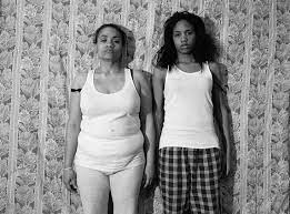
LaToya Ruby Frazier explores her heritage and identity as a black woman living in an industrial city through her project The Notion of Family, a photobook that depicts the relationships between her family as well as the town of Braddock and how integral the steel industry is to the community’s lives. Frazier documents her struggles with chronic illness due to her proximity to the steel mills, the closure of the local hospital which was seen as the heart of the town due to the lack of town development, the death of her grandmother, and the abandonment of the black community in Braddock due to closures at the steel mill, leaving many residents sick and impoverished. Frazier uses photography to explore these societal injustices, and throughout the book places small amounts of text to contextualise images and explain the dynamic of her family. The images are taken on a monochrome film camera, reminiscent to the black-and-white pictures taken of black people during the civil rights movement. Frazier uses these similarities to emphasise her fight against environmental racism and how the US government still does not see black communities as worth protecting, seen through the lack of support given to residents financially as well as the eventual closure of their hospital, eventually leading to the death of Frazier’s grandmother due to healthcare workers not getting to her in time as they had to come from another town. The image I have chosen to analyse is titled “Me and my guardian angel”, which was taken by Frazier in 2005. It shows her and her grandmother sitting on the floor, surrounded by dolls, Frazier’s hair tied up in a childlike style, and smiling while her grandmother looks at it sternly. Frazier was raised by her grandmother and often dressed her in this way as a child. In an interview, Frazier explains her grandmother’s fascination with dolls, ‘She must have had hundreds, all in different sizes, different outfits, different nationalities… She began collecting them when my aunt – her daughter – was murdered. It was something to do with filling that loss’ (Frazier in Siddons 2018). This idea of loss is crucial to Frazier and her grandmother’s relationship, since this is one of the few images of the two of them together before her grandmother’s death, their final image together taken at her funeral, displaying her open casket and surrounded by dolls. In this image Frazier could be showing the complex nature of their relationship, raised by a woman who lost one of her own daughters and fills that hole with legions of dolls. Frazier’s decision to wear her hair in this way could represent her belief that her grandmother still viewed her as a child, despite her being almost 30 years old when the image was taken. Frazier’s position as an “insider” is key to her images, creating personal and impactful pictures that just would not be captured by anyone else, especially a white male photographer who would not have the same level of experience and understanding of the impact that race and gender has on her relationships and image making technique as well as the personal connections required to create them in the first place. Frazier’s position as a black woman leads to her work being mainly focused on the struggles of women in her inner circle, without resorting to sexualisation or pity, depicting them as independent but still in need of assistance of the wider community. For generations, black women have been forced into specific roles and expectations by the world around them and this image, and by extension Frazier’s entire photobook, really show how integral these expectations are in her life.
Me and My Guardian Angel (LaToya Ruby Frazier)
(An Image that shows the room from another angle) Grandma Ruby Smoking Pall Malls (LaToya Ruby Frazier)
An image from the civil rights movement
In conclusion, both Frazier and Yogananthan use photography to explore their identity and heritage using photography but using a range of contrasting techniques. Both photographers shoot using black and white film cameras, creating images that are reminiscent of the photographic movements they have taken inspiration from, however Yogananthan has his images hand painted afterwards while Frazier leaves hers as they are. They both explore locations important to them, Frazier exploring her hometown of Braddock and its descent into disarray as it is consistently overlooked by the local government, as well as her experience living there as a black woman, while Yogananthan reconnects with his South Asian identity and heritage by using a cultural staple to document the Indian subcontinent from his own perspective, while also working alongside Indian writers and artists. For my own work I used a digital camera as I did not have access to a film one and edited my images both in colour, inspired by Yogananthan’s work, and monochrome, inspired by Frazier. While I do enjoy my final results, I would have liked to the opportunity to work using film to take closer inspiration from my photographers and would have also wanted to make more shoots of both me and my family, creating images with more planning and organisation beforehand.
Bibliography:
Sontag, S.(1977) On Photography. New York: Farrar, Straus and Giroux
Anon, (2021). What is Straight Photography? What is Considered Straight? [online] Available at: https://www.imaginated.com/blog/what-is-straight-photography/.
Solomon-Godeau, S.(1994) Public Information:Desire, Disaster, Document, Part 1. San Francisco: San Francisco Museum of Modern Art
LensCulture, V.Y. | (n.d.). A Myth of Two Souls: Understanding India Through the Ramayana – Photographs by Vasantha Yogananthan | Text by Alexander Strecker. [online] LensCulture. Available at: https://www.lensculture.com/articles/vasantha-yogananthan-a-myth-of-two-souls-understanding-india-through-the-ramayana [Accessed 7 Feb. 2023].
The Editors of Encyclopedia Britannica (2018). Sita | Hindu mythology. In: Encyclopædia Britannica. [online] Available at: https://www.britannica.com/topic/Sita.
Hindustan Times. (2019). The dying art of color painting black-and-white photos. [online] Available at: https://www.hindustantimes.com/art-and-culture/the-dying-art-of-color-painting-black-and-white-photos/story-oVNrREtEDHKOjUOP3CSadJ.html [Accessed 7 Feb. 2023].
History.com EDITORS (2009). Civil Rights Movement. [online] History.com. Available at: https://www.history.com/topics/black-history/civil-rights-movement.
Siddons, E. (2018). LaToya Ruby Frazier’s best photograph: me and my guardian angel. The Guardian. [online] 23 Aug. Available at: https://www.theguardian.com/artanddesign/2018/aug/23/latoya-ruby-frazier-best-photograph-grandma-ruby [Accessed 7 Feb. 2023].
‘Damn girl, it’s only a story. It’s not real. And don’t worry, there is a happy ending. ‘
– — Tweeky Dave, Raised by Wolves (Jim Goldberg)
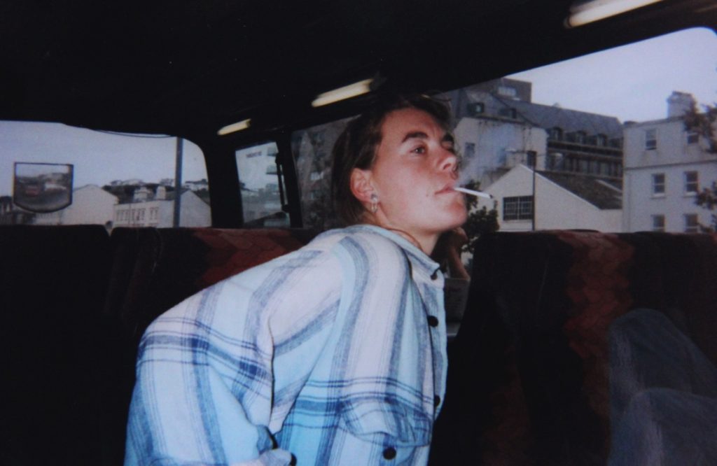
The idea of youth culture is often romanticized through media, especially in the present day through unrealistic beauty standards and expectations that all adolescents should have a positive mindset because they’re ‘only young’. Through social media in particular, a negative stereotype is fed to teenagers that growing up is easy and undemanding, whereas in reality, it can at times be the opposite. In my personal study I plan to explore youth culture in a different light. This interests me as I feel the portrayal of adolescents in media is often unrealistic, blocking out the hedonistic and reckless side of teenage life which is deemed ‘taboo’ in the eyes of society. Therefore, I have chosen the theme of youth culture for my personal study to prove my point that it is a part of growing up and that although to some it may be considered an unacceptable stereotype, it sure is fun.
My chosen artists for my project are Jim Goldberg and Ryan McGinley, two photographers that showcase a side of youth culture that is lesser captured in photography. Jim Goldberg is an LA based artist, most well known for his photobook Raised by Wolves, a ten-year documentation into the lives of teenage drug addicts living on the streets of Hollywood. Through a collection of images paperwork and interviews, Goldberg weaves together a story that makes the reader feel connected with his subjects. When asked about his intention behind the photobook, Goldberg simply said ‘“I had done the Rich, and I had done the Poor, and I had done the Old with Nursing Home, so it made sense to do something with young people.’ His work inspires me because it captures an unfiltered, raw & realistic side of youth culture that is often brushed under the carpet in media coverage. In my project, I aimed to respond to his work by taking a variety of images depicting stereotypes in youth culture that are considered negative, focusing on the lows in teenage life such as violence and the aftermath of hedonistic tendencies. On the other hand, my second artist Ryan McGinley portrays the topic of youth culture in a more fun, positive light, capturing the freedom and liberation of being a teenager but still including the self-indulgence of growing up, mainly through his photobook The Kids were Alright, where he would photograph himself and his friends in New York, most often out late at night smoking, drinking or spraying graffiti tags on walls. In my project, I aimed to respond to his work by photographing my friends in their most carefree state, aiming to capture the essence and intimacy of teenage life.
In media today, negative and unrealistic stereotypes have been normalized. There is never a middleground for how teenagers are perceived, especially in TV and social media. On one hand, social media presents teenage celebrities / influencers as living the perfect life which sets a standard that may confuse someone whose life may not be as ‘perfect’, leading them to believe they need to live up to the unrealistic standard of their potential ‘role model’. On the other hand, teenagers with a more troubled life are also depicted unrealistically, especially in TV with shows like ‘Skins’ that romanticize a darker side of youth culture and depict serious topics such as drug addiction and death through rose-coloured glasses, influencing younger viewers that such severe hedonism is the norm in teenage life. Therefore within media there is no representation for teenagers in the middle, neither perfect nor troubled. This leaves us feeling like an outsider to the experience of growing up. The concept of Insider vs. Outsider is a key factor in youth culture photography, as it helps provide narrative and establish connection between the photographer and their subject(s). Inside/Out Solomon-Godeau, Abigail (1994) is an article analysing the ethics of works by photographers such as Nan Goldin, who presents a similar aesthetic to Goldberg’s work, however through the insider perspective. Solomon-Godeau proposes the question of what is acceptable to photograph as an outsider, and how a photographers interaction with their subject can push past surface level from voyeuristic to engaging. Goldbergs work is a good example of this, as although he lived a very different life from his subjects, he gained their trust and managed to immerse viewers into the essence and unity of their culture whilst still being an outsider by photographing his subjects in both candid and staged images, capturing both the isolation and bleakness of street life whilst still telling each characters unique story in an almost liberating light. He stated in an interview with Magnum “Feeling like an outsider enabled me to evoke stories from the people I worked with because I could relate to them. I always aimed to get to a point where empathy and trust were created… Having people write directly on photos was a way to access their thoughts”. On the other hand, Ryan McGinley’s images are taken from an insider perspective, as his images were composed mainly of himself and his friends, a self-documentation of life in New York. Although Goldberg’s work tells a better story, McGinleys images provide a more relatable narrative that captures the fun and empathy of hanging out in a group of friends. However, at times McGinley blurred the lines between Insider vs. Outsider perspective, often meeting up with a group of graffiti artists he was unfamiliar with. Through these photographs McGinley immersed himself in a different culture, reflected through his images that depict said graffiti artists in their element, this gives a sense of freedom in an art style that is usually considered a negative stereotype. Within my own work, I have taken my images from an insider viewpoint – however my work will be presented to those who are unfamiliar with myself and my friends, so to help give context to outsiders I aim to include text and interviews with my friends, therefore providing an engaging narrative that immerses viewers in the culture of growing up on an Island.
Jim Goldberg explores the idea of youth culture from a darker, more political viewpoint, capturing the lives of troubled youth that were mistreated not only by their guardians but the American justice system as a whole. In 90’s America, the number of homeless youth was at its height due to the homelessness crisis that rose in the 80’s. Youth on the streets had to do whatever they could to survive, putting them in dangerous situations, especially with the rise of the AIDS epidemic across America. Goldberg briefly touches on this in his book, stating that few of his subjects were battling AIDS amongst other illnesses that came as a complication to living on the street. In the same interview with Magnum, Goldberg stated ‘I tried to pull the curtain away and talk about issues of neglect and abuse and show the breadth of reasons why these kids were running from home. Often it was because of abuse, or the pursuit of Hollywood dreams, or coming out to their parents and being kicked out.’ Goldberg is not afraid to expose the injustice his subjects faced at the hands of America’s federal system, including court documents and numerous times cops have arrested him for being a bystander to the offences his subjects have committed. This shows the dedication Goldberg put into the book to spread awareness on the side of youth culture that is commonly swept under the carpet in media coverage. His subjects live off impulse and hedonism, yet Goldberg portrays them in a way where we feel connected to them, and in some cases even sympathize with them. An example of this is Tweeky Dave, arguably the books protagonist. Dave is presented to us at the start of the book with an in-your-face, self proclaimed ‘kamikaze’ personality that makes the reader instantly fond of him. Goldberg pieces together his life and eventual death in a heartbreaking way, documenting his love for drugs, hatred for the police and admiration for his on again, off again girlfriend Echo that presents him as the focus of the book and a voice for troubled youth on the street.
ANALYSIS
This image is one of many that encapsulates the characters in Raised by Wolves. This photo of Dave, taken in black and white, hones in on what may be considered an insecurity – his messy scar and crooked smile, yet he presents himself with such confidence that this image showcases the liberation of Dave and his culture in a positive light. Presented on a double-page spread, these pages tell us a story without the need for excessive detail. The atmosphere of the image is enhanced through text, with the statement ‘I’m Dave who the fuck are you’ that sums up his wild personality through a single sentence and a set of bold black and white images that catch your eye. I feel this image is Goldbergs best portrayal of youth culture as it shows life through Dave’s eyes and tells a story of his character and personality, even if not entirely true. Goldberg states that “The stories that they (his subjects) created about themselves were based on Hollywood, rock and roll, and love stories… They would flow back and forth and be the new James Deans or Johnny Rottens” Although the persona of Dave may be blurring the lines between fiction and reality, Goldberg pieces it together through images like these to establish connection between the reader and his subjects, bringing himself away from the outsider viewpoint and immersing himself in the characters and culture to create a sense of fluidity within his images.
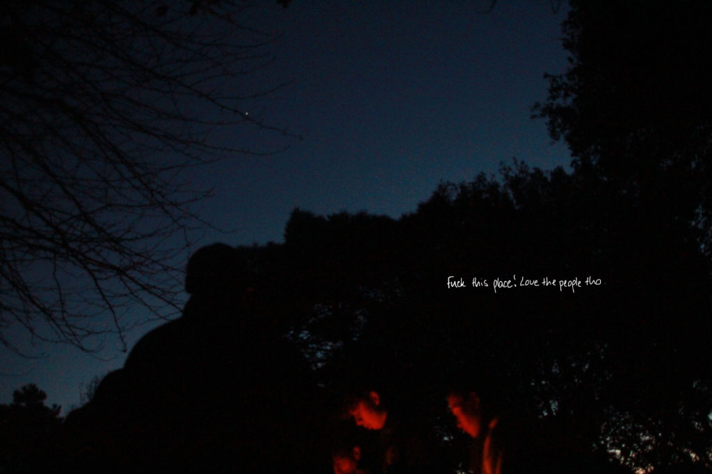
I took this image whilst out at a forest with some friends. This photo clearly shows Goldberg’s influence on my work, with the use of handwritten text. In planning for my project, i asked some friends to write what they thought of being a teenager in Jersey. Gathering the responses I overlaid the text onto my photos. I think adding this to my work provided a clearer narrative and a good representation of my projects theme, as I took different opinions and responded by taking my photos not just from my perspective, but from the perspective of my friends to help present a broader idea of youth culture in Jersey. The image is taken at night, the subjects in the image dimly lit by the fire and street lights from the distance. I wanted this image to have a variety of viewpoints as many things stood out to me upon taking this image, e.g the silhouette of the trees and the singular star in the distance.
Ryan McGinleys earlier work explores the hedonistic side of adolescence, focusing on New York street culture where he would document himself and his friends on nights out through a range of disorderly, hectic images in his 2003 photobook The Kids were Alright. McGinley broke barriers in standard youth culture photography upon the release of his book, capturing everything that went on around him with a chaotic essence that ties together to create a free-spirited, carefree representation of being around friends, a basic narrative that he took and pushed to the limit. In an interview with the NY Times, McGinley stated “I feel like I’ve always been sort of in the spirit of the documentary photographer, exploring every aspect, kind of using my life as my art.” In The Kids were Alright, McGinley explores marginalized groups within youth culture, focusing on skaters and graffiti artists that are commonly perceived in society as wreckless and antisocial through harmful stereotypes. Although he captures the fun and liberation in hobbies such as skating, McGinley also explores aspects of violence that comes with self-indulgent tendancies, photographing his friends with black eyes and bloody noses to show how party culture can get out of hand. After the release of The Kids were Alright, McGinley began to change his approach to youth culture photography from documentation of real-life situations to staged photographs that hold an ethereal, more peaceful atmosphere yet still capture the intimacy and liberation of youth. Another one of his works that stood out to me is his 2011 photobook ‘You and I’, a compilation of photographs involving models in open, natural spaces. Although a juxtaposition from his earlier works, this book stood out to me as i feel it embodies the essence of growing up and portrays a freeing, whimsical feeling that i resonate with and have attempted to replicate in my own work.
Dash Bombing, New York
This image, titled Dash Bombing, shows Dash, one of the more frequently photographed one of McGinleys friends, graffitiing a tag onto the side of a building in New York. The background of the image is dark, dimly lit by the streetlights in the distance. Dash is the lone subject in this photo, momentarily isolating him from civilization as the photo places all focus on him. This image is one of many by McGinley that show the beauty of street art and the dedication graffiti artists put into their practice. Although some link graffiti to antisocial behaviour and gang culture it is used as a way to spread a social or political message. This image showcases a common theme of stillness within McGinleys work – although other features of the book are presented as chaotic and busy, this image resonates a feeling of peace and intimacy – McGinley photographs in a way that immerses us into the atmosphere and the moment captured within the image.
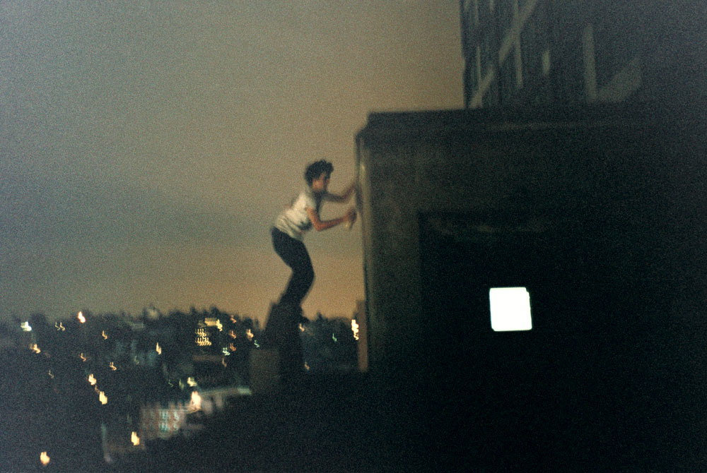
I took this image in response to McGinleys work. It features my friend Tristan, swinging from a tree in a field i visited with my friends. This image is part of a small photoshoot i did whilst out with mates, aiming to capture what we got up to in our free time in a candid style, much like both McGinley and Goldbergs work. Tristan is an isolated subject in this photo which focuses the attention onto him as the trees in the background slowly fade out into the dark. This image to me shows a freeing and fun atmosphere, devoid of anything chaotic, and conveys the adventurous atmosphere of teenage life, with nowhere to be and your only priority being surrounded by your friends and living in the moment. An element of my image-taking process I wanted to stick to was the candidness of my photos- instead of making my friends pose I let them roam and stood away with my camera, blurring the lines between Insider vs. Outsider to provide a unique and fresh narrative to my images.
Goldberg and McGinley present both close similarities and vast differences within their works. In Raised By Wolves, there is a strong underlying political message of bringing awareness to taboo subjects such as addiction, prostitution and homelessness, however through the books characters it becomes a voice for youth culture through liberating atmosphere the characters radiate, without romanticizing the grittier, darker side of street life; much like The Kids Were Alright, which too takes negative stereotypes such as violence and portrays them in a positive light. Unlike Raised by Wolves, the book is devoid of seriousness, and is simply a documentation of fun, which is what i aimed to replicate within my work, yet still include a side to growing up that is often unseen.
Throughout this essay I intend to cover the ways in which I have observed the theme of islandness and its links to isolation and disconnection primarily through the physical aspect of island living. “Little islands are all large prisons: one cannot look at the sea without wishing for the wings of a swallow” – Richard Burton. Through my project, I am aiming for a clear representation of how the island is cut off from the mainland continents by the sea- which is a focal point in the study. I will be attempting to portray how the sea is the rough, brutal and somewhat impenetrable barrier between us and the rest of the world, but alternatively also capture the peace and beauty it brings to where we live. This is a topic of interest for me as not only have I lived on an island around the sea my whole life, but I am now understanding how there is a lot more to the world/life than living on an island and so comes some frustration- which is what I am trying to carry across into my project. To add some depth and contrast I will also be including elements that challenge my main focus and show that it’s not all bad as island living can be nice too. I will be drawing inspiration from the work of artists such as Hiroshi Sugimoto & Stratos Kalafatis both cover themes similar to what I have discussed. I will be linking my work to previous projects I have completed, as a common theme in my work is using the coastline of the island to my advantage in terms of linking to ideas.
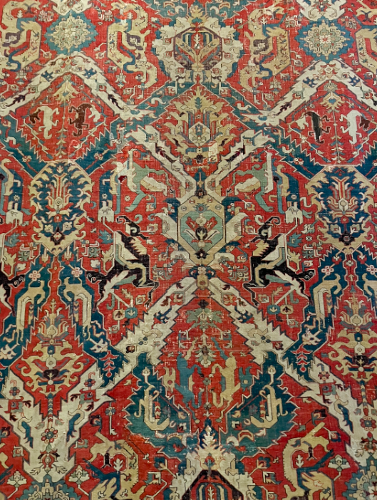
I’d like to start with defining the meaning of “Disconnected”. By definition it means having had a connection broken, which is a good analogy for the island of Jersey’s physical status. I say this because Jersey is a volcanic island formed several millions of years ago. It was in an area near a volcano, and was once connected to France by a low, flat coastal plain before tidal levels rose and cut it off from mainland Europe. However, in this essay I am not just discussing the physical nature of Jerseys, but also the cultural and societal separation between Jersey and the mainland and how it can be portrayed through image as in the end it does all stem from a physical feature of where we live. For example I have been drawing inspiration from photographers such as Stratos Kalafatis, whom has an extensive collection based around archipelagos, in which he captureselements of island living such as ferries; which are a crucial part of life in places separated from mainland countries as it is where the majority of supplies come from and in some cases may also be the only form of transport. I chose Stratos as I can appreciate the way that he captures these images in a way that portrays the eerie loneliness, especially around the sea which obviously surrounds islands completely. A common theme throughout this series of images is the small number of colours present in each image, which is limited to blues, blacks and some whites/dark greys. I would link this particular set of images to themes of realism, due to the accurate, detailed, unembellished depiction of contemporary life.
Stratos Kalafatis, Archipelagos
This image from Stratos’ ARCHIPELAGOS collection is a perfect example of the themes of loneliness that come linked with essential parts of island life as it shows a deserted ferry, in an eerie shot as it crosses the connecting body of water around a Greek island. In contrast, there are photographers such as Michelle Sank who has a collection called Insula focussing on showcasing the uniqueness that comes from island culture in a positive light in relation to history and ethnicity.
Michelle Sank, Insula, 2013
While my project is mainly based on portraying the slightly somewhat negative and borderline depressing side of island life – I found another photographer with a series of images based around islands who gave me a more unique perspective regarding the calmness and zen that comes with being surrounded by the ocean and upon looking through his series “Seascapes”. In this series Hiroshimo Sugimoto creates a number of images in the style of realism, capturing the blending point of the sea and the sky which comes out with a nice effect without any editing.
While reading a somewhat recent interview with Hiroshimo, he came out with the phrase “I’m inviting the spirits into my photography. It’s an act of God.” Kennedy, R. (2012), Hiroshimo: Girl Pictures. New York; New York Times. I found this really useful in understanding his work as at first I saw them as contemporary attempts at pictorialism (an approach to photography that emphasizes the beauty of subject matter, tonality, and composition rather than the documentation of reality)- however after reading this quote and more into his takes on his work, they came across differently. His work appears to look like a painting at first, but they are in fact photos- which is a sort of effect achieved by adjusting camera settings such as exposure. This combined with the photos being taken at night is how he is able to have his images look so clean and painting-like. Another reason I particularly like this set of images is because it has shown me how I can take photos of simple things like the horizon and make them into pieces of art which can evoke emotions and represent specific meanings.
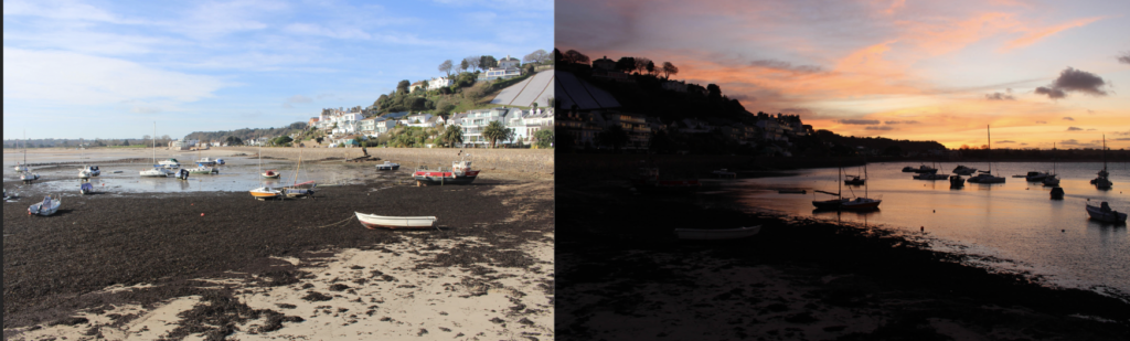
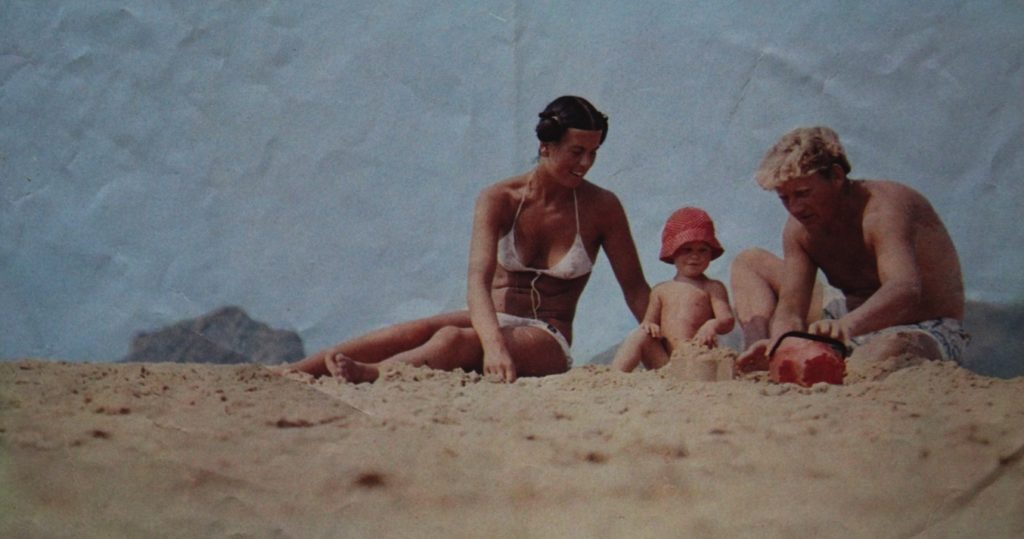
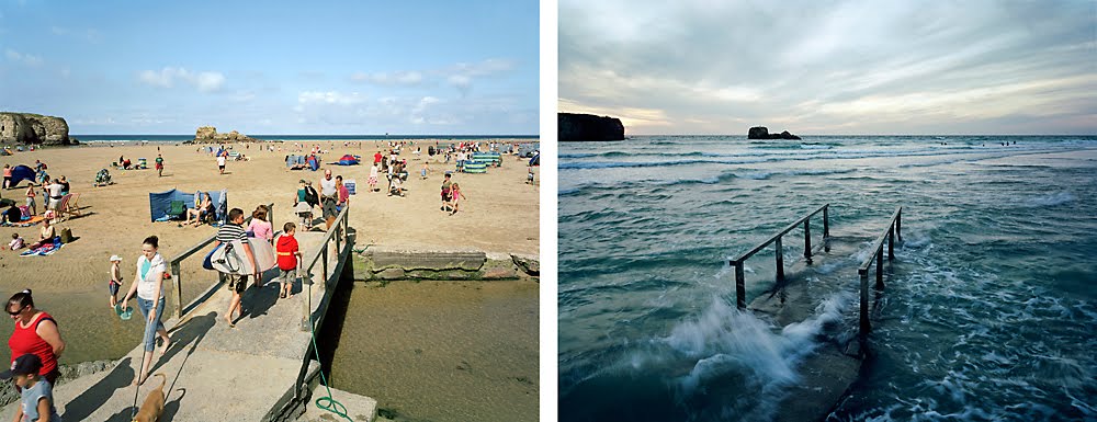
Another artist whose work I am looking at in relation to my is Michael Martin, a British landscape photographer who focuses a portion of his work on photographing changing tides, through which he creates these dramatic images showing the movements of tides along the British coast with before and after photos which he manages to align perfectly in order to make it look like he never moves.
Example of Martin’s work
I feel his work links to my question as his portrayal of drastic tidal changes showcases how the ocean can make a place somewhat untouchable to humans as nature pleases and so cuts off islands from larger populations/communities as I have mentioned previously- ultimately disconnecting them. This image I have used for reference shows how a beach full of people paired with the same beach at high tide- linked together by the focus of the framing of the bridge. The lighting in the first picture is much brighter conveying a more pleasant tone whereas the second image contrasts that with a nighttime setting and darker colours/lighting. I really like how he has created this contrast and it is something I am attempting to recreate in my own set of images of the Jersey coastline as it is a perfect example of how I am trying to describe the negative connotations associated with island living and how the sea is ultimately the root cause. While Martins work is radical, I do find Hirsohimo’s to be slightly more poignant, which I feel links more to the themes of lonliness however I will deffinately be including my shoots inspired Martin as they perfectly show off how tidal ranges cause Disconnection.
One of my first attempts
As a result, I have found that there are photographers who have portrayed themes of loneliness and disconnection through their work in photographing archipelagos which has motivated me to go further down the route of portraying this through my own images. However, through this research I have also found that another theme that comes along with these motifs is elements of peacefulness and tranquility which I found to be present in a lot of the work I looked at and used for reference. While it was difficult planning & capturing Jersey’s massive tidal range I found it an effective way of portraying my hypothesis. I have definately been influenced by the work of photographers such as Hiroshimo as his collections have shown me that my photos dont always have to be landscape photgraphs and that I can make things such as the horizon into surreal “art” pieces. I also found that you dont always get the shoot right on the first try and so it may take multiple attempts in order to get the desired effect.
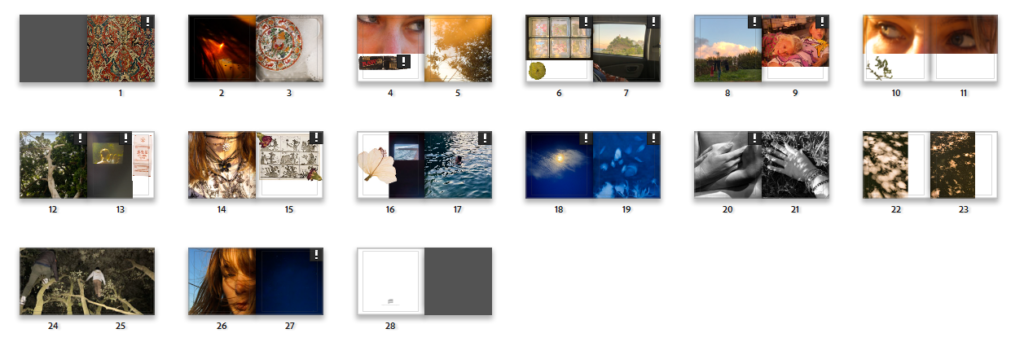
First, I separated the images I am most likely to use from the images I was least likely to use, I did this using a colour-coding system where I selected images I was most likely to use in my final project- after editing I will further narrow down these images when I am choosing the layout of photos in the book.
After this I did some editing on my images- bringing out contrasts, saturating colours, levelling areas with high exposure- I’ve also added grain to some images as to make them look more nostalgic. As with Sam Harris and Olivia Bee’s work I am keeping editing to a minimum however I will be putting some images into photoshop to experiment with different more abstract and distorting editing.
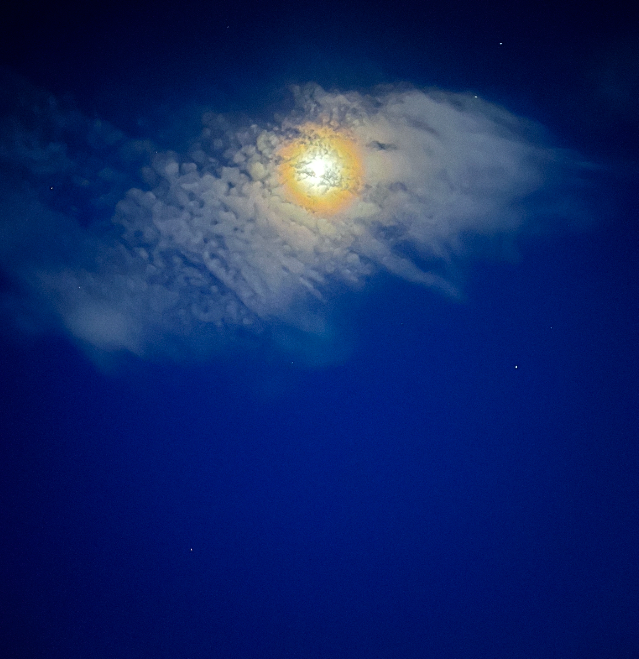
An example of an image which I have edited
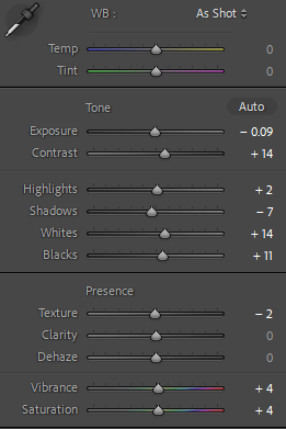
Below is the editing for the image above, I have kept it to a minimum- I have turned up the saturation and vibrancy so the blue of the night sky is more visible- along with the yellow of the moon. Lowered the exposure so the light of the moon is more prevalent. I did experiment with turning down the clarity and dehaze- however this made the image look too unnatural to the extent where it would not go well with other images in the book, especially when I have some images where detail in the image is key. Not shown in the editing was where I turned up the grain to +11 amount, +25 size, +50 roughness.
Editing for above image.
My “textural” images to further enrich textures in the book (will not be a main focus- merely accents/reoccurring themes in the book)
For my textural images I had to crop and resize them to focus on the parts of design I wanted to concentrate on- I then had to edit them so they were brighter (turning up the exposure, whites and highlights) as the environment that the pictures were taken in was dark as to preserve the colours of the rugs.
One of my textural images
Above is an image that was successful when editing- clearly it is not perfectly straight, I have decided to keep this effect as it adds to the more homemade, imperfect aspect of the book. When editing some of these images I realised that cropping and resizing them make the quality of the image worse- so I have decided not to use images where this was noticed.
I then separated my images into categories concerning the main focus of the image; including nature, textural, person and abstract. I did this using a star rating scale- 1 star being nature, 2 being textural, 3 being person and 4 being abstract.
PHOTOSHOP EXPERIMENTATION
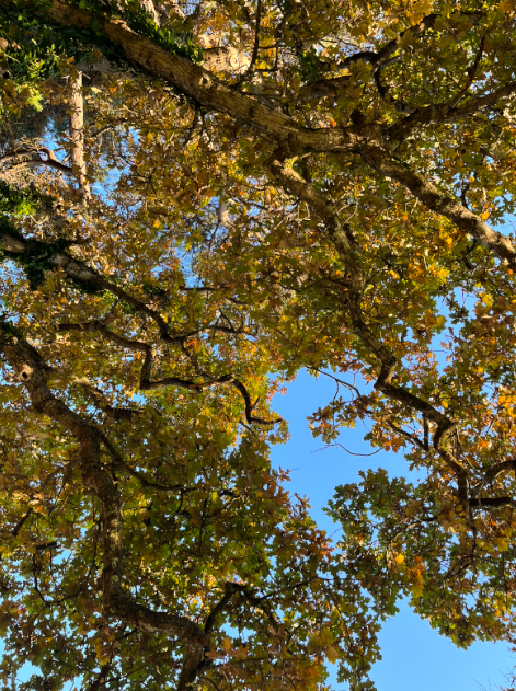
I wanted to create a fisheye effect on my nature images- specifically of pictures where I was photographing looking up through trees to see the crowns.
An image I wanted to edit to a fisheye effect
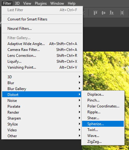
First I edited this image in Lightroom, then exported it to photoshop. I then followed the below options for editing and chose to spherize to -34
My process of editing
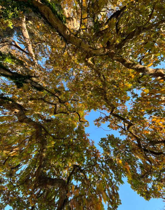
Below is the image after editing, I do not really like how it turned out, personally it gives me a headache, and further editing on photoshop has made the quality of the image diminish.
PHOTOBOOK EDITING
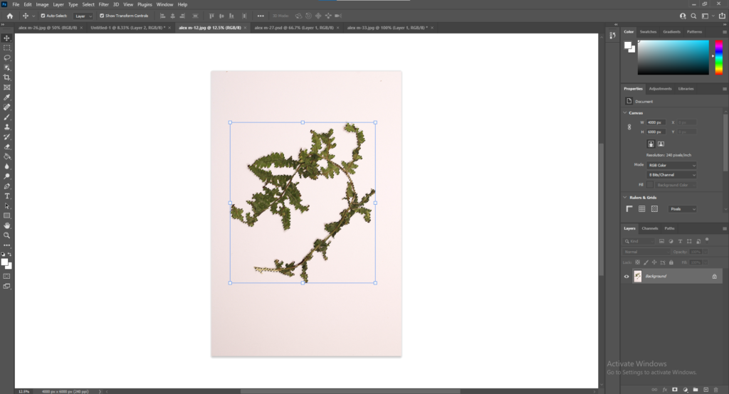
I then started “cutting out” the subject in my studio images to overlay on my photos in the book, I did this by using the object selection tool and then removing the background and importing the image I wanted the item to be over. I had to change the sizes of the images so they would look realistic and get rid of any white areas let on the image after selecting it.
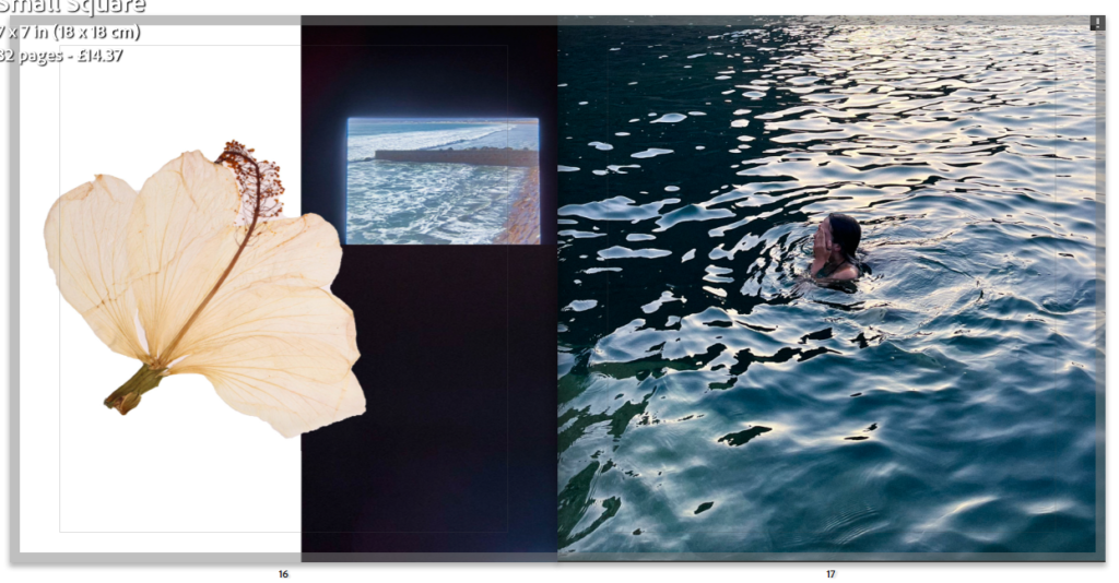
By cutting out these images I created images like the one below- looking natural and homemade with pressed flowers in a book.
I went through my images further, changing duplicates and images which I was struggling to edit- i.e. overexposure tainting part of image, blur, struggling to make it level. To further make selections I am combining some of my nature images on photoshop (seen below)
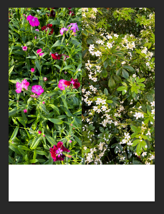
A combination of images
To do this I exported the images from Lightroom onto photoshop and simply opened then dragged them onto one portrait page, making sure they are dead centre and aligned with each other. I am leaving the bottom blank white as when my photobook is printed I am going to handwrite text into it (i.e. poetry, notes, diary entries etc). I am unsure if I will use this image yet as the colours do not match any of my other colours- I may use the white flower image individually.
After I put the edited overlays on the image, some of them were not as effective as others, for the ones where it was not effective I took out the item and left the area blank so when the book is printed I can physically write and stick in the objects themselves or print the pictures onto transparent paper then stick them in.
A page where it is effective- one where I will be keeping the overlay
After doing all this I did not need to edit anymore- so I concentrated purely on photobook design, click the link to view design blogpost.