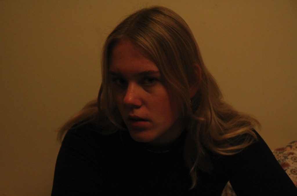
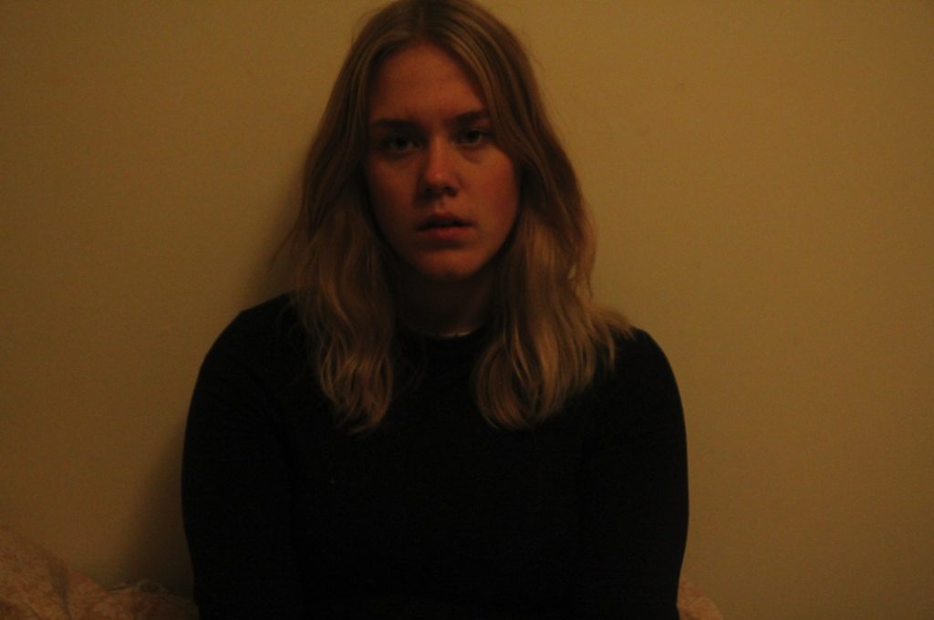
Photoshoots 1 and 2 – Self Portraits

Photoshoot plan

GenreLightingPropsCamera SettingsIdeaLocation
PortraitureArtificialTripodContinuous shooting (10 at once)Self – portraitureHome – lounge and bedroom
Plan

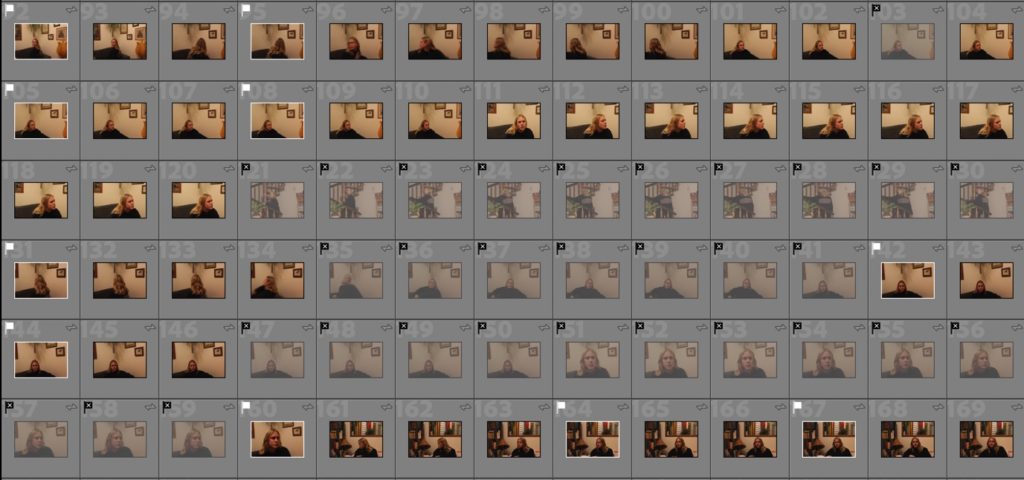
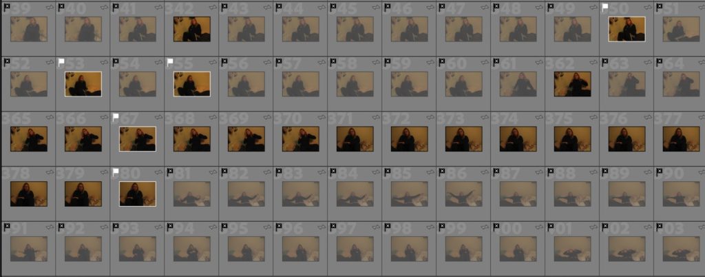
Contact Sheets

First Contact Sheet
Second Contact Sheet
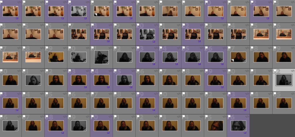
Best Images
Using purple colour coding to show my best images after flagging.

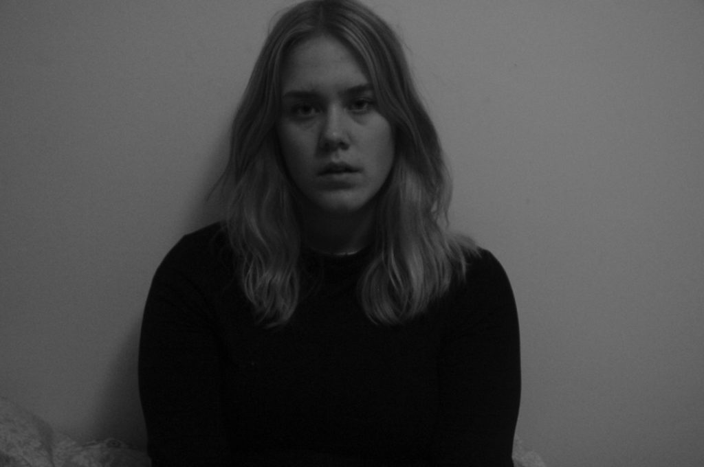
Editing

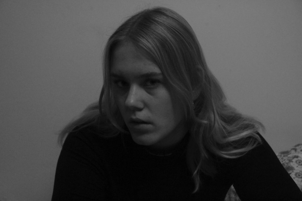
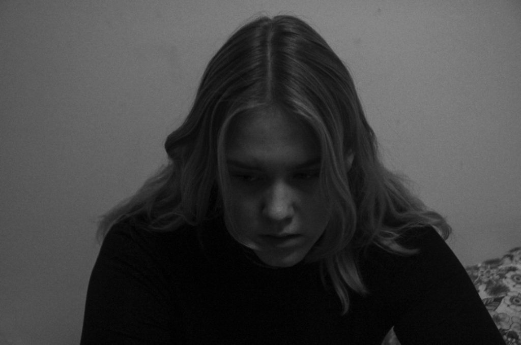
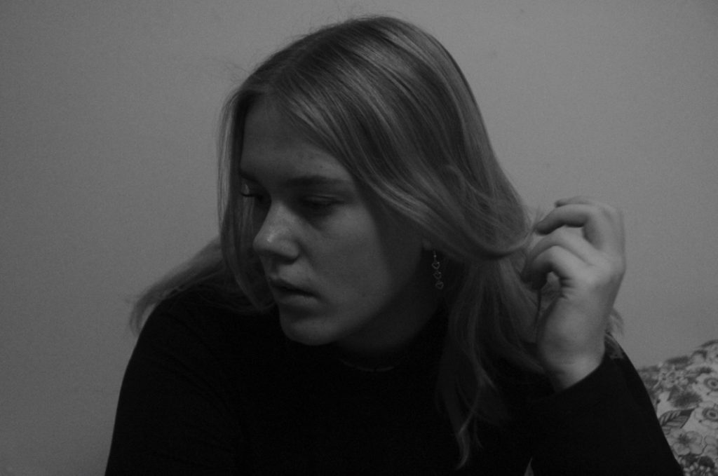
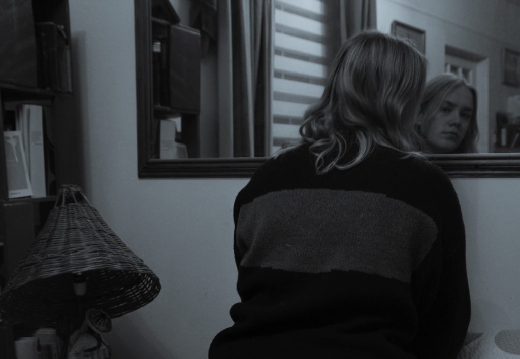
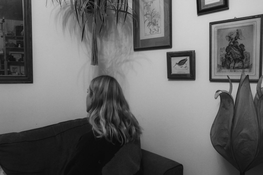
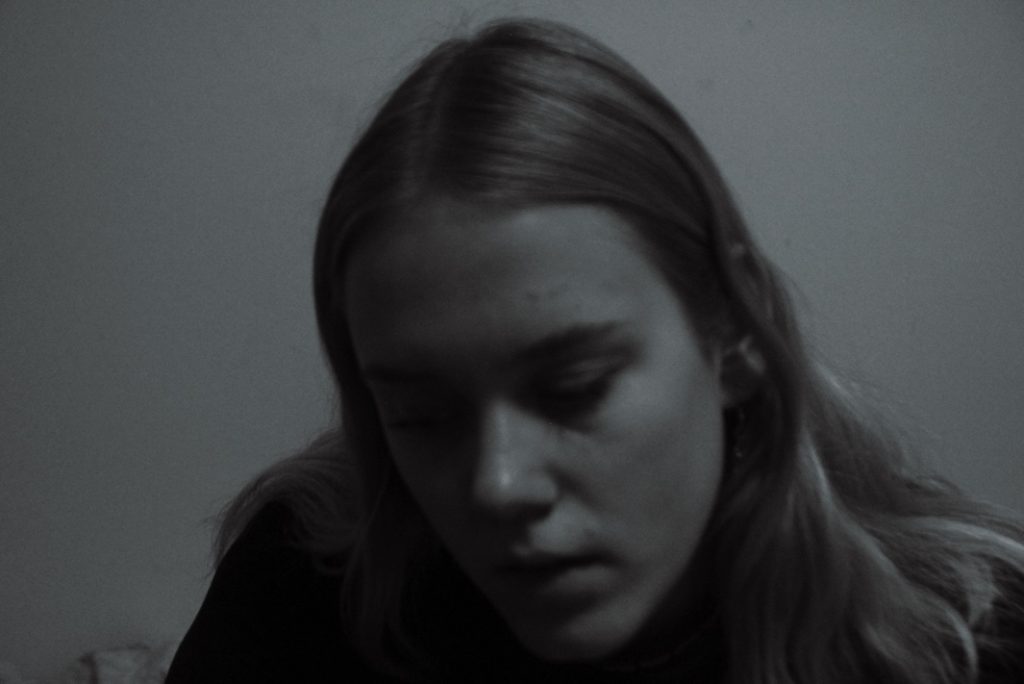
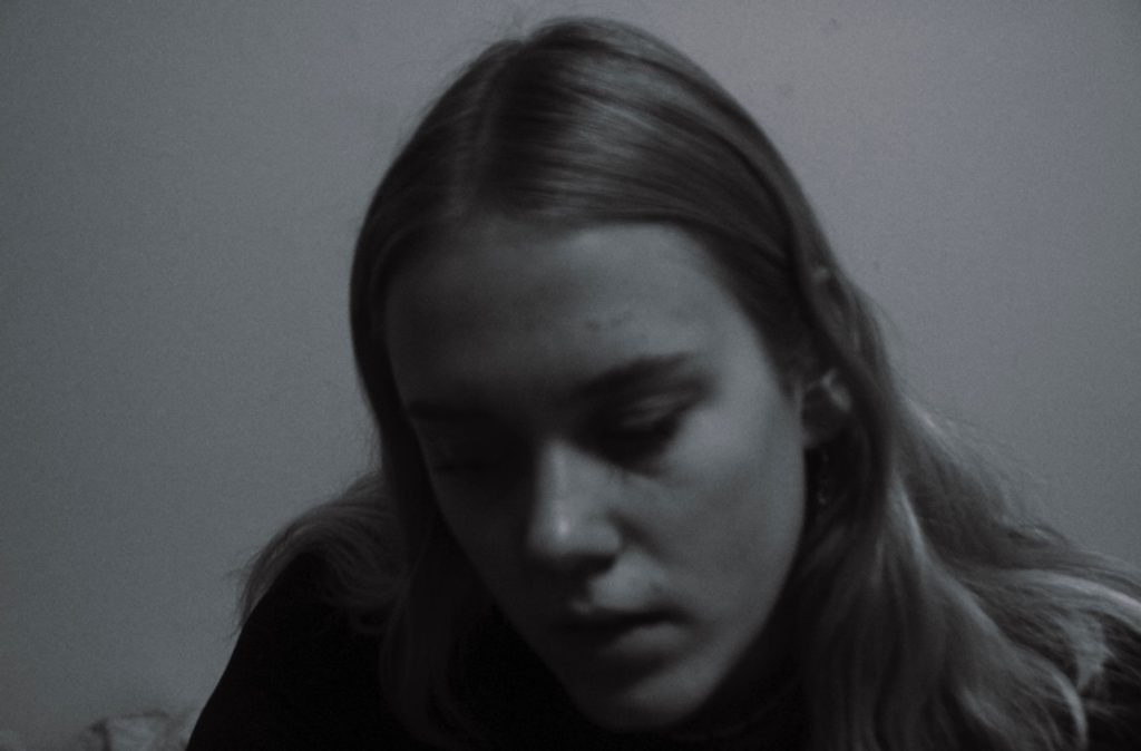
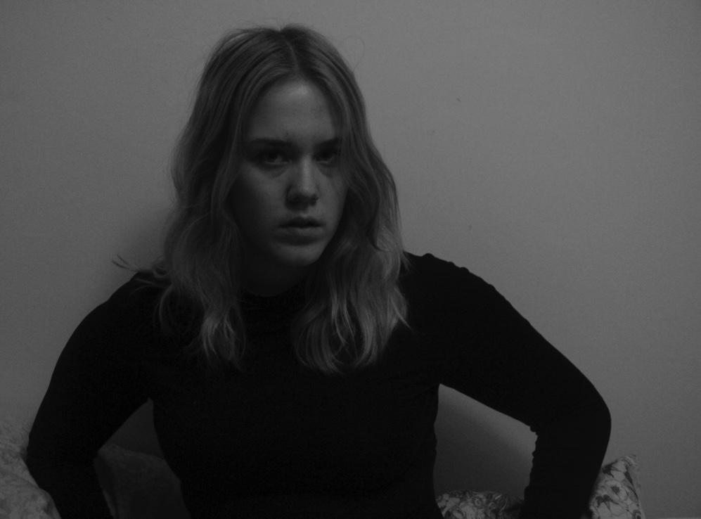
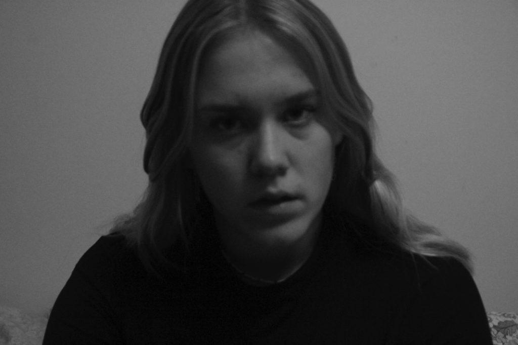
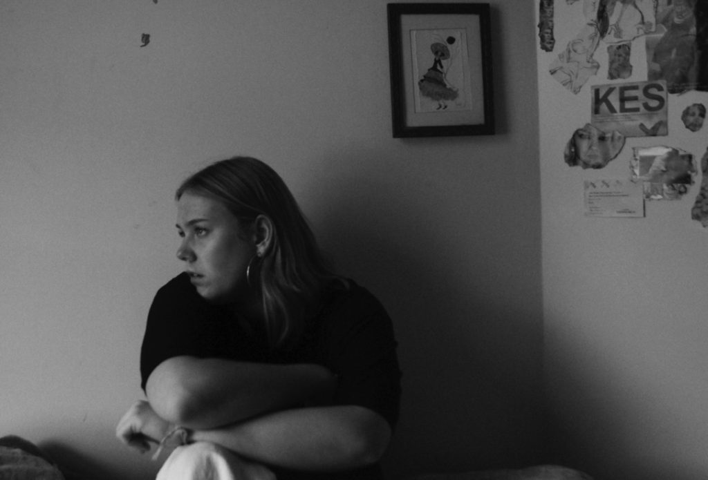
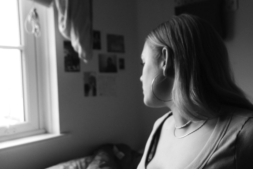
Overall I think my editing was quite successful – at first, I tried editing in colour but due to the poor light quality in these images, I changed to black and white. I prefer editing in black and white with high contrast and grain even with better-lit images so this worked well.

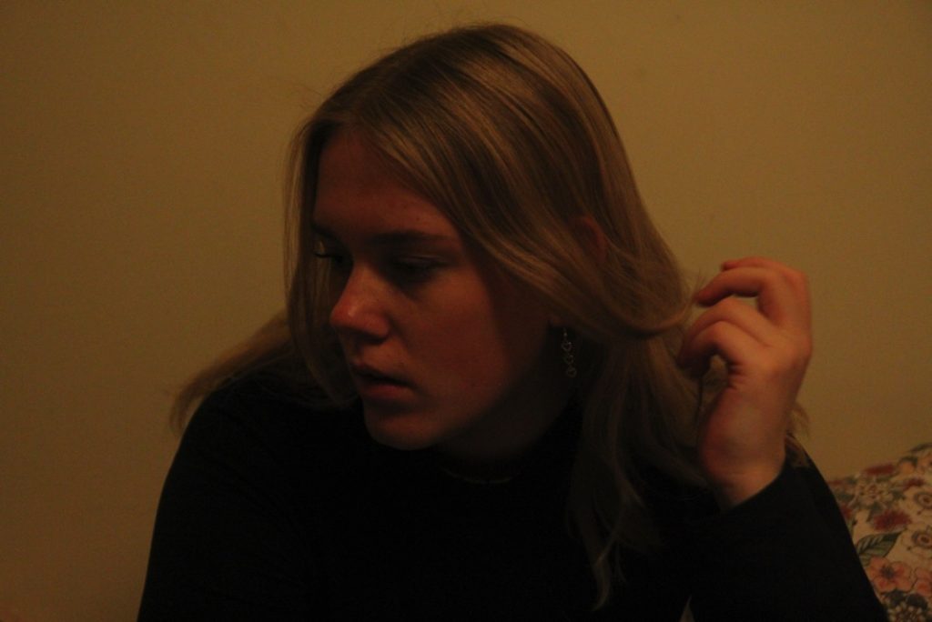
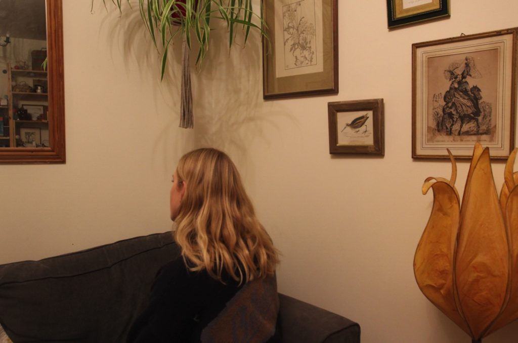
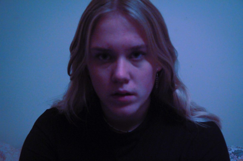
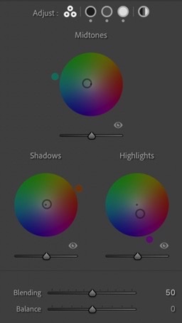
After doing numerous edits in black and white, I created copies of various best images and began to experiment with colour grading in colour, and then in black and white. I don’t know if these images will necessarily be in my final outcomes but I still think they were quite successful.
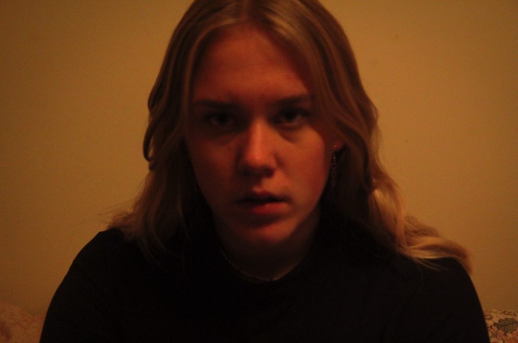
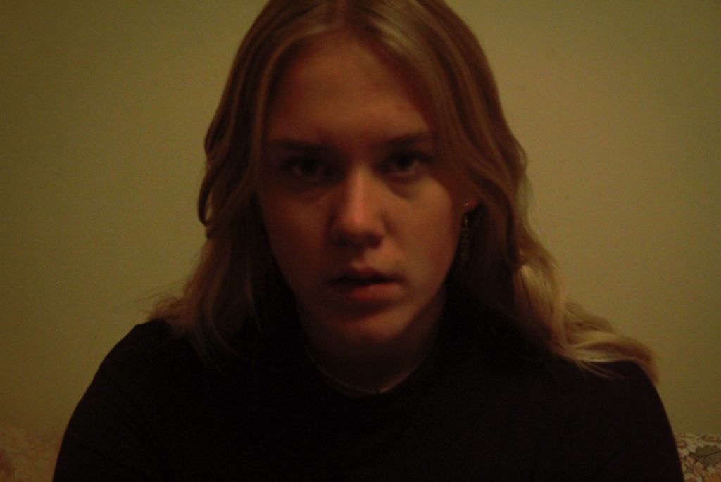
Colour grading was used for this edit.

My experimentation with colour grading was helpful as it will be something I can use later on in this project, for example when editing other images for different parts of the project.

Final Images
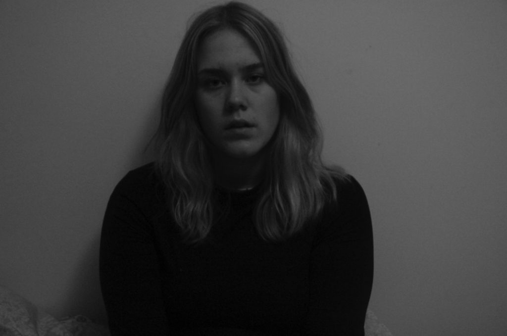
Evaluation

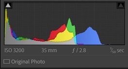
This photoshoot could be improved. The lack of good lighting impacted the quality of my images as I was shooting using overhead lighting that was too warm-toned. I tried to combat this with white balance, ISO and using a cool tone which did help slightly but I think I will carry out another photoshoot of self-portraits with much better light, possibly in another location. I want to touch on my identity linked to the location in the photos, which I did touch on a little in this shoot but due to struggles with lighting my locations were limited around my house. I plan to re-develop this shoot at my grandmother’s house, or again at my house, now that I have gotten to grips with the correct camera settings, using my tripod effectively and positioning myself in the way I want compositionally. However, I think this photoshoot was in some parts successful – I produced quite a few images which I like, showing my personality which was a strong point of this shoot. I wanted to bring across my identity in this photoshoot, and then be able to link this later on to how this links with my mother and grandmother’s identities, both now and also with the help of archival material, which then forms the main idea of my project. Having completed this photoshoot, I am going to carry out another self-portrait shoot which links more directly to my archival material and with better lighting quality.

Photoshoot 2

LightingSubjectLocationIdeaThemeProps Settings
Natural, window lighting with some overhead lights. Myself Bedroom, living room Personal Identity, generational identity, adolescenceSelf-portraiture Tripod, camera. Creative Auto, portrait.
Photoshoot plan

Aims of the shoot

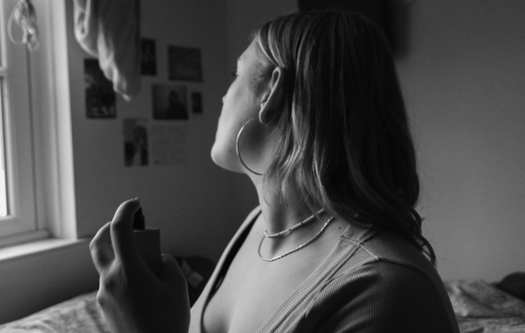
This shoot is a development of my last self-portrait shoot. As I discussed above in my evaluation for my last shoot, I have gained further inspiration from photographing archival family images. These images have given me inspiration for posing, framing and editing – I plan to juxtapose archival and new images in my photo book and I feel that the development of this new shoot will generate further images that will draw clearer comparisons between the two sets of images. This photoshoot is in the same location as my last shoot: my bedroom and living room, which are two places of significant personal identity to me. I wanted to show this through my poses, background and attitudes throughout my shoot, taking inspiration for these aspects from my archival images. In this shoot, I aimed to take images with improved lighting quality than my last shoot – as shown above, I took my images too late in the day which produced poorly lit and overly grainy images, and this shoot was planned in part because of this also.

Contact Sheets
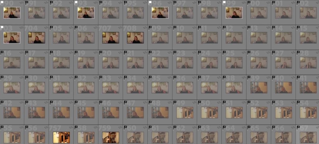
At the start of my shoot, I struggled with the yellow lighting and warm tones of my living room. I shot in a better light than my last shoot, so I had less of a problem but it was still unhelpful – I only took a few images here and then moved to my bedroom.
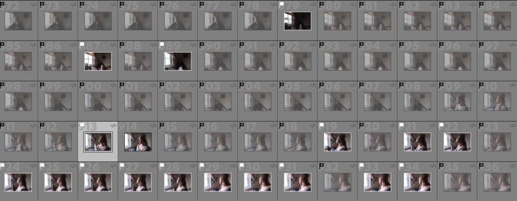
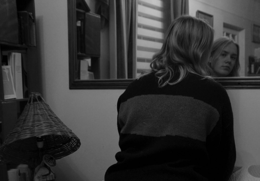
After moving to my bedroom the lighting improved – I only used natural light which helped me in producing clear images. In my lounge I struggled with yellow-toned lighting which reduced the quality of my work – natural light helped.

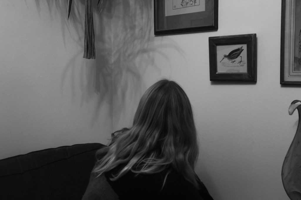
These are my best images for the shoot, flagged and given a purple label which corresponds to this particular shoot.

Final Images
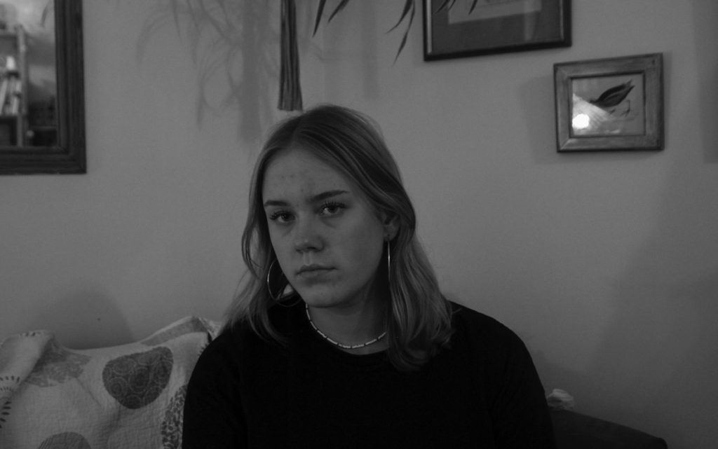
Image Experimentation

Inspired by Lewis Baltz

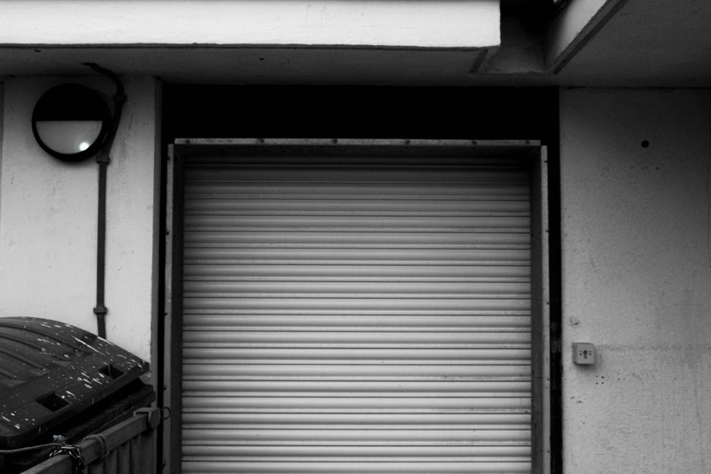
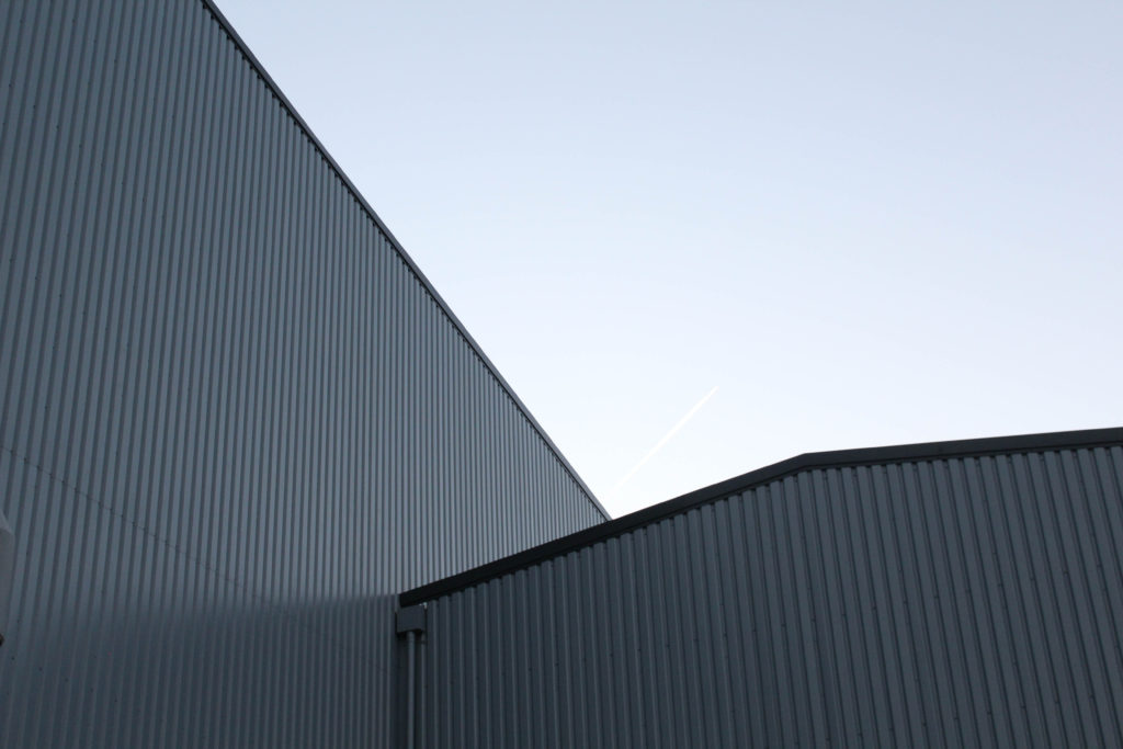
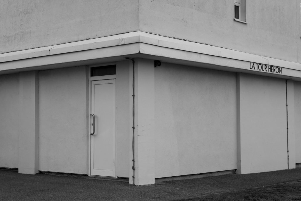
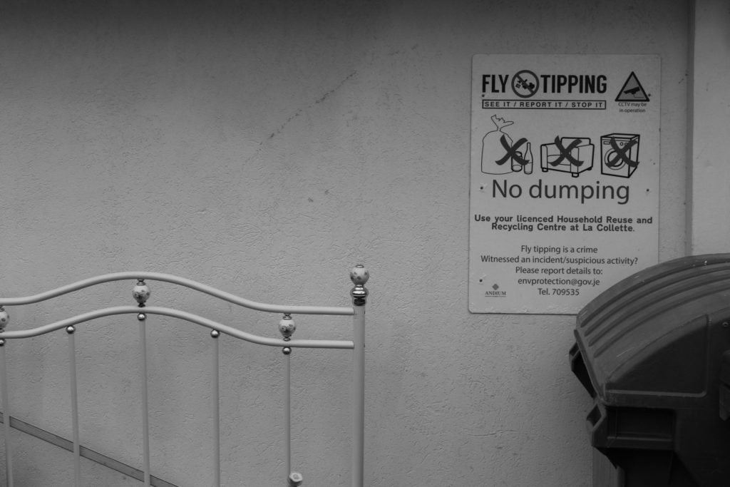
Below I have shown some of my images which are much like that of the works of Lewis Baltz, and then how I have edited them in Photoshop and Lightroom to either make them more creative, or adding another image to them in an attempt to create more depth within the images created from this project. I would like for someone to look at my final images and consider the work of Lewis Baltz’s work next to mine, as I have attempted to stay within the rules of his work so that I could create more thoughts in regards to the compare and contrast posts.
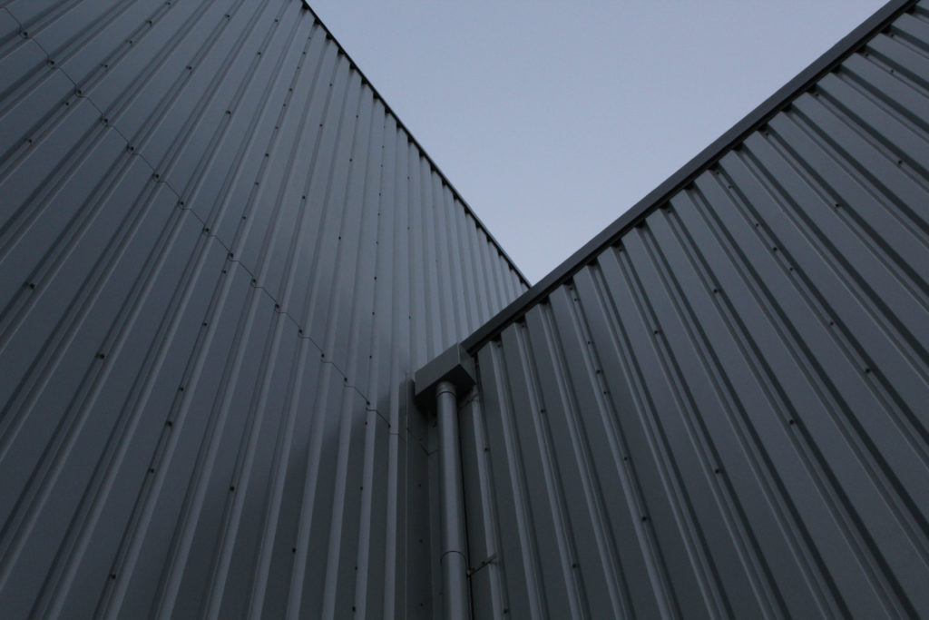
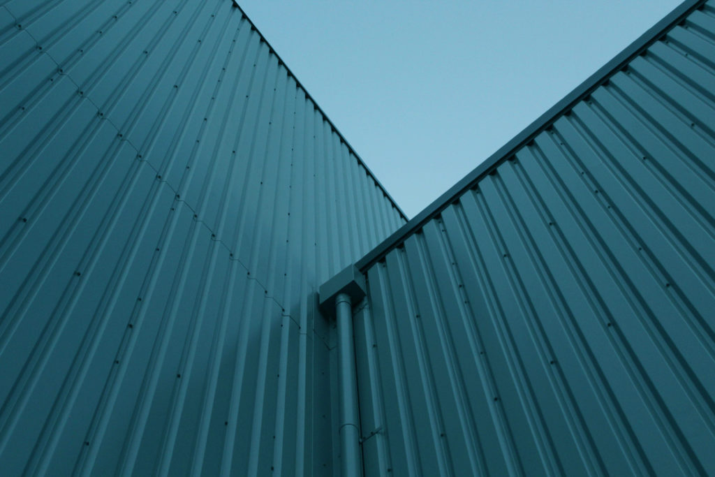
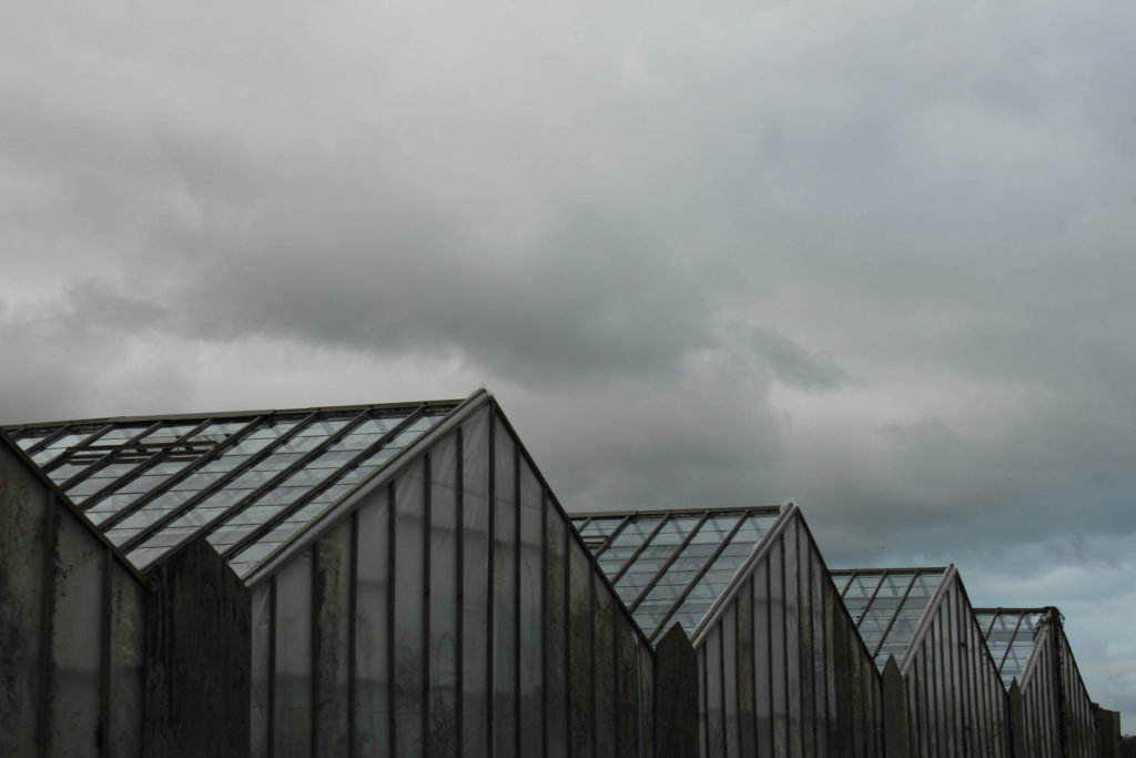
I particularly like this photograph above, and believe it is among most more successful pieces throughout all of these images. This is because of the composition of the image and how the simplistic look can be associated with Baltz, but the smooth tones and colours could be representations of Misrach. I believe that having some photographs which can correlate to either or both of my artists increases the quality and final pieces that my photoshoots create.

Inspired by Richard Misrach

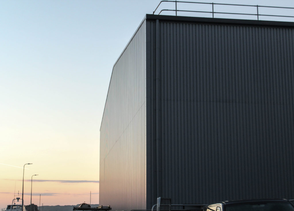
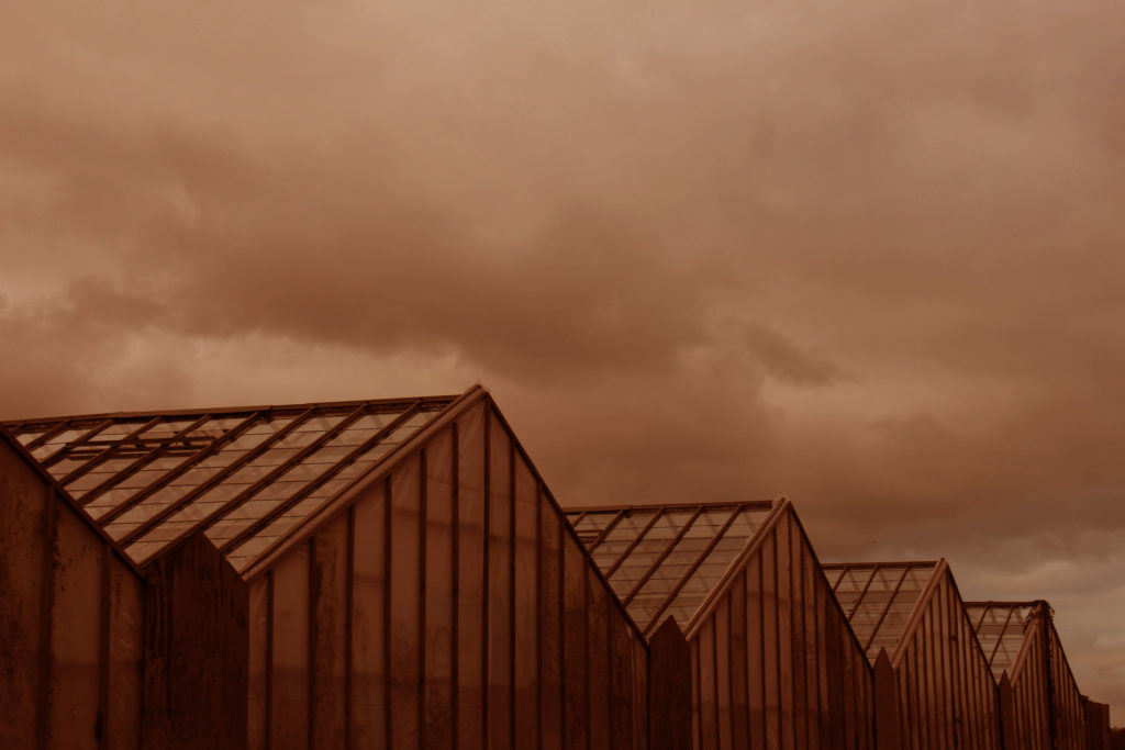
To demonstrate how I have taken inspiration from Misrach, I have selected some edits and showed how I have edited some images in photoshop to create my own versions of Misrach’s work. These images are some of my most successful from all of photoshoots, and additionally I think that they represent Jersey well, as these photographs all show the island in a beautiful way, especially as the sunsets are so appealing and contrast a lot of Baltz’s work. I like that Misrach’s work is a lot softer and somewhat more elegant than Baltz, and it could be said that this is because of the variety of smooth shades and colours, which I have been trying to recreate in the image below.

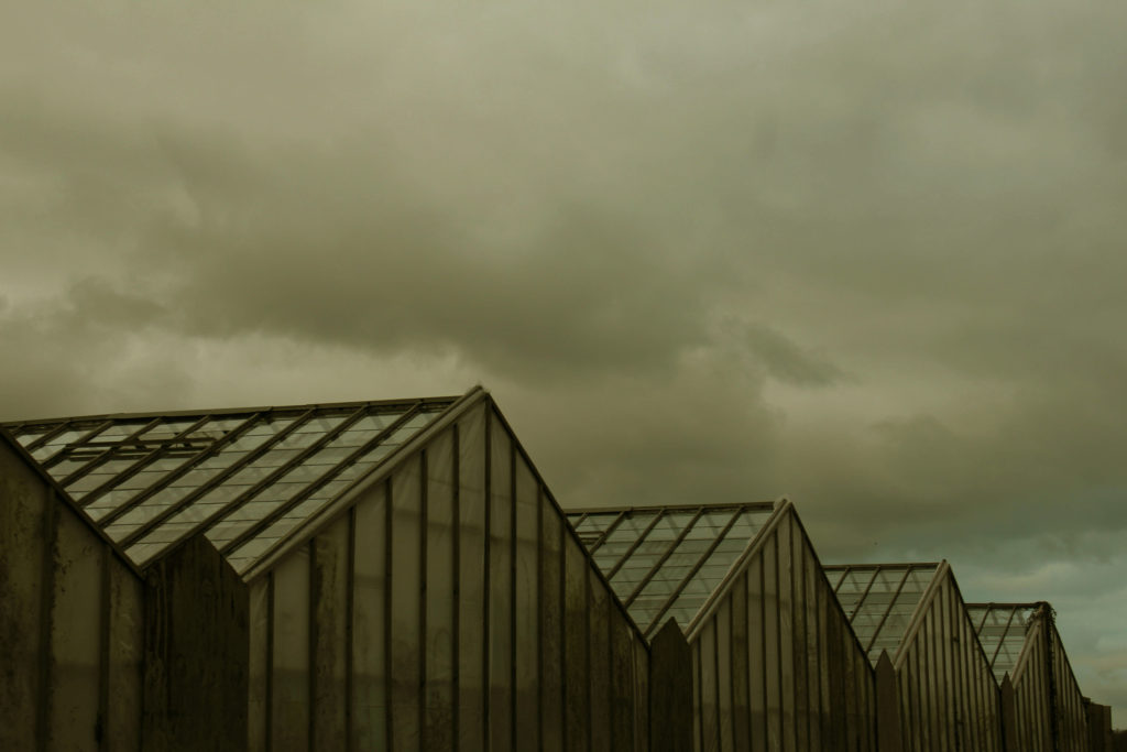
These photographs are from both my La Collette and my Greenhouses photoshoots, I really like the fact that these pieces of work are good quality examples of his work, whilst also having elements of my own style of work. For example, the first and last images and angles of structures that I like to continuously recreate in my shoots, whilst Misrach only uses wide shot images of buildings/ landscapes, with lot of negative and free space throughout his photographs. This is mostly how our work differs as I have taken inspiration from the types of landscapes and lighting, however the compositions of our work are very different.

Editing Process

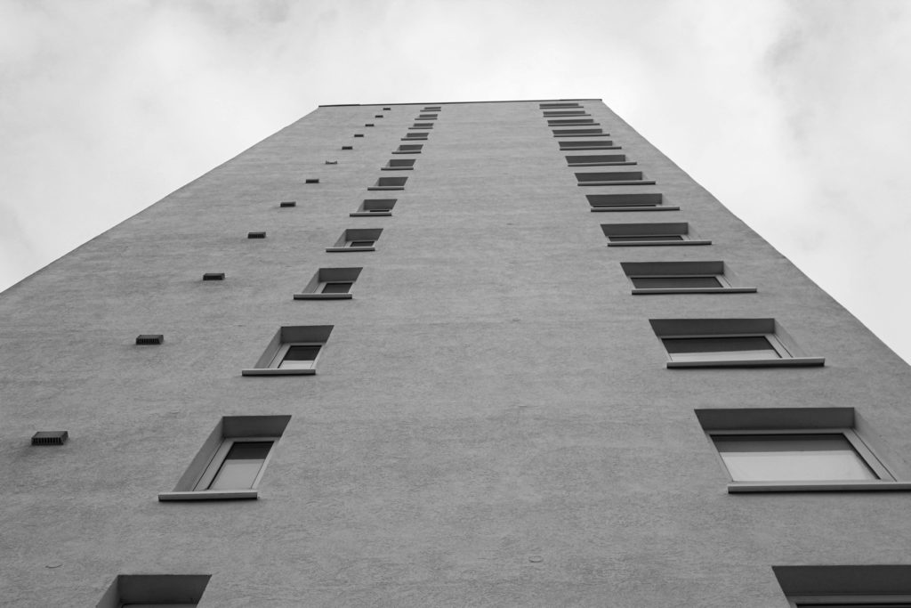
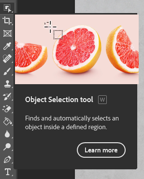
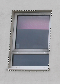
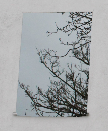
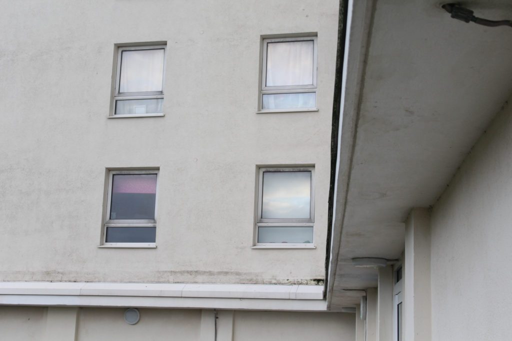
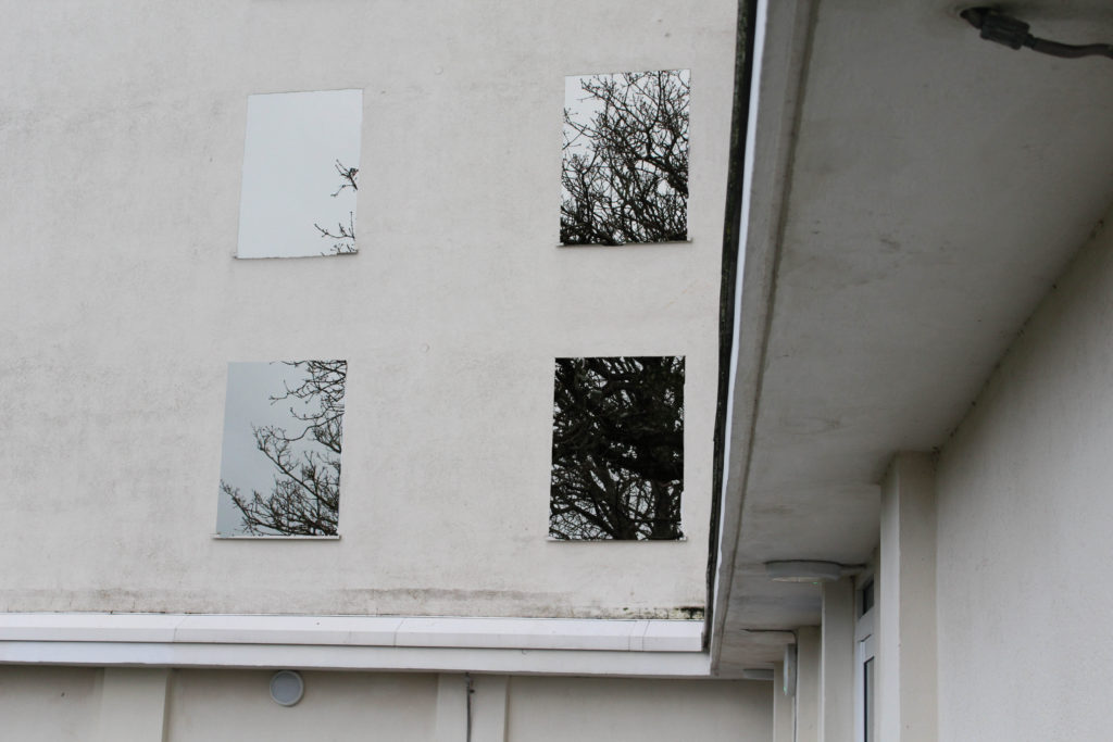
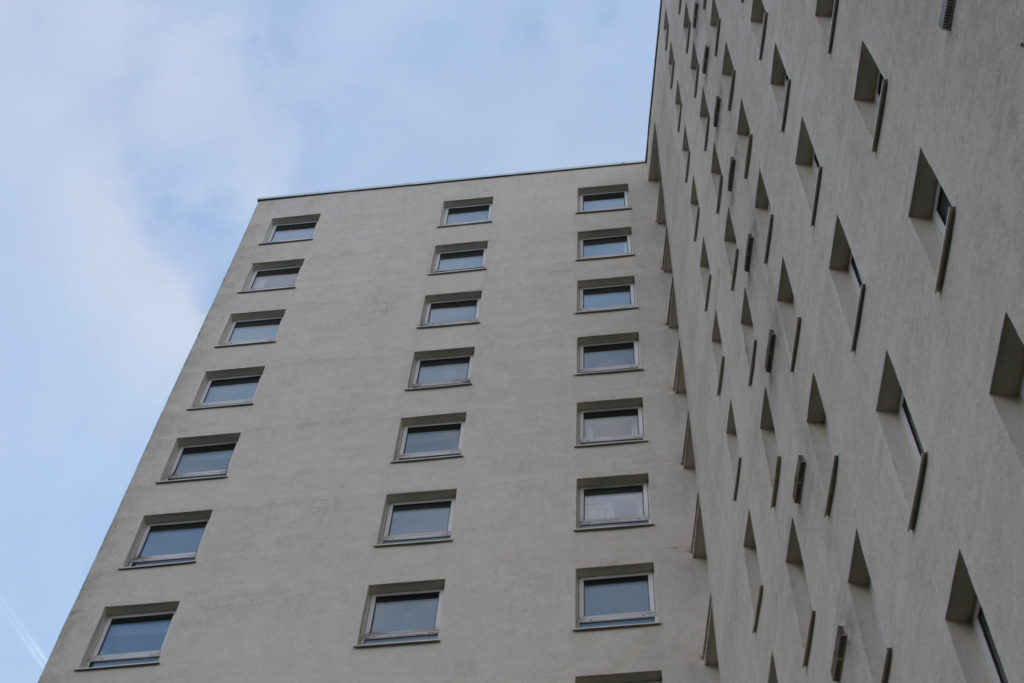
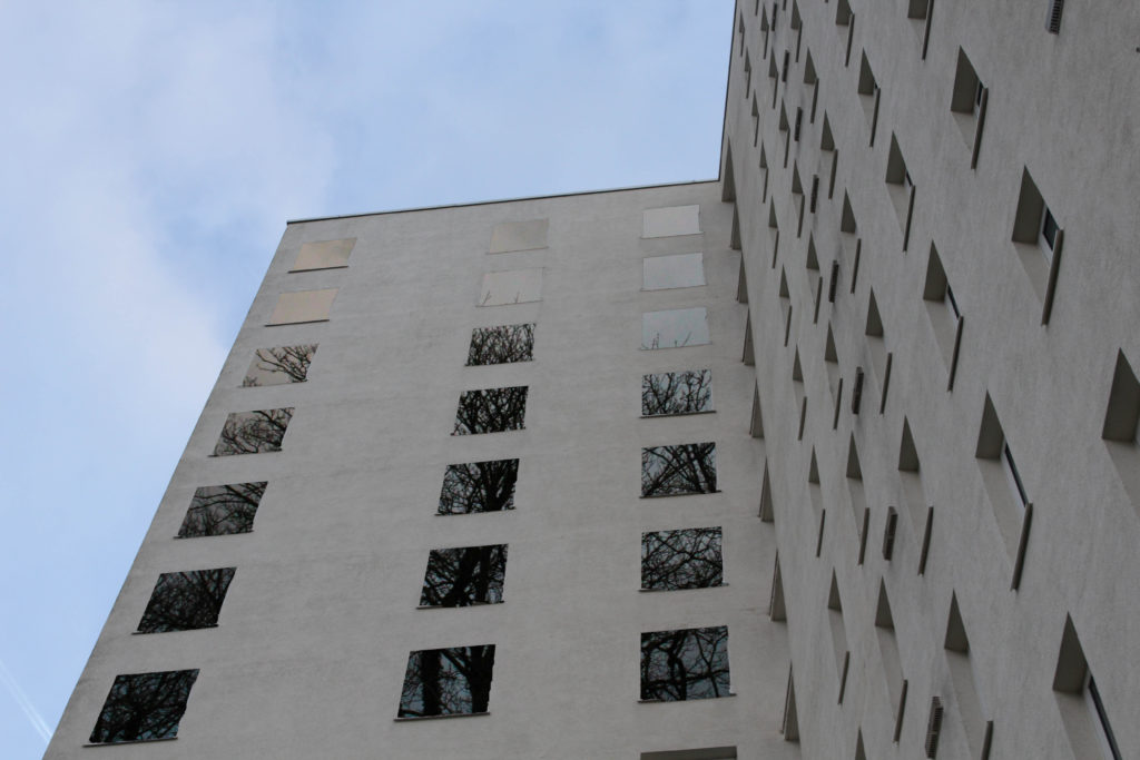
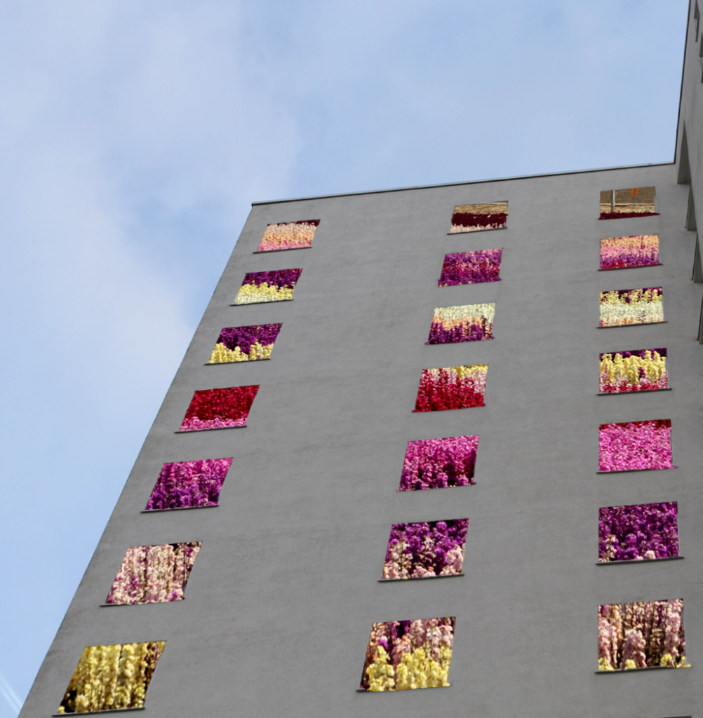
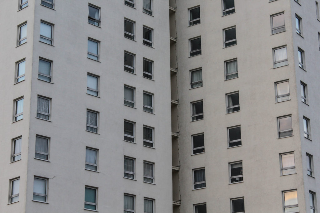
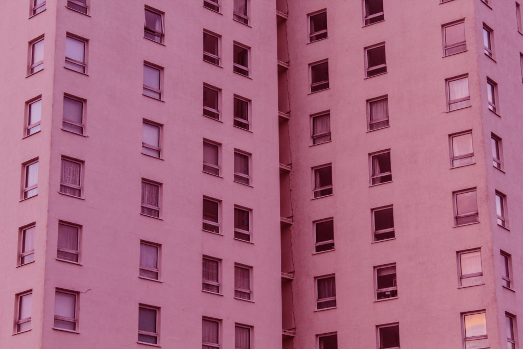
Below I have demonstrated how to cut out parts of images from photoshop and place an image behind, the aim of this was to create visually interesting edits which could be presented as final pieces onto form board or placed in virtual galleries. I had this idea as soon as the project began and thought that these pieces could have a lot of potential and depth behind them. To create this I had to use photoshop in order to cut of the squares using the ‘object selection tool’.

Overall, I don’t think that these pieces came out successfully at all, they didn’t come out to be the way that I expected, maybe this was because of the images that I have used in the background (one being from my Greenhouse photoshoot and the other being from google) as they seem to look good against the tan/ warm tone of the block of flats. I think that these images did not appear to come out as I would have hoped, however I think that this isn’t a bad thing as I can recreate this technique with maybe a different image of the flats.

Inspired by my previous project

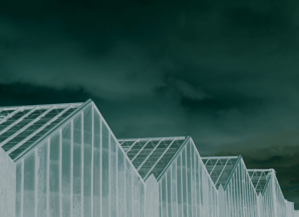
My last Anthropocene Project included lots of inverted and colour editing, and after creating photographs that are much like Lewis Baltz and Richard Misrach, I have decided to include some both original and edited images from all of my photoshoots which don’t necessarily relate to any of these artists. The whole purpose of this is to show some of my own creativity outside of the inspiration I have taken from both of my selected photographers. I would like to showcase the experimentation that I have done which may not be as successful or even featured in my book, but demonstrate that editing images can make them more interesting.

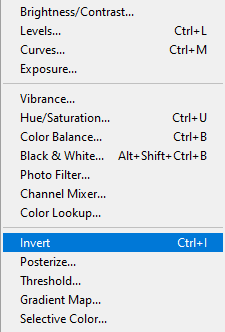
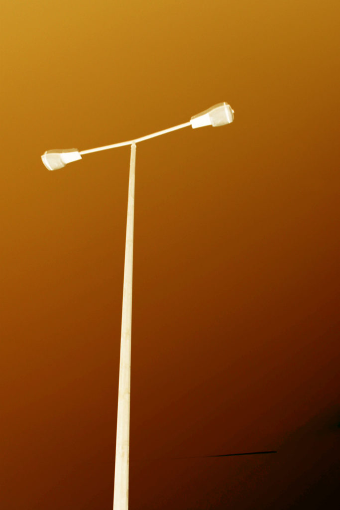
This is my first example of using the invert filter, I think that this image doesn’t look as good invert as all of the subtle colours and tones are lost throughout. I like that this image is very bold representation of Anthropocene, there is still a gradient of brown to orange and yellow throughout the image and I think this adds to the complexity of the photograph, and shows that this kind of editing can be very successful or not worth it, In my opinion, its a good way to change images that you would like to be bold and ones you would like to present as stand out images.

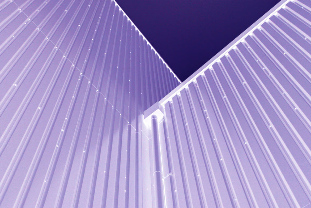
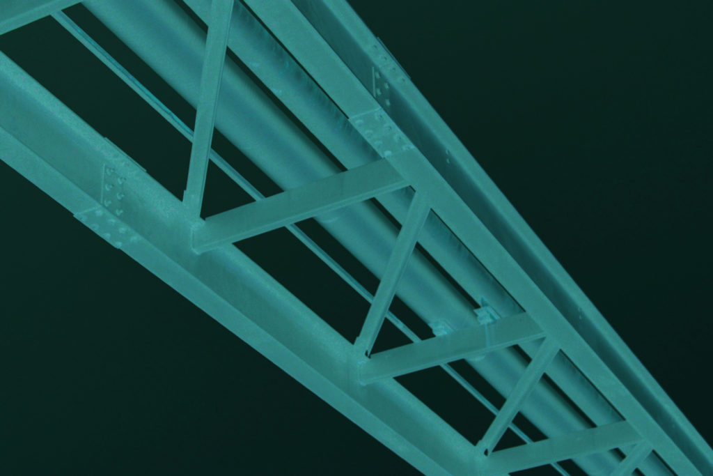
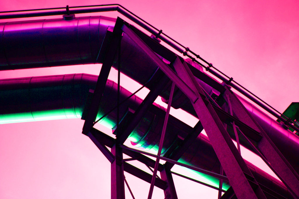
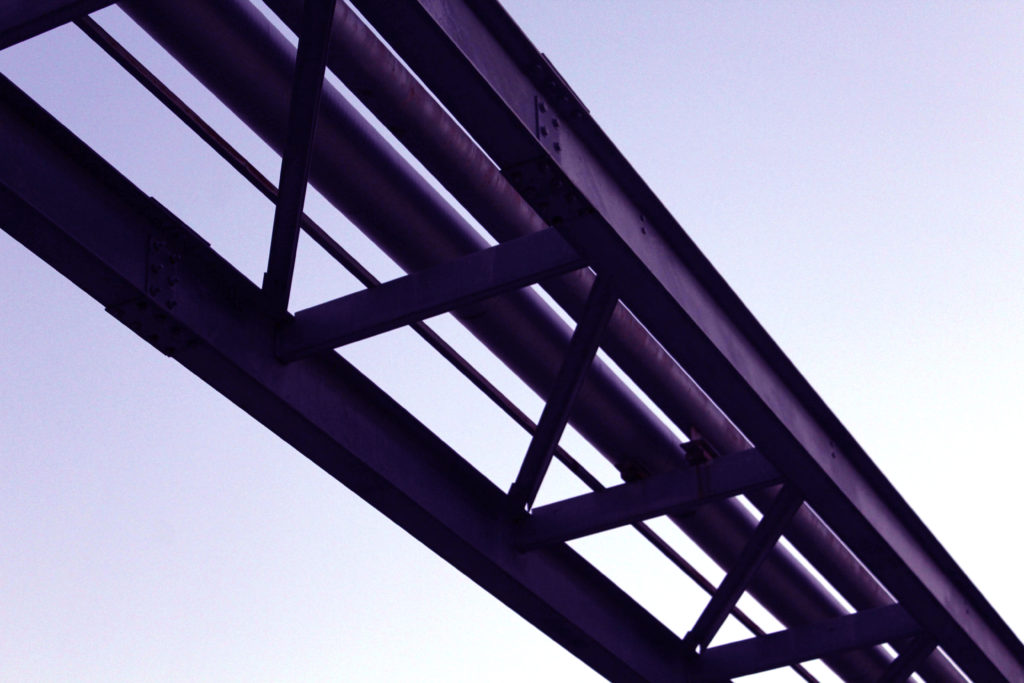
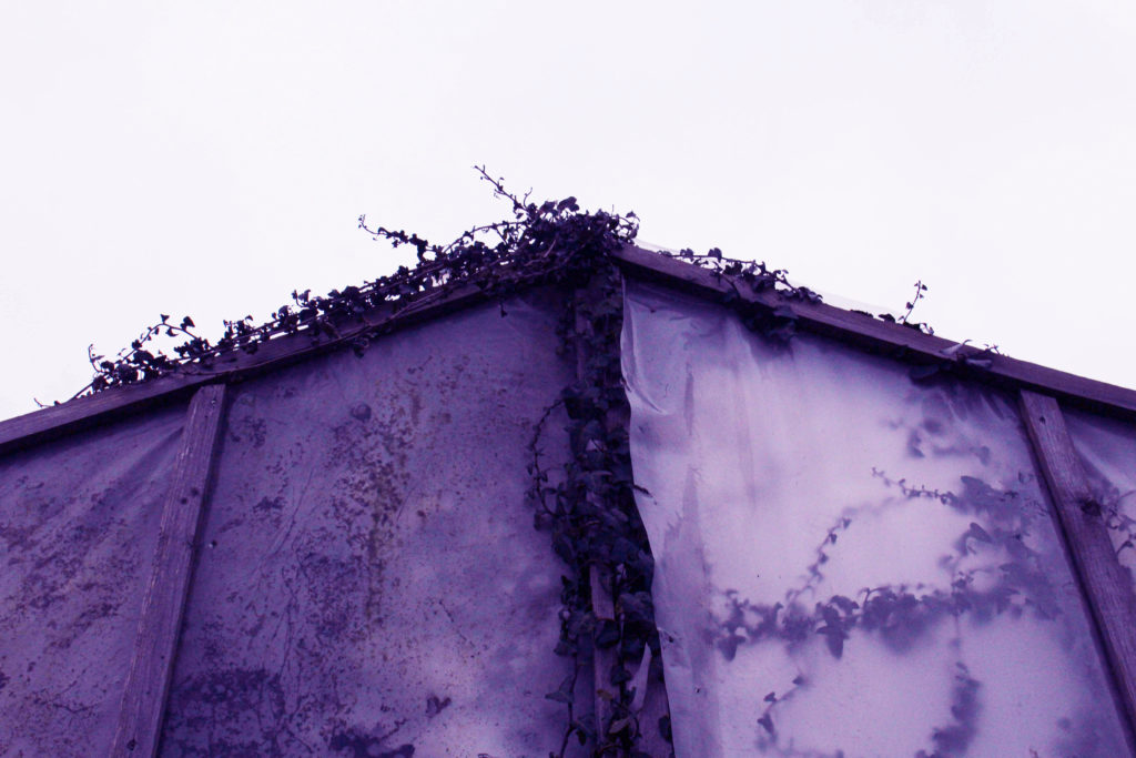
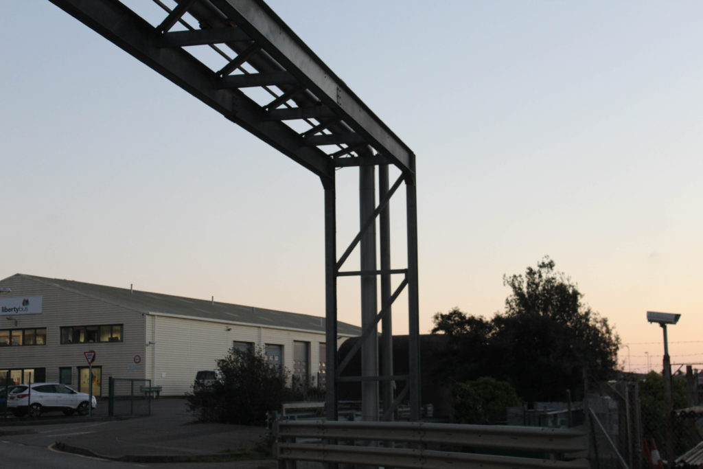
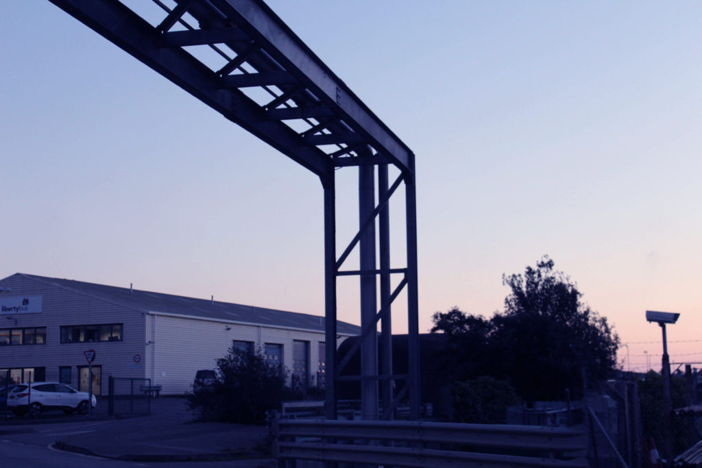
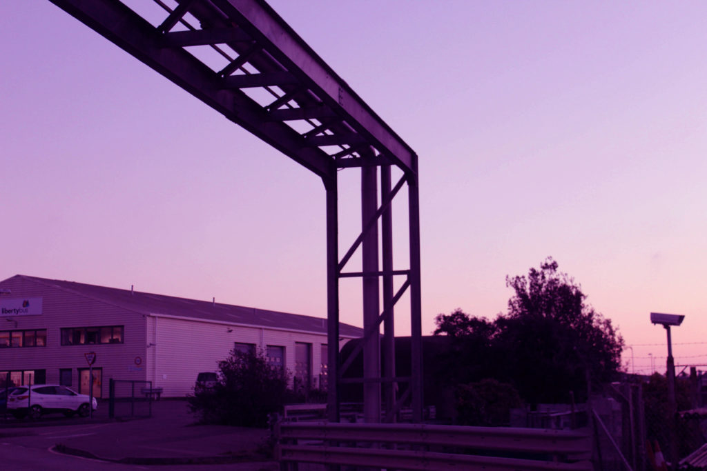
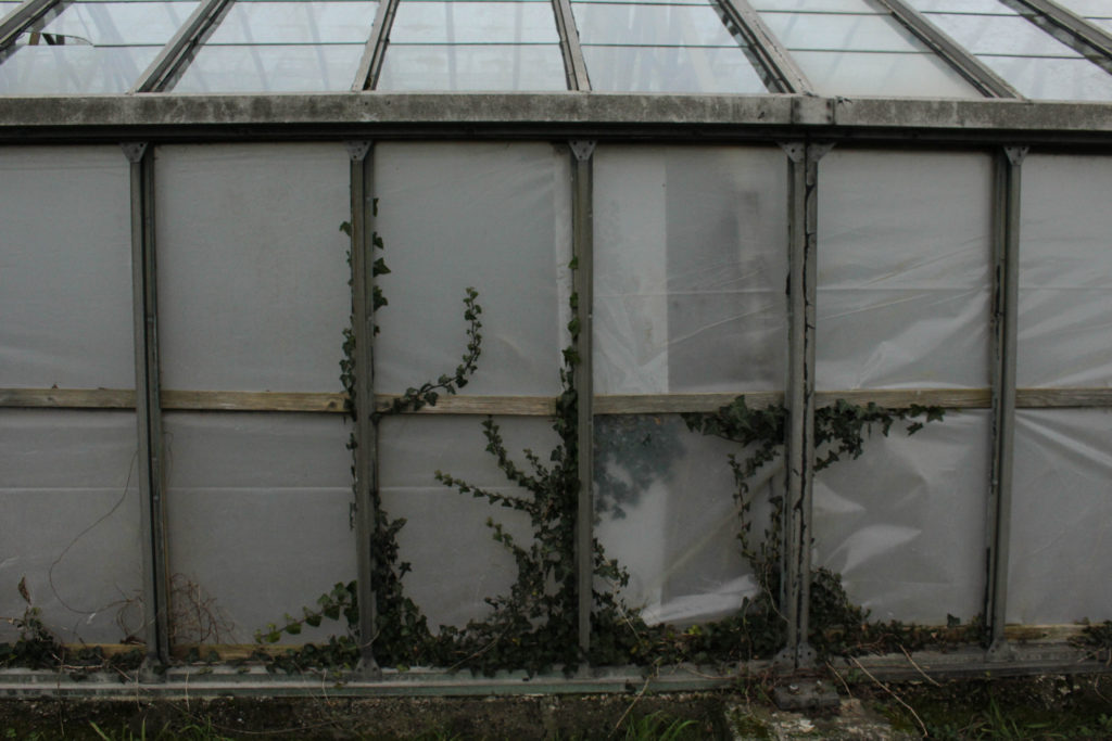
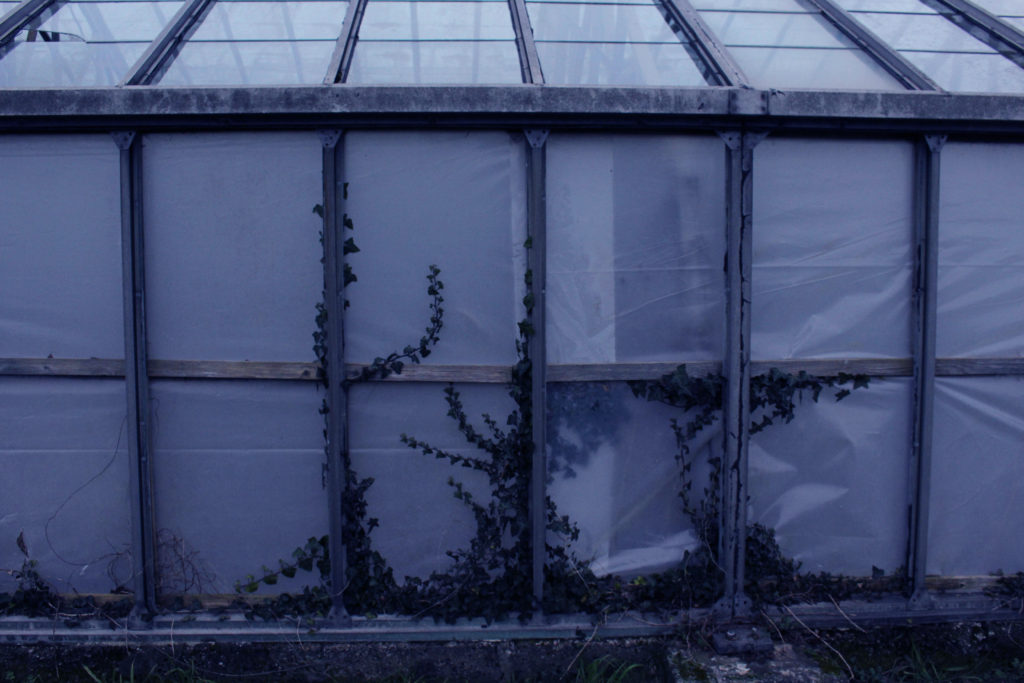
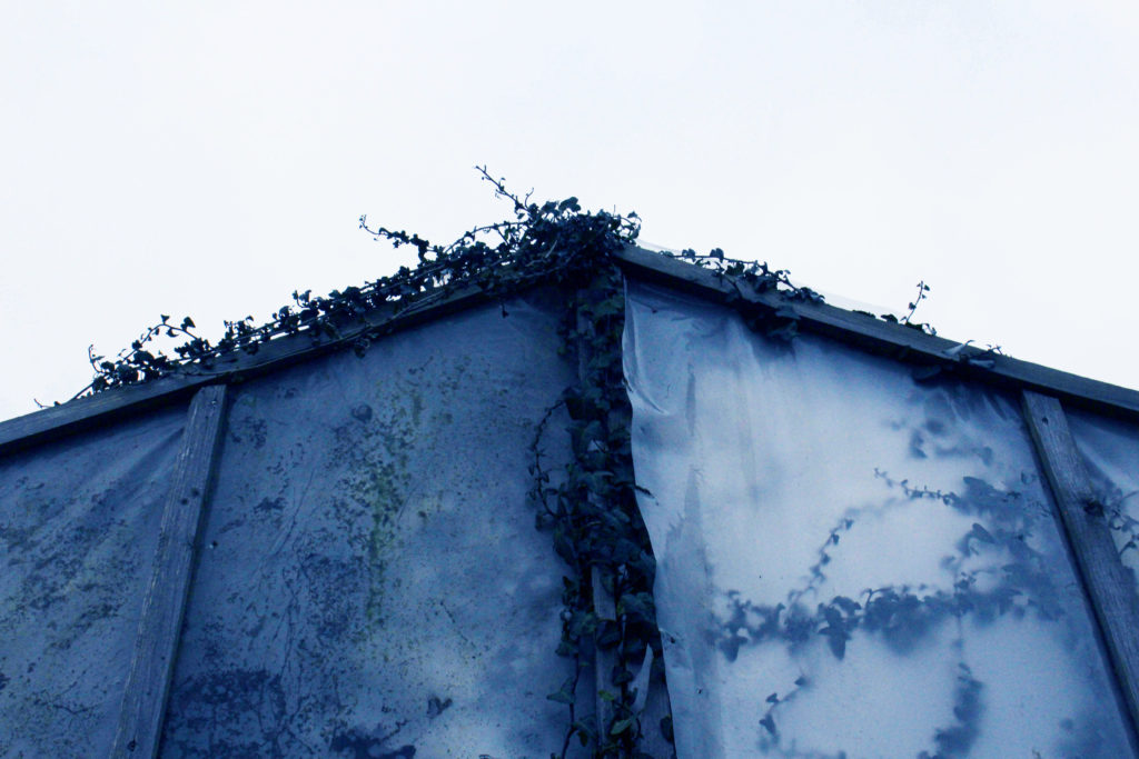
What is the purpose of this editing and how does it link to Anthropocene? This editing below is created by changing the ‘Colour Balance’ setting in Photoshop. I like this editing as I think that it makes metal framework and structures look like more successful/ higher quality pieces of work. The purpose of this harsh editing is more supposed to be used on images of natural landscapes. This is because this editing looks very drastic and unnatural, and changing images of natural objects in a unnatural way is a microcosm of the human impact on natural life. This is important for my project as these small bits of editing relate to a bigger and much more serious topic; Anthropocene. Which greatly affects out world today, and will one day affect how we live and the limits we have to exist in.

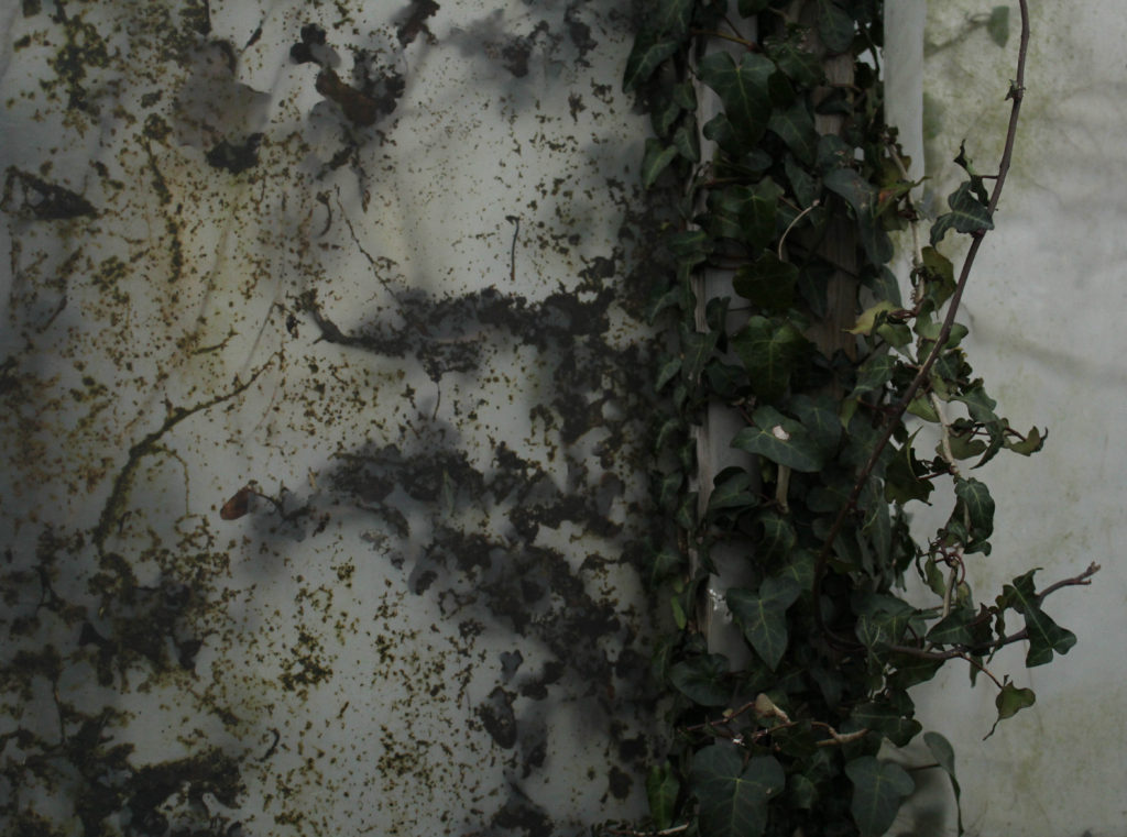
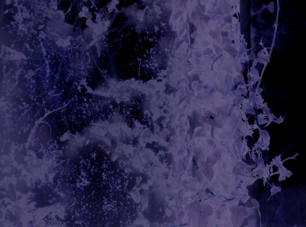
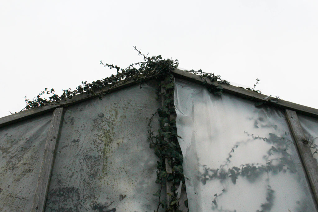
For example, this image relates to my paragraph above, this is both a human and a natural structure, as it has been unused for many years and now natural has reclaimed its place at this location, with all of the plants/ ivy growing back where it used to be. This sequence above demonstrates how these photographs still have their original quality, the colour editing only adds a message about the consequences that human life has had on the environment.

In my opinion, this editing does look better on photographs of industrial landscapes rather than natural landscapes, however, the purpose and message behind the editing is more related to natural features and I think that I should stick to this as it relates to my project a lot more.

Overview: I think that this editing is mostly successful, but is only needed with plain images or ones that are too simplistic. I think that busier images with already good editing done to them do not need this kind of drastic editing. Overall, I do think that some people would not understand the premise behind this type of editing when first looking at my work. However, I think that they turned out better than I expected, but not as successful as my photographs/ edits of work from my last Anthropocene project. Besides some downfalls to this work, in my opinion it was worth doing as it allowed me to demonstrate that creativity doesn’t always create high quality and useable outcomes. Furthermore, I don’t think that I will be using these pieces in my photobook as I think that my book will mainly consist of monochromatic images. I still wanted to illustrate how my plain photographs can be changed drastically to better fit the concept of my project.