The plan for this photoshoot is on this blogpost.
This my second attempt at a night photoshoot, this time I took images of a different location and made sure that my camera was in focus before I took the images (after moving the camera).
Part One for this photoshoot is here.
Editing
Contact Sheet


Process
To start with my selection process I used the ‘Pick’ and ‘Reject’ tool to narrow down my image selection to the strongest images, or the images that I can manipulate. As this was a night photoshoot, some of the images were too dark, too blurry or out of focus, so I removed those in favour of the highest quality images.


Next I put a star rating on each image to select which images I think are the absolute best (and will be using in my final print/photobook) and those which I may use in some way at some point.


I next gave each image a colour to show which images I will, might and won’t use in my photobook.


This is my selection of final images I will 100% use in my photobook:


Final Edited Images:
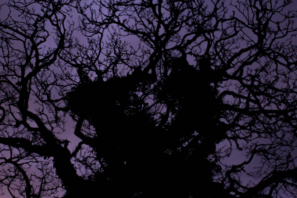

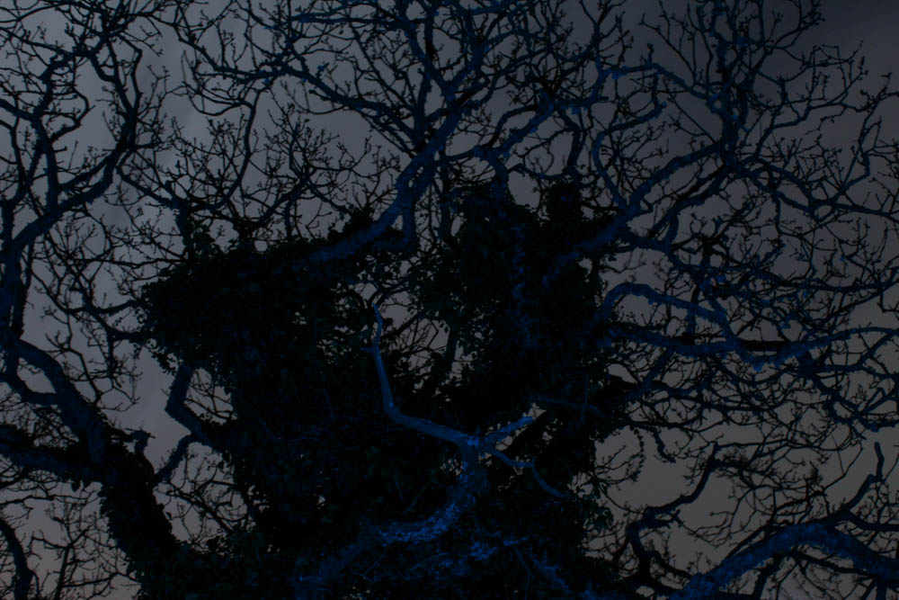


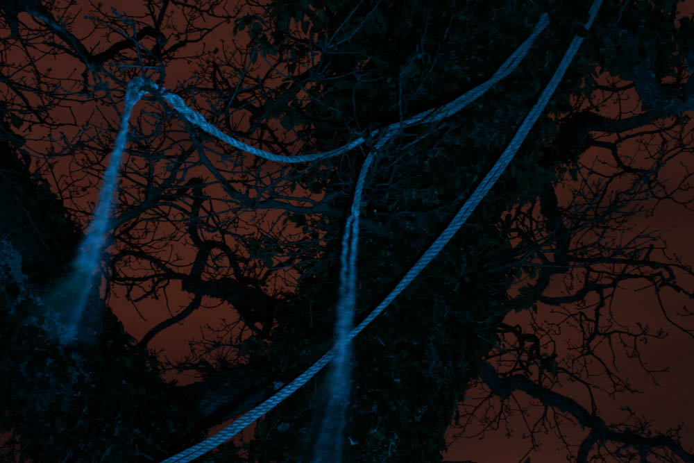

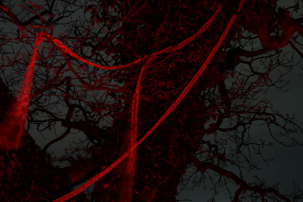

I have made four versions of this image, each with a different colour, I think this will be interesting as a montage on a double page spread:



I have made three black and white images to experiment with how these would look, they turned out better than the black and white images from the first night photoshoot as they have more contrast:


Comparison to Lawrence’s work:


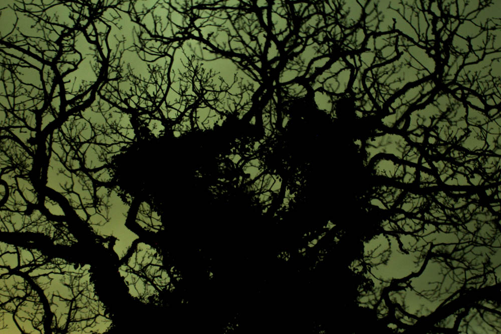
As this was my second attempt at responding to Lawrence’s work, I was still using this (and the image from the last comparison) as inspiration, because of this, I focussed on natural subject matter such as trees and grass. My use of light (specifically the brightness of it) resembles that of Lawrence’s work (however this particular image was rather dark compared to others in the shoot), giving both images a sense of artificiality due to the harsh coloured lighting. The moon during my photoshoot was particularly bright, making the background (the sky) in my images brighter than a normal night shoot, a similar thing can be seen in Lawrence’s image, as the sky has a yellowish light coming from the distance. My images are once again overall darker than Lawrence’s, giving mine a bigger contrast between the light and dark parts of the image compared to Lawrence’s.
Evaluation
I am very happy with the way this photoshoot turned out, it was a direct improvement from my previous attempt at a night photoshoot. My images are not slightly out of focus like the last one as I learned from my mistakes and made sure the images were focussed, so the images look a higher quality. I also think compositionally, the images are stronger and my use of artificial light and colour is far better implemented here. I decided to move to a different location from the last shoot to give my images more variety when it comes to the photobook.
What went well:
As said above, the mistakes I had made in my previous attempt at this shoot were considered during this one, so I did not make those mistakes this time around. As a result, my images are more in-focus, making them more appropriate for use in a photobook, as well as just giving them an overall better quality. My use of light was better in this shoot as well, in the previous photoshoot my exposure times were up to four minutes, this was due to my camera settings not being 100% correct, however this time they were better, which cut the time down to a max of 30 seconds.
How I can improve:
I possibly could have photographed more things to give the shoot a better sense of variety, perhaps next time I could photograph things other than trees and grass. I also could have used more colours when taking the images, as I gravitated towards mainly red, blue, pink and purple.
