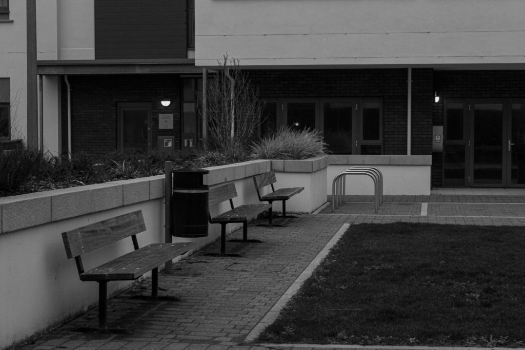
Photoshoot Plans: For these photoshoots I am planning to go to La Marais flats in St Clement, and them take some images of the surrounding estates. This is so that I can show how not all people that have impacted the planet live the same lives or have the same possessions, and that some individuals have had a lesser impact on our environment. Like the other photoshoots, I will be using the school camera and I hope that I can create the best outcomes possible from walking through these areas. These photoshoots will attempt to recreate the work of Lewis Baltz, as I have done of research in his life and work and now have become inspired by his work.
Contact Sheets
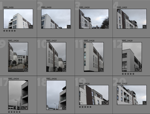
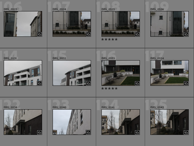
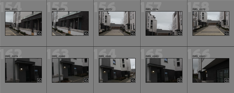
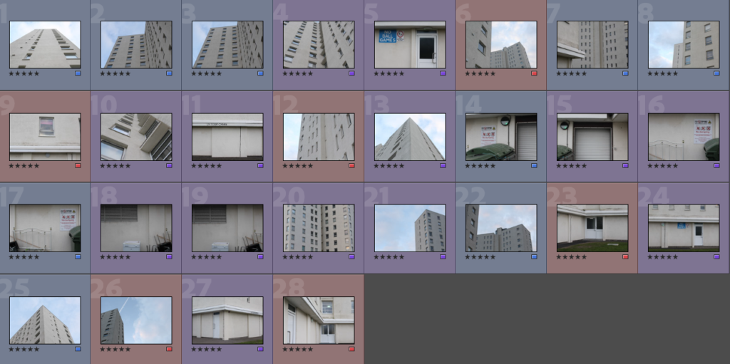
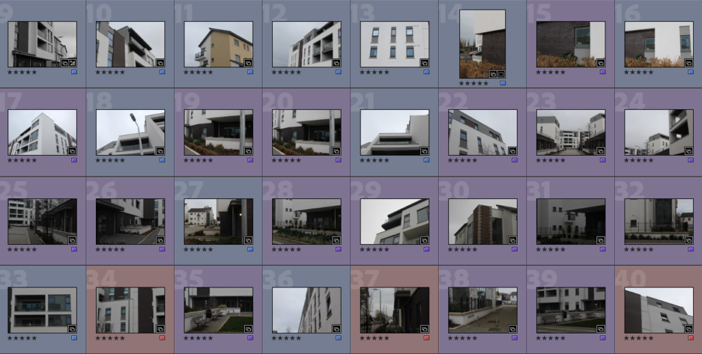
Photoshoot Overview: These photos are mostly successful, some of the images from walking around St Clement housing are fuzzy but I still think that if I wanted use them they could be altered in photoshop. Overall, I think that my images of La Marais are a lot better and can be related to my project more thoroughly.
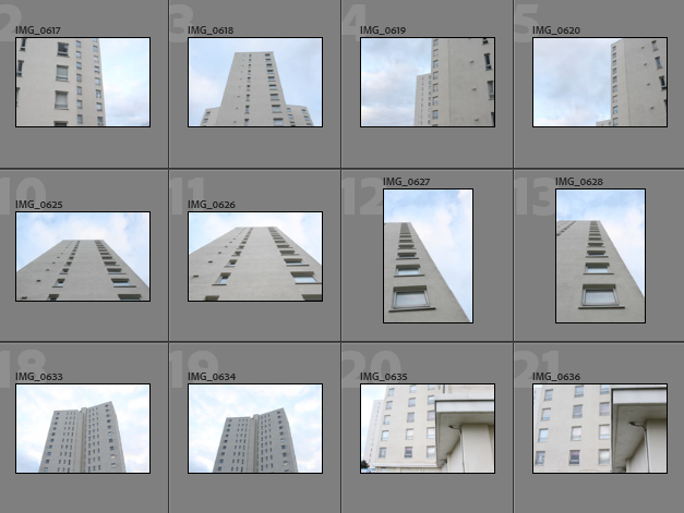
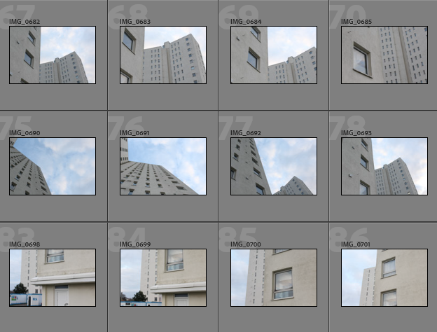
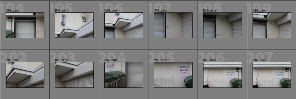
Image Selection
In order to begin my image selection process, I went through all of my images and rated them with stars, this ensures that I can later filter out of my unsuccessful and only focus on the ones I have rated 5 stars. The next step to this process is using a colour coding scheme which helps me determine which images out of my strongest images have the most relevance to my project and are of the best quality. I have also used a star rating system followed by a colour coding system to show my better photographs.
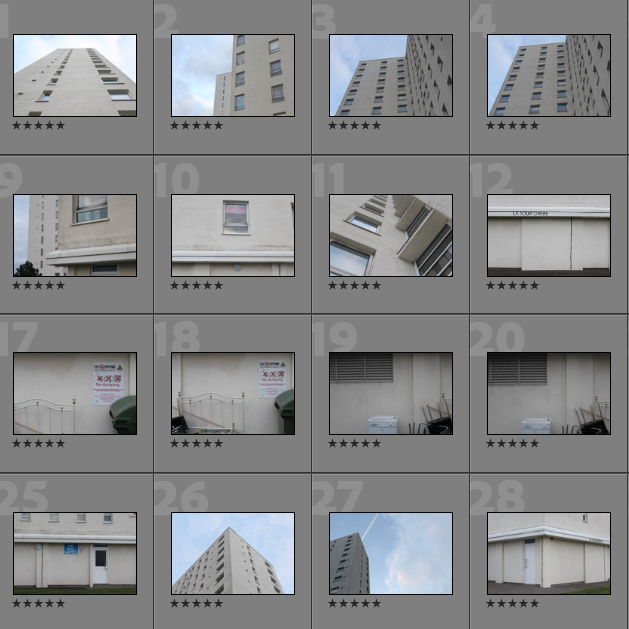
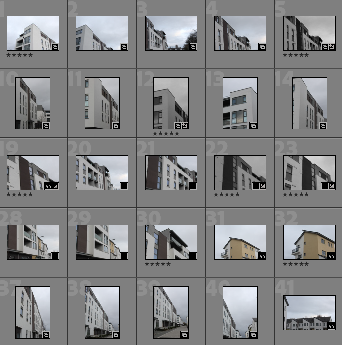
- Purple- images with most potential
- Blue- images that could be used
- Pink- images with least potential
Best Images Before Editing
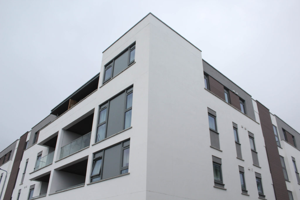
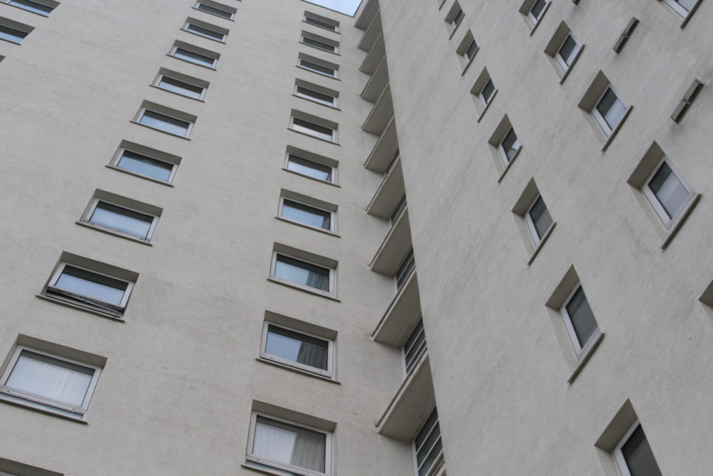
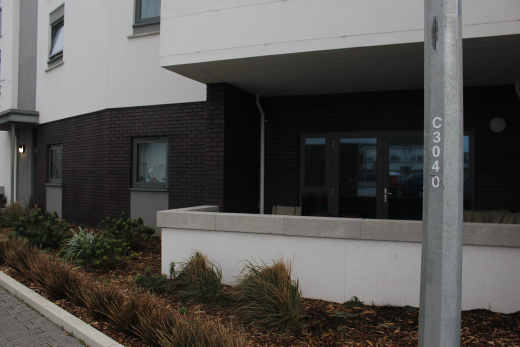
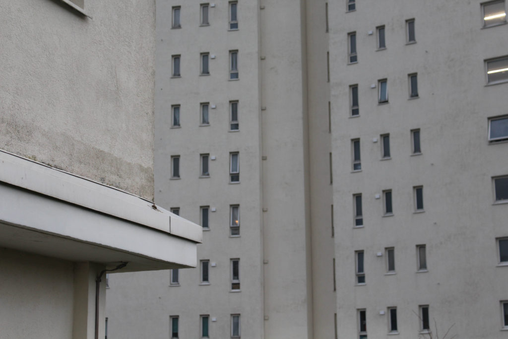
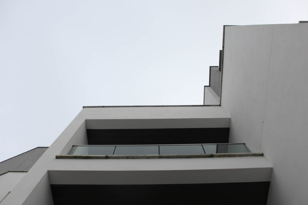
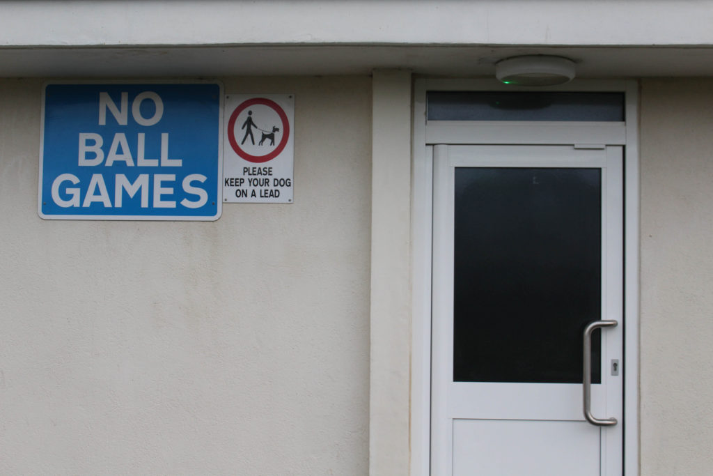
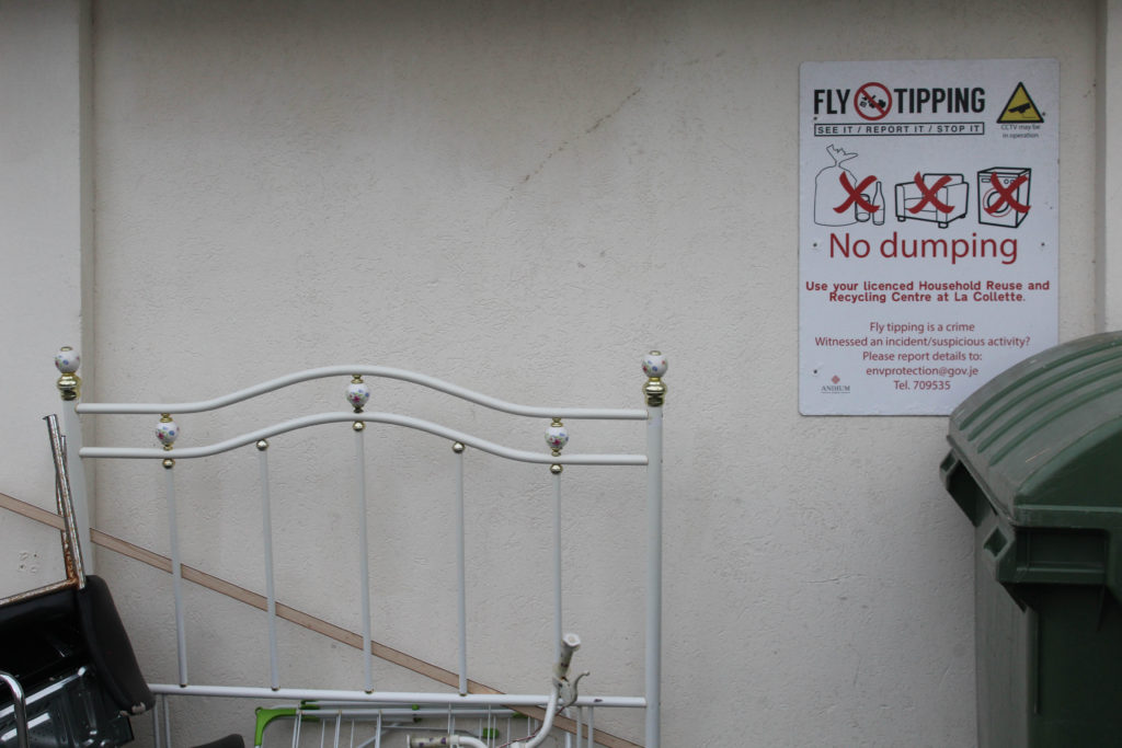
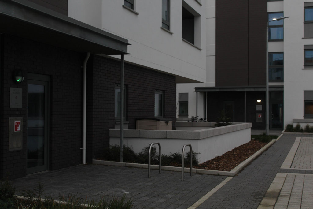
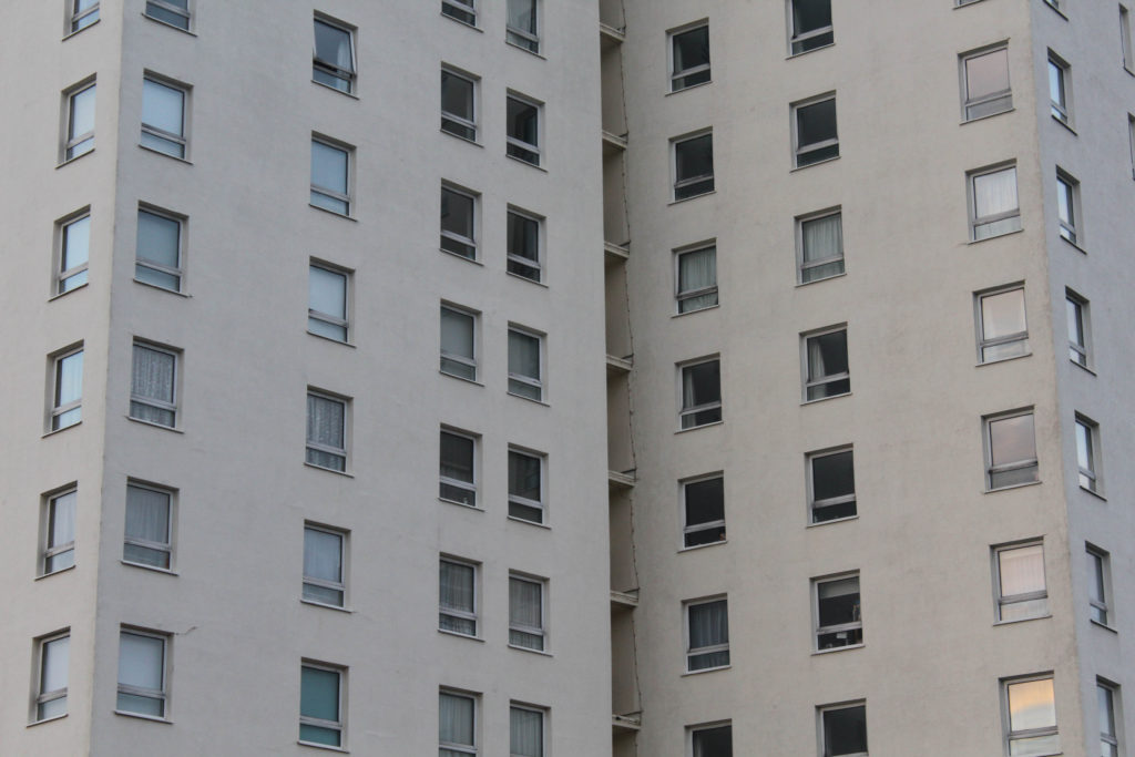
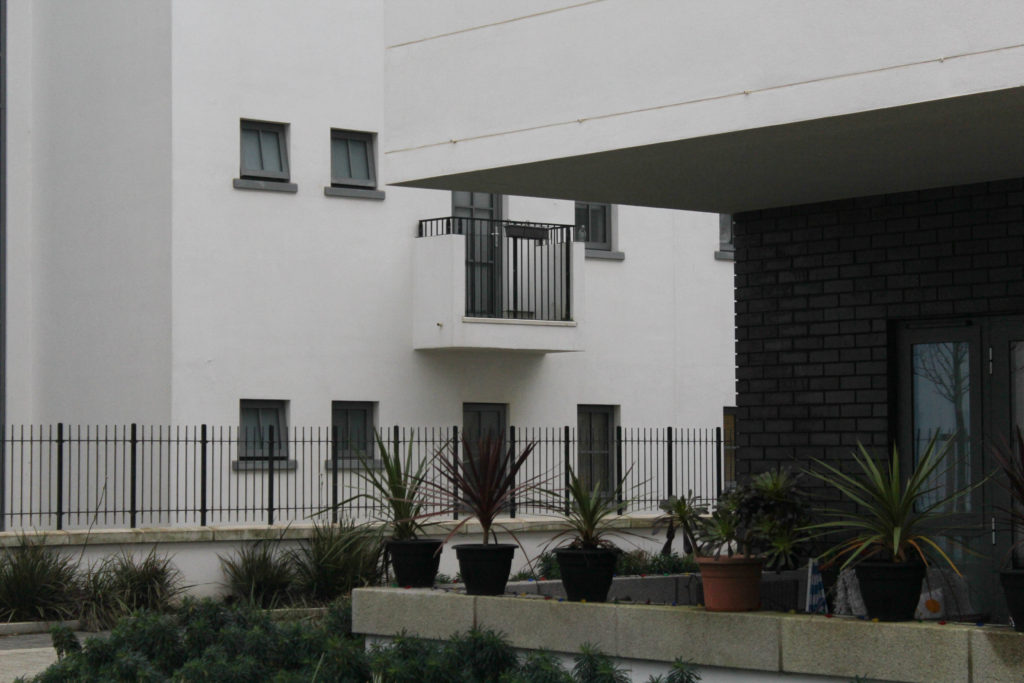
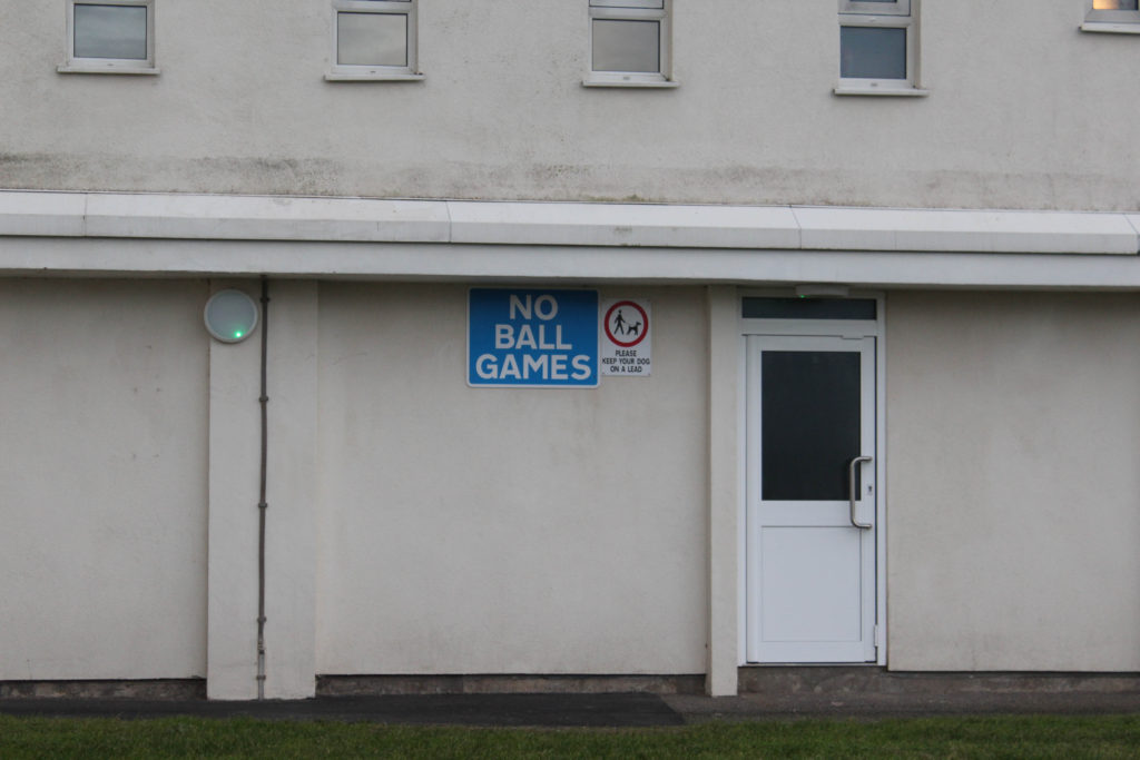
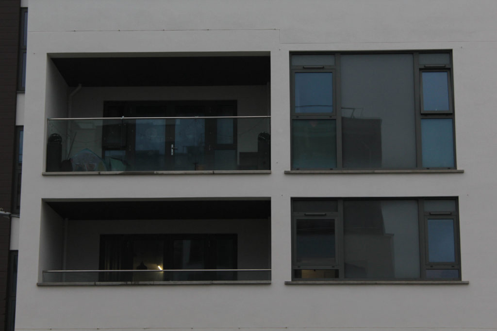
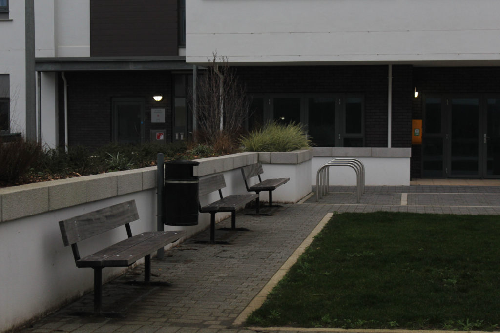
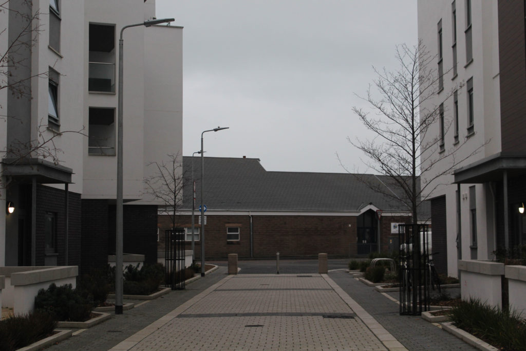
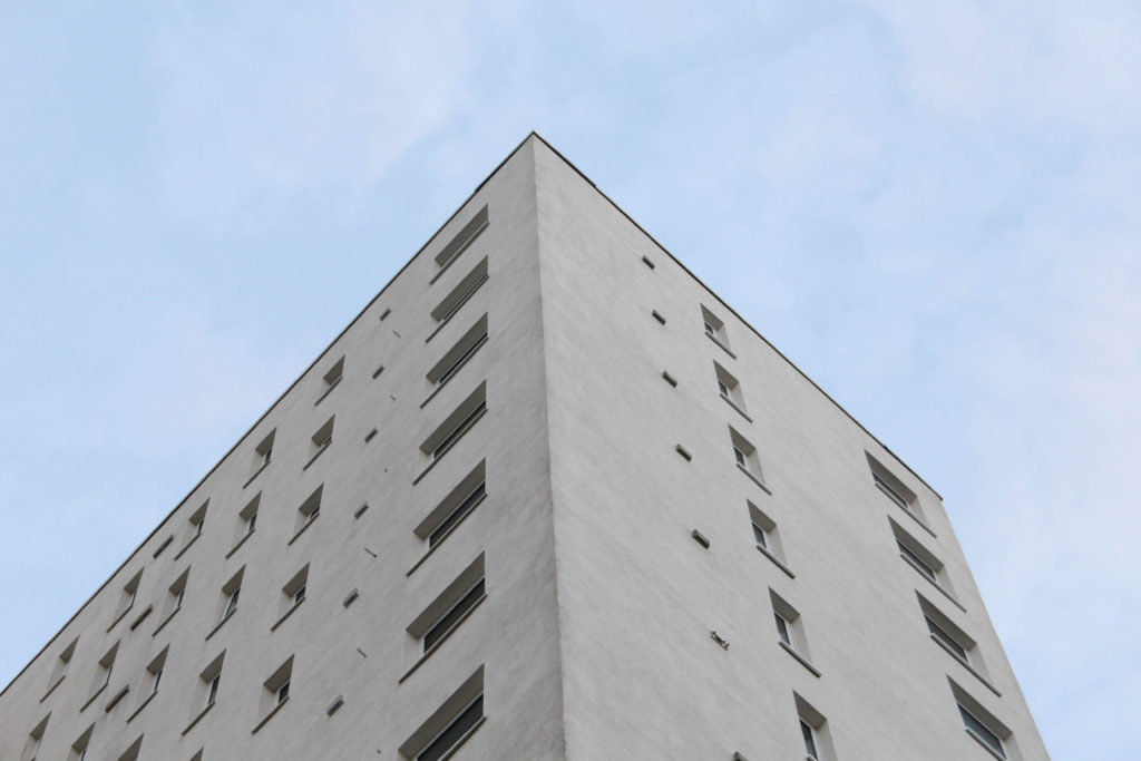
Below I have created a gallery to illustrate my images with the most potential, as I believe that these images do not need a lot of editing and are high quality without adapting the ‘clarity’ and ‘dehaze’ settings in Lightroom Classic. I would like to use these images in my photobook as they highly reflect the work of Lewis Baltz, as this infrastructure is some similar the buildings present in his work. I think that I have done well in taking accurate inspiration from his work and then being able to create photographs like his with Jersey’s structures.

Editing
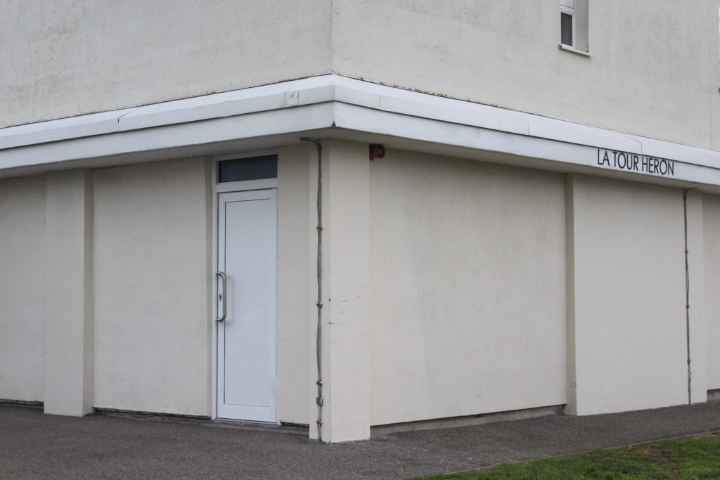
I have created a gallery to demonstrate the different ways in which I have edited my images, this also shows that not every photo needs a lot of adjustments/ changes to them. I found that the case with so many of my images from this photoshoot as the images had good levels of clarity and exposure so not much needed to be adjusted, the next step is to make sure that this level of clarity is maintained when I now convert my images to black and white.
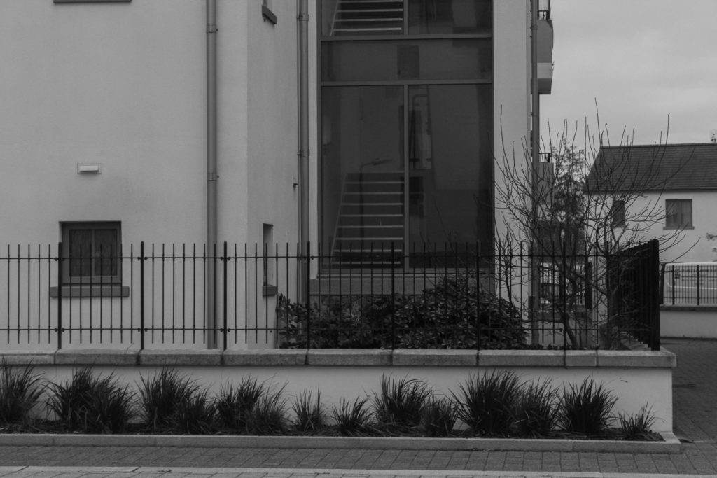
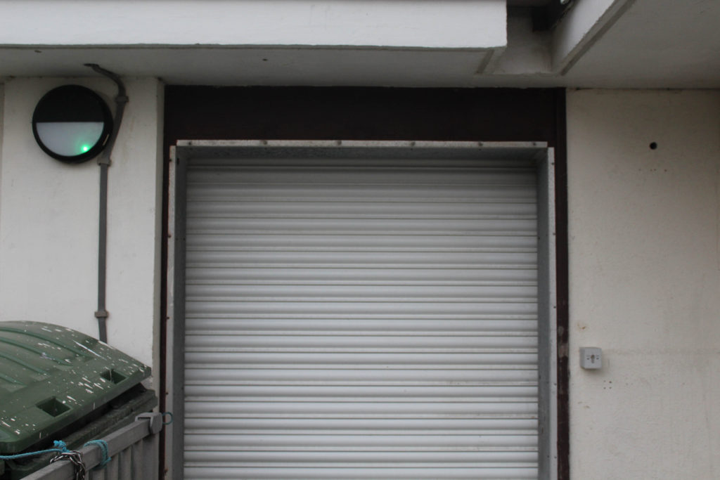
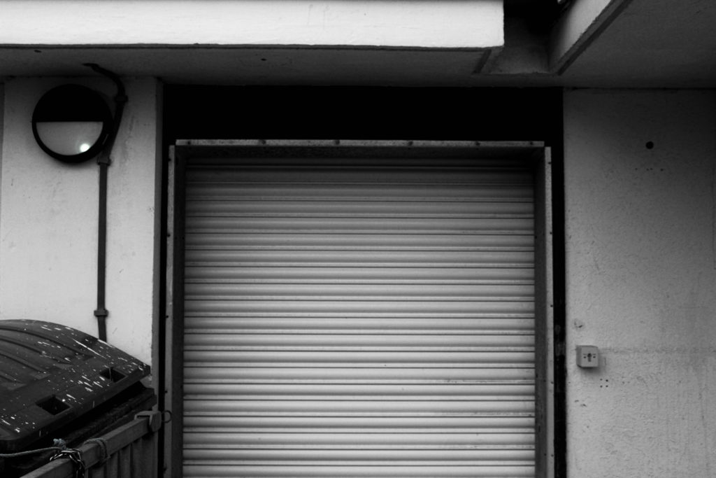
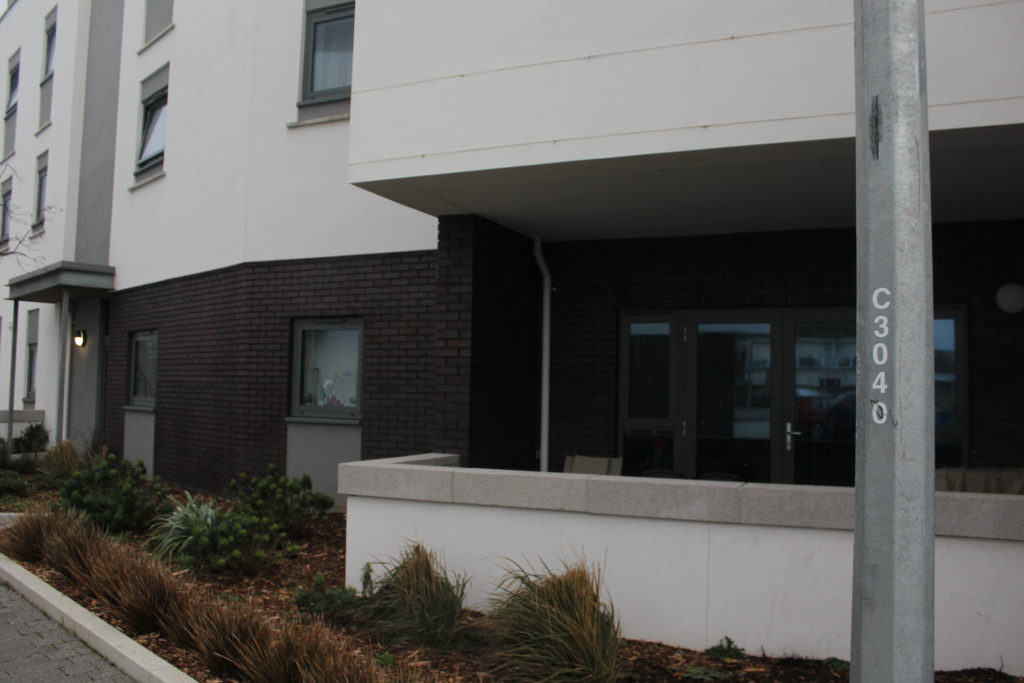
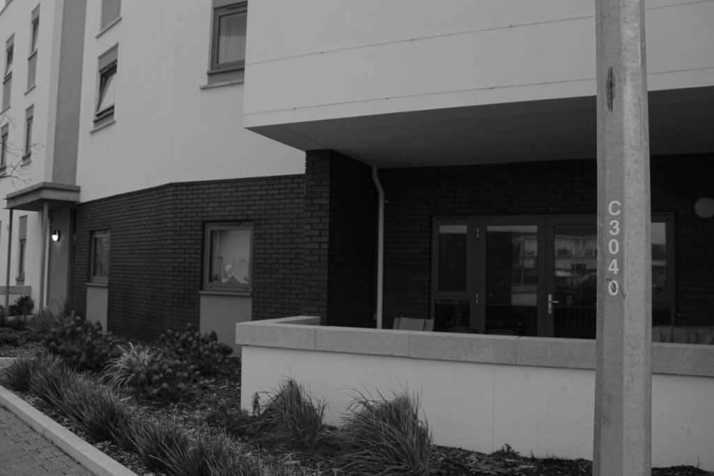
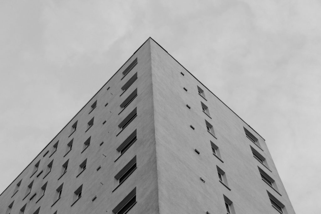
I have chosen to edit all of these images in black and white and in my opinion this makes my photographs more successful, this is because this editing seems to increase the clarity of the images, despite this not being true I think that my photographs occur to be more like Lewis Baltz’s work when they have been edited and this is vital when it comes to creating marks for this project.


Final Images and Evaluation/ Critique
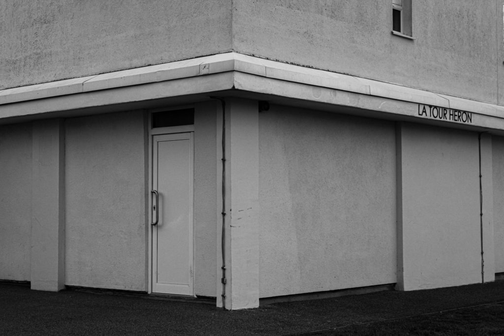
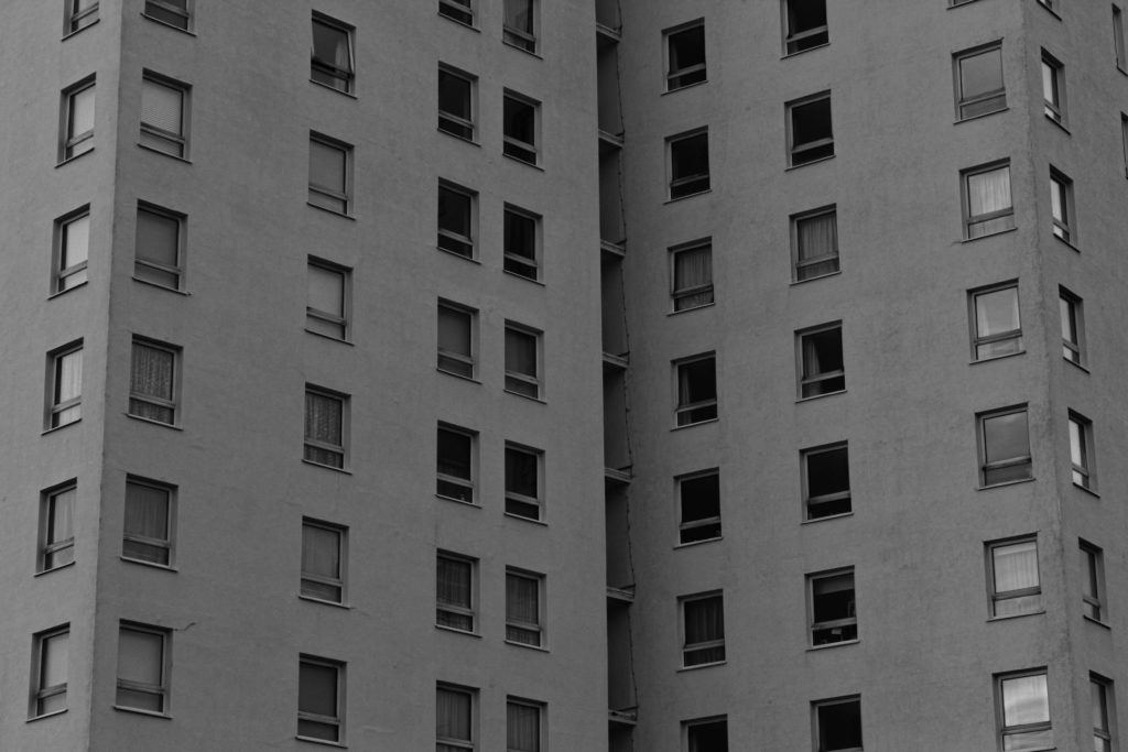
This section will include all of my final images from this photoshoot, this demonstrates that exploring around La Marais was successful when in regards to creating new images for my photobook. The most important aspect of this photoshoot is the fact that I am responding to Lewis Baltz very accurately and now create strong comparisons to his work and how they have influenced my thinking throughout my photoshoots.

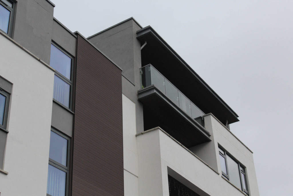
I have selected this as my last final image as I think this is the photograph that best reflects Lewis Baltz’s work, this is because the angle of the image is much like some of his work. Additionally, I think that the editing of this image is much like that of his images, and the clarity of this image demonstrates that I have really considered the outcome of this image before it was taken, I believe that this has great potential throughout my project, as it could be arranged in a group of photos only inspired by Baltz. The composition of this images is very important as it creates contrast within the image, there is lots of area for shadows, areas with large blank areas of white, and then the thin amount of concrete in the foreground means that there is a lot of areas of black. This contrast with the stark white above and means that the photograph becomes more successful as they more appealing to look at. I could be analysed that some areas of this piece are distracting, with the peak/ corner of the building not being in the centre of the image, meaning that it could be less aesthetic. Also with the singular window in the top right corner not really matching with the rest of the photograph.
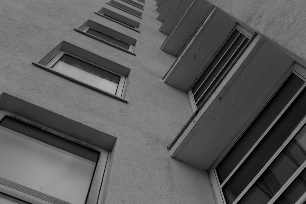
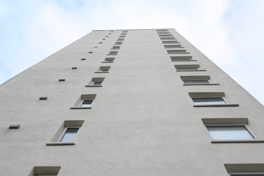
This photograph is one of my favourite shots from my La Marais shoot, this is why I have chosen it to be featured in my final images collection. In my opinion, this image is one which is very striking, with the composition of this image being its strongest feature. The fact that the windows are so close to the lens of the camera means that they can be in good focus, creating this high quality images. I really like the fact that a reflection can be seen on all the windows on the left hand side as you can see the clarity of the sky in this reflection. All of the parallel lines in the windows, as the high contrast was created by increasing the ‘blacks’ and ‘whites’ settings that are found when editing in Lightroom, means that the photograph has been made more successful. However, I could be interpreted that not a lot of consideration was put into the composition of this image, as the overall concept of this shoot was simple and the layout of this image was last minute and the influence of Lewis Baltz wasn’t really put into consideration when taking this image, and I think this is obvious as it can’t closely be related to his work.
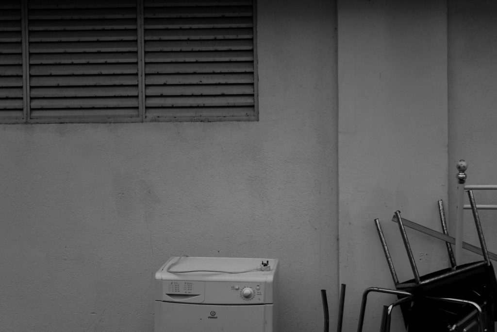
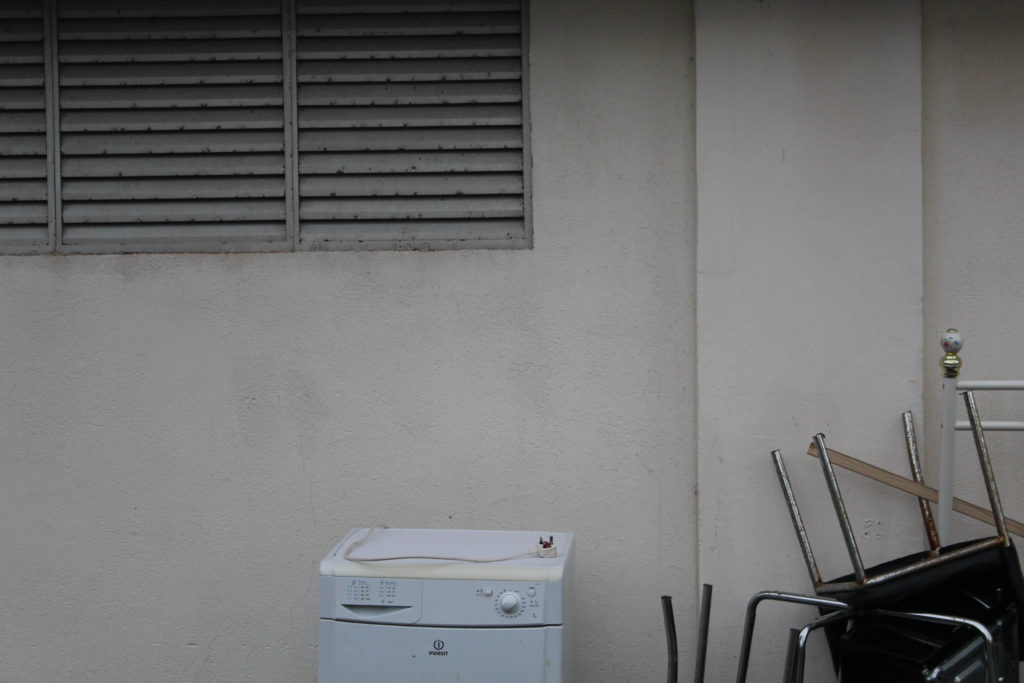
This photograph was taken at the base of one of La Marais’ flats, with all of these objects being carelessly dumbed at the bottom of this block of flats. The composition of this image is mostly minimal, with their being lots of blank space of white wall in the background and the tipped objects in the foreground. This image best demonstrates Anthropocene as it shows the carelessness that people have when it comes to discarding rubbish in an unsustainable way, as the furniture could of been resold and therefore could of been used again instead of adding to Jersey’s waste. I think that the lack of objects to look at throughout this image means that people have to pay attention to parts of our environments that are not so beautiful, and makes humans realise that not everything we are surrounded by is as good as it may seem.
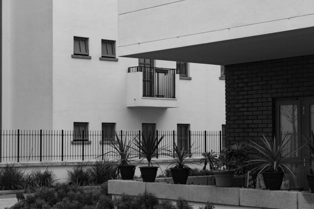
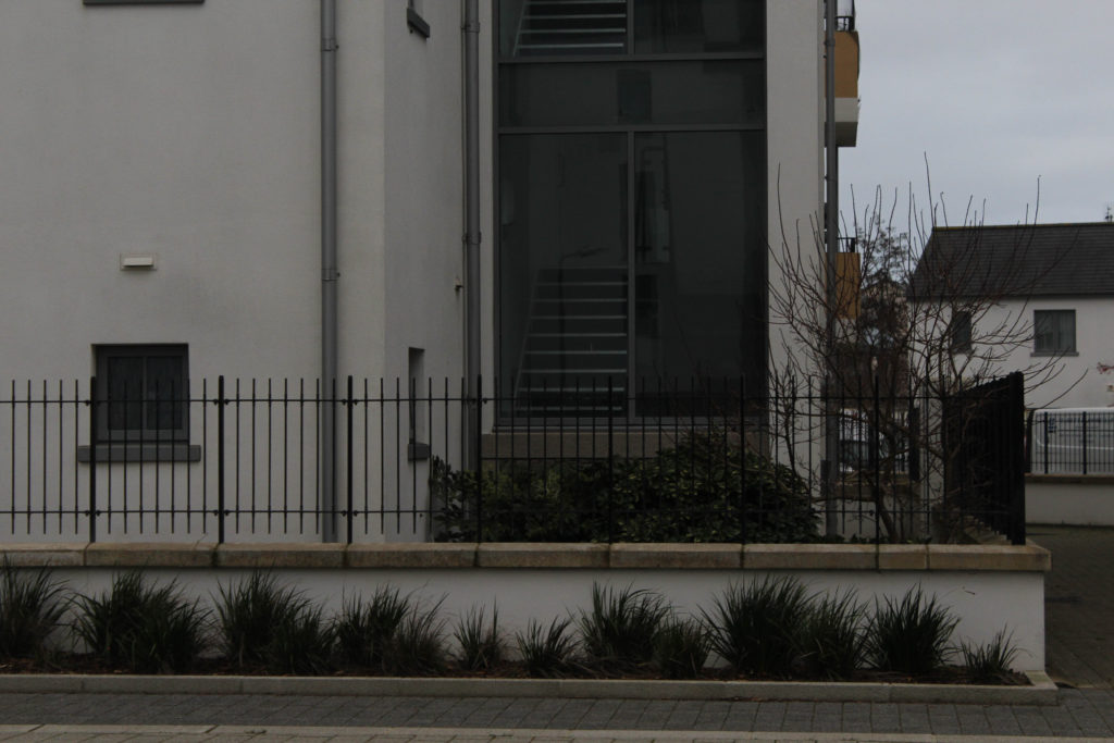
I have selected this as my last final image, as I think despite it not being my most successful out of my whole photoshoot, it best reflects the more accurate in between of recreating Baltz’s work, and my photoshoots reacting to the theme of Anthropocene. So in that respect this could be said to be my most successful image. However, overall I think that this photograph is not that interesting, as the components and composition isn’t very eyecathing at all. There aren’t aesthetic aspects to analyse in this piece, or any that would catch people’s attention. If I were to go back and retake this image I would get a high or low angle in an attempt to create a piece that is more visually interesting and could be used to other parts of my project such as my vital gallery. I think that the plants in the pot get lost as the black fence is behind the, as everything is the same tones it means its hard for a background and foreground to be determined throughout the middle section of the photograph.
