PERSONAL STUDY : ESSAY

Why are photographic archives so important ?
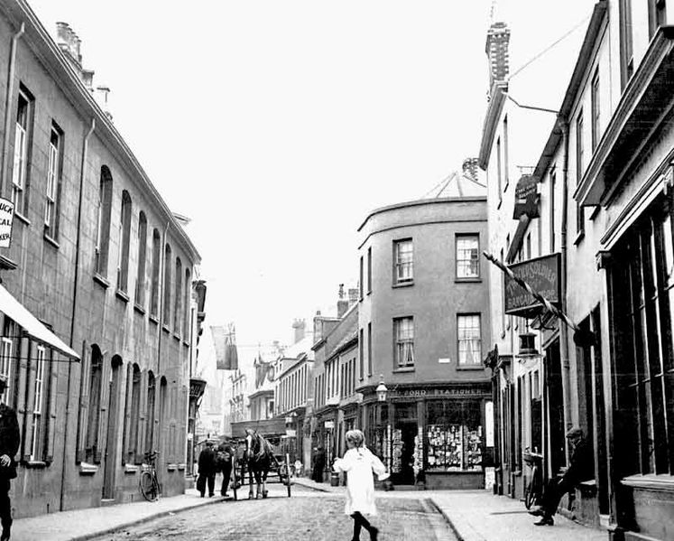
Archives are collections of documents, photographs, and other items that are kept for historical purposes. They’re usually held by governments or other organisations like museums or libraries. They have been around since the invention of writing. The first archives were created as a way to preserve important records and documents from being lost or destroyed over time, but they didn’t start out looking like we think of them now. In fact, before photography was invented, people would often draw pictures or write descriptions of the things they wanted to save for future generations. The first archive photographs were taken in 1839 by Louis Daguerre, who invented the daguerreotype process. In this essay I will be looking at photography that is based on exploring Jersey Islandness. I’ve decided to make my final project of Then and Now photography, It will present a series of photography that document the changes in architecture over time in Jersey. The photographs will be categorised as either “Before” and “after” with the location and date both photos were taken. The images were taken at different times so that they could capture how different structures have been affected by weather, humans, and other factors over time. My goal is to show how much architecture has changed over time, how much it hasn’t changed, and how the buildings have evolved with time and to also help us understand our own history by comparing images from different eras and contexts. I believe that archive photography is an important tool for documenting changes that take place over time. This type of photography allows us to see what has been lost or forgotten over time. For example, if we had never known what it looked like before or after World War II, we would not know what different cities used to look like. Using Société Jersiaise archive I have chosen a couple of photographs around St. Helier where I will re photograph in the same exact spot. The photographers I will be looking at are Jersey photographers that documented jerseys landscapes. My two key photographers are Percival Dunham and Edwin Dale who are both from the same time period and took photographs to document Jersey. Percival Dunham was a photographer for the local newspaper called “The illustrated weekly” and “morning news“. He had been in business as a photographer at 57 bath street since 1911, and had already been taking photographs for the battle of flowers and other events such as the grounding of the roebuck in St. Brelade’s bay in 1911. Little is known about him other then being described in the Jersey roll of service as ‘from St. Helier’ however it seems unlikely that he was born in Jersey. In the photographic archive of the Société jersiaise there is a collection of just over one thousand glass plate negatives taken by Percival taken between 1913-1914. At least 800 of these negatives were published in ‘Jerseys morning news daily newspaper’ or its sister publication ‘The jersey illustrated weekly’ between April 1913 and October 1914. His photographs were taken with a cumbersome plate camera over a decade before the introduction of hand held cameras and flashbulbs were the golden age of photo journalism.

Its interesting to see how photography has changed over Time. In the early days of photography, it was mostly used for commercial purposes, for example, in advertisements, landscape and portraits. But as technology advanced and cameras became more affordable, people started using them in their daily lives. The other photographer I will be looking at is Edwin Dale. Born on 3 January 1882 and has left a fascinating selection of island views taken between 1910 and 1920. In 1913 He entered the Jersey Eistedfodd photographic competition for the first time and won four first prizes and two second prizes. He made his living running his father’s boot, shoe and leather shop at 63 New Street but he had a passion for photography, and among his favourite subjects were harbour scenes and steamships, churches, houses, country lanes and coastal views, sport and the railway. He also took portraits and photographs of islanders at work. As well as being a very talented photographer, Edwin Dale was a keen racer of model boats and known for his love of motorcycles.  Many of his early images include the motorised bike on which he would travel around the island taking photographs.  Most of his work dates from 1910 to the 1920s and one of his favourite subjects was the railway.  He died on 27 January 1956. One of Edwin Dales photos below from 1912 taken with the view from South pier towards commercial Buildings with sailing boats in harbour at mid-tide, advertisement hoarding for Eldridge, Pope & Co, Dorchester ales on granite wall with fort regent in the background. In the foreground there are several different boats all different types of sizes all focused. The lighting is quite over exposed picking up the white colours of the sail boats. If you look closely you can see the reflection of the sailboat in the water which is in the centre of the image. However it being a bright photograph there are also some underexposed areas where you can see on two of the sailboats which adds some detail to the image. There are a range of tones throughout the image, the lightest tones can be see in the background and on the sailboats along with the darker tones that are seen more in the middle ground. The type of lighting in this is natural lighting as its outside, you can tell it was taken in the daylight because the image is clearly visible.

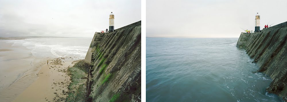
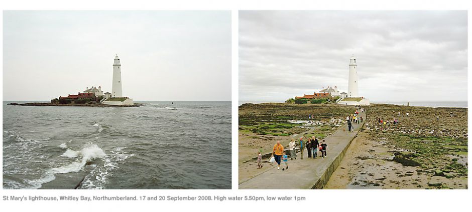
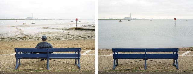
A modern day photographer that has inspired me and is also similar to my Islandness project is Michael Marten, an inspirational seascape and landscape photographer who is passionate about documenting nature. He has an interest with the tides changing throughout the seasons. Between the years of 2003 and to 2012 Michael travelled to different parts of the coasts to photograph an identical view from high tide to low tide of England starting from South-west then on to North west, North-east and ending with South-east. The photographers love for outdoors is evident in every shot as he captures light, texture and colour from outside. A connection Between Michaels and my project is the Before and After concept even though both our photos are different from each other. A quote from his book that relates to my photographs is “One aspect of what makes these photographs so compelling is the fascination of comparing each pair of pictures, spotting what has or hasn’t changedMacfarlane, R. (2012) written by Robert MacFarlane who wrote the introduction to Michael martens book. Having looked at Micheal Martens work I can now approach my work in a creative approach shaped by his style.

‘Sea Change: A tidal journey around Britainby Michael Marten
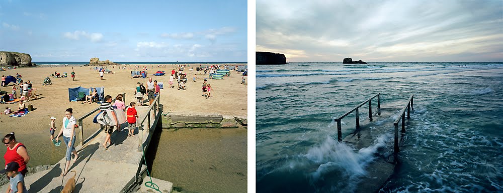
Trebarwith Strand, Cornwall. 21 and 22 March 2011. High water 5pm, low water 12.30pm

Bibliography: https://www.michaelmarten.com/books

Inside page 3 and 4 of sea change

In conclusion Archive photography is a powerful tool for documenting how humans have changed the architecture of their environment. It can be used to document how we interact with our built environment, and it can also be used to show how we’ve altered our surroundings over time. This type of photography allows us to see how things looked in the past, which helps us understand what has changed and why. Archive photography is an important part of the history of photography. It allows us to see how far we have come and how much we have changed as a society. It allows us to see what was considered normal or acceptable at the time when these photos were taken. I think it’s important to have two key photographers, Percival Dunham and Edwin Dale, for inspiration. I’m going to use Société Jersiaise to find their photographs to re-photograph them in the same exact spot that Percival Dunham and Edwin dale took the photographs. After taking the photoshoots I will use Photoshop to experiment with each photograph, photo montages

I will investigate how archive photographs can document architecture through decades. Archive photographs are a great way to understand how a building has changed over time. The photos can show how the building looked when it was first built, and then how it looked when it was renovated or restored. They can also show how the building has aged naturally through the years. This can help us understand what materials were used in its construction and what types of repairs have been made over time. When looking into how archive photographs can document architecture through decades, I will investigate the following:

– The use of camera angles to show off the buildings features and to highlight its relationship with its surroundings.

-The use of light and shadow to emphasise the height of a building or its position in relation to other structure’s

This idea of work that interests me in Then and Now photography is seeing how much has changed within Jersey, such as architecture, old buildings, modern buildings, different influences to change

Bibliography:

Michael marten: https://www.michaelmarten.com/books
Photos: Jerripedia https://www.theislandwiki.org/index.php/Jersey_in_pictures
Photo archive: Société Jersiaise https://catalogue.jerseyheritage.org/societe-jersiaise-photographic-archive/
History of Archive photography:
Jerripedia – Percival Dunham https://www.theislandwiki.org/index.php/Percival_Dunham,_photojournalist
Jerripedia – Edwin Dale https://www.theislandwiki.org/index.php/Edwin_Dale

Researching a Photobook

In class, prior to making our own, we were tasked with choosing a photobook to research, so we can gain a better understanding of how they work, feel and look, giving us the knowledge to make ours as good as they can be.

I decided to look at Night Vision: The Art of Urban Exploration by Troy Paiva as Paiva’s work has inspired me for some time as I have studied his work prior, and I feel like it links to my current focus within this project.

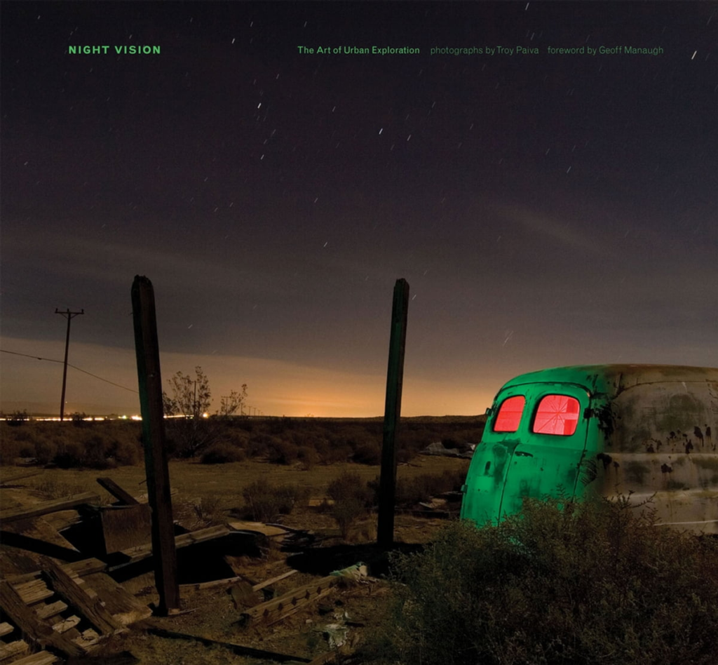
Front cover of Night Vision

1. The photographs in this image fit within the genre of night photography, and what Paiva calls ‘Light Painting’ which uses artificial light to add colour to the subject. In addition, the photographs could be considered urban, as the subject matter includes chiefly derelict buildings and vehicles. Paiva’s approach likely involves finding the locations and returning to them at night, figuring out how he’s going to light up the scene (in the cover’s case, he decided to light the outside of the van to be green and the inside to be red) and then he finally positions the camera to capture the scene he wishes to capture (so in the cover he decides to involve the two posts, some of the landscape and the night sky). The story here is likely the journey Paiva took while exploring each of the areas where he took these images.

2. My interpretation of this story is that Paiva is trying to give life back to these derelict locations and vehicles by giving them a new light he has painted on them, perhaps protesting the idea of leaving things to waste. I don’t feel like there is any particular audience Paiva is trying to adhere to, as the images are fairly art-focussed, as opposed to having a booming political statement attached to them. Generally, the book has received praise for Paiva’s ability to use ‘light painting’ as a way to give the images more depth and life, with people considering him one of the ‘acknowledged masters within the small cadre of professional night photographers’ (link).

3.

  • Book in hand: The book is smooth, due to the paperback cover.
  • Paper and ink: The book uses coloured ink due to his photographs primarily involving colour. The paper on the cover has more of a card-like feel, while paper with the images on are more like standard printing paper.
  • Format, size and orientation: The book is 9.75 x 0.5 x 9 inches, making it a landscape oriented book (however it retains a close resemblance to a square orientation).
  • Binding, soft/hard cover: The book has a softcover with a normal, spine-bound binding.
  • Cover: The cover is an image taken by Paiva, which is a dark image with light painting on a car. The text has a green colour, is small and is positioned at the top.
  • Title: The title ‘Night Vision’ links to using technology to see things that would not normally be seen at night. The typical understanding of night vision is that it involves a lot of colour (green with goggles or other methods such as infrared which uses multiple colours), mirroring Paiva’s style.
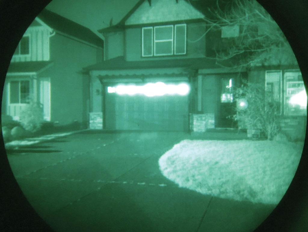
An example of an image with ‘night vision’ applied
  • Narrative: The narrative involves the journey that Paiva has experienced over the years of taking these images in this way and exploring the places that he has.
  • Structure and architecture: The book involves work made from 1999 to 2007, likely from multiple projects with a similar focus.
  • Design and layout: The layout of the images is not regular, with some page spreads having two or more images present, however a lot of the pages involves a classic style with one picture on a page and a caption on the other (each image has a caption). Each page is black where there is no image.
  • Editing and sequencing: The book is sequenced likely by the area Paiva has photographed, likely mirroring the journey Paiva took through them.
  • Images and text: There is usually captions next to each image, and some text detailing the history of a place he has visited.

Deconstructing a photobook

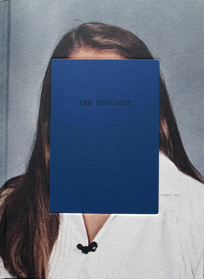
The front cover of “The Epilogue”

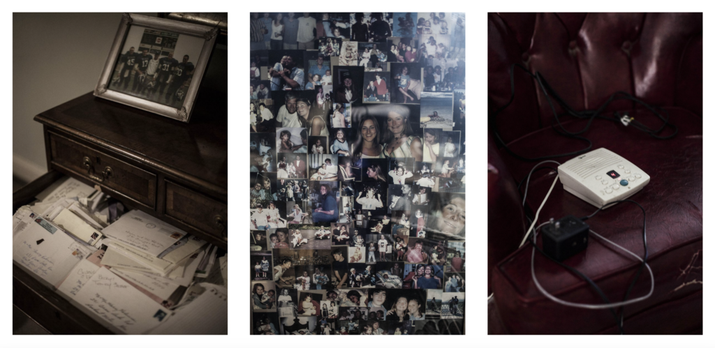
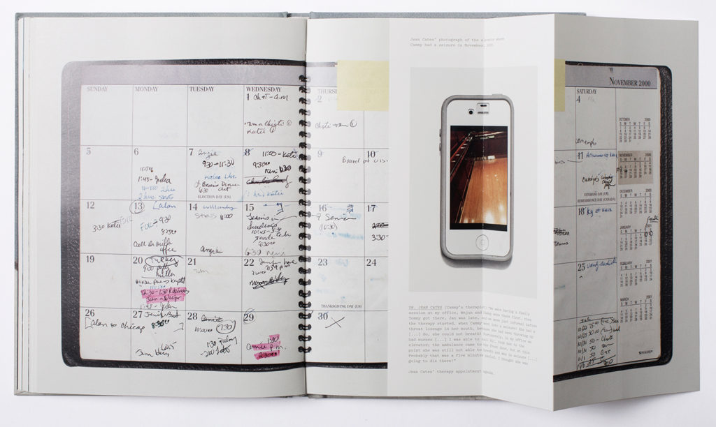
I have chosen to research a photobook named “The Epilogue”. The story of the book is about the Robinson family and the aftermath of losing their 26 year-old daughter named Mary Cameron Robinson, also known as Cammy. They lost Cammy due to the eating disorder, bulimia. This subject is quite heartbreaking as it showcases Cammy’s life before she passed away and highlights the effect that it has had on her family. It showcases how they come to terms with the death of their daughter due to this awful disease and how they deal with the grieving process. Cammy would make statements such as “I know I’m too skinny. I know and don’t want to be this way, but I don’t know how to get better.” These kind of statements were used within the photobook to get a raw adaptation of what her struggle was really like. The photobook is laid out in an order that shows her life in order before she passed away. It showcases a wide range of images referring to both her and objects that played an important role in her life, and also including shots of her family dealing with grief.

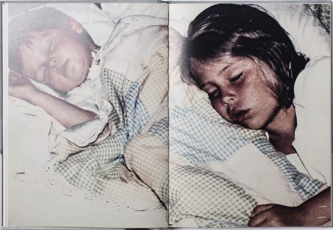
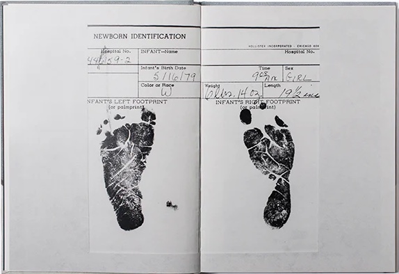
Images from the photobook

Who is the photographer?

The photographer is Laia Abril and she has received a wide range of reviews which all have positive outcomes. The book was mainly directed for the Robinson family and was used to showcase Cammy’s story. Abril stated that the family “understood right away my intention with the project, probably because their own healing process involved creating a small foundation in her daughter’s name.” In The Guardian newspaper, critic Sean O’Hagan goes on to write an article on this photobook and highlights that Abril stated “the uncomfortable aspects (of eating disorders) which nobody wanted to talk about” to “the collateral victims” of the illness.” She wanted to analyse the area regarding eating disorders to bring forth the real trouble and problem of the disorder. O’Hagan stated “It is a dense and rewarding evocation of grief, survival and the still-raw trauma of a family coming to terms with the loss of their most troubled loved one. The Epilogue is a book about absence, but it is also informed by Cammy’s abiding presence: her energy, her willfulness, her often clandestine struggle with a disorder that derailed her life and capsized the lives of those around her.” He also stated that “From time to time, I had to put it down, take a breather. But I kept going back.” (reference O’Hagan using Harvard)

Deconstructing the narrative, concept and design 

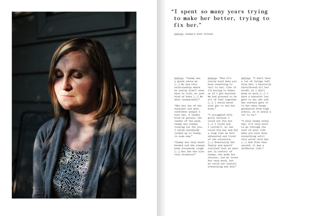
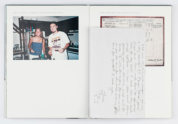
The book feels quite heavy as it is a hardback book and also feels as if it contains a leather-like material as the front and back cover. It has quite a rough texture to it and contains an image of Cammy on the front and back cover with a navy blue rectangle in front of her face. The front cover contains the title inside the rectangle saying “The Epilogue”, and the back rectangle contains a blurb of the content that’s inside the book. Epilogue means “a section or speech at the end of a book or play that serves as a comment on or a conclusion to what has happened” This is relevant to the content in the book as it’s highlighting an end to Cammy’s life by showcasing the images of her before her life was taken and come to an end. The book has been stitched together with the technique of swiss binding which makes it look very neat and well put together. The book contains a variety of landscape and portrait photos, followed by the insertion of text when necessary to present interviews of the family members. The interviews are mainly placed next to images of the family members to present who said it and what they looked like.

Example of the interview pages

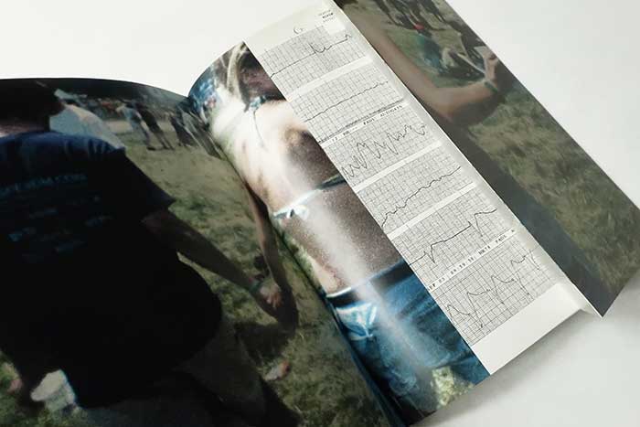
The images are all assembled in a variety of sizes, some take up the whole page, some only take up a small section of the page, some expand to almost the same size as the page but contain a white border around the entire image. There are some pages that you can pull out to witness more content inside it, showcasing links to both images inserted.

Example of one of the pull out pages

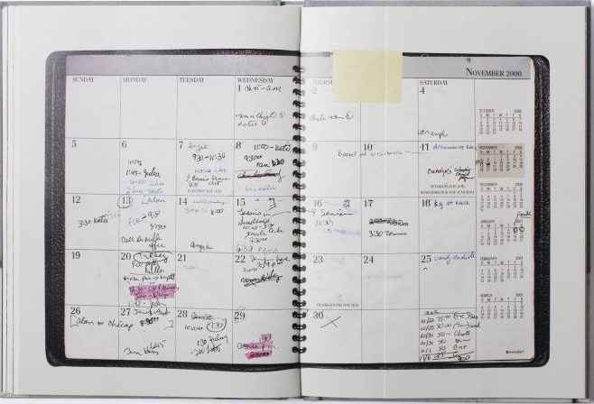
There are different materials inside the book such as glossy white paper for each page but there are also small inclusions of paper letters inserted in certain pages. There is a mix of colours within the images, including some black and white images and also some coloured images from disposable photos. They have quite a vintage colour scheme to them and are also quite grainy looking.

Essay Writing

Academic Sources

Research and identify 3-5 literary sources from a variety of media such as books, journal/magazines, internet, YouTube/video .

Carolle Benitah – Photos Souvenirs

Carolle Benitah – Jamais je ne t’oublierai

Carolle Benitah – History

Carolle Benitah – Lensculture

Birthe Piontek – New identity

Birthe Piontek – Relationships

Joerg Colberg – Photography and Memory

Final Essay | 2022 Photography Blog (hautlieucreative.co.uk)

Photography and Family

Begin to read essay, texts and interviews with your chosen artists as well as commentary from critics, historians and others.

It’s important that you show evidence of reading and draw upon different points of view – not only your own.

Write down page number, author, year, title, publisher, place of publication so you can list source in a bibliography

Quotation and Referencing

Why should you reference?

To add academic support for your work

To support or disprove your argument

To show evidence of reading

To help readers locate your sources

To show respect for other people’s work

To avoid plagiarism

To achieve higher marks

What should you reference?

Anything that is based on a piece of information or idea that is not entirely your own.

That includes, direct quotes, paraphrasing or summarising of an idea, theory or concept, definitions, images, tables, graphs, maps or anything else obtained from a source

How should you reference?

Use Harvard System of Referencing PowerPoint: harvard system of referencing for further details on how to use it.

Bibliography

Meggs, P. B. (1999), FotoGrafiks: David Carson. London: Laurence King

In-text referencing

Direct Quote: In his book on conversations on photography, Meggs writes, ‘a great fear of empty space and silence haunts Western art. We are compelled to fill space and time.’ (Meggs 1999)

Paraphrasing/summarising: Meggs (1999) makes a point about how western artists have a fear of empty space and silence and that they have a need to fill both space and time.

Essay Question

Think of a hypothesis and list possible essay questions:

How does Carolle Benitah and Birthe Piontek portray the topic of family through the manipulation of photos?

How does Carolle Benitah and Birthe Piontek explore the concept of family through their work?

How can memories be presented through the manipulation of old photos?

Opening Quotes

“I make holes in paper until I am not hurting anymore.” – Carolle Benitah

“Those moments, fixed on paper, represented me, spoke about me and my family told things about my identity, my place in the world, my family history and its secrets, the fears that constructed me, and many other things that contributed to who I am today” – Carolle Benitah

“I questioned the power of an image and what it can actually reveal of a person’s identity,” – Birthe Piontek

“The moment where it is all about the person and not so much about capturing a situation or event, so that the image becomes a representation of that person.” – Birthe Piontek

PHOTO BOOK DECONSTRUCTION

Beyond Here Is Nothing:

Who is the photographer? The book is made by Laura El-tantawy

  • Book in hand: how does it feel? Smell, sniff the paper.

The book is created in a very unique way and has a a very different way of opening it. The cover of the book smells like a normal hardback book with the pages having a slight odd smell.

  • Paper and ink: use of different paper/ textures/ colour or B&W or both.

The images contained in the book are all displayed in colour with many different vibrant reds / oranges.

  • Format, size and orientation: portraiture/ landscape/ square/ A5, A4, A3 / number of pages.

Most of the images are presented on small pieces of squared paper in a portraiture layout. Each section of the book contains 30 pages adding up to a total of 90 pages.

  • Binding, soft/hard cover. image wrap/dust jacket. saddle stitch/swiss binding/ Japanese stab-binding/ leperello

The book is a hardcover that folds over to create a unique style and divide the 3 sections of images

  • Cover: linen/ card. graphic/ printed image. embossed/ debossed. letterpress/ silkscreen/hot-stamping

The images throughout seem to be printed rather than any other methods

  • Title: literal or poetic / relevant or intriguing.

The book seems to portray a poetic style through the use of images not having much meaning but rather shown aesthetically

  • Narrative: what is the story/ subject-matter. How is it told?

The story involved is told through the different range of distorted images. Also, in each section there is a few pages stating the topic of images with a poetic story on the other side

  • Structure and architecture: how design/ repeating motifs/ or specific features develops a concept or construct a narrative.

The design of the book constructs a narrative of different weather moods throughout each section

  • Design and layout: image size on pages/ single page, double-spread/ images/ grid, fold- outs/ inserts.

All images in the book are spread out to cover a full single page on each side. It involves inserts of 30 images in different sections of the book that fold-out to be displayed

  • Editing and sequencing: selection of images/ juxtaposition of photographs/ editing process.

The book is edited in a way to make the viewer want to carry on scrolling due to the unique style of images and layout

  • Images and text: are they linked? Introduction/ essay/ statement by artists or others.  Use of captions (if any.)

The book displays around 3 pages in each section giving a 1 word description of what is coming up next and a poetic story that doesn’t have too much meaning

UNDERSTANDING PHOTOBOOKS:

Deconstructing a photobook

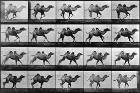
Animals in Motion – Eadweard Muybridge

This book is a documentary book rather than a contextual book. I shows the research he photographer did during his study.

The front cover of the book is eye catching due to the contrasting colours as well as the large text. The book starts with a section about Eadweard Muybridge and his work. I then goes into a preface where it describes how the idea for the book came about, the build up to the shoot, the preparation and the shoot itself.

Throughout the book there are sections of text that describe what is going on in the photographs. It describes the struggles of getting the set of images due to the use of animals. The book has a red hard front and back with a plastic cover over it. The front cover has a large image collage filling the bottom half with a centre meter teal boarder. The top half has a red background, a large white title. It then has a small paragraph where it states some of the animals that were photographed as well as that the book contains over four thousand individual photographs that make up the collages. The pages within the book have a plastic and smooth feel unlike regular paper. It smells of ink as would be common in a printing factory.

The book is heavy to hold. The image on the front has different coloured tints however the images inside are all in black and white due the the images being taken before colour photography was invented.

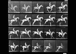
Each image in the book takes up a full double page spread with a few centimetre white boarder around the edge where the name of the photographs are sometimes show and occasionally a small paragraph talking about that specific set of images. In this photobook the images are not singular images as seen in most other books. Each page has a compilation of images all of the same subjects. Due to the use of up to fifteen cameras many images were taken of the same motion in a small space of time with only a small amount of movement between each one. The grid style of images perfectly shows what the photographer was trying to. The different stages of body position during an animals movement.

There is no information after the final image of the book. There are four blank white pages.

DECONSTRUCTING PHOTOBOOK

1. Research a photo-book and describe the story it is communicating  with reference to subject-matter, genre and approach to image-making.

Jim Goldberg: Raised by Wolves. From 1985-1995, Jim Goldberg worked on the streets of Los Angeles and San Francisco getting to know a number of homeless teens, building the relationships that would come to form the basis of Raised by Wolves, the ground-breaking monograph that redefined commonly held notions of documentary work. This photobook describes the stories of runaway, and homeless teens trying to survive on the streets. Jim Goldberg was on the California streets photographing and interviewing his adolescent subjects, their social workers and the police. They all lend a distinct dimension to the harrowing picture of American urban life, and the adversarial institutional culture surrounding it..

2. Who is the photographer? Why did he/she make it? (intentions/ reasons) Who is it for? (audience) How was it received? (any press, reviews, awards, legacy etc.)

Jim Goldberg is an American artist and photographer, whose work reflects long-term, in-depth collaborations with neglected, ignored, or otherwise outside-the-mainstream populations. “I tried to pull the curtain away and talk about issues of neglect and abuse and show the breadth of reasons why these kids were running from home. Often it was because of abuse, or the pursuit of Hollywood dreams, or coming out to their parents and being kicked out.” Received well by critics, often described as very powerful.

3. Deconstruct the narrative, concept and design of the book and apply theory above when considering:

  • Book in hand: how does it feel? Smell, sniff the paper: Book uses laminated paper feels very slippery, but creates a good texture on the photographs included, book has a very woody smell to it
  • Paper and ink: use of different paper/ textures/ colour or B&W or both: Uses black and white and coloured photographs, majority of photographs black and white, all paper laminated.
  • Format, size and orientation: portraiture/ landscape/ square/ A5, A4, A3 / number of pages: Book is portrait, slightly bigger than A4, 315 pages.
  • Binding, soft/hard cover. image wrap/dust jacket. saddle stitch/swiss binding/ Japanese stab-binding/ leperello: Soft cover images wrapped on page no dust cover, stich binded.
  • Cover: linen/ card. graphic/ printed image. embossed/ debossed. letterpress/ silkscreen/hot-stamping:
  • Title: literal or poetic / relevant or intriguing: Poetic, very intriguing
  • Narrative: what is the story/ subject-matter. How is it told: Story is told through the lives of the people photographed within the book, book revolves around runaways and homeless teens.
  • Structure and architecture: how design/ repeating motifs/ or specific features develops a concept or construct a narrative: Stories of the teens have been put into the book next to photographs to help give understanding to the photographs themselves and to create a deeper narrative within the book.
  • Design and layout: image size on pages/ single page, double-spread/ images/ grid, fold- outs/ inserts: Most images take up a whole page, some double spread images, no fold outs or inserts, one grid.
  • Editing and sequencing: selection of images/ juxtaposition of photographs/ editing process: The book takes you through the stories of teens living on the streets with most photographs being black and white to compliment the dark lives of those photographed within the book.
  • Images and text: are they linked? Introduction/ essay/ statement by artists or others: Stories of the teens photographed are placed next to images within the book.

Personal Study Essay

Introduction (250-500 words)

Through my narrative personal study, I want to give a ‘voice’ to the historical past of immigrants and why they travel and how they adapt to unfamiliar places as a source of better income. I am going to focus on my grandparent’s story and how they travelled from Madeira to Jersey to seek better income for a better life for themselves and for a better life for my mother and my uncle. 

This topic interests me as there are a lot of immigrants in Jersey, families that have moved here for a better life just like my grandparents. As an island Jersey has opened to places like Madeira. 

There is no specific links between my previous studies and my chosen personal study topic however My grandparents worked at Hamptonne Farm so I will be going back to Hamptonne farm photographing the fields and tracing the path that my grandparents took on their journey for wealth which included a struggle of bringing my mother and uncle over to Jersey due to

I will be incorporating images from my family archive and where I can demonstrate how its modernised from Madeira interlinking with Jersey to what it is like to be an immigrant 30 years in the past to becoming an Entitled Jersey Citizen. 

Paragraph 1 (500 words)

Realism is the opposite of Pictorialism where objects, environments and people are manipulated. Realism is an object, environment, people etc photographed how it can be seen directly through a human’s eye. Realism is focussed on Naturalism with no form of manipulation through scratching onto photo negatives nor pouring chemicals onto images and scratching lines etc.  

I am liking my project to Realism as I want my images photographed as naturalistically as possible to reflect the reality throughout my narrative.  

Paragraph 2 (500 words) 

For my first Artist I am studying Rita Puig

Rita Puig-Serra Costa Where Mimosa Bloom 

https://paper-journal.com/rita-puig-serra-where-mimosa-bloom/#:~:text=Where%20Mimosa%20Bloom%20is%20a,experience%20of%20grief%20after%20loss.

Paragraph 3 (500 words) 

My second artist is

Conclusion (500 words)

Bibliography: 

https://scalar.usc.edu/works/let-me-get-there/immigrants-photographic-legacy

https://paper-journal.com/rita-puig-serra-where-mimosa-bloom/#:~:text=Where%20Mimosa%20Bloom%20is%20a,experience%20of%20grief%20after%20loss.

Deconstruct photobook

THE PHOTOBOOK ITSELF

Click on the image above to see images from “The Middle of Somewhere”

“The Middle of Somewhere”, a photobook by Sam Harris contains documentary images of his wife and two daughters travelling India and Australia, focusing on capturing memories of his daughters growing up, with a large reference to growing up living off the land in rural communities. The photobook is not organised in chronological order: purely intending to capture memories, the photobook displays themes of family, fatherhood and growing up.

WHO IS THE PHOTOGRAPHER

Sam Harris created this personal photo project in order to capture memories of his young family’s travel through India and Australia, this project grew into an independently published book that won multiple awards including a Lucie Award 2015, and most recently the People’s Choice for the Australian Photobook of the Year Awards 2015.

WHAT IS THE NARRATIVE, CONCEPT AND DESIGN OF THE BOOK

The book is quite like a scrapbook in a way, deep within the pages lie an amalgamation of scribbled memories, with alternative narratives, diary entries, post-its, hastily scrawled love notes and tea stained prints: with the almost poetic title supplying intrigue to readers as it looks almost like a notebook- with the title being whimsical and vague.

The book is portrait and has a soft card, textured cover, with the look of being hand-drawn and painted with a simple small wraparound containing the name “The Middle of Somewhere” and “Sam Harris” handwritten, presumably by the photographer himself.

Inside the book, pictures are only in colour. Depth and context is added throughout the book in the form of inserts, foldouts and even an almost separate book inside called “Travelogue” containing images from travelling to India and Australia.

There are running motifs throughout the book, with images often only being warm toned and vibrant- obviously since the book is about Harris’ family, images are concentrated on his family and are in (somewhat) chronological order: with text sharing context and background of the images.

As stated before, there is an influx of fold outs and inserts in this photobook, mainly being of text; including recipes, diary entries, context for the images, post it notes written by Harris’ children and even a whole almost other separate book titled “Travelodge” containing images of the young family travelling and living in Australia and India.

The images themselves are not massively edited, it is potential they have been made more vivid or saturated however as they were taken to capture memories- it is unlikely they have been edited. There is one image in black and white featuring a particularly stormy day however all the other images are stylistically vivid in colour, mainly warm tones however rich greens and blues are presented.

Artist Reference 3 – Michael Marten


Examples of Martin’s Work

Critical Mass: Michael Marten - LENSCRATCH
Sea Change - Photographs and text by Michael Marten | LensCulture
Sea Change: A Tidal Journey Around Britain by Michael Marten (18 pictures)  | Memolition
Portfolio: Michael Marten | The Independent | The Independent

“We all know our landscape is constantly changing, but as we live in the moment we rarely perceive a big sense of difference”

Michael Marten

From looking at Martins work I gather that he aims to illustrate the ebbs and flows of our environment by taking two photos of the same coastal location at both low and high water, and displaying them side by side. A majority of his images show intense drastic landscape changes in coastal environments, with minimal editing or colour grading – just him leaving original tones and colours.

What his images portray is very closely linked to islandness in the way that he portrays the sea and tidal changes, which is the defining part of island living and will link in nicely with my personal study as I look into what disconnects the island of Jersey from the rest of the world.


I chose to reference Michaels’s work as I feel that it links well into the overall theme of islandness as it obviously portrays coastal movements of the sea which I a key part of island living; but more specifically my focus on loneliness, isolation and disconnection. This is seen in his photos where he captures busy beaches full of people and then the same beach when it becomes unreachable during high tide.


Critical Mass: Michael Marten - LENSCRATCH

In these photos, Micheal takes advantage of natural lighting in order to give a massive contrast between the before and after. By efficiently timing his shoots in accordance with the tidal range he was able to capture low tide at a time when the beach was busy with people and the sun was out providing a light, clear image. He has used a tripod to keep the same angle in both images, and by using a wide shot it captures more people, contributing to the contrast in the second image as they would all be covered.

In the second image, the tide has obviously come up covering the beach which was once full of people. The lighting is much darker as the photo was taken later in the day, but when given context from the first image it makes it slightly eerie.

Michael has used the bridge in the centre as a focal point which makes it clear that the two images are of the same place. Michael also used a slightly slower shutter speed to create a bit of blur while the waves crashed over.


I will be attempting to create my own selection of similar images by photographing coastal points such as Gorey Harbour, Le Hurrel Slip, and St Helier Harbour. I will be doing this by photographing POIs at low tide and high tide, keeping a specific angle by marking my tripod and where I place it.