Photoshoot plan: For my second photoshoot I would like to explore some areas of farmland in an attempt to recreate the work of Richard Misrach. To do so I will be taking some images of green houses in some fields, I would like to create high quality images with an eerie effect to them and some which can be drastically edited using the ‘invert’ tool in photoshoot. To do so I will be exploring this area during the early afternoon in order to get good sunset which creates clear images whilst still being not too bright. The only equipment I will be using will be the school camera, as I don’t think that it is necessary to use a tripod. This is because I think that more interesting images can be created without the tripod as more creative angles can be gained.
Contact Sheets
Below I have included some contact sheet which illustrate all of the different angles and compositions I have achieved during this photoshoot. I think this is important to demonstrate as it helps me look through all of images and start to understand how many successful ones I have taken.


Overview of photoshoot: In my opinion this photoshoot is filled with a lot of images of high quality and potential but there is some images which are too over or under-exposed to be able to edit or use throughout my book, however, I still think that these images will come in useful when it comes to creating creative edited pictures.
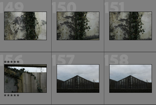


Image Selection
In order to begin my image selection process, I went through all of my images and rated them with stars, this ensures that I can later filter out of my unsuccessful and only focus on the ones I have rated 5 stars. The next step to this process is using a colour coding scheme which helps me determine which images out of my strongest images have the most relevance to my project and are of the best quality. I have also used a star rating system followed by a colour coding system to show my better photographs.

- Purple- images with most potential
- Blue- images that could be used
- Pink- images with least potential


Best Images Before Editing
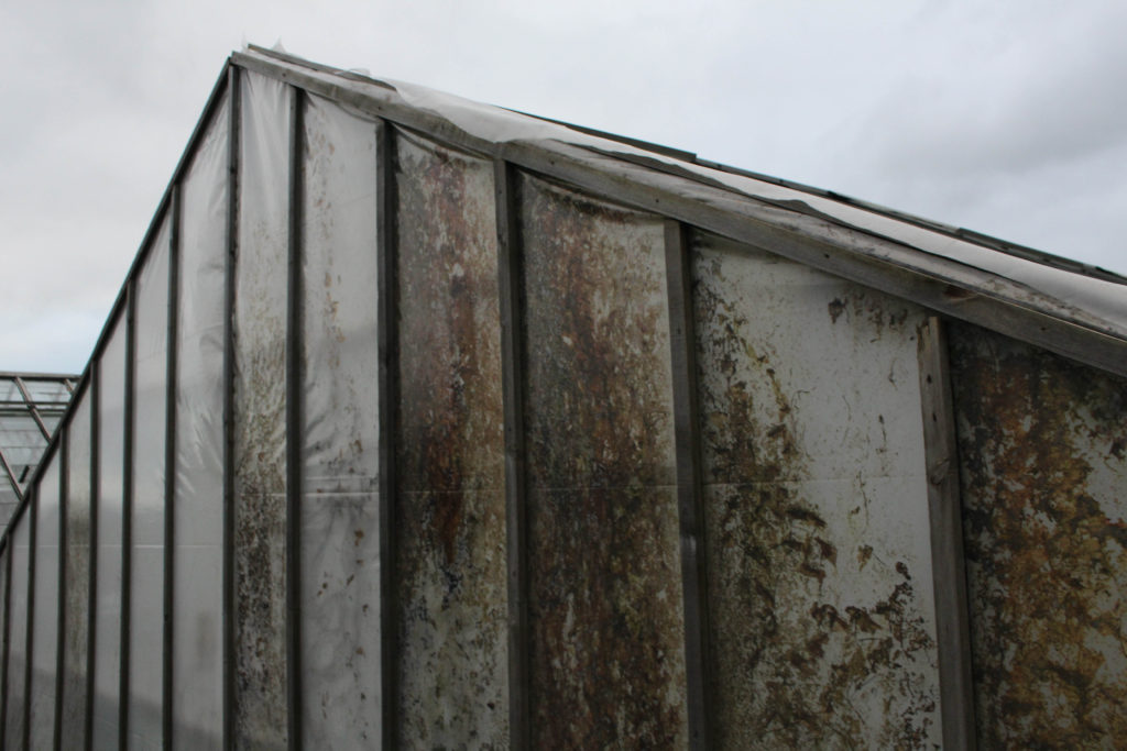
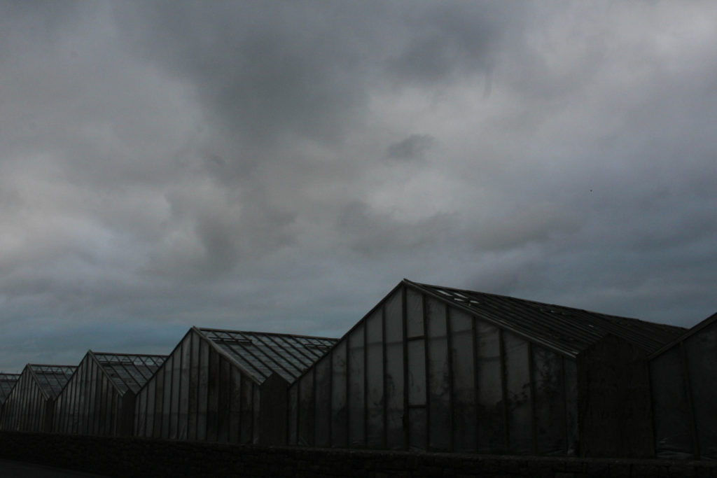
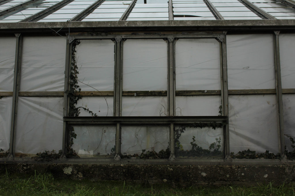
Below I have created a gallery which contains some of my best photographs before I have cropped or edited them. This is in an attempt to show that some good unedited images have come from this photoshoot. I also like filtering out all of my images so I can see which have the highest natural clarity.




Editing
Editing these images came to be more difficult then expected, as some of them were so grey that it was hard for any other colours and tones to comes through in the images. However, I have demonstrated some editing I have done throughout these images and how this has impacted the photographers in a positive or negative way.



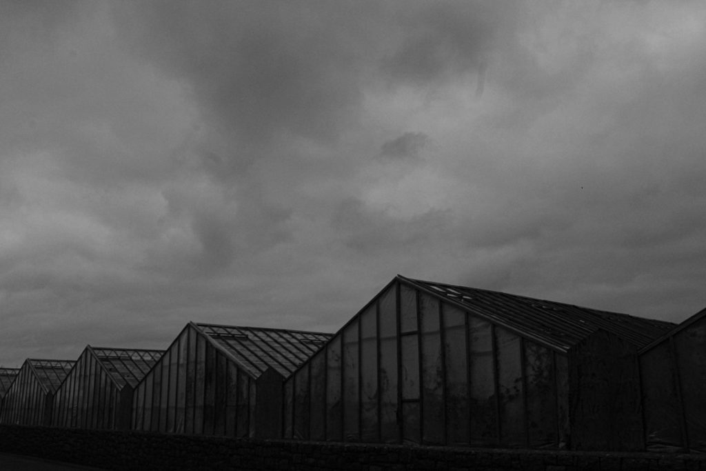
I think that overall my editing has been good, and only adds to the strength of my images that I have taken. This way of monochromatic editing is my favourite as it adds dimension and contrast. The lighter and darker tones are more evident and this means that the shadows are more clear as well. I think that my photoshoot has become even more successful after looking at these edited photos.


Final Images and Evaluation/ Critique
This section will include all of my final images from this photoshoot, this demonstrates that exploring the fields was successful when in regards to creating new images for my photobook. The most important aspect of this photoshoot is the fact that I am responding to Misrach more then Baltz, but this photoshoot could be compared to both.

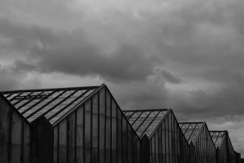
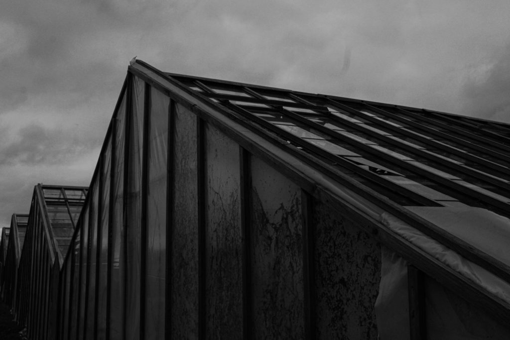
I have selected this as my first final image as I think that this is my most influential image, it shows all of the greenhouses that are present in all of my other images. I like that there are different textures present in this image. This monochromatic editing means that the clouds create different shapes with soft texture in comparison to the parallel dark lines in the greenhouses with lack of texture with lots of dimension. I really like the composition of this images as it allows for half of it to be composed of sky, whilst half of the image is composed of the greenhouses themselves. Lots of this image is filled with dark tones and very harsh lines, whilst the sky is very subtle, this creates contrast within the image and makes it more appealing. Most importantly I think that this image relates more to Lewis Baltz in comparison to Richard Misrach, and this means that this photoshoot links to both of these artists and strengthens the concept of my project.


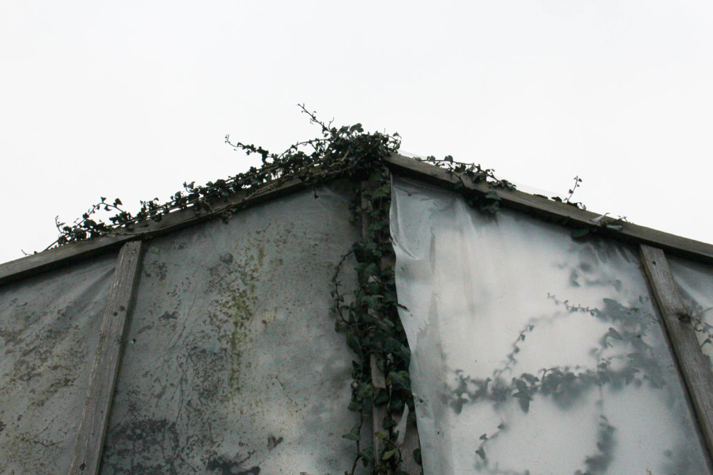
I would like for both of these images to put together when they are being displayed as I think they compliment each other well, with these images being two perspectives of the same structure. I have tried to edit them so they are the same and appear to have similar lighting. I have purposefully make the first image quite over exposed, so that the sky is brighter and the texture of the leaves is more prominent. I think that these are two of my strongest images as the second also contains a lot of detail and texture within the leaves. The purpose of these photographs relating to my project was the fact that they represent manmade structures being built on a natural landscape, and then the natural landscape taking back the scape that us humans has taken for our own benefit, this is important as it links to Misrach’s concept of educating people surrounding the climate crisis we are always facing.

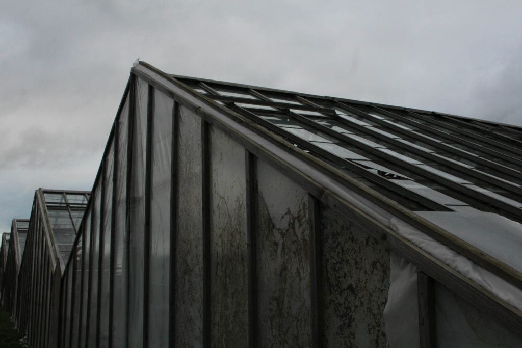
I have selected this as another final image as it represents how strong manmade structures can be, as the structure has obviously lasted a significant amount of time, throughout all the natural events that could have occurred, and this is shown through all of the dirt and moss that can be found on the outside of these greenhouses, highlighting the longevity of their lives. This links to the fact that the damage that manmade life has caused is mostly one which is irreversible and cannot always be controlled. Additionally, this image remained more aesthetic without monochromatic editing, and I like how the colours in this image show how much natural life can still go through and survive regardless of the circumstances.
Compare and Contrast


Similarities: I have now included a compare and contrast of my work versus that of Richard Misrach, this shows where I have got my inspiration to photograph natural landscapes from. The clarity of this images reflects how I have considered my work being compared to his, as I wouldn’t want to take inspiration from his work and then begin to produce low quality outcomes to comparison. Lots of cool and green tones are evident in both of these pieces of work, with natural aspects such as leaves and foliage in both of these pieces.
Differences: I think that these two images have many differences and this is because of the composition and objects that are present in each other the photographs, they have completely different looks with just a few links to each other. Additionally, Misrach’s work is filled with a wider variety of wide shot images, whilst I have more examples of more zoomed in images, attempting to focus on one part of the greenhouse. Despite there being visual differences in my work, their are different conceptual approaches to our work, this means that Misrach has focused on a whole area (Cancer Alley in this photograph above) in an attempt to educate people and bring attention to out current climate crisis. On the other hand, throughout my work I am heavily trying to relate my project to very specific and somewhat overlooked areas of Jersey (like this photoshoot specifically). In my opinion this dramatically affects the outcomes that our work will create, the message of my work is more related to how the landscape itself has changed, and how the environment has continued to adapt.
