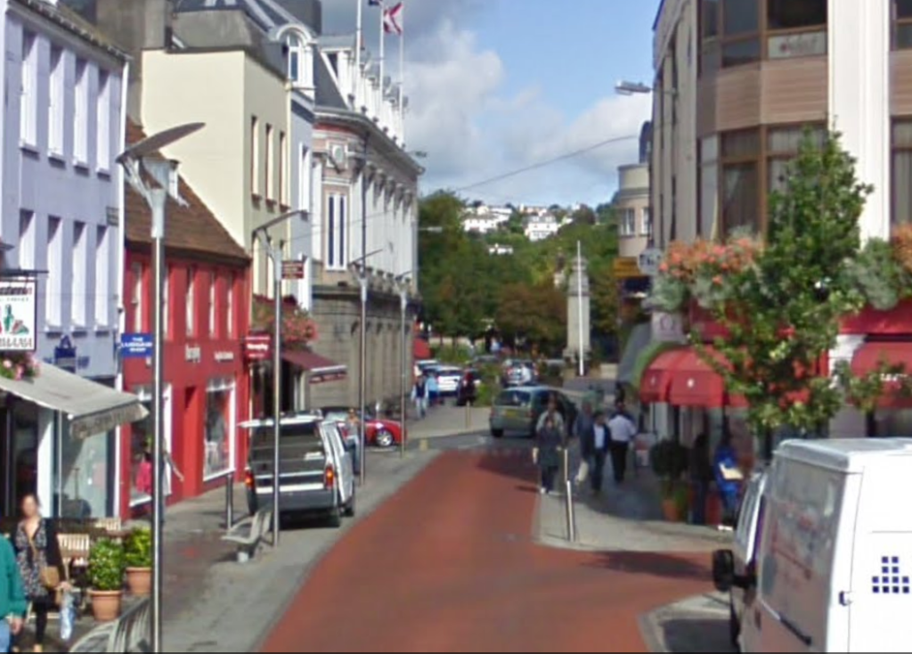
| PLACES: | Pitt Street, Dumaresq Street | ||||||||||||||||||

Pitt Street, Dumaresq Street – google earth
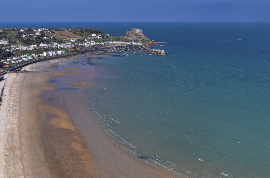

SJPA/032609
First Tower, St Aubin’s Road, First Tower Laundry

SJPA/000053 Parade Place


| SJPA/001545 |
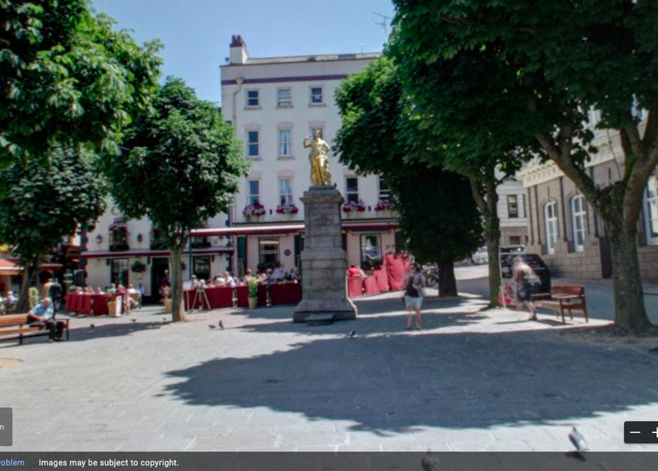


urrard Street, Don Street google earth


| PLACES: | Pitt Street, Dumaresq Street | ||||||||||||||||||


| SJPA/001545 |


urrard Street, Don Street google earth


For my second photoshoot I planned on taking photographs of street spots around St. Helier, but it started raining, so I found myself in an underground carpark near the harbour photographing. I managed to take 199 photos during this photoshoot. Using the flagging option in Lightroom I managed to narrow it down to 36 photographs.
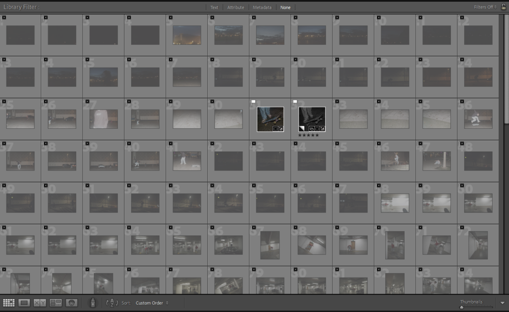


I then once again used the rating option in Lightroom to narrow down the 36 images, which left me with 13 of the best images taken during this shoot. While selecting these 13 final images to use in my photobook I made multiple edits of each as well as editing photos which were not rated.
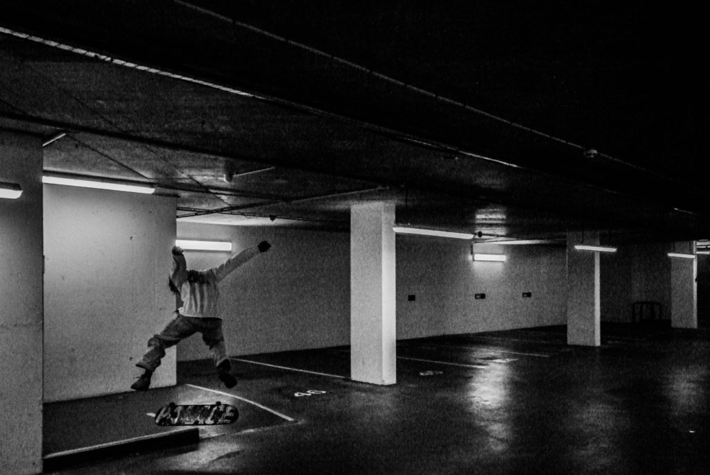
Once again I decided I wanted to use mostly black and white images, as I believe it looked a lot more effective, I found photographing in an underground carpark was unusual scenery wise, as it all looked the same and was very repetitive, although it did lead to some interesting images.



For my first photoshoot, I took photographs down the harbour skatepark over the course of a day and took 318 photographs over this day. I used the flagging option in Adobe Lightroom to narrow down the images taken which left me with 123 photographs, which were still too many.
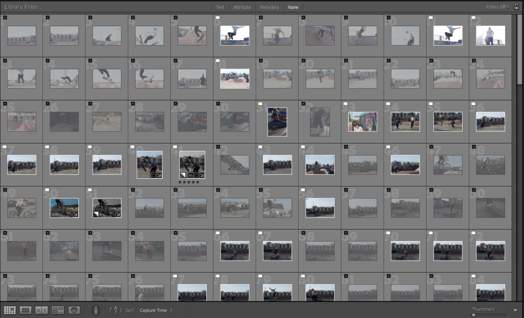


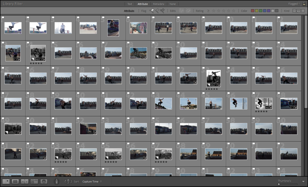

I then took the photos which I flagged and then used the rating system in Lightroom to narrow down the images again to my favourite, which left me with 11 final images, while narrowing down the images I edited a lot of them but only kept my 11 favourite edits to use within the photobook I am creating for this study.

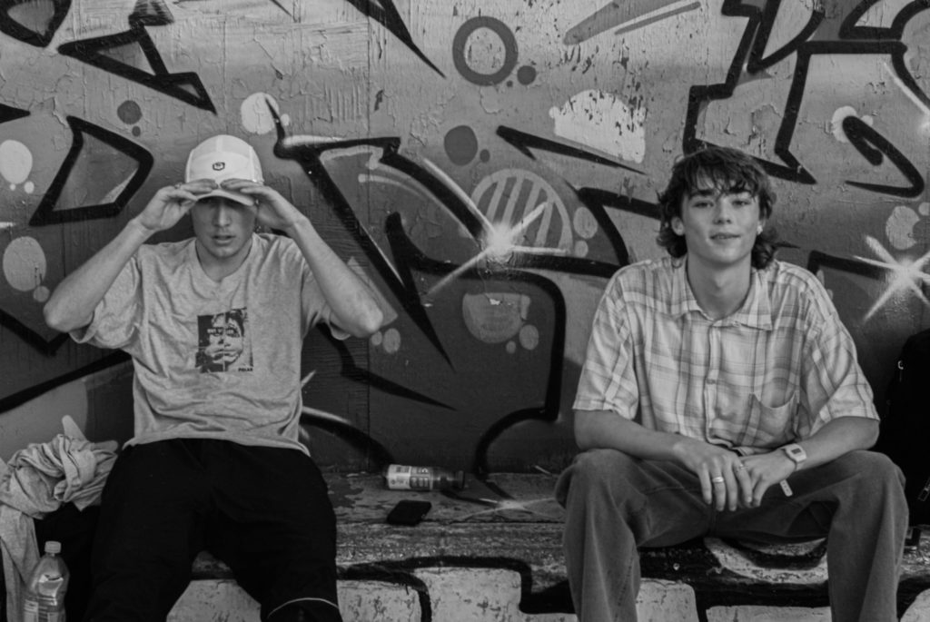
The majority of my final edits were mostly action shots of skateboarders, but also included a couple images of the skateboarding community in the skatepark.
I decided that most of the images that I wanted to include within my photobook to be black and white, this is because I believe it made a lot of the images look a lot more effective. It also draws the eyes of the viewer towards the skateboarders within the photographs, and not anywhere else on the image where there may be distracting colours or other subjects. I selected these images as my best edits as, I believe they are the most interesting photographs I took during this shoot and look the coolest out of all of them.


1. Research a photo-book and describe the story it is communicating with reference to subject-matter, genre and approach to image-making.
“Tokyo is a visual journey through a city at once futuristic and obsolete, its visionary design worn out – like that of a past era. Gerry JOHANSSON uses photography to index the city, finding form and pragmatic order through accumulation and sequence, revealing the city’s hidden, modular logic: lego-like segments, a basic square unit repeated indefinitely and in various sizes. These images are unpeopled, showing only the architecture of the city, a container of 13 million people, organised around mass movement and the funnelling of human traffic. Between the concrete, glass and steel, the occasional green life sprouts – miniature gardens in the narrow alleyways, or a cluster of flower pots lining the sidewalk. The architecture creates its own topography, and the city is glimpsed as the last outpost of a fading, mechanised world.”
2. Who is the photographer? Why did he/she make it? (intentions/ reasons) Who is it for? (audience) How was it received? (any press, reviews, awards, legacy etc.)
Jerry Johansson is a Swedish photographer and author. He is known for his publications of geographical locations in a straight and pragmatic form. He first picked up a camera at age 11 and began printing at age 15. Almost all of his 31 publications are defined by the geography featured in the images.
3. Deconstruct the narrative, concept and design of the book and apply theory above when considering:
Narrative: What is your story?
Describe in:
City, Buildings, Development.
For my photobook, I would like the hardback feel and page layout of ‘Tokyo’. This is because of the quality-product aesthetic. I want my photobook to feel like a quality product, and am happy to spend the money to receive a good quality product.
1. Write a book specification and describe in detail what your book will be about in terms of narrative, concept and design with reference to the same elements of bookmaking as above.
Narrative: What is your story?
Describe in:
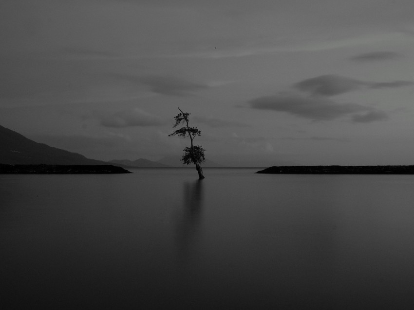
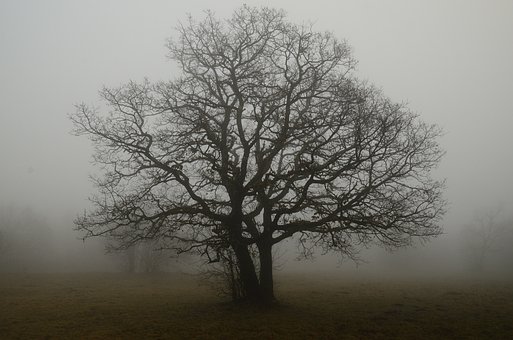
how a certain place may have impacted you or been a special place but is now just a distant memory.
how perhaps the weather and certain lighting can make places feel lost and lonely.
Design: Consider the following
hardback cover and rectangular shape. grey background on the front and back cover.
some dark green ink colours on the text inside the book, plain white coloured pages.
small text set in paragraphs beneath my images.
Island loneliness
mood board-


