Photobook Specification

Ideas for my Photobook

Narrative: What is your story?
Describe in:

  • 3 words– Anthropocene throughout time
  • A sentence– A photographic journey throughout the island which illustrates Anthropocene through time
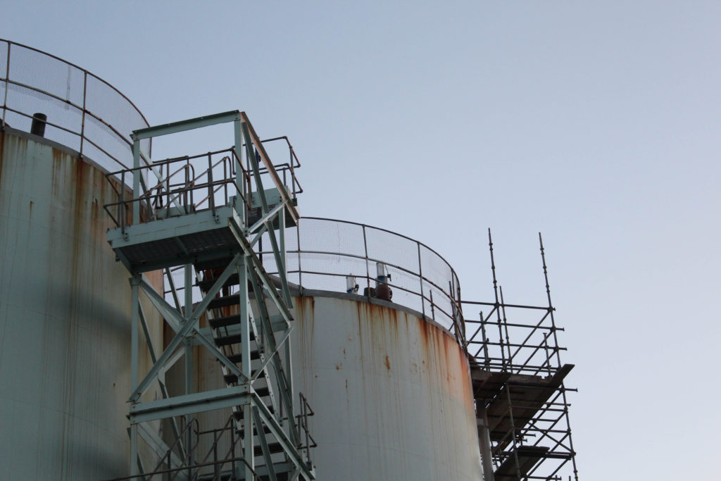
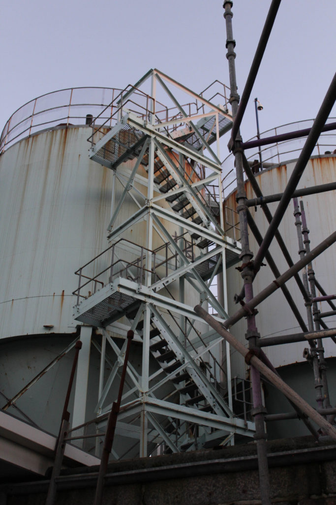
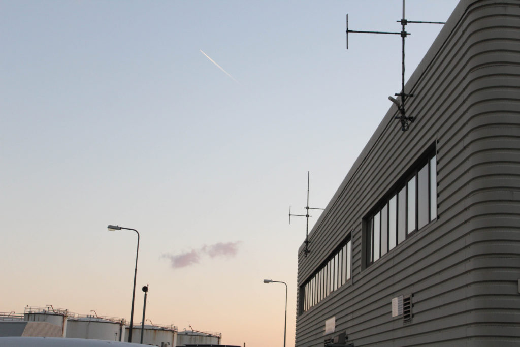
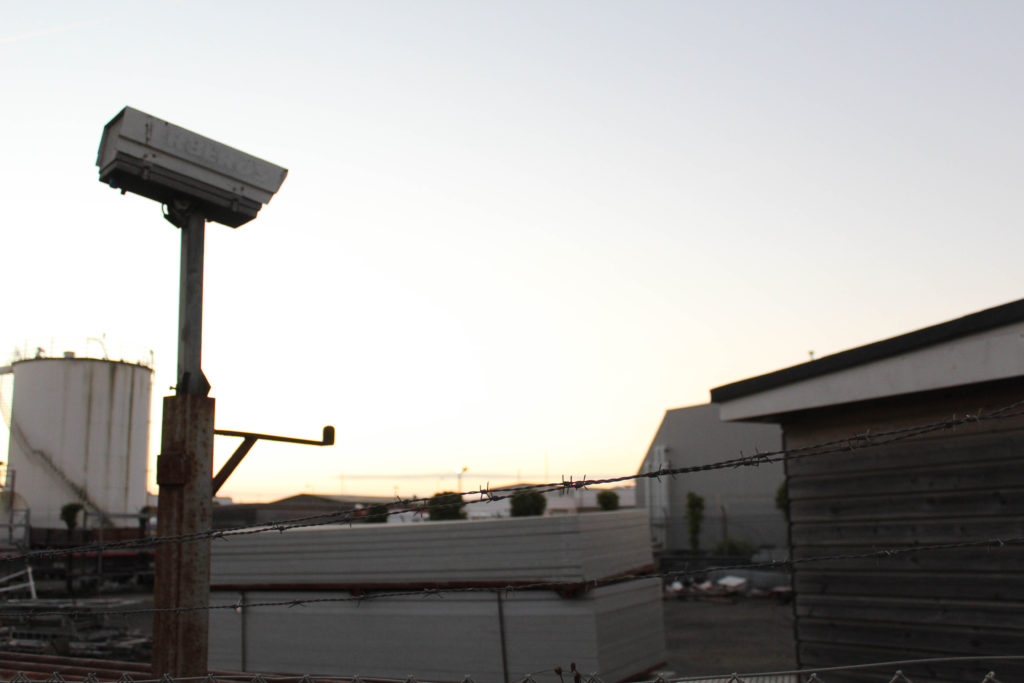
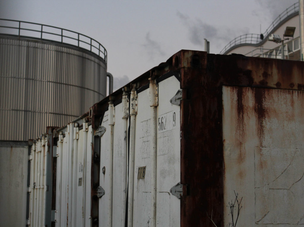
  • A paragraph-My book will illustrate the human effects that have changed our environment. I will use images that I have taken from multiple different locations, this is to reflect the fact that Anthropocene is present everywhere in our island life. Overall, I hope that my book is an aesthetic reflection of my photography A level.

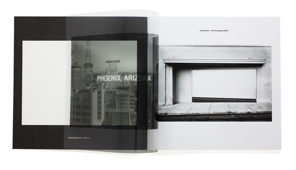
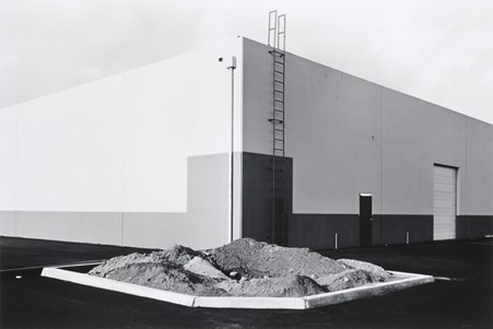
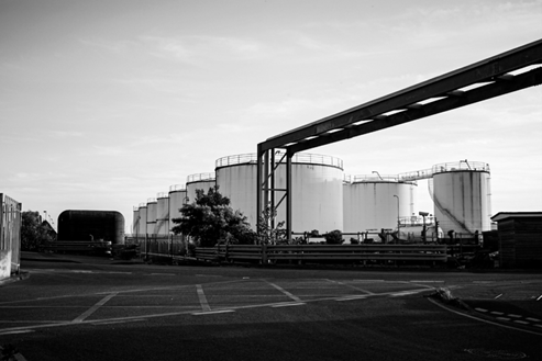
The story of my photobook will focus on how Jersey has experienced Anthropocene and how the island’s environment and climate will be ever-changing. The layout of the book will illustrate the changes the environment has gone through, as there will be images of natural and unnatural landscapes, and I plan to put edited mages of these two concepts together into my final photobook. The end of the book will contain my essay along with Robert Adams’, Lewis Baltz’s and Richard Misrach’s images, this relates to the information I will be analysing and referencing throughout my work.
Design: Consider the following

  • How you want your book to look and feel
  • Paper and ink
  • Format, size and orientation
  • Binding and cover
  • Title 
  • Structure and architecture
  • Design and layout
  • Editing and sequencing
  • Images and text

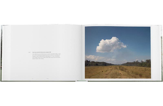
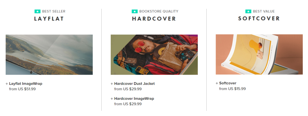
I would like the front of my photobook to be a hardcover book which is a medium size, the cover of book will be a smooth wrapped image, with the will spread around both the front and back of the book. My aim is to make the front of the book as aesthetically pleasing as possible as the smooth textures will contrast will the heavily textured and busy photograph which I will place along the front. The majority of my book will contain black ink with some coloured and some monochromatic images, this is in an attempt to make the book more aesthetically pleasing as it will be filled with contrast and editing.
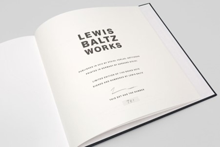
Furthermore, I would like some pages of my book to contain small areas of black writing (with the white writing in the background). The purpose of this will be to show where an image was taken and when, and to give information on how much Jersey’s production of unsustainable substances such as oil has increased since the 1970’s onwards. As this was the decade where Lewis Baltz was first part of the Topographic, and this helps me relate my photobook to his work.
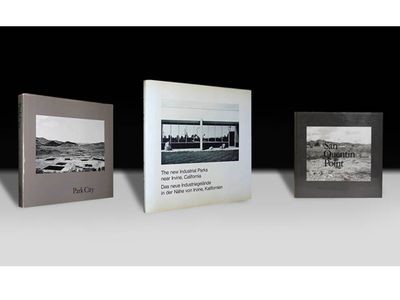
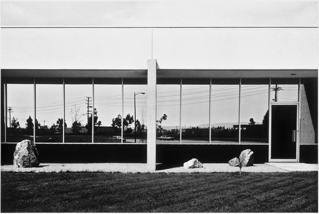
I would like to structure my photobook using a variety of photographs and blanks space to create flow throughout my work. There will some very busy spaces and then some completely blank pages to even out the layout of the book. The pages will also flow well as I will place heavily edited images next to natural/ unedited images, this will allow for my photobook to show off some Photoshop and Lightroom editing skills, right alongside camera skills and demonstrating that I understand the settings and functions of the camera.

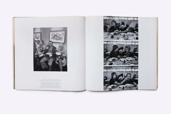
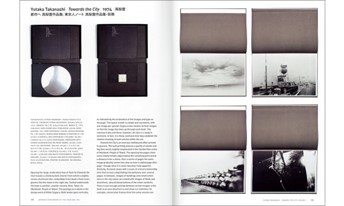
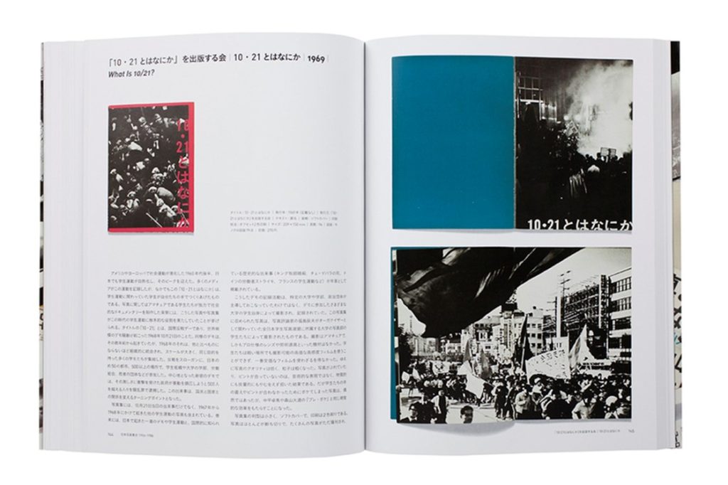
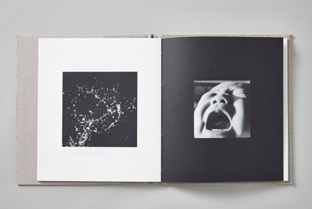
Mood Board

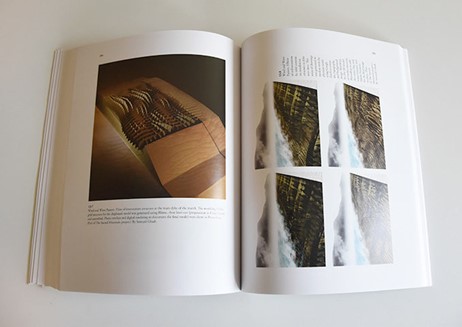
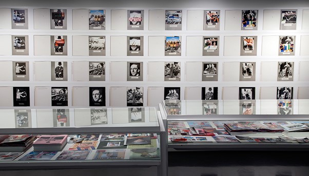
I have created this mood board in order to visually demonstrate some photobooks that I find inspiring and some I would like to take aspects from. This is important as it helps me demonstrate where I have got some of my first ideas from and shows the multiple different types of photobooks that I would like and recreate. At the moment my ideas are quite plain so creating this mood board has helped me consider in more detail and with more creatively how I would like my final photobook layout to look like visually.
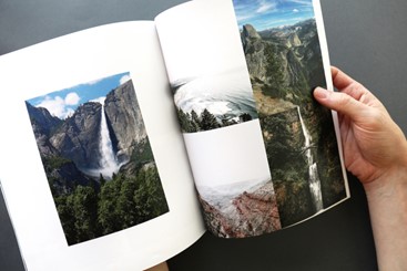
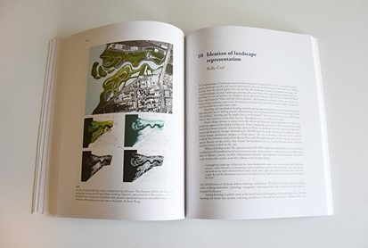
My main focus when creating my photobook is to showcase my most successful photographs, and I hope that I will be able to create balance throughout my book taking inspirations from some of the layouts in this mood board. For example, I really like the bottom right as the high levels of contrast throughout this image means that the viewers attention is draw to the book and they will want to look at the rest of this photobook. Furthermore, I think that having more than one image on one side creates a very aesthetically pleasing look, and especially along with a black space/ page next to it.

Creating my first layout

To create my draft layout I used a website called Blurb which first allows you to look at others photobooks before you sign up, this was helpful as it meant that I could create some more ideas before creating my first draft layout. Additionally, this website provides details regarding the pricing of different quality, size and paper which could be used when considering the overall look and feel of the book.
Before creating my first draft layout of my photobook I have created a collection in Lightroom which illustrates all my best images and the ones I would like to include in my final personally study. Despite these images being from many different photoshoots, I think that I will be able to link them together very well, like one of my inspirational artists, Richard Misrach. I would hope that the book is split so that I can reflect that I have been inspired by both Lewis Baltz and Misrach, as the images I have used in my first draft of my photobook reflect Misrach and focus on his work more closely. Whereas my second section will be more inspired by Lewis Baltz and Robert Adams.
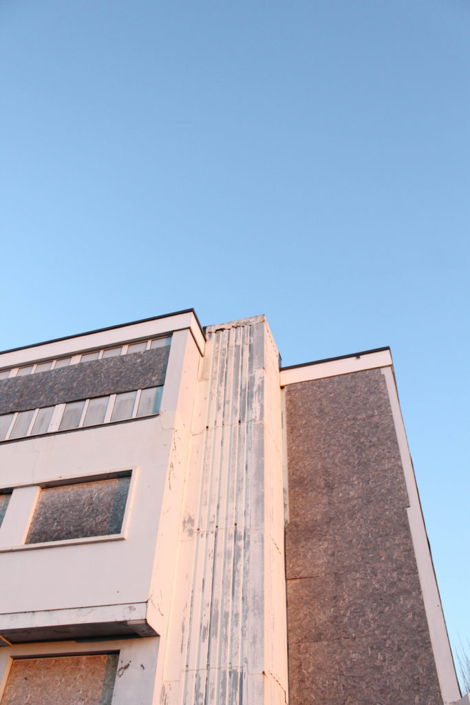
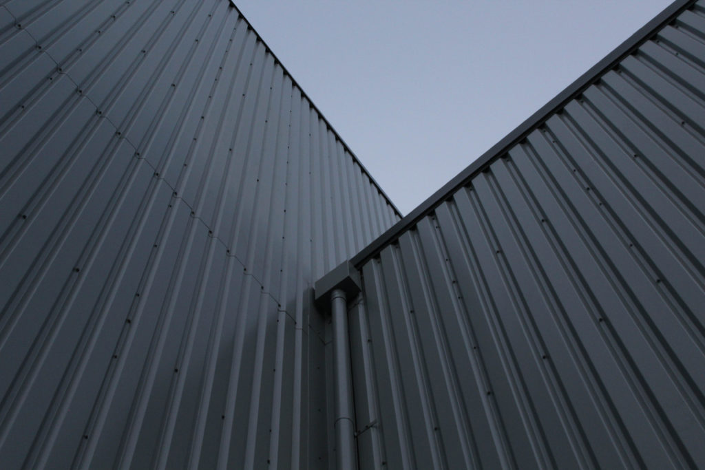
Below I have created my first experimentation of my photobook, the main purpose of this was to get used to using Lightroom as a method of creating my book, as Blurb is only used to print and buy the books. Lightroom is an easy and effective way to create a photobook, it is helpful as you can move the images around and see how the final product and layout will appear when it is printed.
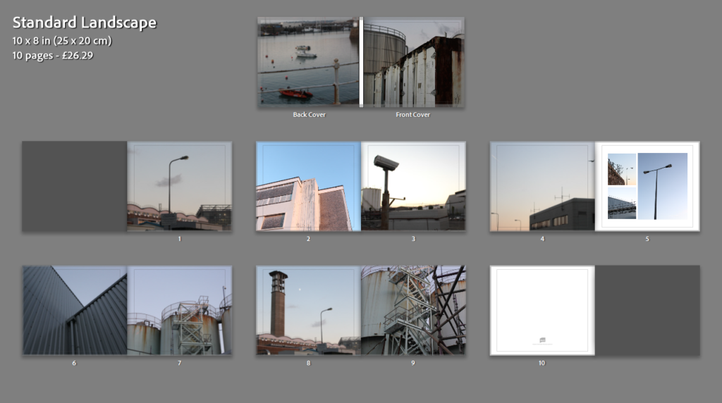
During the exam I will be creating my book using Lightroom as well, along with doing this you can put two-six images on any page of work, and add blank pages and small text around and next to the images. I think that this will make my book more aesthetic and successful. I like that the book can be previewed and the arrangement can be changed as frequently as needed.

Essay Draft

Essay question:

opening quote:

Intro: In this essay I intend to investigate the differences and similarities of how photographers Vasantha Yogananthan and LaToya Ruby Frazier each explore the concepts of identity and heritage in their work. I have chosen these two because I feel that I can relate to aspects of their work, due to being a person of colour myself, and find that they have both approached the subject with their own unique style and technique. Yogananthan often taking images of strangers, blurring the lines between fiction and reality, as well as implementing the technique of hand painting film images, something particularly important to photography’s history in India. His work stands between an outsider and an insider’s perspective, (try and find a quote from Solomon-Godeau text in inside/ outside) while being a stranger and photographing a world he is not entirely familiar with while also reconnecting with his own culture and restabilising the portrayal of South Asia through photography. Frazier focusing on documenting her family, very much from the idea of an insider looking at world that she herself as black woman inhabit growing up in a steel mill town, taking her images using a monochrome film camera, giving them a timeless feel.  

(add describe what and how you are going to respond with your own project – be respectful)

Pg 1: Yogananthan and Frazier use two incredibly contrasting styles to explore the subjects of heritage and identity in their work, Yogananthan relying on traditional techniques and creating images evocative of the Pictorialist photo movement of the late 19th, early 20th century, made up of key figures like Alfred Stieglitz, Heinrich Kuhn and Frank Eugene, employing the help of painter Jaykumar Shankar to help hand colour his black and white images to give them a soft and dream-like appearance, through his use of colour and composition.

(think about why he is inviting a local painter to colour his images -both collaborating and sharing ownership of creative process + by asking to add his creativity he is also providing him with a financial reward by paying him for his services)

His work is a way for him to reclaim his Sri Lankan heritage after being born and raised in France, by choosing to approach The Ramayana through a Pictorialist lens, a style crucial to European photography’s history, Yogananthan creates a series that draws inspiration from both sides of his heritage, while also depicting the mythology in a more fantastical way. 

(find a quote that defines what pictorials was, its aim/ objectives etc)

In contrast, Frazier takes inspiration from a variety of artists who were part of a movement known as social realism, using straight photography, defined as “Photography that attempts to depict a subject in sharp detail and focus and emphasising photography as a medium outside of art like painting and sculpture” (Reference using Harvard system), to explore ideas of societal injustice. Some of these photographers include Dorothea Lange, Walker Evans, and Kathe Kowalski- Frazier’s mentor until her death in 2006. Frazier’s exploration of societal injustice came from her experiencing environmental racism first hand, and how it affects not just her but the wider community of Braddock. 

Photobook Specification

Describe your photobook in:

A Paragraph:

My photobook is going to be about the Portuguese experience in Jersey and how it affects our sense of belonging due to the cultural differences. I’m going to use self-portraits of myself and some images of my parents paired with some text in order to portray this experience to the best of my abilities. I’m hoping that I’ll be able to capture aspects of our culture despite the fact that we’re quite separated from it due to that fact we live in Jersey whilst the rest of our family is in Madeira, making embracing our culture to its fullest quite difficult.

A Sentence:

My photobook is going to use a mixture of portraits in order to express the sense of belonging and separation as a Portuguese person living in Jersey.

3 Words:

Culture, separation, belonging

———————————————————————-

Design your photobook:

I want my photobook to have a short, blunt title in a mid-sized font to catch the attention of the viewer, allowing for intrigue from the title alone. I’d like for it to be a hardback with a black and white image on the cover, setting the theme/tone of the book right from the beginning.

I’m going to try arrange the images inside in a similar way that Larry Sultan did in his photobook ‘Pictures from home’ [1992] as I like how he displays his images alongside his text, allowing the images to be displayed in different layouts on every spread rather than place every image the same way on every page.

Photobook specification


  • 3 words

Isolated peaceful loneliness.

  • A sentence

Representation of the darker themes of islandness.

  • A paragraph

My book is going to be a unique take on island living, somewhat specific to Jersey. It consist of several collections of images based around the coast of the island, most with minimal editing. I will be trying to convey Jersey in a lonely, yet peaceful place as I believe these two themes will either be a nice contrast or complimentary to each other depending on how you choose to perceive it. I want my book to be landscape, with a canvas cover and a larger metal binding. I want to have the title, Disconnected, to span from the front cover to the back cover, with my name in small writing below it. I will be putting the essay on the back few pages and I will choose a stand out image to go on the very last page.


Photobook Mood Board

deconstructing photobook

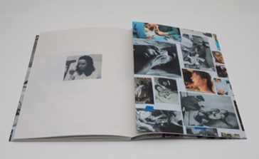
I am researching Jim Goldberg’s 1995 photobook, Raised by Wolves, a 320-page documentation into the lives of teenage drug addicts living on the streets of California. The books story revolves around the lives of protagonists Tweeky Dave and Echo and their friends. Goldbergs portrayal of youth culture through the documentation of Echo and Daves on again, off again relationship and Daves eventual death is tied together through a variety of media and image-making, including polaroids, film, documents and interviews to create a gritty representation of growing up on the streets. Whilst making his images, he would photograph his subjects and ask them what was missing, or what he could do to improve the photo. Considering himself an outsider to the culture and surroundings, Goldberg let his subjects control the narrative, often letting them draw or write over the photographs once they were developed.

Raised By Wolves

Goldberg made Raised by Wolves as part of a trilogy, which began with his first book Rich and Poor and ended with his most recent project, Candy. He created Raised by Wolves to ‘pull the curtain away’ and talk about the issues of neglect and abuse in troubled youth. There is no specific audience for the book, as it immerses the reader in the story to the point they feel connected with the characters, but it could resonate with those who experienced a similar adolescence. Upon release, book was received with praise for the raw and unfiltered portrayal of life on the streets, and has left a considerable impact on pop and photography culture.

Raised By Wolves

Raised by Wolves got further recognition in 2016 when rapper Kanye West was photographed wearing a replica of the jacket once owned by Dave. Among the many awards and grants received by Goldberg for Raised By Wolves are a Guggenheim Fellowship (1985), two National Endowment for the Arts Fellowships (1989, 1990), the Mother Jones Documentary Photography Award (1989), and the Ernst Haas Award for Photography Book of the Year (1995). Goldberg uses a range of different textures and paper throughout the book to provide a better narrative. No two pages are the same, the book features images in both black & white and in colour, along with photographs of legal papers, doctor notes and police fines. When focusing on telling a characters story, he will often feature an image and interview with the subject on a double page spread. Goldberg also takes photos from other media to use in his work, e.g a still of Dave from a talk show he featured on, or a kindergarten photo of Echo when discussing her childhood. Photos from different eras and events in their lives help better the viewers understanding and connects them more with the character. The book itself is in a portraiture format, however features both square and landscape images throughout. It is 4 to 11″ – 13″ tall; 320 pages; (305 x 230 mm). The cover features a silhouette of a girl, with a red background. ‘Raised by Wolves’ is scrawled over the top, written in the same messy handwriting featured throughout the book. The title is taken from a extract of the book, where one of Goldberg’s subjects write ‘Born a wicked child, raised by wolves.’