Deconstruct Photobook – Photo Souvenirs by Carolle Benitah

1. Research a photo-book and describe the story it is communicating  with reference to subject-matter, genre and approach to image-making.

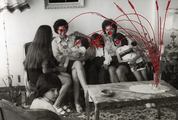
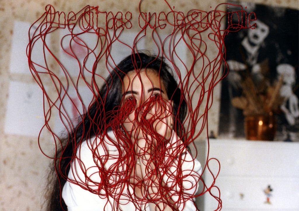
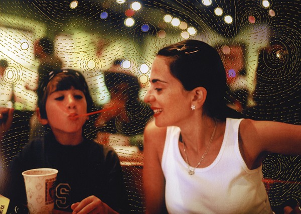
I have chosen Photo Souvenirs by Carolle Benitah as I feel the story behind the book is well portrayed. For the first few pages all the photos are in black and white which I feel is showing her when she was a baby who grew into a toddler, there are pops of the colour red in most of the photos which she has done by either using embroidery techniques, needle and thread or bead work. I find the colour choice interesting as it has many different meanings, some being positive but others are negative. I think that Benitah is trying to portray courage and strength through her images as she was raised in a strict household where she was taught that only girls who come from a “good family” would learn to embroider and she wanted to go against this through her photos, rewriting her past.

2. Who is the photographer? Why did he/she make it? (intentions/ reasons) Who is it for? (audience) How was it received? (any press, reviews, awards, legacy etc.)

Photo Souvenirs is a book made by Carolle Benitah who focuses on archival photos of her family as well as using different techniques to manipulate each photo. Her main intention with the book is to show how using these photos she has got a deeper knowledge of her identity through looking a photos when she was younger which she might not remember. Through the way she edits each photo she tells a more in-depth story as well as portraying her feelings to each individual person. Benitah says that every hole she made with her needle it was like killing one of her demons from her past, I think that she used it as a way to relive those memories but transform/ manipulate them into something she wants.
3. Deconstruct the narrative, concept and design of the book and apply theory above when considering:

Benitah’s book has a hard cover displaying one of her manipulations which is wrapped around the front and back. It is a portrait designed book which is slightly small then A4, it has a matt finish leaving it smooth to the touch. For the title, she has called it Photo Souvenirs which is linked throughout the book by her using archival photos from her childhood and past. She chose a simple but bold font which stands out on the front of her book, it has been pressed into the cover of the photobook as well as being made with a shiny gold colour. Throughout the book she has used the same type of paper which is thick and good quality. Benitah starts by using only black and white photos which I believe has its own meaning behind it, but slowly transitions into all coloured photos as well as using different colours of string in her manipulation of each photo. Carolle Benitah alternates between many ways of presenting her photos on each page of her photobook, some might be across both pages and some might only cover half of a page leaving the other blank. I think that Benitah has created a clever sequence of photos throughout the book, from the beginning to the end the viewer is seeing a chronological story of her life which she has tried to turn into something she wants to remember and enjoy instead of what she actually remembers.
Islandness Project Photoshoot 1- Results/Experimentation


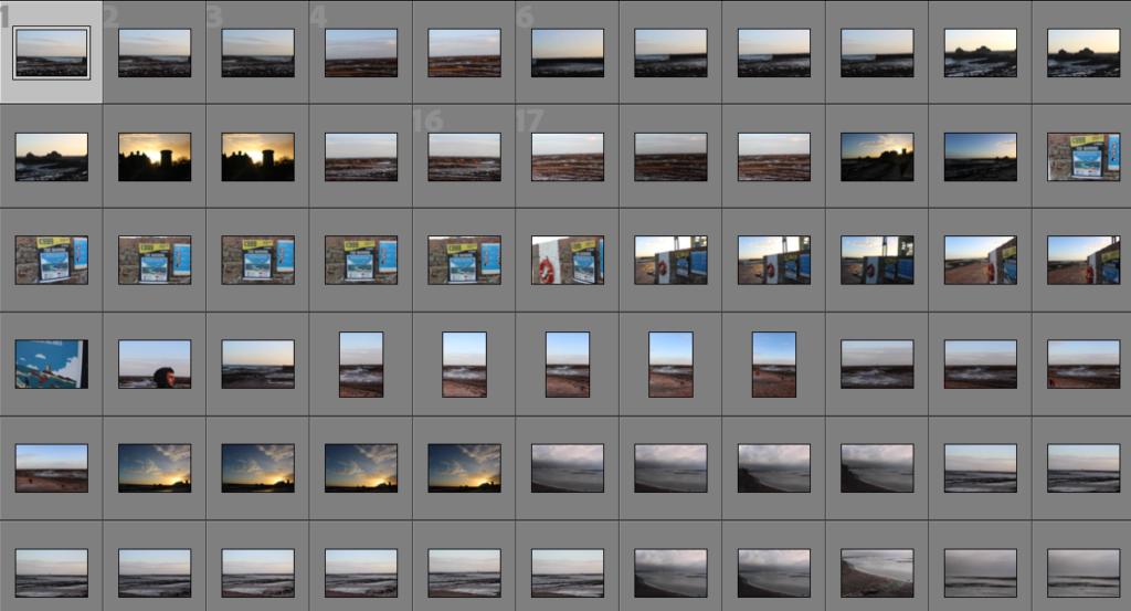
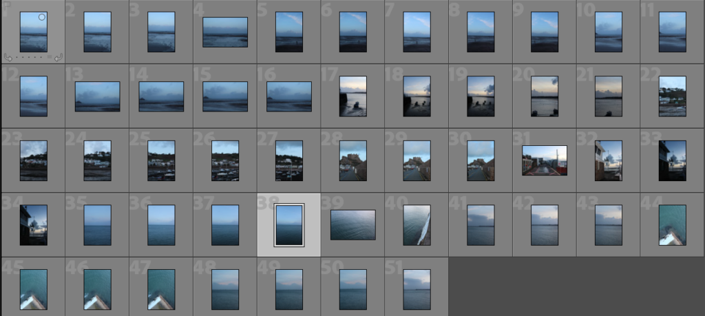
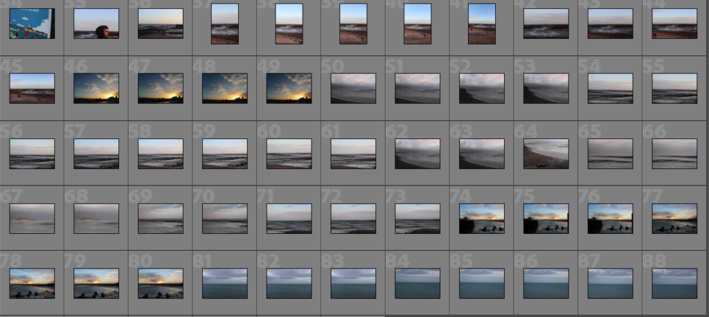
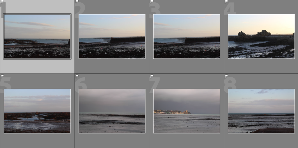
Contact Sheets


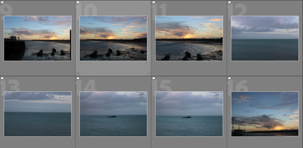
Selections

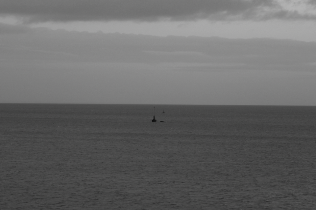
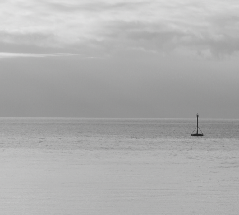
My aim for this photoshoot was to try and get some images similar to those of Shiroshi Sugimoto in his series “Seascapes in which he creates abstract images solely using photos of the horizon, where the sea and sky meet. Mentions in the description of this project how he uses minimal editing, mainly just making it monochrome. I was actually aiming to create a similar style of images but with a bit more going on in the photos, including things like sunsets, cloud formations, rock formations, boats, buoys, piers, etc as I want to link this series of images more closely to island life in Jersey- but still keeping the simple calming nature.

Seascapes — Hiroshi Sugimoto
Shiroshi Sugimoto

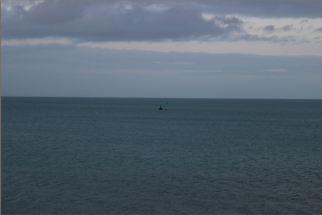
Edits

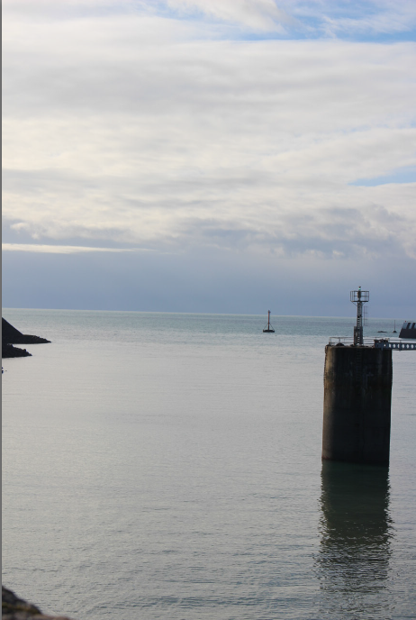
Original
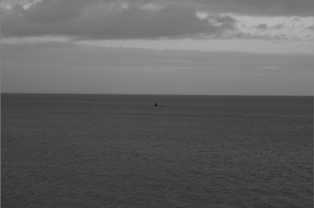
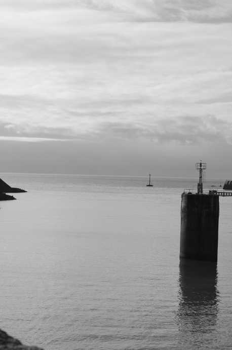
Into Monochrome
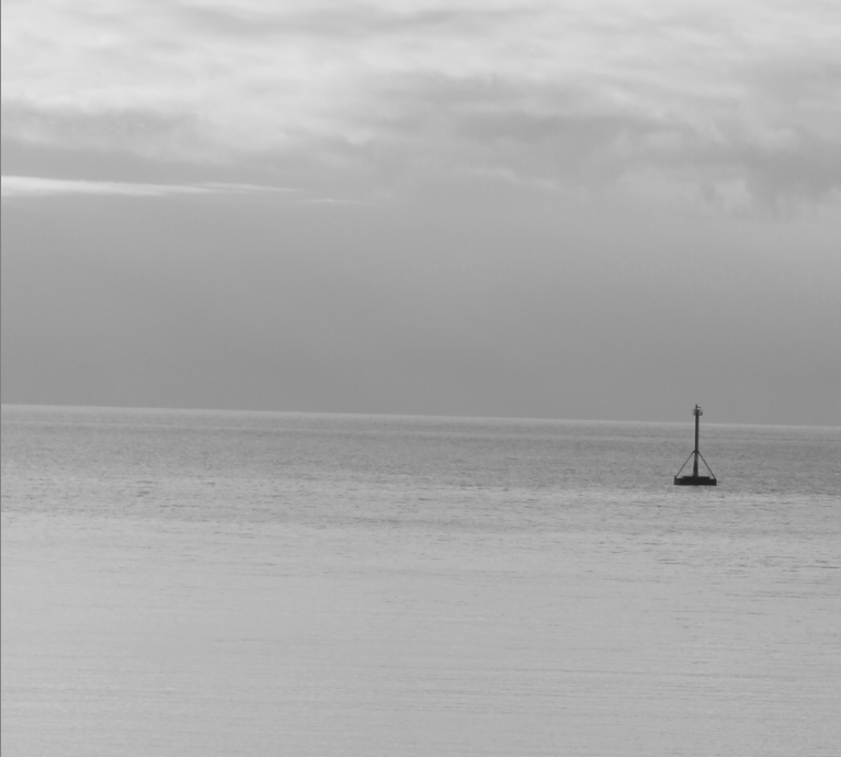
Cropped Final Image

Image 2

Original
Monochrome
Crop

Seeing as I set my tripod up on an angled wall, for this edit I also had to adjust the angle.

Final Image

I have noticed that in this second image, along with some others from this shoot that the water has become almost the same colour as the sky, and so in future, I will need to adjust my camera settings, as well as the angle I’m shooting at + the editing technique I’m using in order to create more of a separation- similar to Hiroshimo’s work.


Conclusion

Overall I am happy with these images as a starting point, but I do feel like I want to create more images in a similar way to create a larger collection in order to convey the desired effect. This means I will be conducting more photoshoots, in order to construct a larger group of images to add to my photobook as I feel like this style of photos works best in a group with complimentary images, and/or contrasting images such as those I am planning on creating showing more “brutalist” images giving a more depressing angle on island living. I feel that having the two different styles of contrasting images potentially even sharing page spreads it will give my book some extra depth.

deconstructing photobook

1. Research a photo-book and describe the story it is communicating  with reference to subject-matter, genre and approach to image-making.– visualisation of her family culture, the way the images have been altered could suggest her relationship with her family.

2. Who is the photographer? Why did he/she make it? (intentions/ reasons) Who is it for? (audience) How was it received? (any press, reviews, awards, legacy etc.)- carolle benitah,

3. Deconstruct the narrative, concept and design of the book and apply theory above when considering:

  • Book in hand: how does it feel? Smell, sniff the paper.- like a childrens book , no text only pictures.
  • Paper and ink: use of different paper/ textures/ colour or B&W or both.- use of both and textured to the eye.
  • Format, size and orientation: portraiture/ landscape/ square/ A5, A4, A3 / number of pages.- all different shapes and sizes.
  • Binding, soft/hard cover. image wrap/dust jacket. saddle stitch/swiss binding/ Japanese stab-binding/ leperello- hard back cover
  • Cover: linen/ card. graphic/ printed image. embossed/ debossed. letterpress/ silkscreen/hot-stamping.
  • Title: literal or poetic / relevant or intriguing.
  • Narrative: what is the story/ subject-matter. How is it told?
  • Structure and architecture: how design/ repeating motifs/ or specific features develops a concept or construct a narrative.

  • Design and layout: image size on pages/ single page, double-spread/ images/ grid, fold- outs/ inserts.- each image is a different size on each page
  • Editing and sequencing: selection of images/ juxtaposition of photographs/ editing process.– each page has either one or two juxtapositions.
  • Images and text: are they linked? Introduction/ essay/ statement by artists or others.  Use of captions (if any.)

UNDERSTANDING PHOTOBOOKS:
NARRATIVE, EDITING, SEQUENCING
DESIGN, FORM, FUNCTION 

Earlier in the academic year we looked at narrative in photography. Let’s refresh our memory and revisit some of the theories around visual storytelling.