Essay Writing

Academic Sources

Research and identify 3-5 literary sources from a variety of media such as books, journal/magazines, internet, YouTube/video .

Carolle Benitah – Photos Souvenirs

Carolle Benitah – Jamais je ne t’oublierai

Carolle Benitah – History

Carolle Benitah – Lensculture

Birthe Piontek – New identity

Birthe Piontek – Relationships

Joerg Colberg – Photography and Memory

Final Essay | 2022 Photography Blog (hautlieucreative.co.uk)

Photography and Family

Begin to read essay, texts and interviews with your chosen artists as well as commentary from critics, historians and others.

It’s important that you show evidence of reading and draw upon different points of view – not only your own.

Write down page number, author, year, title, publisher, place of publication so you can list source in a bibliography

Quotation and Referencing

Why should you reference?

To add academic support for your work

To support or disprove your argument

To show evidence of reading

To help readers locate your sources

To show respect for other people’s work

To avoid plagiarism

To achieve higher marks

What should you reference?

Anything that is based on a piece of information or idea that is not entirely your own.

That includes, direct quotes, paraphrasing or summarising of an idea, theory or concept, definitions, images, tables, graphs, maps or anything else obtained from a source

How should you reference?

Use Harvard System of Referencing PowerPoint: harvard system of referencing for further details on how to use it.

Bibliography

Meggs, P. B. (1999), FotoGrafiks: David Carson. London: Laurence King

In-text referencing

Direct Quote: In his book on conversations on photography, Meggs writes, ‘a great fear of empty space and silence haunts Western art. We are compelled to fill space and time.’ (Meggs 1999)

Paraphrasing/summarising: Meggs (1999) makes a point about how western artists have a fear of empty space and silence and that they have a need to fill both space and time.

Essay Question

Think of a hypothesis and list possible essay questions:

How does Carolle Benitah and Birthe Piontek portray the topic of family through the manipulation of photos?

How does Carolle Benitah and Birthe Piontek explore the concept of family through their work?

How can memories be presented through the manipulation of old photos?

Opening Quotes

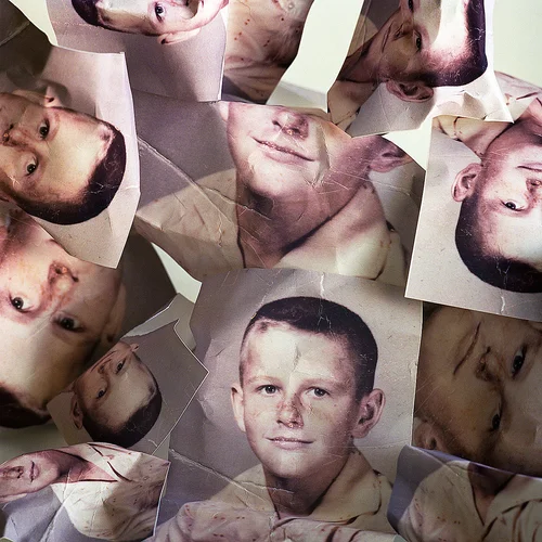
“I make holes in paper until I am not hurting anymore.” – Carolle Benitah

“Those moments, fixed on paper, represented me, spoke about me and my family told things about my identity, my place in the world, my family history and its secrets, the fears that constructed me, and many other things that contributed to who I am today” – Carolle Benitah

“I questioned the power of an image and what it can actually reveal of a person’s identity,” – Birthe Piontek

“The moment where it is all about the person and not so much about capturing a situation or event, so that the image becomes a representation of that person.” – Birthe Piontek

PHOTO BOOK DECONSTRUCTION

Beyond Here Is Nothing:

Who is the photographer? The book is made by Laura El-tantawy

  • Book in hand: how does it feel? Smell, sniff the paper.

The book is created in a very unique way and has a a very different way of opening it. The cover of the book smells like a normal hardback book with the pages having a slight odd smell.

  • Paper and ink: use of different paper/ textures/ colour or B&W or both.

The images contained in the book are all displayed in colour with many different vibrant reds / oranges.

  • Format, size and orientation: portraiture/ landscape/ square/ A5, A4, A3 / number of pages.

Most of the images are presented on small pieces of squared paper in a portraiture layout. Each section of the book contains 30 pages adding up to a total of 90 pages.

  • Binding, soft/hard cover. image wrap/dust jacket. saddle stitch/swiss binding/ Japanese stab-binding/ leperello

The book is a hardcover that folds over to create a unique style and divide the 3 sections of images

  • Cover: linen/ card. graphic/ printed image. embossed/ debossed. letterpress/ silkscreen/hot-stamping

The images throughout seem to be printed rather than any other methods

  • Title: literal or poetic / relevant or intriguing.

The book seems to portray a poetic style through the use of images not having much meaning but rather shown aesthetically

  • Narrative: what is the story/ subject-matter. How is it told?

The story involved is told through the different range of distorted images. Also, in each section there is a few pages stating the topic of images with a poetic story on the other side

  • Structure and architecture: how design/ repeating motifs/ or specific features develops a concept or construct a narrative.

The design of the book constructs a narrative of different weather moods throughout each section

  • Design and layout: image size on pages/ single page, double-spread/ images/ grid, fold- outs/ inserts.

All images in the book are spread out to cover a full single page on each side. It involves inserts of 30 images in different sections of the book that fold-out to be displayed

  • Editing and sequencing: selection of images/ juxtaposition of photographs/ editing process.

The book is edited in a way to make the viewer want to carry on scrolling due to the unique style of images and layout

  • Images and text: are they linked? Introduction/ essay/ statement by artists or others.  Use of captions (if any.)

The book displays around 3 pages in each section giving a 1 word description of what is coming up next and a poetic story that doesn’t have too much meaning

UNDERSTANDING PHOTOBOOKS:

Deconstructing a photobook

Animals in Motion – Eadweard Muybridge

This book is a documentary book rather than a contextual book. I shows the research he photographer did during his study.

The front cover of the book is eye catching due to the contrasting colours as well as the large text. The book starts with a section about Eadweard Muybridge and his work. I then goes into a preface where it describes how the idea for the book came about, the build up to the shoot, the preparation and the shoot itself.

Throughout the book there are sections of text that describe what is going on in the photographs. It describes the struggles of getting the set of images due to the use of animals. The book has a red hard front and back with a plastic cover over it. The front cover has a large image collage filling the bottom half with a centre meter teal boarder. The top half has a red background, a large white title. It then has a small paragraph where it states some of the animals that were photographed as well as that the book contains over four thousand individual photographs that make up the collages. The pages within the book have a plastic and smooth feel unlike regular paper. It smells of ink as would be common in a printing factory.

The book is heavy to hold. The image on the front has different coloured tints however the images inside are all in black and white due the the images being taken before colour photography was invented.

Each image in the book takes up a full double page spread with a few centimetre white boarder around the edge where the name of the photographs are sometimes show and occasionally a small paragraph talking about that specific set of images. In this photobook the images are not singular images as seen in most other books. Each page has a compilation of images all of the same subjects. Due to the use of up to fifteen cameras many images were taken of the same motion in a small space of time with only a small amount of movement between each one. The grid style of images perfectly shows what the photographer was trying to. The different stages of body position during an animals movement.

There is no information after the final image of the book. There are four blank white pages.

DECONSTRUCTING PHOTOBOOK

1. Research a photo-book and describe the story it is communicating  with reference to subject-matter, genre and approach to image-making.

Jim Goldberg: Raised by Wolves. From 1985-1995, Jim Goldberg worked on the streets of Los Angeles and San Francisco getting to know a number of homeless teens, building the relationships that would come to form the basis of Raised by Wolves, the ground-breaking monograph that redefined commonly held notions of documentary work. This photobook describes the stories of runaway, and homeless teens trying to survive on the streets. Jim Goldberg was on the California streets photographing and interviewing his adolescent subjects, their social workers and the police. They all lend a distinct dimension to the harrowing picture of American urban life, and the adversarial institutional culture surrounding it..

2. Who is the photographer? Why did he/she make it? (intentions/ reasons) Who is it for? (audience) How was it received? (any press, reviews, awards, legacy etc.)

Jim Goldberg is an American artist and photographer, whose work reflects long-term, in-depth collaborations with neglected, ignored, or otherwise outside-the-mainstream populations. “I tried to pull the curtain away and talk about issues of neglect and abuse and show the breadth of reasons why these kids were running from home. Often it was because of abuse, or the pursuit of Hollywood dreams, or coming out to their parents and being kicked out.” Received well by critics, often described as very powerful.

3. Deconstruct the narrative, concept and design of the book and apply theory above when considering:

  • Book in hand: how does it feel? Smell, sniff the paper: Book uses laminated paper feels very slippery, but creates a good texture on the photographs included, book has a very woody smell to it
  • Paper and ink: use of different paper/ textures/ colour or B&W or both: Uses black and white and coloured photographs, majority of photographs black and white, all paper laminated.
  • Format, size and orientation: portraiture/ landscape/ square/ A5, A4, A3 / number of pages: Book is portrait, slightly bigger than A4, 315 pages.
  • Binding, soft/hard cover. image wrap/dust jacket. saddle stitch/swiss binding/ Japanese stab-binding/ leperello: Soft cover images wrapped on page no dust cover, stich binded.
  • Cover: linen/ card. graphic/ printed image. embossed/ debossed. letterpress/ silkscreen/hot-stamping:
  • Title: literal or poetic / relevant or intriguing: Poetic, very intriguing
  • Narrative: what is the story/ subject-matter. How is it told: Story is told through the lives of the people photographed within the book, book revolves around runaways and homeless teens.
  • Structure and architecture: how design/ repeating motifs/ or specific features develops a concept or construct a narrative: Stories of the teens have been put into the book next to photographs to help give understanding to the photographs themselves and to create a deeper narrative within the book.
  • Design and layout: image size on pages/ single page, double-spread/ images/ grid, fold- outs/ inserts: Most images take up a whole page, some double spread images, no fold outs or inserts, one grid.
  • Editing and sequencing: selection of images/ juxtaposition of photographs/ editing process: The book takes you through the stories of teens living on the streets with most photographs being black and white to compliment the dark lives of those photographed within the book.
  • Images and text: are they linked? Introduction/ essay/ statement by artists or others: Stories of the teens photographed are placed next to images within the book.

Personal Study Essay

Introduction (250-500 words)

Through my narrative personal study, I want to give a ‘voice’ to the historical past of immigrants and why they travel and how they adapt to unfamiliar places as a source of better income. I am going to focus on my grandparent’s story and how they travelled from Madeira to Jersey to seek better income for a better life for themselves and for a better life for my mother and my uncle. 

This topic interests me as there are a lot of immigrants in Jersey, families that have moved here for a better life just like my grandparents. As an island Jersey has opened to places like Madeira. 

There is no specific links between my previous studies and my chosen personal study topic however My grandparents worked at Hamptonne Farm so I will be going back to Hamptonne farm photographing the fields and tracing the path that my grandparents took on their journey for wealth which included a struggle of bringing my mother and uncle over to Jersey due to

I will be incorporating images from my family archive and where I can demonstrate how its modernised from Madeira interlinking with Jersey to what it is like to be an immigrant 30 years in the past to becoming an Entitled Jersey Citizen. 

Paragraph 1 (500 words)

Realism is the opposite of Pictorialism where objects, environments and people are manipulated. Realism is an object, environment, people etc photographed how it can be seen directly through a human’s eye. Realism is focussed on Naturalism with no form of manipulation through scratching onto photo negatives nor pouring chemicals onto images and scratching lines etc.  

I am liking my project to Realism as I want my images photographed as naturalistically as possible to reflect the reality throughout my narrative.  

Paragraph 2 (500 words) 

For my first Artist I am studying Rita Puig

Rita Puig-Serra Costa Where Mimosa Bloom 

https://paper-journal.com/rita-puig-serra-where-mimosa-bloom/#:~:text=Where%20Mimosa%20Bloom%20is%20a,experience%20of%20grief%20after%20loss.

Paragraph 3 (500 words) 

My second artist is

Conclusion (500 words)

Bibliography: 

https://scalar.usc.edu/works/let-me-get-there/immigrants-photographic-legacy

https://paper-journal.com/rita-puig-serra-where-mimosa-bloom/#:~:text=Where%20Mimosa%20Bloom%20is%20a,experience%20of%20grief%20after%20loss.

Deconstruct photobook

THE PHOTOBOOK ITSELF

Click on the image above to see images from “The Middle of Somewhere”

“The Middle of Somewhere”, a photobook by Sam Harris contains documentary images of his wife and two daughters travelling India and Australia, focusing on capturing memories of his daughters growing up, with a large reference to growing up living off the land in rural communities. The photobook is not organised in chronological order: purely intending to capture memories, the photobook displays themes of family, fatherhood and growing up.

WHO IS THE PHOTOGRAPHER

Sam Harris created this personal photo project in order to capture memories of his young family’s travel through India and Australia, this project grew into an independently published book that won multiple awards including a Lucie Award 2015, and most recently the People’s Choice for the Australian Photobook of the Year Awards 2015.

WHAT IS THE NARRATIVE, CONCEPT AND DESIGN OF THE BOOK

The book is quite like a scrapbook in a way, deep within the pages lie an amalgamation of scribbled memories, with alternative narratives, diary entries, post-its, hastily scrawled love notes and tea stained prints: with the almost poetic title supplying intrigue to readers as it looks almost like a notebook- with the title being whimsical and vague.

The book is portrait and has a soft card, textured cover, with the look of being hand-drawn and painted with a simple small wraparound containing the name “The Middle of Somewhere” and “Sam Harris” handwritten, presumably by the photographer himself.

Inside the book, pictures are only in colour. Depth and context is added throughout the book in the form of inserts, foldouts and even an almost separate book inside called “Travelogue” containing images from travelling to India and Australia.

There are running motifs throughout the book, with images often only being warm toned and vibrant- obviously since the book is about Harris’ family, images are concentrated on his family and are in (somewhat) chronological order: with text sharing context and background of the images.

As stated before, there is an influx of fold outs and inserts in this photobook, mainly being of text; including recipes, diary entries, context for the images, post it notes written by Harris’ children and even a whole almost other separate book titled “Travelodge” containing images of the young family travelling and living in Australia and India.

The images themselves are not massively edited, it is potential they have been made more vivid or saturated however as they were taken to capture memories- it is unlikely they have been edited. There is one image in black and white featuring a particularly stormy day however all the other images are stylistically vivid in colour, mainly warm tones however rich greens and blues are presented.

Artist Reference 3 – Michael Marten


Examples of Martin’s Work

Critical Mass: Michael Marten - LENSCRATCH
Sea Change - Photographs and text by Michael Marten | LensCulture
Sea Change: A Tidal Journey Around Britain by Michael Marten (18 pictures)  | Memolition
Portfolio: Michael Marten | The Independent | The Independent

“We all know our landscape is constantly changing, but as we live in the moment we rarely perceive a big sense of difference”

Michael Marten

From looking at Martins work I gather that he aims to illustrate the ebbs and flows of our environment by taking two photos of the same coastal location at both low and high water, and displaying them side by side. A majority of his images show intense drastic landscape changes in coastal environments, with minimal editing or colour grading – just him leaving original tones and colours.

What his images portray is very closely linked to islandness in the way that he portrays the sea and tidal changes, which is the defining part of island living and will link in nicely with my personal study as I look into what disconnects the island of Jersey from the rest of the world.


I chose to reference Michaels’s work as I feel that it links well into the overall theme of islandness as it obviously portrays coastal movements of the sea which I a key part of island living; but more specifically my focus on loneliness, isolation and disconnection. This is seen in his photos where he captures busy beaches full of people and then the same beach when it becomes unreachable during high tide.


Critical Mass: Michael Marten - LENSCRATCH

In these photos, Micheal takes advantage of natural lighting in order to give a massive contrast between the before and after. By efficiently timing his shoots in accordance with the tidal range he was able to capture low tide at a time when the beach was busy with people and the sun was out providing a light, clear image. He has used a tripod to keep the same angle in both images, and by using a wide shot it captures more people, contributing to the contrast in the second image as they would all be covered.

In the second image, the tide has obviously come up covering the beach which was once full of people. The lighting is much darker as the photo was taken later in the day, but when given context from the first image it makes it slightly eerie.

Michael has used the bridge in the centre as a focal point which makes it clear that the two images are of the same place. Michael also used a slightly slower shutter speed to create a bit of blur while the waves crashed over.


I will be attempting to create my own selection of similar images by photographing coastal points such as Gorey Harbour, Le Hurrel Slip, and St Helier Harbour. I will be doing this by photographing POIs at low tide and high tide, keeping a specific angle by marking my tripod and where I place it.

Case Study: Diana Markosian

Diana Markosian is an American and Russian visual artist who uses both film and photography to portray her roots. Her series ‘Inventing My Father’ and ‘Mornings (With You)’ depicts her relationship with her father after not seeing him on almost 20 years after moving away when she was 7. The series also includes text about her relationship with him, focussing on the awkward tension between them as they both view each other as strangers.

I feel inspired by her images due to how they’re clearly laced with personal and emotional aspects. The amount of time that she’s put into creating each individual image along with how she’s chosen to compose, edit, and present them allows us to see the emotional distance between her and the people within each image yet still portrays the warmth she feels for them. I hope I can portray a similar feeling within my own project by looking further into her work.

Art Movements & Isms


PICTORIALISM

time period : 1880-1920

Key characteristics/ conventions : images that resemble paintings blurred fuzzy imagery to make photography art

Artists associated: Clarence H. White, Peter Henry Emerson

Key works:

Methods/ techniques/ processes: scratching and brushing in darkroom and soft focus Vaseline on lens

REALISM / STRAIGHT PHOTOGRAPHY

Time period: 1880-1920

Key characteristics/ conventions :  photographs that are not manipulated, either in the taking of the image or by darkroom or digital processes, but sharply depict the scene or subject as the camera sees it.

Artists associated: Clarence H. White

Key works:

Methods/ techniques/ processes:


MODERNISM

Time period:

Key characteristics/ conventions :

Artists associated:

Key works:

Methods/ techniques/ processes:

POST-MODERNISM

Time period:

Key characteristics/ conventions :

Artists associated:

Key works:

Methods/ techniques/ processes:

Case Study: Daniel W. Coburn

Daniel W. Coburn is an American photographer who doesn’t follow traditional methods of photography, often using a slow shutter speed to create purposefully blurred images along with a mix of well focused images to represent his ideas.

I am particularly inspired by his series ‘Next of Kin’ where he staged photographs of his immediate family members and explored various themes without sugar coating how he and his family are together, leaving him with a raw set of images rather than creating the stereotypical, picture-perfect photo album. Along with that, I also take inspiration from his series ‘The Hereditary Estate’ where he continues with the theme mentioned above whilst delving into the darker side of his family history, highlighting what would’ve otherwise been supressed. In this series, however, he chose to take exclusively black and white photos of objects and places rather than just focusing on his family members, creating a more emotional response, especially once compared to ‘Next of Kin’, almost making it seem as everyone has disappeared.

I plan on taking some photos in a similar style as Coburn, using careful composition of me and my parents mixed in with some images of personal items/places in order to create a meaningful set of photos.

Next of Kin Series: Examples

The Hereditary Estate Series: Examples