Photoshoot 1: Robbie Lawrence Inspired Shoot (1)

The plan for this photoshoot is on this blogpost.


Editing

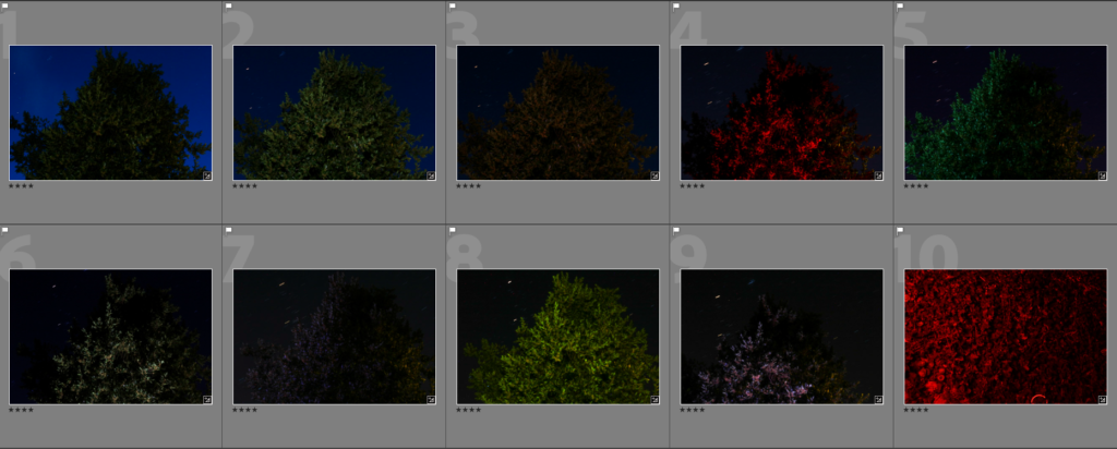
Contact Sheet:

(As this was my first ever attempt at a night photography shoot, a lot of the images were blackened out).


To start editing, I selected the images that I could use for potential final images by using the ‘Pick’ and ‘Reject’ tools on Lightroom.

I then narrowed my selection down further by using the star rating tool, these are the images 4 stars or higher:
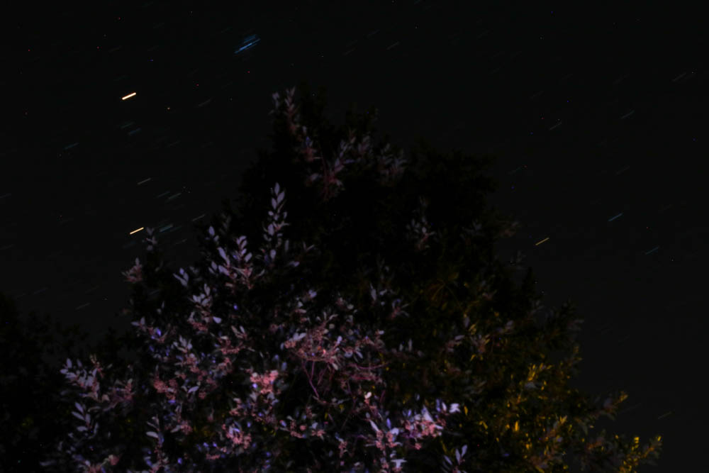
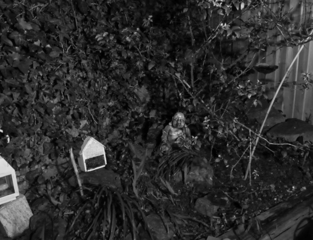
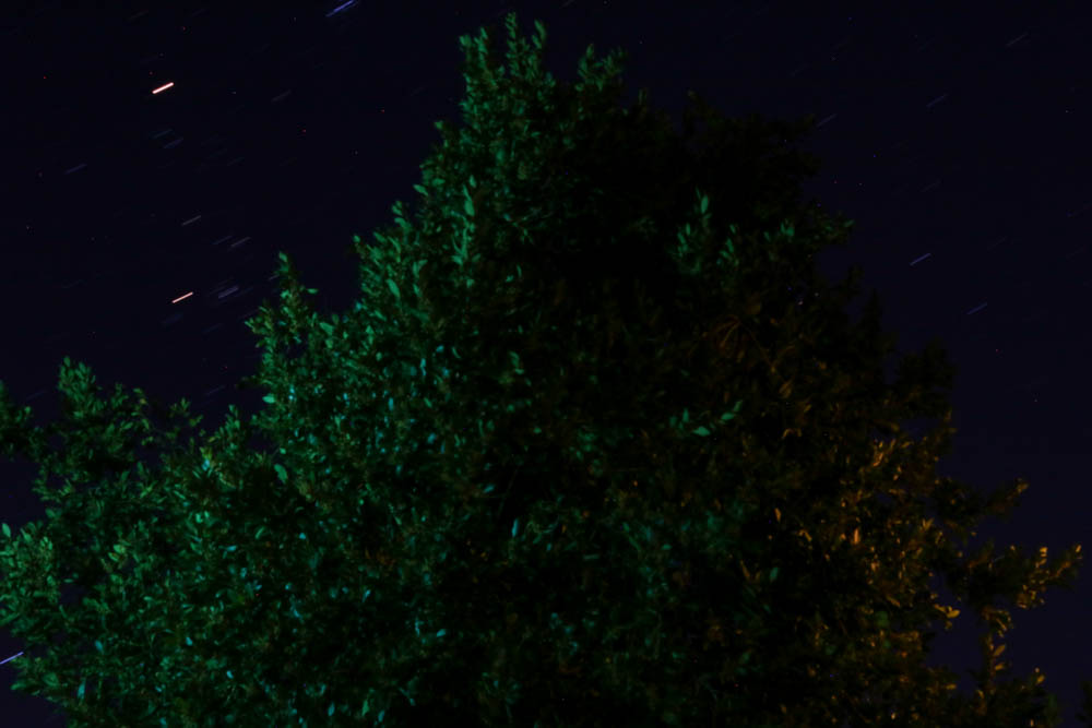
This is my final selection of images:


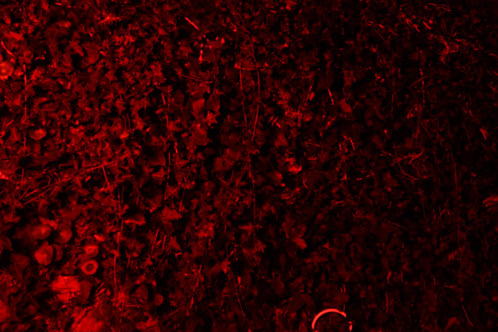
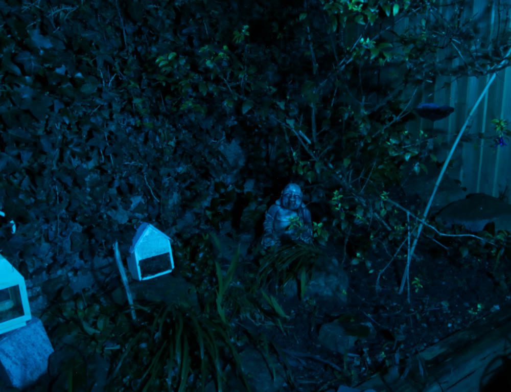
Final Edited Images:
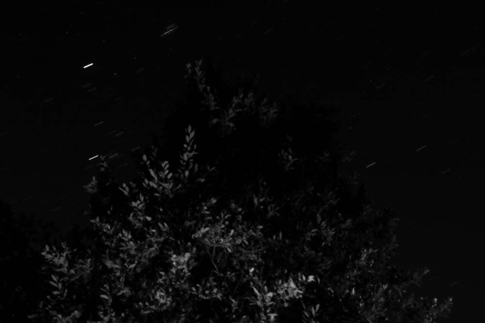
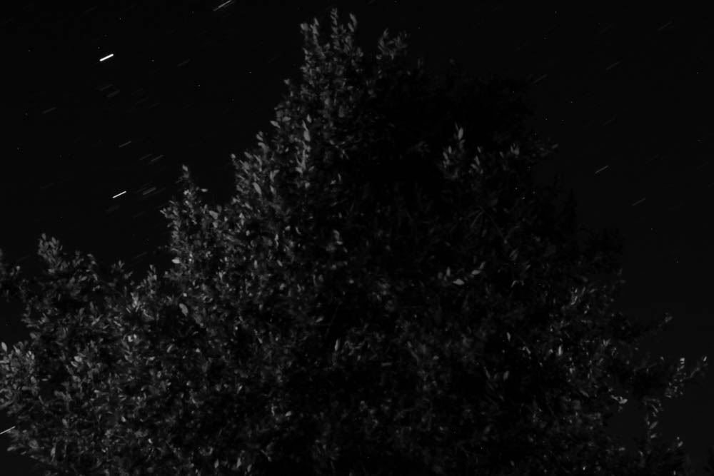
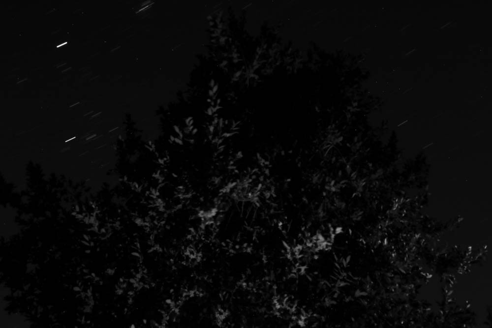
I also made black and white versions of each image, this wasn’t the most effective however:

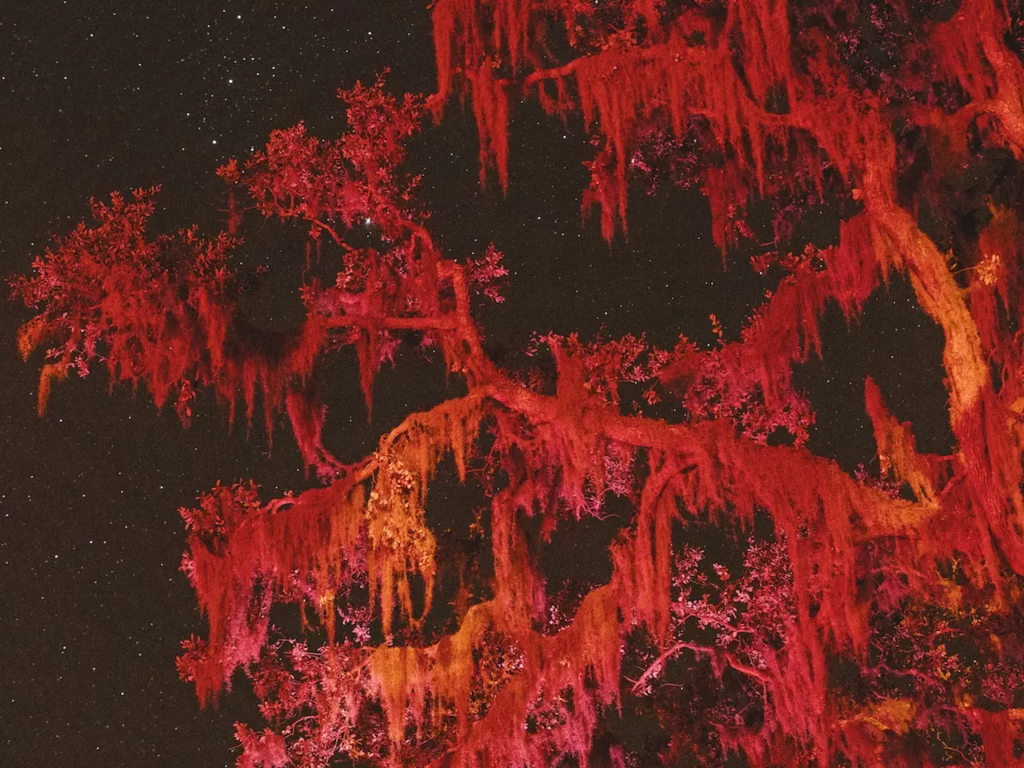
Comparison with Lawrence’s work:
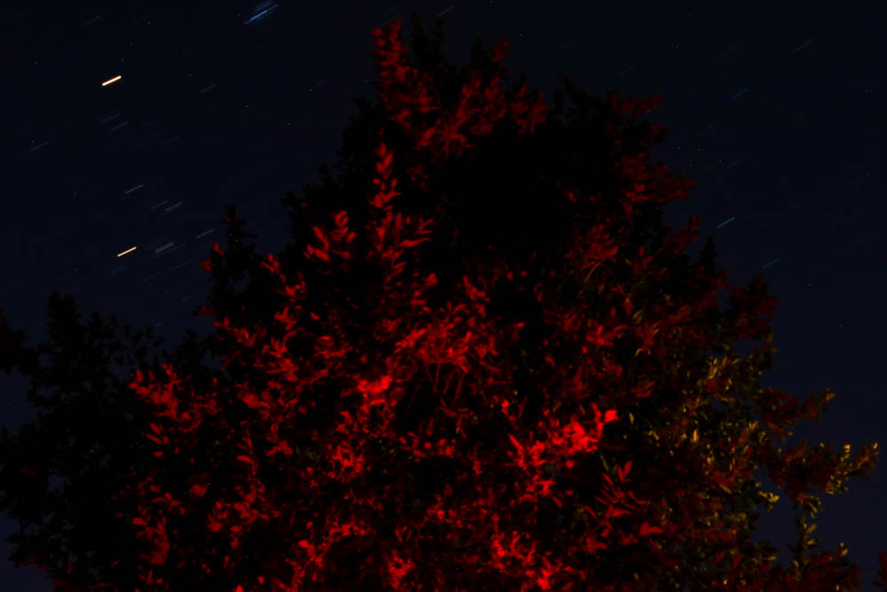
I was inspired by this particular image taken by Lawrence, the bright red in Lawrence’s image was what I was going for with this image, however I did not have the knowledge and skill at night photography than I do now, which meant my photographs weren’t as bright as Lawrence’s. Both mine and Lawrence’s images depict a tree under artificial lighting, the tree photographed by Lawrence has a more ethereal and open shape, while mine is a more angular and enclosed shape. My images likely had a far longer exposure time than Lawrence’s (due to my lack of knowledge), however as a result, the stars in my images take the form of lines instead of dots, creating a unique and otherworldly appearance. My light source likely having a smaller radius than Lawrence’s made my photograph have a large amount of shadows that contrast wit the bright reds, unlike Lawrence’s image in which the tree is almost fully lit-up.


Evaluation

As a first experience to night photography, I think this shoot went well. I enjoyed the process as it is very different to regular photography as there is a sense of surprise as to what the images will turn out like. I think my use of light was effective and I got the hang of the exposure times the more images I took (in this case the exposure times were up to 3-4 minutes). I enjoyed experimenting with the gels as they gave each image a different tone and execution, due to the varying exposure times they require.

What went well:

I think the images good compositionally, with the tree being the central focus of the image, mixed with the slightly upwards facing viewpoint to include some of the sky and stars (which created a nice effect due to the longer exposures). I think the use of coloured lighting gives the image an otherworldly effect, which matches with the main idea behind this project, meaning I have stuck to my ideas well.

How I can improve:

While the images have nice lighting and colours, they are slightly out of focus, giving the images a noticeable blur. I could still use these images for a final piece if it involves heavy editing or distortion. This is simply inexperience with this genre which caused this mistake, if I try a photoshoot like this I will aim to make the focus correct so the images look as high quality as possible.


Part Two of this photoshoot here.

Deconstructing a photobook

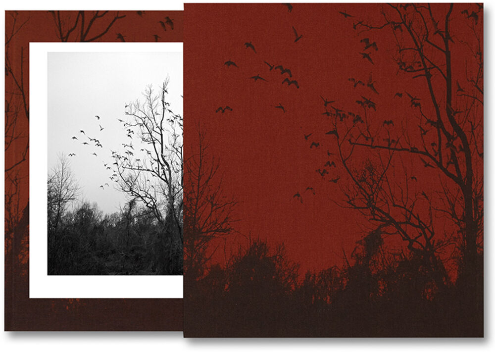
‘She Dances on Jackson’ Photobook by Vanessa Winship.

The front cover and page example which is seen clearer underneath.
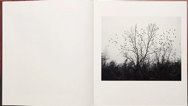
Further expansion of an example of a page in the photobook.

1. Research a photo-book

(describe the story it is communicating  with reference to subject-matter, genre and approach to image-making)

‘She Dances on Jackson’ communicates a story of how Winship tries to understand the link between the landscape/territory and its inhabitants within the United States who are living the ‘American dream’. She attempts to show this link through travelling through a vast amount of states such as California, Virginia, New Mexico, Montana, etc and how she views them from her perspective. The genre of the photobook ‘She Dances on Jackson’ is a exhibition catalogue, an exhibition catalogue is seen as a book that describes a temporary exhibition within a museum/art gallery which includes main images/descriptions of the exhibit and its theme. Therefore, this leads into the approach that Vanessa Winship takes within her photobook ‘She Dances on Jackson’ which is where she photographs a person and the landscape that they link too, this can be seen through the layout of the photobook where there is a picture of a person which is then followed by a landscape on the opposing page.

2. Who is the photographer?

(Why did he/she make it? (intentions/ reasons) Who is it for? (audience) How was it received? any press, reviews, awards, legacy etc.)

Vanessa Winship is the photographer who created the photobook ‘She Dances on Jackson’ and the funding for this project across the United States was from her being the 2011 winner of the Henri Cartier-Bresson award. The reasons as to why she created it is to emphasize the connection between the subject and photographer (in the portraits) as they are aware of themselves when she is photographing them, although they are strangers which she encounters throughout her travels in different American cities and towns. This creates a contrast between the landscapes which she photographs within her book as the photos mainly include no people but have curious and unique alterations to the landscape in which she photographs, creating a nice flow between the person and landscape. The intended audience for this photobook is not specific as it is a personal project made by Winship but the title came from an a moment in which she was shooting in Jackson, Mississippi where a young girl began to dance with her mother to a band a train station and the two hold a strong connection and Winship became curious on their relationship, who they were and where they are going.

3. Deconstruct the narrative, concept and design:

  • Book in hand: how does it feel? Smell, sniff the paper.
  • Paper and ink: use of different paper/ textures/ colour or B&W or both.
  • Format, size and orientation: portraiture/ landscape/ square/ A5, A4, A3 / number of pages.
  • Binding, soft/hard cover. image wrap/dust jacket. saddle stitch/swiss binding/ Japanese stab-binding/ leperello
  • Cover: linen/ card. graphic/ printed image. embossed/ debossed. letterpress/ silkscreen/hot-stamping.
  • Title: literal or poetic / relevant or intriguing.
  • Narrative: what is the story/ subject-matter. How is it told?
  • Structure and architecture: how design/ repeating motifs/ or specific features develops a concept or construct a narrative.
  • Design and layout: image size on pages/ single page, double-spread/ images/ grid, fold- outs/ inserts.
  • Editing and sequencing: selection of images/ juxtaposition of photographs/ editing process.
  • Images and text: are they linked? Introduction/ essay/ statement by artists or others.  Use of captions (if any.)

The book which I have chosen to look at feels quite big but light and easy to carry in your hands, yet you wouldn’t bring it around with you everyday as it is impractical. The first 2 pages when you open the book are black which sets the theme throughout the book as the photos which are featured are also printed in black and white. This leads on to the first page, which is a creamy white like the rest of the pages in the book, on the book which has the title ‘she dances on Jackson’ in a small grey print which then flows to a plain page which is followed by a photo on the opposing page of a landscape. This then leads to the introductory page of the right side of the book which features Vanessa Winship’s name, then the title underneath and on the bottom right of the page the word ‘MACK’ is written in a small block font. This creates a lead for the rest of book which follows the pattern of the left side of the book being plain and the right side holding a picture in black and white, although this alternates in some parts swapping positions, which alternates between a landscape and person each time. The format of the book is square A4 and holds over 200 pages and the front cover has a linen texture. It includes a photo from Winship’s work that is found within the book and it is turned into red for the background colours and the silhouette of the trees/birds/grass are coloured in black. The title ‘she dances on Jackson’ is in a small letterpress print on the bottom right of the cover in silver. It is barely seen, due to its small size, but has a faint glow to it depending on the light which shows simplicity and solitude which are themes that are carried throughout the book recounting Winship’s journey across America. Most of the photos within the book create a story of finding people who live in these areas which Winship has explored and photographing the landscape in which they live in or one she thinks matches their nature, this creates a link between the subject and landscape as there is a sense of identity found within the photos, as many of the photos have people of different ethnicities, classes, etc. The photos stories are left for you to decide on the story in which they hold as there aren’t any captions to guide you through the narrative of the book, making the book simplistic yet effective in what it is describing as the ‘American dream’.

Deconstructing a Photobook

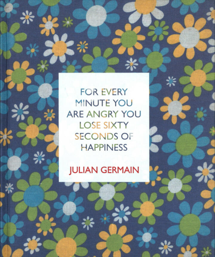
“FOR EVERY MINUTE YOU ARE ANGRY YOU LOSE 60 SECONDS OF HAPPINESS”

Made by Julian German, who happened to meet an old man named Charles Albert Lucien Snelling after spotting his unique coloured house with plants for sale outside. I can perceive this book as being made with the intention of entertaining and enlightening people.

This specific book is a hardcover made of a unique canvas material, with prints of white, yellow, green and blue flowers around it. The cover also includes a silkscreened title box with the book name and authors name. Its slightly bigger/more square than A4 size in a portrait layout, and doesn’t include page numbers but I can estimate there to be around 30. I find the title is clearly literal but is an attempt to be an intriguing way of putting a phrase to make it more rememberable- while also foreshadowing how the contents are meant to be pleasant and enjoyable to consume.

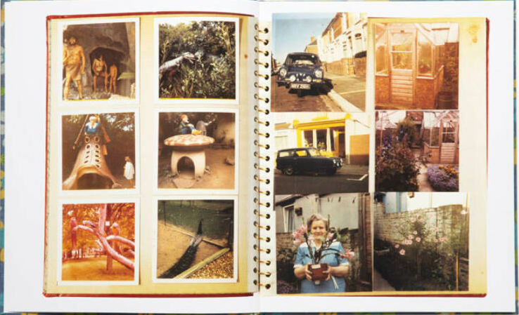
The story is based around an old widower who has a passion for flowers, but can gauge that the creator chose to write on him after being intrigued by his simplistic life and general happiness and content with this life. This is shown as Julian takes a look into his simple life, including lots of shots of the man himself, along with shots of his old house, and lots of shots of his flowers/flower themed décor. Julian has for the most part stuck to one image per page, bar images of the man’s personal photo books featured on the first and last few pages. Julian has left many a page blank, and photos with minimal editing; which i perceive as a an attempt to focus the viewers attention on the striking simplicity of the images and overall the life of the man he is portraying.

Personal Study: Deconstructing Photobook

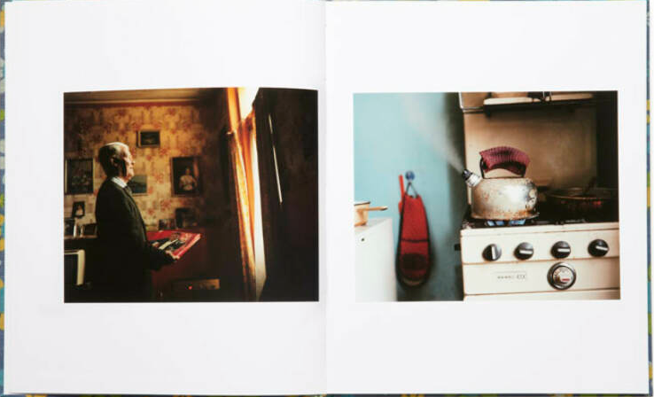
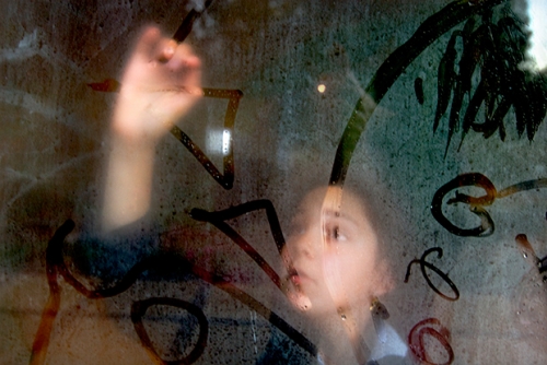
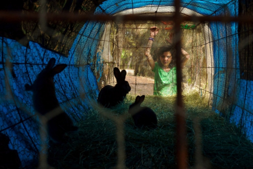
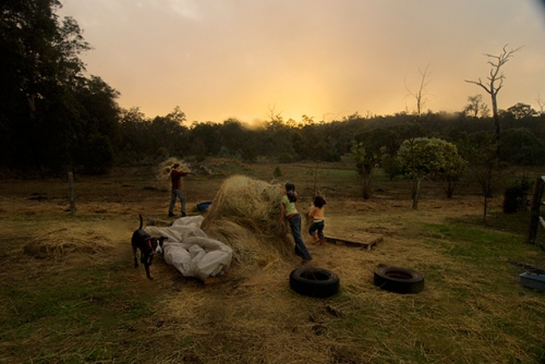
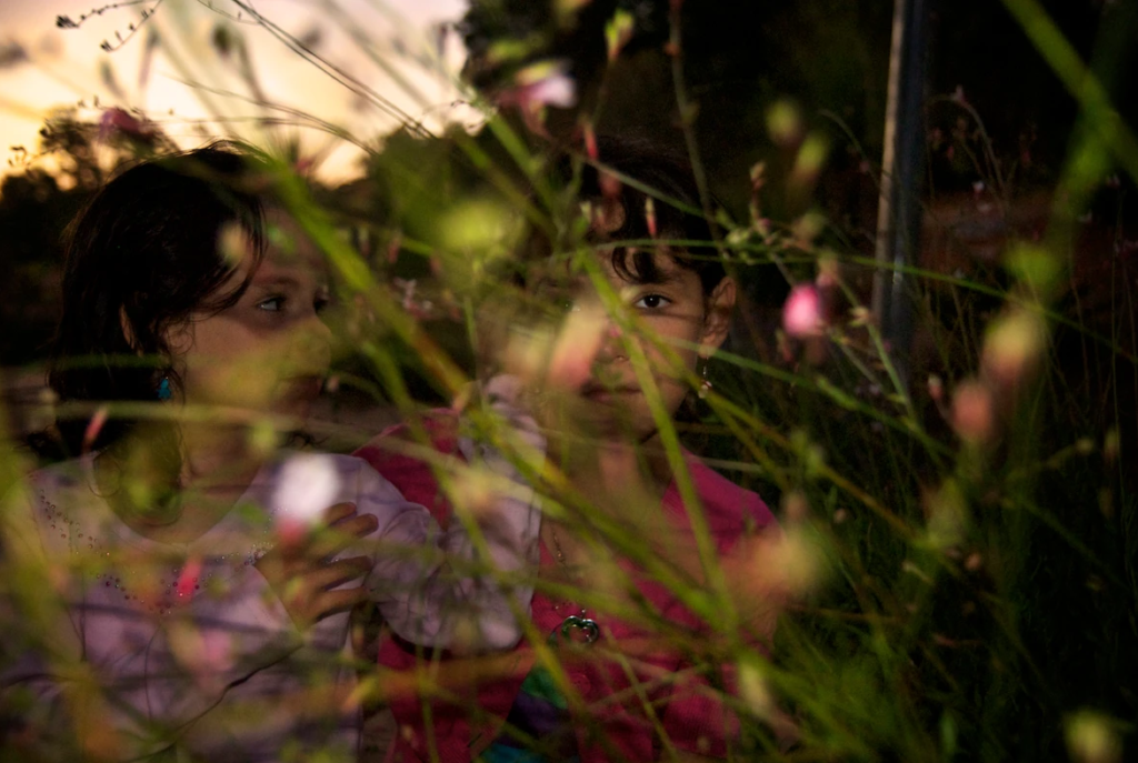
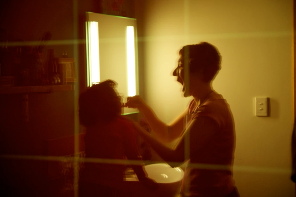
The photobook I will be researching is ‘The Middle of Somewhere’ by Sam Harris. This photobook is an ongoing family diary that revolves around Harris’ two daughters, Uma and Yali, growing up throughout the years. This series began years after they moved from London (2002) and finally settled in Balingup, Australia. It shows their journey and how they also lived in India for a few years. I’d say the images in this photobook are documentary photograph as Sam Harris takes snapshots of his daughters’ day to day activities and their lives.

The Middle of Somewhere – Sam Harris

Sam Harris wanted to document his family in a way he was familiar the most so he decided to make his own family album. His personal photo project grew into an independently published book that won multiple awards including a Lucie Award 2015, and most recently the AIPP Book of the Year 2016.

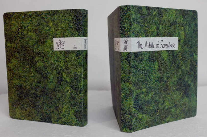
The title of the book is quite poetic and literal as Harris’ family and him are quite literally in the middle of somewhere. They are far from their home land and in a small village in the middle of Australia, which is on the opposite side of the UK.  The book is a conversation, a play between the reader and the photographer, both of who traverse different visual journeys that seem to meet in… the middle of somewhere.

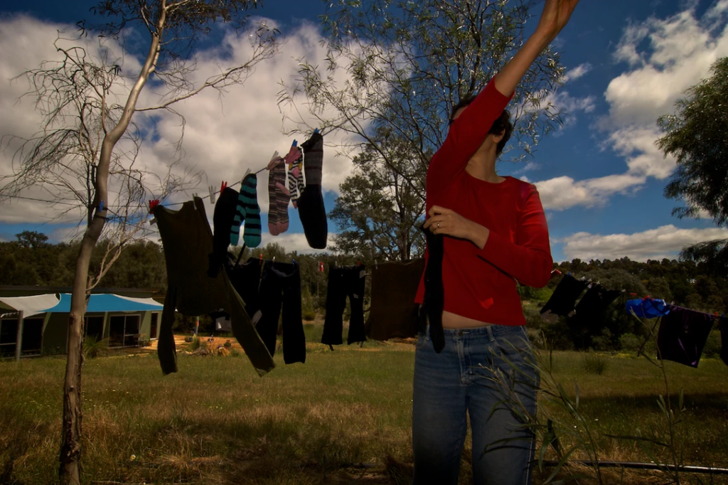
“There’s a photo with Yael hanging the washing in a red t-shirt, with her arm going diagonally across her face. That was a sort of eureka moment for me. It was one of those happy accidents that is something I love about photography. Yael was hanging the washing and I thought it would make an interesting shot so I grabbed my camera and walked up to the washing line. I had something different in mind but as I took the shot her arm went up across her face. When I was reviewing my images it struck me, that there was something about that photo… it was like a key for me and it unlocked a lot I’d been struggling with. The moments in-between the moments. To allow myself to be looser, the ambiguity and it even has the diagonal which always seems to appear in my work. That’s when this project really got its legs, so to speak.” – Sam Harris

My work is a celebration of childhood, family life, love and our simplistic lifestyle which intertwines with our environment. As I witness my daughters’ transformation—in what feels like the briefest of moments—I’m compelled to preserve something of our time living together.” – Sam Harris

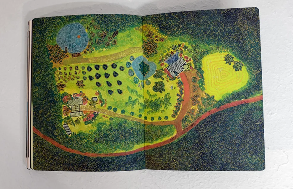
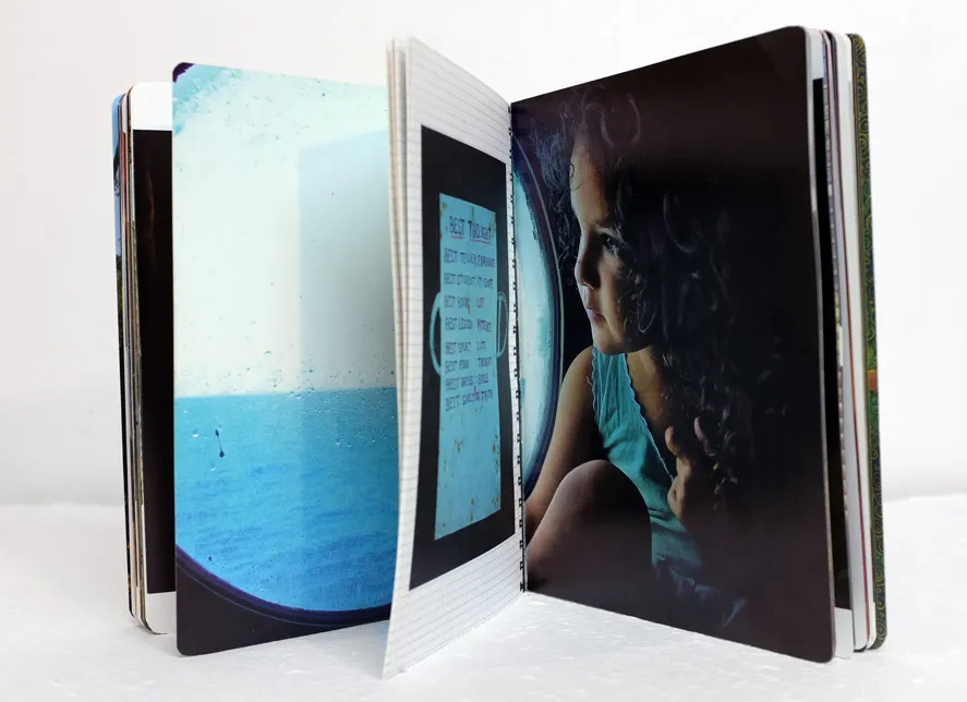
This book has a soft green cover. There’s golden patterns on it which are indented in the cover, giving it some texture. The cover has rounded edges, giving it a more softer look and feel. The title is written on a piece of cloth and stuck at the top of the book, giving it more texture. To me the book has faint smell of sweet perfume and wood/cardboard.

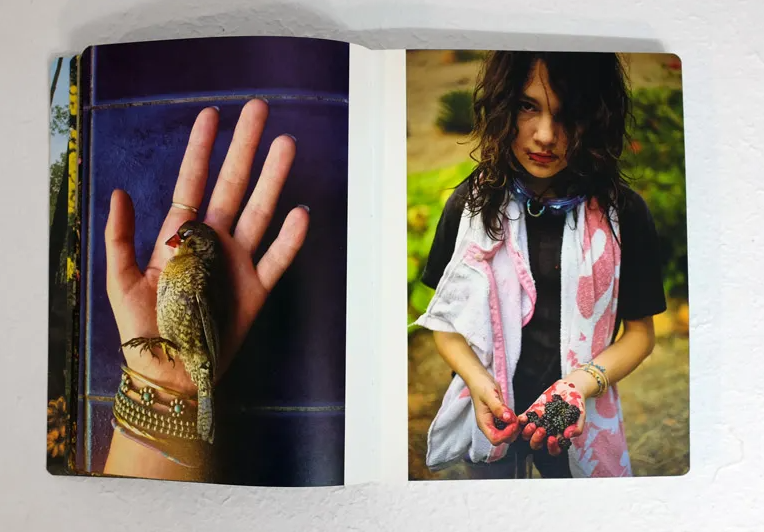
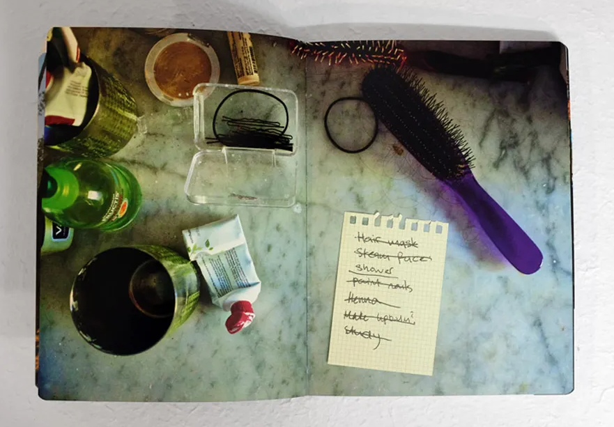
Most of the pages in the book are thick and seem to be more durable than usual paper; and are filled with many coloured photographs. There are also lined & checker paper, as well as sticky notes that have been stuck down in the book with either tape or clear glue. This gives the book a variety of different types of papers and textures.

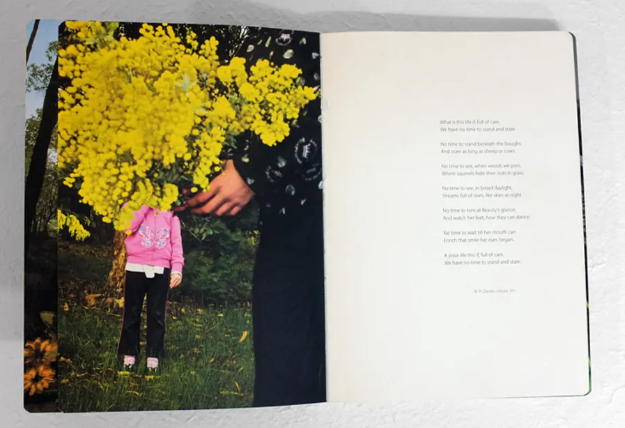
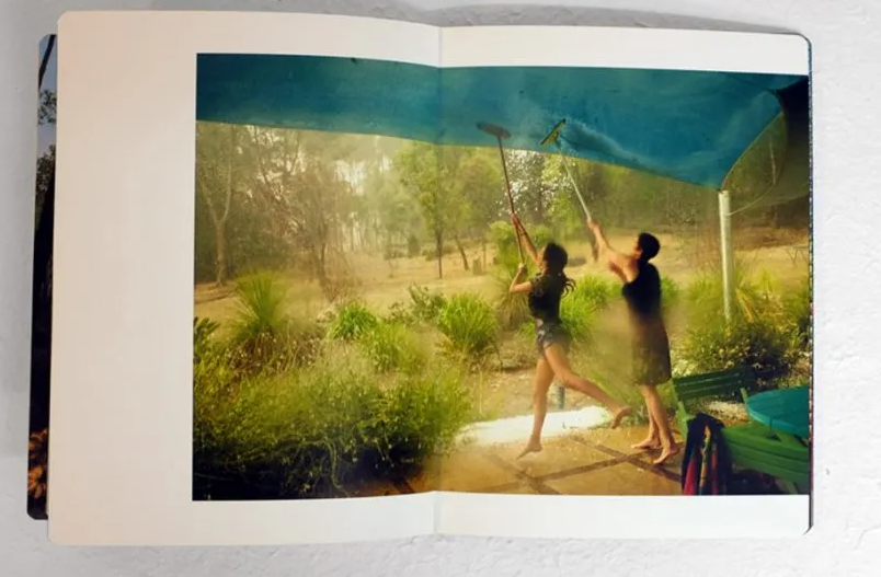
The book itself is a a bit smaller than an A4 and consists of mostly landscape photographs spread out on two pages, and juxta position images. The only times this photobook has writing is at the beginning, end and through the inserts. The book starts with a poem by W.H. Davies, Leisure, 1911, which is about life and how we have no time to appreciate it. Towards the end of the book there’s an essay called “Memories of Today” that describes what Sam Harris’ work is all about. Few pages after that there’s a two page spread written by Sam Harris in which he thanks everyone that helped him make this photobook.

The book has two main inserts. The first one is “No Yesterdays. Notes from Somewhere”, which consists of diary entries and love letters from 2000 to 2015. The second main insert is the “Travelogue”, which shows the young family’s journey from India to Australia, 2002-2006. It’s filled with images documenting their travels, life in India and Yael’s pregnancy with Yali. This makes the photobook feel more like a diary rather than a book, making it more personal and appealing to the reader.