The plan for this photoshoot is on this blogpost.
Editing
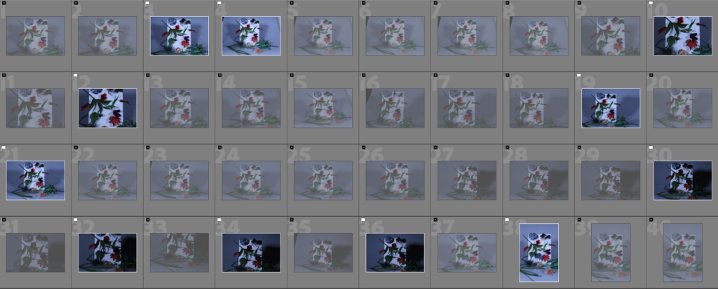
Contact Sheet


To start editing, I narrowed my image selection down by using the ‘Pick’ and ‘Reject’ tool on Lightroom.

I then used the Star Rating feature to further narrow it down.

Out of this selection, I selected the 3 images that I gave a five star rating, as these would be the best images out of the set.

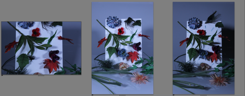
Final Edited Images
These are the best three images from this photoshoot after being edited:


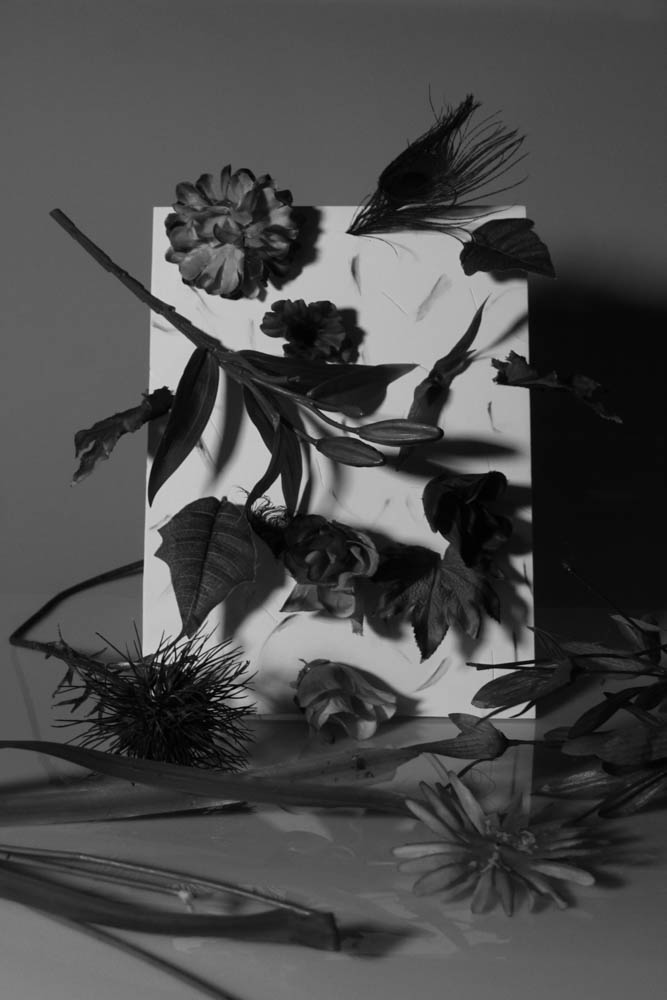
I have also made some black and white versions of these images:


Comparison to Biró’s work:


As I was inspired by this image in particular, I tried to make my images resemble this one as much as I could, I used a coloured (blue) background to mirror the pink in Biró’s image, I used a white board with ‘plants’ poking through, creating some similarities between the two. However, I tried to make my image differ from Biró’s as much as I could: first, I made my images appear colder using the cold light, giving it a far less welcoming aesthetic. Biró’s image depicts a whole plant in a pot poking through the white board, however my image depicts many parts of a plant (leaves, flowers, stems, etc.) poking through in an erratic fashion, with some lying on the floor, mirroring themes of destruction and death of plant life. I made use of harsh lighting to create shadows, giving my image more contrast and a far darker look.
Evaluation
I think this was a successful photoshoot as I was able to mimic the style of Biró’s work, while also applying my own style and ideas onto it, creating something unique in the process. I am not the most experienced when it comes to object/studio photography so this was a good way to improve my skills in this area, I think my ability to create a set to photograph has improved as well. I have matched my success criteria for this shoot well, my idea for putting a twist on Biró’s work by making the lighting more intense has been executed successfully, giving the shoot a more serious tone, which will fit nicely into this project’s theme.
What went well:
I think the final images for this shoot are strong, and will fit into my project involving humanity vs nature, as the images provide an artistic, painterly feel of older still life photographs, as well as a darker, slightly more surreal tone. I like the way these images look similar to a still life painting, with the scene purposely created and not found, which perhaps acts as another way to make the images appear even more unnatural. Even though the colours in these images are darker than what I would normally do, they are still very much present in these images, which gives them a more vibrant sense of life.
How I can improve:
For this photoshoot I only used one piece, with the only difference being some ink smeared on the board to give it more colour/shapes, if I were to do something similar to this in the future, I could try and create another piece to create more variety. I could have also made use of gels to give the images more colour as a means of experimentation.

Hi Joshua, have you begun to write your essay introduction and paragraph 1? It would be good for you to publish what you have written so far as draft, so we as teachers can read it and give you some feedback on how to develop/ improve it etc.