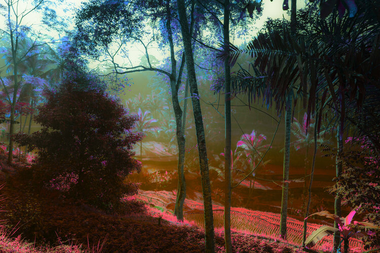
Identity
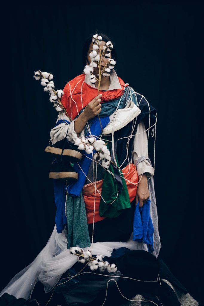
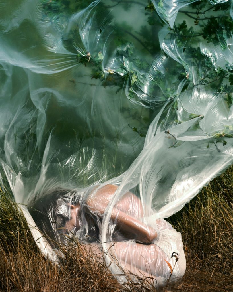
I would consider my identity project to be my weakest photographic area of study. Even though the identity project was by far one of my favourite topics, I do also believe that this contained some of my weakest photoshoots compared to my most recent ones. This was the first topic that I ended up getting set on so I was quite unfamiliar with what I was looking to achieve when I took these images.

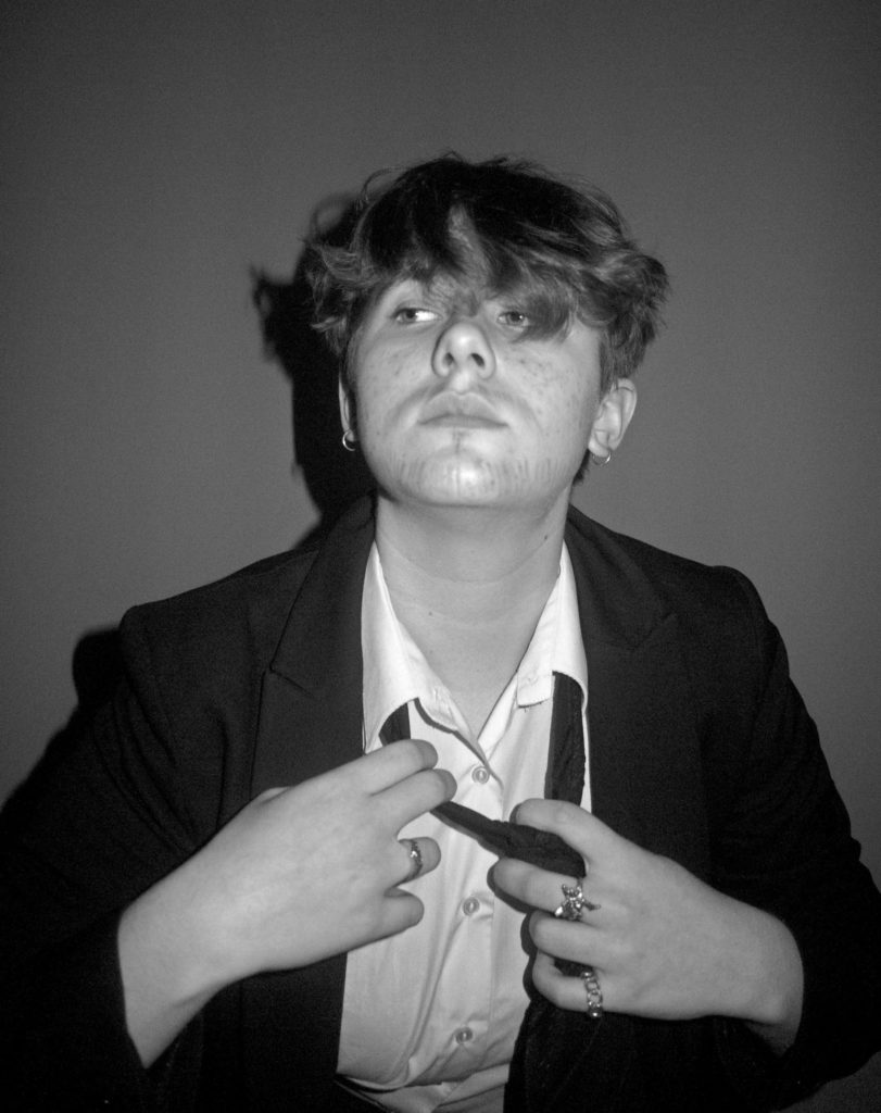
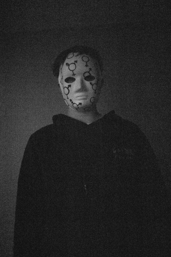
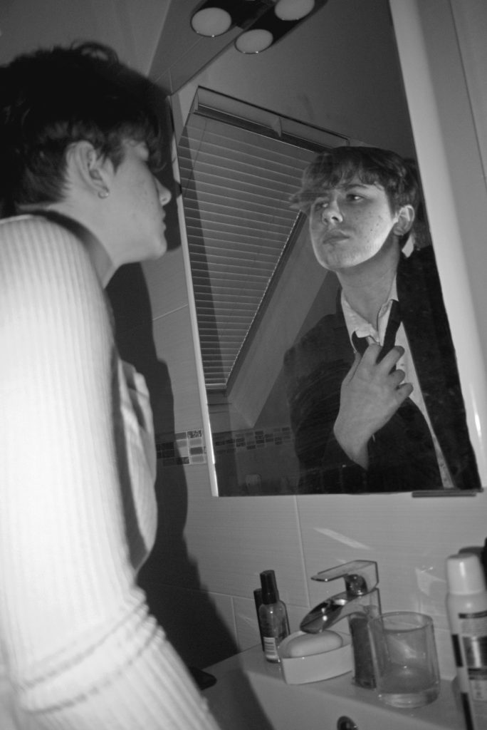
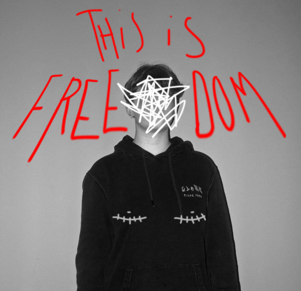
Within this area of study, I played around with a lot of editing skills such as photoshopping and drawing on top of my images. I experimented a lot with my photographs so that they could display the main area of study for my identity project which I chose to be ‘gender identity’.

Within this project, I really wanted to capture what it truly meant to struggle with the gender norms in society, and to capture a real personal take on the topic itself. This topic was incredibly personal to me as gender plays a massive role in my life and has brought me up to become who I am currently today. The gender norms of society categorise people as either ‘male’ or ‘female’, but there is a vast range of genders and identities that many people in our world explore and live by. I wanted this project to capture just my personal struggles with the area of gender identity and I do believe that my photography has displayed that.
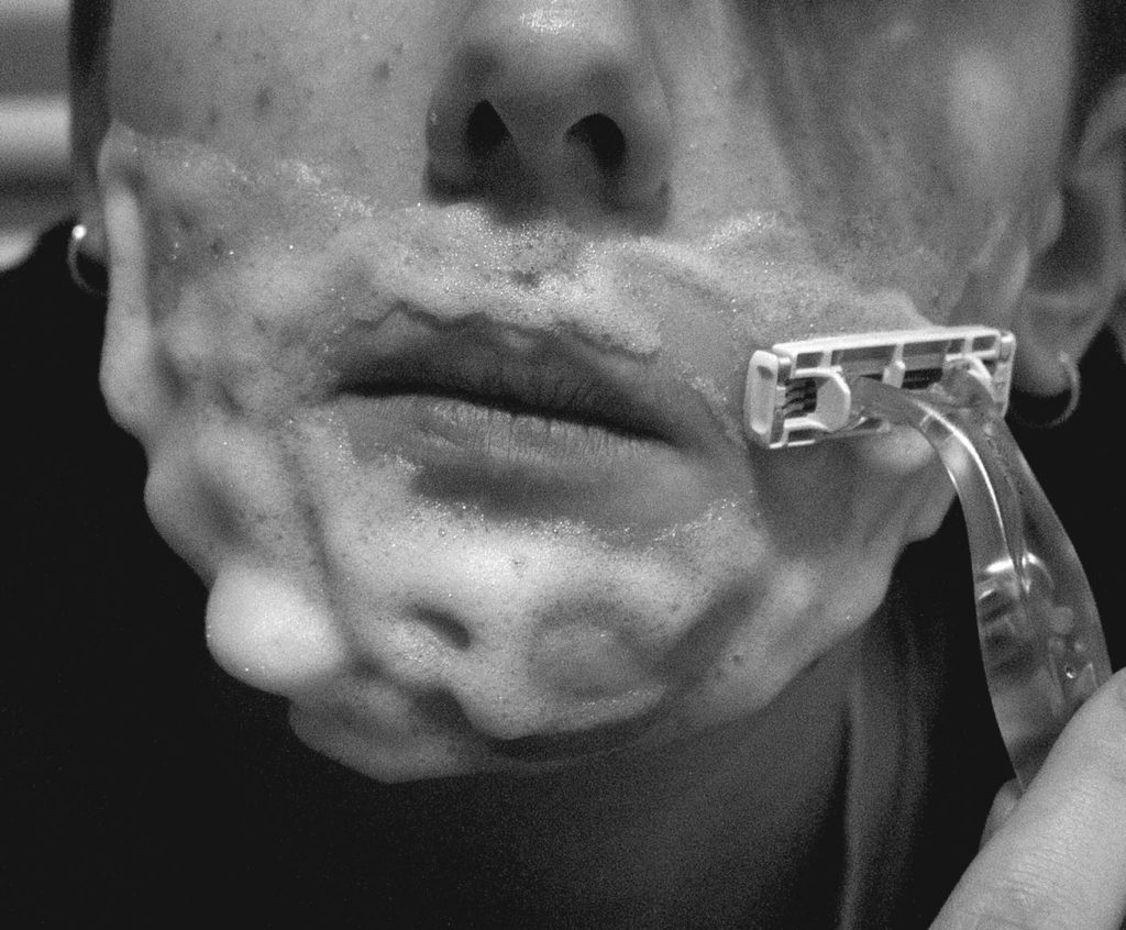
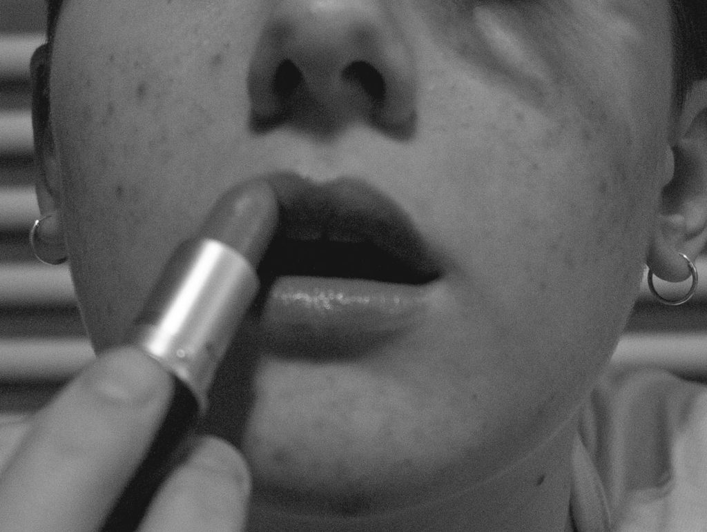
By believing that this topic is one of my weakest projects, I would like to hopefully expand and improve on this topic by basing my personal study mainly on the area of identity again. I would like to follow the route of identity once more but possibly take a slightly different approach by choosing another area to base my study around.
Romanticism – Rural landscapes
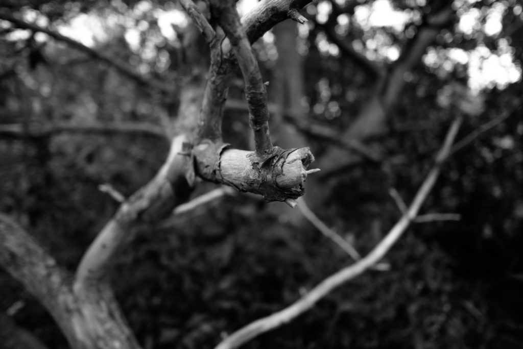
I was very satisfied with how my rural photography turned out during this topic. I believe this project to be one of my strongest projects as I was able to produce a variety of photographs that I was very happy with.
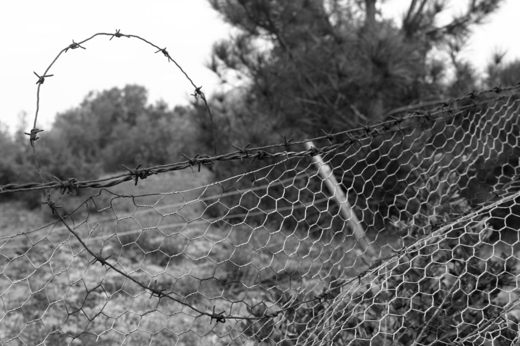
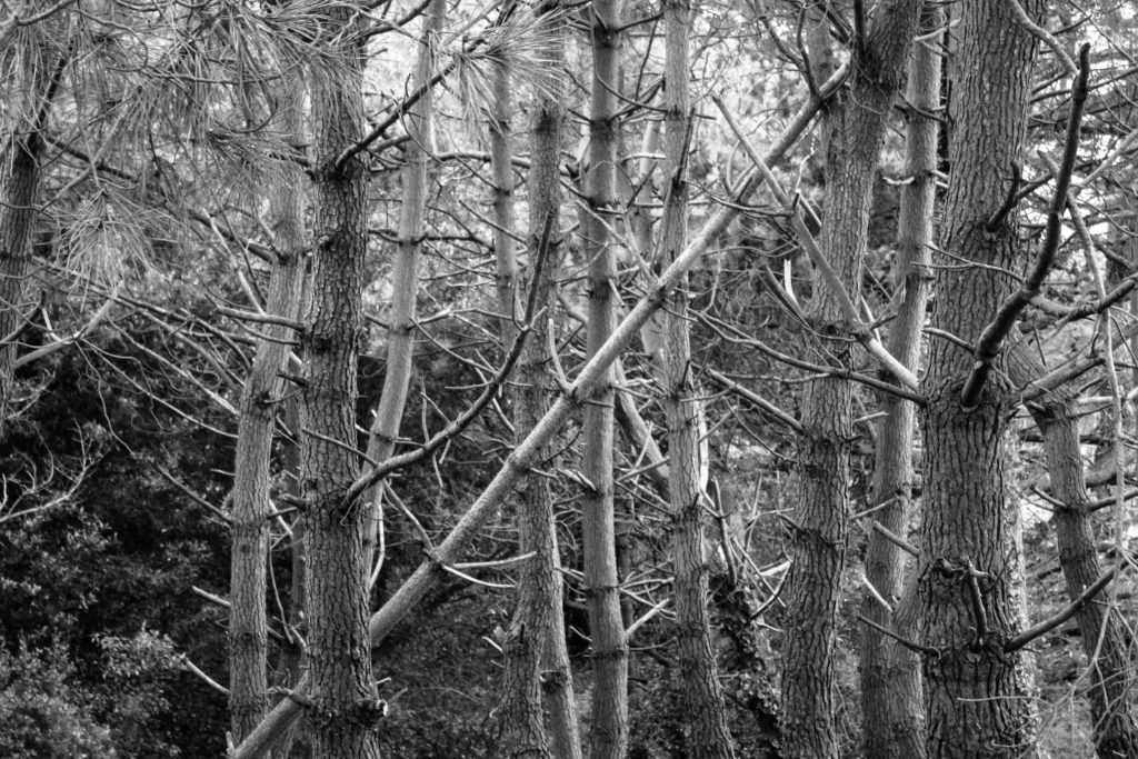

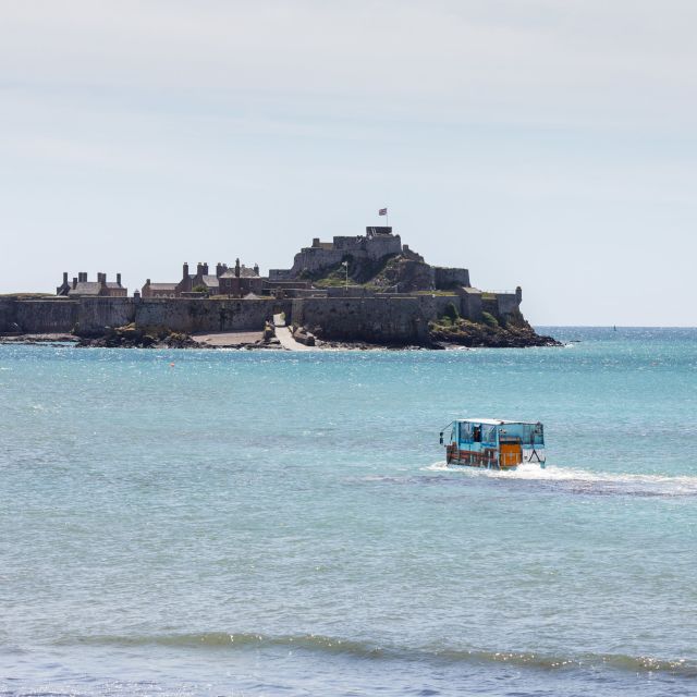
During this project, I didn’t use an awful lot of editing methods to improve the overall outcome of my images but I didn’t think that they really needed them. I liked how they turned out by just purely being black and white and having a few basic editing methods put in place for them such as exposure adjustments, shadows and more. I didn’t want to over-complicate the images as they were suppose to just showcase rural aspects of Jersey.
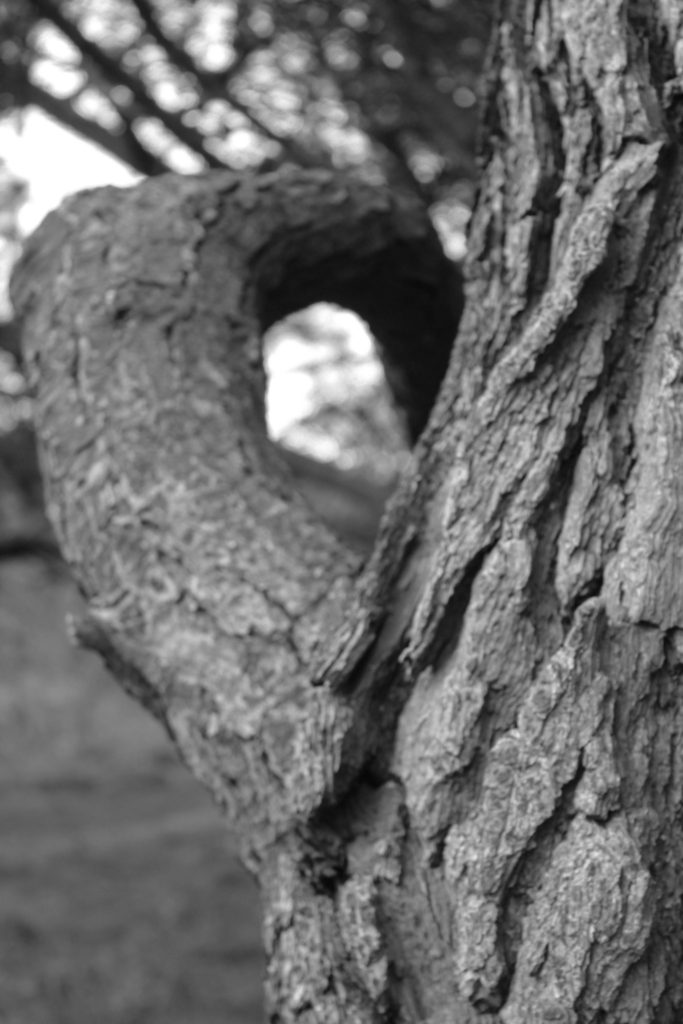
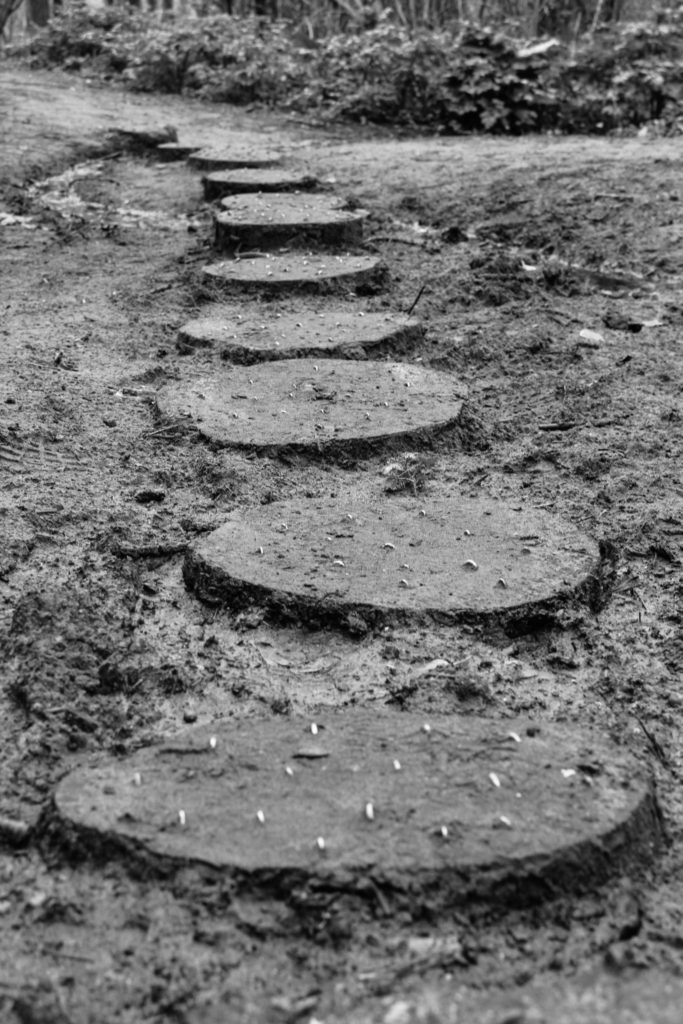
From this project, I definitely learned a lot about Jersey’s rural landscapes by exploring the island and photographing areas of interest that I came across. I also wanted to display the many different textures that can be seen from Jersey’s rural aspects such as the trees that were present and the subtle inclusion of man-made items as well that might have become intertwined with the landscapes.
New Topographic – Urban landscapes
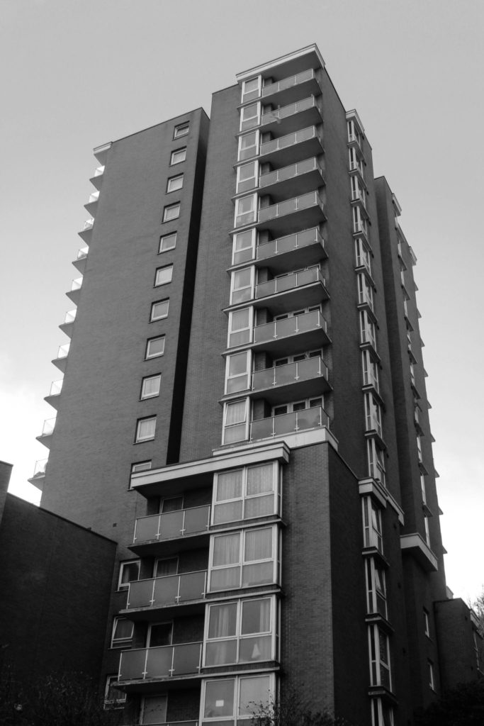
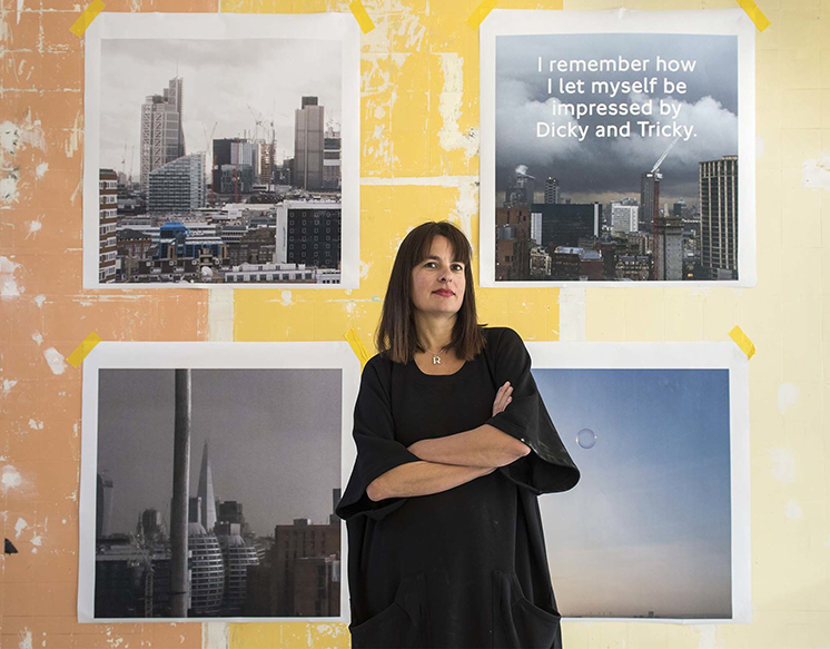
I would also consider my urban landscape photographs to be quite a strong area for me as well. I believe that I was able to capture a good contrast between the urban landscape photography and the rural photography with a complete difference in imagery. The rural photographs containing Jersey’s intriguing textures and scenery, whilst the urban photographs contain the exact opposite of that area, with its man-made buildings and structures that completely take over the more rural aspects of Jersey.

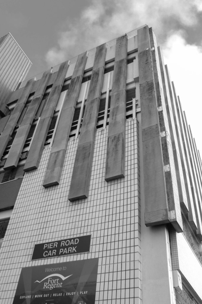
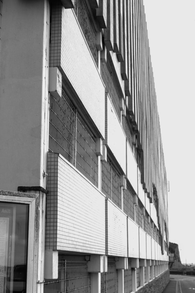
I was very proud of my photographs that I was able to produce from the urban landscape topic. I was incredibly happy with my final outcomes and I just enjoyed the overall effect they were able to give off, as to really showcase what the urban areas look like in Jersey and how much they contrast to the natural areas of the island.
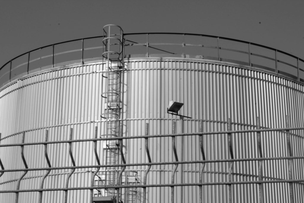
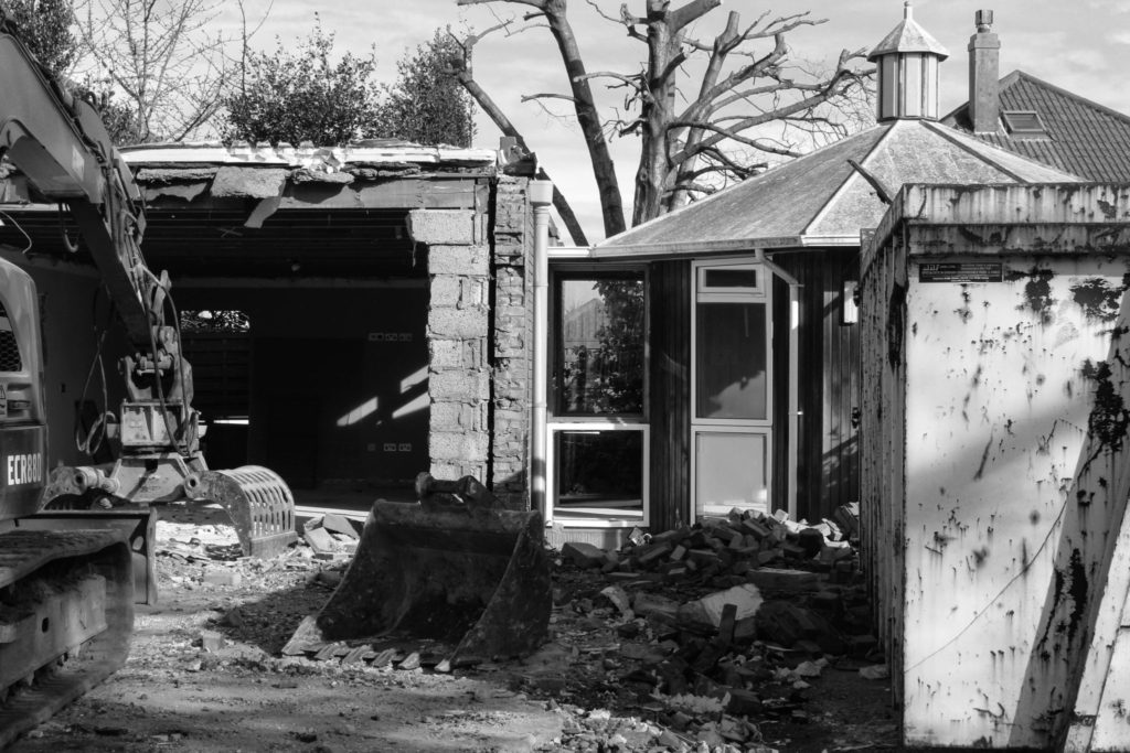
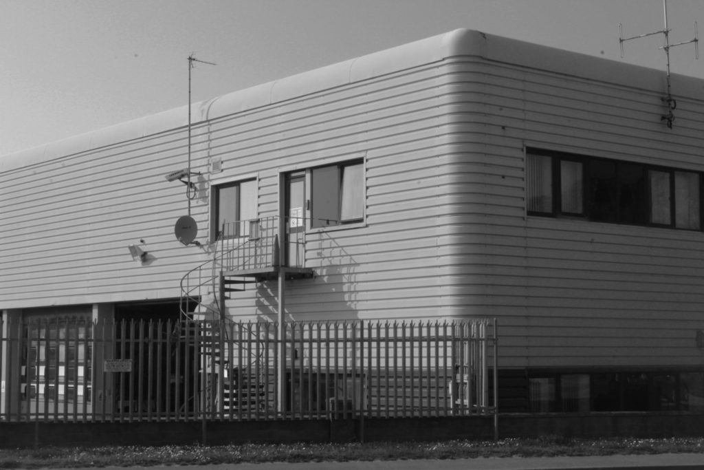
Furthermore, I much prefer the overall aesthetic that the urban photographs give off compared to the rural photographs I captured. I much prefer the different shapes and senses of symmetry that are present within the images as these are man-made buildings. Nature is something that adapts and grows on it’s own so it can come out as being any shape and size, buildings and structures are made with a thought process put in place and a plan of how they’re going to look and be made.
Anthropocene
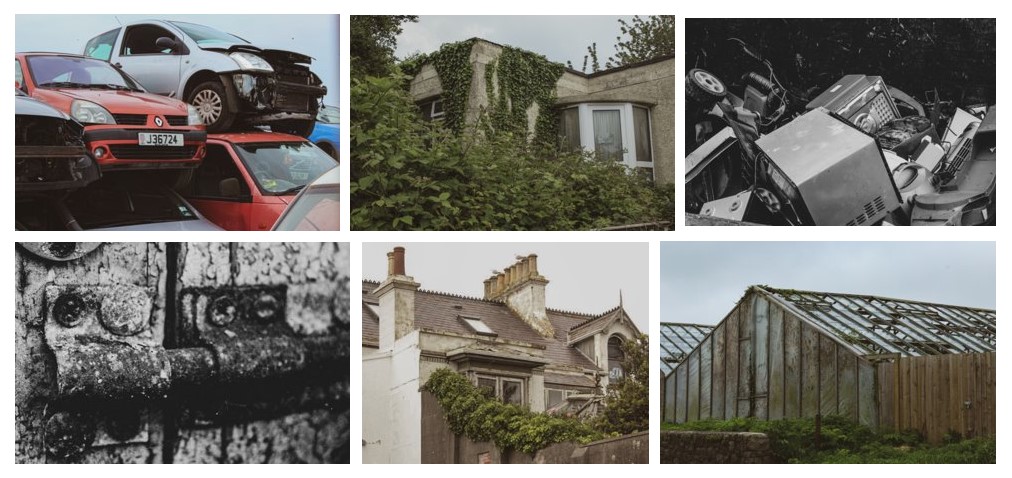
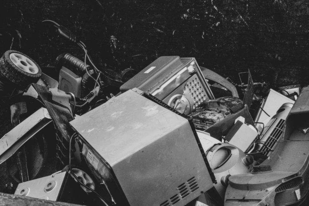
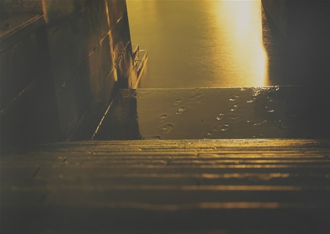
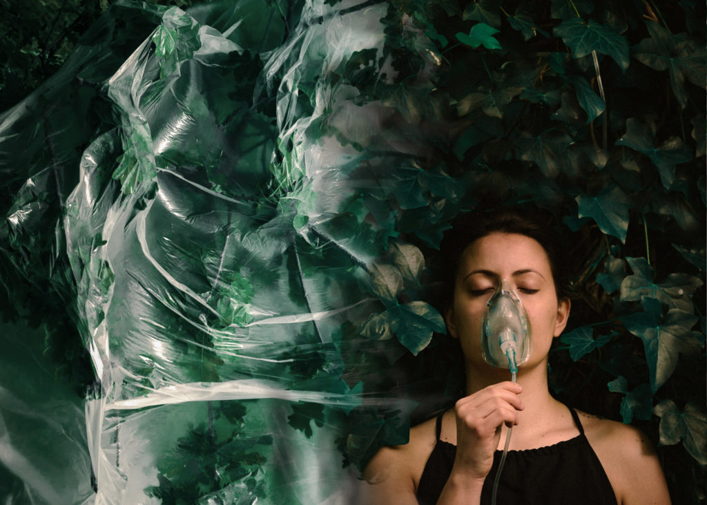
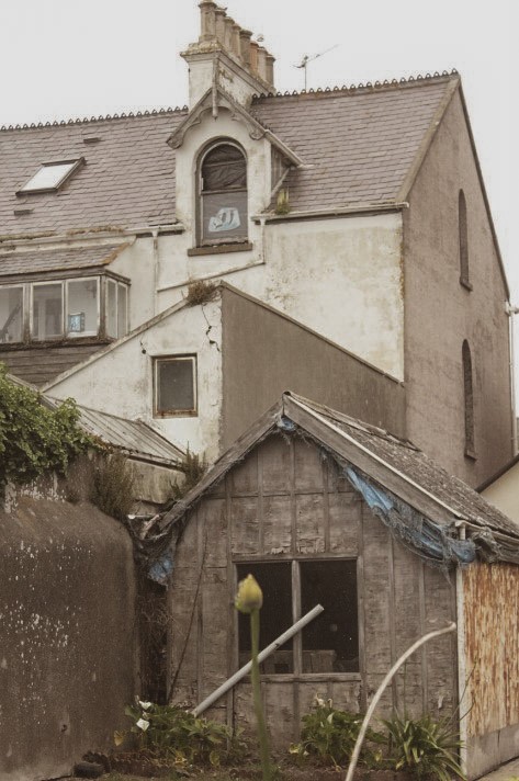
Personally, I believe the anthropocene project to be my strongest area and it overall was my favourite project that I ended up doing. I chose to pursue the route of capturing Jersey’s deteriorating areas that included decay and deserted buildings or structures.
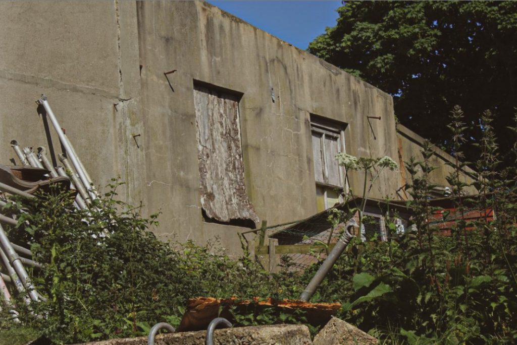
I wanted to explore Jersey’s deserted areas so that I could really present images of harder to notice aspects of the island. I broke down my anthropocene project into sections such as ‘Dystopia’, ‘Industrial’ and ‘Abstract’. The dystopia series included a variety of images which had to be my favourites as they really presented a good link between Jersey and the term anthropocene. They were able to show that nature was easily taking over the man-made structures that where sitting among the island.
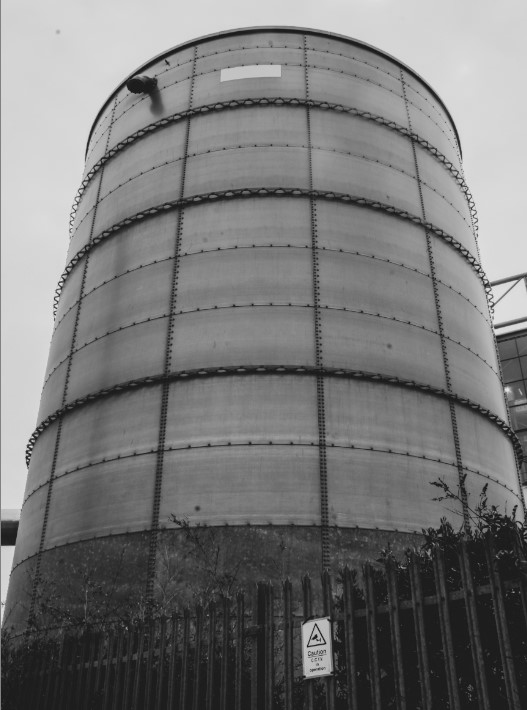
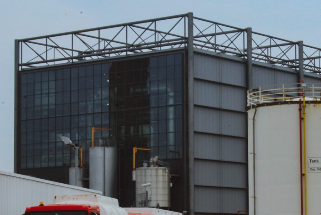
I definitely liked how the ‘Industrial’ and ‘Abstract’ projects turned out as they were still able to present what the anthropocene project was really all about. The ‘Industrial’ project included a range of images of Jersey’s factories, incinerators and overall the industrial structures that the island has to offer. I wanted to include this section into the anthropocene project as I believed it would exhibit that the island is being damaged by these structures being on the island. The incredibly large size of the structures as well is something I wanted to capture, as to really highlight how intimidating and overbearing these can be on the islands condition.
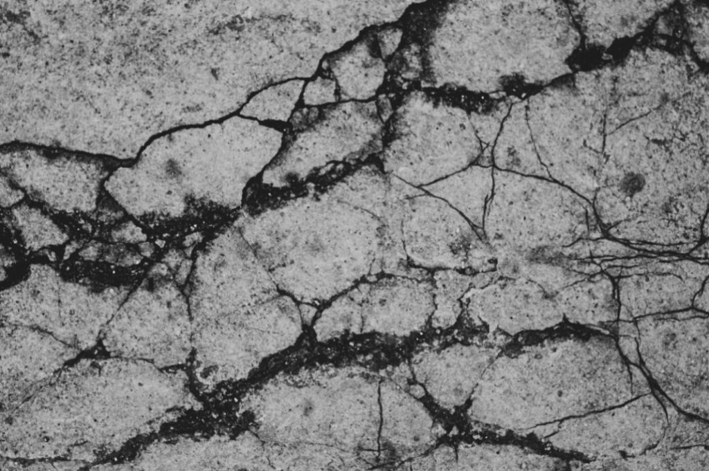
For the ‘Abstract’ project, I wanted to showcase a similar aspect to that of the ‘Dystopia’ theme, but I wanted this one to be more close up as to really display the impact of decay and the overall deterioration of the buildings. The shapes and textures that were manipulated into the structures was something that I really enjoyed the look of and wanted to present them well within this theme.
My rock
This project was one that I thought to be a weak point within my photography topics. I liked quite a few of the images I was able to produce, but I still think this project contained a wide variety of photographs that I deem to be my weakest final outcomes.

During this project, we were given the task of creating ‘joiners‘ and an awful lot of them turned out to be unsuccessful and didn’t turn out the way that I imagined they would. This was one of my successful joiners, but the majority of the ones I produced, I wasn’t very satisfied with. I didn’t really like the process of making the joiners just because there were a lot of components that had to be taken into account in order to make them. I much preferred the outcome of a digital joiner than a physical joiner, just because it looked a lot cleaner and sharper.
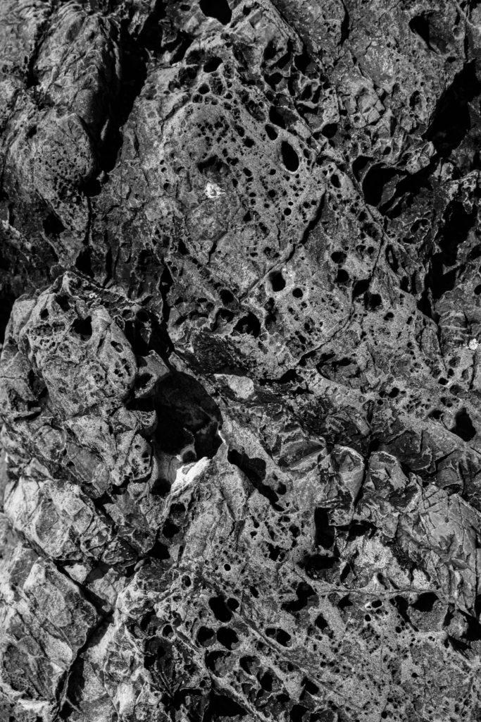
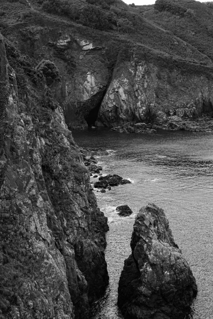
Here I have a few examples of my best works from the ‘my rock’ project. I still think that I managed to produce a range of images that I was proud of, but overall the project fell under being one of my weakest.
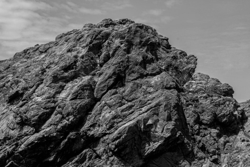
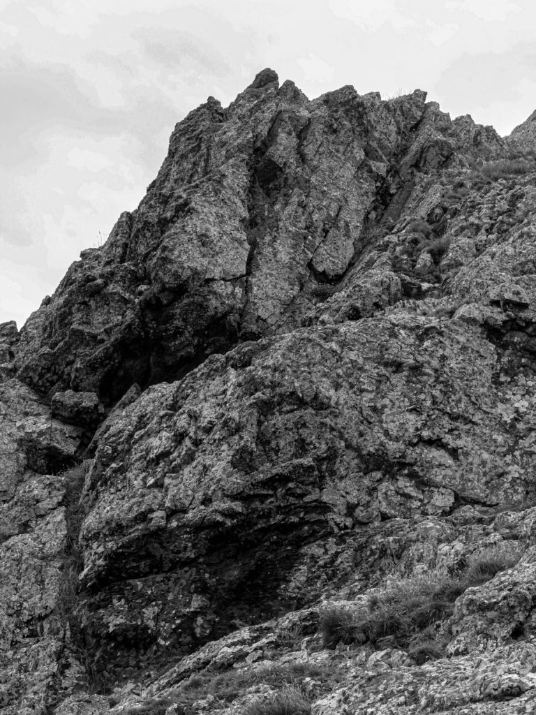
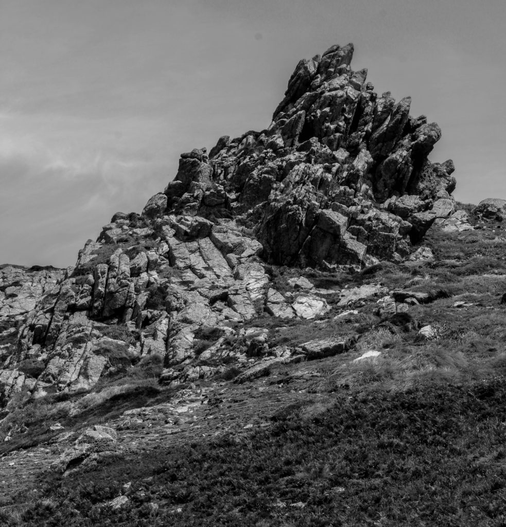
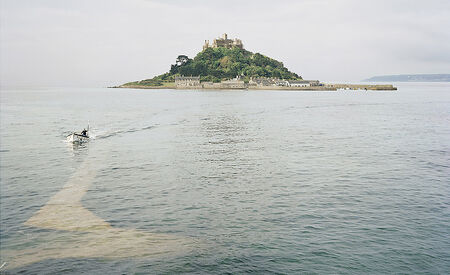
I did enjoy capturing the raw aspects of Jersey and manipulating the images to make the island seem much more dramatic and textured, but I wasn’t overly interested in the topic overall. It wasn’t my favourite area of study but I still thought it was an interesting on as a way to showcase what the island has to offer with his geology and coastlines.
Editing techniques
During all of my projects, I visited a variety of different editing techniques as ways to enhance my photography and make the final outcomes stand out. I manipulated the photographs in a range of ways such as creating digital joiners, using editing techniques inspired by photographers, photoshopping and more.
— Joiners —
I already mentioned about the use of joiners being included in the ‘my rock’ project that I was tasked to do and that involved a lot of technical aspects to it. I had to automate a variety of images that would all combine together to produce one complete image. Although this technique was definitely interesting to experiment with, it wasn’t my favourite technique to use for final photographic outcomes.
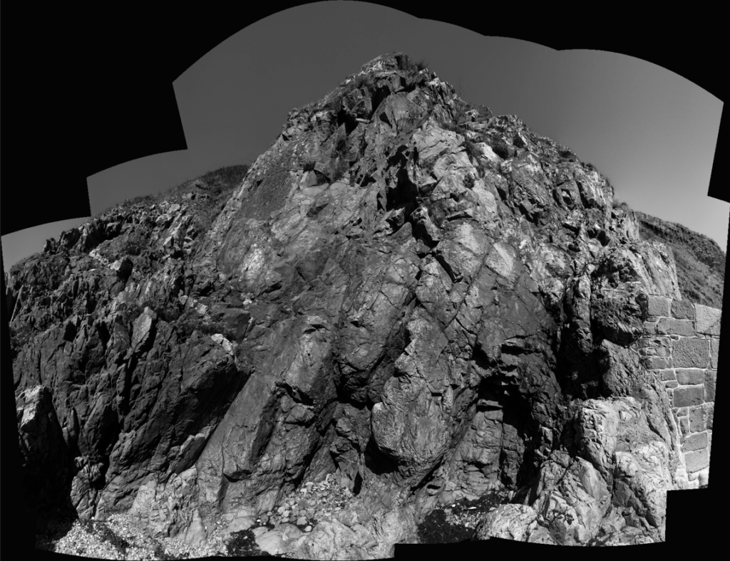
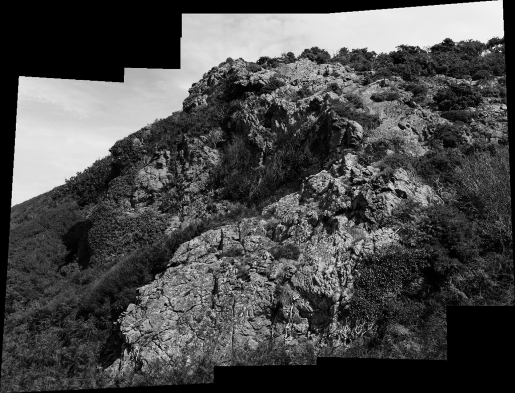
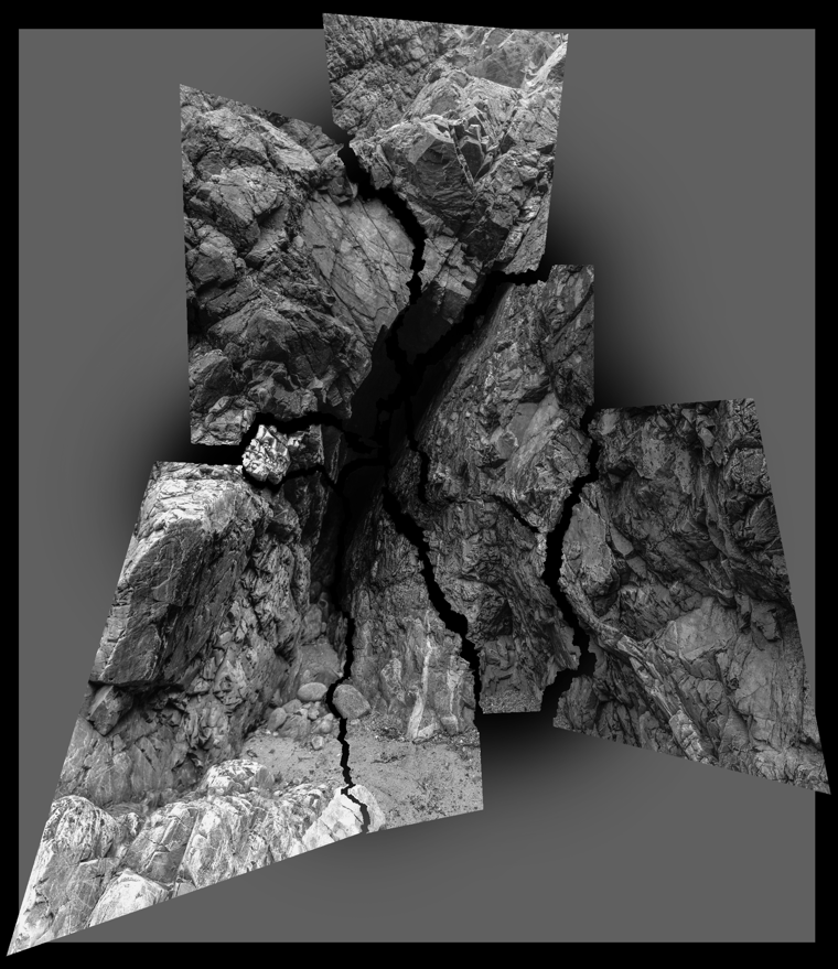
Here I have some examples of more successful joiners that I was able to produce during the time of this topic. I was happy with how they turned out, but once again it is not an area that I would like to revisit for my personal study.
— Keld Helmer Peterson —
Here we have a range of my images that were inspired by the photographer Keld Helmer Peterson. We learnt how to adapt to this editing style by first changing the images to black and white and clicking on the ‘Threshold’ setting, we then had to adjust the image to our liking until we were able to capture the perfect effect that was similar to Helmer Peterson’s.
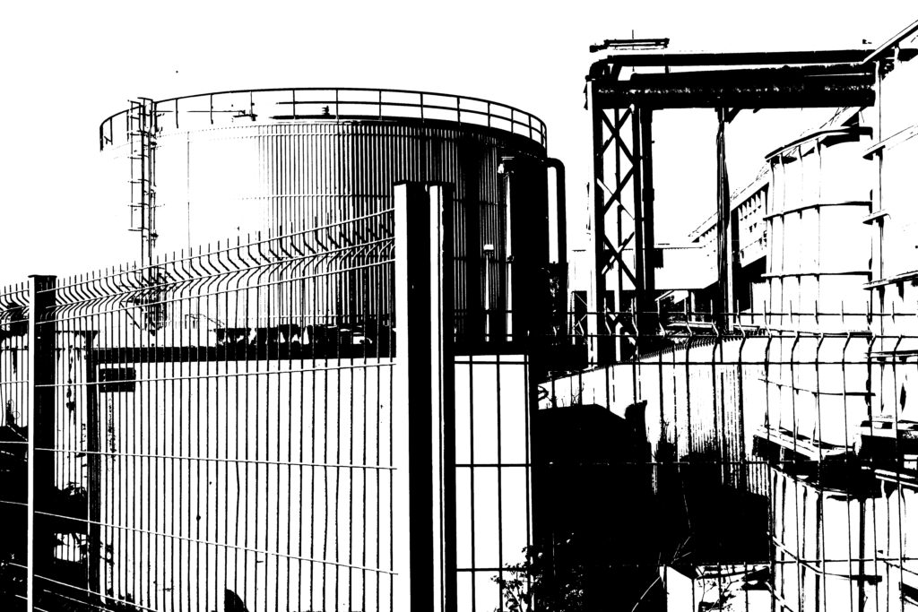
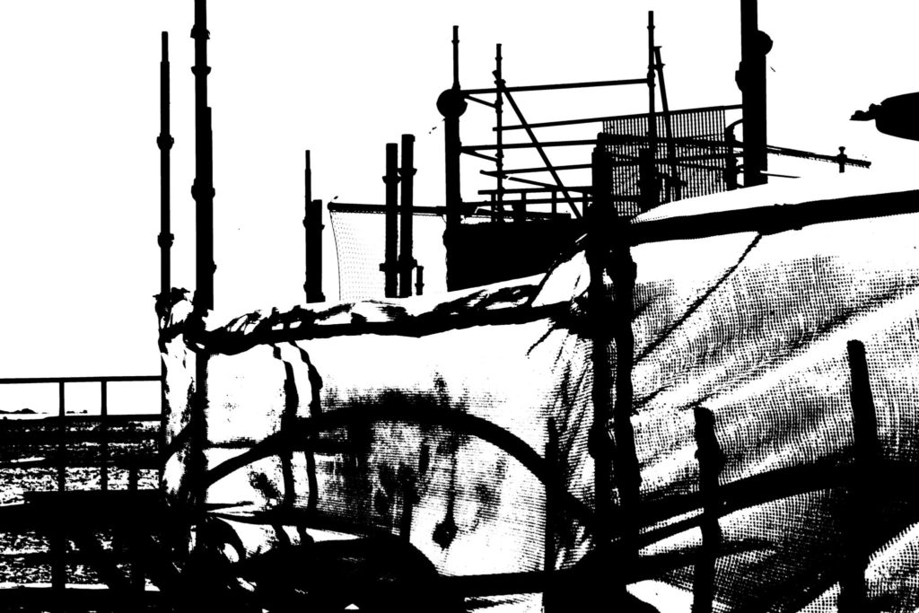
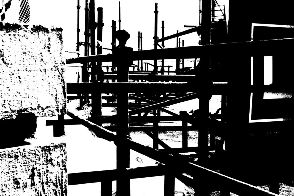
These were my versions inspired by the photographer and I enjoyed learning this technique. Although it is not something that I would like to adapt into my personal study, I do still believe it was a good technique to use and I liked how these images turned out.
— Multi-exposures —
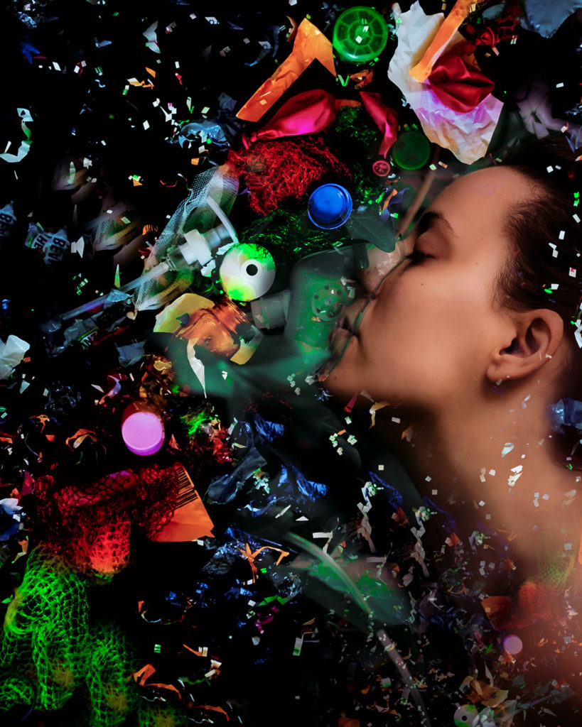
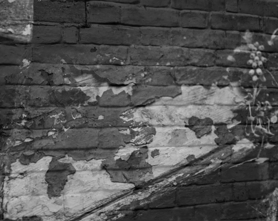
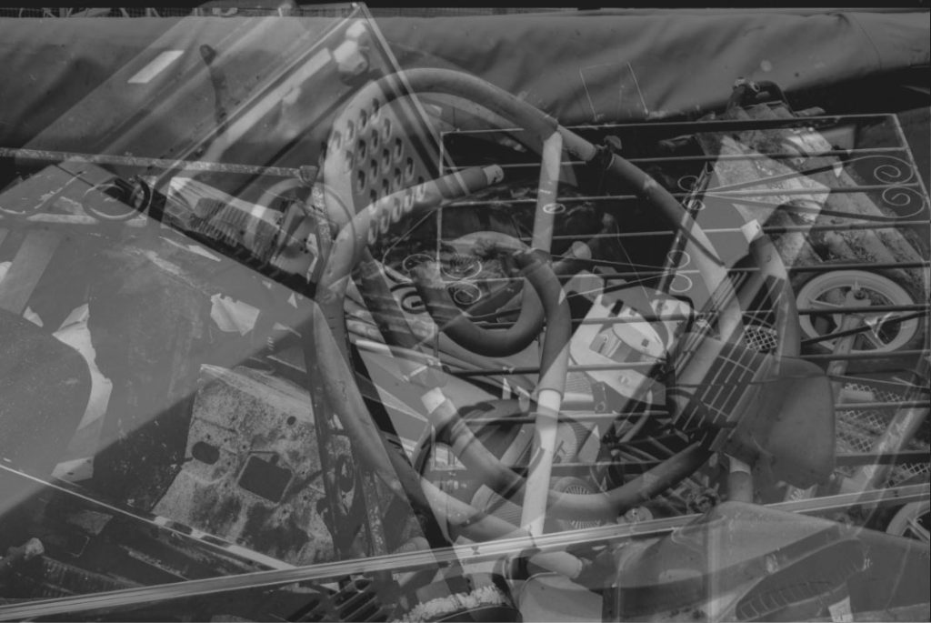
These images I took, containing the use of multi-exposures, in my opinion aren’t photographs that I’m particularly proud of. Even though I don’t like the final outcome for these images, I was still glad that I tried out this editing technique as it can be a very useful tool to embed into photographs. I was able to control the opacity of one image that was layered overtop of another, so that both images came through.
Most successful photographs

