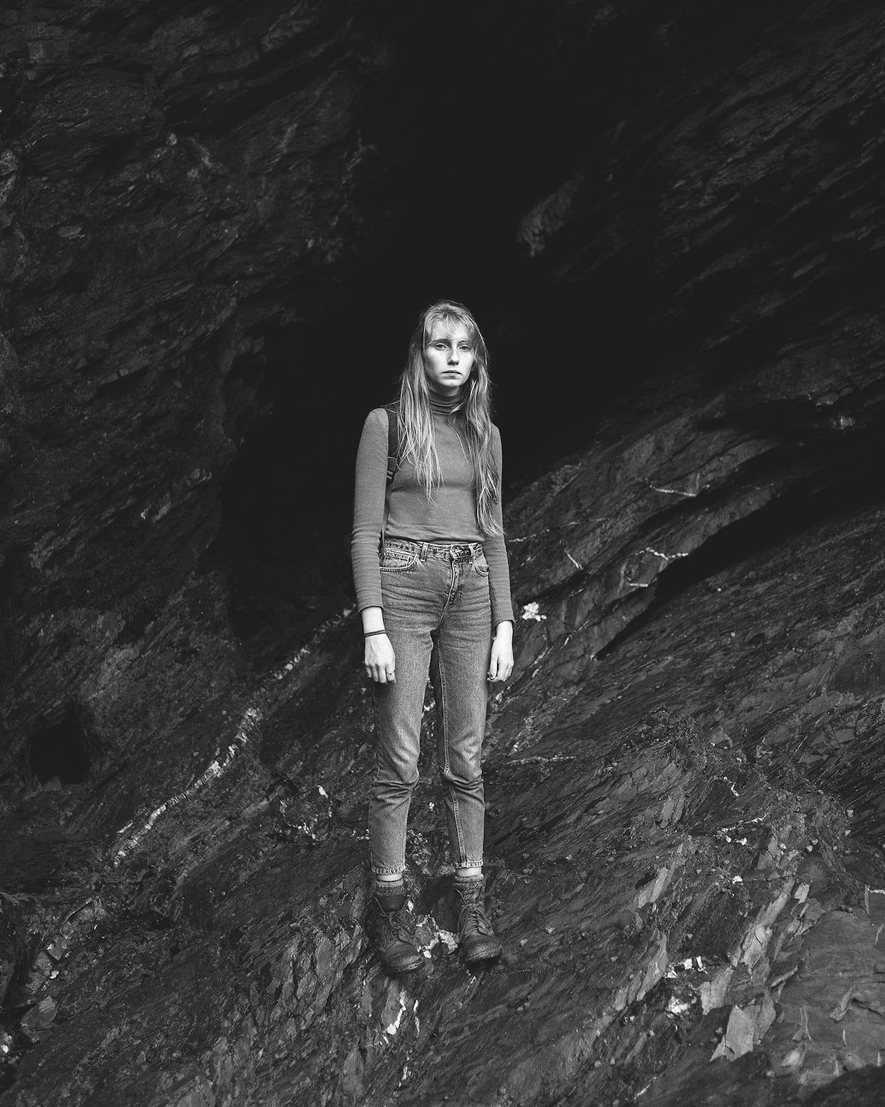
This photo was taken by Robin Darch on June 24th 2016. The day after the UK elected to leave the EU. Robert said he felt the overwhelming sense of heaviness and isolation the morning this photoshoot was done. I believe Roberts feelings have been transefered intot he image. The subject in the image looks as though she feels the same as Robert describes himself.
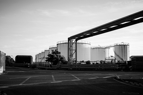
Lewis Baltz was a visual artist and photographer who became an important figure in the New Topographic movement of the late 1970s. His work has been published in a number of books, presented in numerous exhibitions, and appeared in museums such as the Museum of Modern Art. Born in Newport Beach, California, Baltz graduated with a BFA in Fine Arts from San Francisco Art Institute in 1969 and held a Master of Fine Arts degree from Claremont Graduate School. He received several scholarships and awards including a scholarship from the National Endowment For the Arts.
Baltz
His work
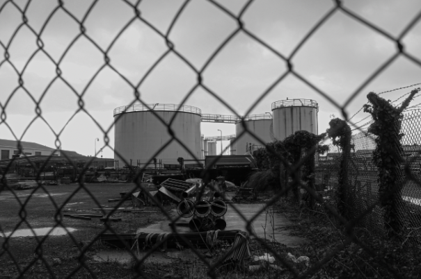
His books and exhibitions, his “topographic work”, such as The New Industrial Parks, Nevada, San Quentin Point, Candlestick Point (84 photographs documenting a public space near Candlestick Park, ruined by natural detritus and human intervention), expose the crisis of technology and define both objectivity and the role of the artist in photographs.
“I never had any profound loyalty to the idea of photography as a medium but simply as the most efficient way of making or recording an image.”
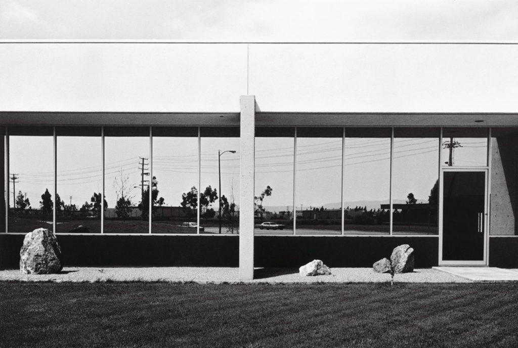
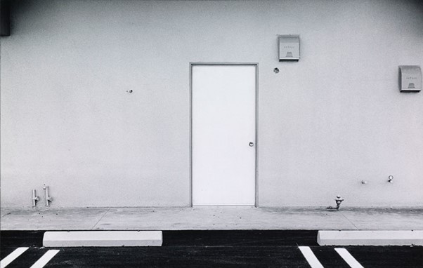
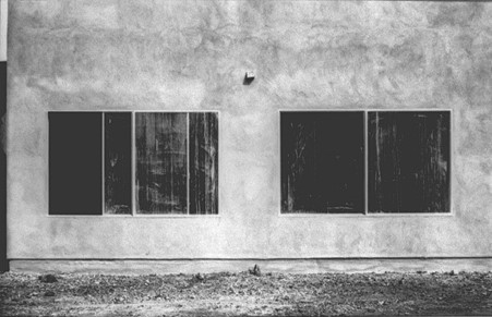
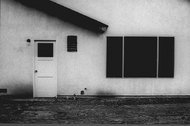
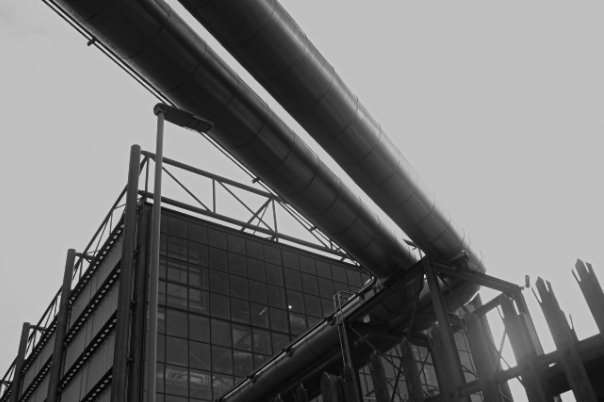
His work is focused on searching for beauty in desolation and destruction. Baltz’s images describe the architecture of the human landscape: offices, factories and parking lots. His pictures are the reflection of control, power, and influenced by and over human beings. His minimalistic photographs in the trilogy Ronde de Nuit, Docile Bodies, and Politics of Bacteria, picture the void of the other.
Favourite Piece of Work
His work, like that of others associated with the New Topographics, challenges the nineteenth century tradition of western landscape photography represented by Timothy O’Sullivan, Carleton Watkins, and William Henry Jackson by presenting a less innocent view of the landscape. Baltz’s perception of the landscape necessarily reveals the effects of twentieth-century culture and suburban development on the nation’s topography.
He published several books of his work including Geschichten von Verlangen und Macht, with Slavica Perkovic. Other photographic series, including Sites of Technology (1989–92), depict the clinical, pristine interiors of hi-tech industries and government research centres, principally in France and Japan. In 1995, the story Deaths in Newport was produced as a book, Baltz also produced a number of video works.
Example of his work I would like to recreate
Baltz was shooting in colour and, long before it became accepted practice in the conceptual photography world, was making large-scale prints. He was interested, he said, in representing “the generic European city”. Out of this grew a fascination with digital technology and its uses, not least in surveillance and control. In 1992, he created the monumental Ronde de Nuit installation at the Pompidou Centre in Paris, a series of images printed on Cibachrome panels that together measured 2.1m (7ft) high and 11.9m (39ft) across.
Link to my project
His work
My work
Why his work has has influenced me: The message behind his work is very important and I would like this to be reflected in my future personal study as it think that our urban environment is one which should be preserved in its current form, as future industrialisation because of Jersey’s increasing population means that there is a threat that our natural island will look significantly different in the future, with not as much of out natural landscapes left. I think the fact that Baltz that was about to visually communicate a problem that was occuring throughtout the world is quite inspirational, and the fact that these issues are still going on today means that these images are easy to create.
What I like about his work: I think that the simplicity of his work makes him more memorable and along with the monochromatic photography, this makes more unique pieces. I also like that for this time this type of photography was to demonstrate the affects of mankind on the natural environment and his work demonstrates this well as the builders are the main focal point of the images. I think that Lewis Baltz work is some of my favourite as it links in with the theme of Anthropocene, which is linked to my most successful project in photography so far. He mainly focuses on urban landscapes which was has been amongst my favourite photoshoots I have done so far. I think that’s important to note that some of my work will be taking a lot of inspiration from Baltz and the other parts will be using heavily editing to make these structures look they are not manmade at all.
Image Analysis
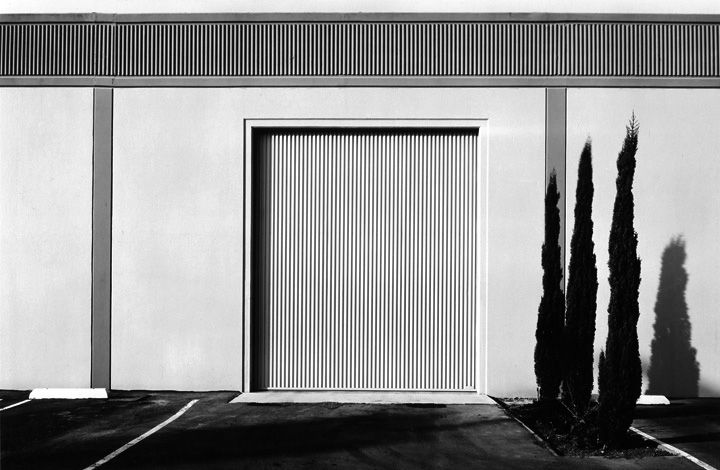
I have selected this image to analyse as I think the overall composition of the image is one of its main strengths, as it means that the silhouette of the mountain is the background of the image and that the main houses in the front create a focal point for the image. Furthermore, I think the lighting of this image brings and all of its features and makes it more cohesive as the lighting from under the roof trim of the house means that strong shadows are created, as the brightness of the lighting in the sky creates contrast between it and the outline of the mountains. Additionally, I think that the clarity of the image makes it stand out more as the details in the brickwork of the building and even the blinds in the windows creates contrast. This is shown as theres lots of details within the foreground of the photograph and this lack in the background, however this is not a negative as it demonstrates the rule of thirds, as the pavement, housing and mountains/ skyline and very clearly separated in this piece. It’s also important to note how important the different shapes and lines are within this image, as the vertical lines contradicts with the horizon created but the mountain, and the squares and rectangles contrast with the smooth natural landscape. This is a good example of The New Topographic’s work as their is a manmade contrast created with the lighting in this image, as a somewhat natural contrast between the housing and landscape further away in the image.
There are three island territories within the British Isles that are known as Crown Dependencies; these are the Bailiwicks of Jersey and Guernsey which make up Channel Islands, and the Isle of Man. The Crown Dependencies are not part of the United Kingdom, but are self-governing possessions of the British Crown. The three Crown Dependencies have their own varying forms of self-administration, although the United Kingdom government is responsible for certain areas of policy such as defence and foreign affairs. The King’s special relationship with the Crown Dependencies is reflected by the titles he has in them.
The Channel Islands were part of the Duchy of Normandy when Duke William, following his conquest of England in 1066, became William I. In 1106, William’s youngest son Henry I seized the Duchy of Normandy from his brother Robert; since that time, the English and subsequently British Sovereign has held the title Duke of Normandy. By 1205, England had lost most of its French lands, including Normandy. However, the Channel Islands, part of the lost Duchy, remained a self-governing possession of the English Crown.
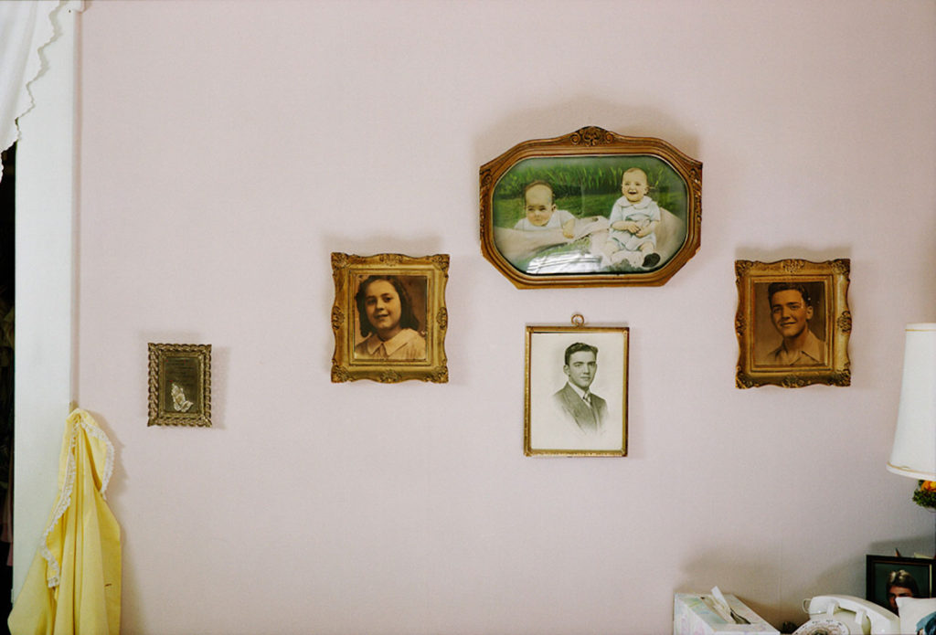
In my personal study, I want to explore my immediate family, specifically the women I grew up with. I want to explore the generational female identity of the women in my family, the unique relationship they each have with the island, their life experiences, and their relationships with me. I want to try and photograph and respond to the complex relationships between mothers and daughters, but through multiple generations.
Hannah Altman, Kavana
Why it matters to you?
Photographing my grandma and my mum is important to me as they are the two most important people in my life. My mum brought me up with no help and the presence of strong women has always been something present in my life, which is why I wanted to focus on it for my personal study. I want to document my experiences of growing up with only women around me, telling a story of my life so far as well as my grandmother’s and my mum’s. I think I have had quite a unique upbringing with the strong influence of women in my life, and I want to show this in my work.
Hannah Altman, Indoor Voices, “Thanksgiving”
https://www.hannahaltmanphoto.com/indoorvoices#28 An artist I am inspired by for this project, who documents the delicate relationship between a mother and daughter – Hannah Altman and her project “Indoor Voices.”
How do you wish to develop your project?
I am going to develop my project with lots of different types of shoots and ideas. I want to develop my project from my previous work photographing my mum and grandmother, which I think was my most successful work so far. I enjoyed photographing my family and it made the process a lot more enjoyable as I was producing work with personal meaning. I would like to produce multiple series of portraits of my mum and grandmother, in their homes and places significant to them and their lives in Jersey. I also want to use archive images as part of my project, which is something I included in my last project with my family which I loved. I want to create images of important places for my family as well, such as my home and my grandmother’s. As well as photographing landscapes, I want to photograph closer-up still-life images of particular things in my house as well as my grandmother’s, specifically things linked closely to family and personal identity.
An article I read which helped me gain inspiration for my project as well as artist reference ideas.
Doug Dubois
I also want to conduct interviews with both members of my family on the subject of family, and also other things related to my project. I will do these handwritten, so I can include them in my photo book and create photo collages. Photocollages are a medium which I love to use in my photography and have been previously successful in my past work on family, and I want to develop this in my personal study. I want to incorporate the words and ideas from my interviews with my family into my later work, both to help me with the direction of my shoots and also actually include them in photomontages.
An example of the kind of photomontage I like, is Savannah Dodd, “Thanks, Gd”
Below is a link to my previous photomontage work, an example of successful outcomes on the idea of family previous to this personal study.
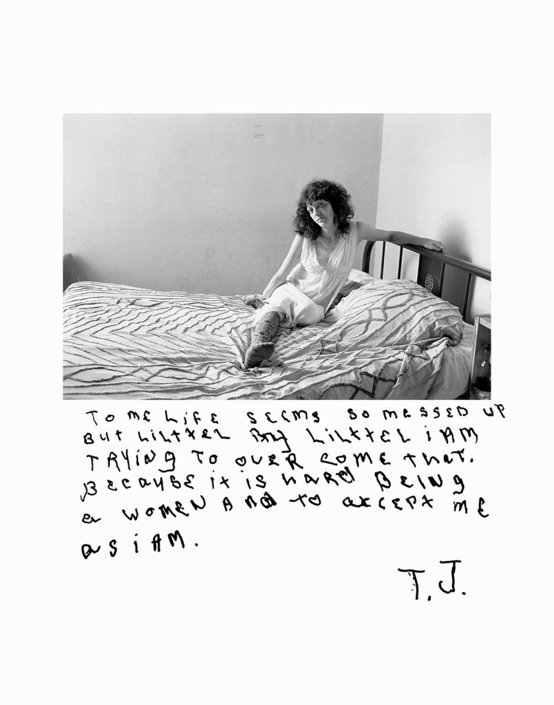
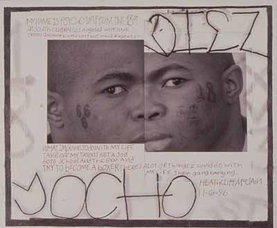
As well as this, I am interested in the idea of having my family write on images of themselves and each other, and contrasting the ideas they write of each other and themselves. This is inspired by the photographer Jim Goldberg, who used this technique in his projects, specifically Raised by Wolves, and Rich and Poor. This inspired me as the subject’s opinion of a photo of them or someone else in the project is often overlooked, and I think in my documentation of family, this is an interesting way of showing relationships and different feelings towards ourselves and each other.
Jim Goldberg’s use of subject opinions on photographs of themselves.
When and where do you intend to begin your study?
For my personal study, I want to begin by gathering images of my own home and my grandmother’s home, as well as objects within the home more closely. After that, I then plan to begin portraits of my mother and grandmother, both separately and then together. An important part of my family is the relationship between the two, and I want to include a series of the two together in my grandmother’s house. It is tricky when photographing your own family, and am doing some research into the problems that can occur when doing this. So far, I have read this article, which I found super helpful.
I am thinking of starting with photographing around the homes which I’m focusing on because this will familiarlise me with the light in both my house and my grandmother’s, and will also help me to gain inspiration for places to shoot in both homes and the further direction of the project. Another starting point for my project is starting with portraits, specifically double portraits. The idea is that I could include myself in these portraits, to produce outcomes all 3 generations of women in my family in front of the camera. This will be challenging as I haven’t made self – portraits before, but it is something I’m willing to try. If it doesn’t turn out well, I still can show all 3 generations but without me in front of the camera.
Latoya Ruby Frazer – The Notion of Family
Make sure you describe how you interpret the theme of ‘islandness’, the subject matter, topic or issue you wish to explore, artists’ references/ inspirations and outcome – photobook or film.
What makes Jersey special to you?
Jersey is special to me because of the way it influences Identity. I think that my family, the focus of my project, have especially been influenced by Jersey – the environment, the attitudes towards things here, the way they act and their interests. I think Jersey has unique characteristics and attitudes towards things, making it very special to me.
Beach culture in Jersey
What are the distinct qualities of island life?
There are lots of defining qualities of island life in my opinion. For example there is a strong sense of community in the island, within different cultures and parishes. Furthermore, in Jersey there are outstanding areas of natural beauty which make the island unique.
Plemont Bay
A sense of place and identity?
For a lot of islanders, there are specific places that feel at home to them. This may be a beach, a parish, a home or even within a community. These places give comfort and hold strong memories for Jersey residents and are crucial parts of many people’s identities.
Surf Culture in Jersey – an important community in Jersey and also within my family and its’ history
Theory of binaries. According to French philosopher, Jacques Derrida, meaning is often defined in terms of binary oppositions, where “one of the two terms governs the other.”. An example would be the white/ black binary opposition in the United States, the African American is defined as a devalued other. An example of a binary opposition is the male-female dichotomy, where male is the dominant gender and women are subservient (patriarchy).
Examples
InsideOutsideFemale Male RuralUrbanMonochromaticPolychromatic
Patriarchy: a system of society or government in which men hold the power and women are largely excluded from it, both within family, workplace and government.
Patriarchy is obligated to protect and care for the woman’s mental, physical, spiritual and financial wellbeing, That is failing to do so will lead to genuine prolonged harm in mind and body of the female. So patriarchy is simply an evolutionary protective social role and social construct.
Photoshoot and Contact Sheets
Below I have included some contact sheets with all of my images that I took through my two shoots for this project. Overall, I think that my photoshoots were only somewhat successful, as the images didn’t turn out as successful as I would have hoped as certain aspects contributing to the quality of the photographs, such as the exposure and shutter speed of the camera were not correct throughout these photoshoots. However, looking through my photos on first glance it seems like I will still have some good outcomes.
Least Successful Images
I have created a gallery with some of my least successful images in it, this is to demonstrate that not all photographs that come from shoots are good. These images mostly ended up being unsuccessful as they are too bright and fuzzy to be of good enough quality to be edited into final pieces. I will not be editing any of these images as I feel like they will not make aesthetic pieces of work. Furthermore, this could have been fixed it I had made sure the camera was on the right settings, so in my future photoshoots I can make sure I do this.
Editing Best Images
Below I have included a range of examples of editing some of my better images, making some of them monochromatic in Lightroom, and only adjusting the saturation, contrast and exposure of others. This was in an attempt to make these images more interesting and adequate to become final images.
Overall, I do think that my editing is mostly successful, with the black and white images being the most successful as it emphasises the different shades in the metal, this type of editing is colour that has the ability to simplify a scene by helping to diminish visual distractions. Again, a familiar thought processes used when processing black and white photography. Absence of colour becomes a great way to highlight other compositional elements in the frame, such as texture, shape and form.
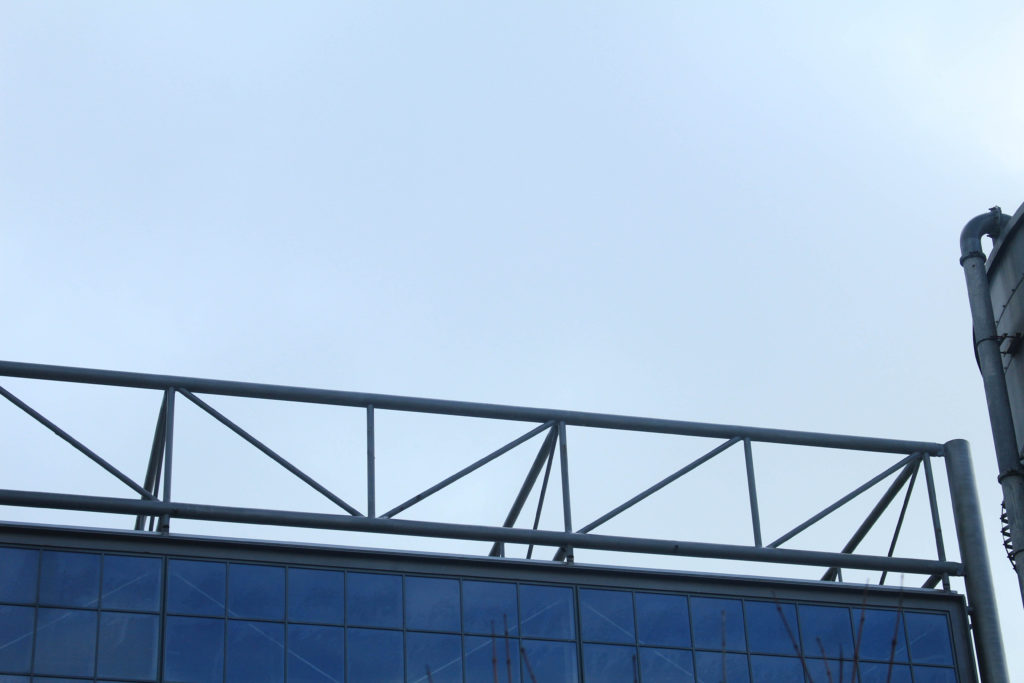
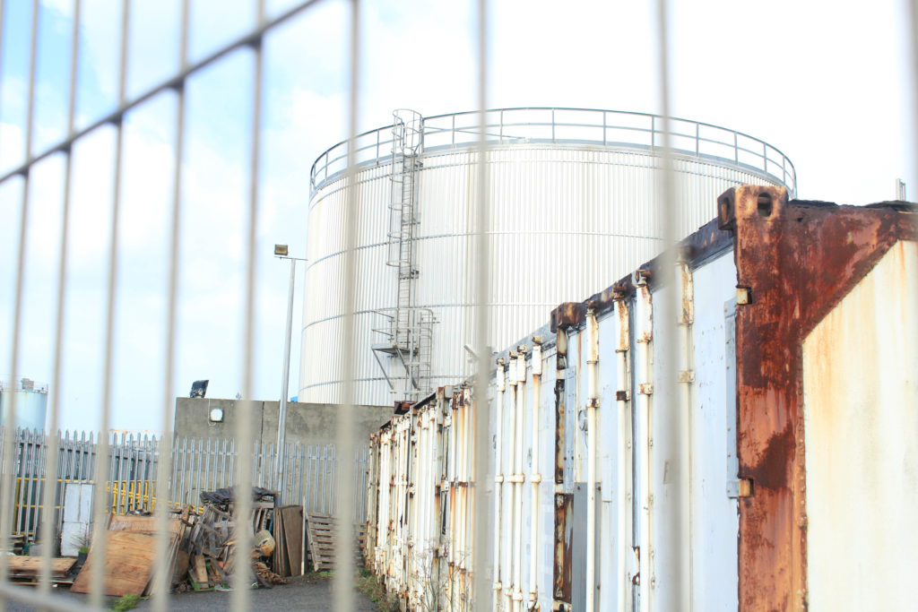
Rural vs Urban-Final Images
How my images link to binary opposites: I have been on two separate photoshoots to illustrate the ‘rural vs urban’ theme within the concept of binary opposites. This is important as it gave me an opportunity to demonstrate that my practical work can reflect different themes that have been presented as ideas that can be visually displyed.
I have placed these two images together as final pieces as I think that they oppose each other very well. with the landscape not having many naturally straight lines and sharp edges, and the metal lining contrasting this. Additionally, the first image is filled with some colour and texture, along with some darker lighting. Whereas, the image on the right is very bright, along with sharp edges and smooth textures, this means that the blues in the first image and the greys on the right mean that they can also match each other. They link to the theme of binary opposites as there is concepts of both rural-ism and industrialism, which is clear in both pieces.
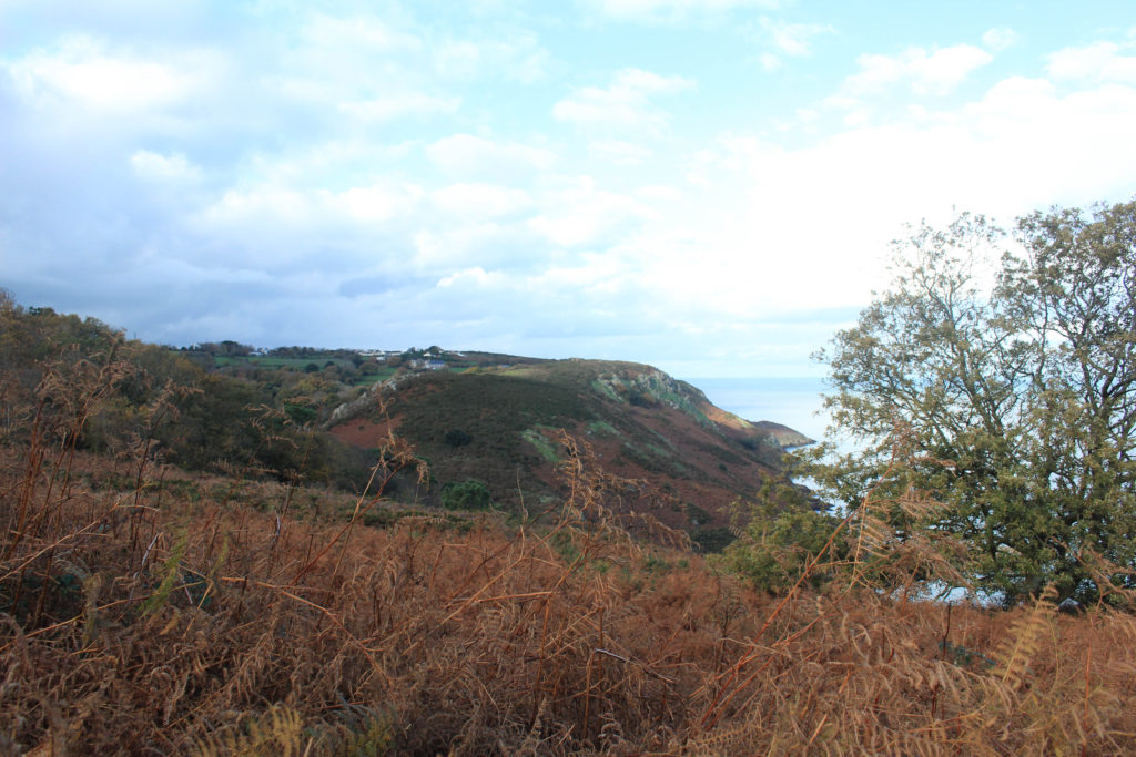
I have selected these as some of my final images as they look very good together, I have tried to make it so that they have been edited the same as each other, this is so that they match up better together, as they could be displayed as a pair instead of individually. Furthermore, I think that the monochromatic editing means that the lack of texture within the surfaces is seen, in my opinion this makes the images stronger rather than weaker. These images are similar to images created by the photographer Ansel Adams, this is important as it shows that I have considered and have been influenced by other artists, and when it comes to writing my personal study I will need to write about such photographers throughout my essay.
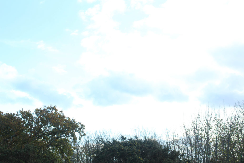
I have selected this as my fifth and last final image from these shoots as I think that is the most aesthetically pleasing of all of the images, this is because of the composition of it. The fact that there is both natural life in the form of trees, and metal framework, means that this image alone represents the theme of binary opposites. Additionally, I think that the different areas of sky which are very light grey, contrasts with the darker grey in the structural work and industrialism. In my opinion, this is the most successful of my final images mostly because of the overall quality of the image and how smooth all of the work looks.
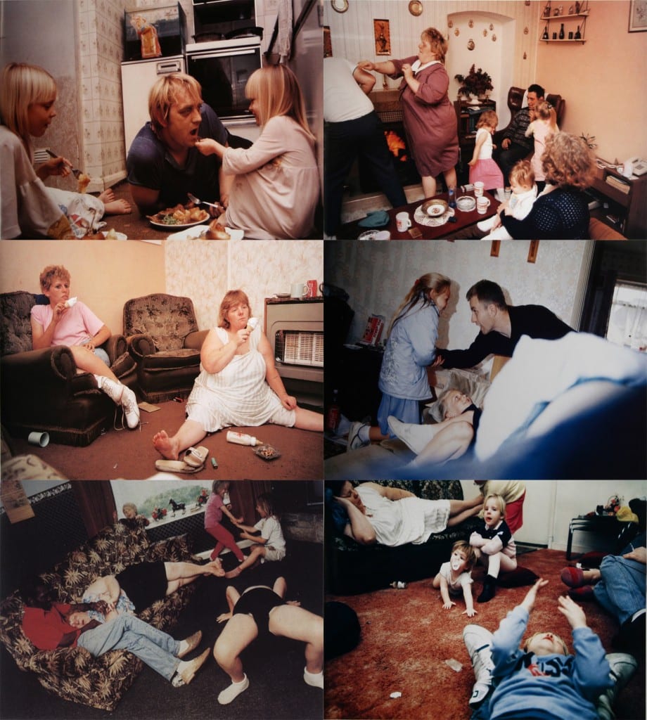
Gavin and his then girlfriend, hugging, High Wycome, UK early 1980’s
NICK WAPLINGTON
An image taken from Waplington’s photobook, ‘Living Room’
Nick Waplington is a British artist and photographer. He first developed interest in photography in 1984, when he would visit his grandfather on the Broxtown estate in Nottingham and regularly photograph his surroundings. He began experimenting taking photos of his friends and family, which led to become his body of work – starting with his first photobook in 1991 titled ‘Living Room’ where he spent four years documenting the daily lives of two families living on a council estate in Nottingham, capturing the raw, unfiltered lives of working-class Britain through a range of candid images. This series inspires me because of how Waplington captures the essence of British culture through candid photos, and how everything is stripped down to the point you can almost feel the atmosphere in the images, almost as if you are in the living room with him.
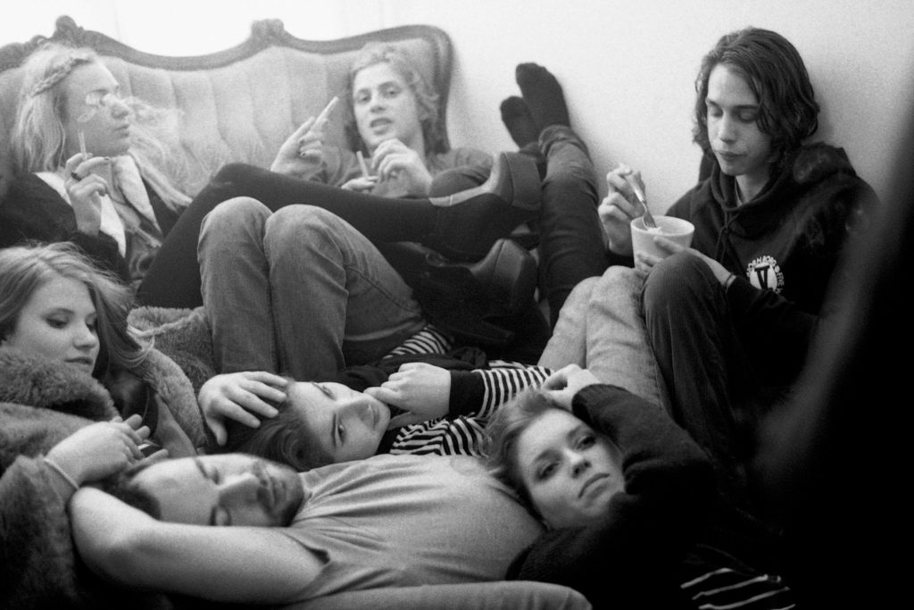
Images taken from Waplington’s photobook ‘Anaglypta’
Of all Nicks work, the project that stood out most to me is his photobook Anaglypta. Containing over 500 images, Waplington produced this photobook over the span of almost 40 years, in three different continents, of what seem to be friends and acquaintances in the punk/raver/left wing protestor scenes in London and in the earlier years of the book, more so in New York. In some ways it is percieved as a non-linear documentation of Waplington’s life – in his words the book is ‘anything you want it to be.’ What stood out to me about this book is seeing Waplington’s photography style improve and change over the years, and the wide range of setting and subject featured in this zine, which has inspired me to go out different places to document as much as i can. This book is similar to my theme, as it focuses on identity within different communities, not just in Waplingtons hometown, but around the world.
GIOIA DE BRUIJIN
An image taken from De Bruijin’s photobook, ‘Weekend Warriors’
Born in, in, Gioia de Bruijn views community and identity through her own eyes, capturing the hedonistic lives of adolescents around the world through raw and intimate images. Her photobook ‘Weekend Warriors’ is a documentation of the rave and afterparty culture in London, Amsterdam and Berlin. She follows around a group of friends, photographing them at their highs and lows and captures the essence of youth through a showcase of grainy black-and-white images. Bruijin’s work inspires me because there is an element of togetherness found within the rave community that she perfectly depicts and although some of her work may be controversial, it is realistic and relatable, which is why it inspires me.
An images taken from her photobook ‘Smells like Summer’
Another work by De Bruijin that inspires me is her photobook ‘Smells like Summer’ A mix of landscape and portrait photography, she perfectly creates the vibe of summer within her work, immersing the viewer in her images to the point they can almost feel the cool summer breeze. De Bruijins work, this zine in particular, is simple yet so effective in the way she captures youth enjoying summer days through candid photographs, like the one above. Lighting and setting play a big role in this project, e.g this image of a group of teenagers stood outside an ice cream shop, such a stereotypical scene that viewers find themselves relating to this image and feeling a sense of connection, which ultimately is the whole concept of identity and community through De Bruijin’s eyes.
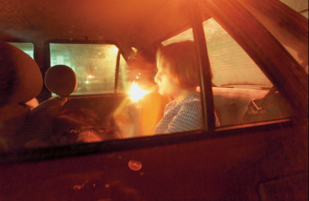
TOBIAS ZIELONY
An image taken from Zielony’s collection ‘Car Park’
Tobias Zielony is a German photographer and filmmaker. His work revolves around teenage communities in public spaces. Here, they are in command, with nobody to tell them what do to; here, they are among their own kind. Regardless of where his pictures are taken – whether in Wales, Marseille or Los Angeles – the subject is the same. In his words, “The places have nothing in common, and yet they form the background for very similar events. Everywhere, there are people hanging out on the street.” While studying Documentary Photography at the University of Wales, Zielony was first drawn to “anti-social” youth culture in Britain. In shady Bristol car parks, his series Car Park captured listless young Brits in a desolate urban landscape, depicting teenage society through a display of images, dimly lit by the flame of a lighter.
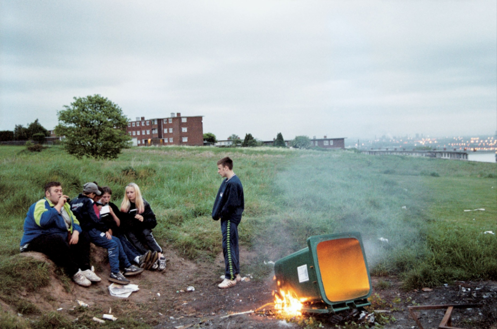
An image taken from his photobook ‘Curfew’
His photobook Curfew is a more surreal depiction of youth culture. Subtitled ‘A Journey into the Night’, the book shows average activities in a hedonistic teenage life through raw and gritty images – the photos are thrown at us without filter for an insight into what teenagers do when left to their own devices. When speaking about his book, Zielony said ‘There was a time in my childhood when I had to return home when the streetlights were turned on. The young people I photographed in Bristol, Newport, and Cwmbran prefer to stay out later. Hanging around bus stops, street corners, car parks and wastelands at the edge of town, they wait for something to happen. Some of them however have got into trouble. It is only since the beginning of the year 2001 that the police have imposed curfews on individuals. James, Nathan, John, Craig, Lee, they all to have to be back home at nine o’clock p.m. and stay in all night with the police calling every so often to check if they accord to the curfew.’
In what way have Jim Goldberg and Ryan McGinley represented youth in their work?
The essay does address the hypothesis clearly throughout. It provides insight into the life of adolescents and individuals of specific groups showing both the beauty and adventure of being young as well as the challenges and the bleakness of reality.
The essay are well structured with a sense of introduction, paragraph and conclusion.
The essay shows confident use of language, punctuation and specialist terminology to express complex ideas with authority.
The essay shows deeper analysis of an artists oeuvre
The essay shows evidence of further reading in the context of politics, history, art and religion
Presents use of direct quotes, summary and commentary from others to make an informed and critical argument.
The student included photographs listing name of artist, title of work and year of production.
I want to use this project to explore ideas of heritage and identity through the lens of islandness, using as a chance to compare and contrast culture here in Jersey to my own South Asian heritage.
Why it matters to you?
My heritage is something very important to me, especially as non-white person growing up on a predominantly white island in the UK. I enjoy exploring it because South Asian culture is something that is rarely seen here and it allows me to share my culture with others while also getting to learn more about it myself.
How do you wish to develop this project?
I am planning on making a photobook from this project so will need to carry out a large number of planned shoots so I have enough material to work with.
When and Where you intend to begin your study?
I am planning on uses a variety of artist references whose work revolves around the concept of heritage, family and identity and conducting shoots inspire by them, making sure to implement parts of my traditional culture to further push these themes and add more visual interest.
I am planning on starting off by looking at French photographer, Vasantha Yogananthan, specifically his work “The Myth of Two Souls” which is a retelling of The Ramayana using images from modern day India, Nepal and Sri Lanka. I like how he ties his images back to text as well as his editing style and am planning on doing a shoot inspired by his work at some point in the future.
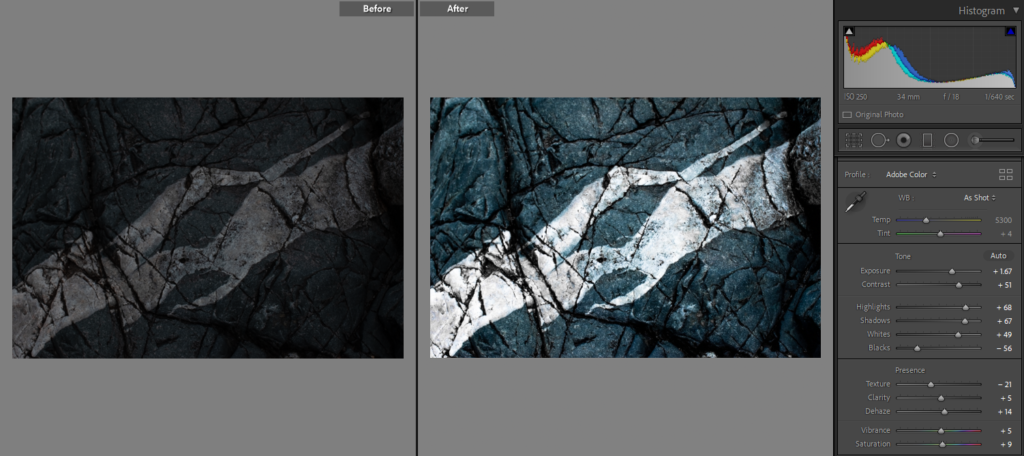
Those are the images I flagged as usable after evaluating exposure, sharpness and overall aesthetic.
Experimentation
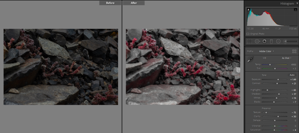
Firstly I increased the exposure as the ISO was too small and the picture was a bit under exposed, increased the contrast because the shadows and the darks became greyish and I needed to add some depth, for this reason I also decided to increase the shadows. As the photo was a bit too dark I decided to increase the whites as well. I wanted to picture to be a bit more mellow so i decreased the texture because adjusting the balance and increasing the contrast made it a bit to gritty. I also decreased all the other colours and increased the red and pink as I felt like the monochrome format would also help keep it simple and mellow.
First I turned it into a black and white image to eliminate the distraction of colour, then I increased the contrast and the texture options to make the textures even more prominent as well as increases the highlights and the blacks. I had to turn down the shadows as they spread too much and took over some of the textures.
Firstly, I increased the contrast to make the imperfections stand out more as well as increase the shadow and the whites, i turned downs the blacks so that the picture wasn’t too dark. I decreased the texture setting so that it didn’t look so gritty. I turned the temperature down to make it colder.
Increased the exposure as the picture came out a bit dull, increased the contrast and increased the shadows to make the picture more dramatic and turned down the temperature to give it a more cold colour and turned up the texture to make it sharp
This photo was very underexposed so i turned up the exposure and increased the contrast, highlights and shadows to make it less dull and add tonal range.
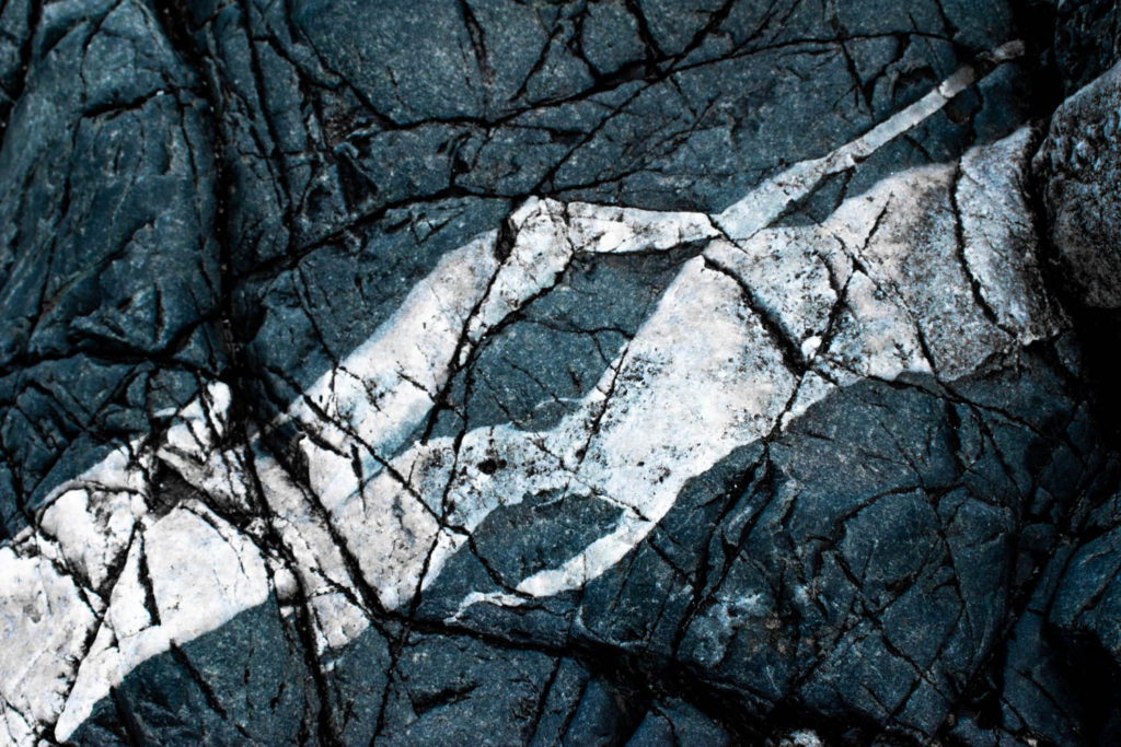
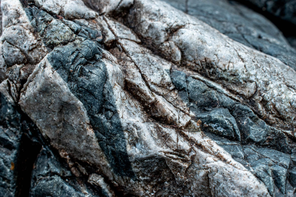
Final Outcomes
The photograph is rather mellow as the textures are smooth and the colour pink adds to the calmness and joyfulness of the photograph, in addition I think pink represents a certain kind of gentle feminine power almost as a good mother. This creates a nice contrast to reality as rocks are usually rigged with more bluish and earthy undertones. In this photograph we can see a variety of rock sizes as well as flowers growing from underneath. Through this I wanted to show that rocks aren’t just rough, dull, lifeless objects but rather a strong but gentle foundation for life to strive and a crucial part of our mother earth.
In this photograph we can see a few types of plants and fungus growing on a rock which makes it full of different, interesting textures. The photograph is monochrome as colours would be too much considering the amount of textures, and would definitely be distracting. The grey colours also convey the neutrality and the balance of the natural world. The rough textures attract the eye and intrigue the viewer, giving them loads to look at. In addition I think rough textures convey the inconsistencies and imperfections of nature well. Strong, hard textures also represent the masculinity of nature, evoking the feelings of stability and conveying the longevity and resilience of the sublime which is able to withstand the test of time.
Evaluation: Overall I enjoy the detail and the texture of the photographs. I could improve on adjusting the camera settings and sharpness next time maybe by taking a few pilot shoots.
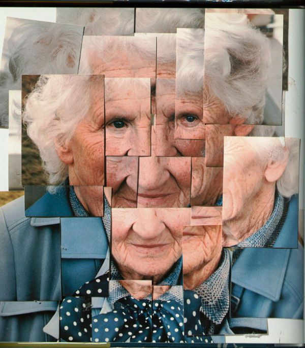
David Hockney is an English painter, draftsman, printmaker, stage designer and photographer. His work is characterised by the exploration of traditional techniques such as oil painting, print making and digital reproductive technologies as well as fascination with light and mundane realism. His contribution to the Pop art movement made him considered one of the most influential British artists of the 20th century.
He studied at the Bradford College of Art and the Royal college of Art, London where he received a gold medal in the gratitude compensation. He went to teach at the university of Iowa, Colorado and California in 1964 and permanently settled in Los Angeles in 1978. The city’s intense light and “California modern” aesthetic influenced his work.
Much of Hockney’s work was autobiographical including self portraits and incidental scenes of his friends such as the Pool with Two Figures.
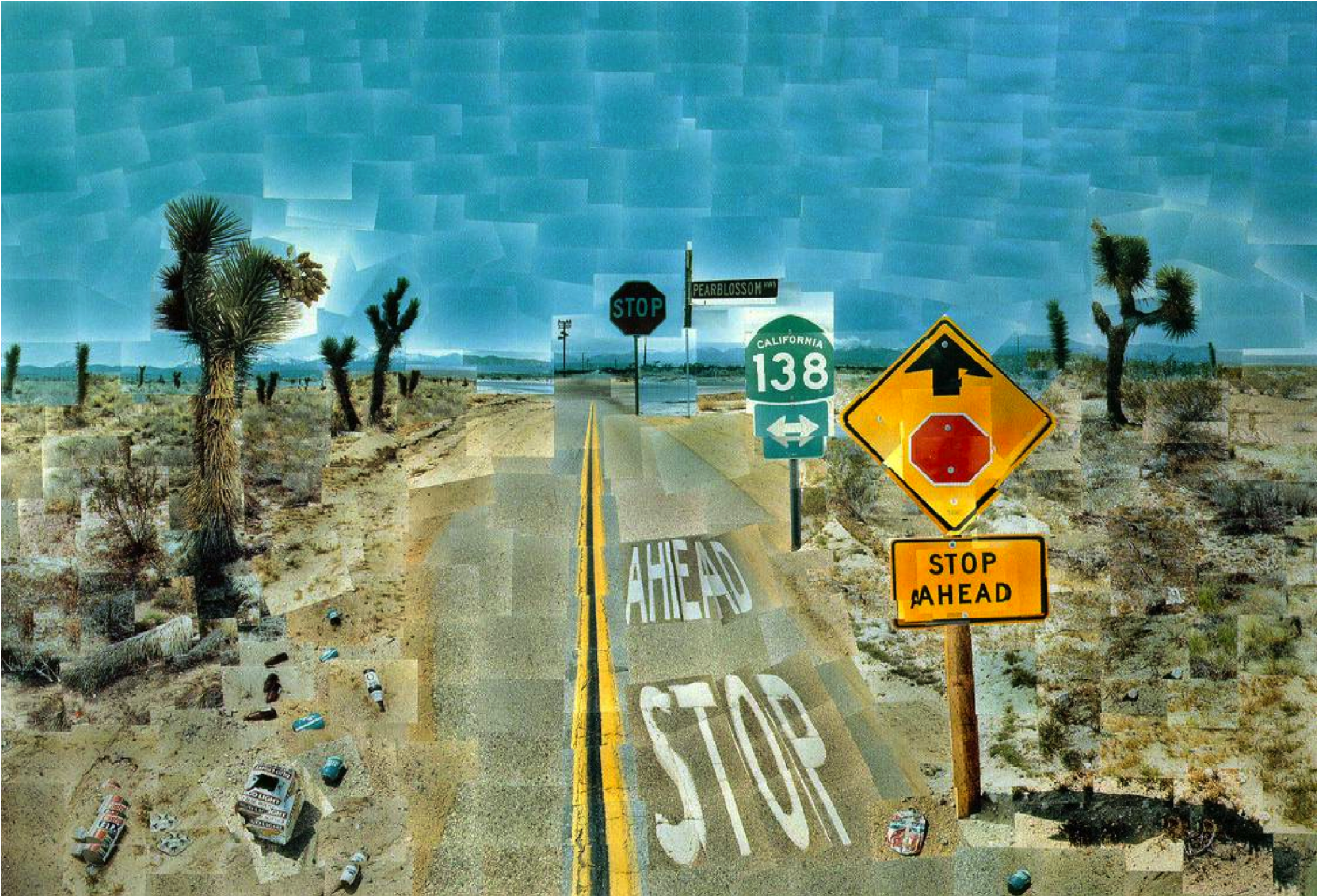
In the early 1980s, Hockney started to experiment with photocollages he called “joiners”. He started off with polaroid prints, then 35mm, processed, coloured prints. Using multiple prints of a single subject he would arrange them to make one image. Since the photographs are takin from different perspectives and slightly different lighting, the final collage gives an effect similar to Cubism.
This image shows an elderly couple solving a crossword puzzle. I chose to analyse Hockney’s joiner because he captures something not many artists do, and that is time. He said “Photography seems to be rather good at portraiture, or can be. But, it cant tell you about space, which is the essence of landscape. For me anyway. Even Ansel Adams cant quite prepare you for what Yosemite looks like when you go through that tunnel and you come out the other side”. He also quoted “The space is the illusion, but the time is not the illusion”. Almost all photographs only capture a frame of a certain moment in time, Hockey’s joiners consist of multiple pictures taken at different points in time, they show the development of emotions throughout time. Time is also highlighted in the process itself, as he took each individual shot in a space of an hour, he had to wait for them then put them together. The overall tone of the photograph is rather dull, very blueish grey, influenced by the colour of the walls, the objects on the table, the hair of the subjects and even the weather outside. Although the picture is cool toned the warmer colours in the faces of the subjects create a pleasant contrast, standing out and so acting as the focal point of the photograph.


.jpg?w=780)