Theory of binaries. According to French philosopher, Jacques Derrida, meaning is often defined in terms of binary oppositions, where “one of the two terms governs the other.”. An example would be the white/ black binary opposition in the United States, the African American is defined as a devalued other. An example of a binary opposition is the male-female dichotomy, where male is the dominant gender and women are subservient (patriarchy).
Examples


Patriarchy: a system of society or government in which men hold the power and women are largely excluded from it, both within family, workplace and government.
Patriarchy is obligated to protect and care for the woman’s mental, physical, spiritual and financial wellbeing, That is failing to do so will lead to genuine prolonged harm in mind and body of the female. So patriarchy is simply an evolutionary protective social role and social construct.
Photoshoot and Contact Sheets
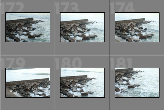
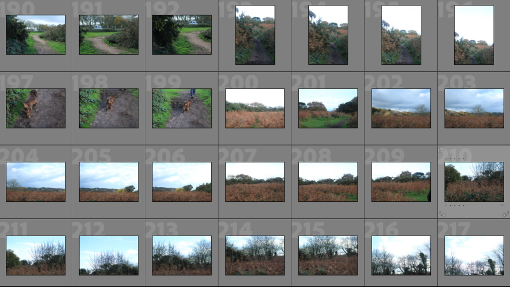
Below I have included some contact sheets with all of my images that I took through my two shoots for this project. Overall, I think that my photoshoots were only somewhat successful, as the images didn’t turn out as successful as I would have hoped as certain aspects contributing to the quality of the photographs, such as the exposure and shutter speed of the camera were not correct throughout these photoshoots. However, looking through my photos on first glance it seems like I will still have some good outcomes.


Least Successful Images
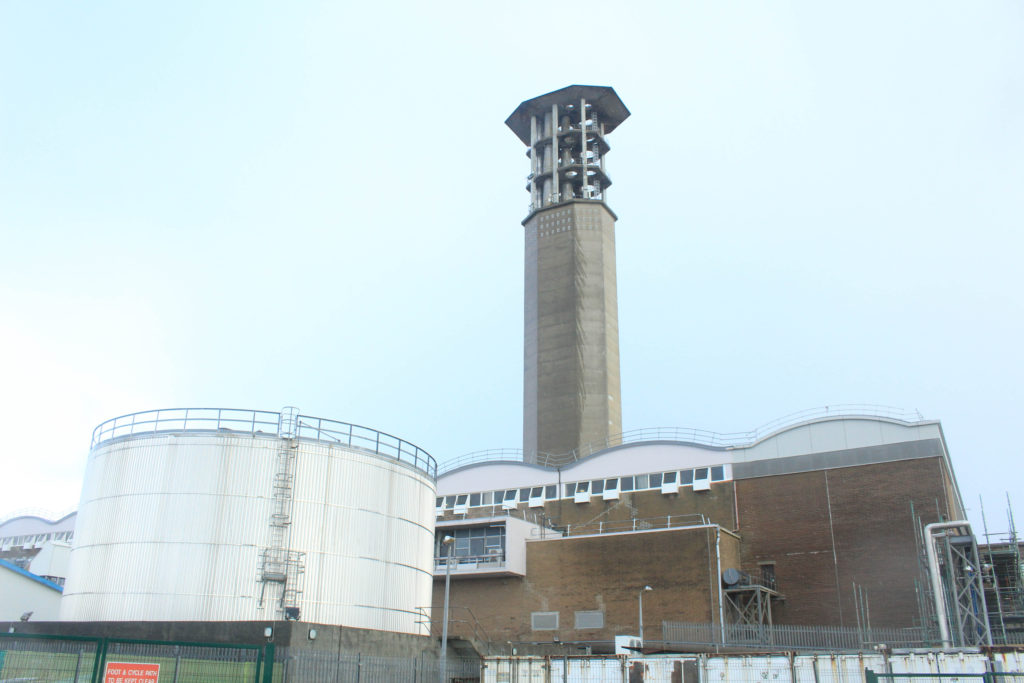
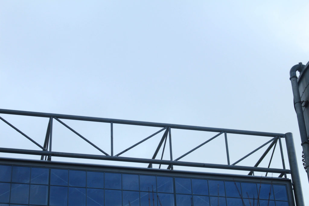
I have created a gallery with some of my least successful images in it, this is to demonstrate that not all photographs that come from shoots are good. These images mostly ended up being unsuccessful as they are too bright and fuzzy to be of good enough quality to be edited into final pieces. I will not be editing any of these images as I feel like they will not make aesthetic pieces of work. Furthermore, this could have been fixed it I had made sure the camera was on the right settings, so in my future photoshoots I can make sure I do this.


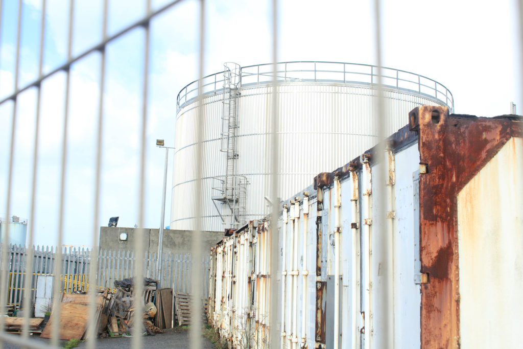
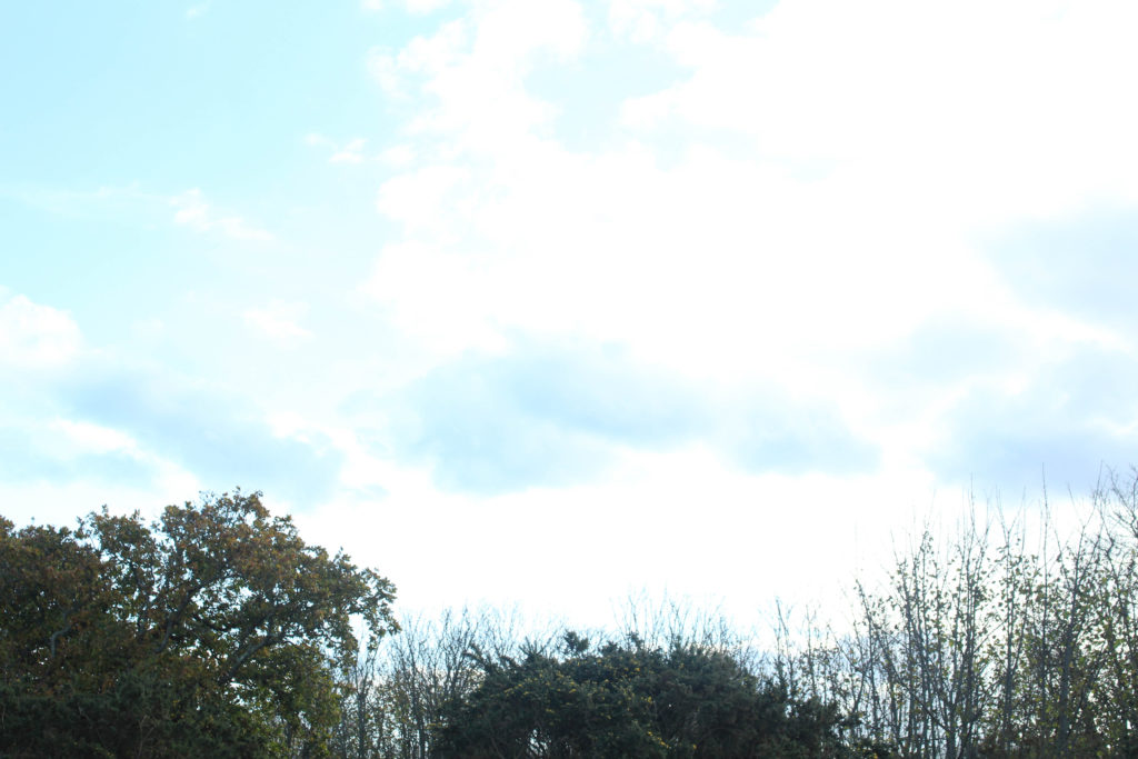


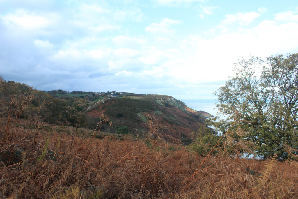
Editing Best Images
Below I have included a range of examples of editing some of my better images, making some of them monochromatic in Lightroom, and only adjusting the saturation, contrast and exposure of others. This was in an attempt to make these images more interesting and adequate to become final images.

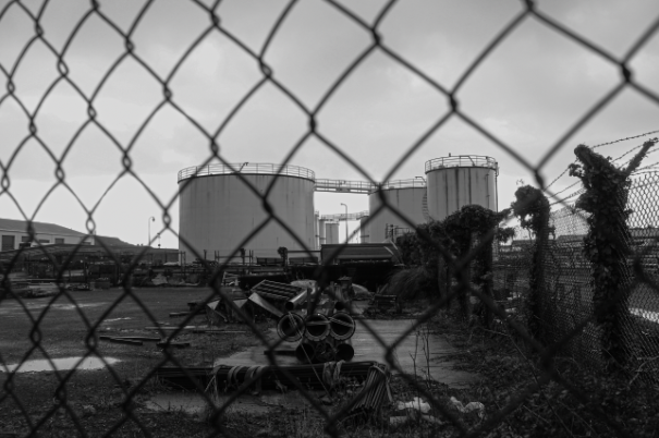

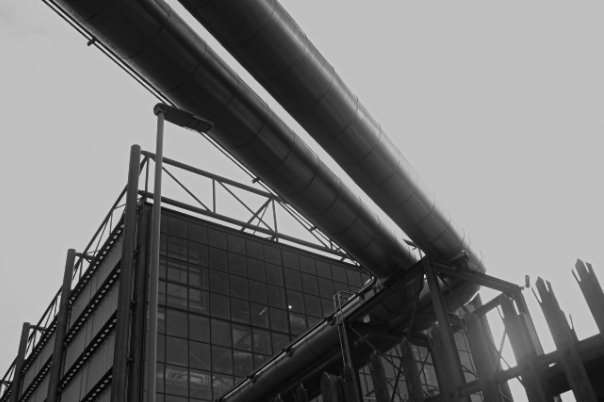
Overall, I do think that my editing is mostly successful, with the black and white images being the most successful as it emphasises the different shades in the metal, this type of editing is colour that has the ability to simplify a scene by helping to diminish visual distractions. Again, a familiar thought processes used when processing black and white photography. Absence of colour becomes a great way to highlight other compositional elements in the frame, such as texture, shape and form.

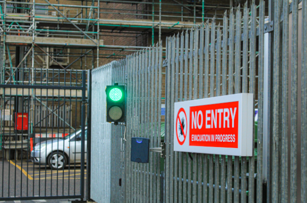


Rural vs Urban- Final Images
How my images link to binary opposites: I have been on two separate photoshoots to illustrate the ‘rural vs urban’ theme within the concept of binary opposites. This is important as it gave me an opportunity to demonstrate that my practical work can reflect different themes that have been presented as ideas that can be visually displyed.


I have placed these two images together as final pieces as I think that they oppose each other very well. with the landscape not having many naturally straight lines and sharp edges, and the metal lining contrasting this. Additionally, the first image is filled with some colour and texture, along with some darker lighting. Whereas, the image on the right is very bright, along with sharp edges and smooth textures, this means that the blues in the first image and the greys on the right mean that they can also match each other. They link to the theme of binary opposites as there is concepts of both rural-ism and industrialism, which is clear in both pieces.


I have selected these as some of my final images as they look very good together, I have tried to make it so that they have been edited the same as each other, this is so that they match up better together, as they could be displayed as a pair instead of individually. Furthermore, I think that the monochromatic editing means that the lack of texture within the surfaces is seen, in my opinion this makes the images stronger rather than weaker. These images are similar to images created by the photographer Ansel Adams, this is important as it shows that I have considered and have been influenced by other artists, and when it comes to writing my personal study I will need to write about such photographers throughout my essay.

I have selected this as my fifth and last final image from these shoots as I think that is the most aesthetically pleasing of all of the images, this is because of the composition of it. The fact that there is both natural life in the form of trees, and metal framework, means that this image alone represents the theme of binary opposites. Additionally, I think that the different areas of sky which are very light grey, contrasts with the darker grey in the structural work and industrialism. In my opinion, this is the most successful of my final images mostly because of the overall quality of the image and how smooth all of the work looks.
