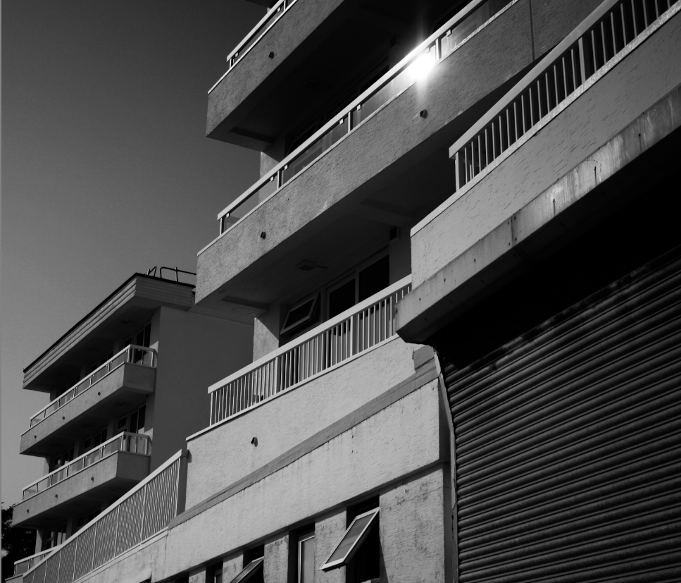
Weakest Work
Below I have included a variety of examples of my weakest work since the start of year 12, this helped me as I got to look through all of my work since the start of year 12 and do a self assessment to discover which of my work I would not like to take inspiration from for my personal study which I will be starting soon.
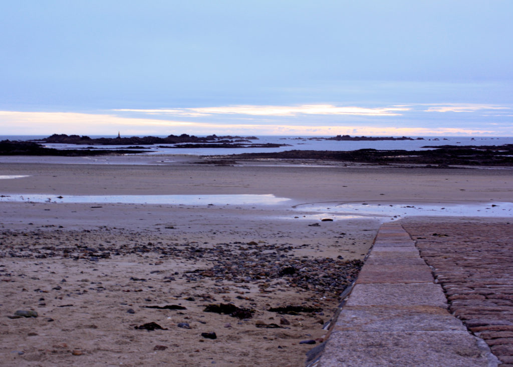
Heritage Project
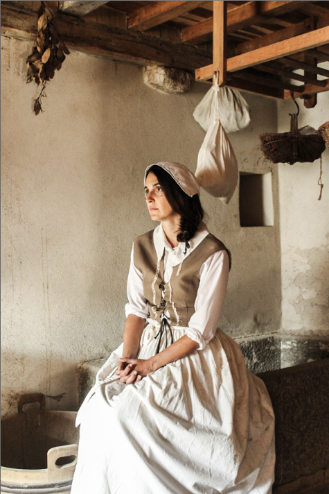
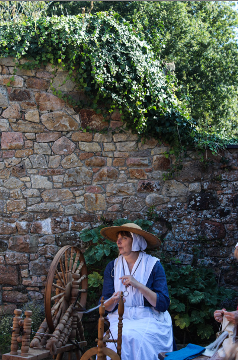
I would consider my heritage project to be my weakest class trip photoshoot. I think this was mostly because it was my first time using a camera outside of the class, along with being unfamiliar with the settings and how to change the settings of the camera, this photoshoot was mostly unsuccessful, with me only producing 4 final outcomes, and three of those being the same image edited in three different ways.
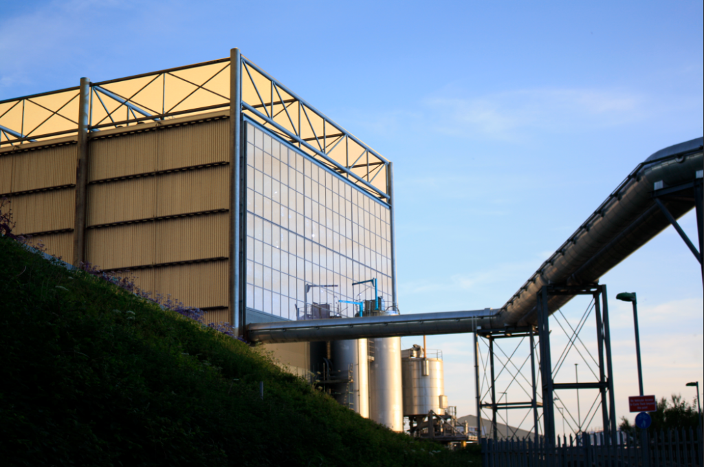
Despite enjoying this photoshoot, I don’t think I will be including the Island’s history in my personal study, as I think because I’m not as interested in this idea that my images would not be good enough to be put into my future photobook. This is important for to recognise as even if I’m not sure on what my final study will be about, I am aware of what I enjoy in photography and the fact that historical sights don’t interest me as much as developing sights, such as the incinerator. This project was by far not my worst but most of the images that turned out successful were all down to luck.
Romanticism- Rural Landscapes
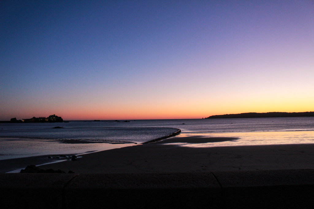
This was a project in which we had to explore the theme of Romanticism, inspired by Ansel Adams. I thought that this project was actually quite interesting to learn about inside and outside of class. Despite me enjoying this project my final outcomes weren’t as successful as I would have liked as I didn’t take enough time to do the photoshoot in the first place, and a lot of my original images came out too under- exposed or blurry.
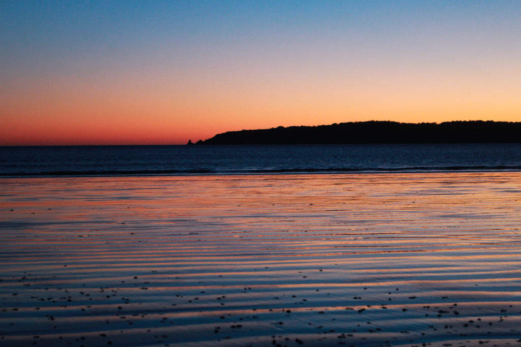
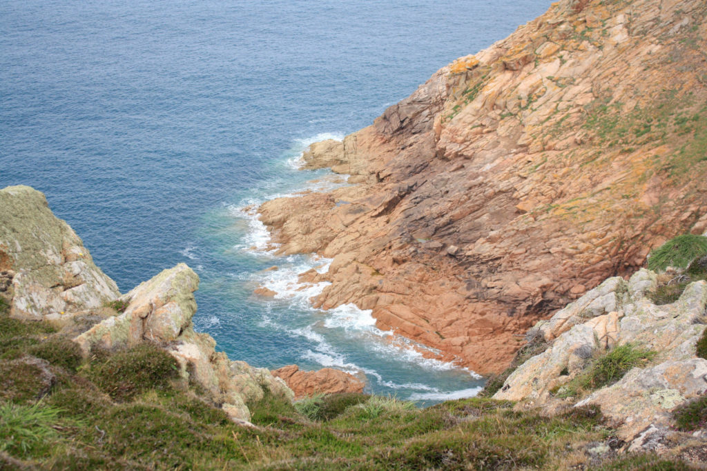
For example this image above is one of my better pieces of work, it is one of my only good outcomes from this whole project, this image ending up being a lot more successful than I would have thought as I didn’t even end up editing it to make it look better. The quality of this image is still very high as I like that the vibrancy of the colours is all natural and not manipulated into the image.
From this project I learned that I liked learning about and photographing landscapes, this was because I got to explore the areas of Jersey, some of which I had never been to before. I would like to include landscapes in my project as I think that my images come out a lot better than the ones I take of people.
Joiners
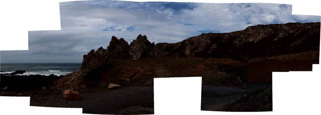
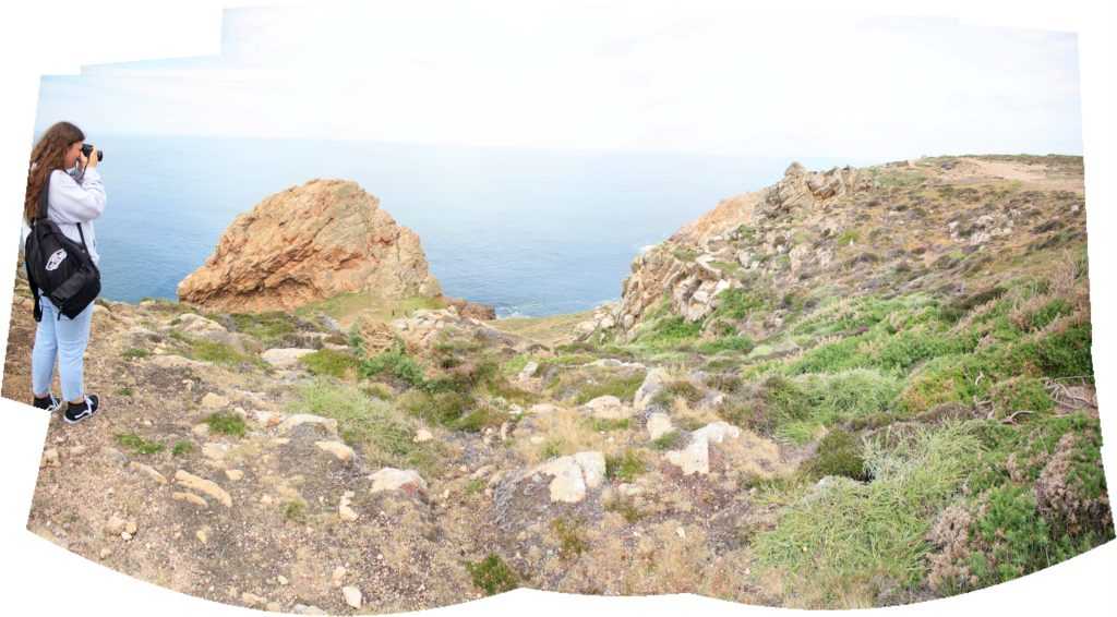
These joiners did not turn out successful at all and this was because I didn’t like the experimentation, editing and formatting that came along with creating Joiners. In addition to this, when creating my Joiners, I came across the problem of me not having enough images to make the best Joiners I could, despite all of this I still didn’t end up liking any of my Joiners, this may have been because of the images I have taken.
Furthermore, the research behind creating the Joiners and the artist references included did not have any interest to me and I think this is one of the reasons why I did not put as much effort as I could into these pieces of work. Additionally, I thought that the images I used to create my Joiners weren’t that good, as you can see above it could be argued that this joiner was created with images that are all too over-exposed, as during this class trip I still wasn’t as used to the camera settings as I am now, I think that getting used to the camera and understanding how the settings work has played a key role in how much better my work has gotten.
Strongest Work
Below I have included a variety of examples of my strongest work since the start of year 12, this has helped me as I got to rediscover the work where I created the best outcomes that I had forgotten about. Throughout my final ‘Islandness’ project I will be taking a lot of inspiration from some of my old projects, as they were the most enjoyable for me to photograph and ended up being part of my strongest pieces of work.
Anthropocene Project
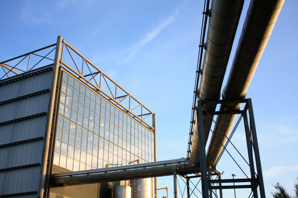
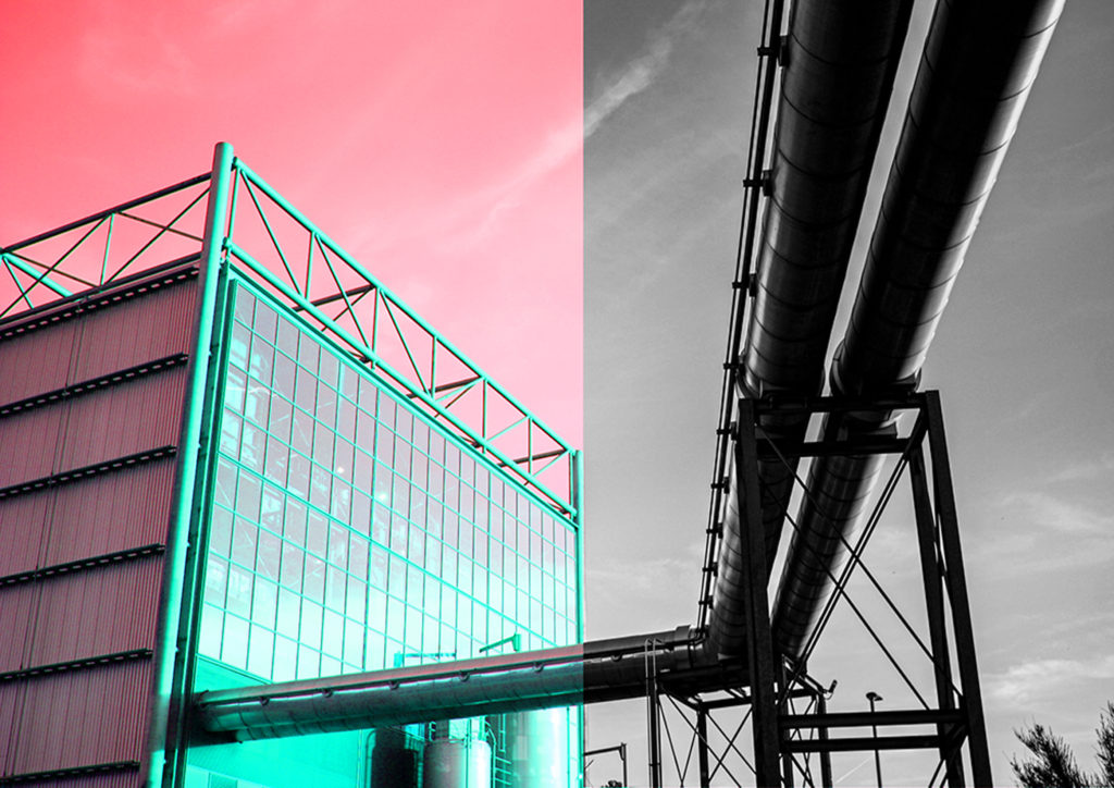
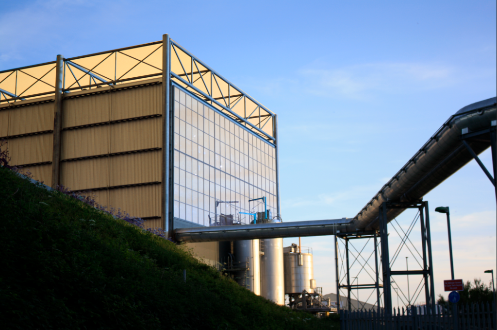
I am going to take a lot of my inspiration for my personal study from my Anthropocene project, this is because I think that this was the area of work where I created the most successful final outcomes, along with this being my favourite exam and topic we have done so far. By the end of the exam, I had only created 5 final outcomes, 4 images and one typology, the aspect I enjoyed most about this work was the practical process. Photographing the incinerator was a fun experience as I got to go into the sight and get images that no one else would have. Additionally, I think that the editing process was so fun for me as I got to use some experimenting skills for the first time, such as using the ‘invert’ tool in photoshop which meant that I had a new style of editing.
I have included some of my best outcomes from this mock exam, I think these are the strongest pieces of work I have ever produced, despite being made in year 12 and me having more experience now, I think that it was mostly because the quality of my original images was so good that went I put the photographs through such drastic editing, they still looked good. Its very important for me to take inspiration off this concept and even the editing style as images, as this was by far my favourite project I have done.
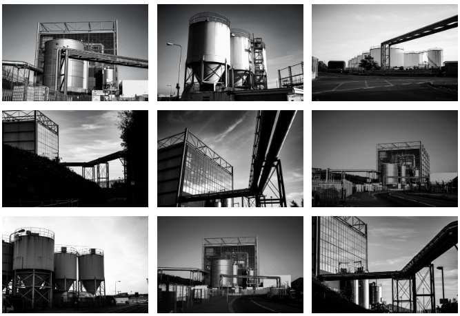
Additionally, this project gave me my first opportunity to create a typology for an exam piece, I didn’t plan on creating this piece but thought it was a good chance to show that I can arrange images so that they look aesthetic once they are put together. This made this project a lot more fun for me as it meant that I had an aim when going out on my photoshoots, as it was a good way to showcase all of images together and was good to show the overall pieces from my project. This was successful as it linked to my favourite theme so far in my photography course and it meant that I put a lot more time and effort into this piece.
Portraiture
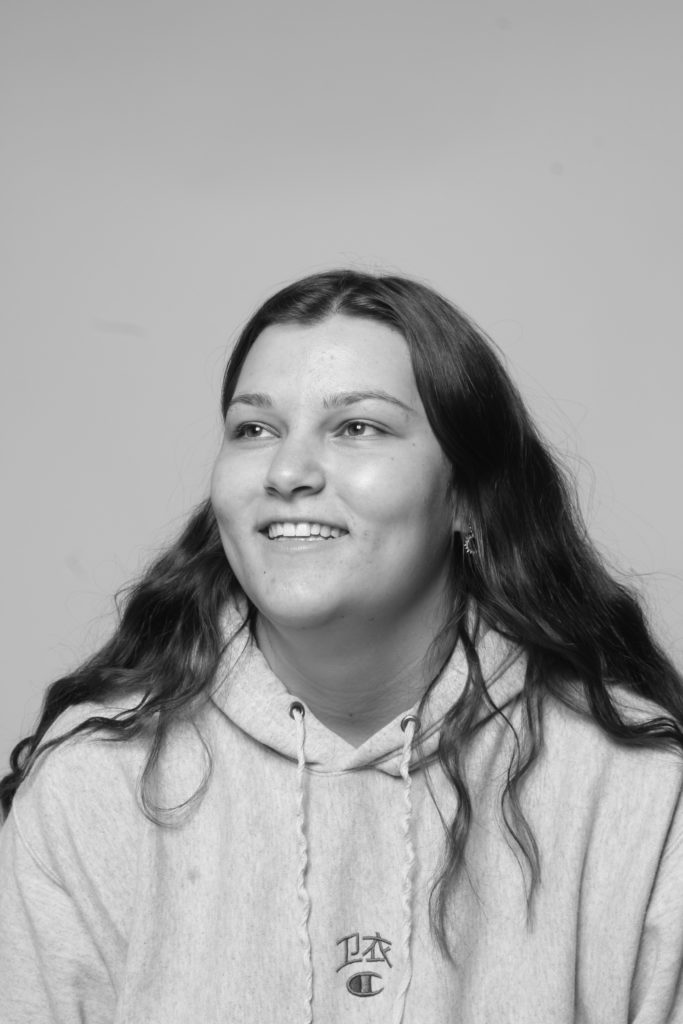
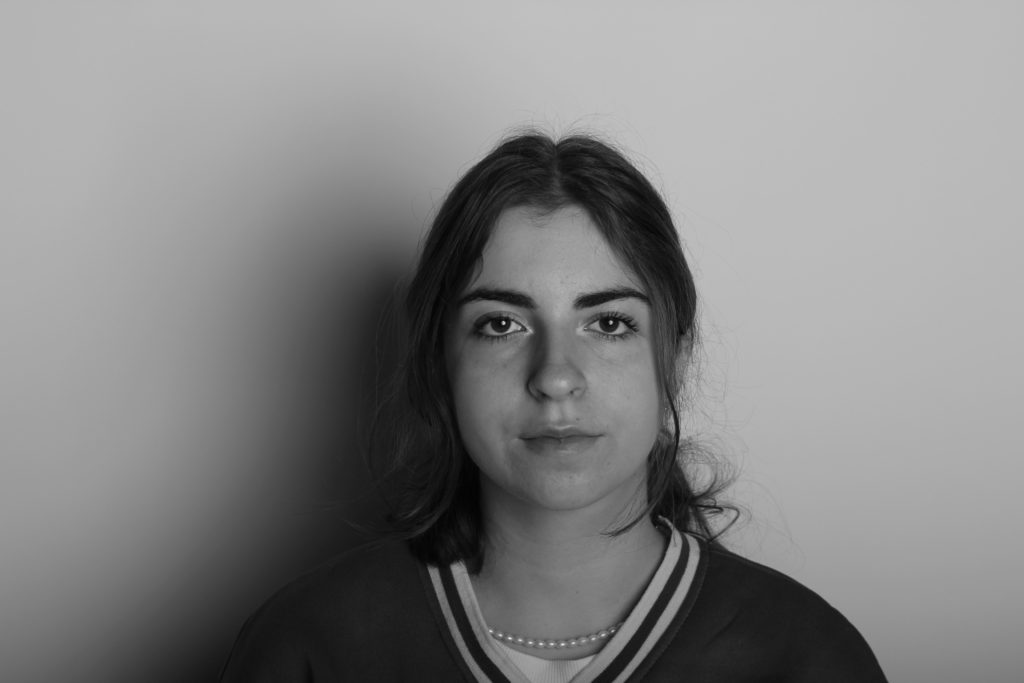
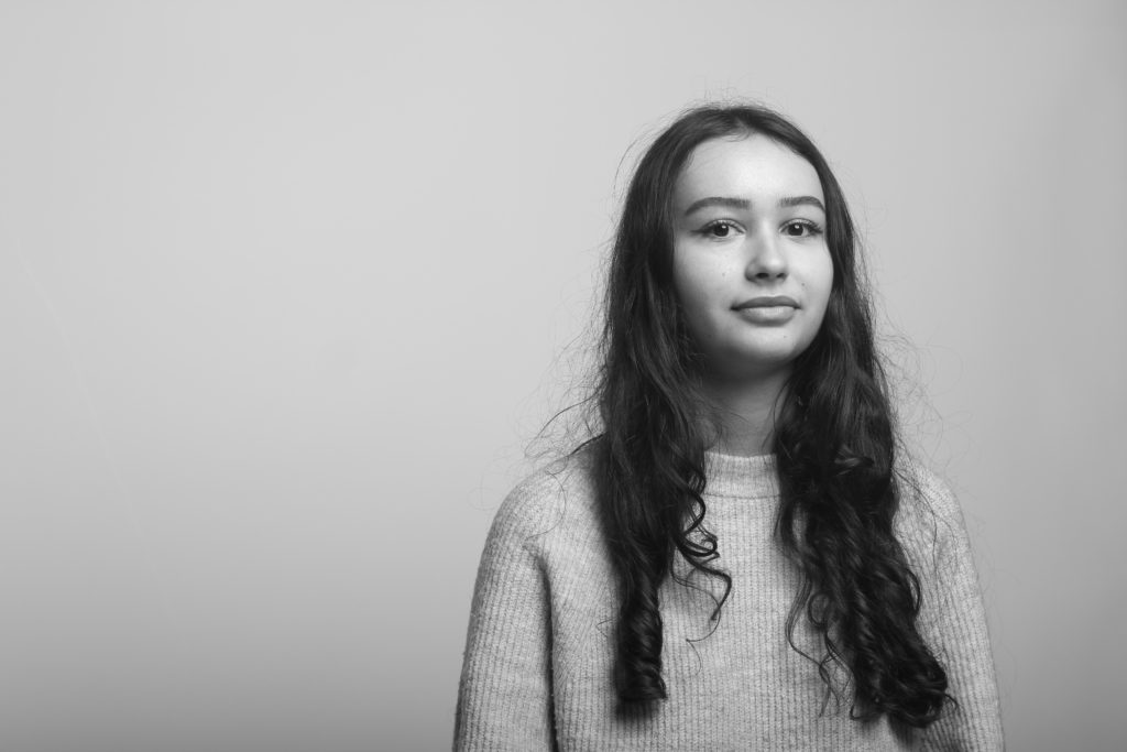
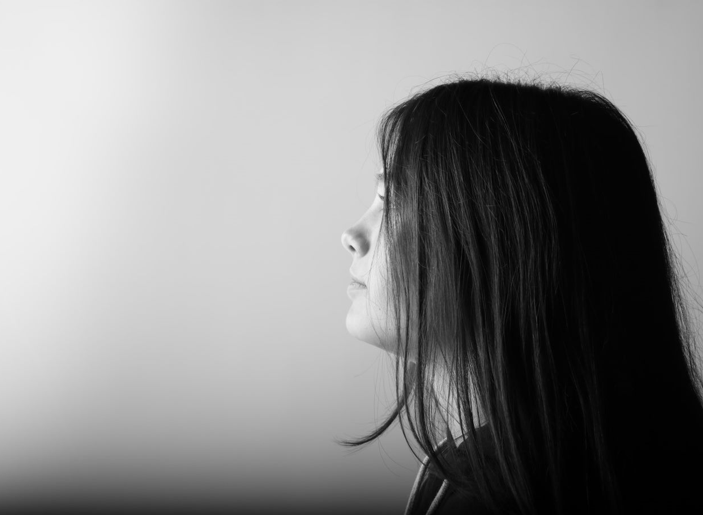
My portraiture project took place at the start of year 12, after the Heritage project was over, we had a visit from Oliver Doran where the topic of studio work and lighting was first introduced to us. Before taking these images, we were taught how to control the flash and one point lighting and manage the camera settings.
Along with not finding this task very exciting, I didn’t really know how to work Lightroom or Photoshop as well as I do now, this meant that some of these images turned out to be too over-exposed and too under-exposed. My final outcomes for this project were not as successful as I would have liked, I think this is because I don’t enjoy studio work as much as I enjoy work outside of class and creative/ practical tasks we have done in the past.
This project made me not as much effort into it as I should have and this is definitely reflected in my final prints as the lighting and techniques are just not as good as they should have been. However, some of these images turned out to be successful, this is because of the good camera settings that were put there for us before taking the images. I really liked that some of these images turned out to be a lot better than I thought, even as I thought this was boring I think that this project turned out to be good considering that it was one of our first opportunities in the studio.
Islandness
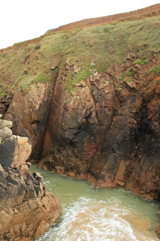
Islandness was one of our most recent projects, as we went out on two school trips and got the opportunity to explore the northwest coast of the island. I thought the concept of this project would not be as good as the outcomes came out to be. As learning about Islandness meant learning about the history of the island and how much the landscaped has been naturally altered throughout time.
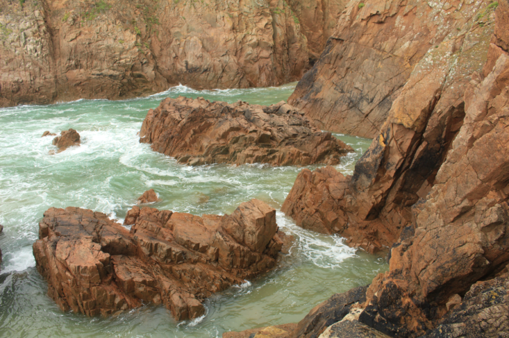
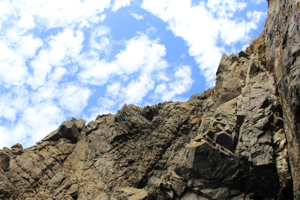
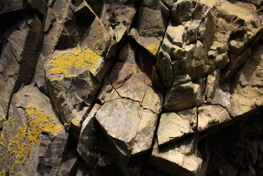
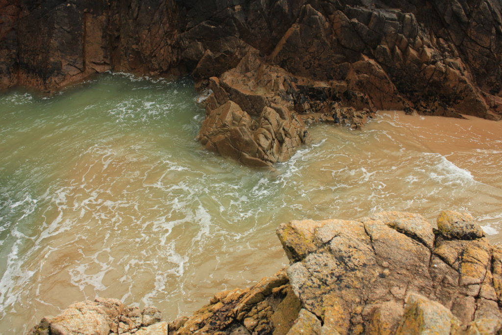
Despite only taking images of the seaside (all beach and rocks) I really enjoyed editing and arranging all of final images. I had a wide variety of images to select to place into the print folder and then arrange of foamboard for mounting and display. I would like to include this in my future project as it means that I will have a link to the island history than will be more linked to geography rather then features such as war fortifications such as bunkers.
This last photograph at the bottom was my favourite from my whole project as I think that it illustrated Islandness really well, taking good quality images for these mini projects makes me excited to include them in my final project, this is because printing images and arranging them when they have a high resolution means that they look a lot more aesthetic they have been arranged.
New Topographic- Urban Landscapes
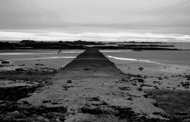
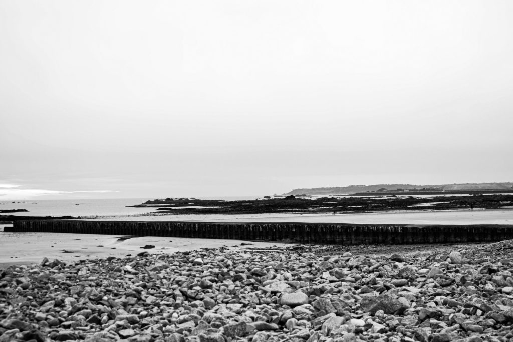
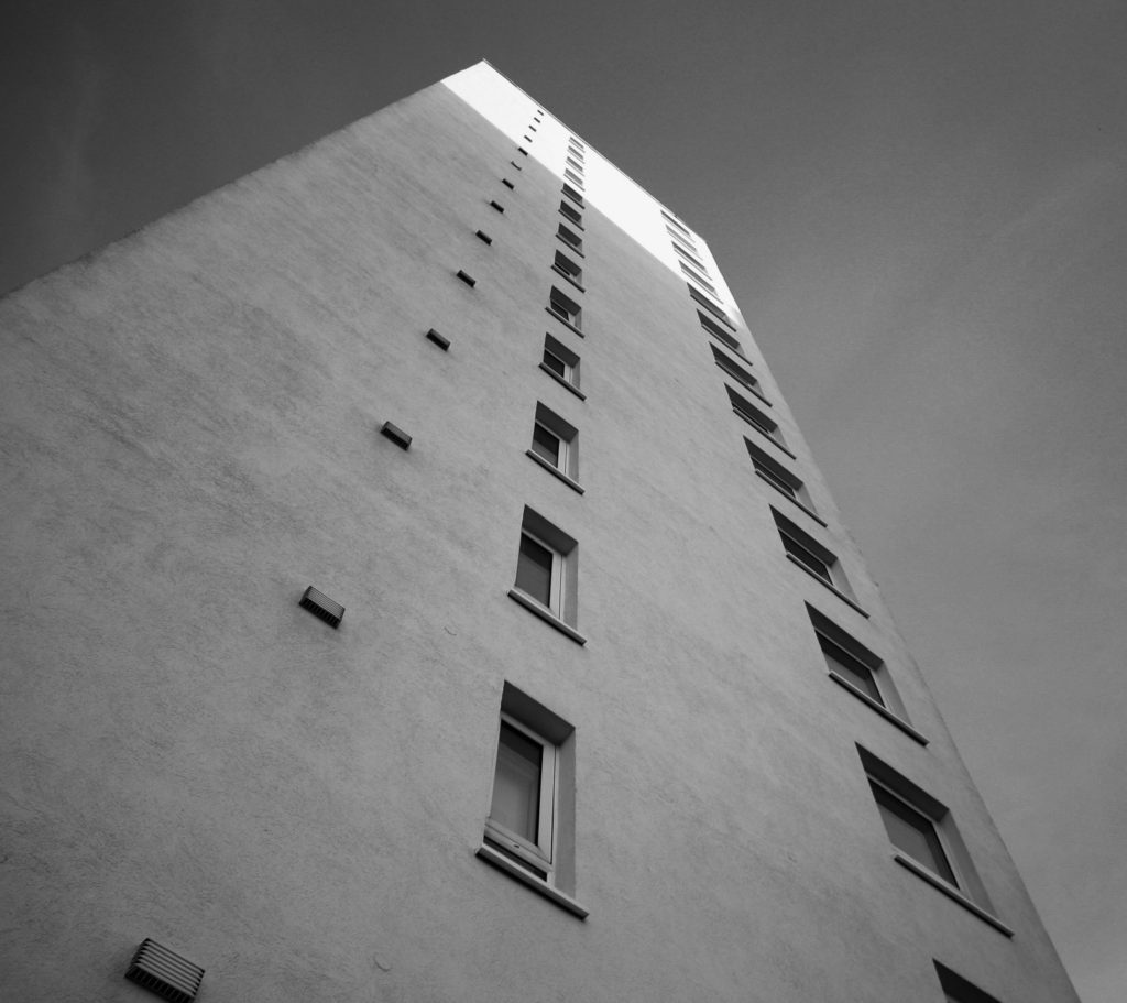
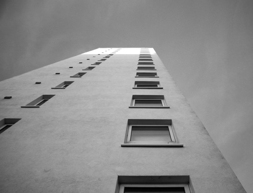
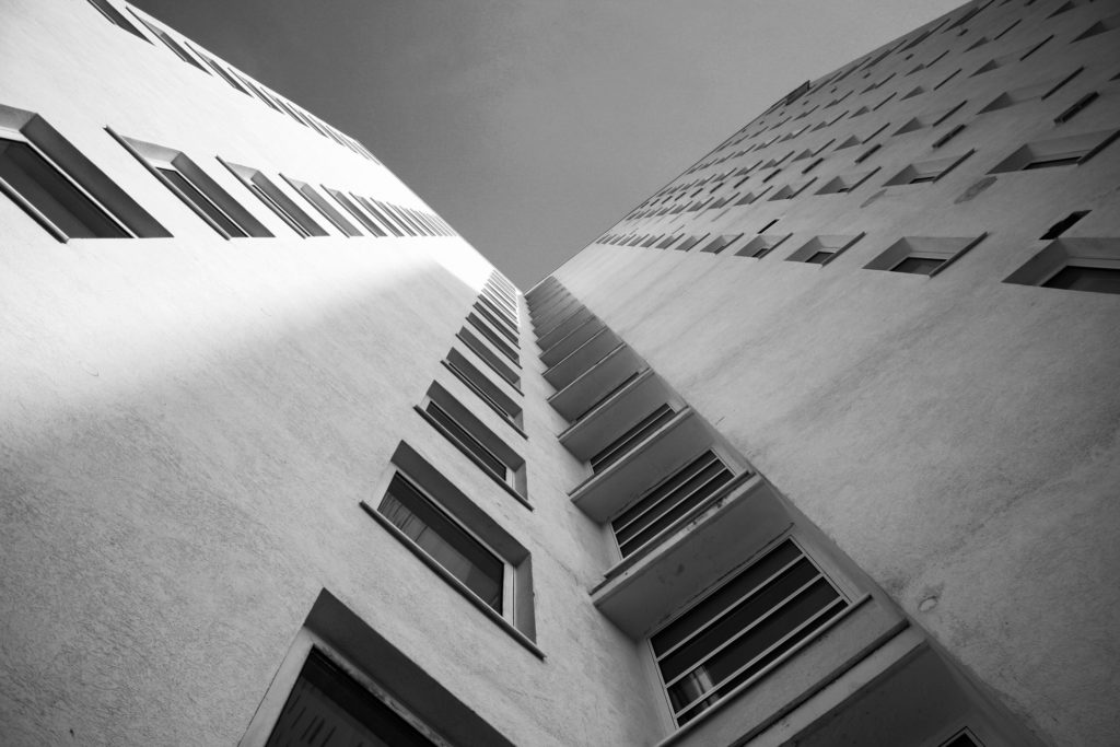
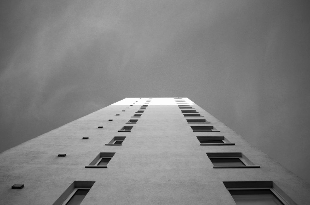
The concept of the New Topographic was introduced along with the photographer Ansel Adams, the ideas of the Urban Landscapes came before the Rural Landscapes project, these photoshoots were a lot more fun compared to the rural landscapes as I got to take better images of man-made structures.
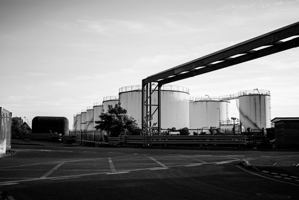
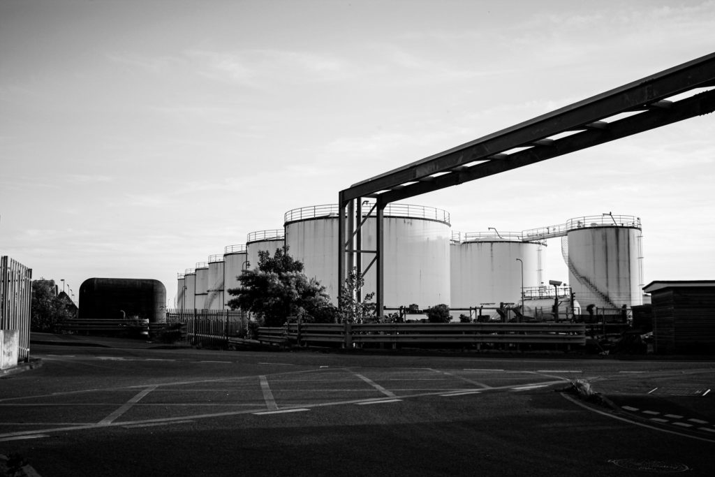
In my opinion, these are some of the best images that I have ever introduced, and I really think that they will be featured, or some images/ ideas that are similar to them, in my final personal study. Additionally, I think that these images look really clean and a lot more professional in black and white. I would like to include this in my final study as I think that it makes my images look like they are better quality then they actually are.
Additionally, I like that when photographing man-made buildings there is always structure and symmetry within the images, this makes the final outcomes more aesthetic than images of natural objects, and this is why I would like to include structures just like these in my personal study. Doing a style of photography that will reflect all of my old work I enjoyed doing will be important as it will make sure that I put more effort into my project.
Technologies/ Editing Techniques
I think that there has been a lot of developments throughout my work from the start of year 12 to now, the middle of year 13. This is especially clear through my Anthropocene project as it means that I got to use some new editing skills in Photoshop.
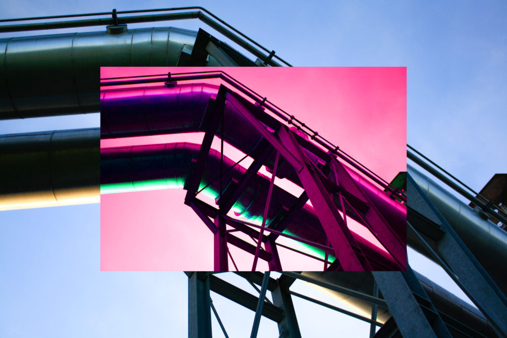
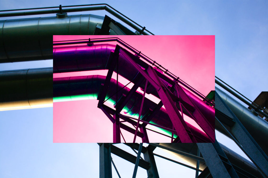
Here I have included an example of me using some colour editing skills in order to make some of this picture look almost like it is animated. I would like to include this type of editing in my final project as I think it provides my work with a lot of variety and links with the theme of natural vs unnatural landscapes. Furthermore, learning how to create
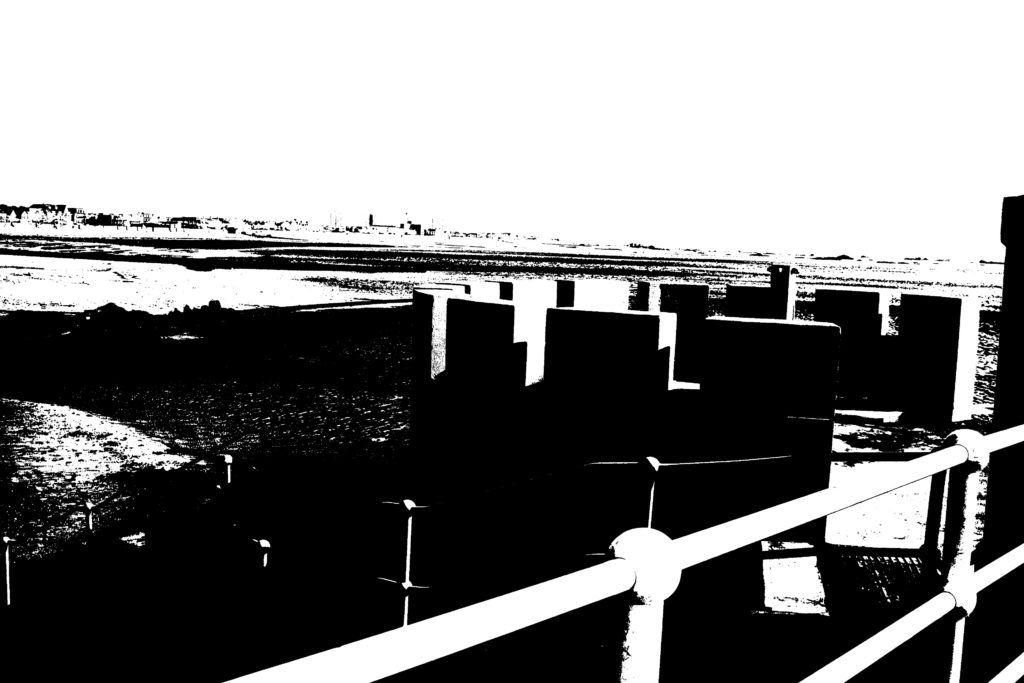
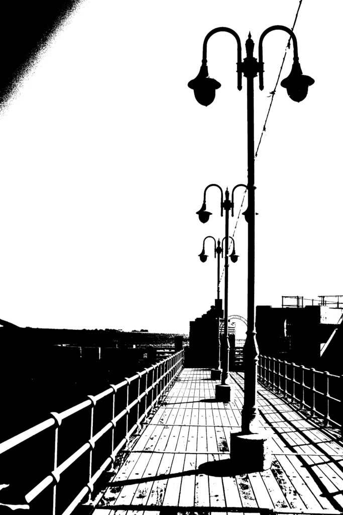
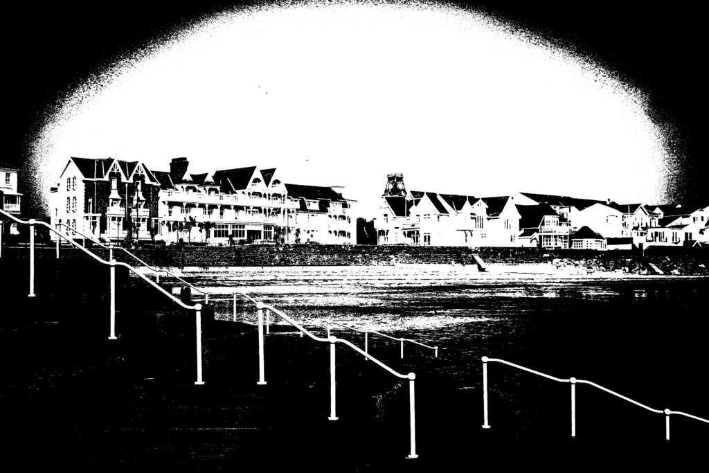
This type of editing, inspired by Keld Helmer-Petersen was something we learnt a long time ago as a new and intresting editing process; After selecting images to open up on Photoshop, I changed the images to black and white at first, then clicked on the Threshold setting where a gage appeared that allowed this setting to e changed up and down, to get the perfect final product there needed to be a good balance between having a plain background and detail in objects and textures in the foreground.

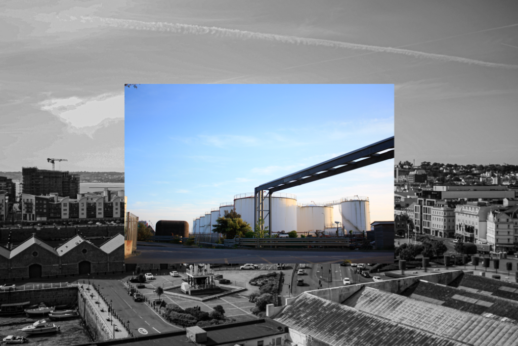
I am included this example of a simple photo montage, only using two images, to demonstrate that I used to create very simple photo montages and that I know I can create more detailed and successful combinations of photographs now. I don’t really like the photographs that I had chosen to put into this photo montage. However, I think that the clarity of the middle images saves the whole piece.
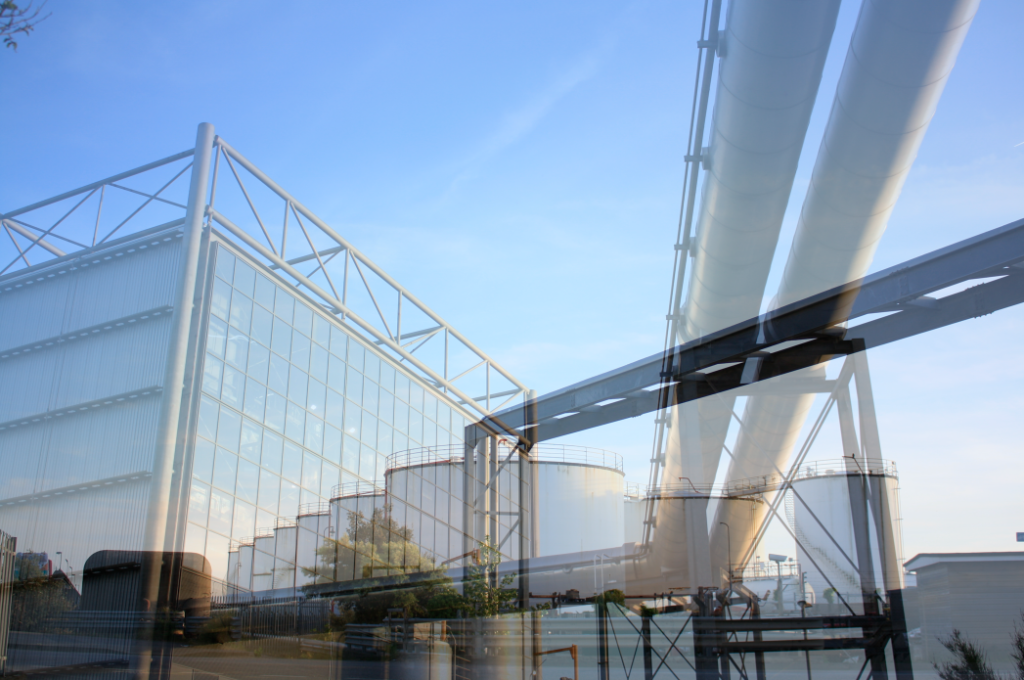
Another editing technique which is one of my favourites is multi-exposures, I like them because they are so varied and can be made with any two images that you want to put together, additionally, you can control the opacity so that one image can be more or less visible them the other one. These pieces are very eye-catching final outcomes as the colours are very present, and the multi-exposures I created came out the best if the two or more images I used had similar colour tones.
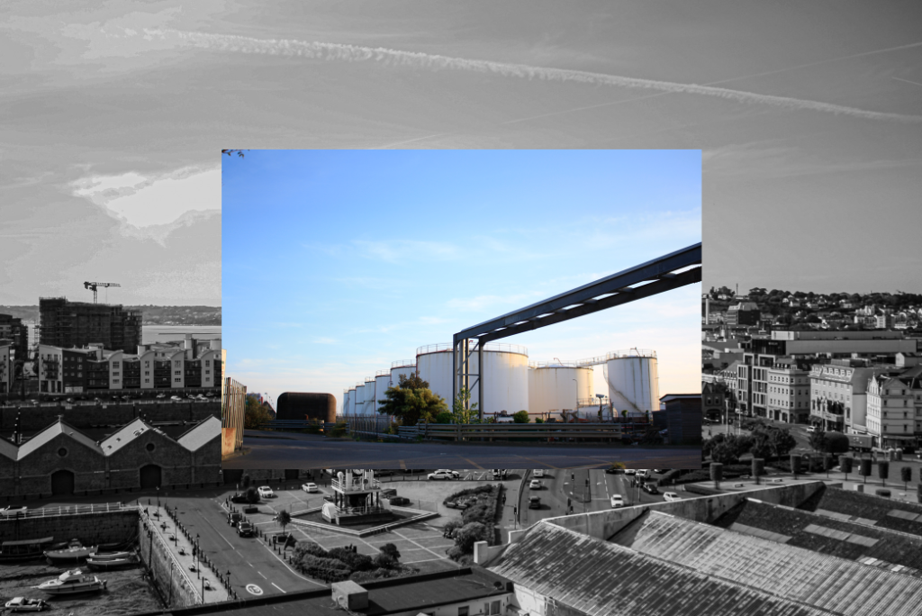
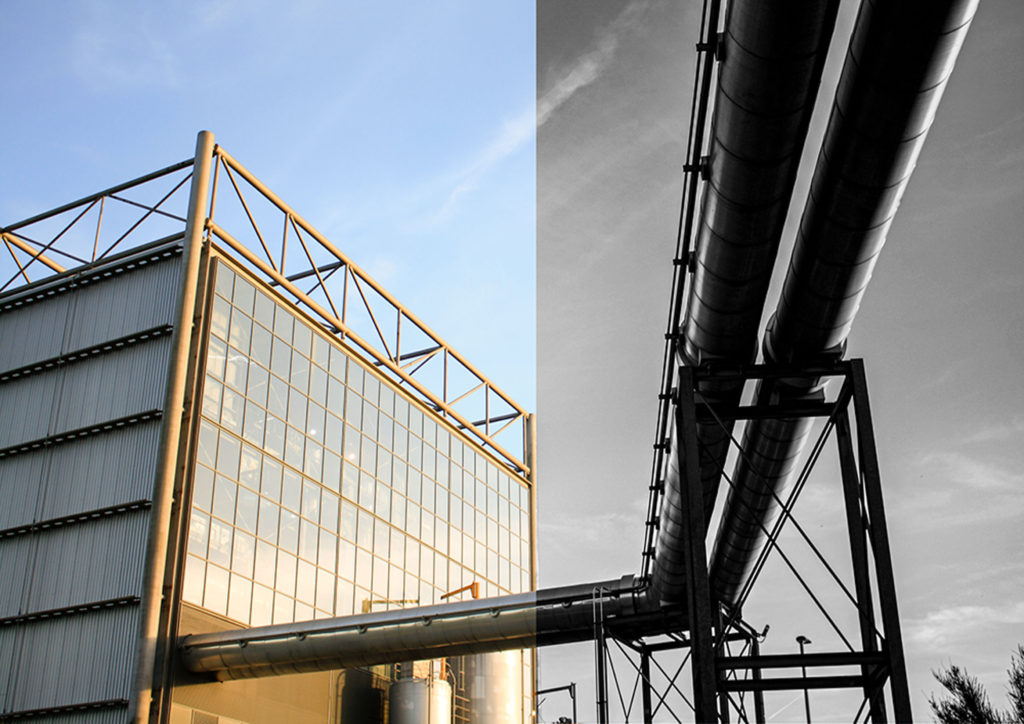
Here I have included a different examples of editing, as I have combined images and drastically changed one side and left the other, this was in an attempt to give the images more texture and depth, and this would inevitably make them more eye-catching. This would be good to put into my future project as images of waves crashing against rocks may come out very successful using this type of editing as the different textures of the rocks would stand out.
Future Project
Relation to my future ‘Islandness’ personal study: I have been looking back at my previous blog posts in order to help me choose which of my older work was the most successful and enjoyable. This is important and it means that if i have enjoyed the themes and liked the outcomes of my previous projects enjoy, I can build on this work and research for my future personal study. This means that my work may be easier as I am using my developed camera skills along with ideas that have already been constructed on my blog. The idea that I will not have to start from scratch again is one that interests me a lot as it means that I know what works and what doesn’t when it comes to going on photoshoots, editing images and compiling my final pieces. I have decided that I am going to stick with the theme of Islandness instead of changing to the idea of ‘My Jersey’ which is more like creating a whole new concept for my final study.
Most Influential Work
Here I have created a gallery of my best and most influential, with all of the projects and also along with my environmental portraits project and aspects of my zine, I think that this is important as it means that I can visualise all of my best work and helps me think about which sub-topics/ projects that I could maybe put together in order to make the most successful personal study I can. As this is my last attempt to show my favourite areas of photography to explore.

