Zine 2
In my last zine for the My Rock project, I am including more personal, intimate images from my trip away this September. In this zine I wanted to document rural American life through my perspective, capturing my experiences as an outsider, but also where I stayed and things in my immediate environment.
Final Images for this Zine
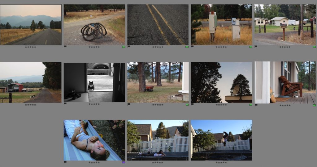
I compiled my images for this zine from my flagged image from each photoshoot. I then put them into a separate folder for this zine “zine 2” and gave them all ratings, as well as edited them in a similar style – I used sync settings for a few images to keep my style of editing consistent.
Designing my zine – experiments
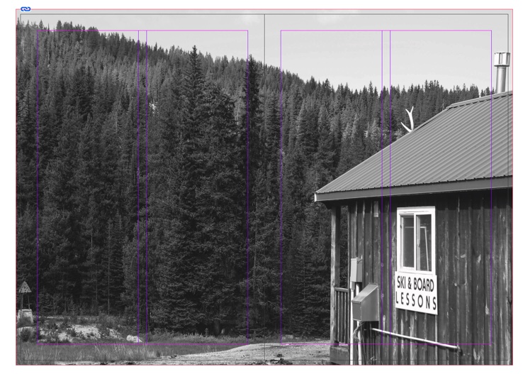
In this experiment, I was using a series of two images – I was stuck on presenting them with different layouts. I started with two on one page, then decided to do one on each. I tried first with one image of each page but then thought there was too much white space.
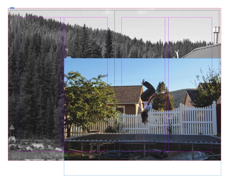
I decided to add another image underneath, and I wanted to use one that was not too busy. I then tried this but decided I didn’t like it, so I tried the images differently, below.
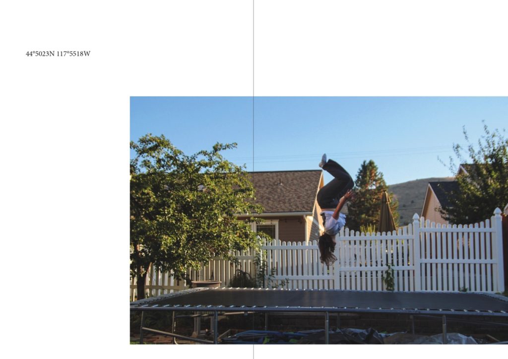
I then switched both images back to the original placement, with one embodiment higher on one page, than the other at the bottom – both had the same alignment to keep the composition balanced. I then, after adding my title to the front, decided to experiment with text on this page. I used the coordinates of the road where I lived next to this image. I liked it but felt it didn’t fit with the rest of my zine as there was not much space on my other pages for text – I wanted to keep my zine as cohesive as possible so didn’t end up including the text in the end. This is something that I want to include in the future though, in my study photobook.

The final layout of the two images that I was experimenting with – one out of the two, with the final sequence below.
Final Zine
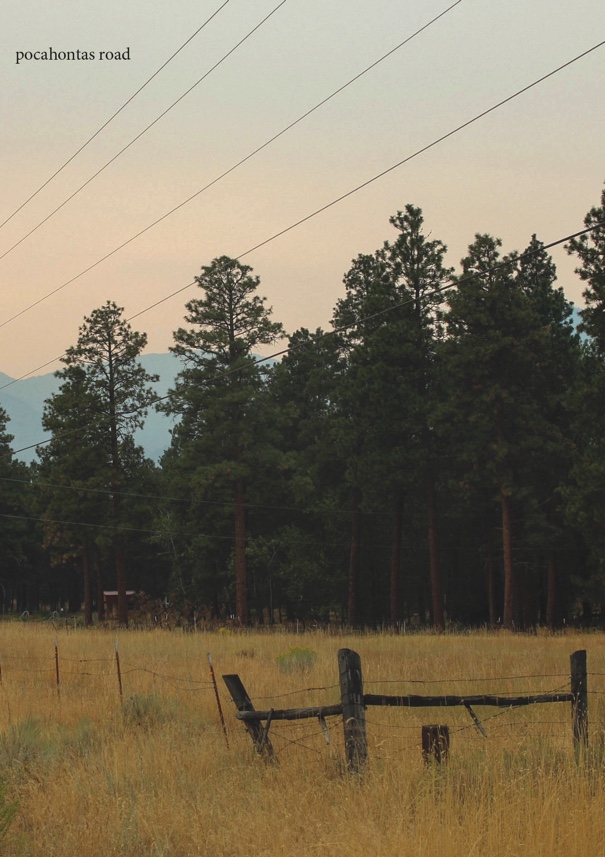
My front page for this zine. I used cropping tools in InDesign when placing the image onto my front cover, which helped me to create my desired composition. I think that putting my title so small at the top of my cover helped to not distract from the rest of the image, and I like how it is quite understated – this is a theme throughout this zine and I like how I’ve introduced this on the front cover. I think my editing was successful. It is an example of how I tried to edit my images for this zine – I wanted to create warm, faded images with a bit of grain, to show the quiet and understated nature of these images.
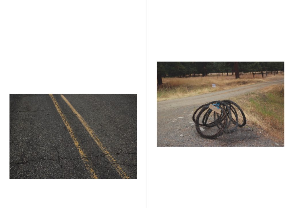
This is a unique set of two images, my first page in my zine. Both these images are taken from the surrounding roads from where I lived, on a loop of roads called the “Proffit Loop”. I placed these images together due to their similar features. They both feature strong leading lines, in different directions, which creates a balanced composition for the spread. The left image’s leading lines are the perpendicular road markings, leading off to the left. I also like this image due to its more macro composition – I don’t normally take images like this, and I like this unique image in that way. The yellow road markings in the left image tone with the yellows and greens in the right image, which ties the two coherently together. The right image’s leafing lines are off to the right. This image ties further with the left because of the grey wire – the smaller amount of grey in this image ties nicely with the entirely grey image next to it, making for opposite images in a way, and an interesting comparison.
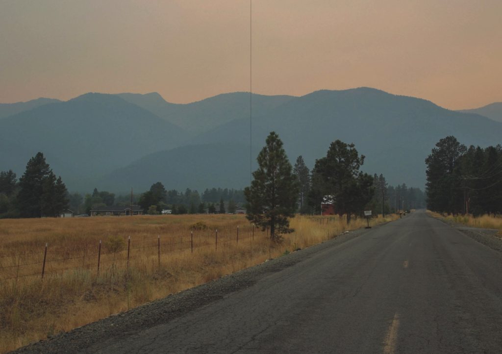
This image is one of my favourites from my whole trip away. I think this composition is really good and features a unique landscape which is really unlike anything I’ve photographed before. I think this image uses the rule of thirds very well, and there are strong leading lines. The angle at which I took the picture created the strong leading lines from the left, leading to the right middle of the image. The leading lines to the right create a triangle shape to the left, which ends with a clear line through the middle. This cuts the darkness of the mountains off, creating a separation between the different parts of the image.
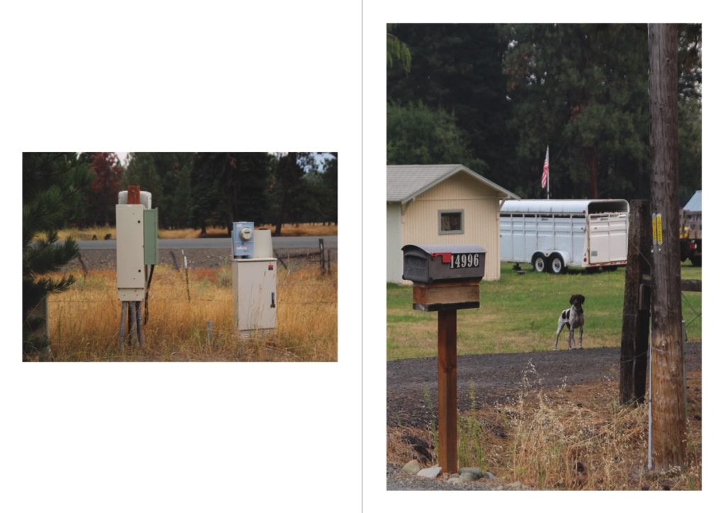
I chose to include these two images next to each other due to their similar tones and subjects. Both images feature beige and white tomes – the image on the left features these in the two electrical boxes, and the image on the right is in the cattle trailer. Both images also have similar backgrounds of the same type of tree – this is because they were both taken on the same photoshoot, which brings them coherently together with similar settings. I think that both images paint a unique picture of rural life in the US, with the old-fashioned electrical boxes and mailboxes, as well as hints at the farming industry in the right image.
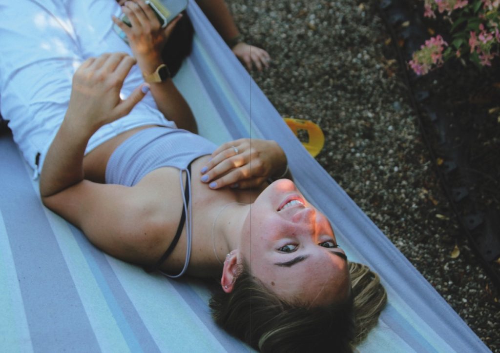
This image is unique compared to other images in this series. I didn’t take many portraits while away, and this is one of my few. This image was strong as a raw image due to the lighting at the time of my shoot – I shot during golden hour, actually with an impromptu photoshoot, in which I photographed my fellow exchange students in one of our last evenings in the USA. I tried to capture my subject naturally in this image, to create unstaged images. In my editing of this image, I used several filters in lightroom with high amounts of grain and soft tones. I like the playful, child-like nature of this image and my other two portraits in this Zine, which shows a sense of how we all felt during our time away.
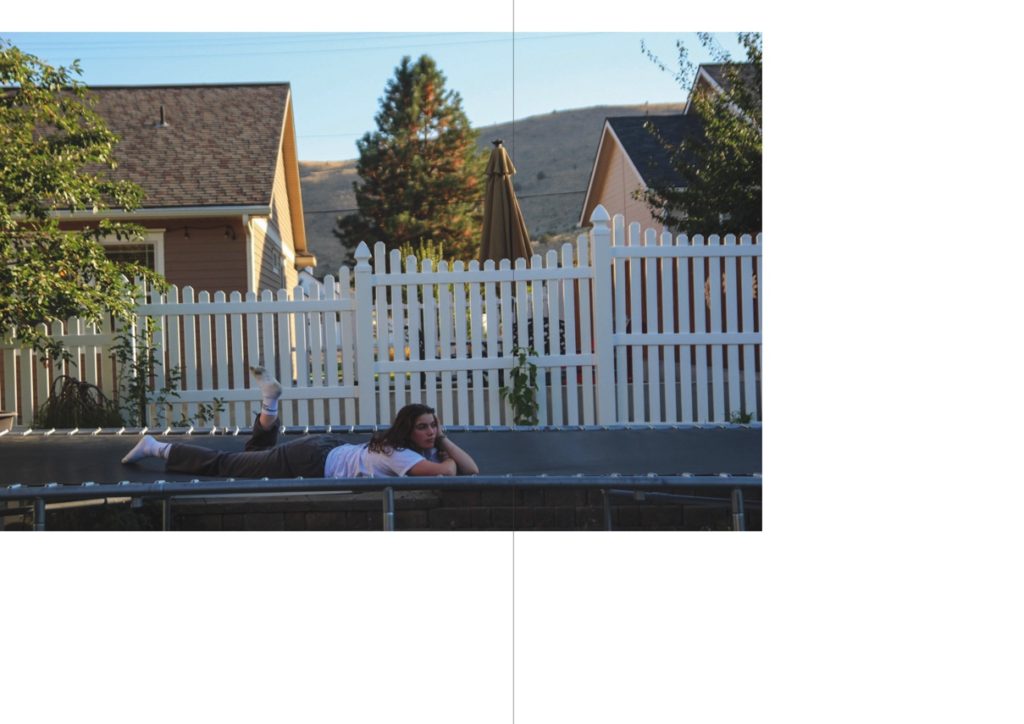
This spread is that of a sequence of two. The other image is placed after my next double-page spread. I think that including a sequence of two images separated from each other creates a logical thread throughout the zine, and helps to keep a cohesive theme between all my images. This image was edited like most of my others in this zine, with soft tones, reduced contrast and added grain. I wanted to create a peaceful mood and thoughtful image in this image, that matches the expression of my subject. This is quite fitting as it was the end of our trip, our last evening altogether – it all felt a bit surreal, and this can be shown with the confusing landscapes of a suburban house and a trampoline with mountains in the background. I used negative space in this image, as well as its counterpart two pages over, to symbolise the vastness and size of how America felt to us during our stay, and to create and experiment with different layouts that I hadn’t used before.
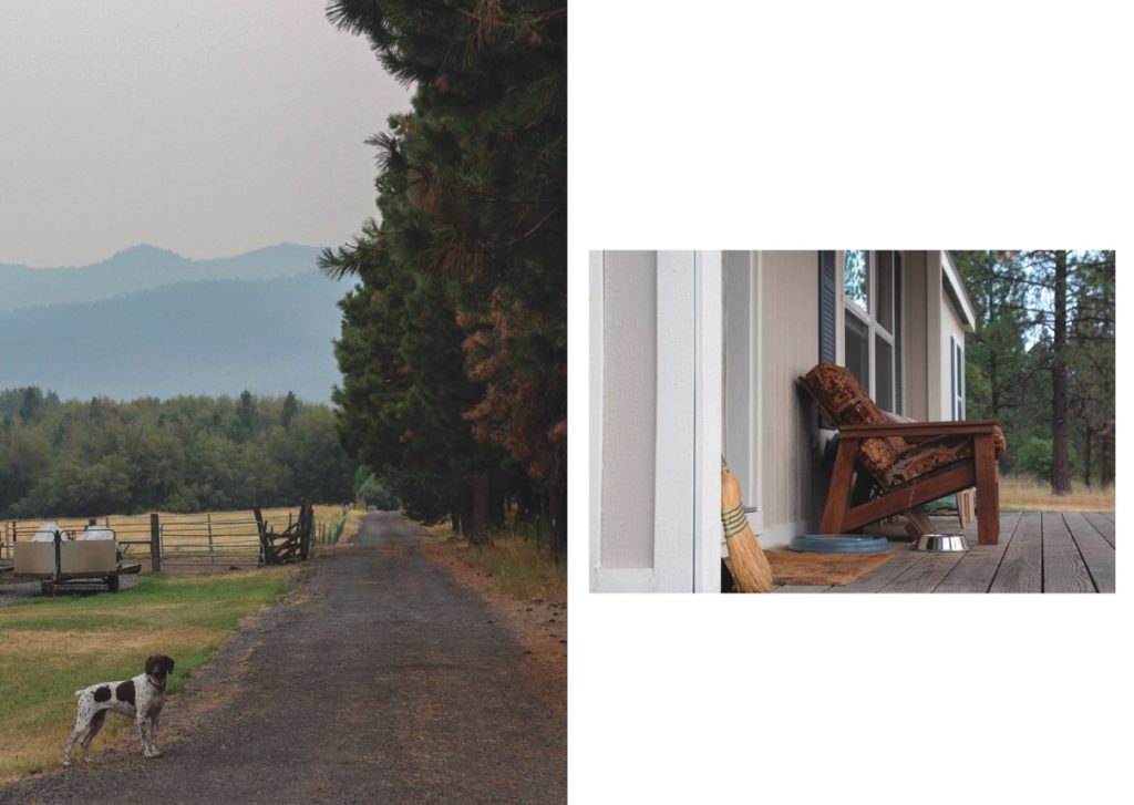
This is my last double-page spread. Both these images, in my opinion, are quiet images, that show a more intimate side to my personal experiences. The left image features the dog looking inquisitively like the outsider, standing outside his house. This represents in a way, how I felt at times during my trip: an outsider. The right image is one of the home where I stayed. This is the only actual image of the house that I stayed in, and in hindsight, I feel like I should have included more.
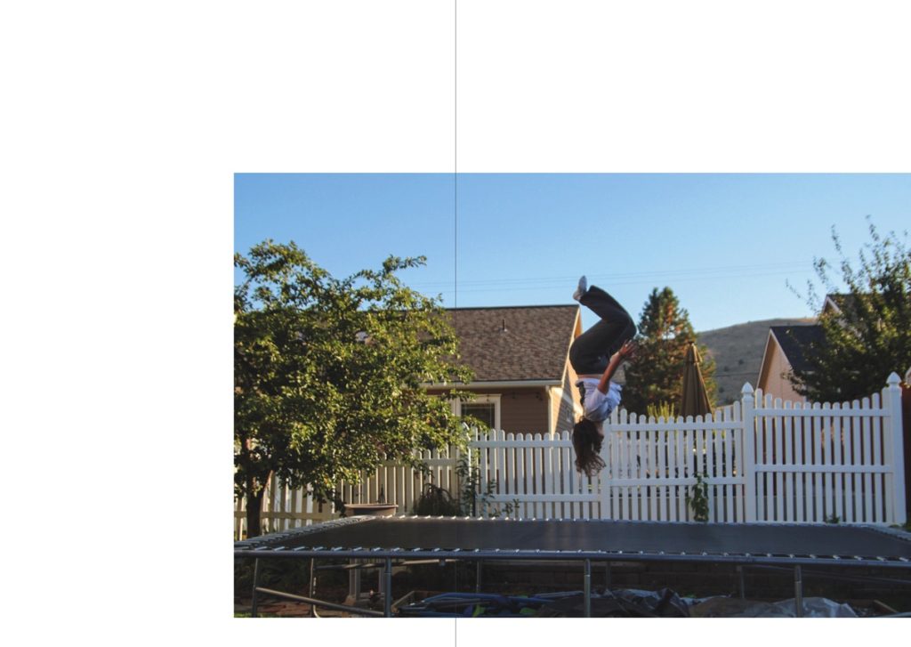
This is the second image from my sequence of two. This is the more playful image of the two, as I spoke about in my evaluation of the other image. Having this image as my last in the zine, also in a sequence, meant it created a clear end to the project.
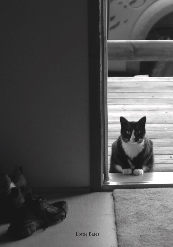
This is the back cover from my second zine. This image is from where I stayed, and the feature of the door signifies the end of a journey and the end of a project to me. Even though this is the only black-and-white image in this zine, I think it worked perfectly with the tones in the image and creates a quiet end to my zine.
Evaluation
Overall I think this zine was very successful. I like how it showed a more personal side to my trip and included images that documented my own personal experiences in a new country, with new people and places. I also like how I touched on how I felt during the trip in these images. I love how thoughtful some of these images are, and I think they show my improvement as a photographer throughout the course in the ways of design choices and editing, and overall as a photographer.
