making my zine

The story for my zine will target human impact on nature, featuring a variety of images both of a natural and manmade landscape. Focusing on rocks and texture i will show how the seascape has changed over time with impact from erosion and the progress of industrial buildings. I will tell my story through a range of images and text – i was mainly focusing on overlaying poems on my images to provide a better narrative.

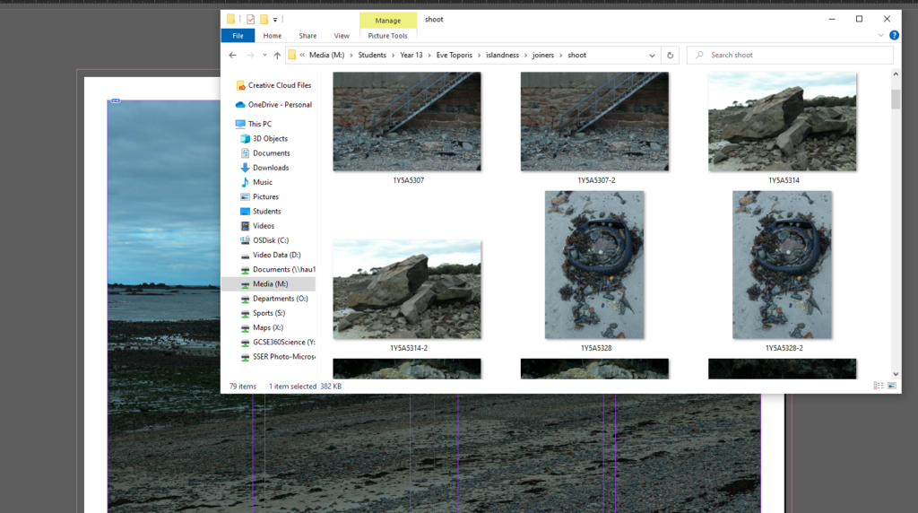
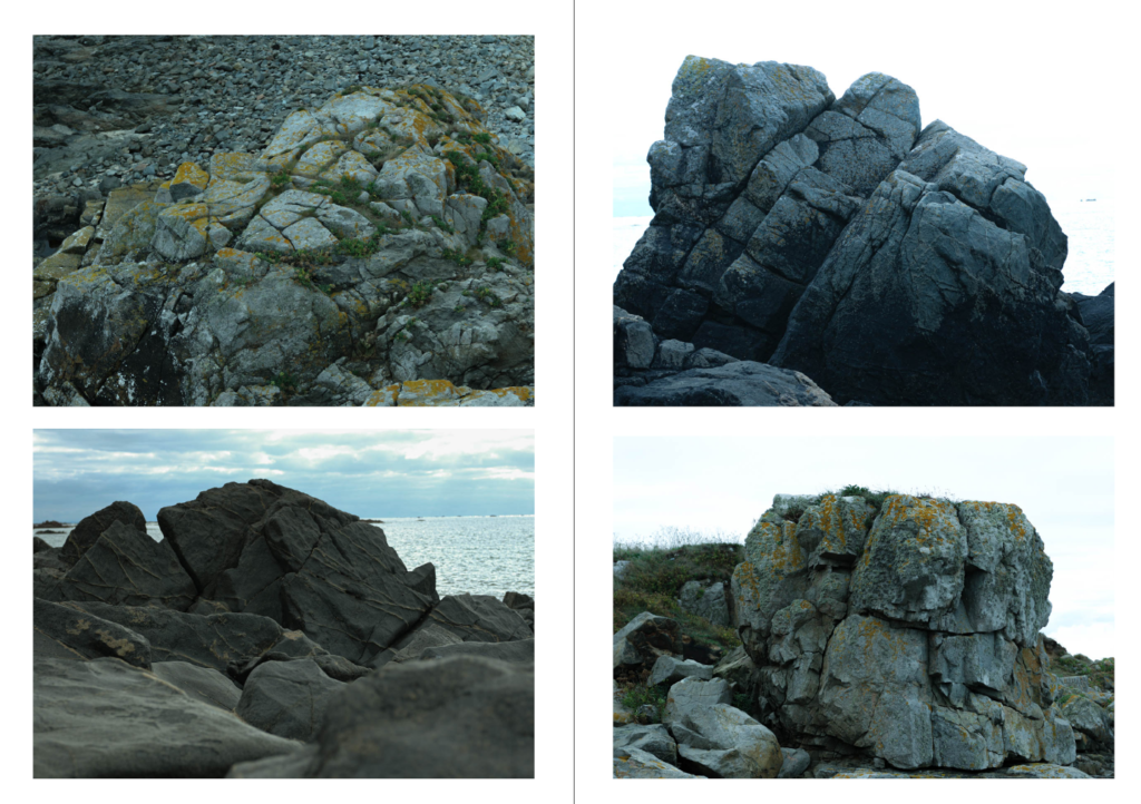
Editing on InDesign, i used a 16 page format for my photos and made sure I had a variety in layouts like full page spreads for my best photos and galleries for different objects e.g rock faces.
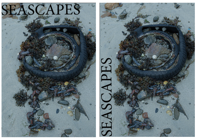
Experimenting with different text for the title – I settled with the second cover as the first overlapped with the rocks and was difficult to read. I chose this photo for the cover because it is unique to the others in the zine and combines manmade elements with natural objects and shows how nature reclaims land. I chose the name Seascapes for my zine because it is short but sums up my zine well.
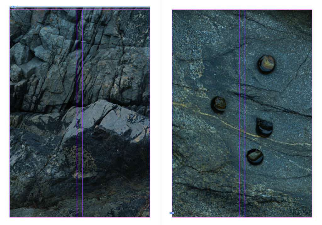
Whilst choosing where to drop my photos I colour co-ordinated them, i paired these two photos together because they were both dark colours and had similar aspects e.g the jagged rock face.
Photo selection
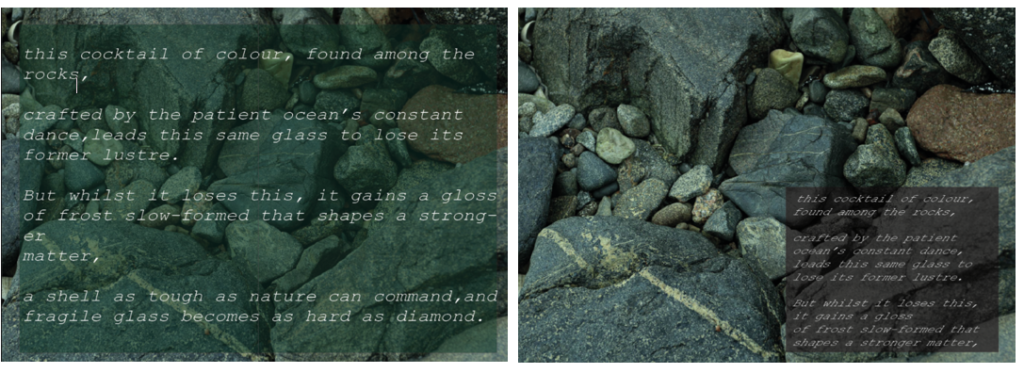
I wanted to add a poem about seascapes over my photos – here i am experimenting with placement, font and colour. I chose the first option because the colour blended into the background well and was easier to read. I chose this poem about rocks to go over my photo because it matches the aesthetic of my zine well and adds a nice touch.

Leave a Reply