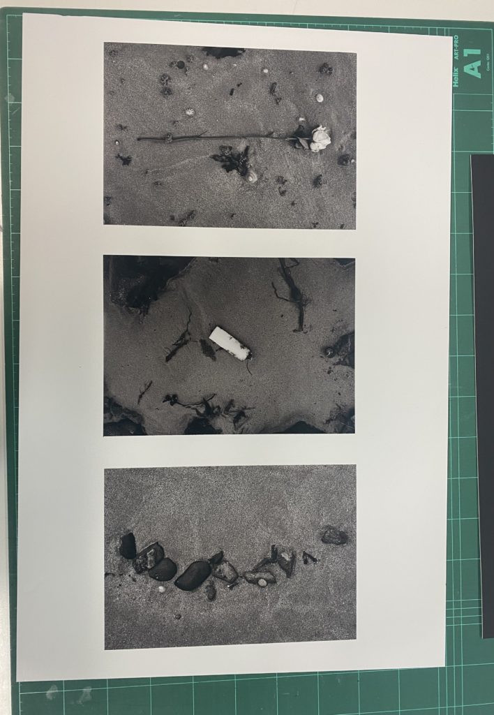
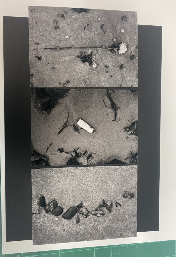
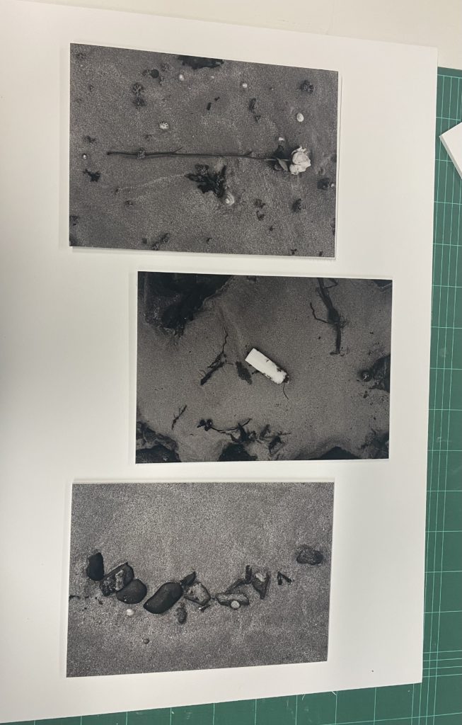
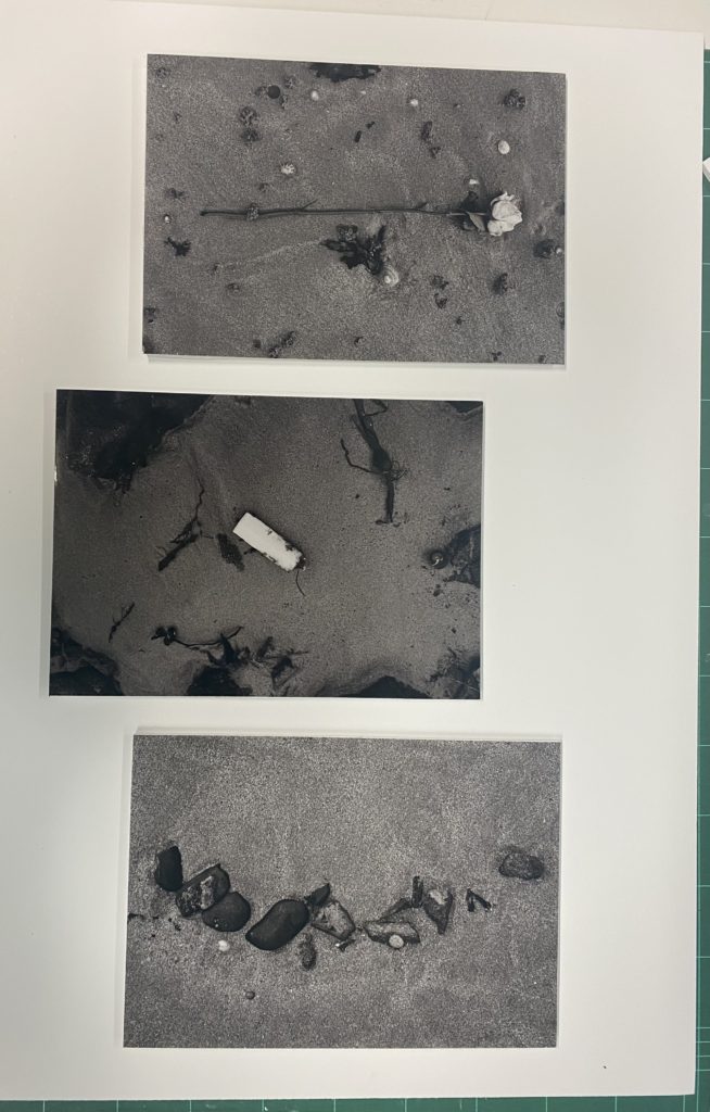
To create my mounted final outcomes, I began by deciding what pictures I wanted to use. I decided to use the set of 3 photos which I used for the middle page of my zine because I liked how well they worked together as a set of images, showing what is found on the seabed as you follow it. Then I began deciding whether I wanted my photos be mounted on a black or white background, I liked the white background to begin with and this was because it contrasted well against the darker black/grey tones in my photos, as well as creating a flow between the 2 images which have some white in them as well. I wasn’t sure on having a black background while experimenting, this was because I thought that the photos got lost within one another as they got lost due to the similarity of the darker tones within the photos and the black background. Upon further experimentation, I felt as if just having a plain white background was too dull and gave the feeling that it was unfinished. I decided that I wanted to add some dimension and borders around the photos, but wasn’t sure how I wanted this to be incorporated to begin with.
In these two images above, I was experimenting with different layouts which I could use to mount my photos with. I thought that I could experiment with putting my photos on different levels such as bringing the middle photo up or down. I didn’t like this experimentation as I wanted the photos to be level and not create a feeling that one is less than the other as they all work alongside one another to create a story. Therefore this was helpful with deciding the layout of my mounted final outcome as I knew that I didn’t want to have the photos be at different levels, so I experimented again with different ways to present my work which can be seen below.
Final Outcome –
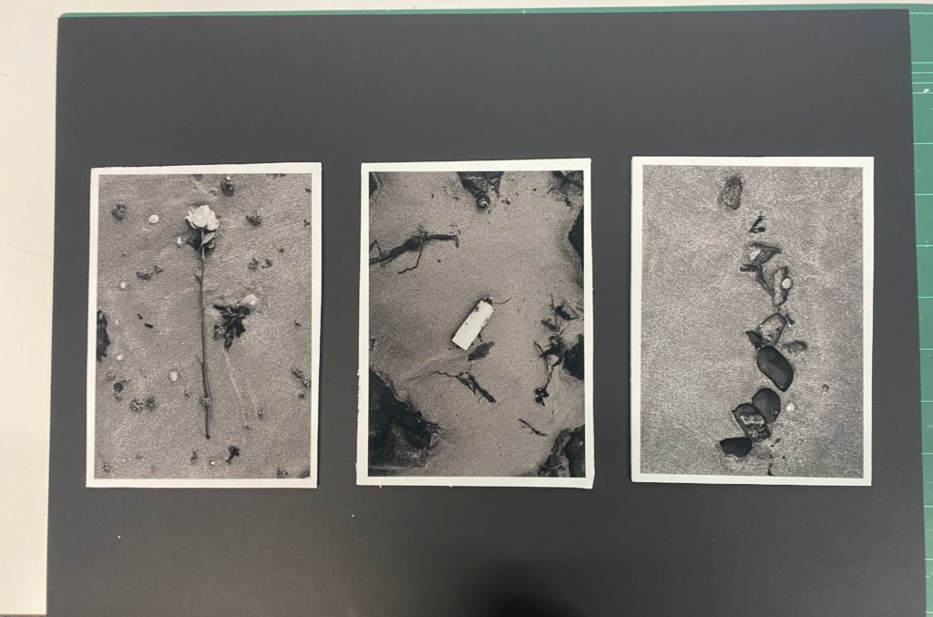
This was my final outcome which involved using a black background, as the more I experimented with the white background I felt as if it was too overpowering. I decided to mount my photos on to white foamboard, which I cut out in to 3 squares which were slightly bigger than the A4 pictures to create a white border around the photos, making them stand out well against the black board which I used for the background. I then stuck them down using double sided tape on the photos to the foamboard then the frames to the black mount board behind it and this made sure that they remained in their places securely but I had to be quite precise while using the tape. This was because after the photos were placed it was difficult to move them without potentially ripping them, which I didn’t want to happen, so then I made sure to place the 2 side photos first, making sure that the space above, below and to each side of them was even then placing the middle one, which made sure that the photo in the middle was centred. I really liked this way to present my photos because it lifted the photos up off of the page, which I really liked as it added dimension to the photo which I preferred more than experimenting with the different levels of the photographs. I was really happy with this idea and decided to use it as my final way to present the photos I have used, creating a triptych.

