Story/ Purpose behind my zine
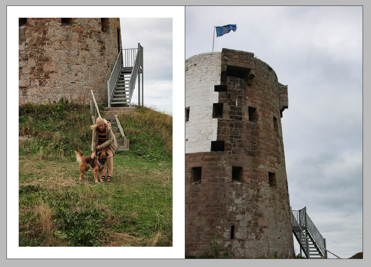
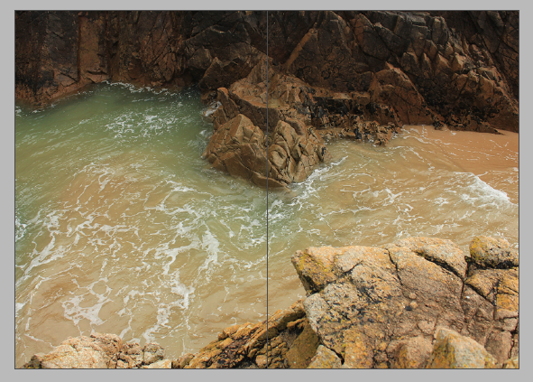
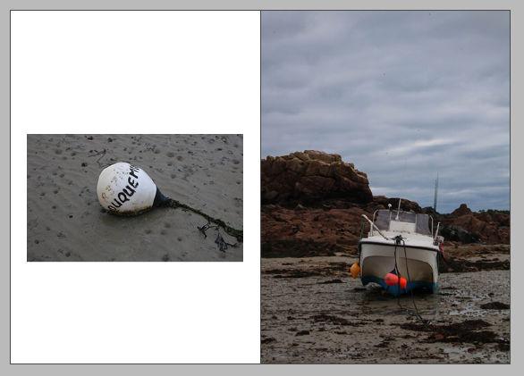
Throughout my zine I have attempted to create a visual story which illustrates the importance of Jersey’s Sites of Special Interest (JSSI), to create this I visited the sites of Plemont, La Hocq and Stinky Bay. This was in an attempt to show multiple different parts of the island, as Plemont in the north is filled with a variety of different rock formations compared to La Hocq in the east. This helped me to create my story as I could show the natural beauty of the island throughout my photographic/ zine work. The purpose of my zine is not just to show off ‘Islandness’ but to try and get people to understand that Jersey may not be like this forever, as uncontrollable movements such as erosion means that these rocks are going through constant change. However, I am also attempting to help people realise that controllable aspects affect our island life as well, despite Jersey being considered more environmentally friendly, with places such as reservoirs to prevent water waste, human life will forever continue to affect out island. My zine illustrates the untouched parts of the island that everyone would like to preserve, this is vital as it demonstrates that we must keep our island this way and try to maintain the island we live on in a sustainable way.
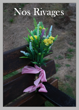
Explanation behind my title: ‘Nos Rivages’ is a direct translation of ‘my shores’ in French. I have translated it as I thought it made the lettering look more aesthetic. Additionally, the typography I picked made the lettering look the best on the front cover of my zine, along with linking well with the story behind my zine. This is really important as it shows I have considered the context of my work when titling my zine.
Layout
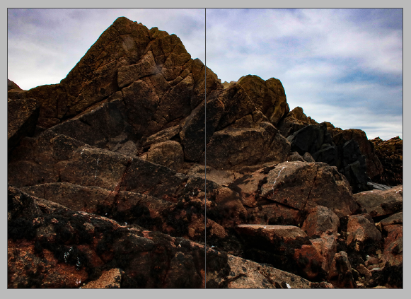
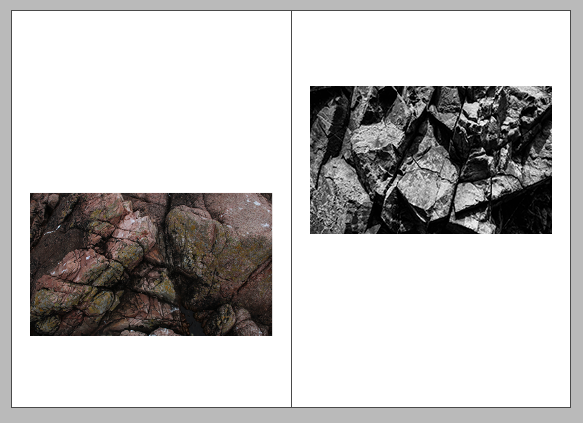
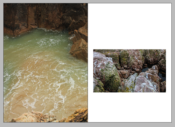
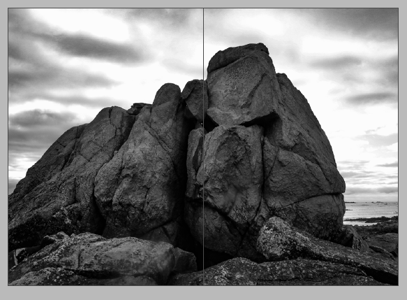
Analysis
Overall, I think that the story behind my zine is illustrated well throughout my zine, a lot of my images have been heavily edited and some unchanged, this links with my story, as the purpose of my story was to show unchanged parts of the island and show how humans may change it for the negative in the future. This is reflected in the editing of my zine as the unchanged images reflect my zine itself, and the edited images could be a reflection of the future to come if humans continue to use the island unsustainable resources. Altogether, I like the final outcome of my zine, as the layout means that overall, it is aesthetic and catches your eye. The front cover is very important as it draws you in and makes you want to look through the zine, but I think that I have bolder and more adventurous images inside of my zine, which makes the view want to keep looking through it.
In my opinion, I think my final zine was a success, I am happy with my result, I still think that my main strength is the composition of my work. This is because I took me a lot of time to think about the arrangement of my images, meaning that each page too me a lot of time. However, this was a positive as it meant that I had time to probably think about the arrangement of my pages. Another aspect that I like about my zine is the balance between monochromatic and colour images, I tried to do this so that my zine had more depth to it, along with the fact that photographs of rock formations being edited in black and white means that a lot of texture becomes more present.
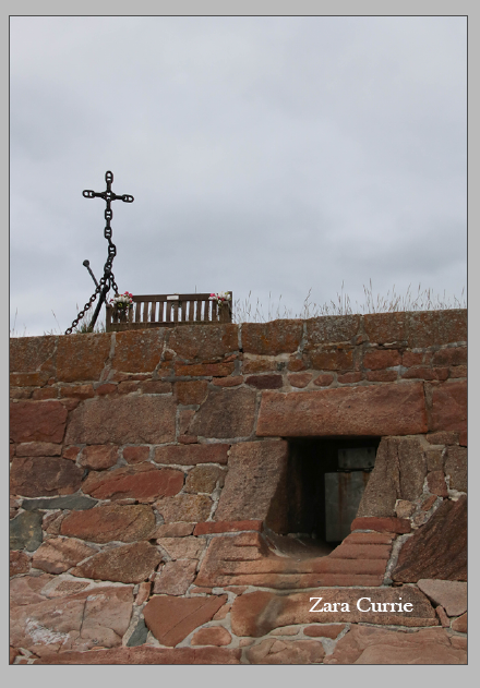
Lastly, I like that my zine matches well with my storyline/ purpose of my zine which can be seen above. I think this is important as it shows that my piece of work is a reflection of all the time, I have put into trying to illustrate the important of maintaining our Island’s natural features. Furthermore, my zine links well with the overall purpose of the project and is a positive reflection of my work from the multiple photoshoots. Despite the variety of images, the front and back cover were taken during the same photoshoot, and I think that they link very well together as they both have this idea of death. As the flowers represent someone who has just passed away, and how fresh their memorial is, and in contrast with this, the cross is usually a representation of someone or a group of individuals who have passed many years or even decades ago. This is important and it creates a cyclical narrative to my zine story (as they start and finish with the same concept).
Critique
However, there are some weaknesses throughout my final zine, I could be thought that the quality of some of my images is not as good as other, and this is distracting, and it makes for a negative contrast throughout my whole zine. As there is a constant change from very high-quality images to slightly blurry ones, however, I was more focused on my story rather than my images, this could be seen as a hinderance to my work. I even had to edit some of my images in Photoshop in order for them to be good enough to put into my zine, this was because I didn’t have enough photographs to begin with when starting this project and I should have gone to the same sights and taken more images to solve this problem.
Looking through my zine there is no clear colour scheme of arrangement throughout my images, this could be seen as another weakness as there is a balance between the arrangement of the images, but no link between aspects such as warm and cooler toned photographs. This means that my piece is filled with mixed pieces that in some people’s opinions this could mean it lacks smoothness.
