In order to construct the Zine digitally, I will use Adobe InDesign to lay out each image on each page, as well as include any text and experimentations digitally. My Zine will be 16 pages, some images will take up a two page spread, while others will be one image per page.
Image Experimentation
This is a simple experimentation on one of the images. As the image itself was fairly dark in tone, I thought it would be a good idea to see how the image would look if I inverted it. I don’t think this was that effective so I won’t use this in the zine.

Despite my zine focusing on the vibrancy of the images, I want a few black and white images at certain points in the zine to create a contrast. These are the black and white images I plan on using:
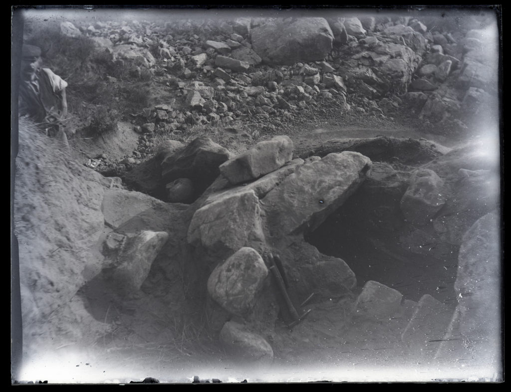
As well as these images, I will be using an archived image taken by Emile Guiton showing the La Motte Excavation:
For the seventh page spread, I am planning Guiton’s image on top of it, to create the symmetry that the zine has (the second and second-to-last spreads are both large double-page spread images that are black and white). I will use one of my own images of green island and place an image by Guiton on top. I want to have the viewer lift Guiton’s image up (from tape) to reveal the new image underneath. I think this interaction will create a sense of turning back time, linking nicely to the archive. Above is Guiton’s image I will use.
For my original experiment, I had two images from Guiton on the original Zine and having one of my images being placed over it:

This is the original page spread, with two images of Green Island from the archive.

This is the page spread with my image printed in acetate laid over it.
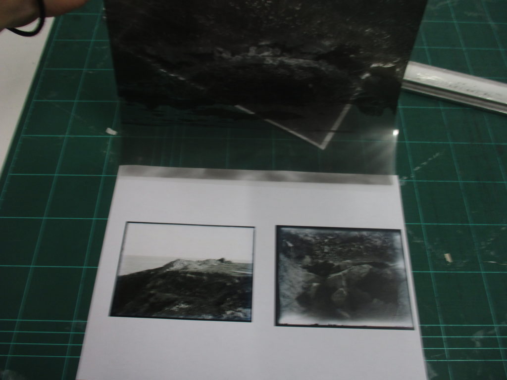
This is that same image but with the acetate lifted as a demonstration of how it would work.

This is my image as a plain piece of paper laid over the original spread.

This is another demonstration of me lifting the page to see how it would work.
I think swapping the layout of this spread around (so my image is on the zine and Guiton’s is the interactable addition to the page) will be more effective as it will give my image more of an emphasis, it will also fit with the symmetry of the zine better.
Here is an example of the new layout:

This is what the layout looks like on the printed zine:

Zine Layout
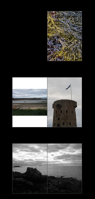
For the front and back page I used one image of seaweed spread between the two. I chose this because it is a colourful image with striking lines and textures. I chose the tower as the main image on the second page spread because it marked the start of the journey of the photoshoot, but also acts as a way to point towards the other image on the left (with the flag). I chose the third image to be a double page spread because it contrasts with the previous pages and the next because of how it is laid out, as well as the fact that it is black and white.

For the fourth page spread, I chose this layout because it fits with the almost ‘endless’ amount of small rocks and pebbles, which is represented by the higher amount of these images in the page. I chose the seaweed to take up a double page spread next because it continues the sequence of the large seaweed images, contrasts with the previous and next page spreads due to it’s colour. The sixth page spread is similar to the fourth (with the sequence reversed) to mirror the other pages. It is also worth mentioning that the zine’s viewpoint is getting closer and closer until the fifth page spread (which is the middle of the zine) where it then starts to zoom out.
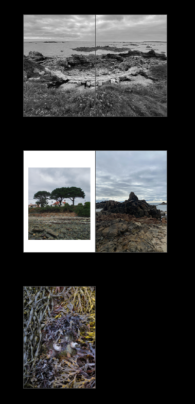
On the seventh page spread, I chose two images by Emile Guiton and put them on each page in a uniform sequence, similar to how a document contact sheet would be laid out. The next page spread consists of two images (the one on the left has a frame) which the horizon line of it leads into the image on the right which is a full page image of a rock. The boarder creates an emphasis on the image on the left. The back of the zine is the other half of the image on the front cover.
Name of the Zine
While thinking of a name for my zine I wondered what Le Hocq meant in modern English. After searching it up, I found that Le Hocq means ‘the headland’ or ‘the cape’ in English.

I think I will use one of these (perhaps with or without ‘the’) to name my zine.
Text:
As for the placement of the title itself I had a few ideas of where to put the text, the font I will use and the orientation of the text.
I think I will use the layout of having the title in the centre of the page, as it gives the text enough space to stand out, it also isn’t too light/dark as to obscure parts of the font.
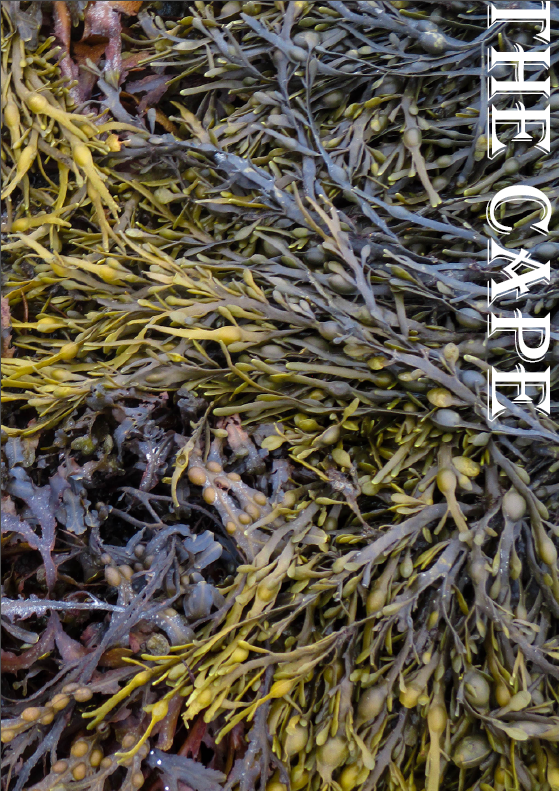


In terms of the font, I will use ‘Algerian’ as it is a nice serif font that will give the title an older aesthetic, which I think is fitting for the subjects of the zine.

I also experimented by using an underline to divide my name and the title of the zine.

Final Front Page


