EVALUATION
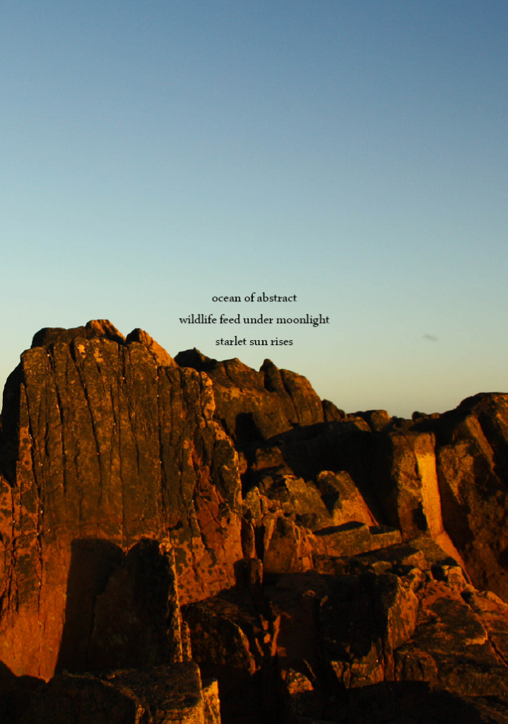
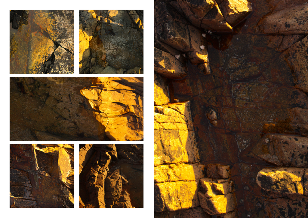
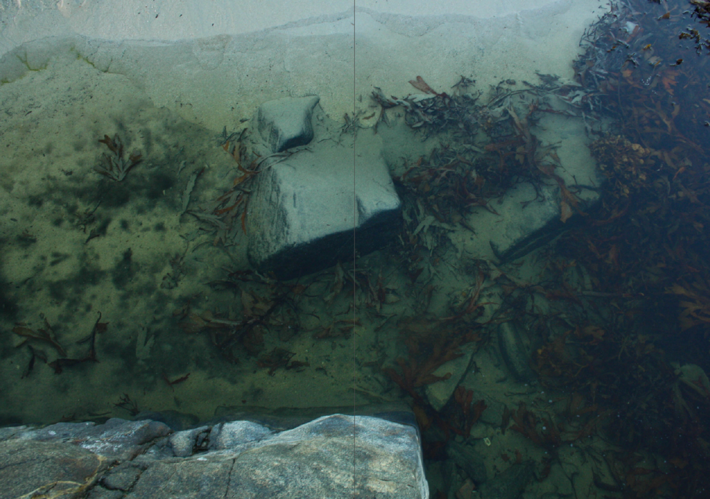
I am pleased with the outcome of my zine, my images carry an abstract theme where colour is a major part of the flow of the zine, the colours go from warm to cold however as I have a “title” on both sides of the zine the zine can be viewed from front-to-back or back-to-front, this was meant display the change of the colours throughout the day. Within the way my images were displayed there is regularity including grids, one page spreads and double page spreads- a lot of this was to be able to fit all my images in my zine as I had around 47 images overall I think this aspect worked as it shows transitions of colour. I decided to put contrasting haikus on the front and back page- on the warmer starting page the final line of the haiku is “scarlet sun rises” while on the colder page the final line is “midnight’s darkness awaits” this once against presents the transition throughout the day of colour and light.
FINAL IMAGES


