Paper mock up –
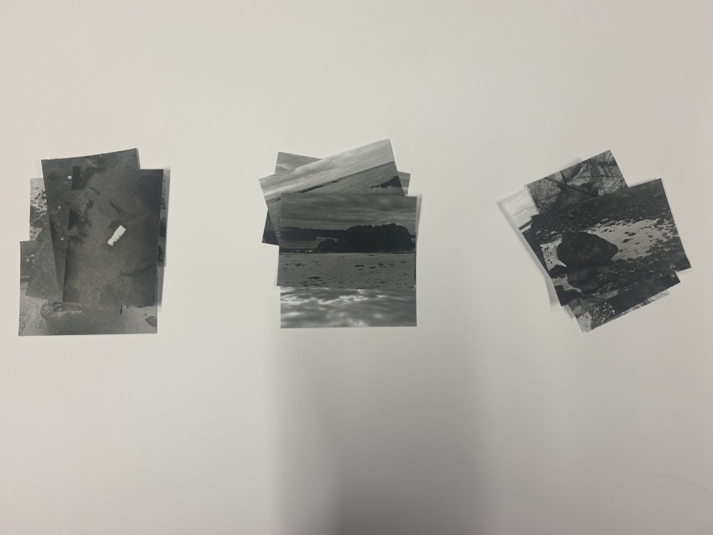
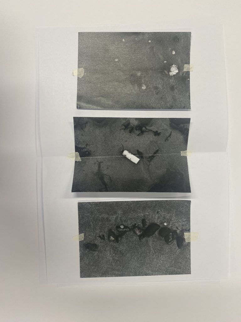
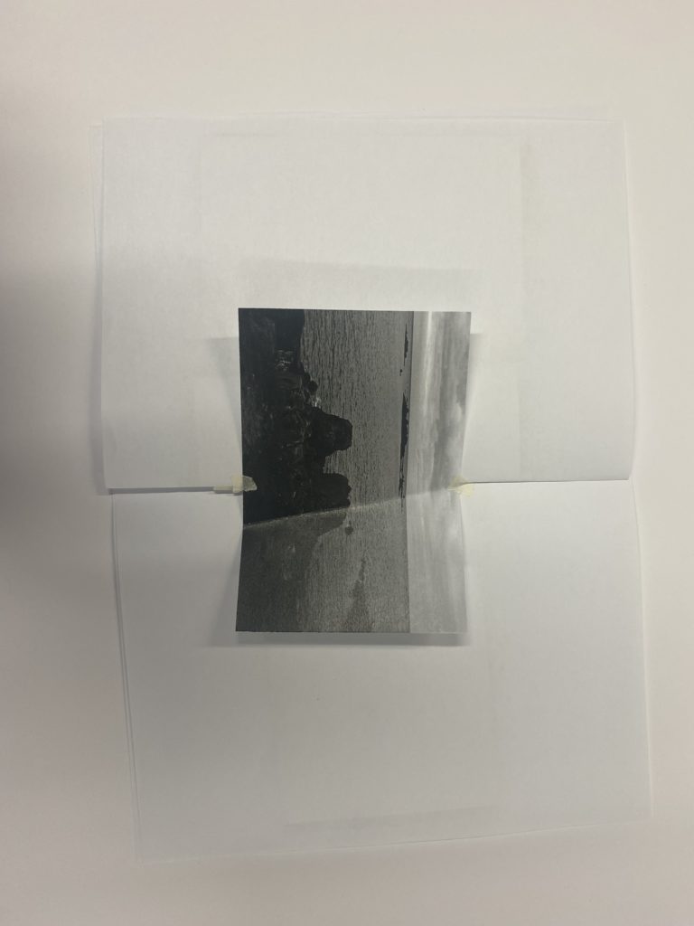
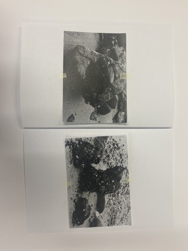
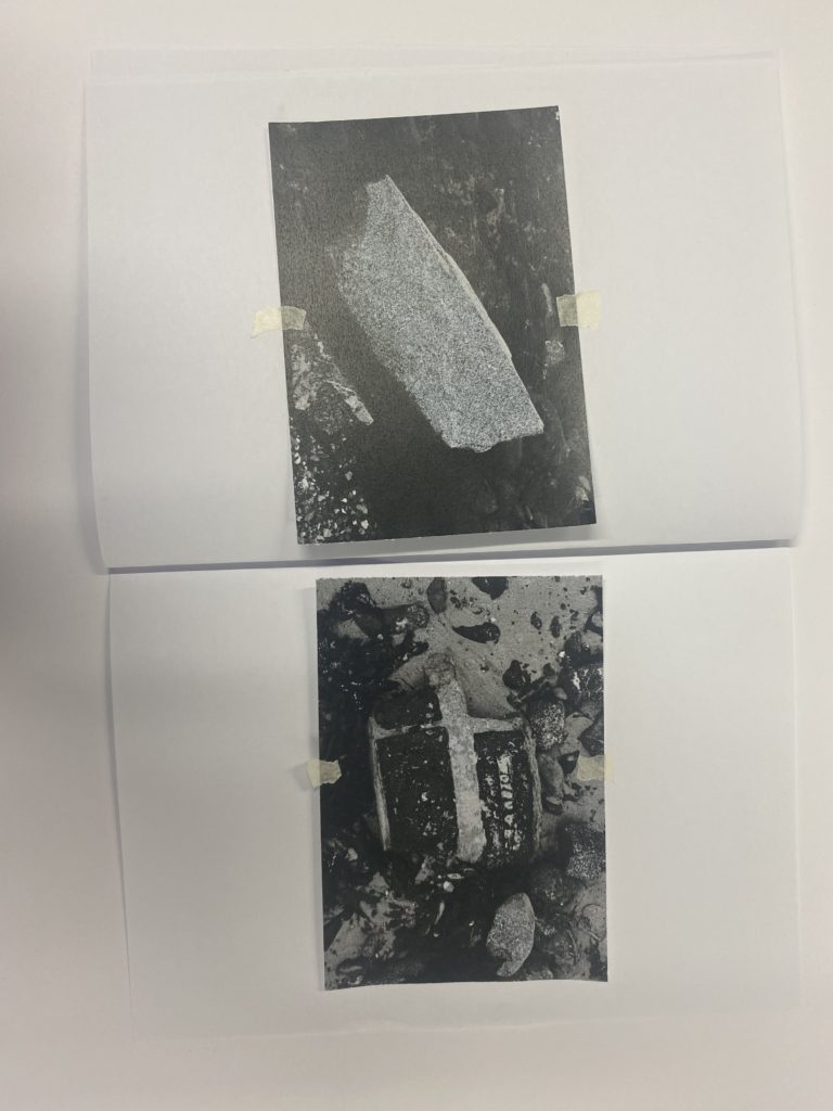
To begin the process of creating my paper mock up which will help me to create my zine and organise the layout in InDesign, I began by printing my photos out and sorting them into 3 separate piles. These 3 piles were:
-Objects
-Views
-Rocks
I found this organisation to be helpful as I was able to lay them out, giving me a clear view of the photos that I have chosen to use and see how well they flow and work together.
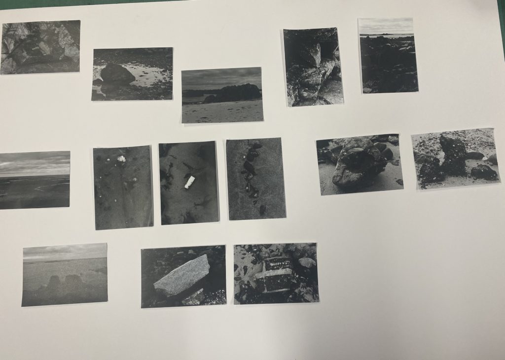
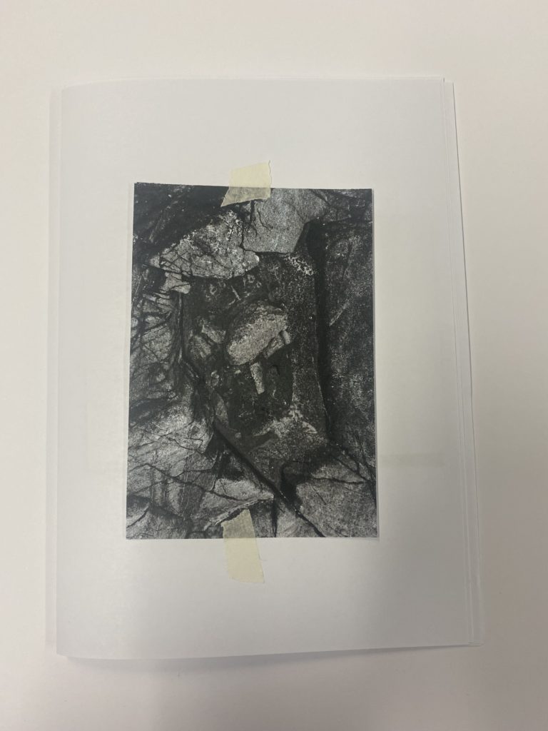
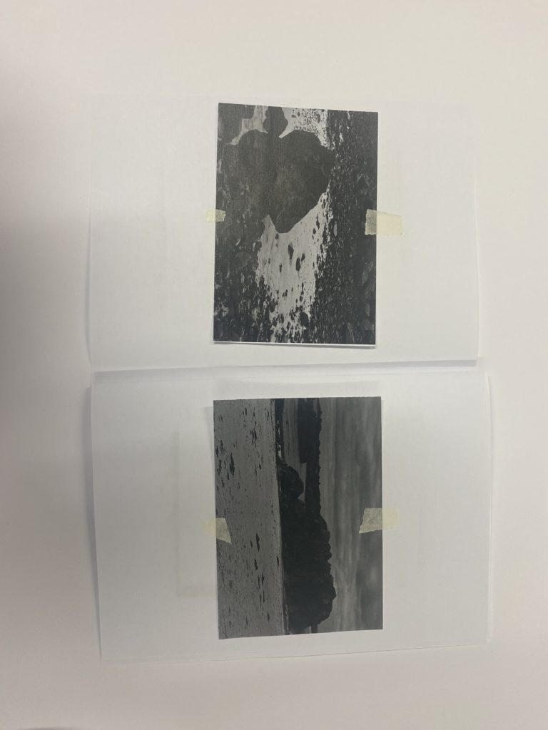
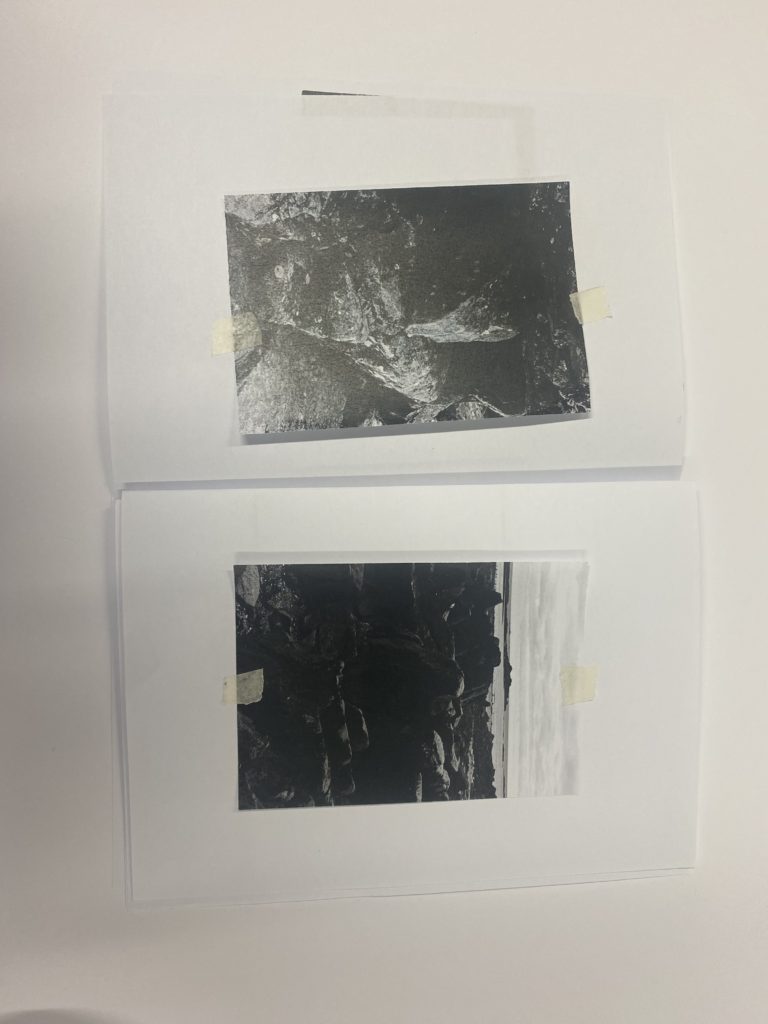
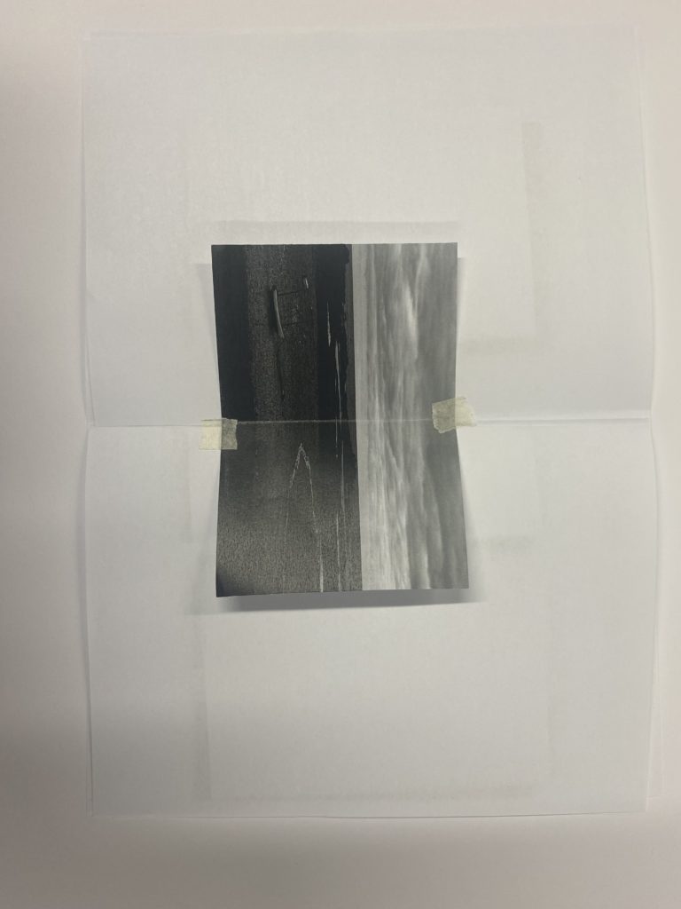
Then I began to decide on the way that I want the photos to be laid out. This process started by placing the first picture in the top left, which I decided to be my front cover that I will later invert in photoshop to create the back cover. Then I placed the photos which I wanted on the same spread next to each other and the ones which I wanted separate by themselves. I also decided that I wanted to create a spread across my middle page, consisting of three photos. I found that this way to create my zine, and adding it to a little book, made it easier to visualise before bringing it into InDesign which I will do later on.
This was the final outcome that I decided upon for the layout of my zine. I created this mini paper mock up zine by gathering 3 pieces of paper and folding them in the middle then layering them to create a mini book. Then I placed my photos on the pages where I thought was applicable and would work well, this made it easier oy visualise and see if the photos which I have chosen to work alongside each other flow well, which many did. I found this technique to be helpful and will use it in the future as it made it easier for me instead of going straight into InDesign with no direction to follow.
Moving to InDesign –
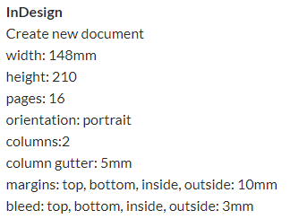
Generic layout –
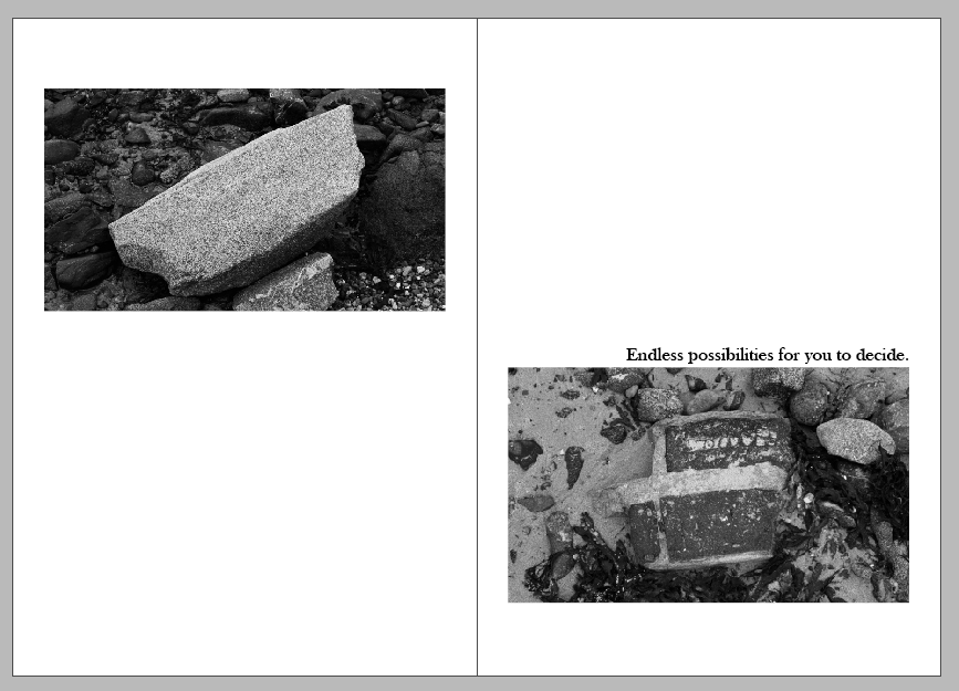
Using my paper mockup, I began to insert my photos in the places where I had decided to put them, following the mockup which I had previously created but then moving and adjusting the photos in different ways to show experimentation.
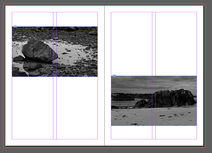
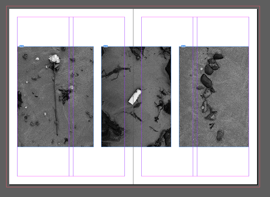
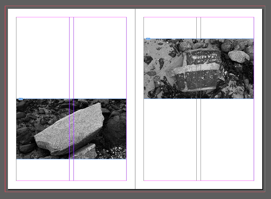
This can be seen as I chose to have the photos on the first page to be at different heights/points on the paper to add a level of individuality to my work so that it wasn’t following a uniformed structure, I then repeated this once more before the end of my zine but going the opposite way.
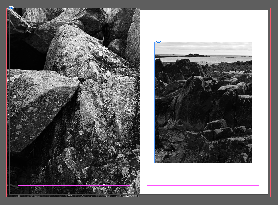
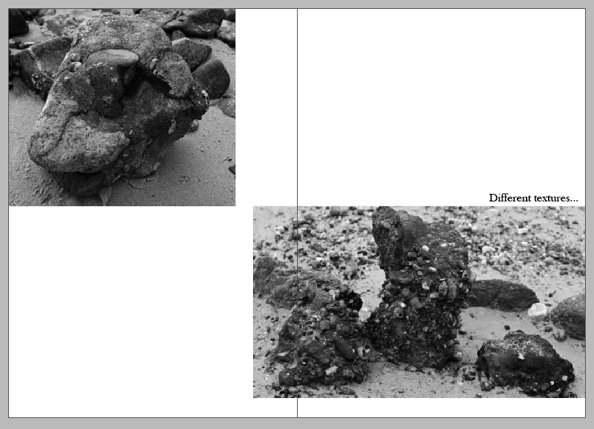
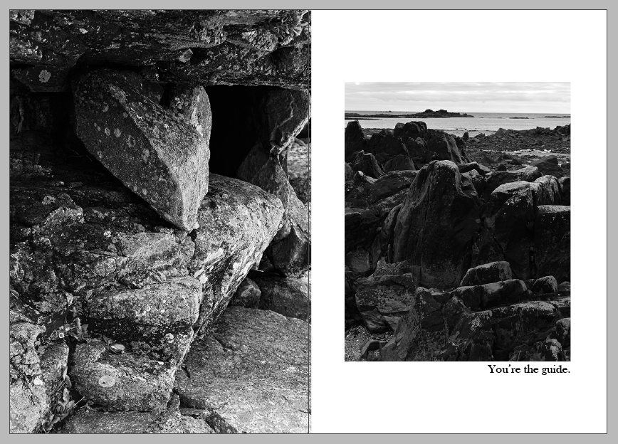
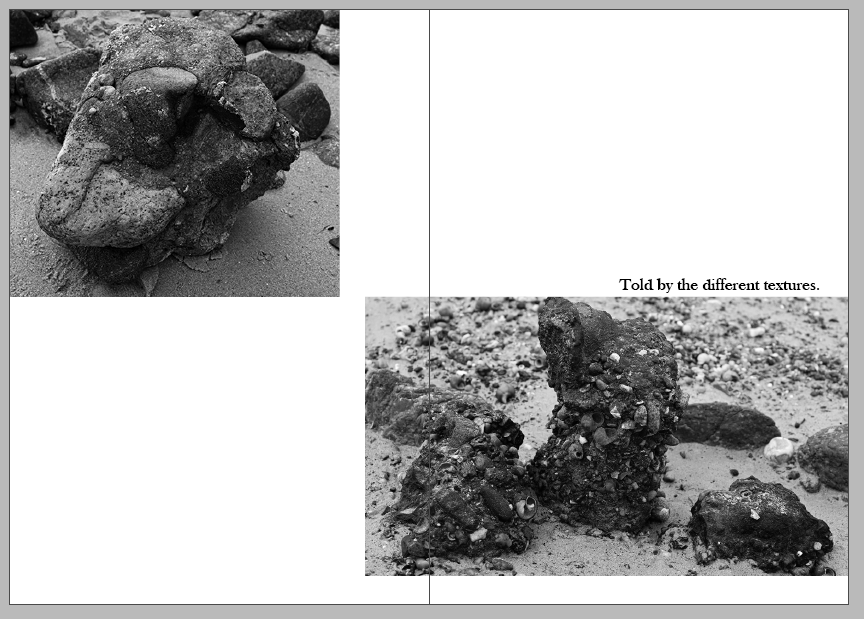
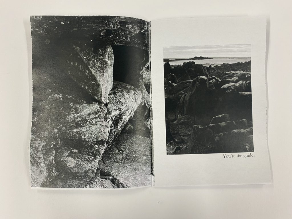
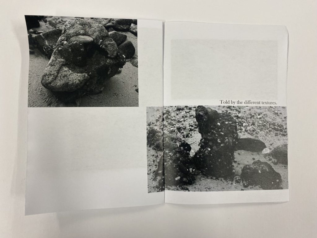
I then decided to have one full page spread next to one which used the white of the page as a border around it. I liked this spread on these pages because I think that it shows a zoom in to the textures of the rocks and then it shows you what surrounds them.
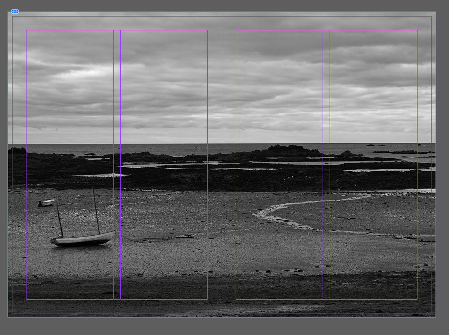
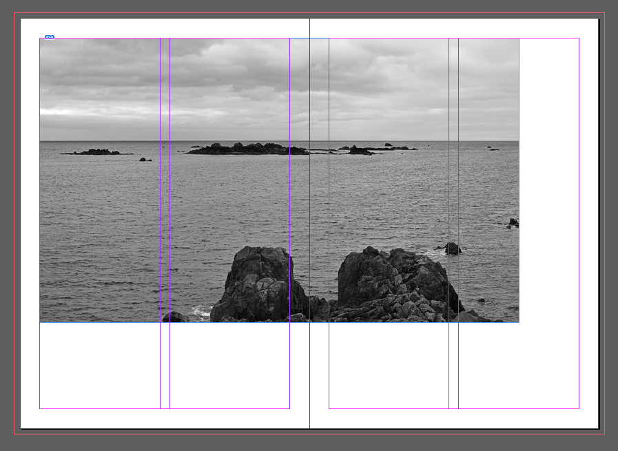
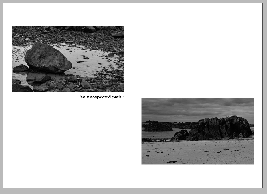
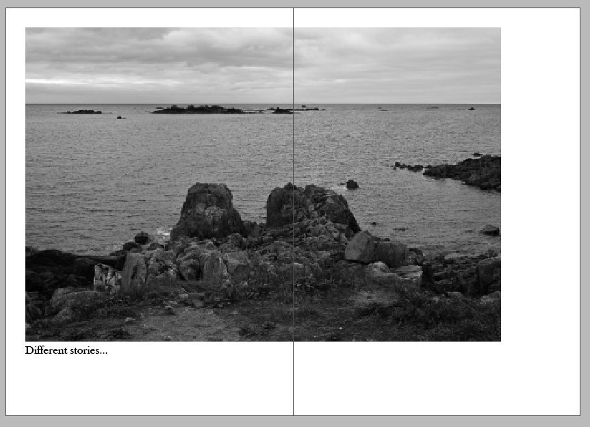
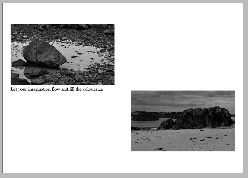
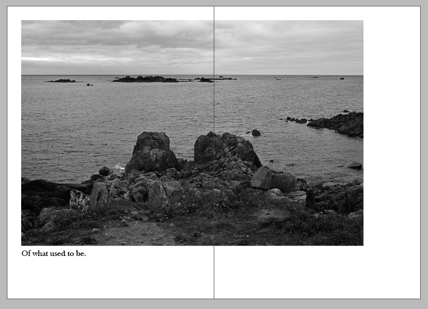
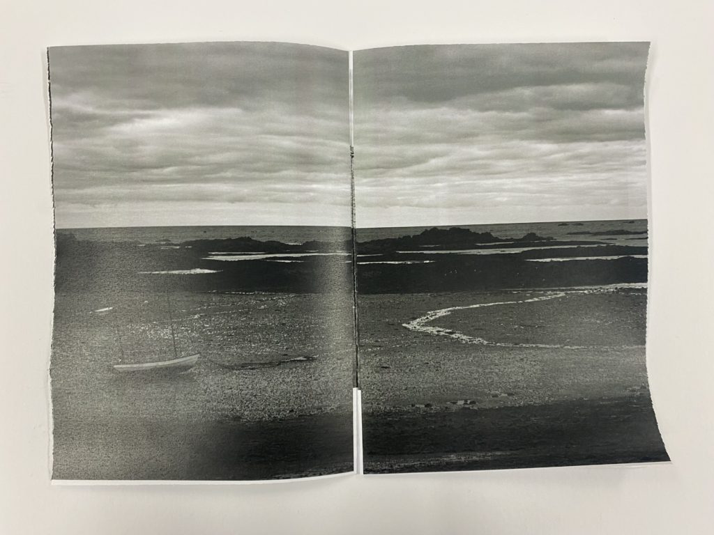
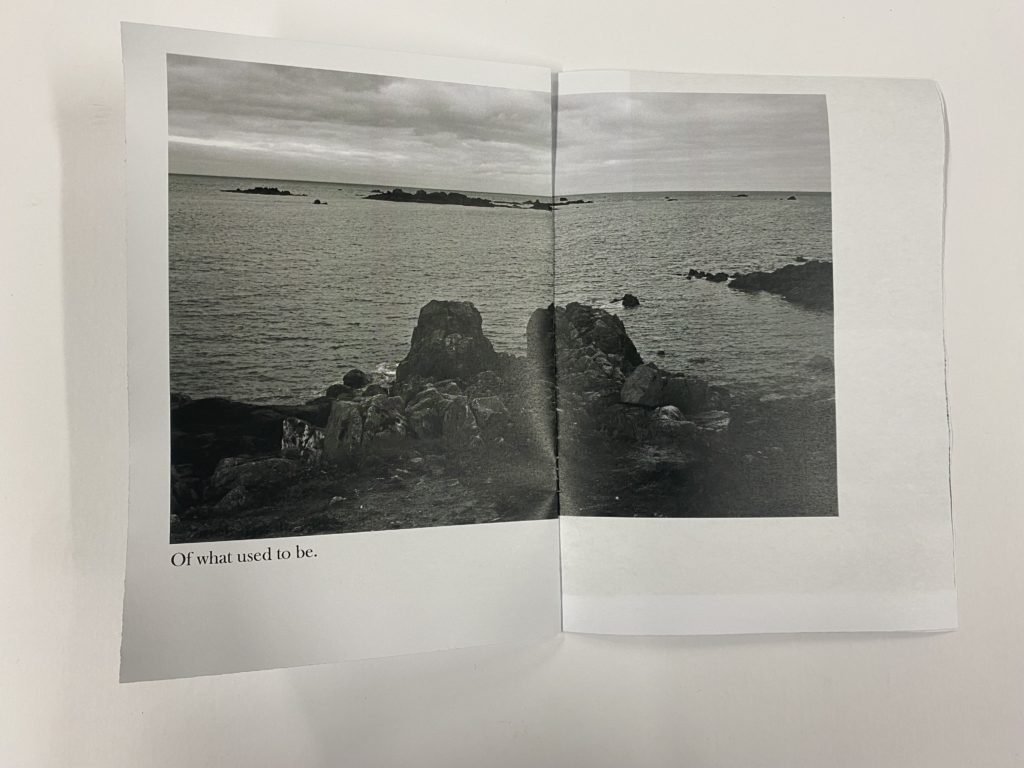
I only decided to have one full page spread for one photo of a view of the beach with a boat, which I really like, in my zine. I chose to do this because I felt as if it would be overwhelming to have more than one as it would tell the main story of this is where the location is where the story that you crate is based and to remember this scenery when developing the story for yourself.
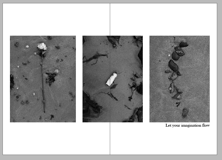
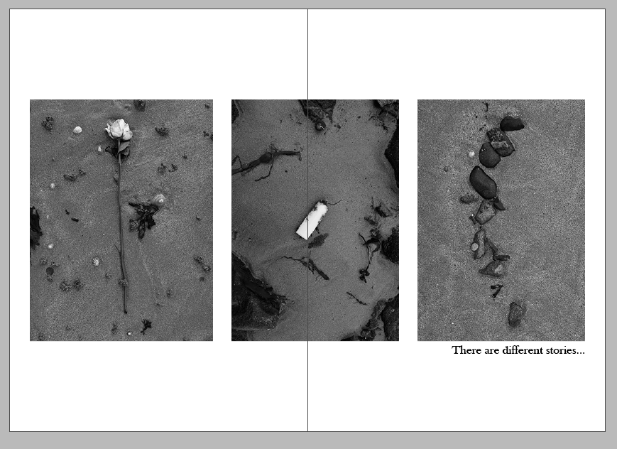
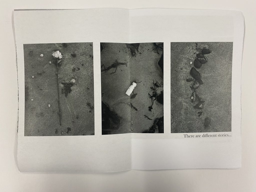
I created a 3 photo spread across 2 pages as the objects which I photographer of various items which I found along the way on the trip to green island. I thought that this could create different stories of how they ended up there and why they have been put together in the set, making the viewer think about the deeper meaning as to why as it could show links to pollution and damage to sea life etc.
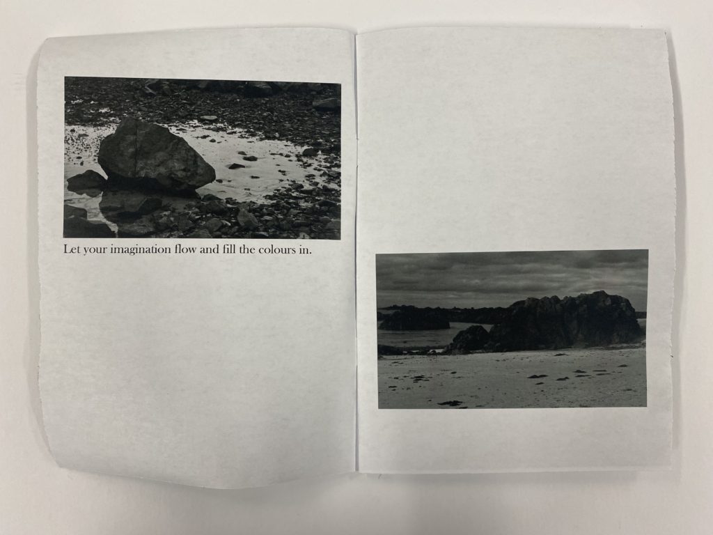
Then I decided to have a photo by itself, but I positioned it so that it did not take up the whole page and only spanned across the top left of the opposing page. I really liked this spread because I think that it shows the scenery of the page but the framing is quite effective as there is a lot of open space, but it allows me to add text to it to create a story throughout my zine which I add later on.
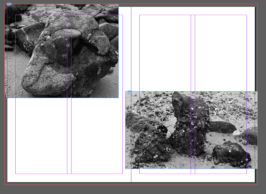
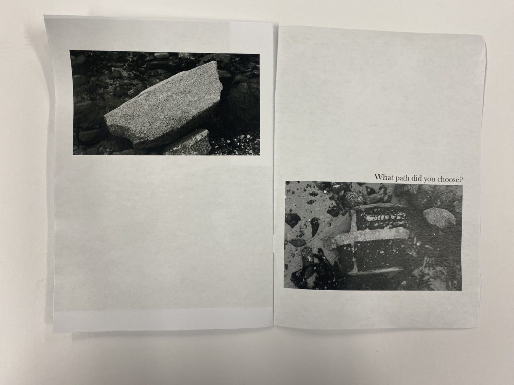
For the 7th spread, I began by using the original template of having 2 opposing pictures but then I wanted the photos to be different shapes so I made the photo in the top left corner squarer whereas the picture below it on the right had more of its original rectangular form. I then experimented with their sizes across the two pages and decided that I liked them to not conform to the normal grid and had them spilling over on the sides.
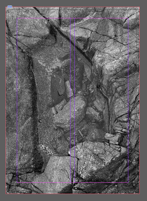
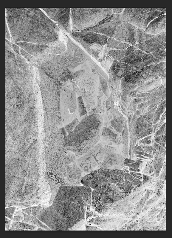
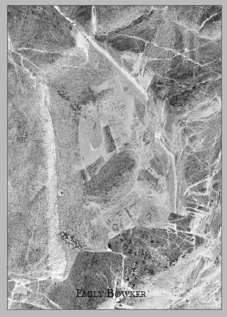
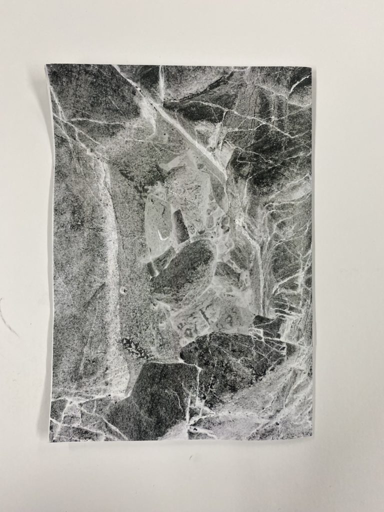
For the back cover, I began by being unsure of what to do and considered leaving it blank but then I decided to invert the colours of the front cover so that it gave it this x-ray feeling which I really liked as it added another layer of creativity.
Personalising my zine in different layouts –
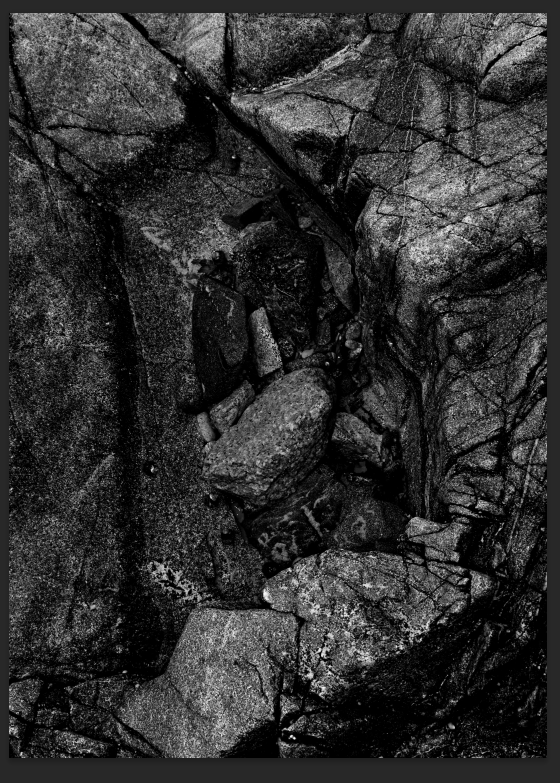
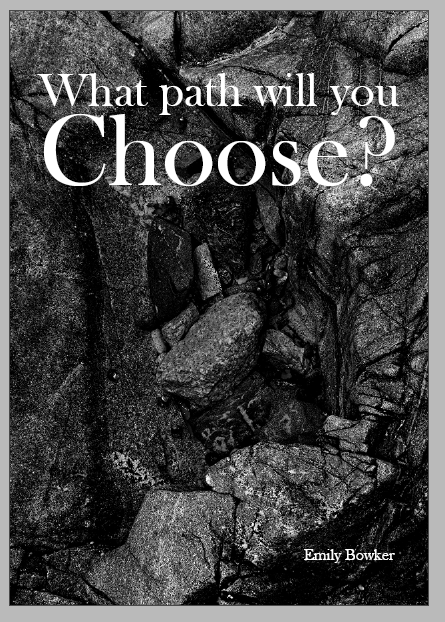
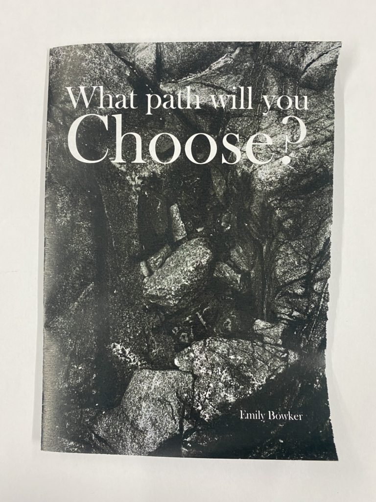
For my front and back covers, I decide to experiment with inverting the photo which creates a comparison of the front and back covers, which reminded me of sea foam too as this was originally a miniature rock pool and this fits in well with the theme of my zine which is mainly the seaside and surrounding areas/objects which you may find on the ground. I achieved this through bringing the original front cover in to photoshop and darkening the original photo so that the blacks and shadows contrasted well against the grey tones. Then to create the inverted back cover I chose the ‘invert’ option which was a pre-set setting. The inverted filter reminds me of sea foam too as this was originally a miniature rock pool.
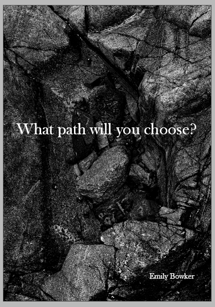
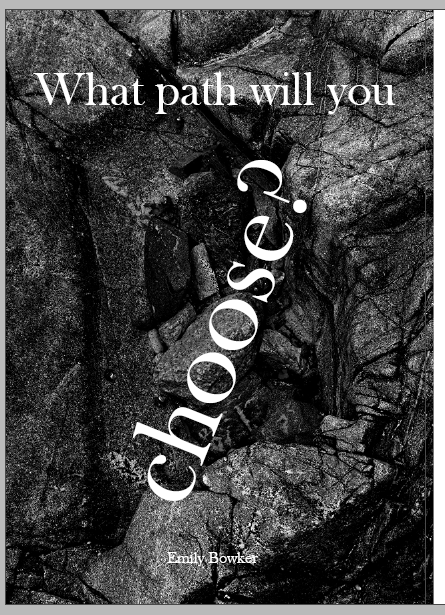
To create my front cover I decided on the title ‘What path will you choose?’ and I chose the ‘Baskerville old face’ font to create this in white colour so that it stood out against the darker colours in the rocks. I began this process by just writing the title and placing it in the middle of the page but I felt as if this wasn’t effective enough as the words seemed to get lost in one another. I then decided to enlarge the word ‘choose?’ to emphasise the importance of my zine which is deciding the path by yourself of what you could take. Then I decided to turn it at on an angle but I decided that I didn’t like this as I felt that it made the text look quite messy and unorganised. Then I finally decided on having the text at the top in a smaller font than keeping the enlarged word of ‘choose?’ which created this impactful effect, knowing that this journey is completely up to you, which I really liked and chose to have as my title. I also experimented with the position of my name and decided that I preferred it be in the bottom right corner instead of the middle as it looked better and the white contrasted well against thee darker tones.
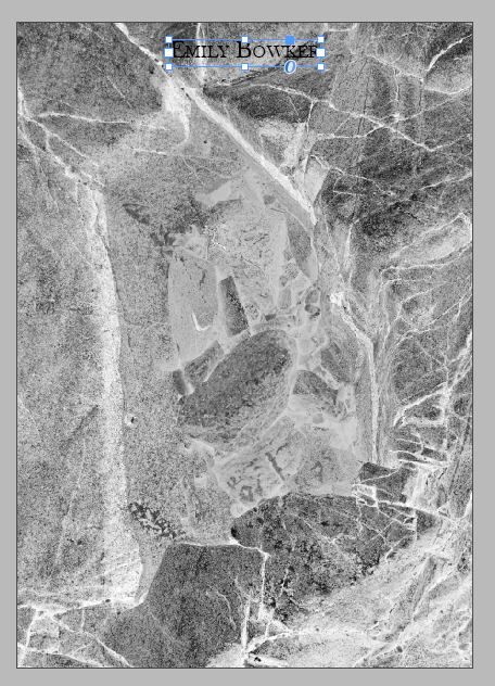
I also decided to experiment with placing my name on the back of my zine, but I didn’t like this because the font and black colour didn’t work well on the back cover as it felt lost and misplaced throughout it which I didn’t want to happen. Therefore I ended up choosing to have it on the front and leaving the back blank with no text to show the inverted filter and effectiveness of it.
Text used:
Pg1 “An unexpected path?”
Pg2 “Unspoken rules of creativity”
Pg4 “Let you imagination flow”
Pg5 “Different stories…”
Pg6 “Different textures…”
Pg7 “Endless possibilities for you to decide.”
Above shows the experimentation of text which I decided to bring in to my work, using the same font as my title to show a continuation and flow throughout my zine as I felt that using a different font would make it seem unorganised. I began this process of decision by knowing that I wanted the text to act as a subconscious guide throughout my zine but also make sure that the journey which you experience is self guided as well. I felt as if this collection of text which is seen throughout the book didn’t flow as easily as I wanted which I wasn’t happy with so I decided to rewrite it, as seen below, but keep different parts of it but change where they are placed.
Text used:
Pg1 “Let your imagination flow and fill the colours in”
Pg2 “You’re the guide.”
Pg4 “There are different stories…”
Pg5 “Of what used to be.”
Pg6 “Told by the different textures.”
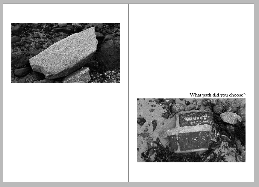
Pg7 “What path did you choose?”
These were the final version of the text which I included in my zine which I thought was successful. This was due to the way that the text flows easily from one page to another, which creates a poetic sense and feeling throughout the experience. I really liked how I used a continuation of texts to create a sentence in my zine on pages 4 and 5 because it creates a scaffolding for the viewer of what they should be thinking about yet letting their imagination and creativity run free. I also liked how I included the title on page 7, before the back of my zine, as I think that it acts as a summariser for it as it reminds you of the journey you have taken and why you have taken it which makes the viewer reflect on my zine later on in their own time.
Final outcome –
This was the final outcome of how my zine turned out once I had printed in and I was pleased with the way that it turned out. This was because the text feels as if it is in the correct places and it doesn’t appear to be too overwhelming as I made sure to keep them small and precise. I also liked the different framing techniques which I experimented with in each spread as I was able to have many different ways to create a story through the way that it is presented. I am glad that I decided to keep a black and white theme throughout the zine of my photos as I wanted the title to imply that as you take this journey, on the path that you do end up choosing you fill the colours in yourself. This means that they could be as vibrant or as dull as you wanted, dependant on your mood and how you feel at the point in time and then you can come back to it in the future and decide on a different way to go with the journey and the colours which you paint with your mind. I really liked the process of creating a zine from the decision of photos and creating a paper mock up to using InDesign as I think that it is a unique and different way to present the photos which I have taken.

