
Write a book specification and describe in detail what your book will be about in terms of narrative, concept and design with reference to the same elements of bookmaking as above.
Narrative: What is your story?
Describe in:
3 words
Generational female identity.
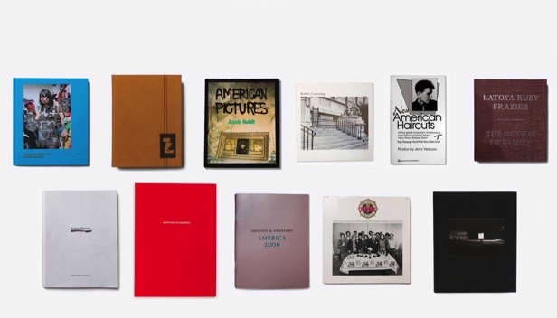
https://www.shashasha.co/en/book/how-we-see-photobooks-by-women – an article I used to look at notable photobooks by women, in order to gain inspiration for my own.
A sentence
My project focuses on the personal and generational identity of women in my family, using archival and new material.
A paragraph
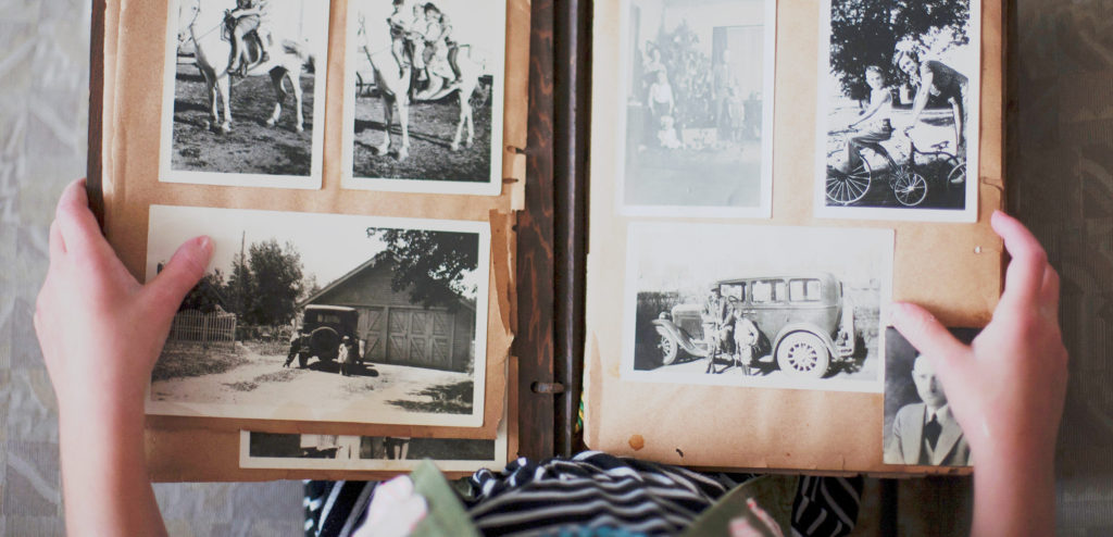
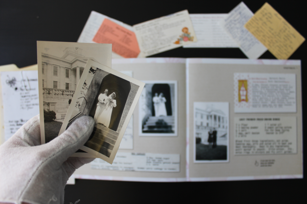
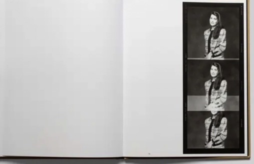
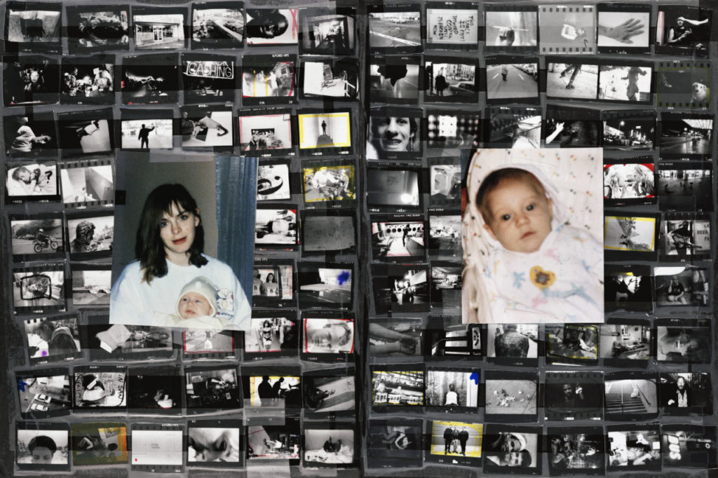
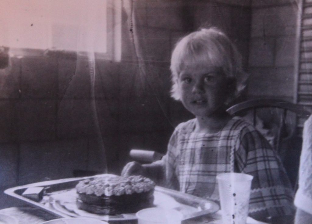
This project looks at different facets of identity, both in the past and present. More specifically, the project explores the personal identity of each of three subjects: my mother, grandmother and myself. Then, through the use of collage, it shows how each person’s identity links with each other. – The past also plays a role in my project, with the use of archival images a key part, used for comparison to the present day for my collages. The use of collages is inspired by my previous identity project, which formed the basis of this project. My personal study draws a lot from identity within a place as well, such as within the home: whether it be a past or present one.
Design: Consider the following:
How you want your book to look and feel
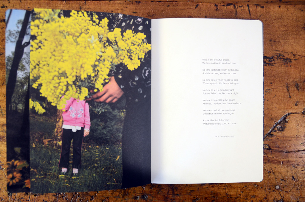
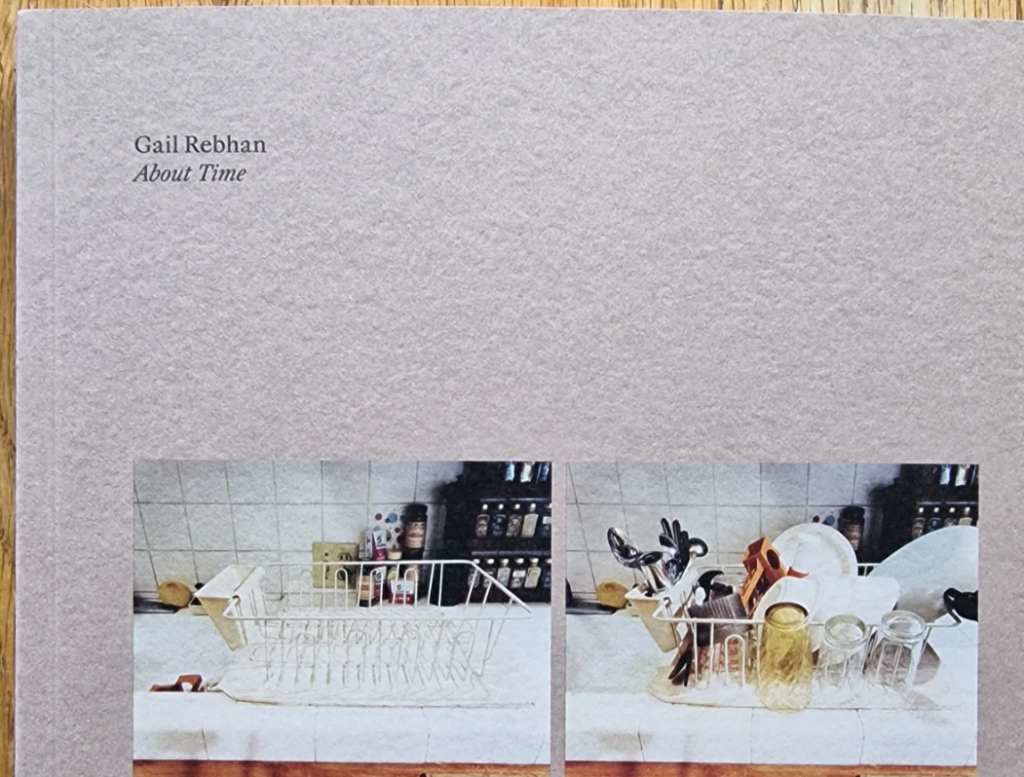
I want the book to have a soft, gentle feel. I think using vintage style, faded colours and fonts will suit the style of my work and editing style. I want to use classic colours and fonts to give my photobook a vintage/ timeless feel to it. – this is influenced heavily by my use of archival material, as well as my editing style, using high grain and faded tones. In this photo book, I have chosen to take inspiration from classic photo albums and books – I was heavily influenced by this after looking through my own family’s photo albums from the 70s, 80s and 90s which will help me to design my own.

Paper and ink
I plan on using white paper with black ink, creating a timeless feel. – I plan to use matte paper, to keep my style consistent. Furthermore, I think that using matte paper will help to keep the detail and unique features of my archival images throughout – using glossy paper may draw attention from small details of the images, such as creases, folds, and rips in the images. I am interested in keeping these imperfections intact to keep the authenticity of the images and to create a more tactile and immersive feel to my photobook. When adding my essay to the photo book, I have seen the idea of using different colour pages that fit with the theme. I like this idea as it would create a distinction between my pages with images and those with my essay and the images that accompany it.
Format, size and orientation
I’m going to choose the orientation based on my front and back cover choices – Probably either portrait or square. However, with still more images to make, I may change my mind – I tend to have more landscape-orientated images, which would also influence a choice of a landscape-orientated book. For these reasons, I’m still undecided. Having thought about this more, I have decided on a portrait format book. However, when creating my photobook
Binding and cover
I plan to use archival or collage images for my front and back cover, either slicing an image in half or two separate images. I want the front cover to be tactile, and heavy.
Title
I’m still thinking of a title to do with my family or to do with the content. I think that I might need to focus on the content of the photobook first, and when I know what that looks like I will come back to the title. As for ideas, I was thinking of something linking back to my own family and its’ history, or to do with the content. For example “The Albums” or “80-18” – (The difference in ages between the 3 subjects in my book at the time of completion.)
Structure and architecture
https://gatekeeperpress.com/types-of-binding-for-a-self-published-book/ – an article I used to find more information about book architecture.
I am considering different types of architecture for my photobook: a softcover, with a smooth image, wrapped front cover, or a hardcover, with a more vintage style cover, with either two images wrapped onto the outside or just a single image wrapped on to the front and back cover. I have decided against the use of a dust jacket for my book, as I want the image to be wrapped in the book.
Design and layout
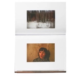
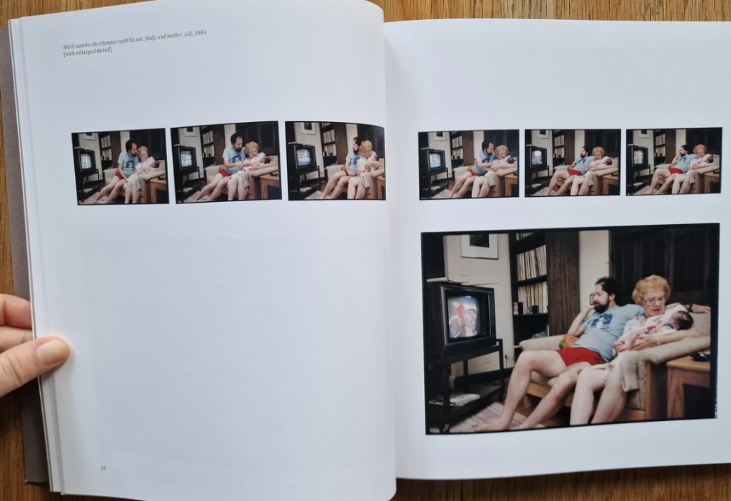
After completing my previous zines for the ‘My Rock’ project, I have gotten a better idea of what kind of design I would like in my project. I am going to use a mix of double-page spreads, specifically my strongest image on the middle page of my book. I want to utilise blank space in my photograph, creating unique compositions with different shapes and sizes of images. I have thought of lots of different layouts. For example: double page spreads, two image spreads, images on opposite ends of double page, single images on double and single pages, and arrangements of different sizes and orientations.
Editing and sequencing
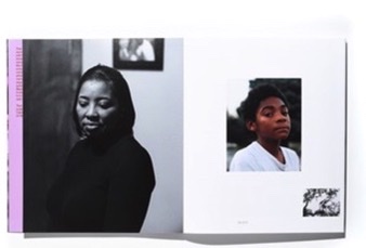
My editing for my self-portraits is in B and W, along with some of my other portraits – most of my portraits are in colour, along with almost all of my archival material. I plan to create collages, as well as juxtapositions of multiple images. I will sequence these evenly with normal portraits and single archival images.
Images and text
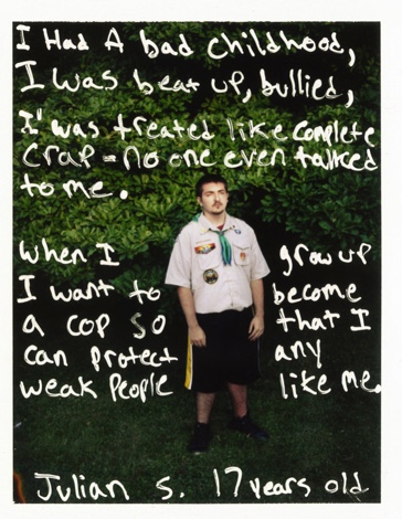
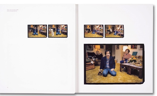
I might use text on top of my images, narrating the photos or adding context. I first thought of this idea after looking at Jim Goldberg’s project: “Raised by Wolves”, in which he asked subjects to write on their own photos after being given them back. I think this idea links really well to my project as I wanted to find a way of including my subjects’ own ideas of the images and my project in my work. As well as asking my subjects (my mother and grandmother, and me) to write on their own images, I plan to write little captions or paragraphs in my own handwriting about the content of some pages and their meaning. This is also influenced by my interest in photocollage, and other artists using text in their images.
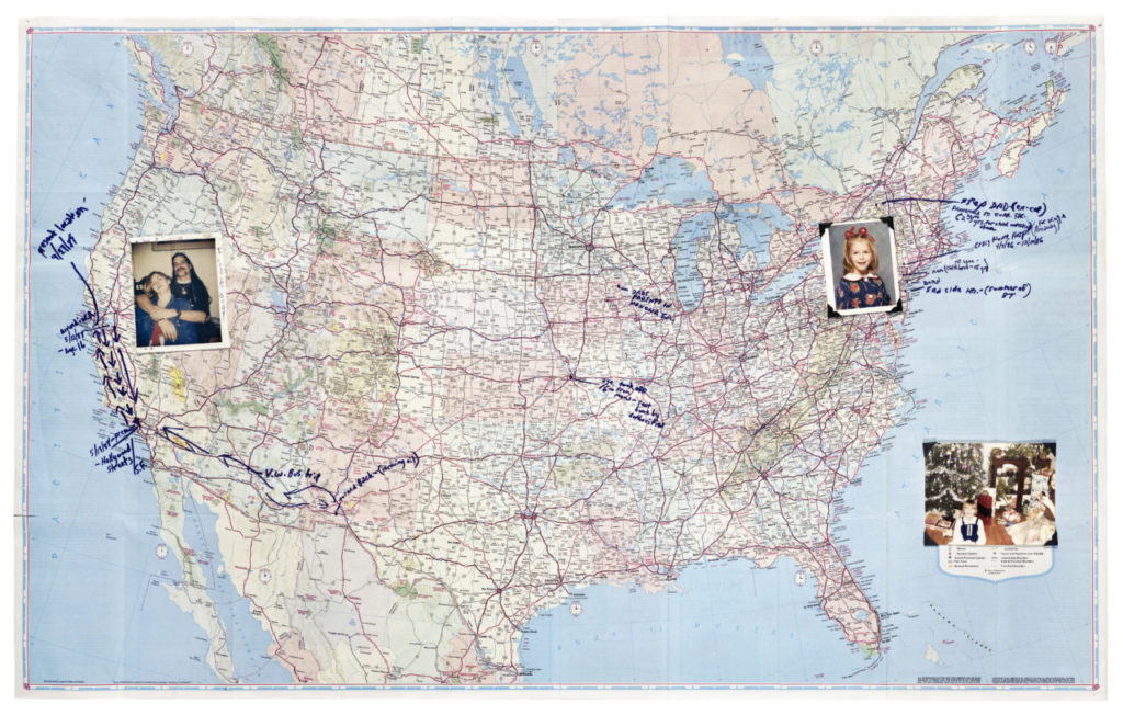
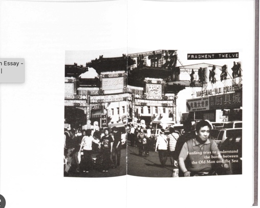
I also have an idea of including drawings or annotated images, in the same style as Jim Goldberg above – possibly a family tree, or a map of Jersey, UK and France to map out my family’s origins and homes. I think that this idea links well with my interest in photocollage, as it is another part of mixed media art.